
Signage Design
When a brand needs to be felt
Signage is the first thing customers see, from the greatest distance, yet it is often the last thing anyone thinks about.
FreshBrand designs building signs, facades and branch and dealer signage from the identity system, with proportion, materials and lighting worked out for each location. The aim is for the brand to look the same everywhere, day and night. FreshBrand is responsible for the design and the standards; production and installation are handled by the business’s own contractor.

Perspective
Signage is often handed over entirely to a sign maker, and the familiar result is a sign with a size chosen to fit the facade, an enlarged logo to fill the frame, and a phone number and product list added to fill the space. Each branch and each dealer ends up doing it differently, so the network no longer looks like one brand.
Good signage starts with the person looking at it: someone riding past on the street, a visitor looking for the right building, a shopper walking along a mall. That is why letter size, the space around the logo, materials and lighting are worked out for the viewing distance and written into standards that every location can follow.
For FreshBrand, signage is the hardest test of a brand: viewers usually pass by, stand fairly far away and have only a few seconds.
When to start here
Signage usually needs to be redesigned when a business changes its identity, opens a new headquarters or branch, or finds that its network of stores and dealers has gone a different way in every location.
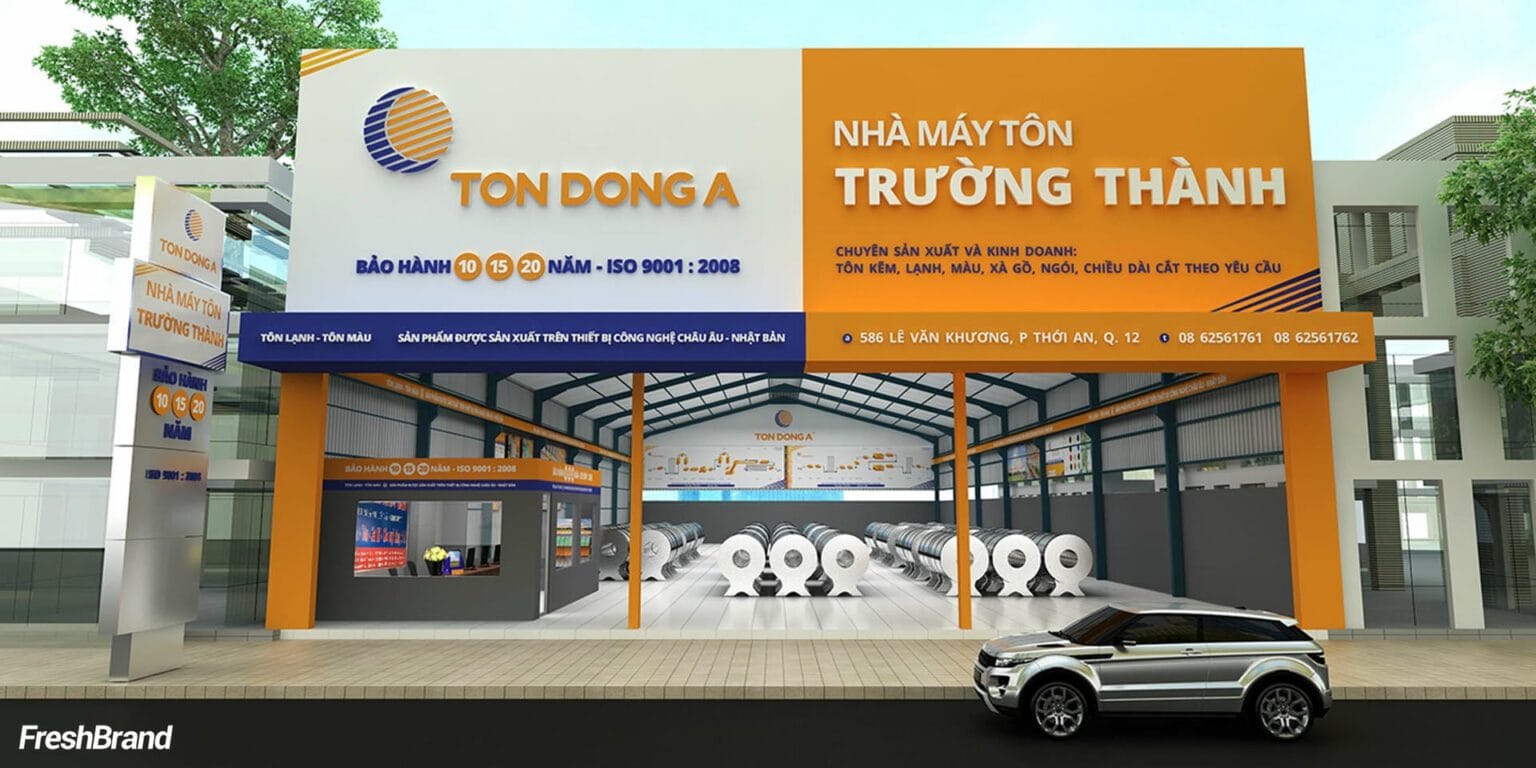
When a dealer network needs one face
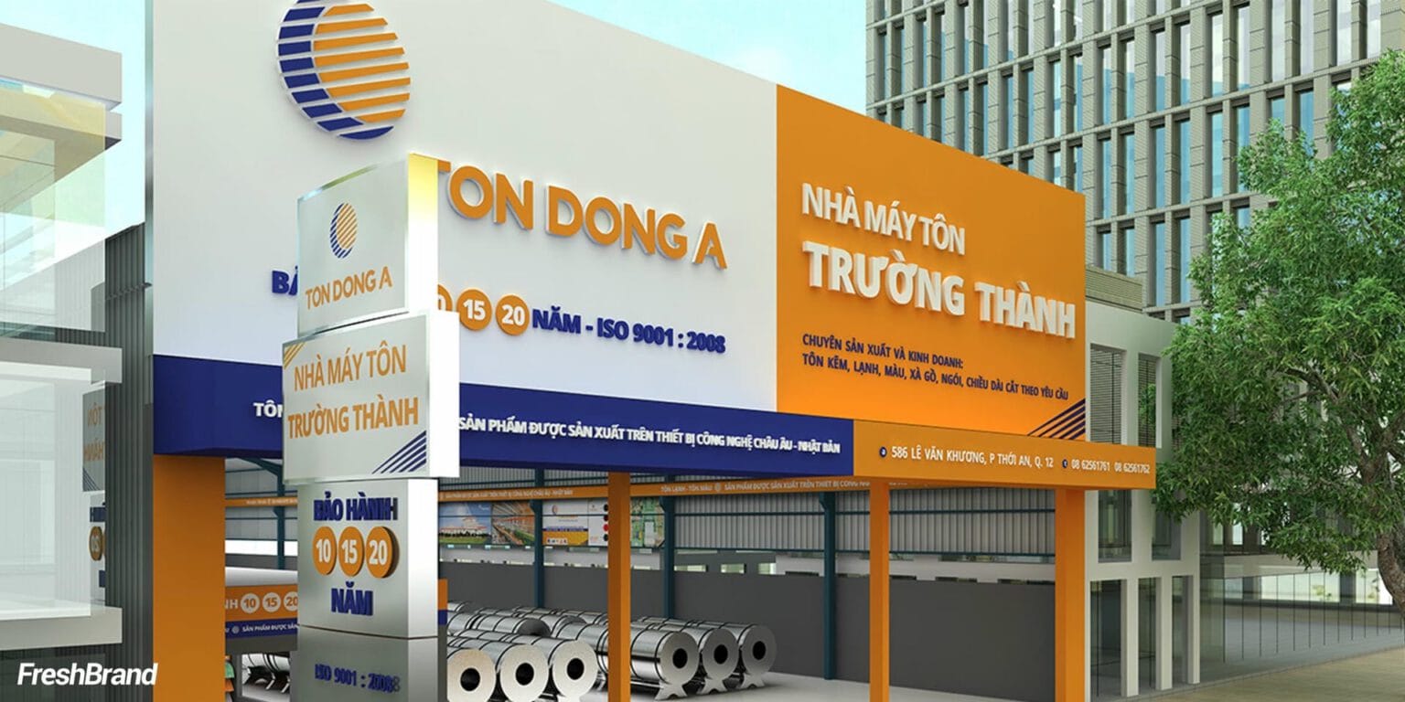
Ton Dong A’s dealer stores pair the dealer’s name with the logo and the brand’s orange and blue on the same facade, so that wherever shoppers are, they recognize they are standing in front of a Ton Dong A point of sale.
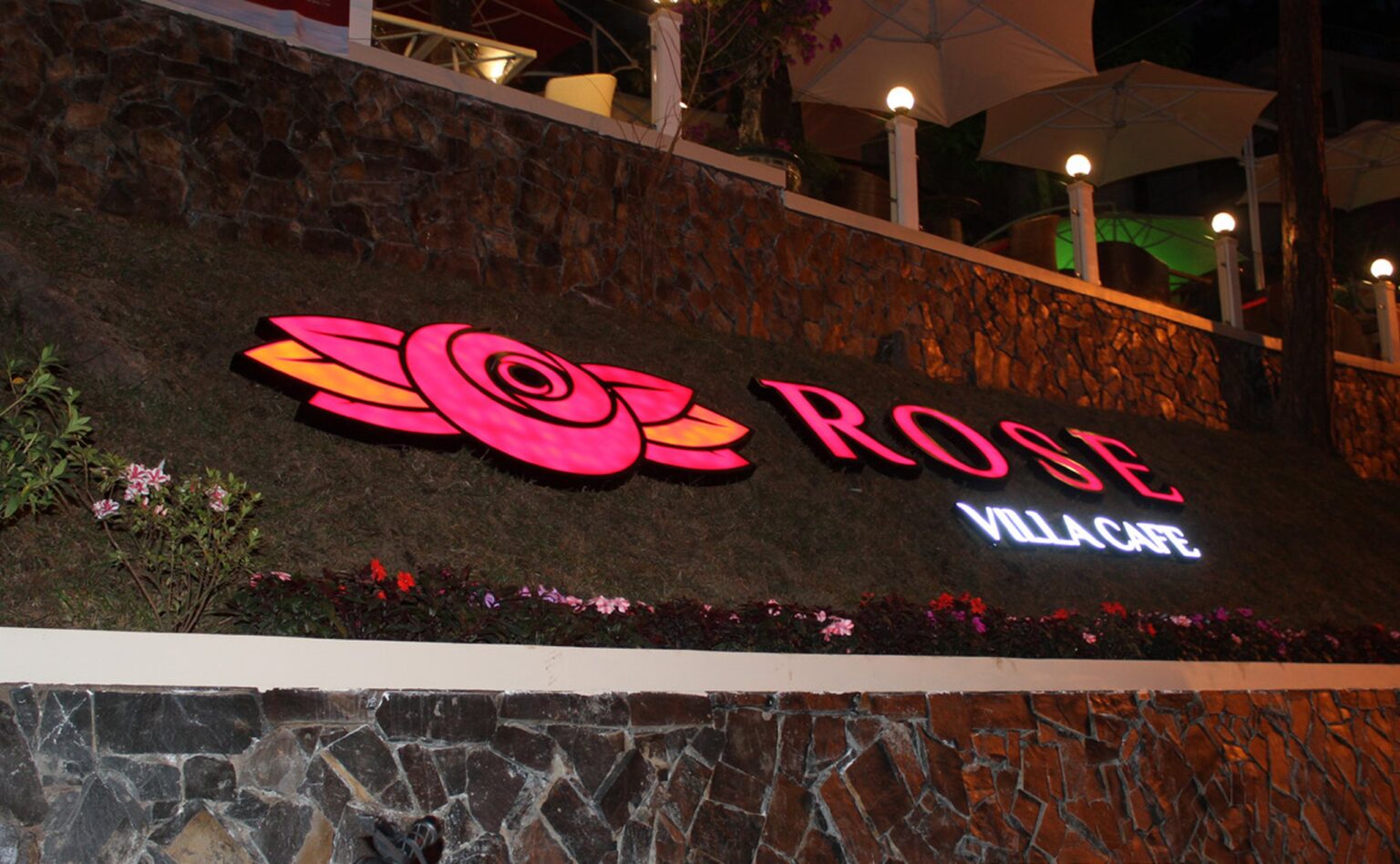
When a cafe has to be recognized after dark
At Rose Villa Cafe, a red rose and the letters ROSE are made into an illuminated sign on the facade and the awning, so the cafe stays clearly visible on the street at night.
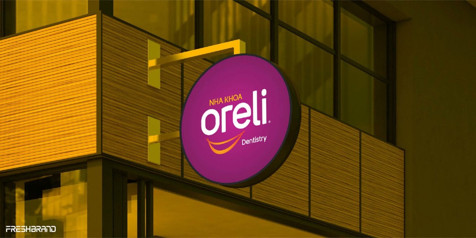
When a clinic needs to be found from the street
At Oreli Dental Clinic, a round pink-purple lightbox carrying the brand’s logo and smile projects out from the facade, so passersby can see it from both directions, by day and by night. The clinics in Buon Ma Thuot, Ea Kar and Buon Ho have different facades, but all carry the same sign.

When a store needs to be noticed from the facade
At the GOCHARM store, the GOCHARM name glows on the facade while inside, boldly made-up faces stand beside the products, so the store looks like a page from a fashion magazine and invites customers in.
How FreshBrand works
Signage design runs from where the sign will stand and the distance people will see it from, through a catalog of each type of sign, to the documentation and standards that let every location build it correctly.
Where is the brand now?
We start with the identity system and the places where signs will stand: facades, buildings, branches and dealers, along with their dimensions, sight lines and the local rules on advertising signs.
Which types of signs are needed?
From there, FreshBrand defines the catalog of signs and the role of each type.
BuildingName signs on the roof, on a wall or at the gate
FacadeStore signs, lightboxes and dimensional letters
NetworkBranch and dealer signs built to one standard
What do we choose?
Each sign is designed for the distance people will see it from, rather than for a computer screen.
Readable from afarLetter size and spacing set by viewing distance
LightingLightboxes, dimensional letters or backlighting for the night
Less informationName and symbol first, everything else after
How does the signage get built?
FreshBrand renders signs in perspective on the actual facade, then finishes them as a design package with dimensions, materials, colors and lighting. It comes with standards for different facade sizes, so the contractor in each locality builds it correctly; permits for advertising signs, along with the structure and electrics, are handled by the business and the contractor.

What will really change?
With signage, the change lies in consistency: customers recognize the brand at every location, from headquarters to the farthest dealer, and each new location is built correctly to the standards already in place.
What the business keeps
The more the network grows, the more this set of assets pays off, because every new branch or dealer is built to the standards from the first time.
- Sign designs for the building, the facade and the main locations.
- Perspective renderings on the real facade for approval before production.
- Signage standards for branches and dealers across many facade sizes.
- Specifications for dimensions, materials, colors and lighting for the contractor.
Branch & Dealer Signage
When a brand has dozens or hundreds of locations, signage is what keeps the whole network looking like one, even when each location is built by a different contractor.
- One set of standards: Placement of the logo, the location name and secondary information for each facade size, whether wide, narrow, tall or low.
- Dealer name beside the brand: How to place a dealer’s store name next to the logo without dimming the brand.
- Build guide: Drawings and specifications clear enough for the contractor in each locality to build it correctly.

Let's talk
Is your business facing a similar question? Send a request to talk with FreshBrand, or download the portfolio to see more of our work.

In practice
SCBRepositioning and identity, 2018
When signage has to keep customers from mistaking one bank for another
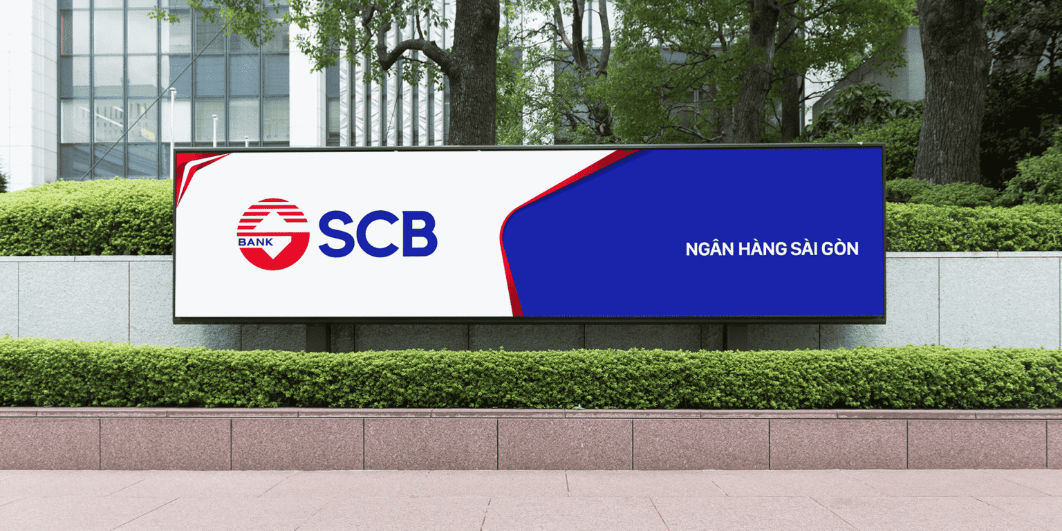
In 2018, SCB had a wide network of branches but was easily confused with other banks that also carry the name “Saigon” or have a similar abbreviation. When it was repositioned as a modern, versatile and friendly retail bank, the SCB name was kept as the central point of recognition.
“Every touchpoint is a chance for SCB to be seen in line with its new direction.”
The new identity was rolled out across signage, facades and ATM booths, in the same blue and red palette and with the same logo placement. As a result, at any branch, by day or by night, customers see the same SCB.

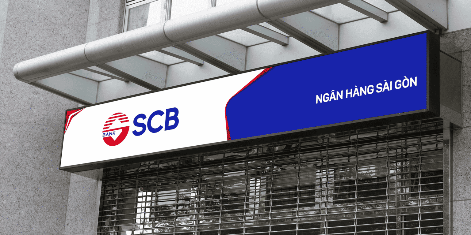
SCB’s brand guideline is the foundation for its branches, printed materials and digital channels to roll out one identity; as a result, each new branch has standards ready to follow.

The question behind it
Signage is where the identity system meets the street, so it calls for a set of standards for the whole network, and for an interior that speaks the same language.
FreshBrand capabilities
Strategy
When a brand needs a direction
Identity
When a brand needs to be recognized
Expression
When meaning needs to take shape
Experience
When a brand needs to be felt
- Brand Space Design
- Trade Show & Exhibition Booth Design
- Signage Design
Communication
When a brand needs to be understood
Start with FreshBrand
Send us the problem, get a point of view.
You can send a request today, or download the portfolio to share with your leadership before we talk.