
SCB
Repositioning
2018
A new future needs a new way of seeing.
- Client
- Saigon Commercial Bank (SCB)
- Industry
- Finance & Banking
- Year
- 2018

Overview
SCB’s new brand platform is built on the values that created the bank’s standing, while opening a direction of growth better suited to the future.
With three core values, Modern, Versatile, Friendly, SCB aims to be a bank that is more unified, dynamic and approachable, building on its existing strengths while connecting better with a younger generation of customers and with financial needs that keep changing.
Context
Where did the brand stand?
SCB (Saigon Commercial Bank) has a long operating history, a large scale, strength in raising deposits and a wide network of branches. Its core customers are middle-aged and older people, who stay with SCB for its deposit products and its customer care.
Yet the banking market is moving fast toward modern retail, and competition has widened from interest rates to technology, convenience and customer experience.
SCB had also set a new direction: keep its current customers, attract younger customers aged 25 – 40, develop its products and services, and become a modern, versatile and friendly bank.
But a considerable gap remained between that new direction and the brand’s image in the market.
Problem
What really had to be renewed?
SCB was “stuck” in the image of a traditional bank, strong on deposits and tied to older customers.
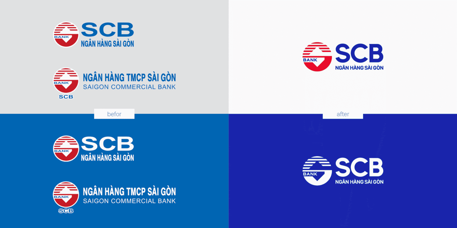
The brand was also easily confused with banks named “Saigon” or with similar abbreviations, while its identity system had not been built in a deliberate, coordinated way.
What was not yet clearly seen was an SCB in transformation: more modern, more versatile, friendlier and turned toward a new generation of customers.
What was not yet felt were the changes SCB had set out in its development strategy.
So the problem did not lie in identity alone.
The brand had to move from being seen through the image of its past to being recognized for the direction of its future.
Discovery
What did FreshBrand see?
Through research, observation and dialogue with SCB, FreshBrand recognized a paradox:
SCB had changed its direction, but the market had not changed how it saw SCB.
Inside, SCB had set its course toward a modern, versatile, friendly retail bank with a younger customer base. Outside, the brand was still known mainly as a bank with high deposit rates that serves older customers well.
The gap, then, did not come from SCB lacking a foundation or a direction.
It lay in the distance between “what SCB wants to become” and “what the market sees SCB as.”
Insight
“SCB has a direction for the future, but the market still sees SCB through the lens of the past.”
Diagnosis
SCB is “boxed in” by an old image while its brand direction has already changed.
This bottleneck had to be resolved through brand repositioning.

Point of view
How did FreshBrand read the problem?
FreshBrand did not see SCB as a bank lacking strength or direction.
SCB was boxed in by the very image of its own successful past.
Repositioning, therefore, was not about denying what SCB had built, nor simply about making the brand look “younger.”
It was a process of freeing the brand from its old image, so the market could see and believe in the version of SCB the bank was building.
A brand cannot move toward the future while the market still looks at it with the eyes of the past.
From that point of view, every decision that followed had to serve one goal: to break the old image and build a new perception of a modern, versatile, friendly SCB.

Strategy
What did we choose?
The strategy began by deciding what to keep, renew, focus on and develop.
- KeepIts scale, strength in raising deposits, network, trustworthiness and loyal existing customers, along with its customer-centered direction.
- RenewHow the market sees SCB: from a traditional bank strong on deposits to a modern, versatile, friendly retail bank.
- FocusFree the brand from its old image, and make the new direction easier to see, feel and recognize.
- GrowA youthful, modern brand image, with experiences and messages better suited to customers aged 25 – 40, without losing the trust of current customers.
We do not deny a successful past, but we refuse to let it keep defining SCB in the market’s eyes.
Renewal
How was the strategy brought to life?
The strategy became a unified brand system that carries SCB from its old image to a modern, versatile, friendly direction.
- PlatformA Brand Platform that connects SCB’s strengths with its direction as a modern retail bank centered on customer experience.
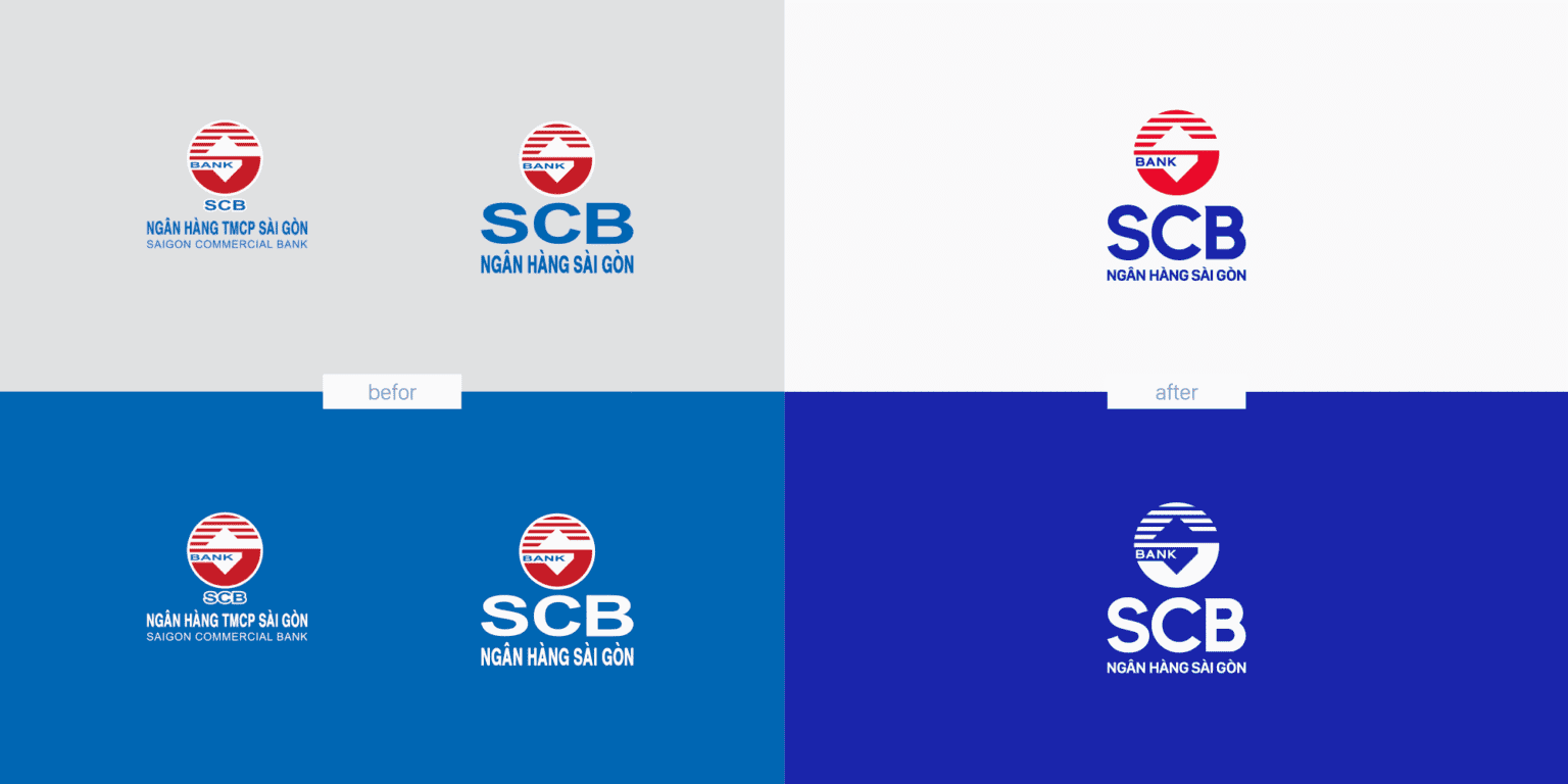
- Architecture & namingKeep SCB as the central point of recognition and unify the brand structure under one roof.
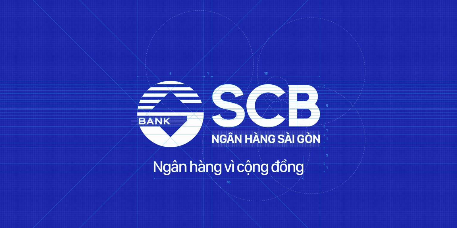
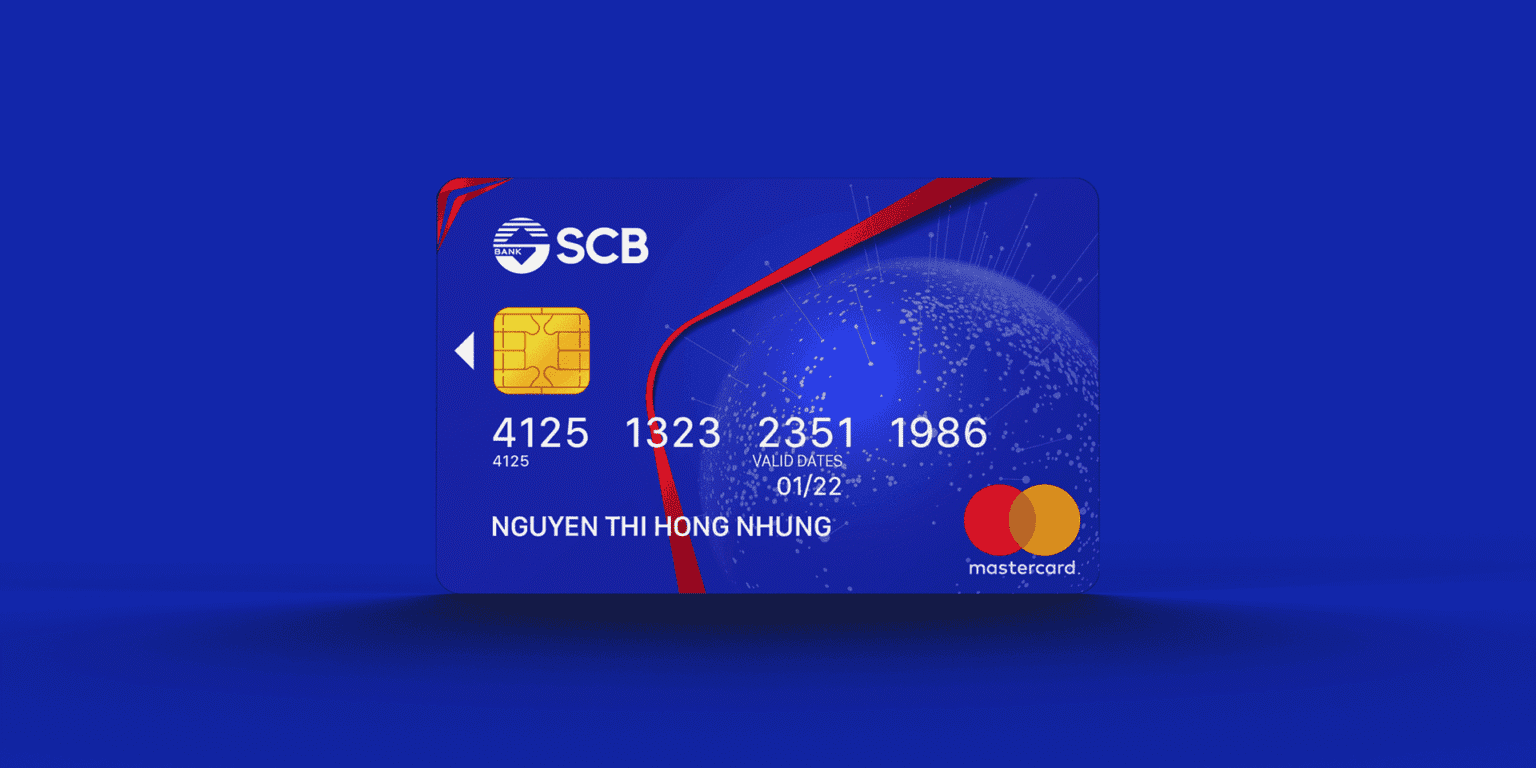
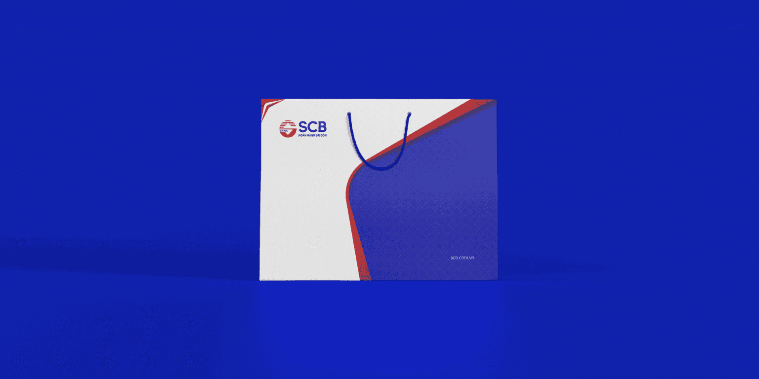
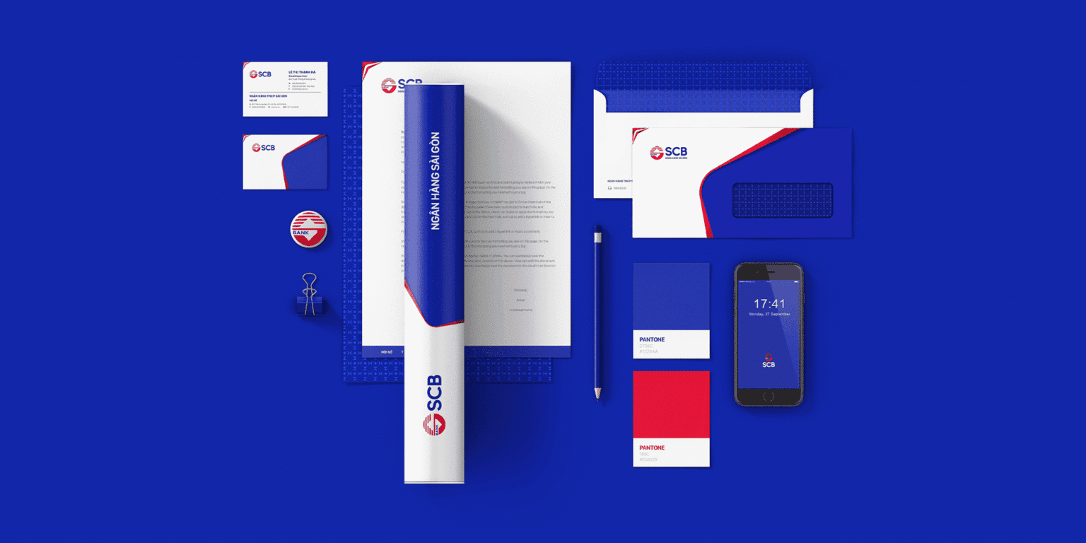
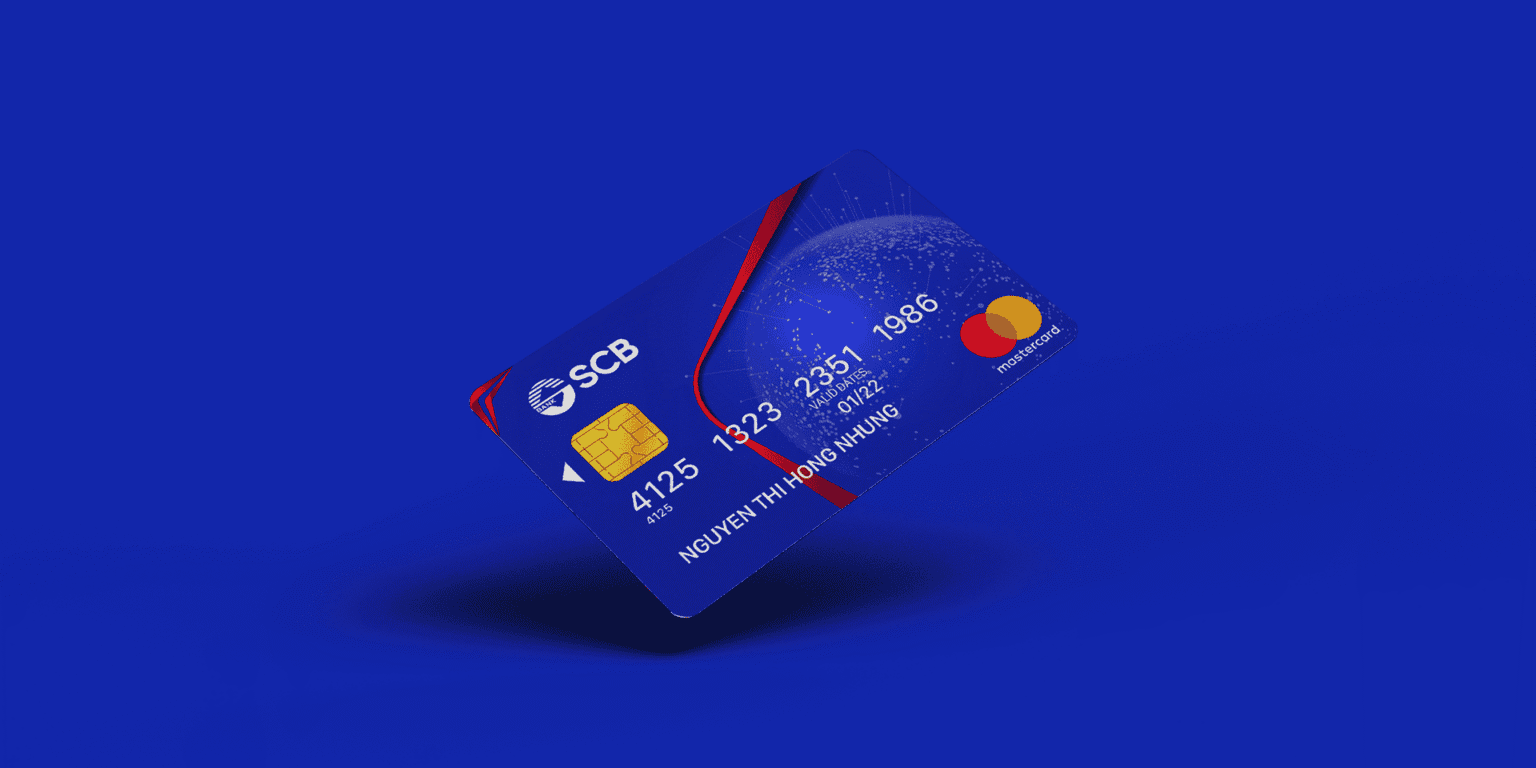
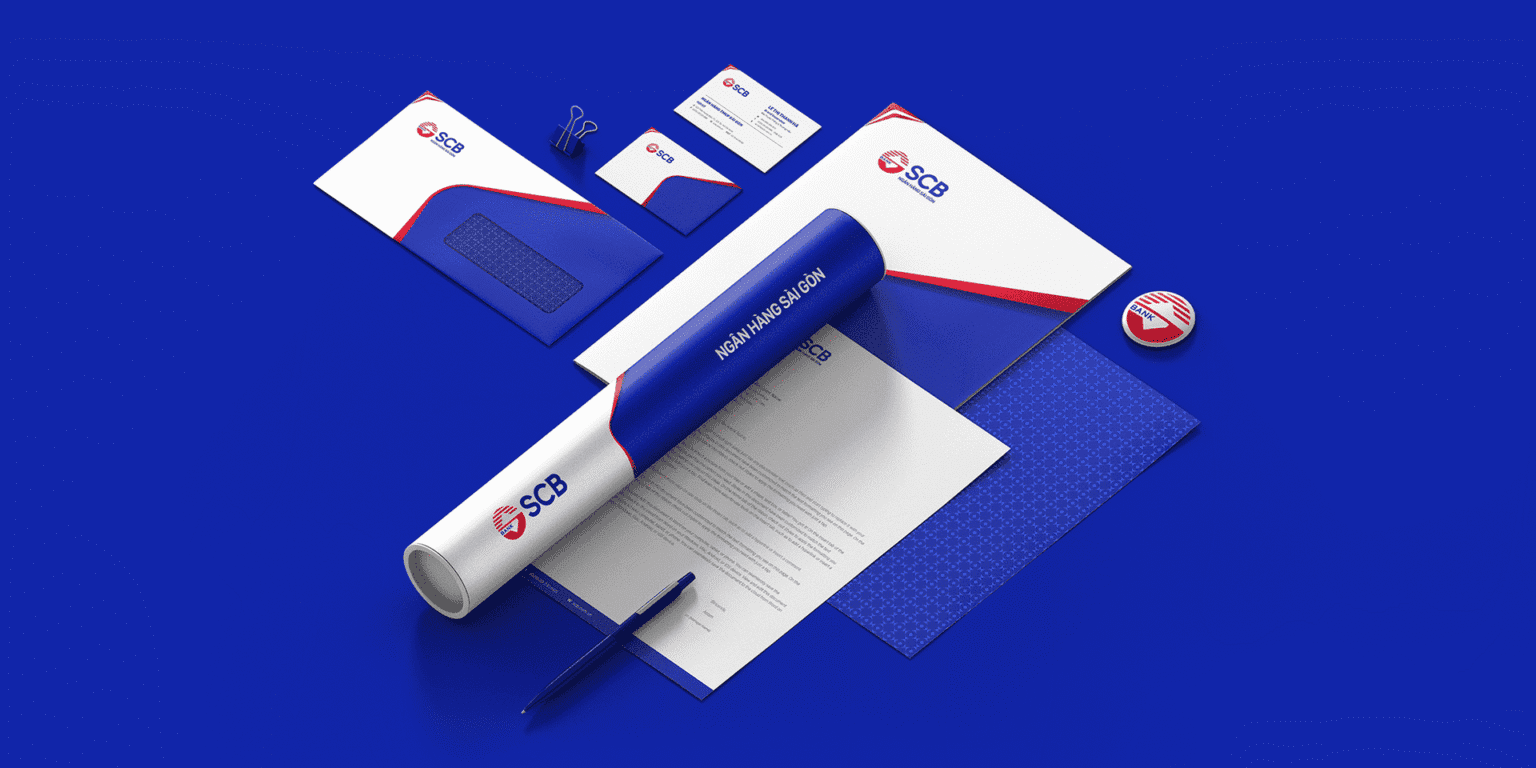
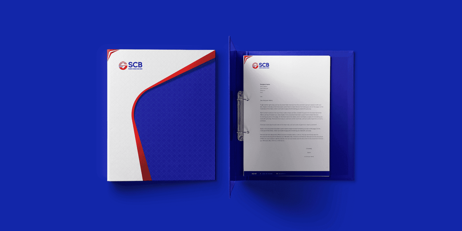
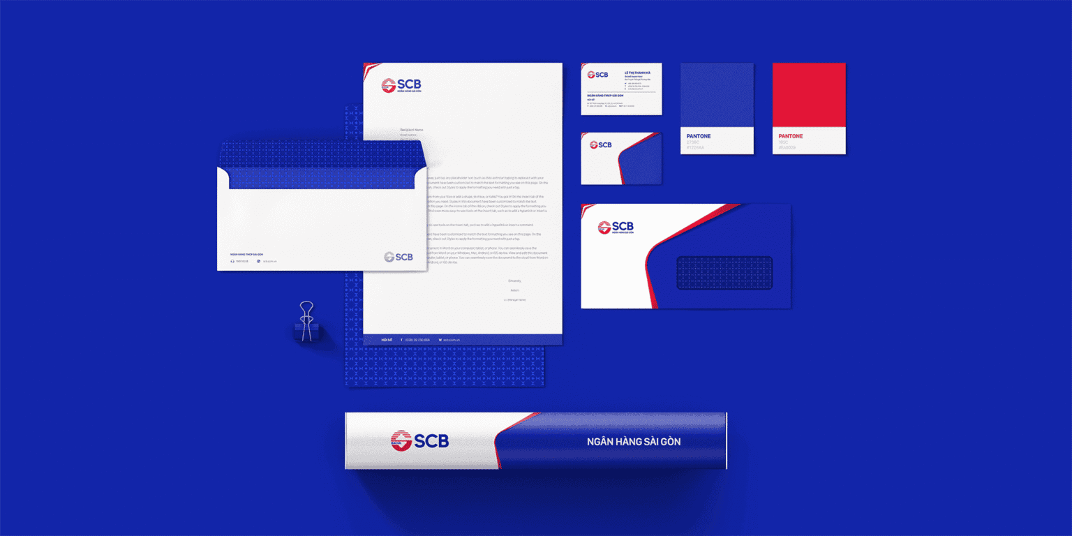
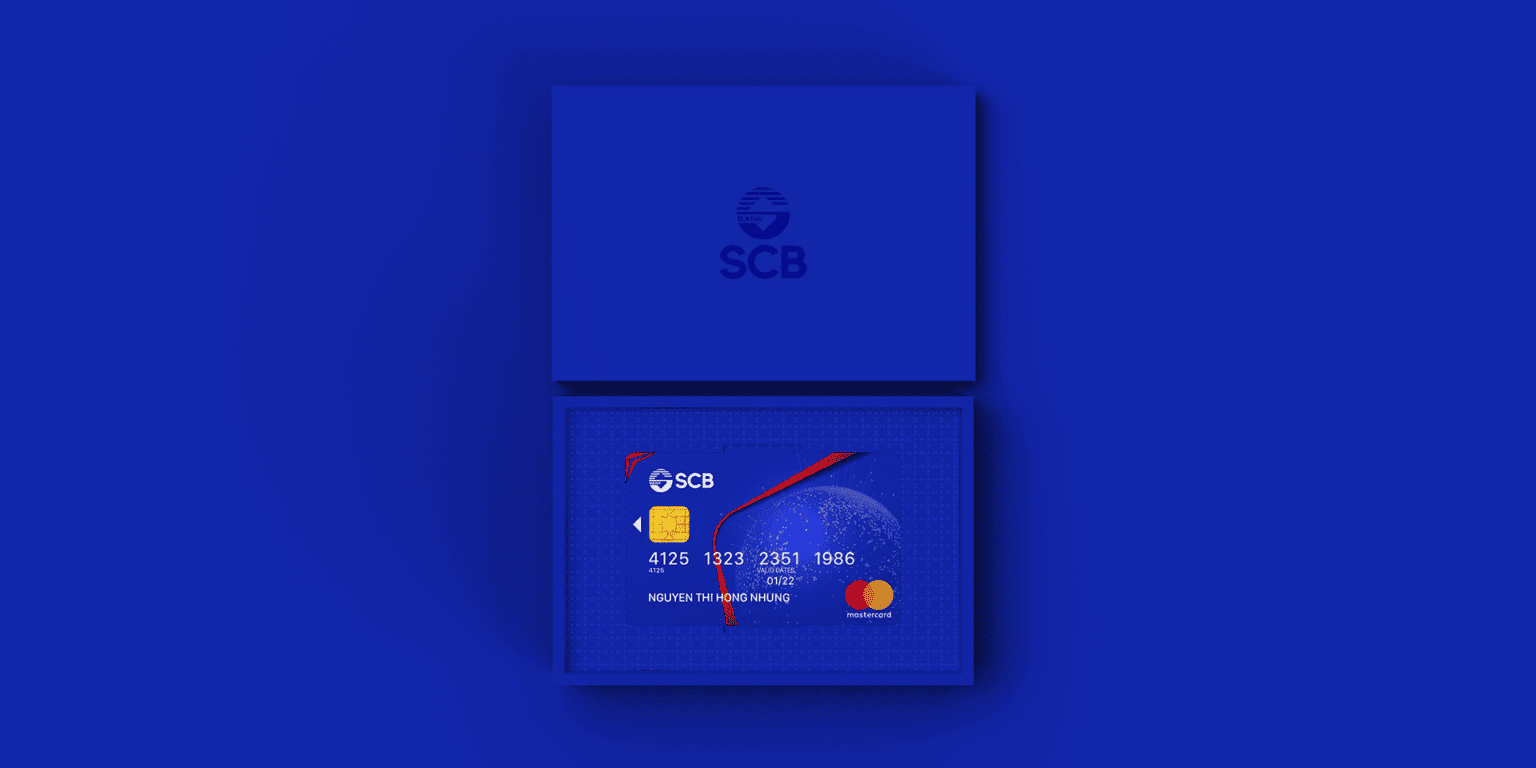
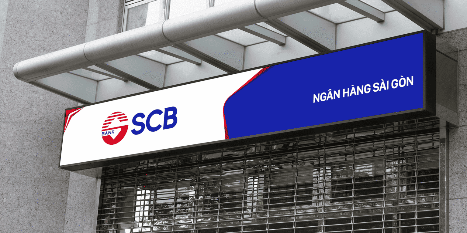
- IdentityAn identity system developed to feel modern, friendly and easy to recognize, while keeping the trust of a bank with a solid foundation.
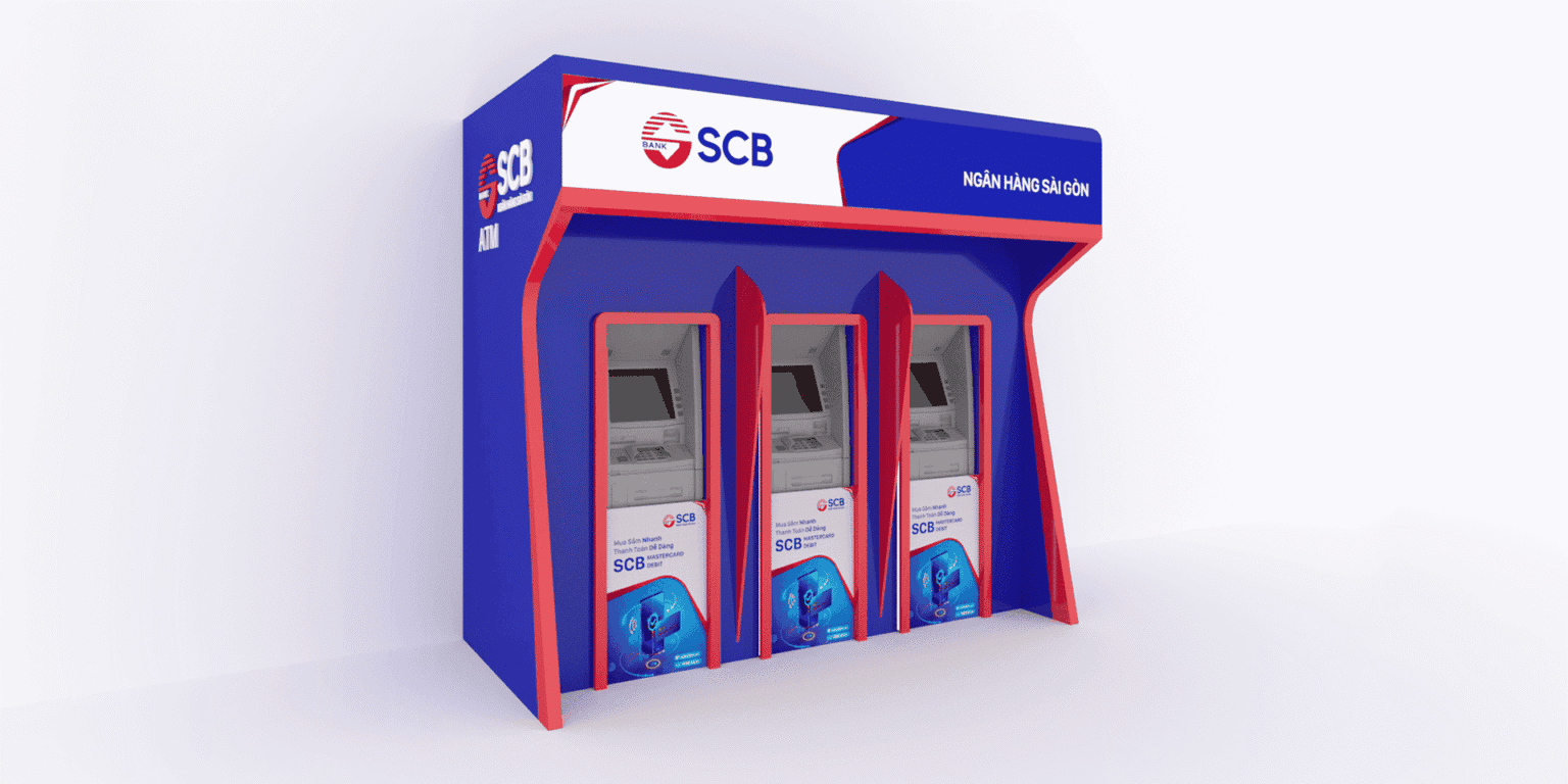
- Brand & experienceVisual language, tone of voice, branch spaces, digital, motion and communication organized consistently around the spirit of “Modern, Versatile, Friendly.”
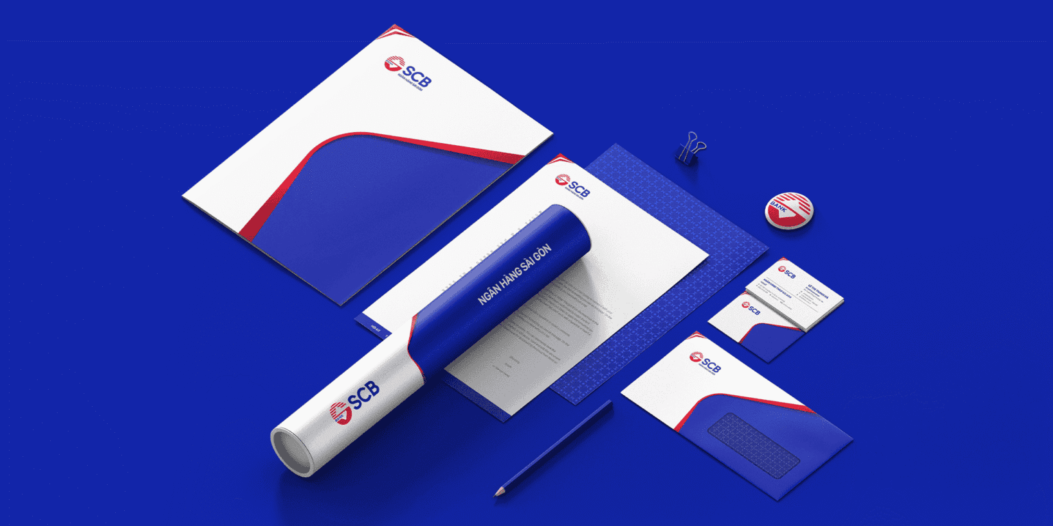
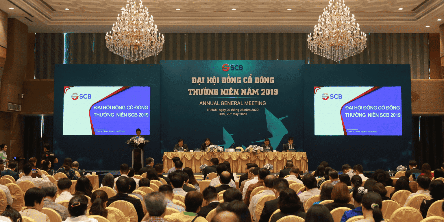
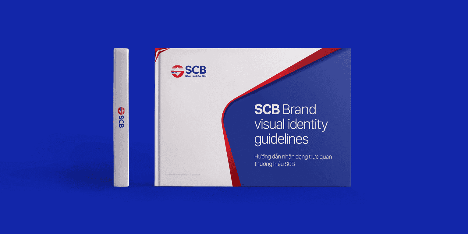
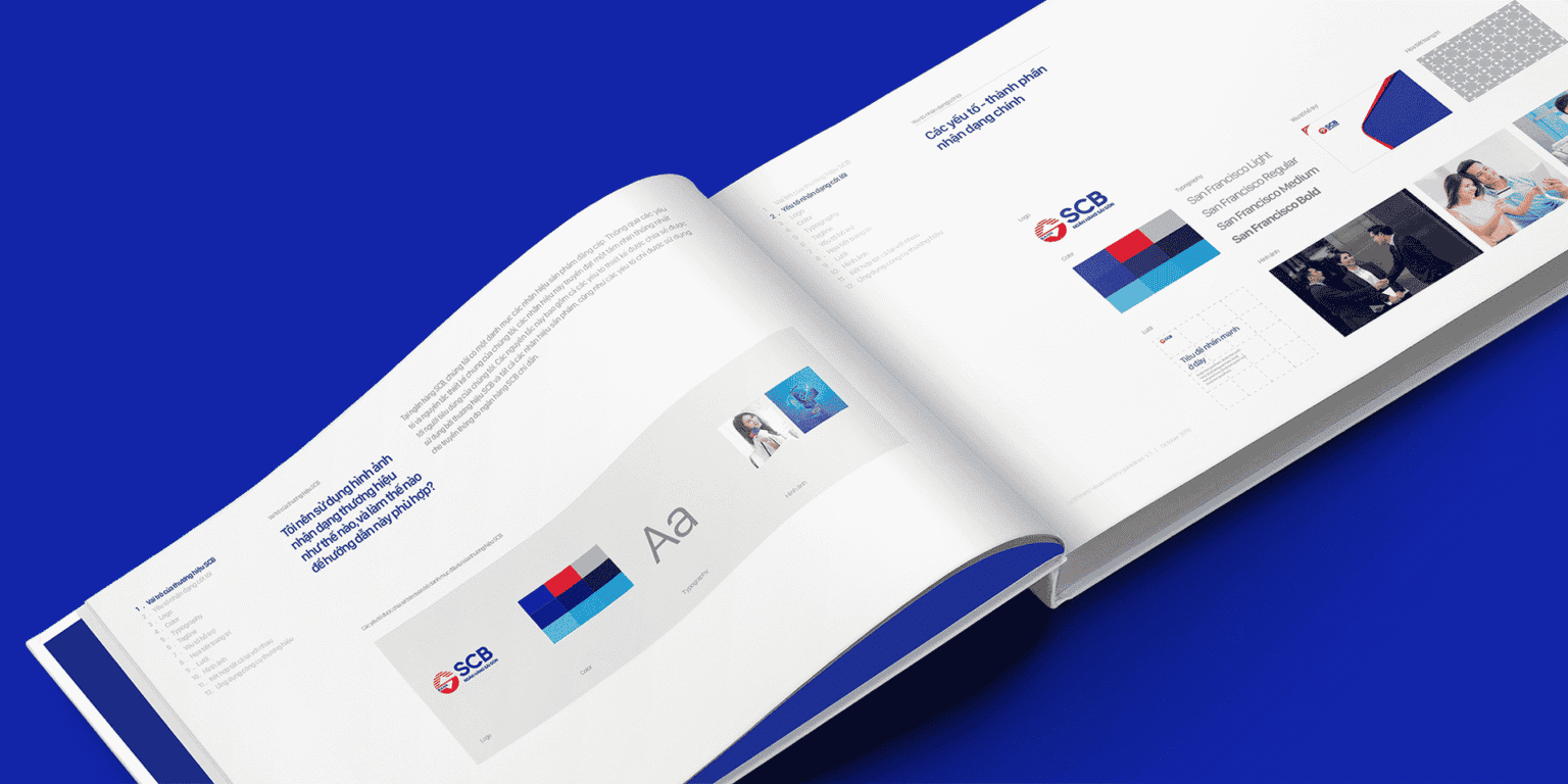
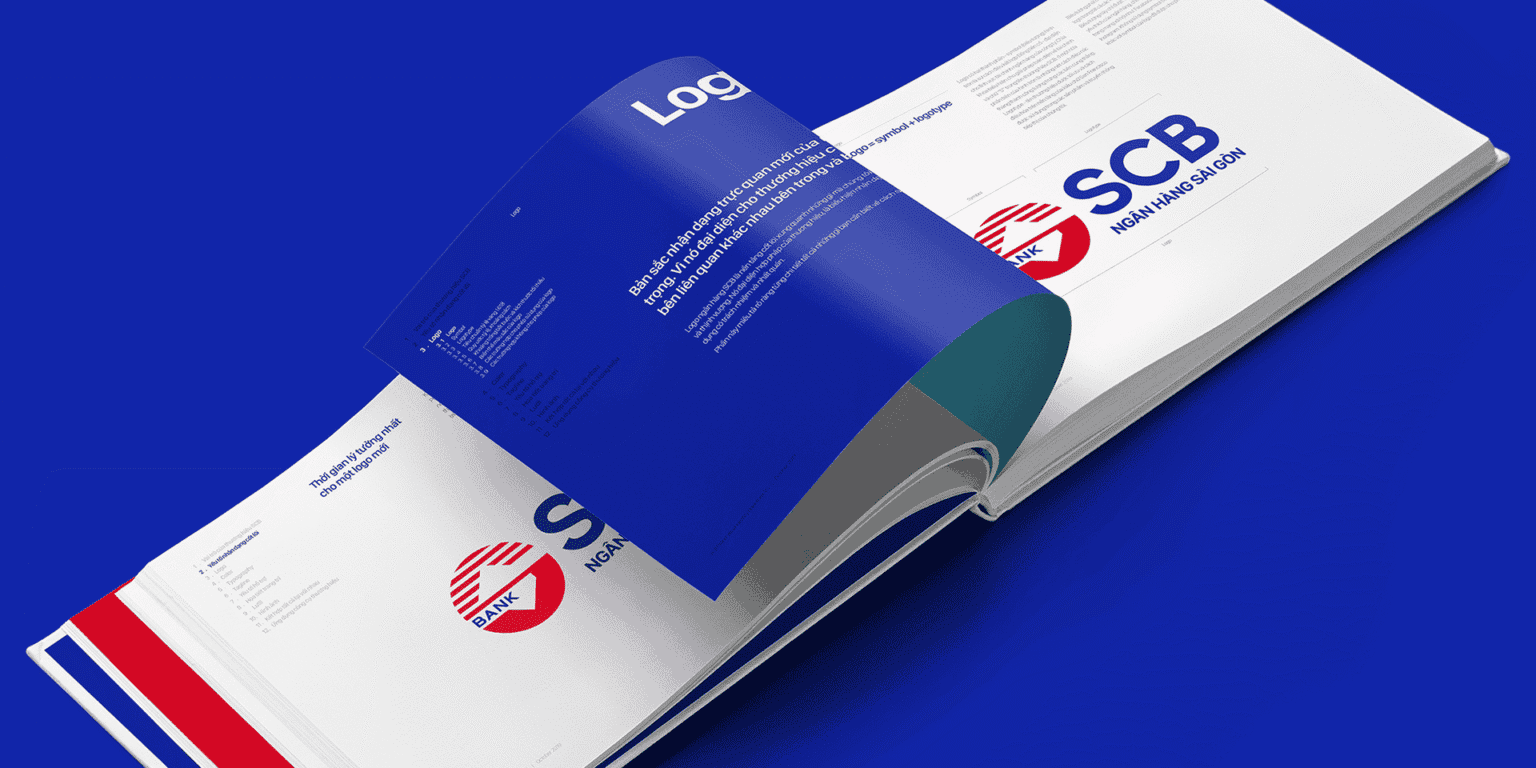
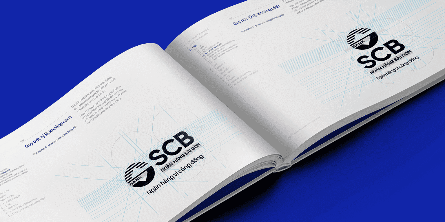
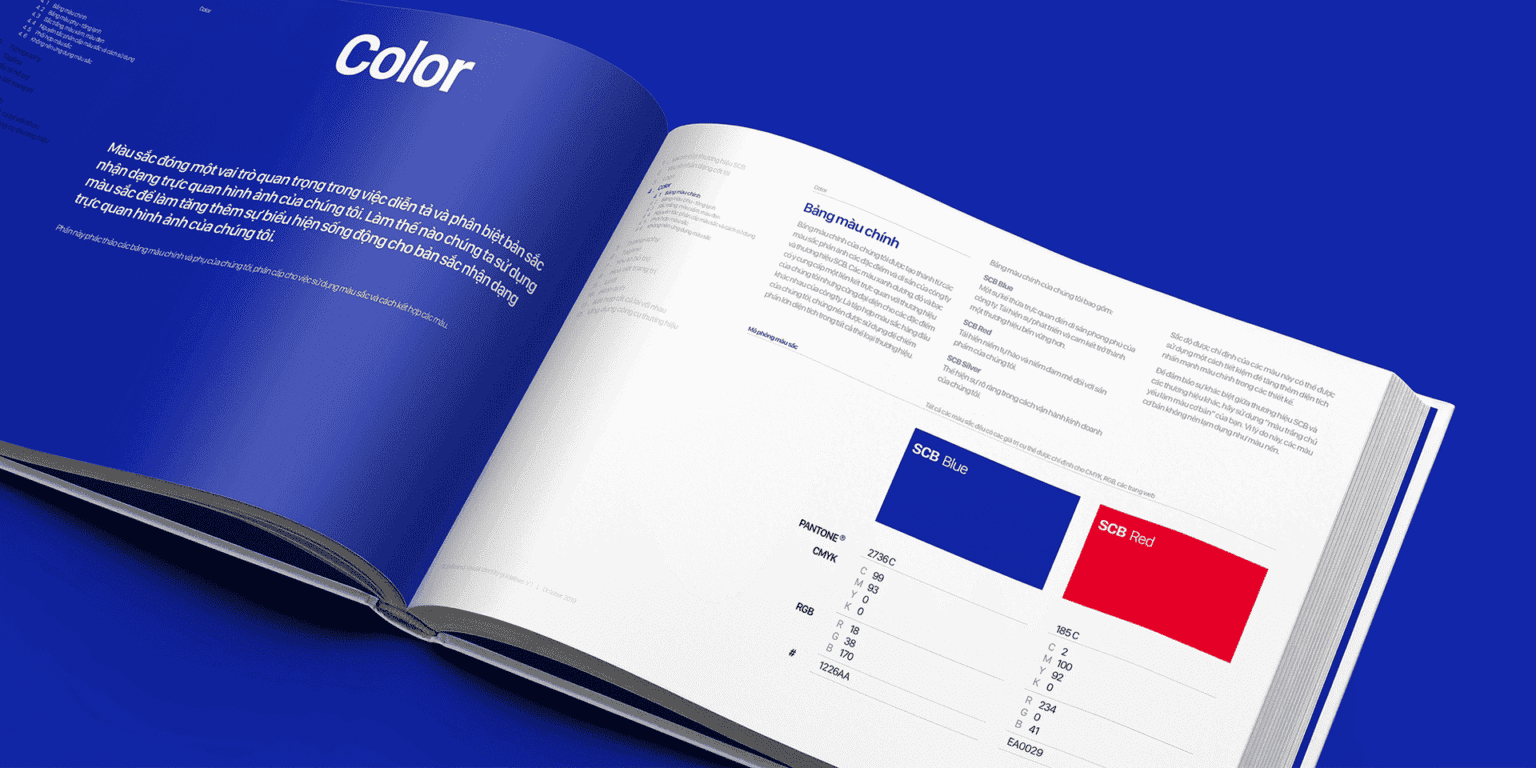
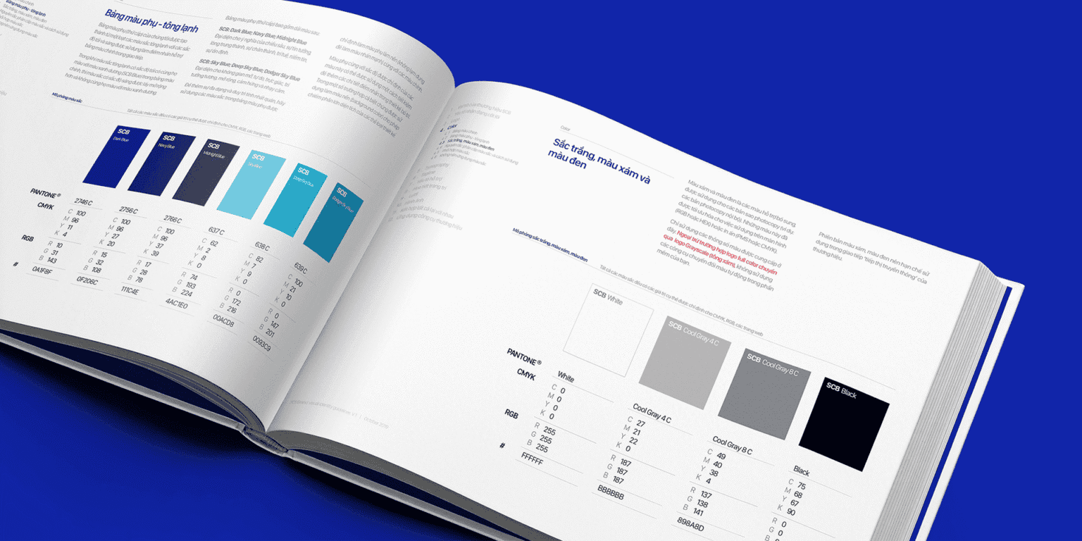
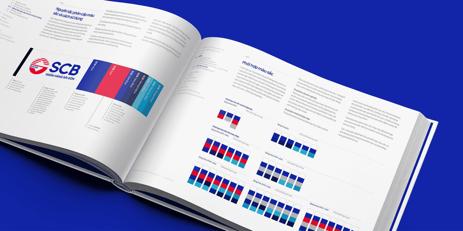
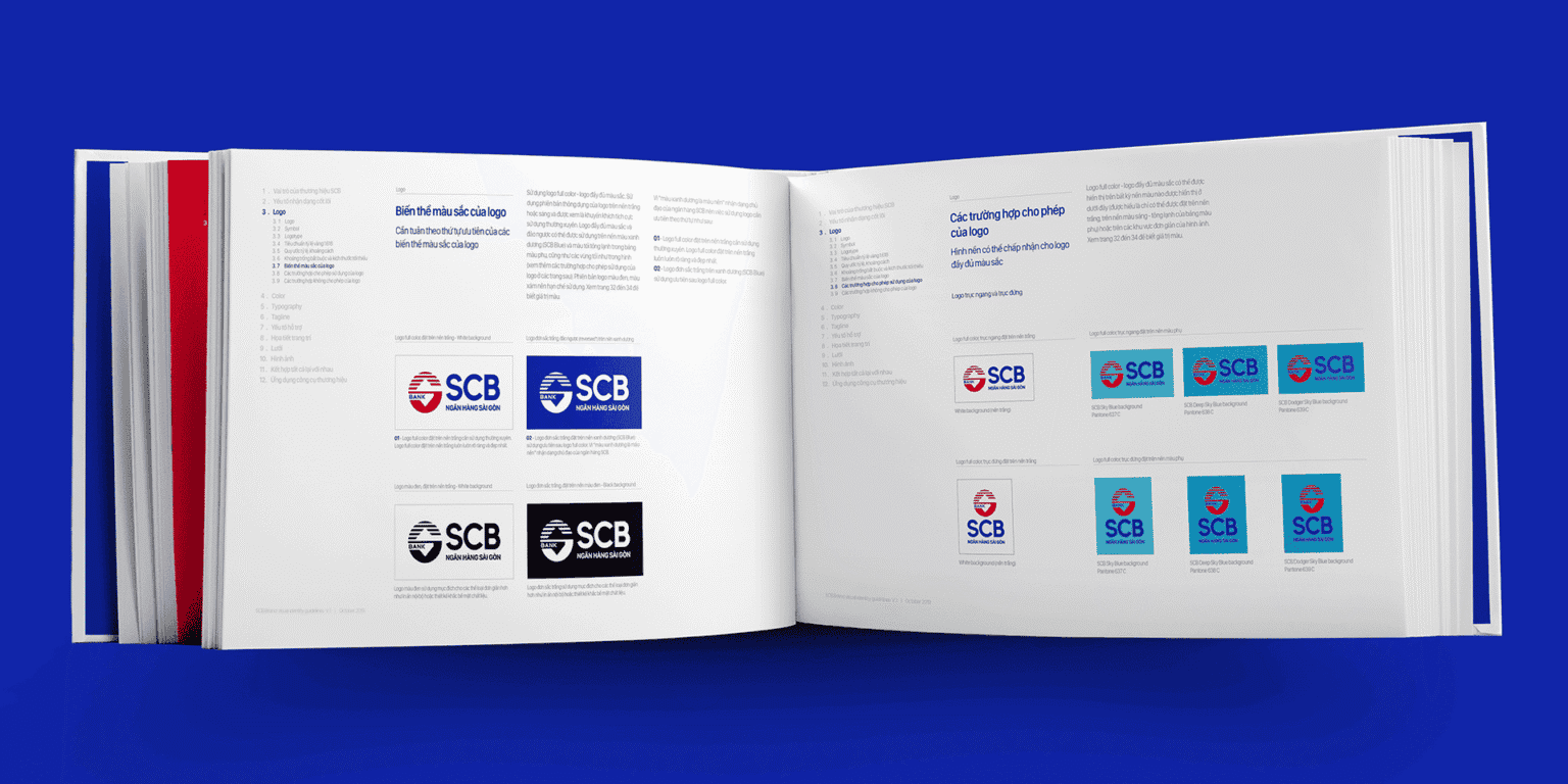
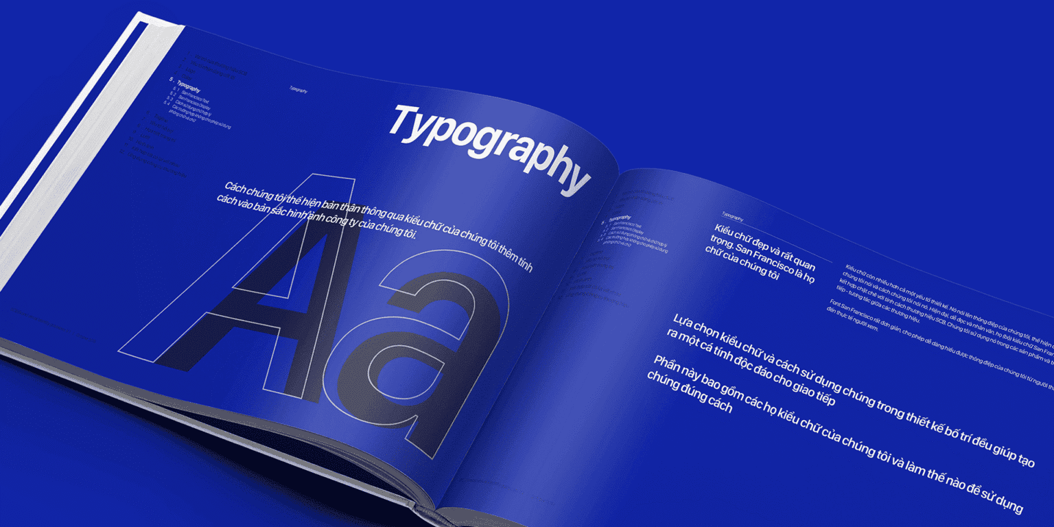
- TouchpointsBrand Guidelines give the identity and experience a foundation to be applied consistently across branches, printed materials, digital and communications.
Every touchpoint is a chance for SCB to be seen in line with its new direction.









Impact
What really changed?
The renewal aimed to change how SCB shows up and is perceived, going beyond the surface of the identity.
- IdentityA clear, unified brand system that sets SCB apart better.
- ExperienceThe modern, versatile and friendly spirit carried into every point of contact, from branch spaces to digital channels.
- PerceptionA foundation for narrowing the gap between strategic direction and the brand’s image in the market.
- TrustA wider basis for trust, drawing on modernity, convenience and brand experience as well as deposit advantages and habit.
- MarketA foundation for SCB to reach younger customers while keeping its relationship with its loyal existing customers.
These are the effects the repositioning system was designed to create; we make no claim to market results for which there is no post-project data.



Value created
How did the brand come to mean more?
- Identity valueA clear, unified brand that sets itself apart better.
- Perceived valueA foundation for SCB to be seen as closer to its new direction of growth.
- Meaning valueA broader role for the brand, from a bank remembered for its deposit products to a companion across more of its customers’ financial lives.
- Long-term valueA brand and experience system that can keep growing, helping SCB build recognition, trust and relationships with generations of customers on its own terms.

Brand Guidelines
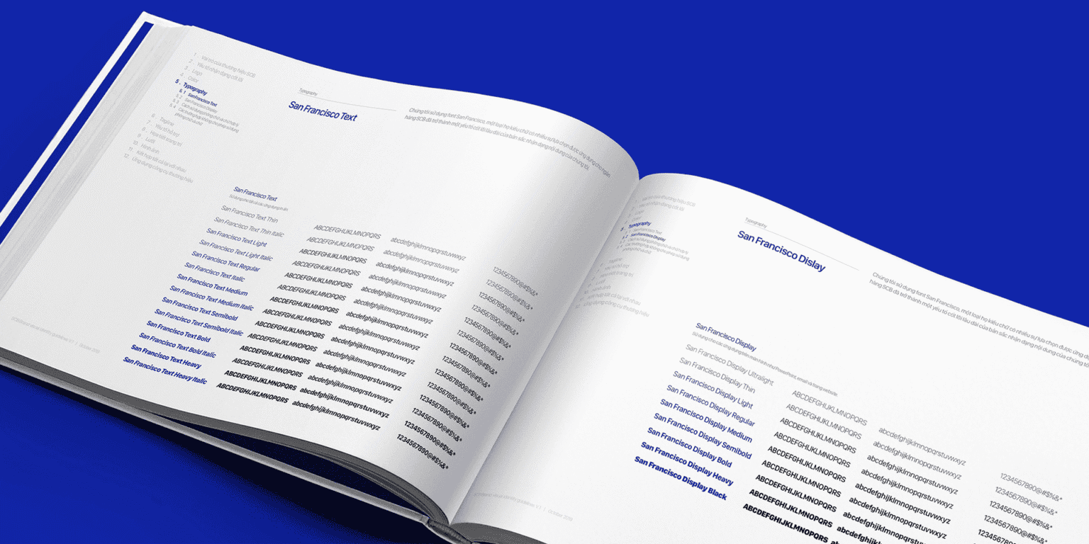
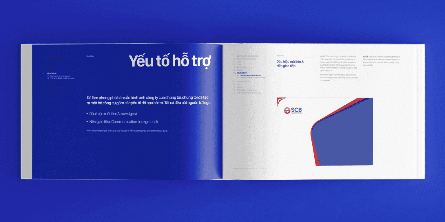
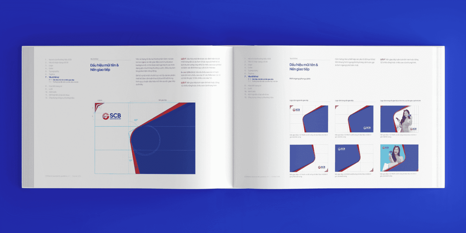
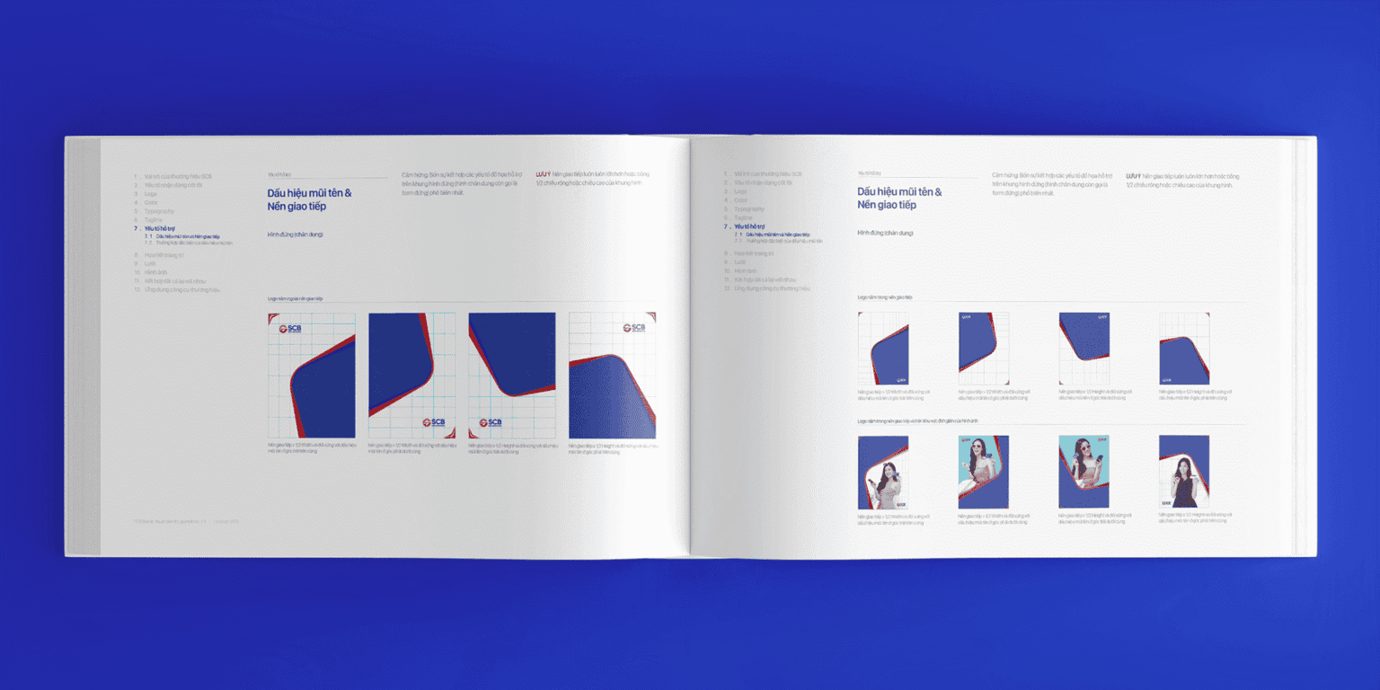
The greatest value lies not in refreshing the SCB image, but in giving the brand a foundation to be seen for the future it is building.
Thinking in Practice · FreshBrand Case Stories
FreshBrand team
- Trần Anh Tú — Creative Director, Project Director, Design
- Kiều Nga — Design
- Trâm Anh — Design
Project
- ClientSaigon Commercial Bank (SCB)
- Year2018
