
GOCHARM
Style is a curve placed in exactly the right spot.
- Client
- Thien Long Group
- Industry
- Fashion & Beauty

Overview
GOCHARM is the beauty brand of Thien Long Group.
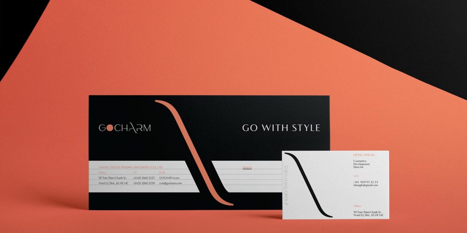
FreshBrand built the strategy, name, logo and identity system for GOCHARM around a direction that is natural, distinctive, bold and new, with the tagline “Go with style.”
Symbol
How did the idea take shape?
One dot, one curve
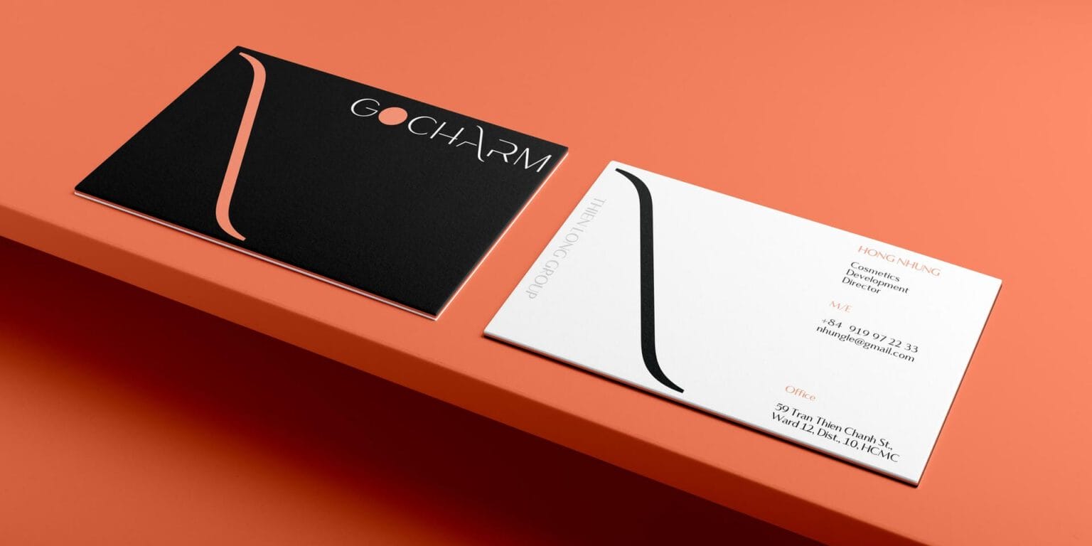
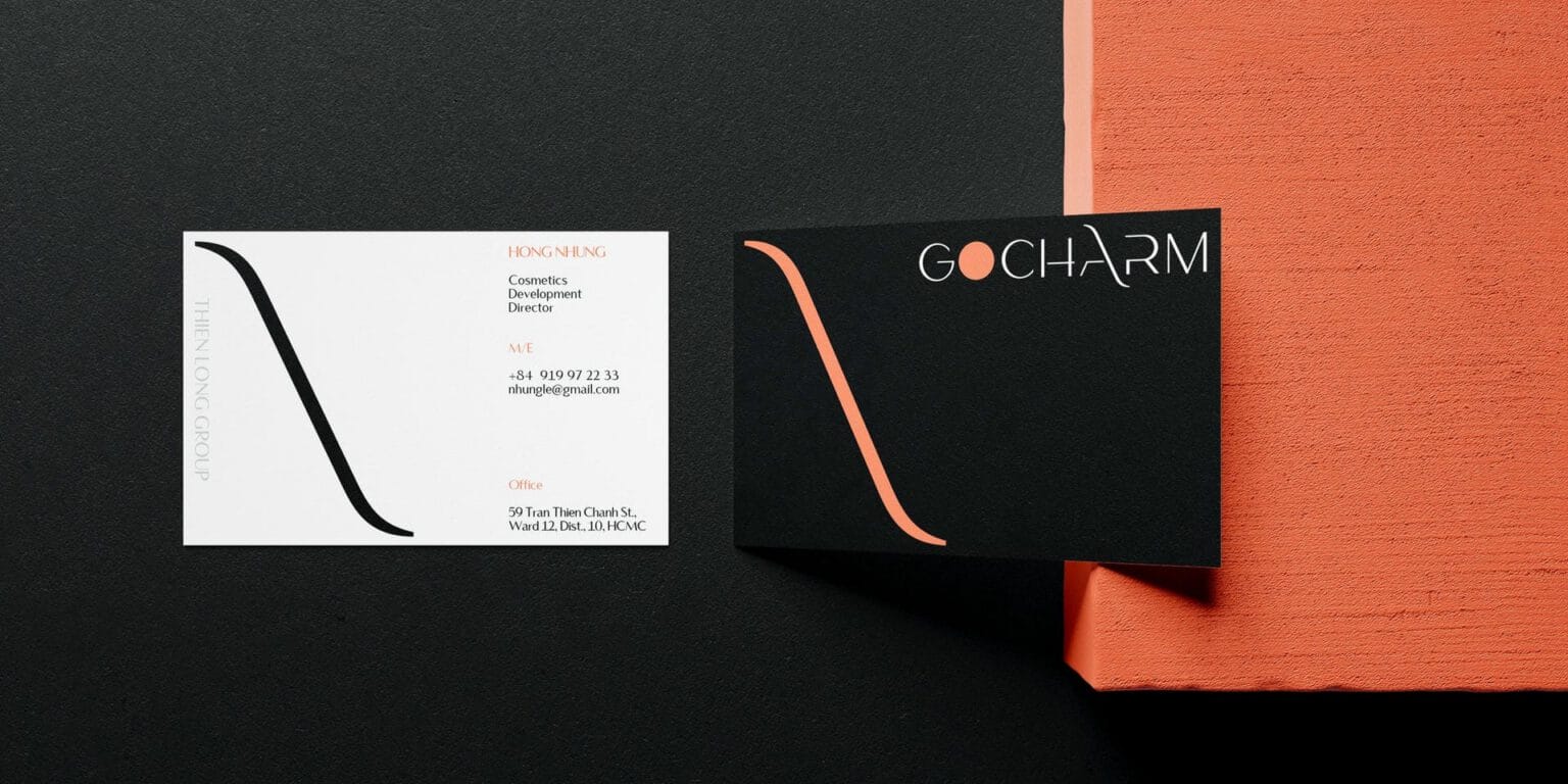
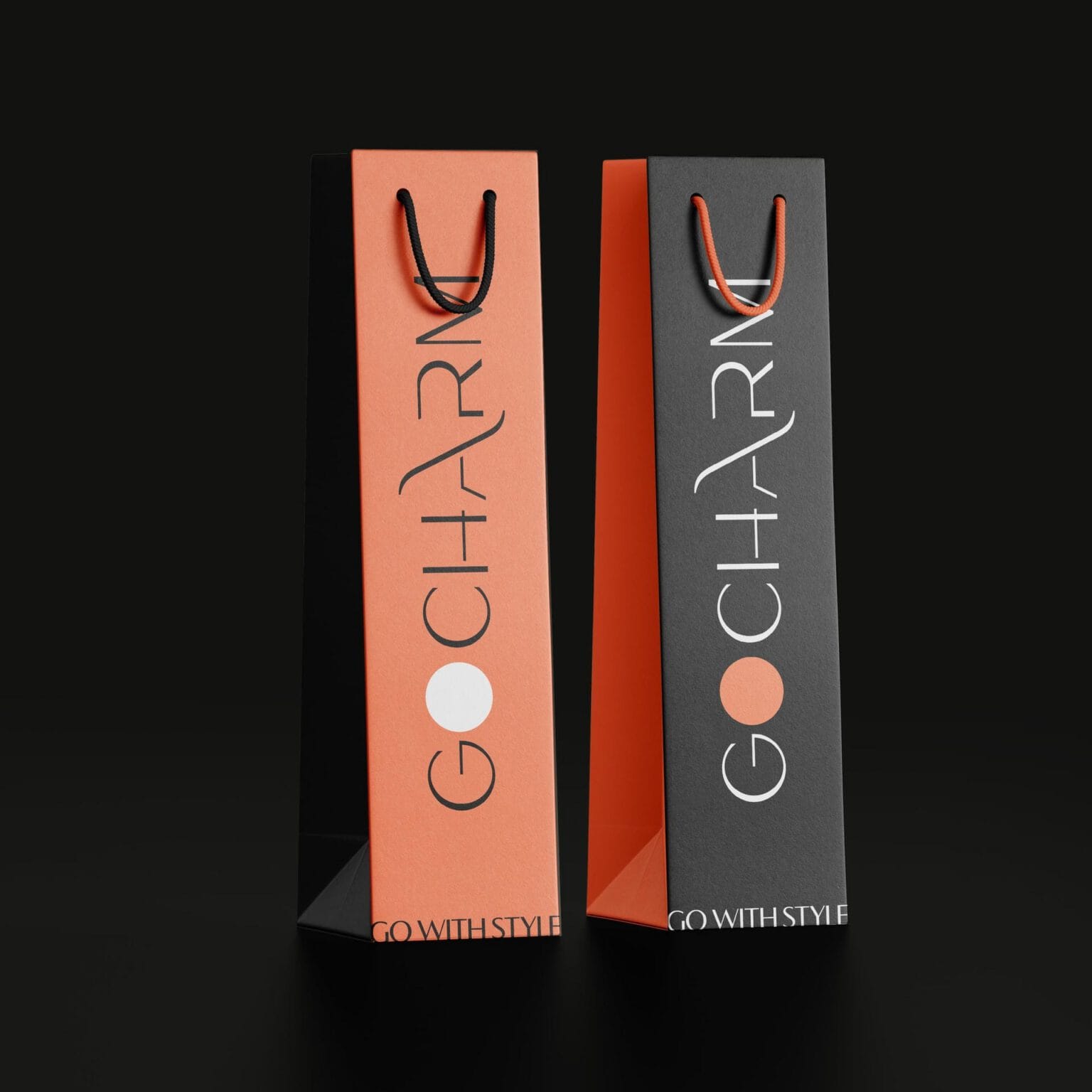
The GOCHARM logo keeps two details: the O is replaced by a round coral orange dot, and the A opens into a long, soft curve like a stroke of a makeup brush. The letters are built on a grid and paired with the serif typeface Vanitas.
Black, white and coral orange make a palette that is fashionable, confident and easy to remember.


System
How is the identity kept consistent?
The curve leads the way
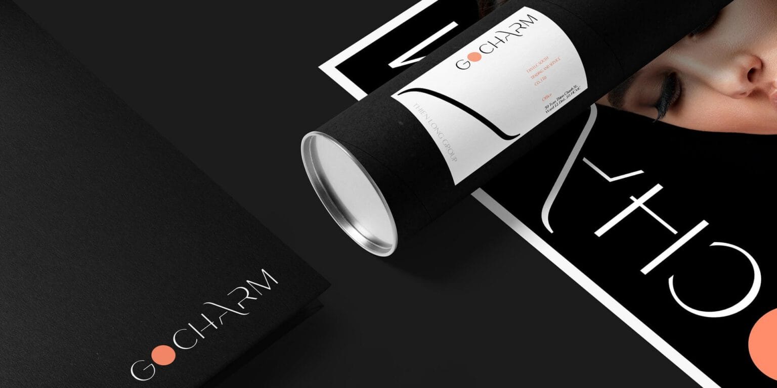
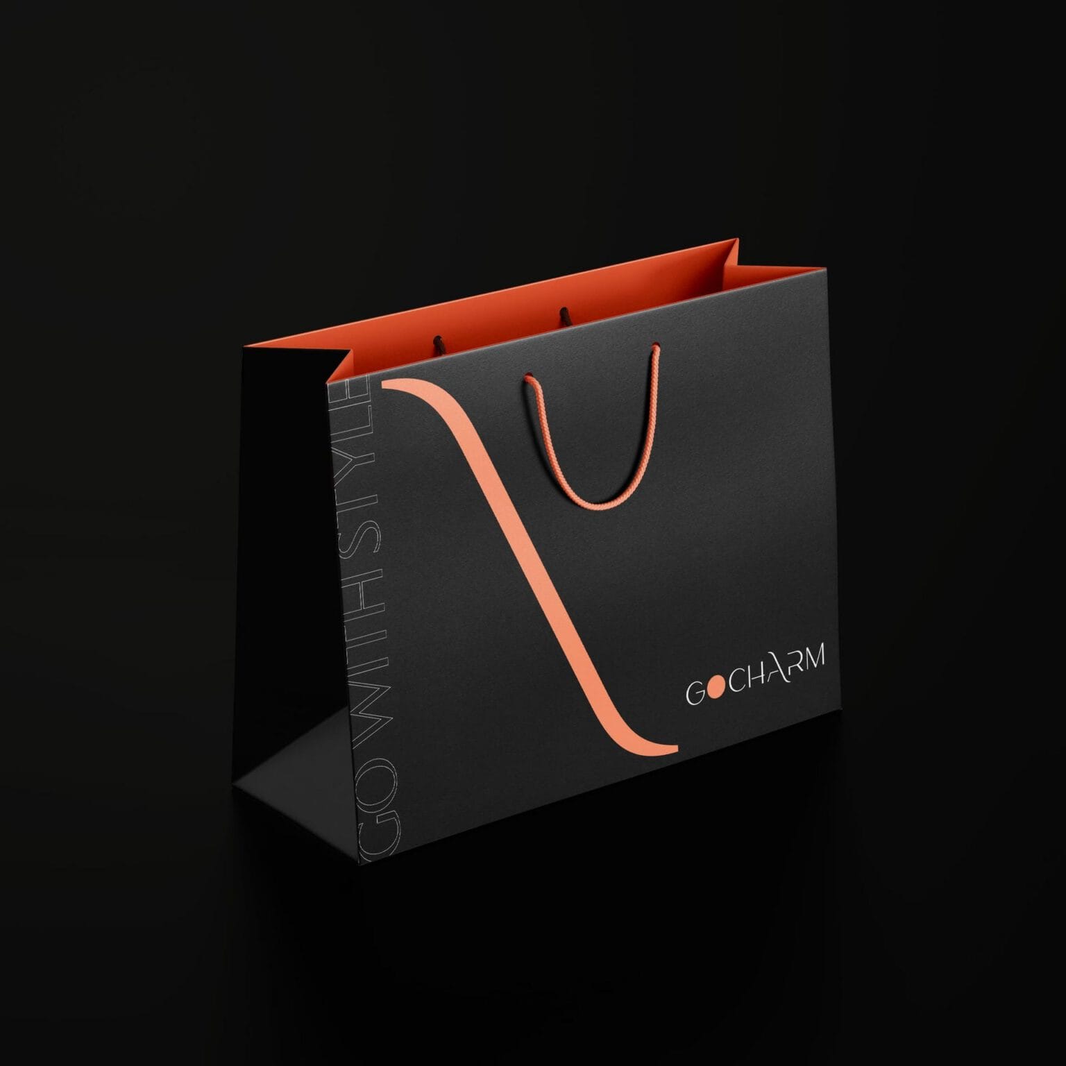
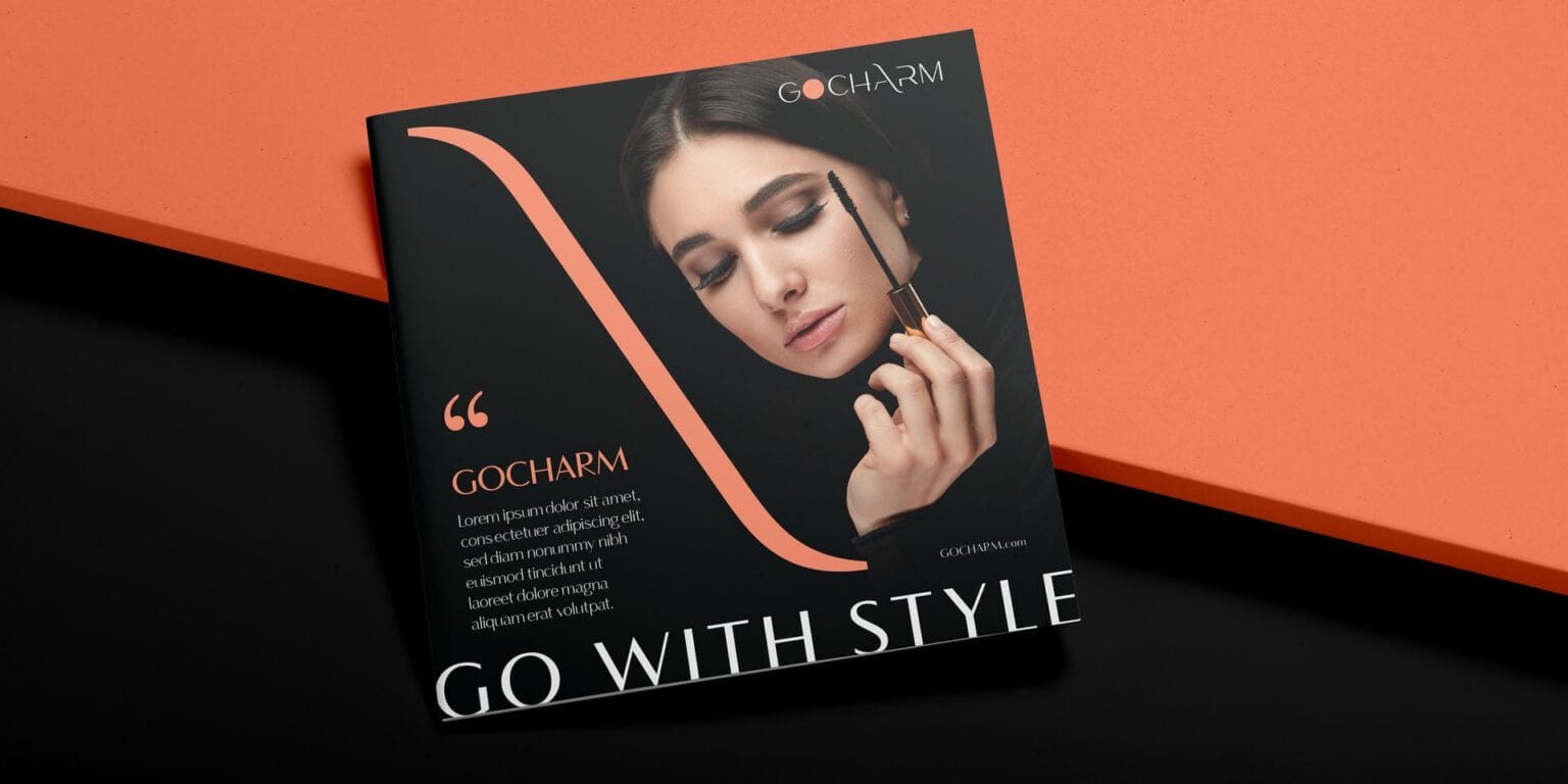
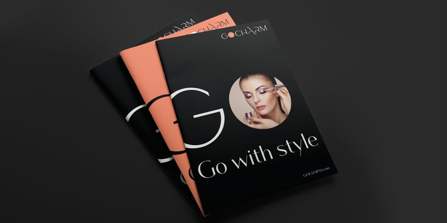
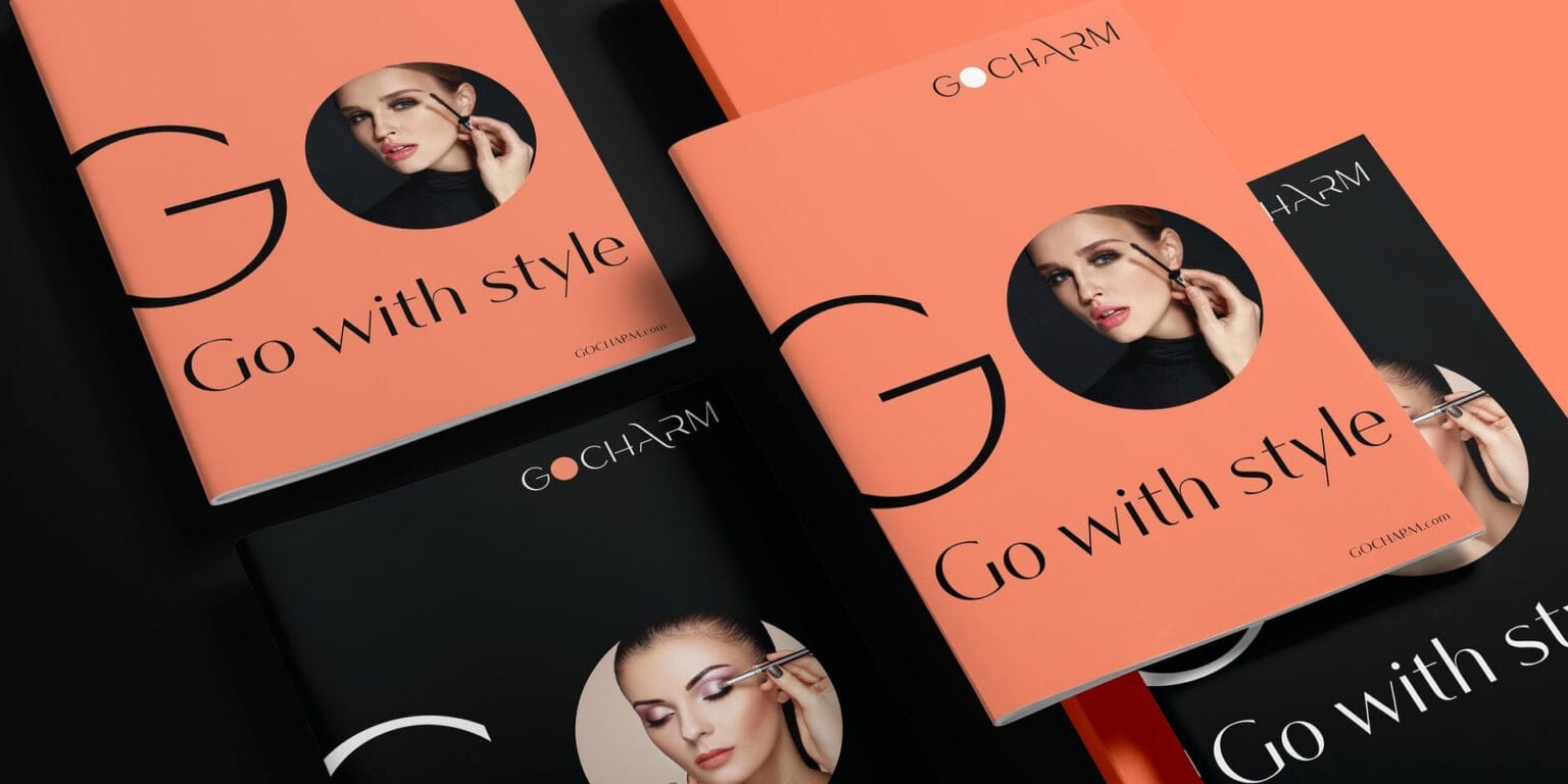
The curve of the A is pulled out as the main graphic element, running diagonally across letterhead, business cards, shopping bags and printed materials. An enlarged “Go” wraps around a model’s face and opens the story of “Go with style.”



Retail
Where does the brand appear?
A lit sign, real faces
At the store, the GOCHARM name glows on the facade, and inside, boldly made-up faces stand beside the products. The brand looks like a fashion magazine and invites customers to step into the next page.


FreshBrand team
- Trần Anh Tú — Creative Director, Project Director, Design
- Kiều Nga — Design
- Trâm Anh — Design
Project
- ClientThien Long Group
