
Phan Bon Ha Lan
One core brand, instead of many labels competing to be heard.
- Client
- Phan Bon Ha Lan
- Industry
- Agriculture & Agribusiness

Overview
When a brand has too many sub-brands, buyers start remembering the product names and forgetting the name of the business.
FreshBrand worked with Phan Bon Ha Lan to rebuild its strategy, logo, identity system and packaging, so that the core brand steps forward and the whole product range speaks in one voice.


Context
Where did the brand stand?
Winning back the hearts of farmers and gardeners
Phan Bon Ha Lan has served gardeners since 2011, but over time the core brand lost control and its product range fragmented. Individual labels were launched in a rush, with little oversight. Buyers faced too many choices, recognized label names rather than the brand name, and could hardly tell the packaging designs apart. Names and visual identities competed with each other, the core brand against the “product labels” on the packaging, and the core brand often stood out too little, on packs with so many dominant colors that nothing was easy to recognize, which cost the company market share. Phan Bon Ha Lan asked FreshBrand to rationalize the portfolio of the core brand and its products so that it could stand apart from its competitors.


Discovery
What did FreshBrand see?
Bringing the iconic assets to light
Using a consumer brand perception tool, the Brand Asset Valuator, we found that Phan Bon Ha Lan had room to set its brand further apart. It was still regarded as a reputable and authentic leader in its industry, as it had been for more than nine years. But the perception results showed a basic confusion between managing the brand and managing the products, which dimmed the core brand’s newer attributes of dynamism and progress. After years of attention drifting away from the core brand, the brand culture had become less appealing, short on identity and creative spirit. We also found that Phan Bon Ha Lan was innovating strongly in technology, quality and distinctiveness, the very attributes across a product range that the strongest brands in the fertilizer industry thrive on.


Strategy
What did we choose?
A search for simplicity and a wish for inspiration focused on the core brand
To help Phan Bon Ha Lan stand out from the crowd, we determined that it could lean into two trends that fit its heritage: a search for simplicity, and a wish for inspiration that is well focused on the core brand. That led us to a very clear strategy: move toward a more recognizable image by using the main Phan Bon Ha Lan brand to tell the story of doing good for agriculture in a way that is natural, simple, honest and engaging, reviving an asset that had been widely recognized long ago.




Renewal
How was the strategy brought to life?
Improving communication with buyers at the dealer
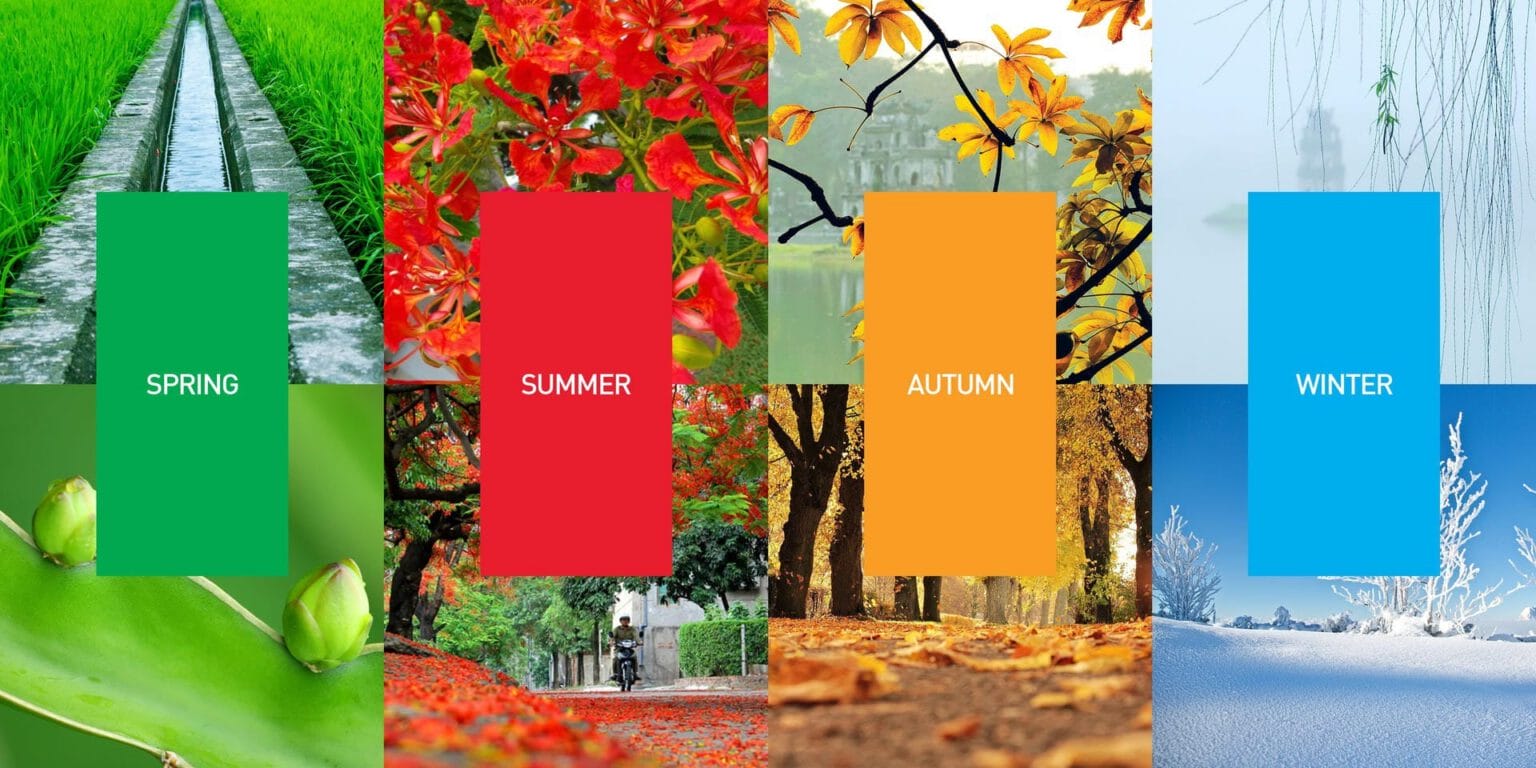
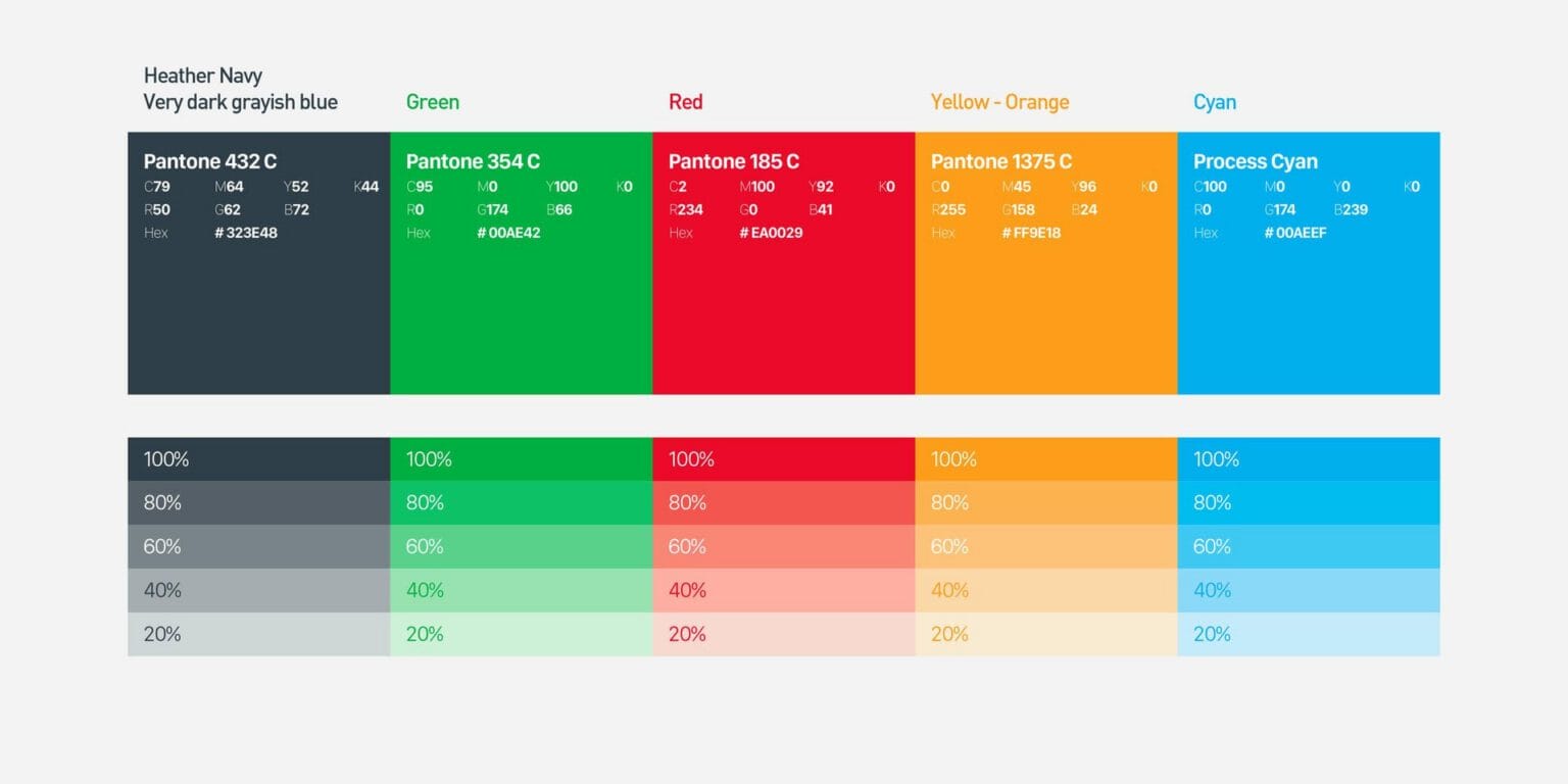
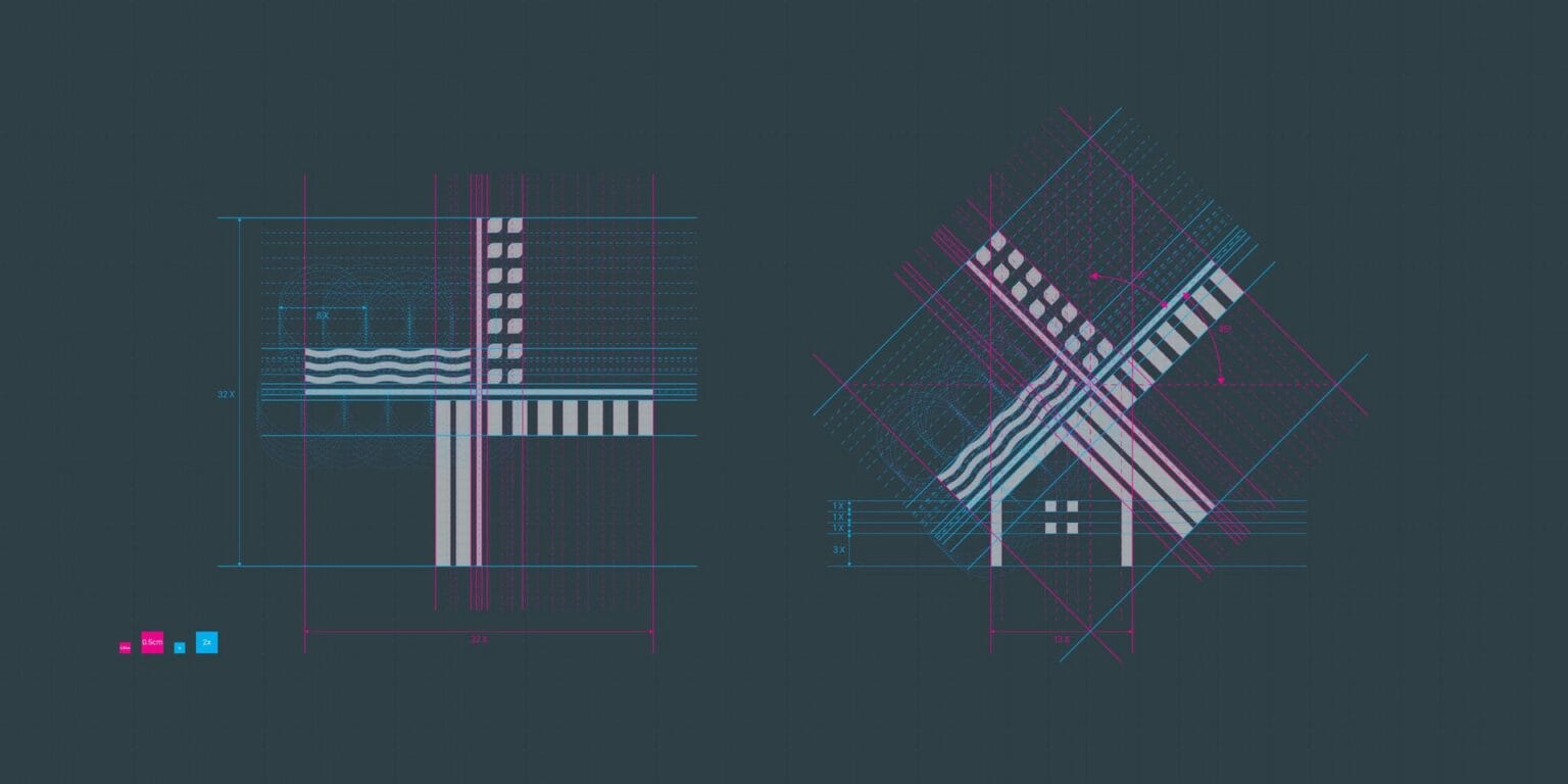
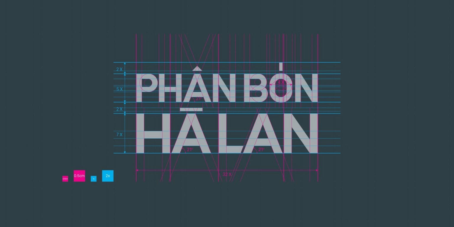
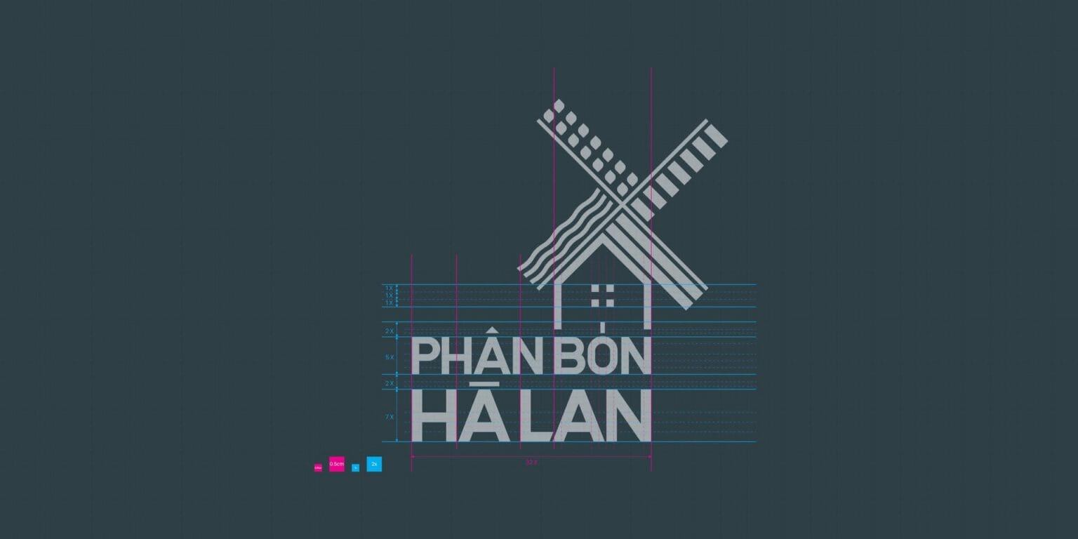
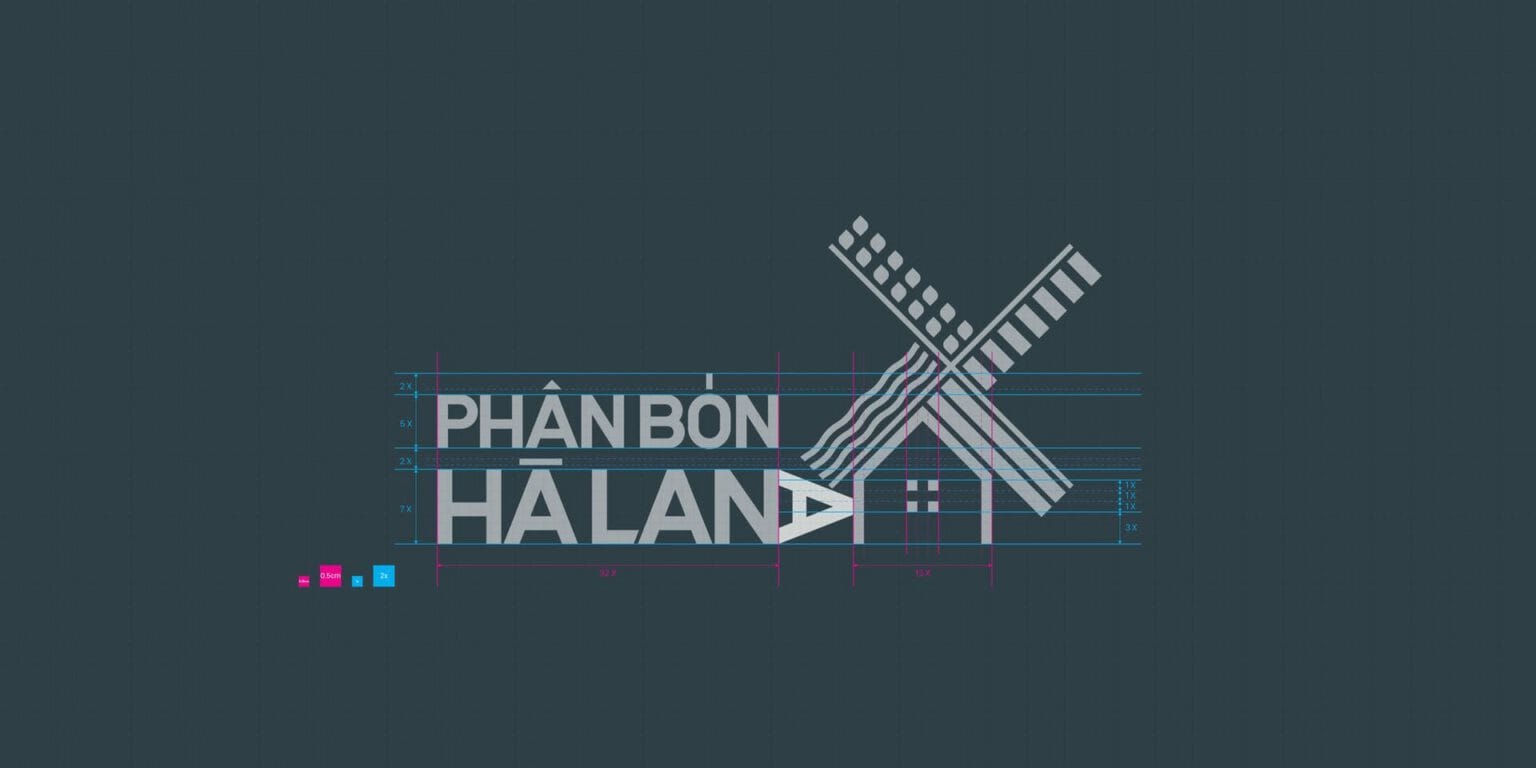
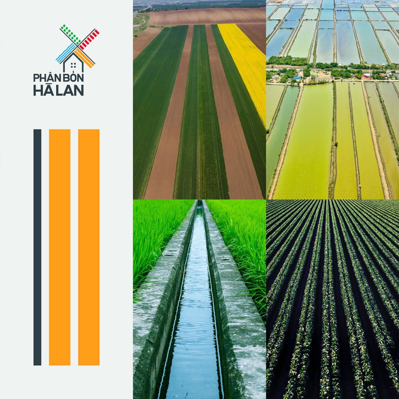
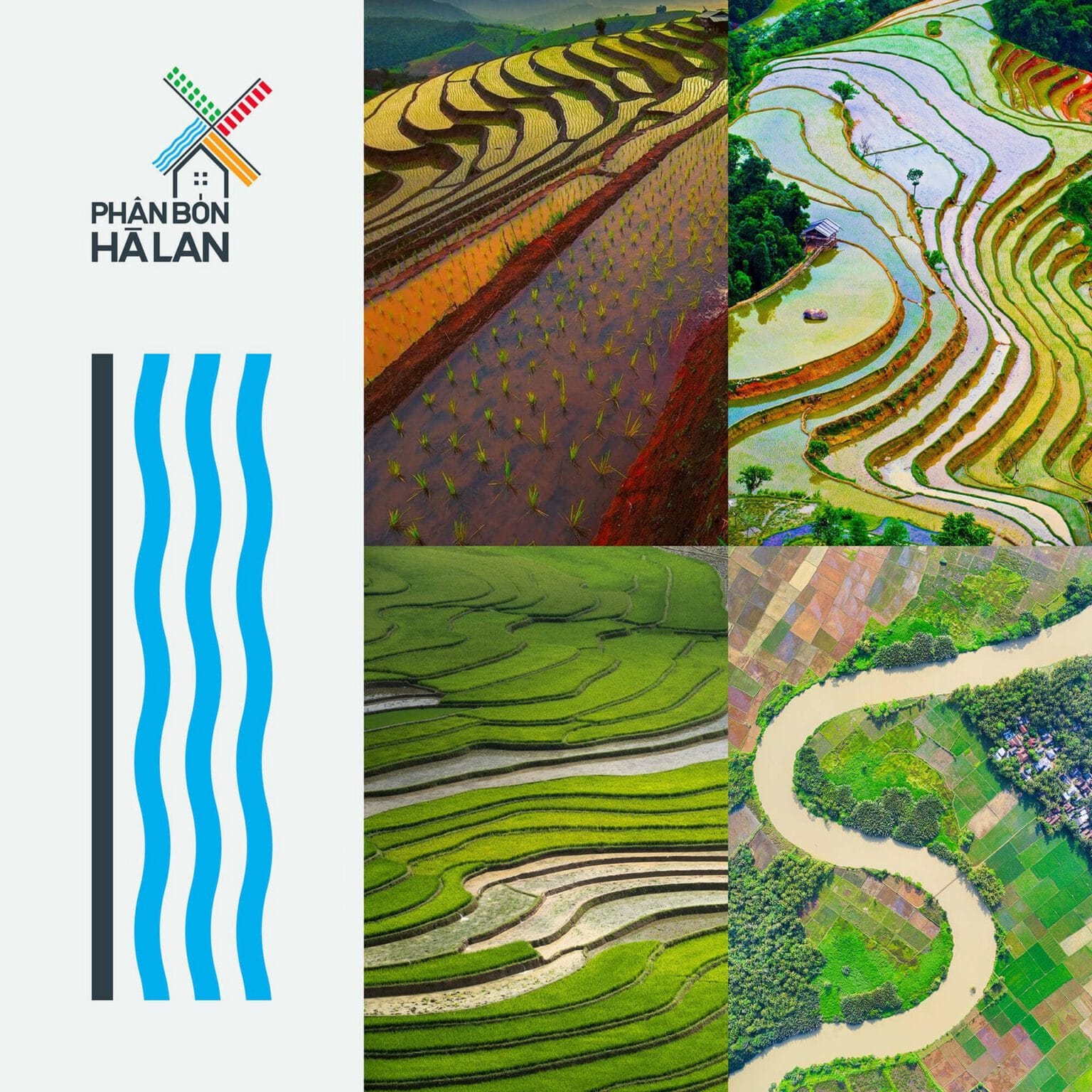
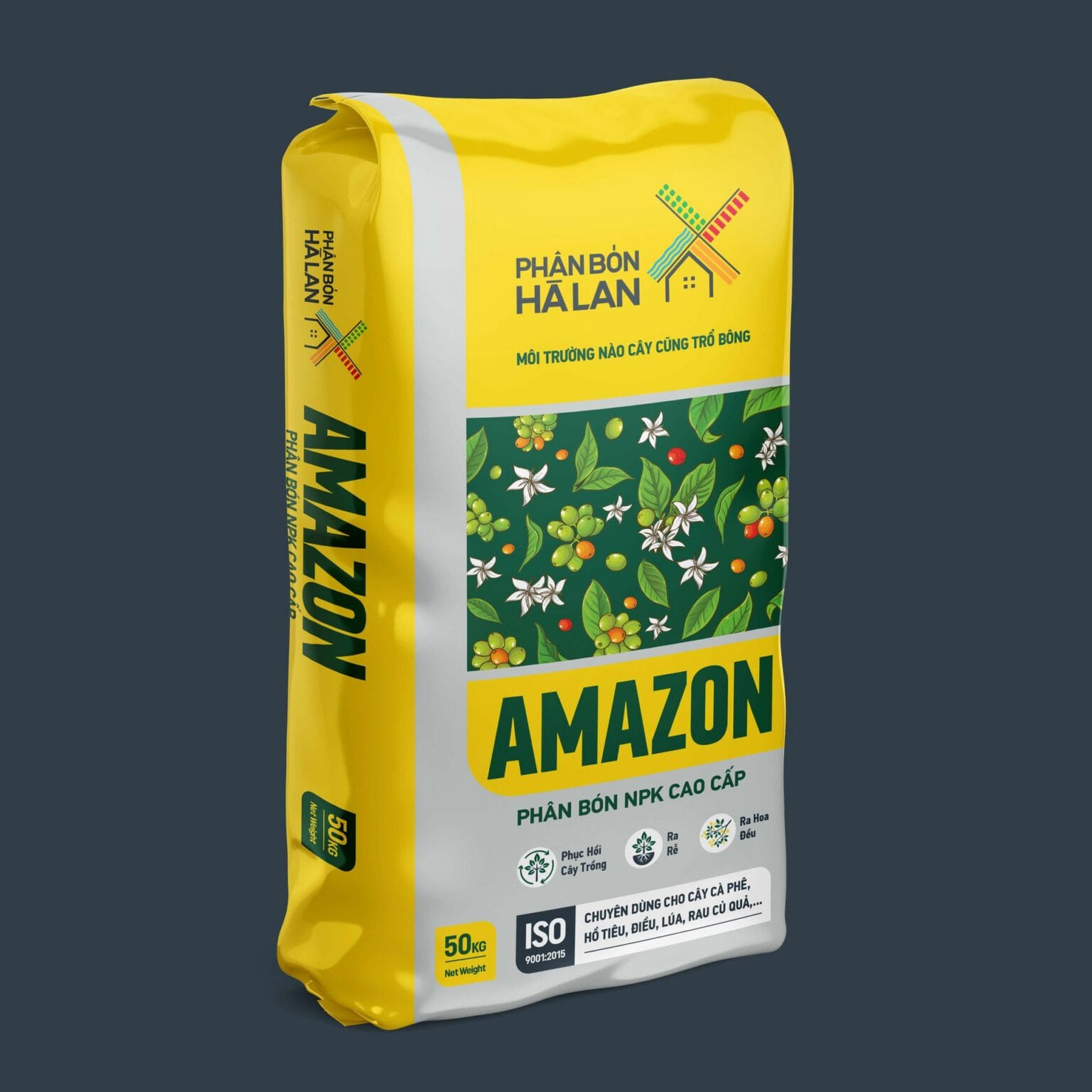
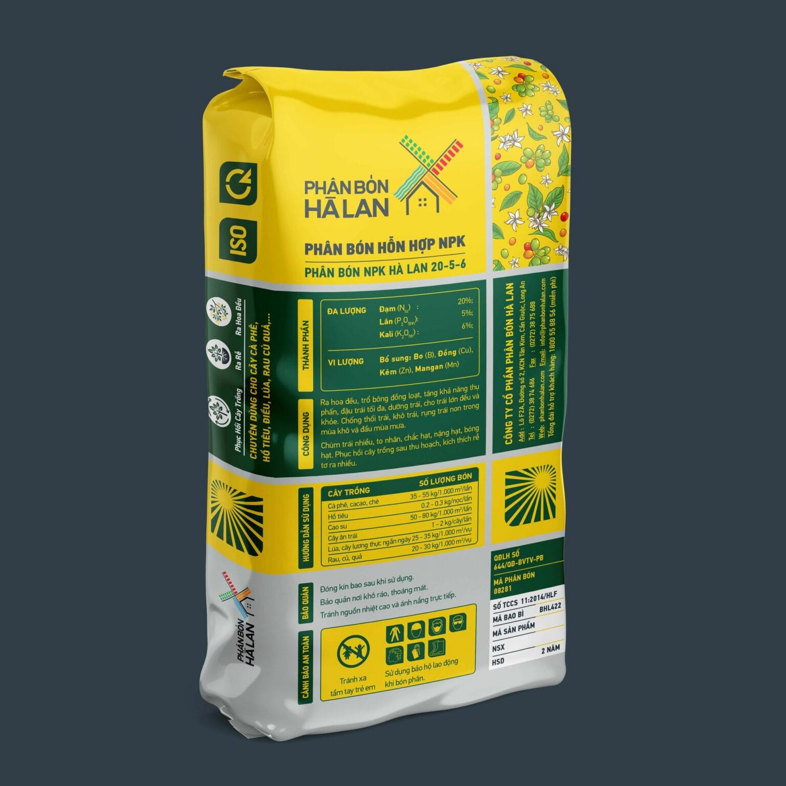
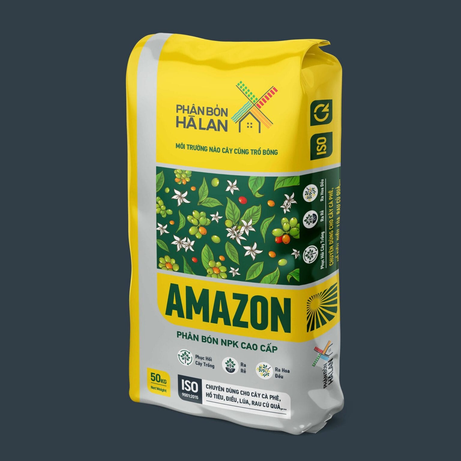
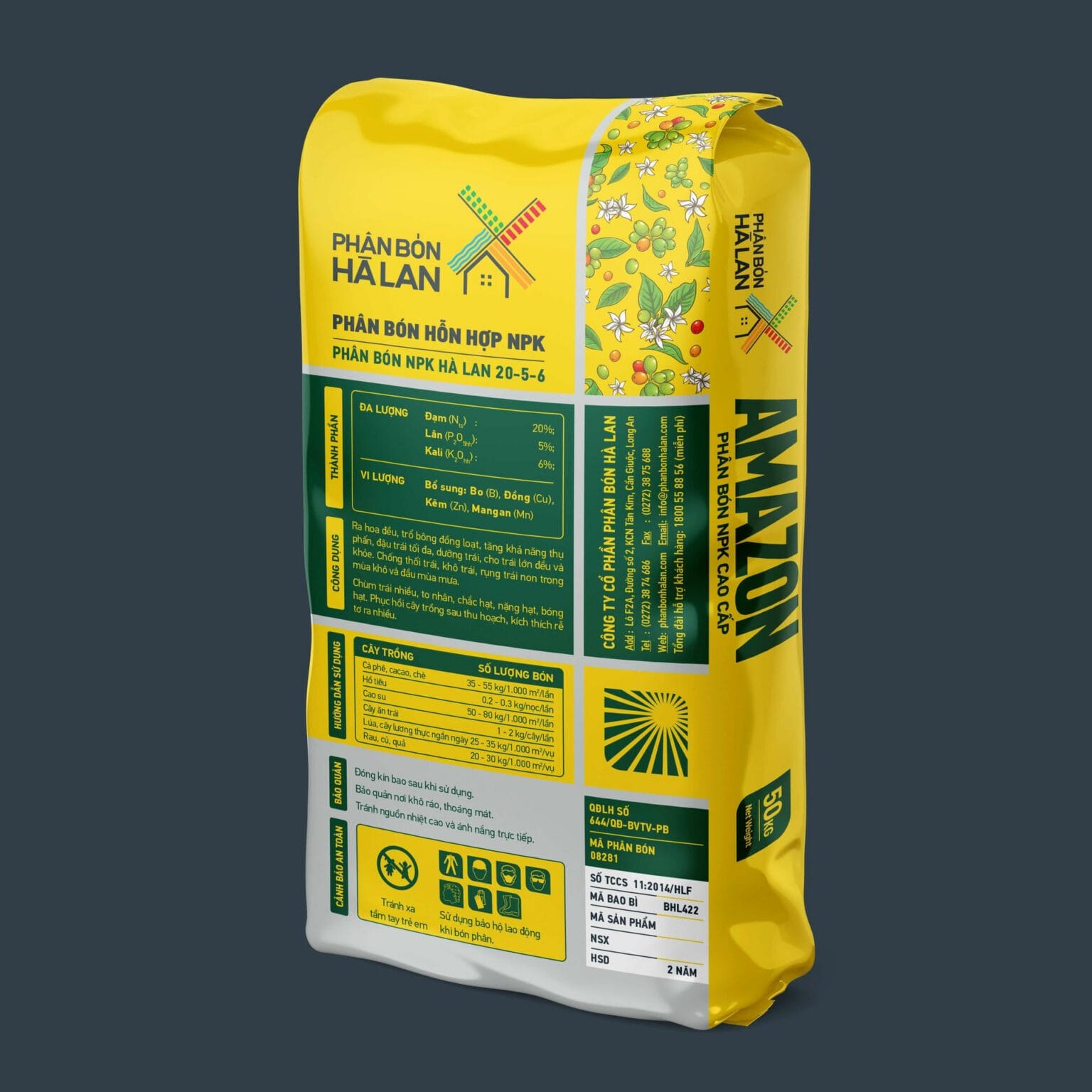
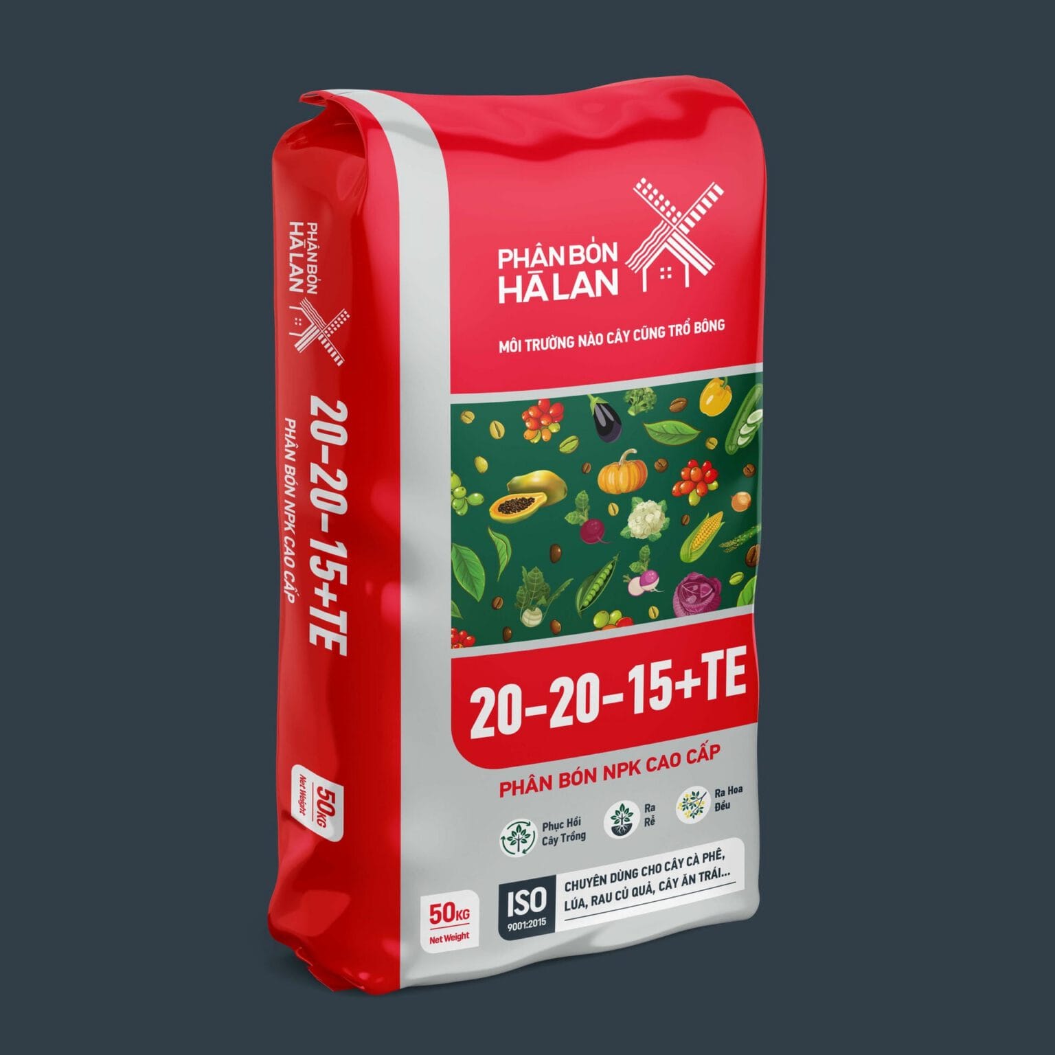
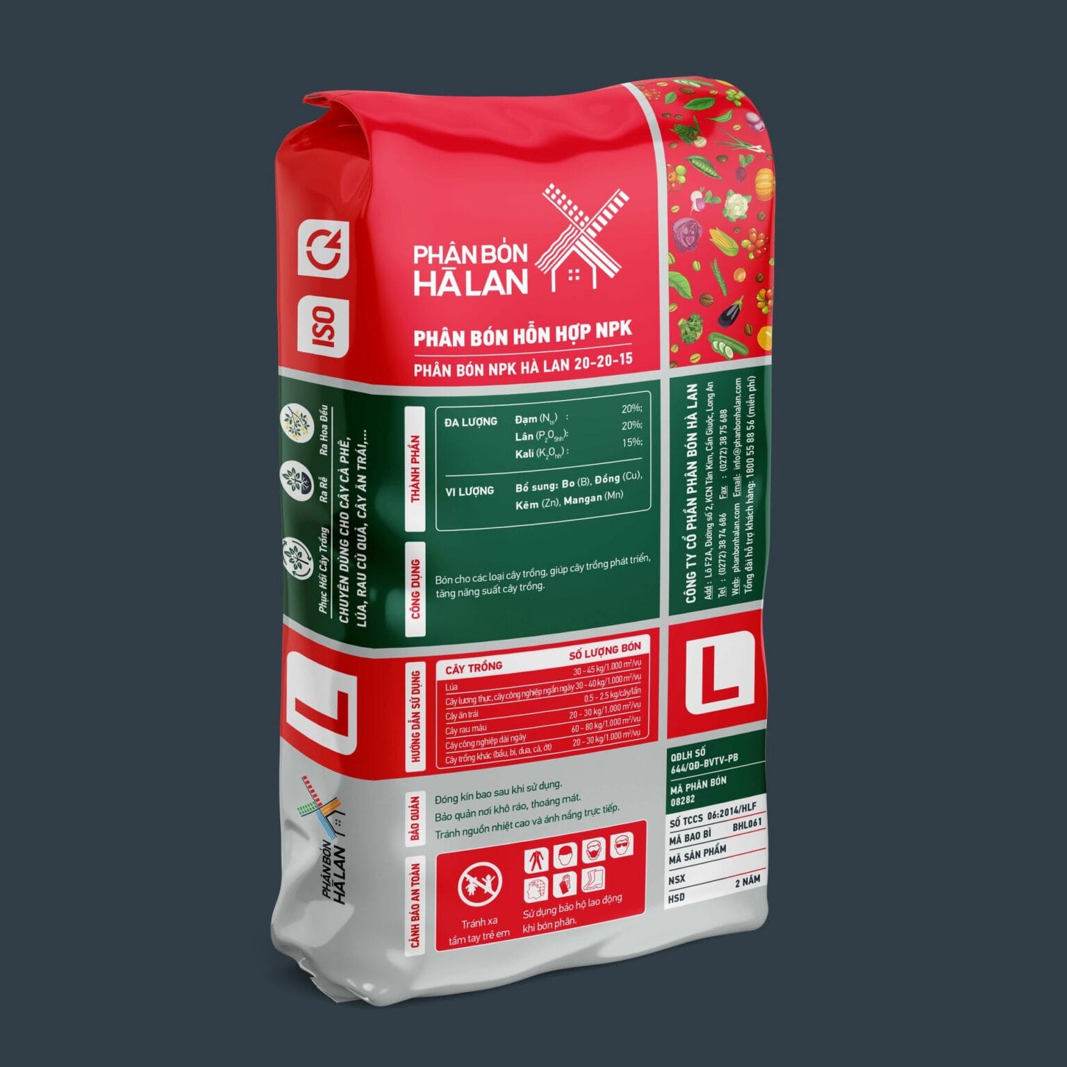
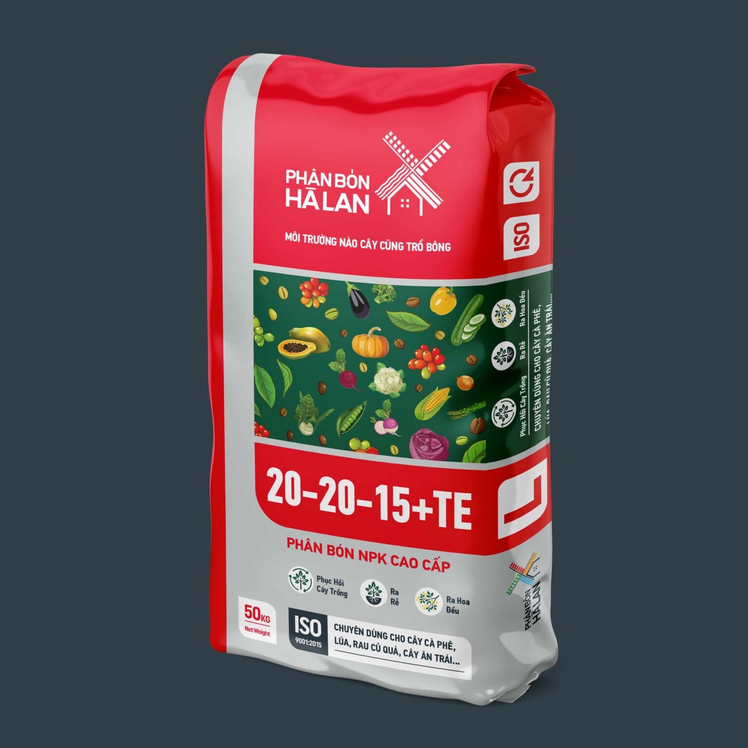
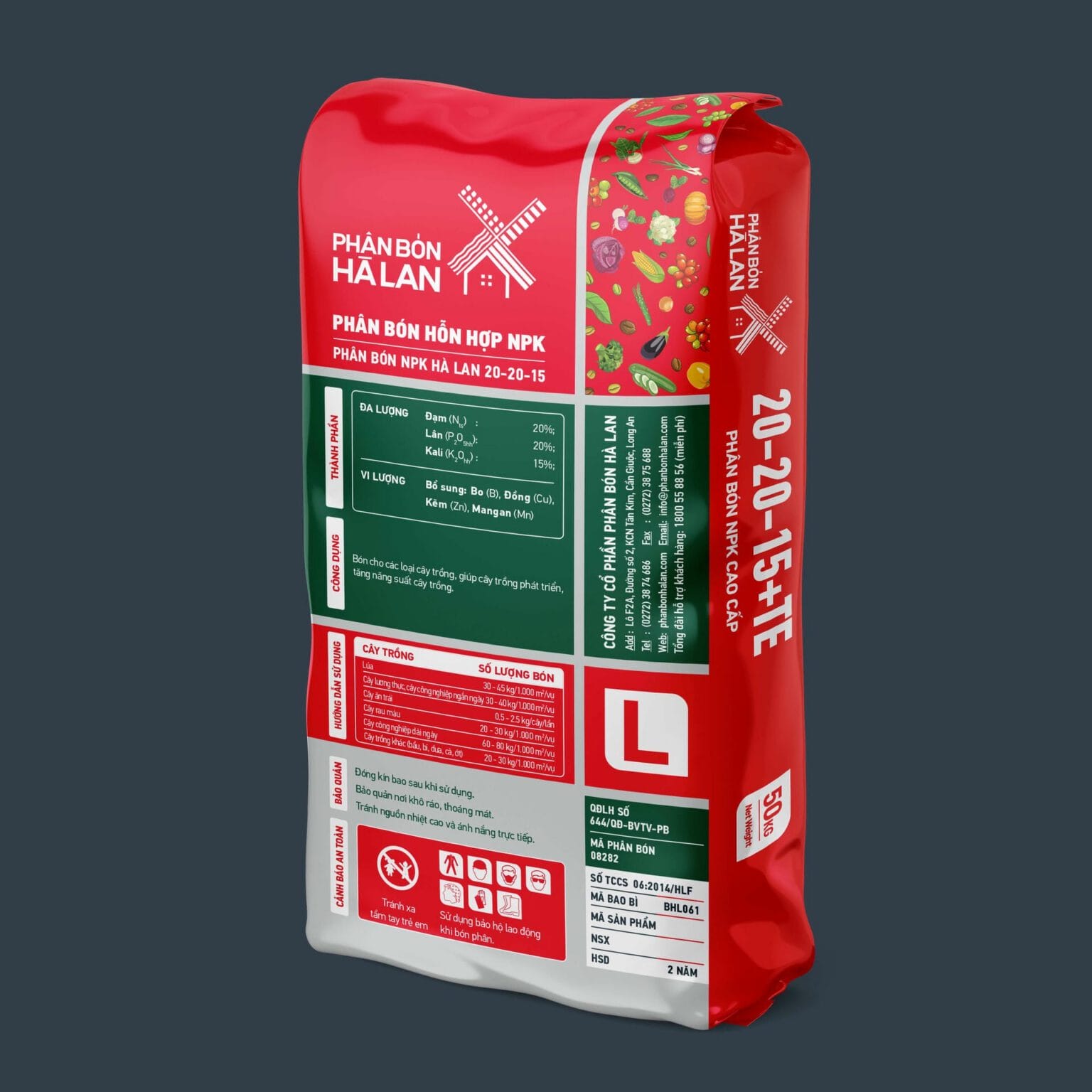
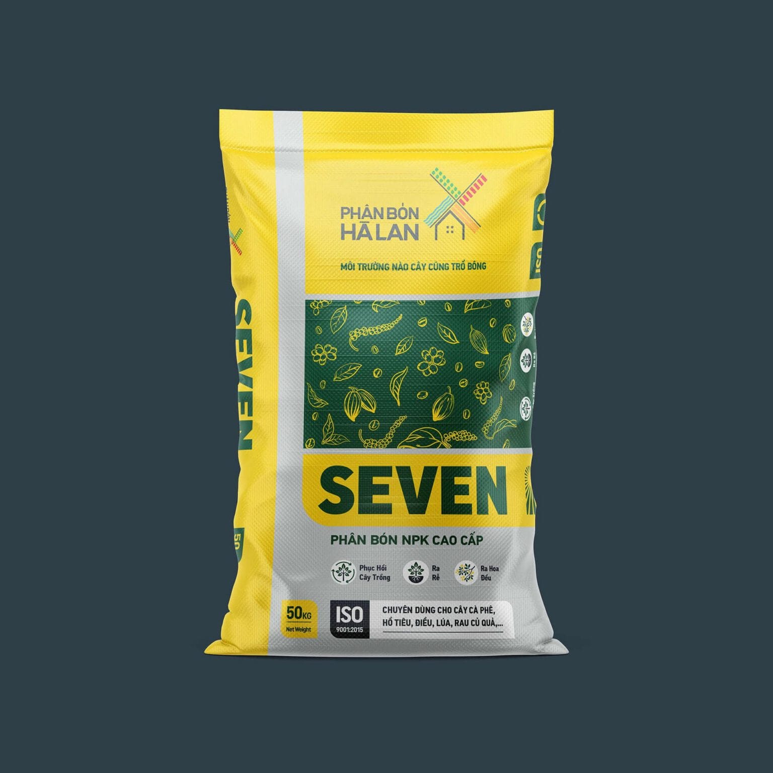
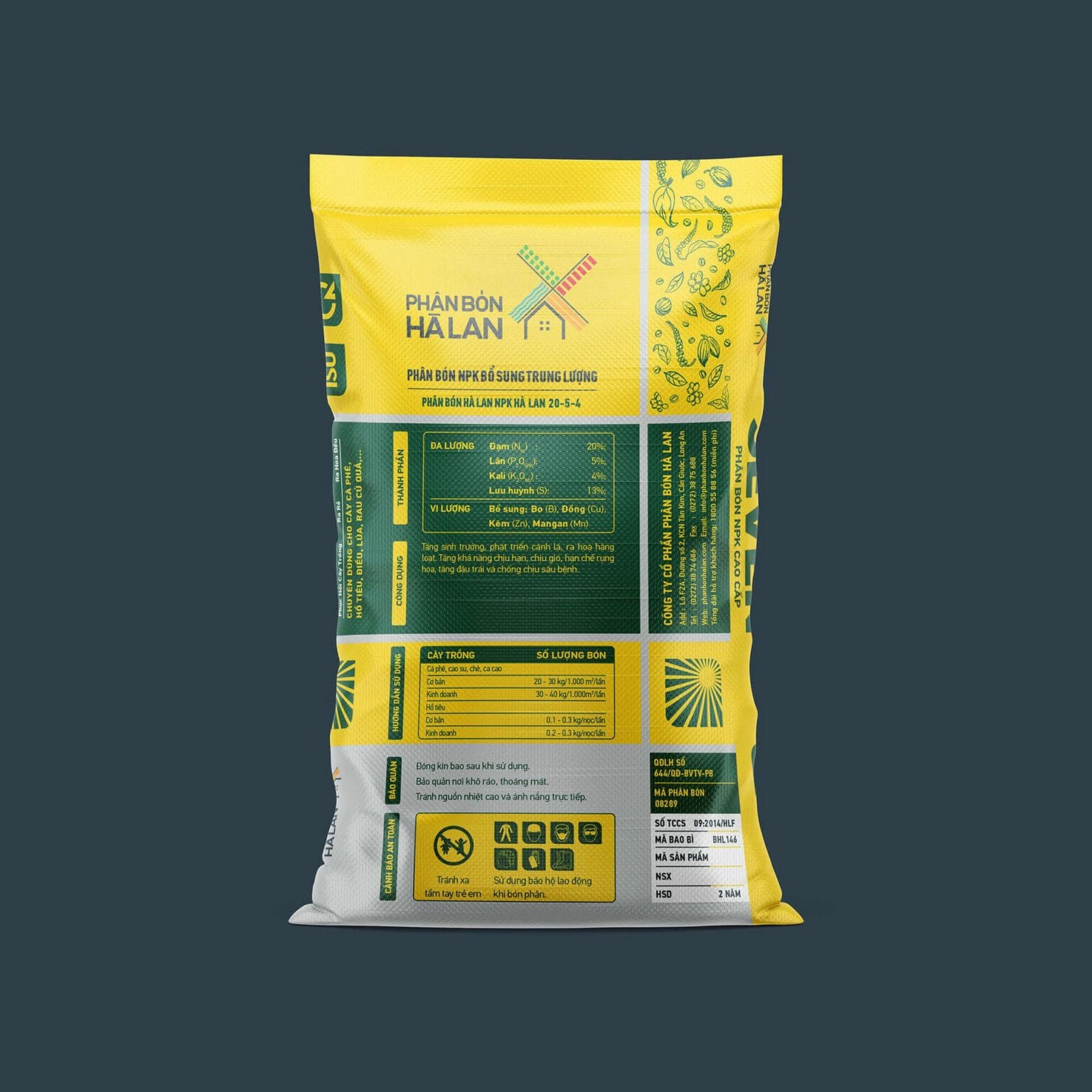
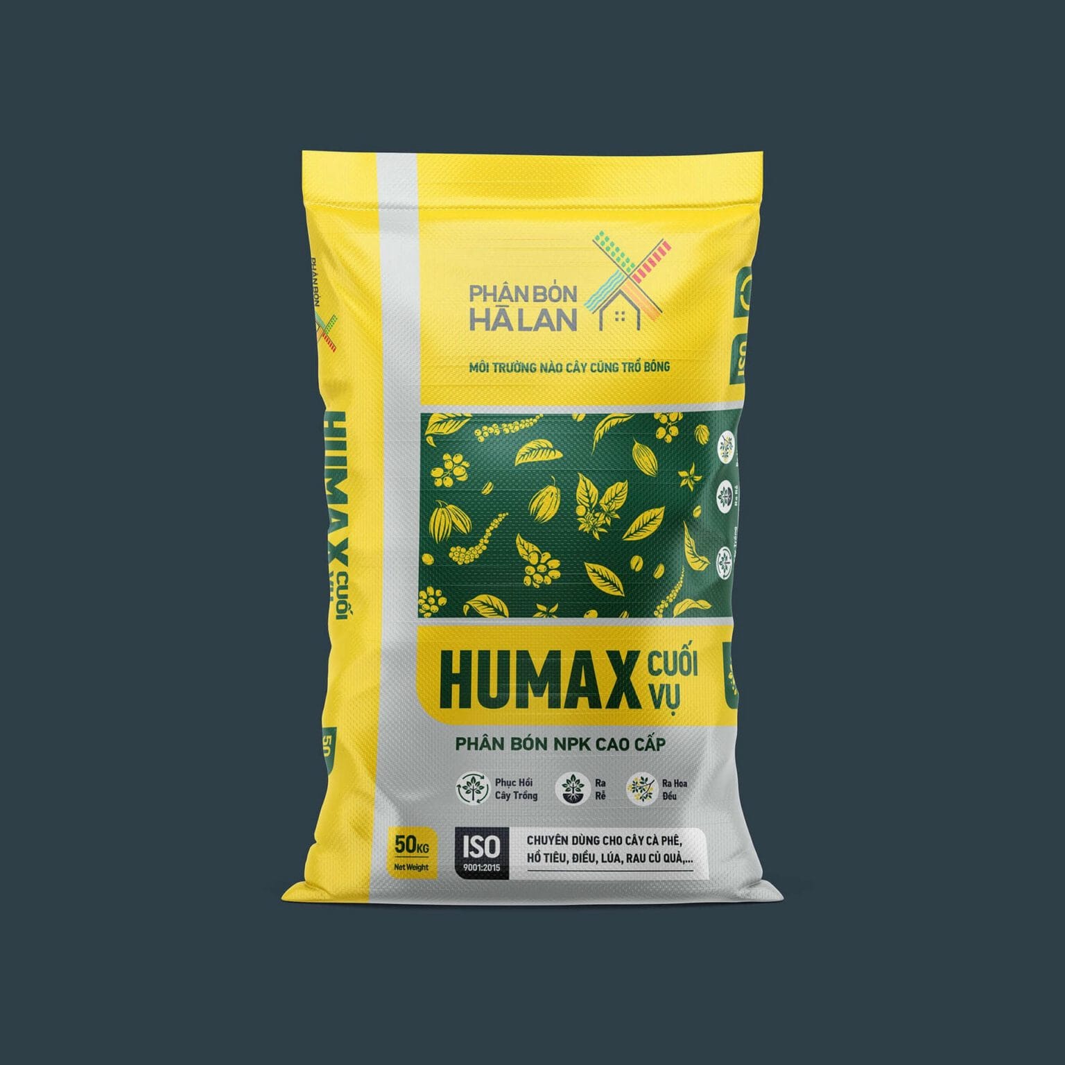
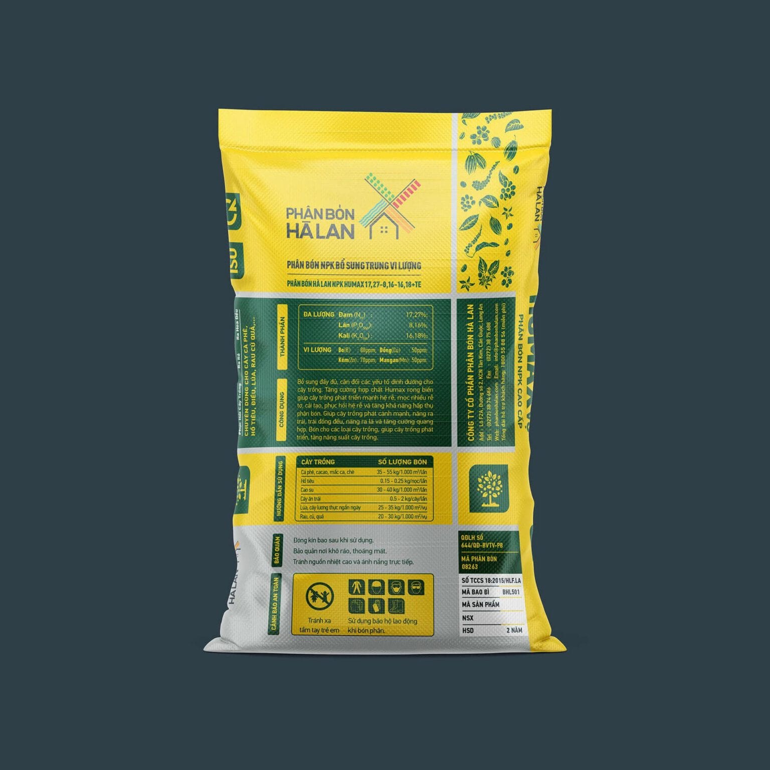
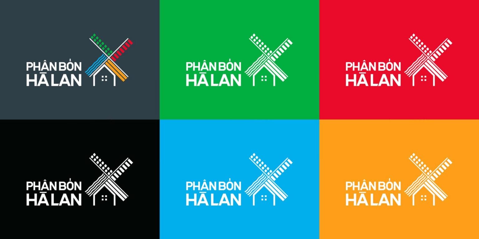
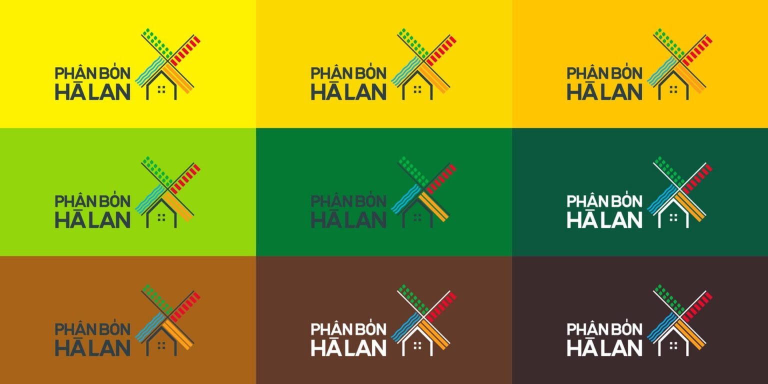
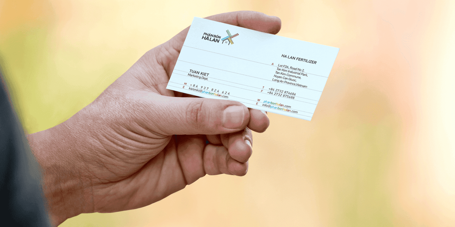
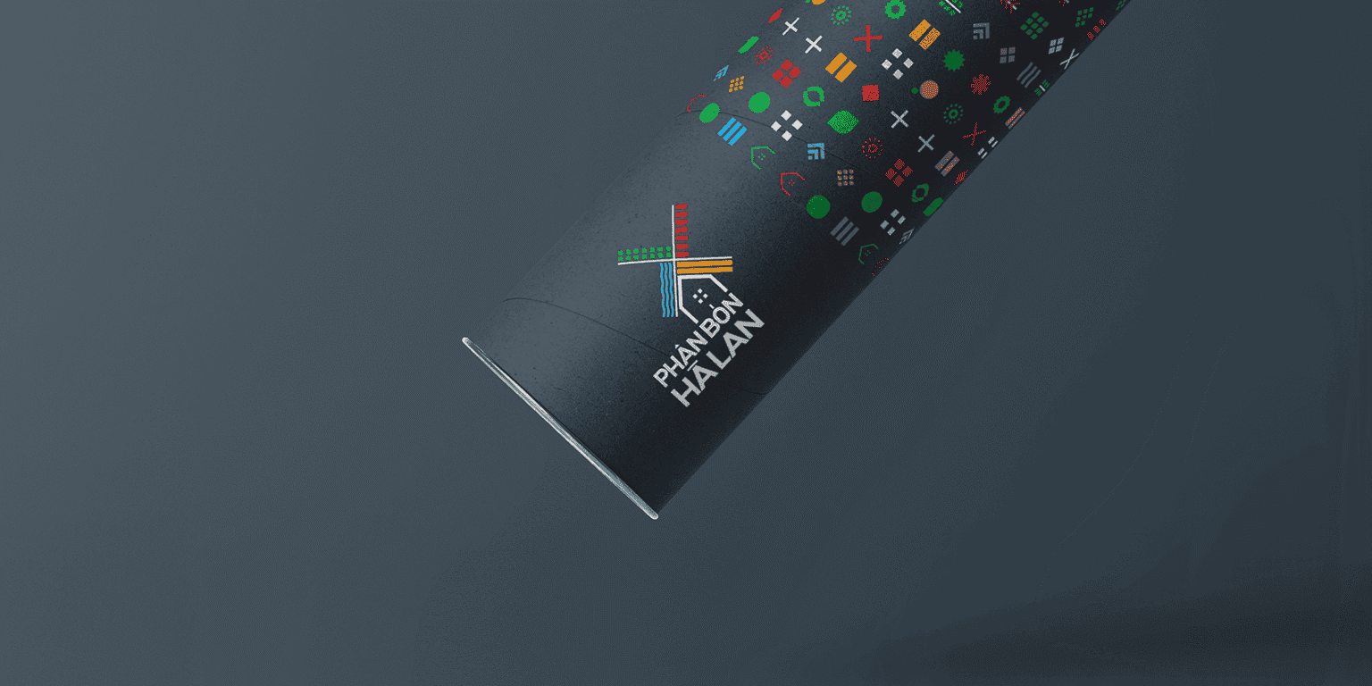
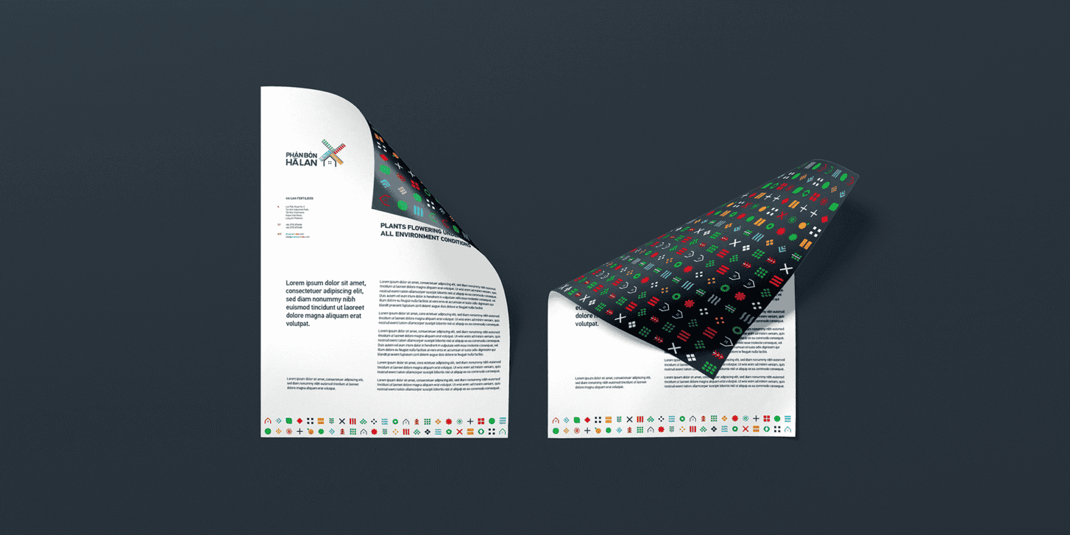
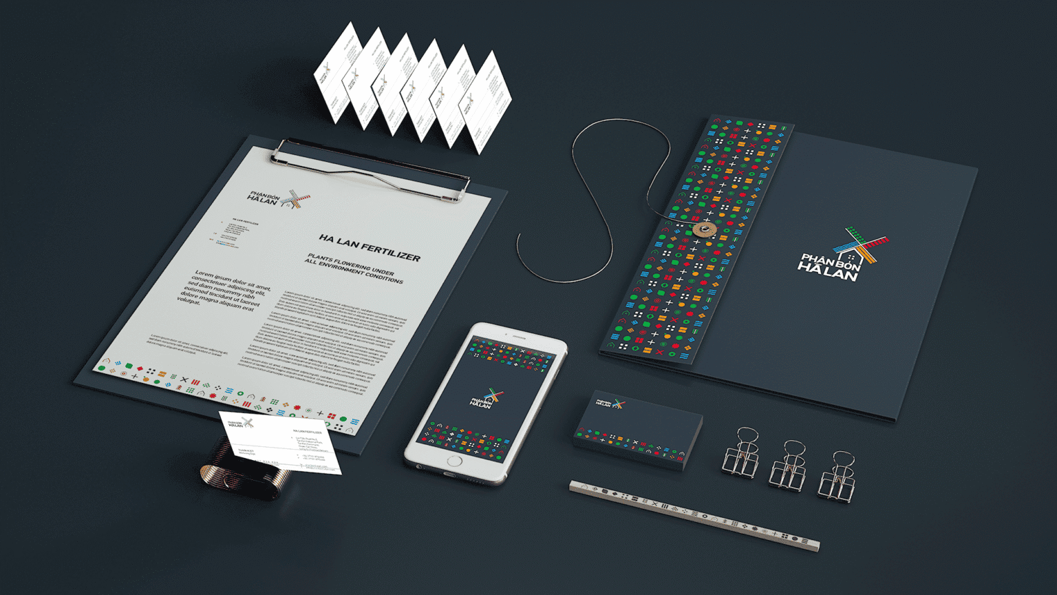
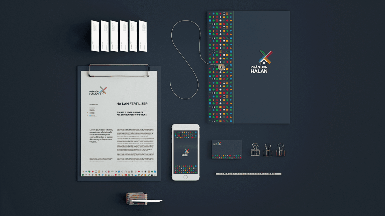
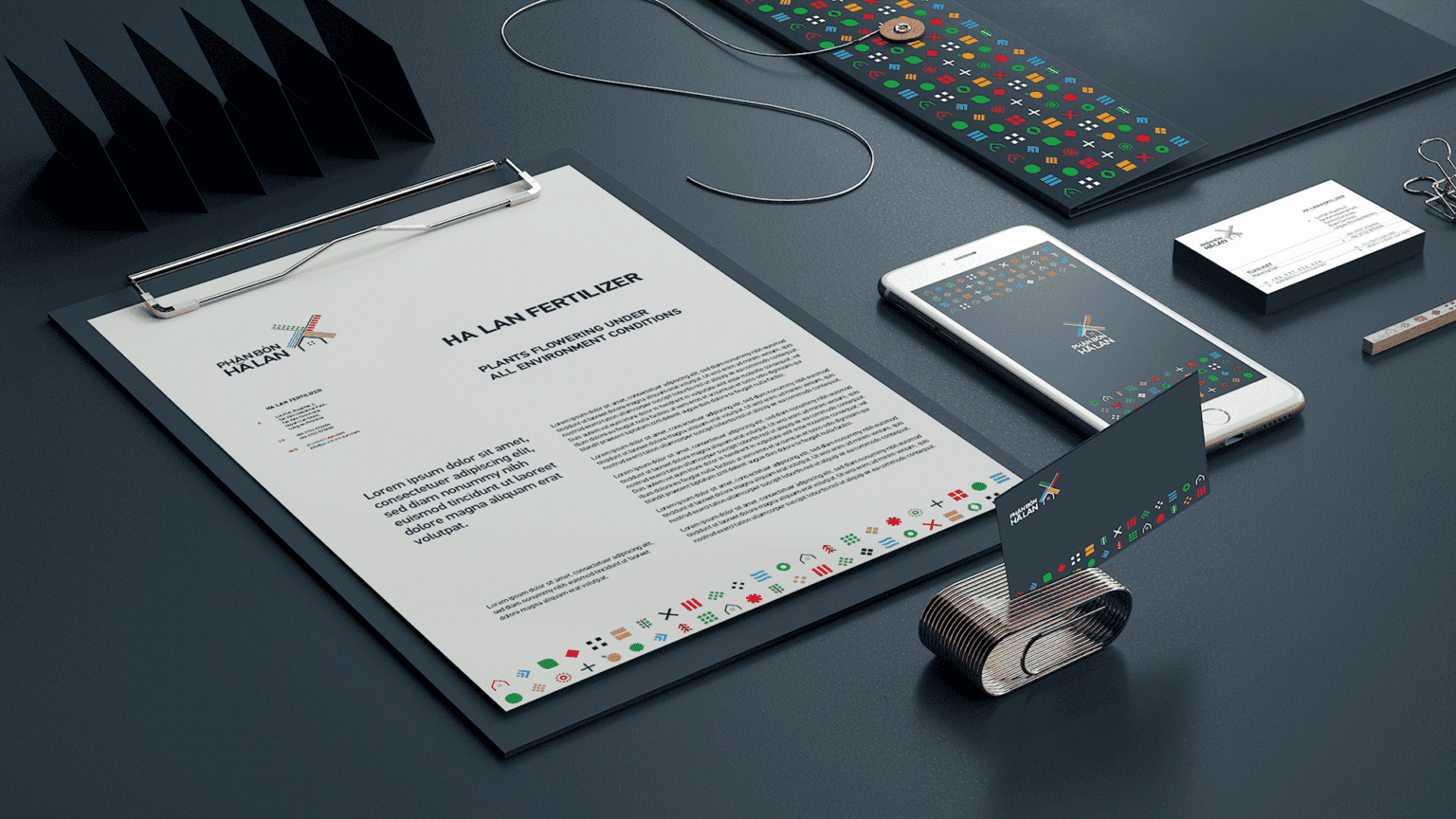
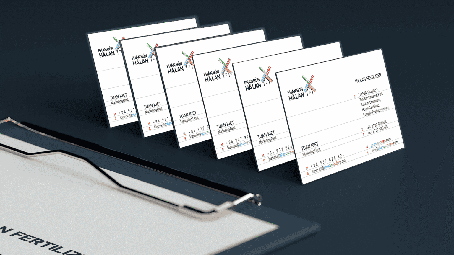
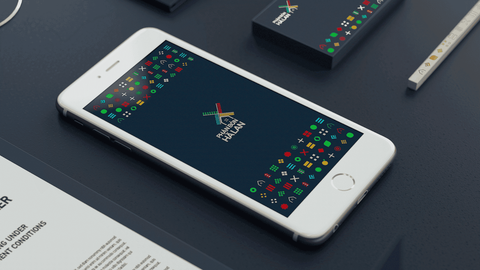
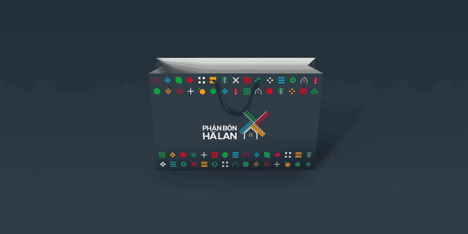
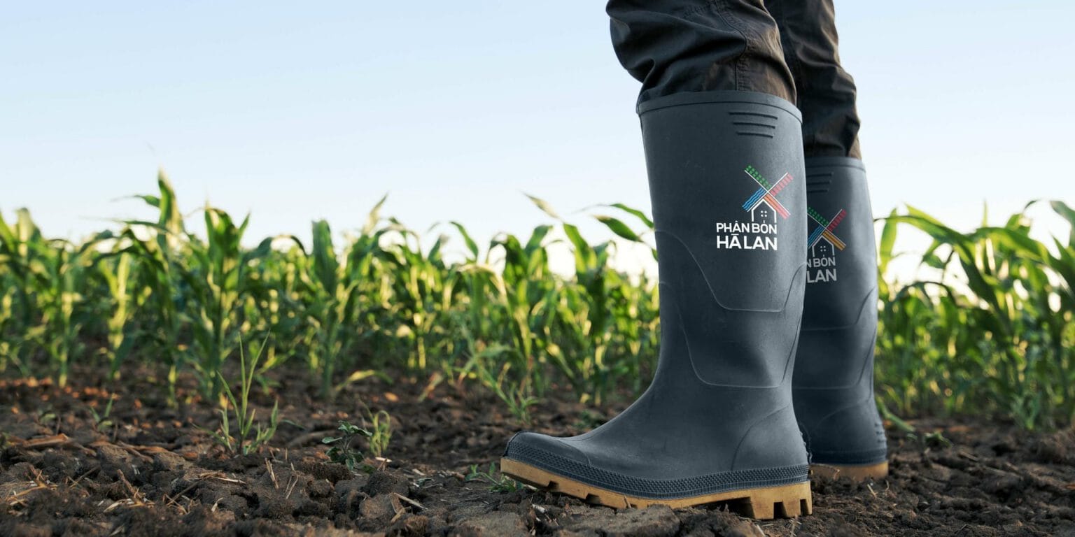
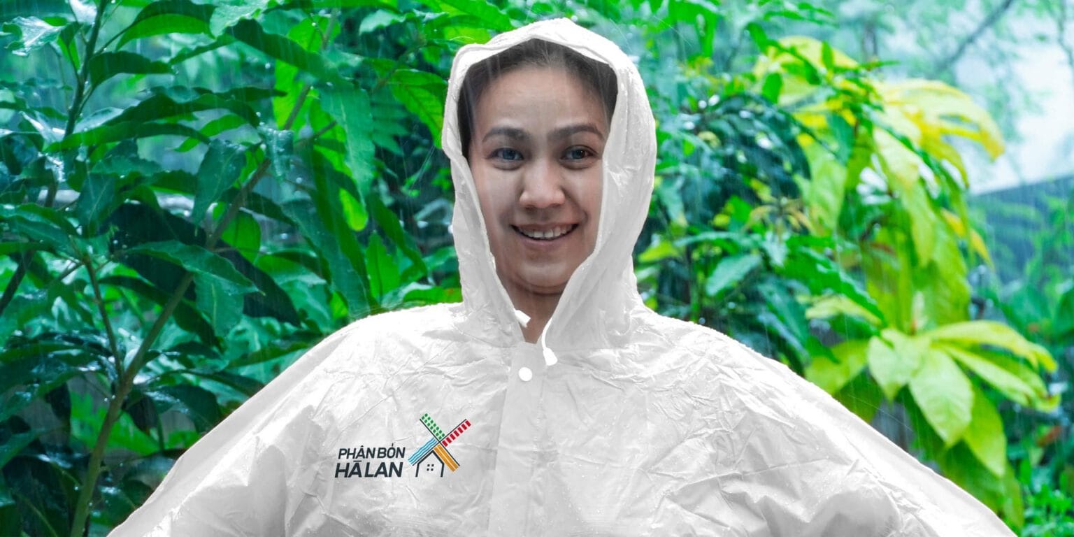
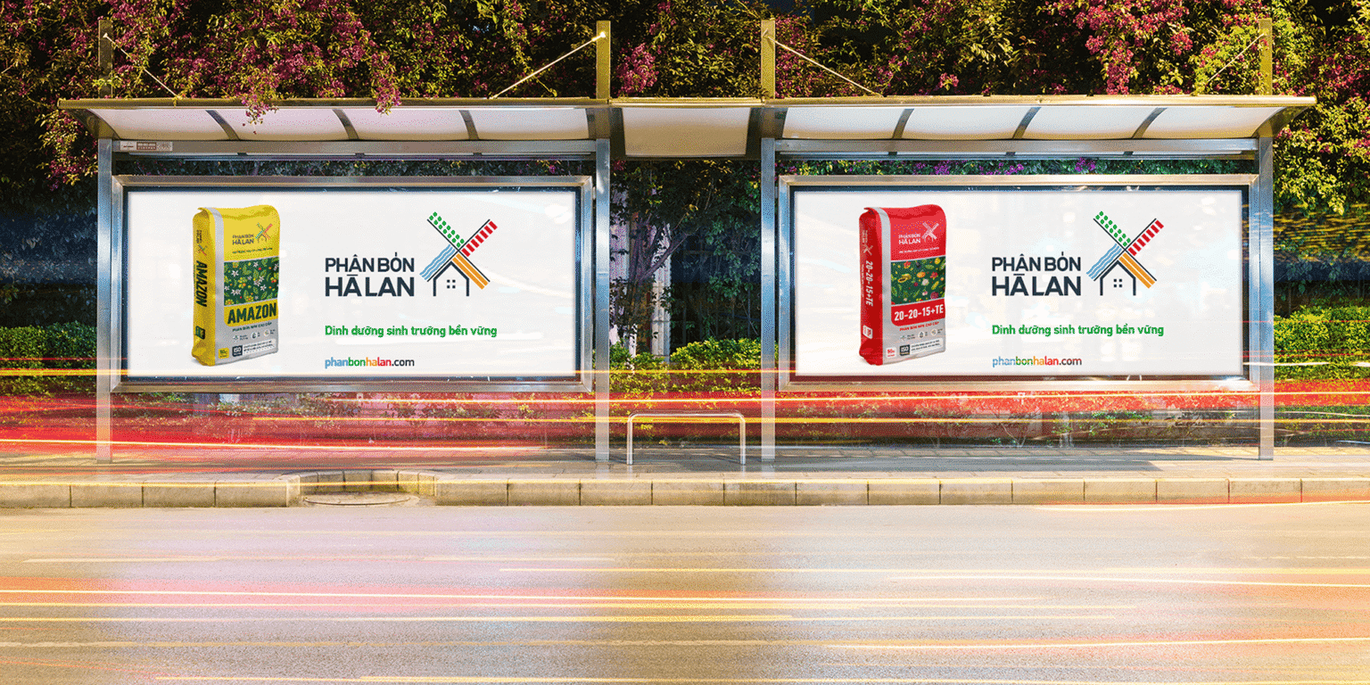
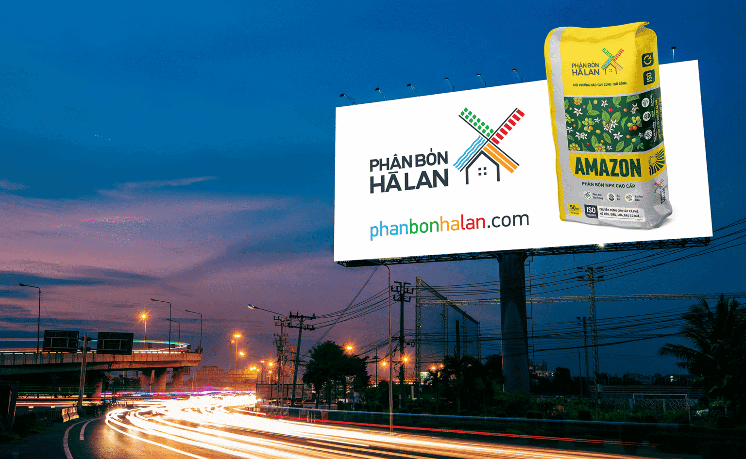
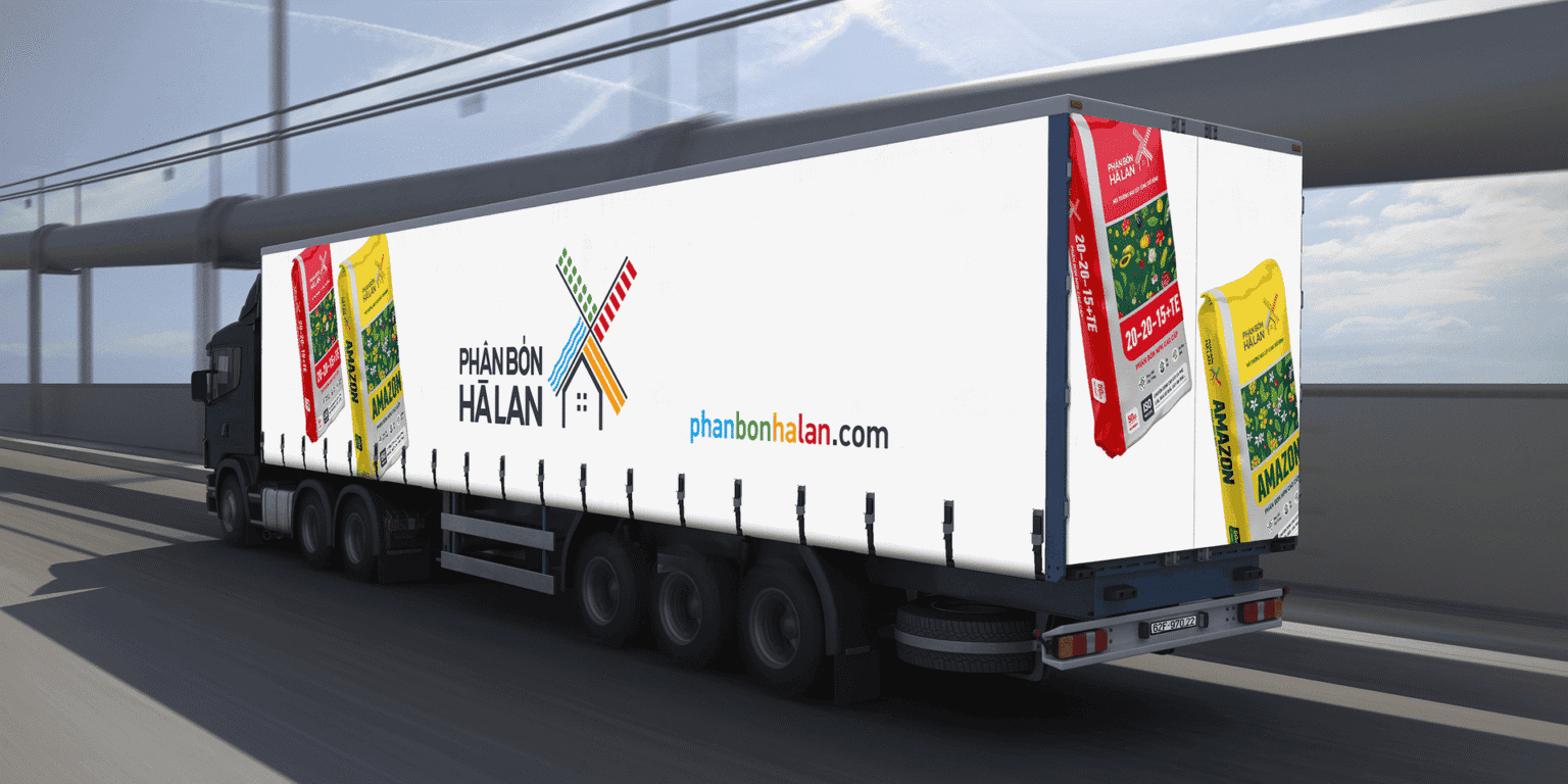
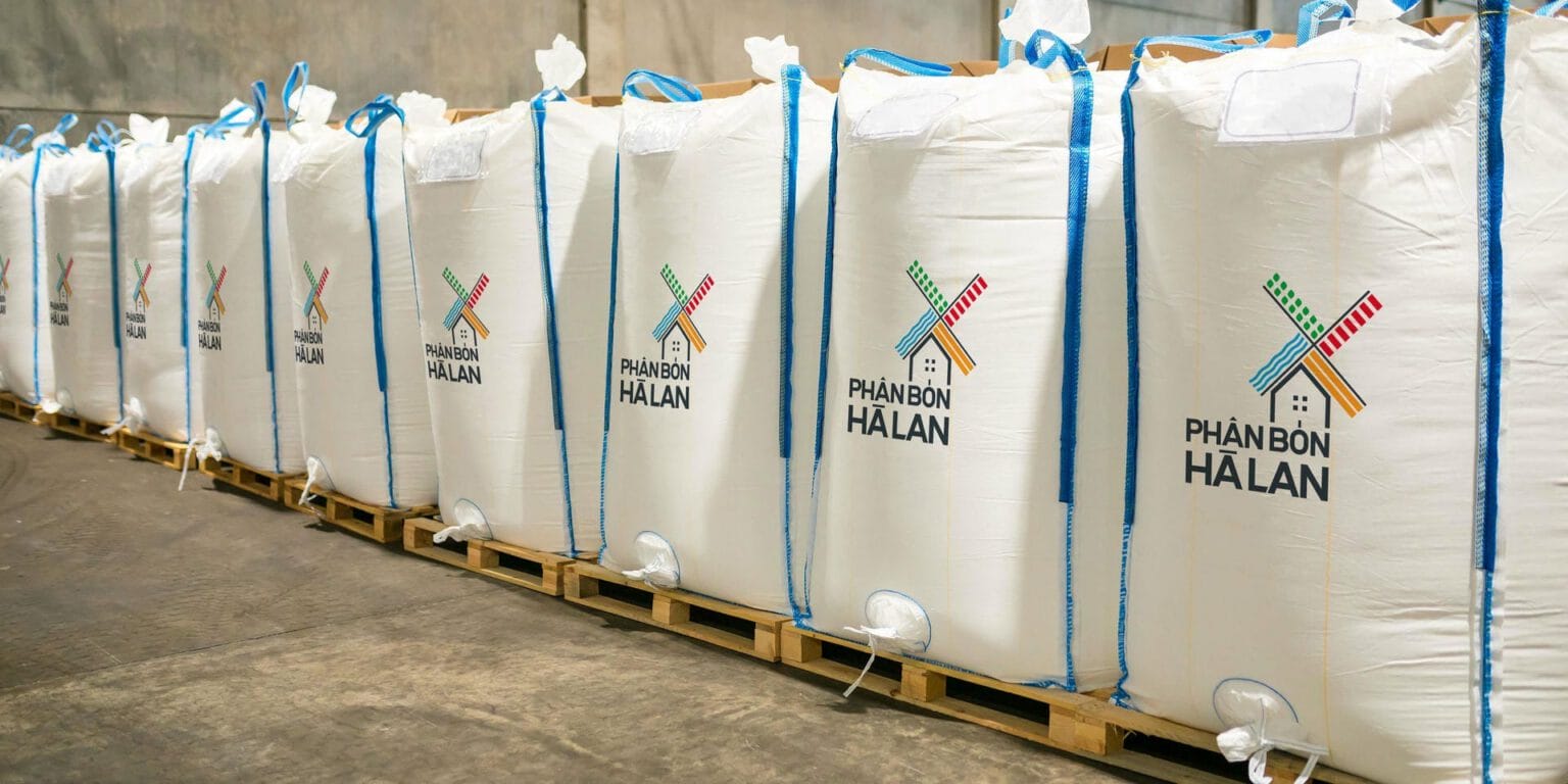
We renewed the distinctive Phan Bon Ha Lan logo with a bolder new identity in its idea, its symbol design and a minimal, well-reasoned typeface, to show that even after more than nine years of history, Phan Bon Ha Lan is still courageous, modern and dynamic. Next we simplified the packaging, building on the inherent strength of the brand’s strongest elements. The eye-catching new palette draws on the four seasons, and the graphic elements and layouts were arranged with more care. The portfolio is now more visual, with a wider and more cohesive palette that makes the packs stand out clearly in the dealer’s space.

Story
What story did the packaging tell?
The rich nutrition that fertilizer brings to soil and crops
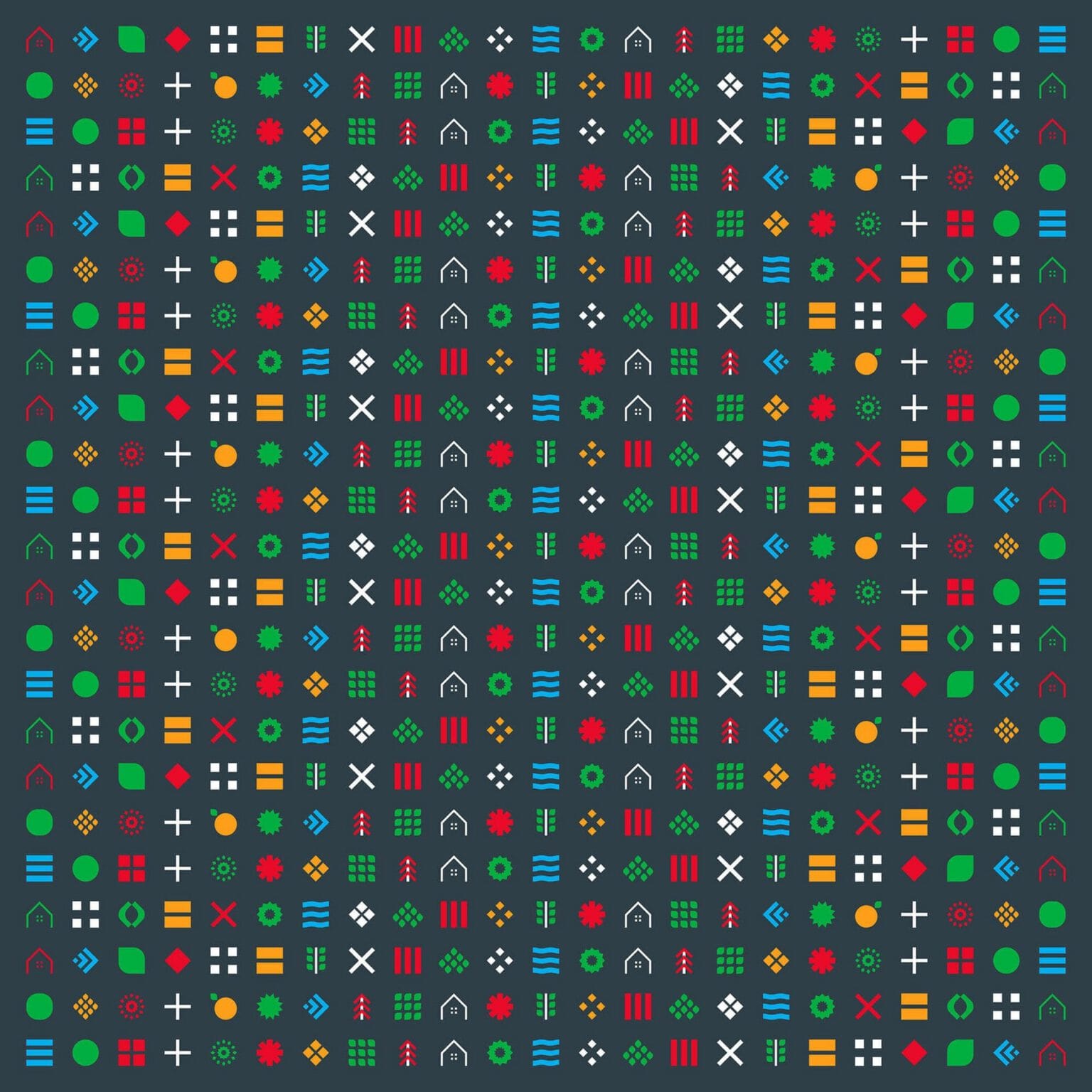
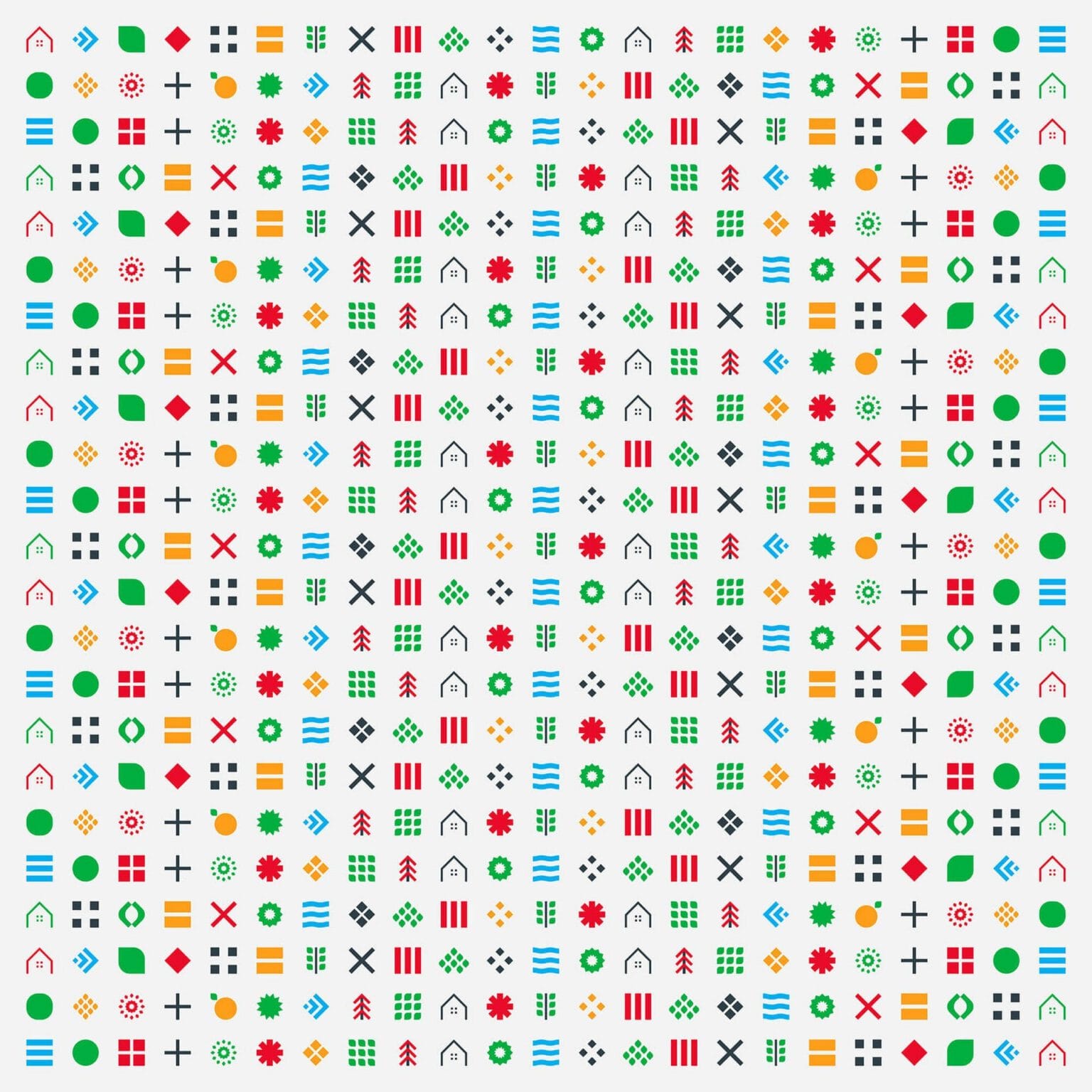
We also wanted to bring out the most valuable asset of Phan Bon Ha Lan: the rich nutrients that its fertilizers give to soil and crops. We did this by creating a story of soil, plants, seeds, roots, fruit and leaves, told in simple graphics that honor the brand’s commitment to sustainability for the soil and the crops.
Impact
What really changed?
Phan Bon Ha Lan, a bold leader
Taken together, these changes positioned Phan Bon Ha Lan as a bold leader while restoring its iconic status. Most importantly, the simpler, clearer design markedly improved how the brand communicates with buyers.





FreshBrand team
- Trần Anh Tú — Creative Director, Project Director, Design
Project
- ClientPhan Bon Ha Lan
