
Communication Design
When a brand needs to be understood
An identity system can look airtight on the guideline page, but a brand is only truly recognized when it shows up on a billboard, a shelf and a screen.
FreshBrand designs the communication applications of the identity system, meaning the places where the identity appears before customers: billboards, large-format panels, point-of-sale materials (POSM), printed materials and illustration. That way, every time the brand appears it carries the same identity. FreshBrand is responsible for the design; buying ad placements and running channels is handled by the business or its own media partner.

Perspective
Many businesses invest in a thorough identity and then let each place make its own pieces: billboards as the printer sees fit, standees from a stock template, posts as the person in charge feels inspired. Each one has the logo, but side by side they no longer look like one brand.
Communication design is the part that connects the identity system to reality: knowing what to hold fixed so the brand is always recognized, and what to stretch to suit each format, viewing distance and place of appearance. A billboard on the highway has to be read in a moment, while a standee in a clinic can say more.
For FreshBrand, a good communication piece lets viewers recognize the brand even before they have time to read the name.
When to start here
Each piece starts going its own way when the brand appears in more places and passes through more hands.
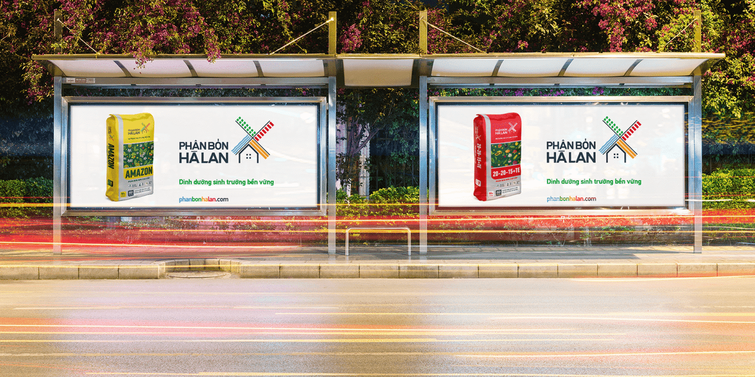
When a brand needs to be on the customer’s route
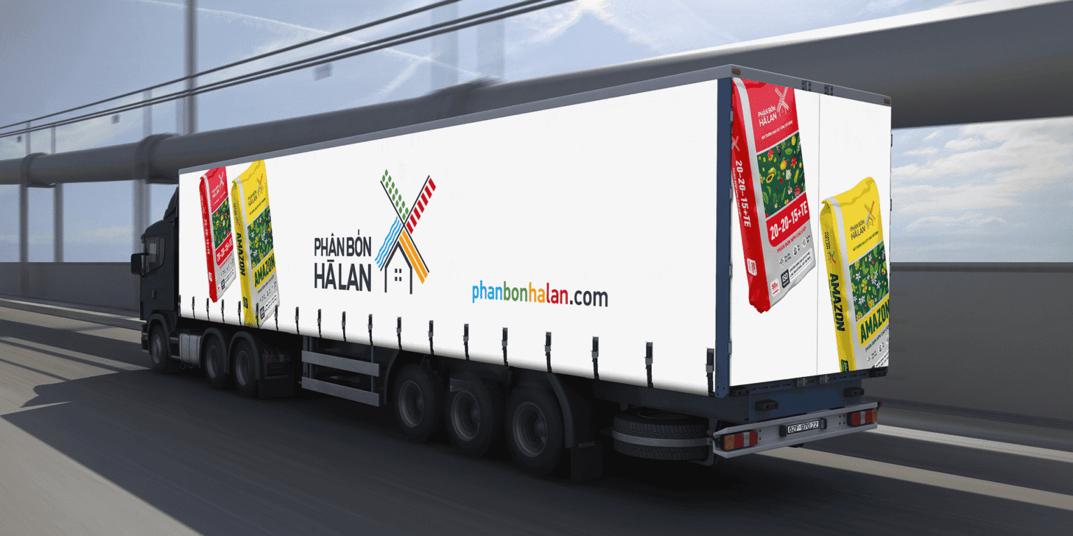
From roadside billboards and bus shelters to the sides of trucks, the Phan Bon Ha Lan identity appears with the same arrangement of the windmill logo, the product packaging image and the website address.
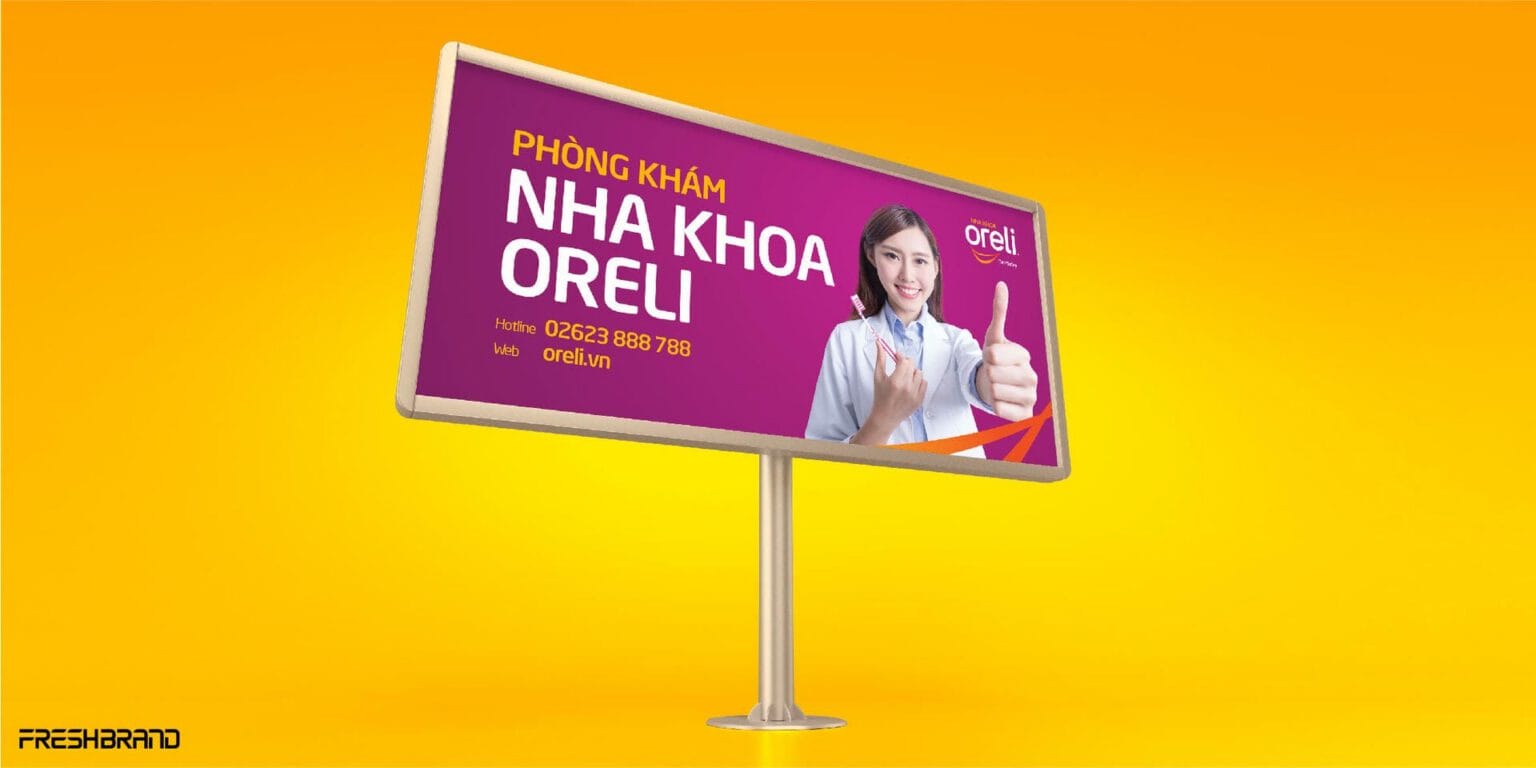
When a clinic needs to speak to customers on the spot
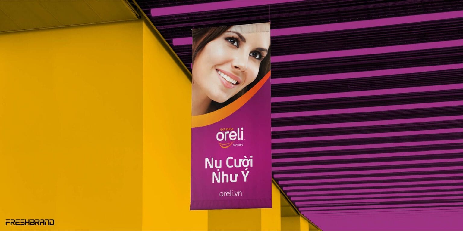
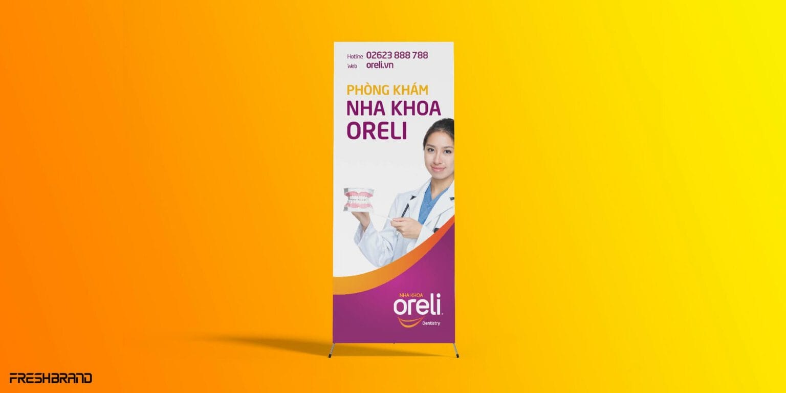
The billboards, hanging banners, standees and posters of Oreli Dental Clinic all use the same pink and purple, real smiles and the promise “The smile you wish for,” so customers meet the same brand from the street to the waiting chair.
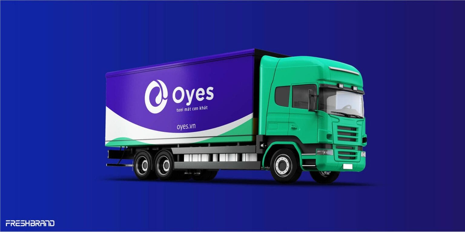
When the brand travels the streets
On Oyes motorbikes, cars and trucks, a green wave cuts across the purple ground, the same motion already seen on the business cards and tote bags. At every size, people on the street meet the same brand.
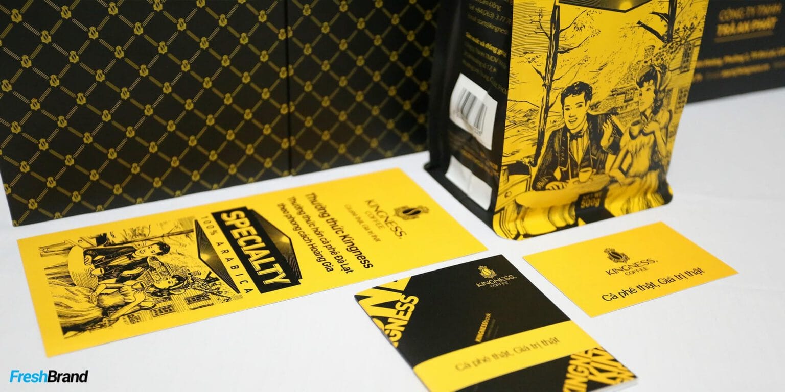
When identity needs an illustration of its own
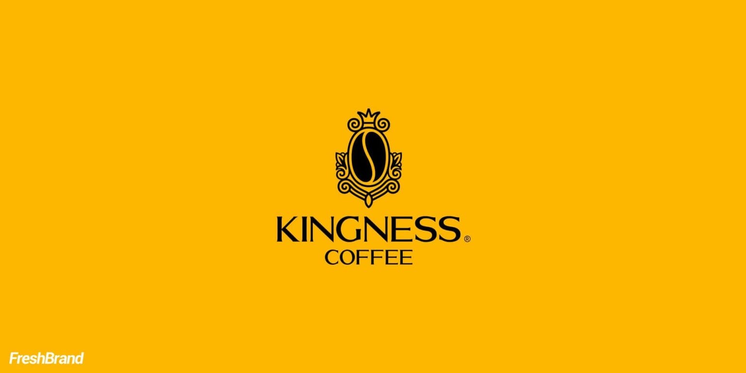
For Kingness Coffee, the engraved illustrations on black with gold accents were drawn specifically for the brand, then carried from the packaging to the website.
How FreshBrand works
FreshBrand starts by gathering every place the brand appears, from billboards to posts, to see which pieces need a common template before each one is designed.
Where is the brand now?
We start with the identity system and the places where the brand now appears: printed materials in circulation, signage, shelves, digital channels, and the spots where the brand is being done differently.
What really needs to be designed?
From the business’s plans, FreshBrand defines which communication applications are needed and the role of each type.
OutdoorBillboards, large-format panels, shelters and vehicles
POSMStandees, banners, display shelves and point-of-sale items
Printed materialsBrochures, leaflets, posters and product introduction documents
Art & IllustrationIllustrations and patterns drawn specifically for the brand
Digital templatesBanner and post templates the team can fill with new content on their own
What do we choose?
Every application is designed on a shared layout system, so the brand keeps its identity whether the format, the material or the person making it changes.
Fixed partThe logo, colors, typefaces and how they are placed do not change, so viewers always recognize the brand
Flexible partImagery, content and proportions change with the format and viewing distance
LegibleEvery application is checked at its actual size and in the place where it will appear
How are the applications finished?
The design is finished as print and production files with technical specifications for each material, along with a set of templates so the team and contractors get it right the next time.
What will really change?
When the project is complete, customers recognize the same brand in the places where it appears, and the business has to fix individual pieces less often because every place did it its own way.
What the business keeps
The people making printed materials may change from year to year, so the assets below are left behind to keep every later piece true to the identity.
- A set of communication applications built to the agreed catalog.
- A layout system and templates for the most commonly used formats.
- The brand’s own illustrations, in reusable formats.
- Print and production files and technical specifications for each material.
- A guide for the team and contractors to roll out new applications.
POSM
At the point of sale, a brand has to be seen in a moment among many other products, so each item has to stand out and stay true to the identity at once.
- Standees and banners: Placed at the entrance, reception desk or waiting area, in the same visual system as the signage outside.
- Shelves and display items: Help the product get recognized on the shelf among other brands.
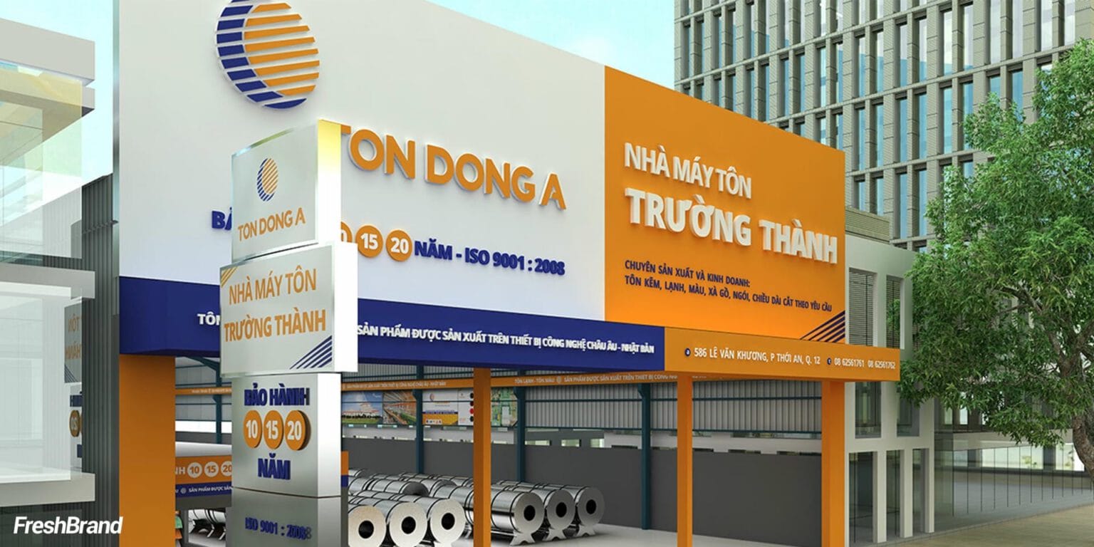
- Dealer signage: Brings the same imagery to the facade and sign of dealer stores, where first-time buyers meet the brand; the detailed standards belong to the Signage Design service.
Art & Illustration
An illustration drawn for a brand can tell what stock photography cannot, and no other brand can reuse it.
- Identity illustration: Illustration becomes part of the identity, moving from packaging to the website.
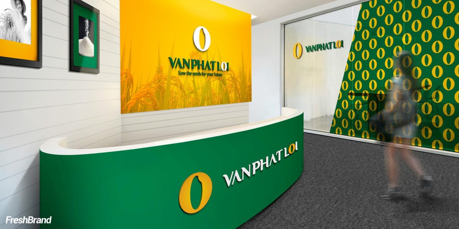
- Patterns: A pattern system developed from the symbol, serving as a backdrop for printed materials, packaging and spaces.
- Thematic illustration: Illustrations for individual products or communication pushes, in the same style as the main system.

Let's talk
Is your business facing a similar question? Send a request to talk with FreshBrand, or download the portfolio to see more of our work.

In practice
SCBBrand repositioning, 2018
When a new direction has to show up at every touchpoint
In 2018, SCB had a long-established base, strength in raising capital and a wide network of branches, with middle-aged and older customers at its core. The bank chose a new direction: to make its customer base younger, aiming at the 25 – 40 age group, and to become a modern, versatile and friendly bank.
“SCB has a direction for the future, but the market still sees SCB through the lens of the past.”
On cards, card holders and printed materials, the new blue and red palette and logo placement are used under one common rule, so the modern, versatile and friendly direction shows up right in what customers hold in their hands every day.

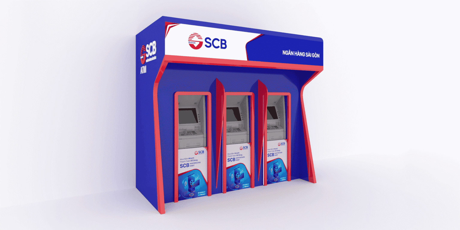
The greatest value is not in refreshing the SCB image but in giving the brand a foundation to be seen for the future it is building.
The question behind it
Every communication application rests on two things that come first: an identity system clear enough to build on and a set of standards every location can follow.
- Brand Identity Design
When a brand needs an identity system before taking it into communication applications. - Campaign Key Visual
When a campaign needs a lead image that runs through every application. - Brand Guidelines
When communication applications need standards so that many people can get them right.
FreshBrand capabilities
Strategy
When a brand needs a direction
Identity
When a brand needs to be recognized
Expression
When meaning needs to take shape
Experience
When a brand needs to be felt
Communication
When a brand needs to be understood
- Communication Design
- Campaign Key Visual
Start with FreshBrand
Send us the problem, get a point of view.
You can send a request today, or download the portfolio to share with your leadership before we talk.