
Visual Identity
When a brand needs to be recognized
A logo helps customers recognize a brand, but it is the system around it that keeps the brand looking like one brand everywhere.
FreshBrand develops a logo into a complete identity made of typography, color, a graphic language and printed materials. The rules that come with it are clear enough that every time the brand appears, from a business card to a sign to a screen, it is recognized as belonging to the same business.
Perspective
A beautiful logo without a system beside it will soon be used a different way in every place: one printed piece picks a typeface, another sign mixes its own color, each designer adds one more detail. After a few years the brand has a great many different faces, and none of them is truly its own.
A good identity needs only a few carefully chosen elements, such as a curve, a band of color or a pattern, repeated by rule so that customers recognize the brand even when the logo is not in the frame.
For FreshBrand, every element in an identity must have a reason rooted in the brand’s strategy, because a curve or a color is only worth repeating when it says what the brand wants to be.
When to start here
An identity is usually called for at one of three moments: a new brand is born, a logo exists but the system does not, or the brand is appearing a different way in every place. The four projects below show the same problem solved with different choices.
When a new brand needs a whole system
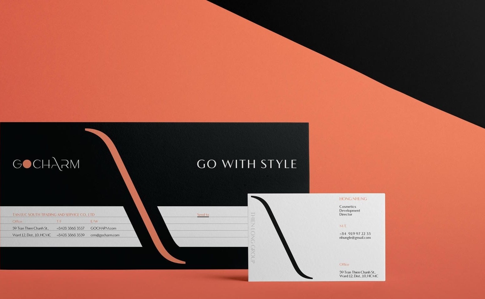
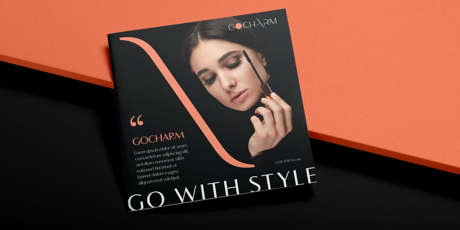
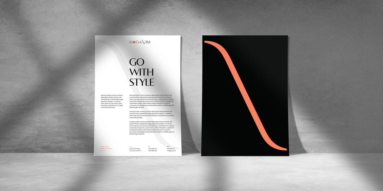
GOCHARM is the beauty brand of Thien Long Group. FreshBrand pulled the curve of the letter A in the logo out as the main graphic element and let it run diagonally across letterhead, business cards, shopping bags and other printed pieces, in a palette of black, white and coral orange.
When a brand has to represent many groups of members
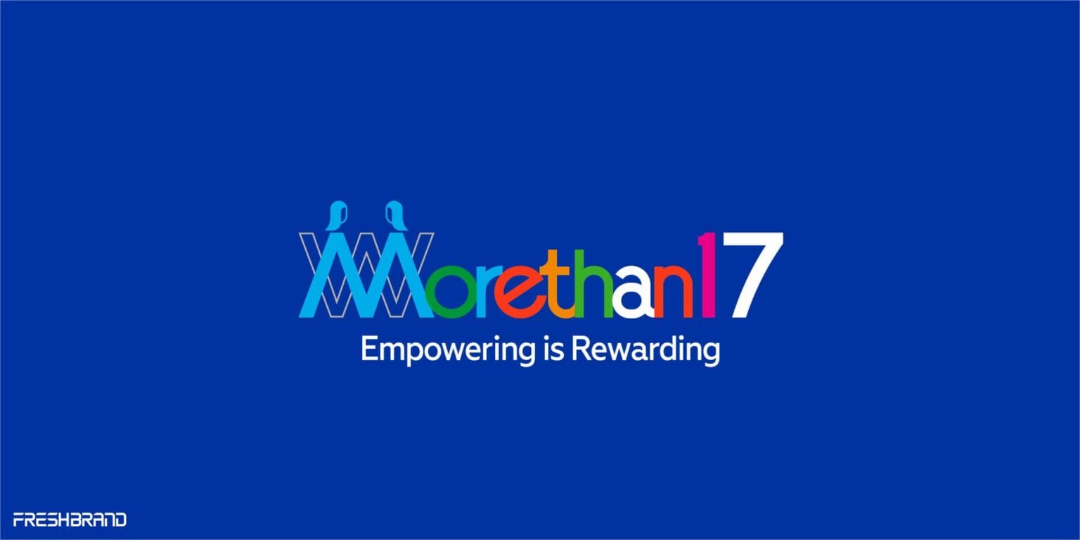
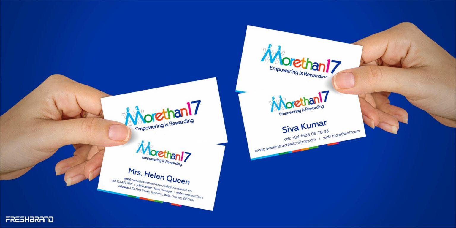
Morethan17 is a community in Canada whose members come from many cultures. A palette of eight colors, each representing a field, keeps the brand open; a deep blue ground makes it serious enough.
When a brand needs to feel luxurious with very few elements
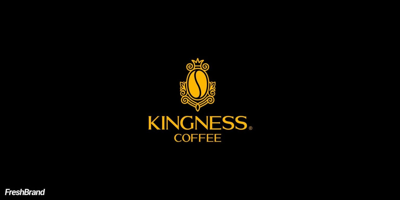
Kingness Coffee uses only two colors, black and gold. The crown-and-coffee-bean emblem is multiplied into a mesh pattern that covers the packaging like woven silk, so just two colors and one repeating pattern are enough for the brand to be recognized.
When the material is also the identity
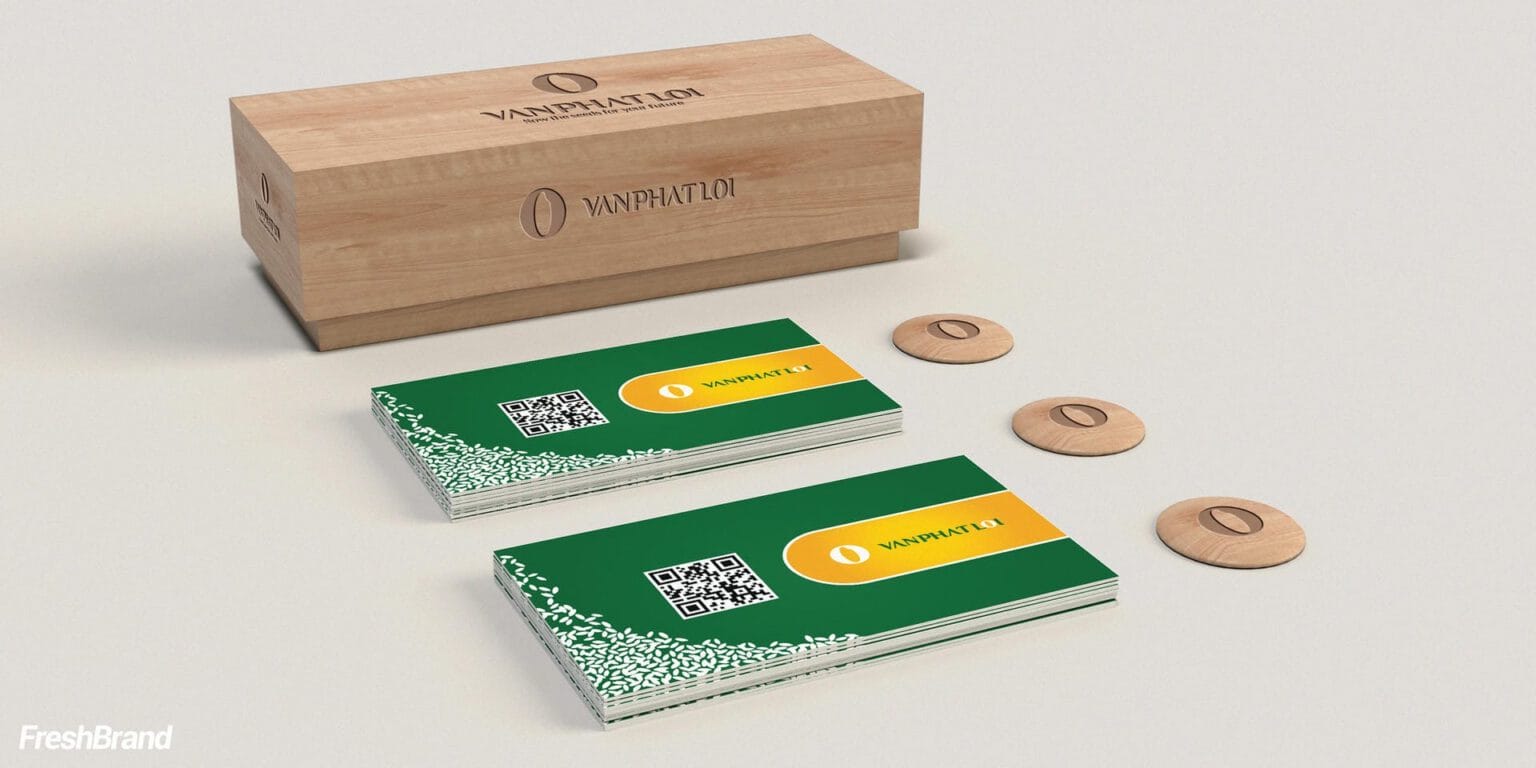
The Van Phat Loi printed set is made on bare wood, so the natural, safe feeling of a rice brand can be touched and not only seen. At large scale, the rice-grain symbol is multiplied into a pattern for the meeting room wall and runs along the body of a container truck.
How FreshBrand works
FreshBrand builds an identity from a small number of elements, tests it on real applications and only then writes it down as standards, through the five questions below.
Where is the brand now?
We start with the strategy, the logo and the places where the brand will appear, then look at the printed materials and signage already in use to see what is fragmenting the brand.
What elements does the system need?
From the logo, a complete identity grows into three groups of elements, typography, color and graphics, along with a first group of applications, printed materials.
TypographyPrimary and secondary typefaces for headlines, body text and screens
ColorPrimary and secondary colors, and the proportion in which each is used
GraphicsPatterns, lines and the way imagery is used
Printed materialsBusiness cards, letterhead, envelopes and other basic applications
What do we choose?
The system is kept to a few elements, so the brand is always recognized yet stays flexible enough for new applications.
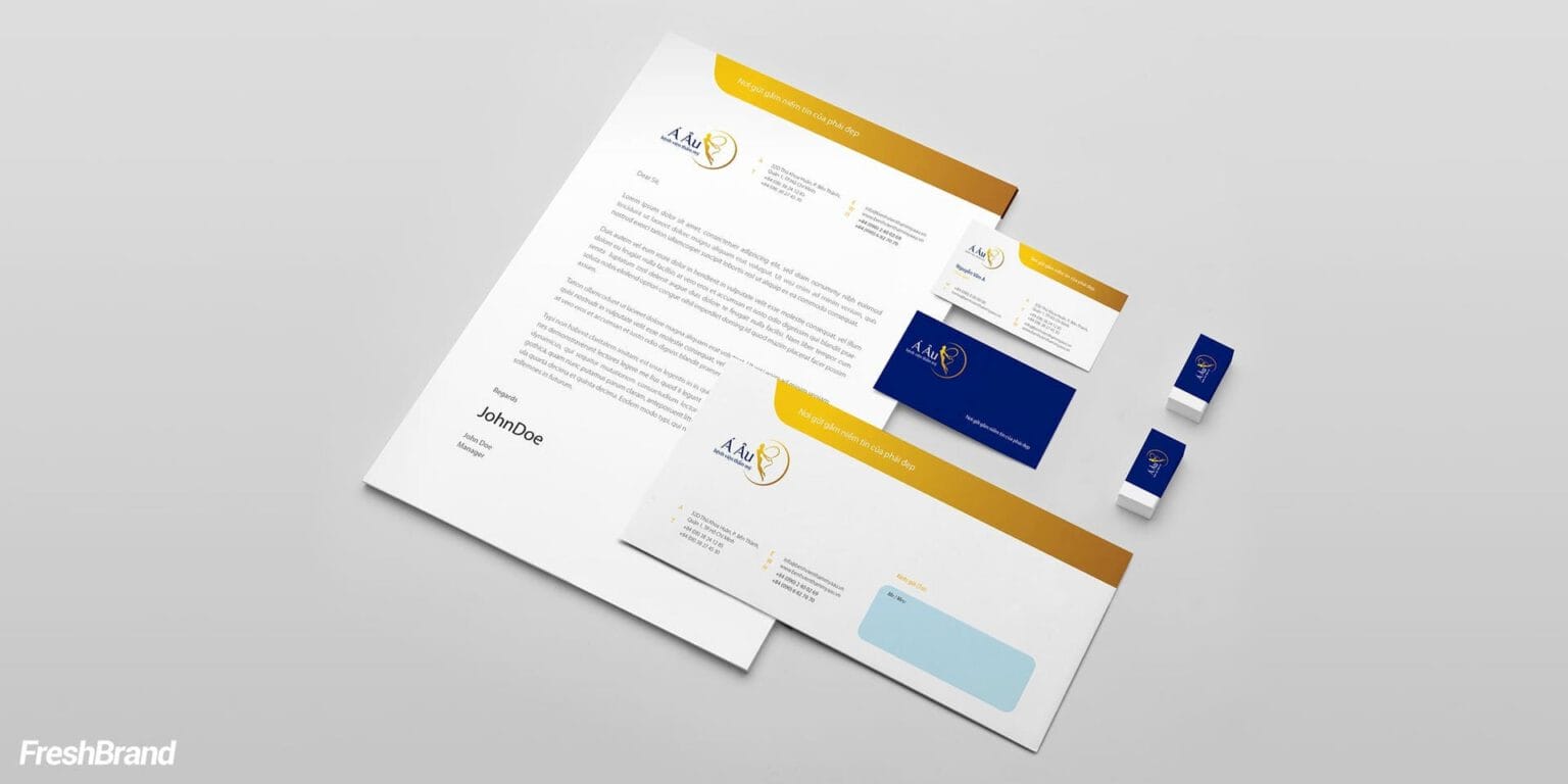
One lead elementLike the curve of GOCHARM or the gold band of A Au
A clear paletteJust enough colors for each to hold a role, and every color has specifications for both print and screen
Rules of combinationHow the logo, type, color and graphics sit together on every format
How is the identity finished?
FreshBrand tests the identity on real applications, from office stationery to signage and screens, then compiles it into a standards document and a set of master files, so the team, printers and contractors can use it correctly the next time.
What will actually change?
The brand shows up as one brand everywhere it appears, and new applications that come later are done right from the start, without being designed from scratch.
What the business keeps
The identity elements are handed over together with the rules for using them, so whoever works on the brand next does not have to guess its intent.
- The logo and its usage versions.
- The typography, color and graphic language systems, with rules of combination.
- The office stationery set and basic applications.
- An identity standards document for consistent rollout.
- Master files for print, fabrication and screen.
Typography system
Typography is what customers have to read at most touchpoints, so it needs a voice of its own while staying clear at every size.
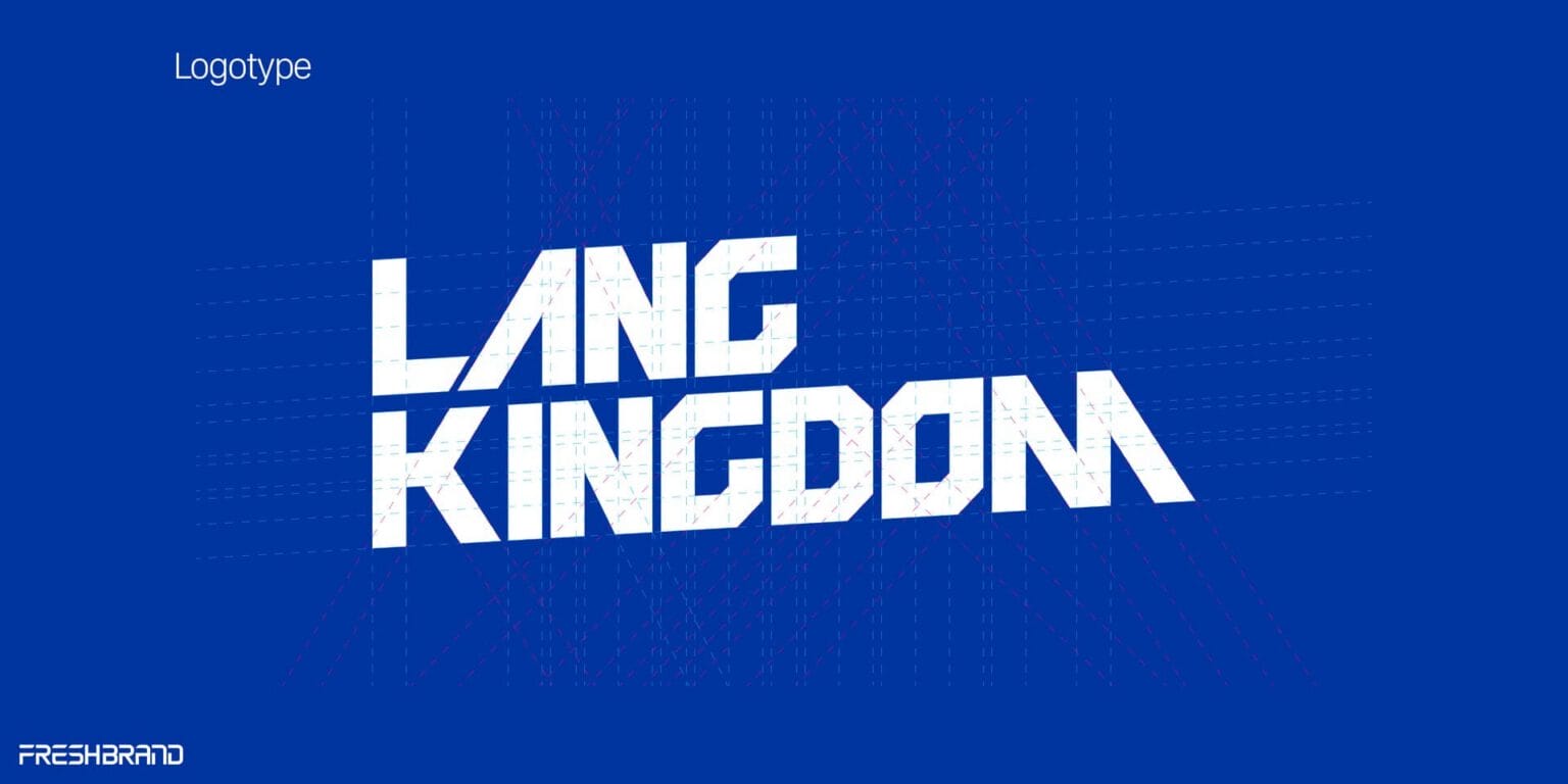
- Logotype: Custom drawn or refined, like the angular, sturdy LANG KINGDOM lettering that balances the multicolor symbol.
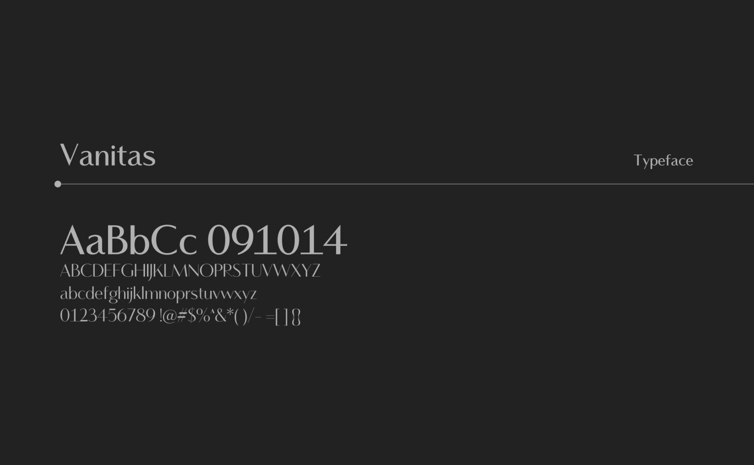
- Primary typeface: Used for headlines and the lines a brand wants to say loudly, like Vanitas for GOCHARM.
- Secondary typeface: Used for long text, easy to read on paper and on screen, with full Vietnamese support.
Color system
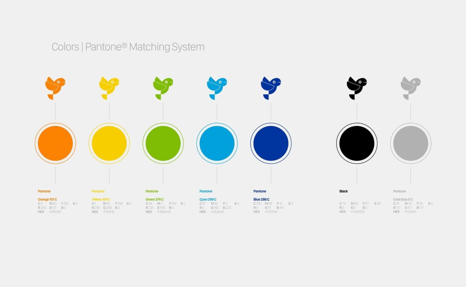
Color is the element customers recognize first, so every color needs a reason for being chosen and comes with specifications that make print and screen produce a consistent color.
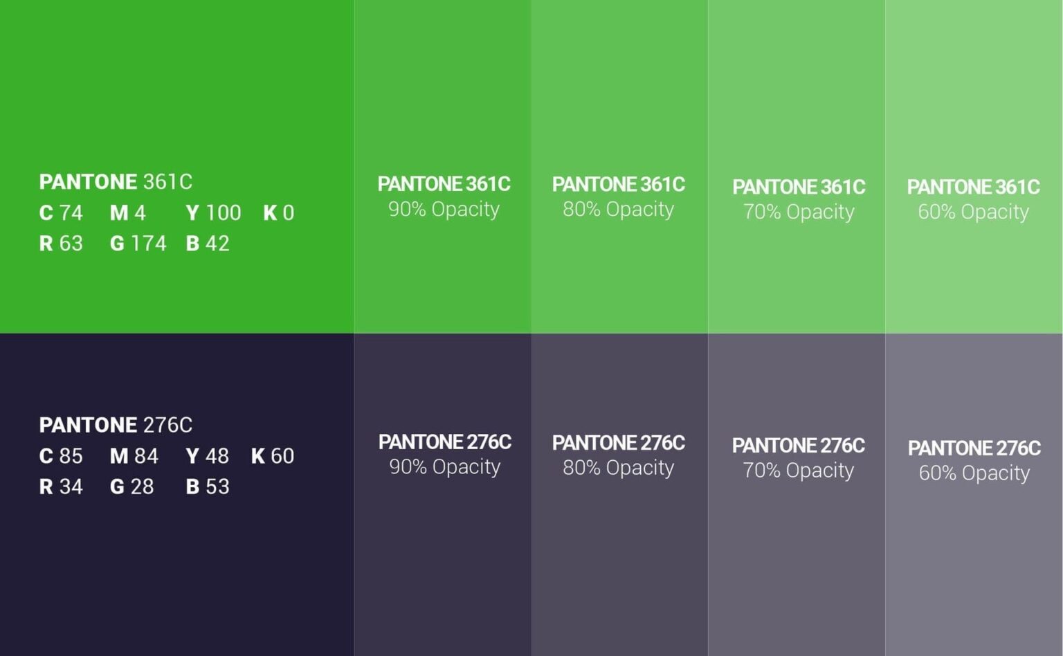
- Primary colors: One or two colors that carry the brand, like Pantone 361C and 276C for Lasuco.
- Secondary colors: Colors that go alongside, for different product lines or kinds of content.
- Specifications: Pantone, CMYK, RGB and screen color codes, with the permitted tints.
Graphic language
A graphic language is the set of visible details beyond the logo: a line, a pattern, a way of placing imagery.
- Lead element: A detail pulled out of the logo, like the curve of the letter A in GOCHARM.
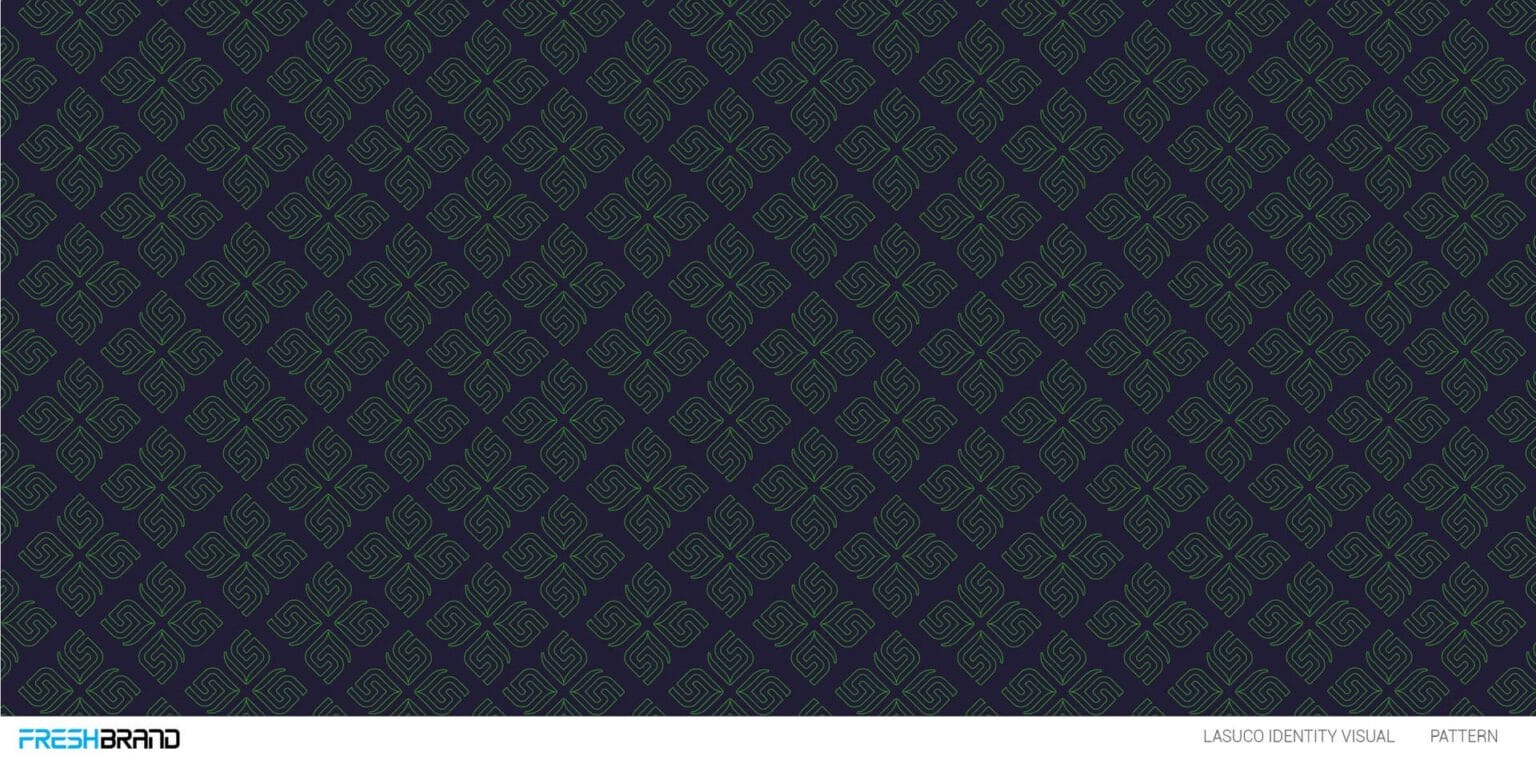
- Pattern: The symbol multiplied into a ground, like the Lasuco pattern or the emblem mesh of Kingness.
- Imagery: How photos are chosen and placed, like the real faces always at the center of Morethan17.
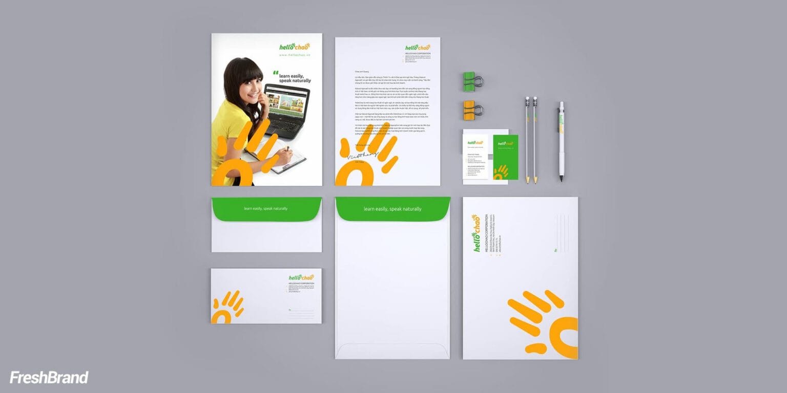
Office stationery
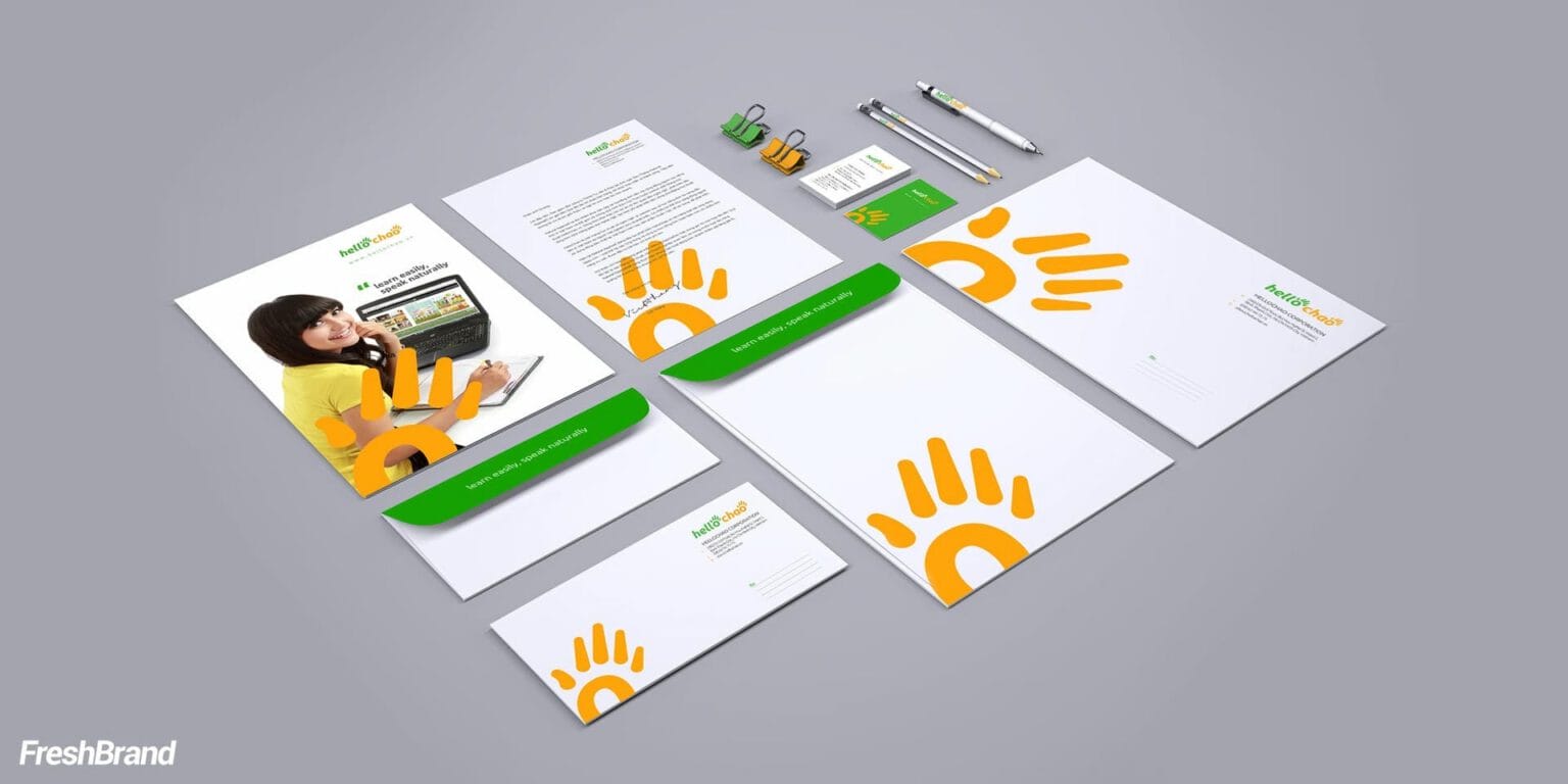
Office stationery is where a brand meets its partners every day, so a consistent set says something about the care a business takes before a meeting even begins.
- The basic set: Business cards, letterhead, envelopes and folders.
- One repeated detail: Like the half-cropped orange hand in the page corner for HelloChao.
- Extended applications: Notebooks, staff cards, paper bags and the items a business uses often.
Let's talk
Is your business facing a similar question? Send a request to talk with FreshBrand, or download the portfolio to see more of our work.

In practice
Lang KingdomLogo and identity system
When five colors and one parrot make a whole system
Lang Kingdom is an online and offline English-learning platform. The brand needed to be dynamic and modern like a learning platform while still feeling reliable and stable, and its identity system had to be consistent at every touchpoint with learners.
“A good symbol is not only seen. It makes people want to begin.”
From a character that is creative, witty, approachable and flexible, FreshBrand chose the parrot, the animal best at communicating, and built it from simple geometric shapes. The palette comes straight from its feathers: orange, yellow, green, sky blue and deep blue, while the LANG KINGDOM lettering is custom drawn, angular and sturdy.
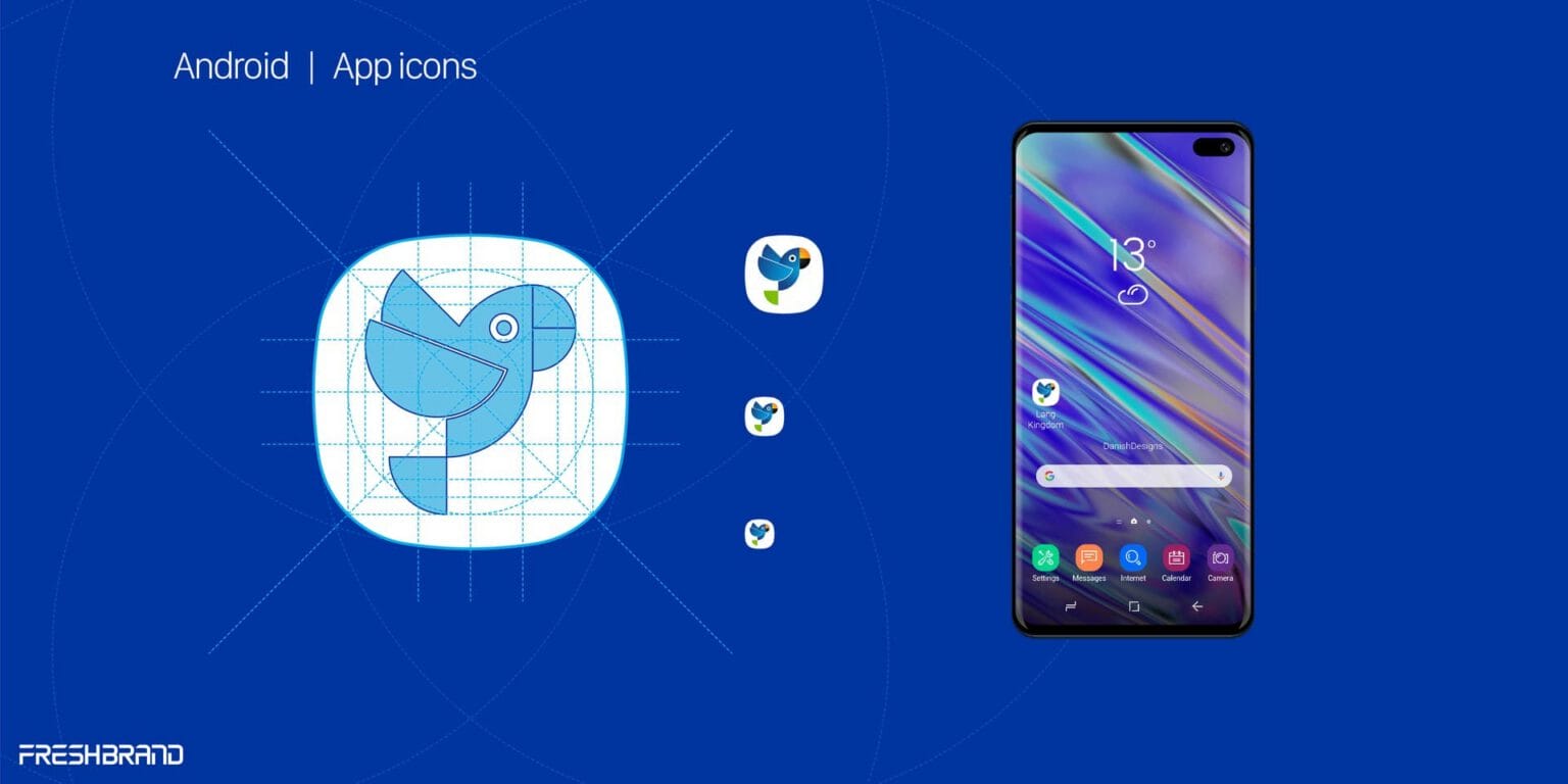
The parrot has many poses to serve as a mascot, is multiplied into a pattern and reduced to an app icon. This makes the system playful enough to attract learners and tight enough to keep their trust: from business cards, paper cups and uniforms to screens, there is always a large block of color and a parrot looking out.
The question behind it
An identity starts from the right logo, is written down as standards and is carried onto the business’s most important applications.
FreshBrand capabilities
Strategy
When a brand needs a direction
Identity
When a brand needs to be recognized
- Logo Design
- Brand Identity Design
- Brand Guidelines
- Tagline & Brand Messaging
Expression
When meaning needs to take shape
Experience
When a brand needs to be felt
Communication
When a brand needs to be understood
Start with FreshBrand
Send us the problem, get a point of view.
You can send a request today, or download the portfolio to share with your leadership before we talk.