
Packaging Design
When meaning needs to take shape
On a shelf, no one stands next to a product to introduce it, but its packaging can speak for the whole brand.
FreshBrand designs packaging and labels for a single product or a whole product line, from structure, imagery and color to the information on the label. The aim is for a product to get chosen from a crowded shelf and still meet standards in production.
Perspective
Much packaging is designed one piece at a time: a new look for each new product, and a printer making its own adjustments with each run. Every pack may look good on its own, but side by side on the shelf no one can tell they come from the same house.
Good packaging starts with the shopper standing in front of the shelf, who needs to recognize the brand, find the right variety and trust what is inside. To recognize the brand, the fixed part has to stay the same on every pack, and to find the right variety, the variable part has to be clear enough; that is why FreshBrand designs packaging as a system of those two parts, so the whole range speaks in one voice.
For FreshBrand, packaging is the touchpoint customers hold in their hands, so it has to carry the brand’s identity and not just contain the product.
When to start here
Businesses usually rethink their packaging when they launch a new product, extend a product line, or see that the packaging they use no longer holds its own on the shelf.
When a product has to stand out on a crowded shelf
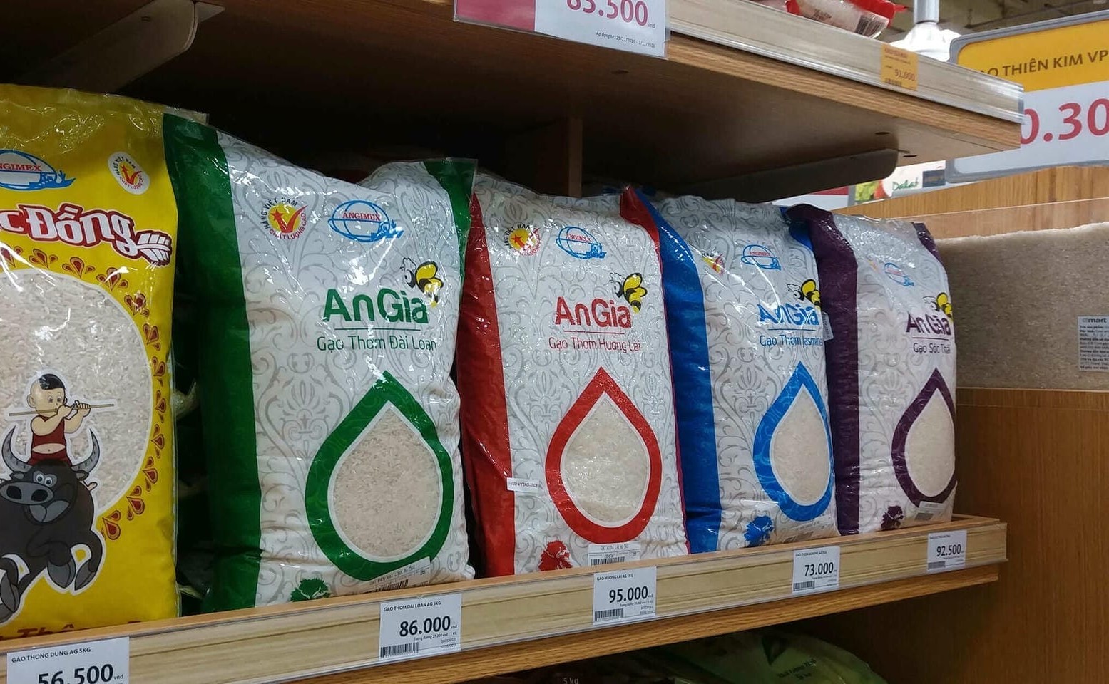
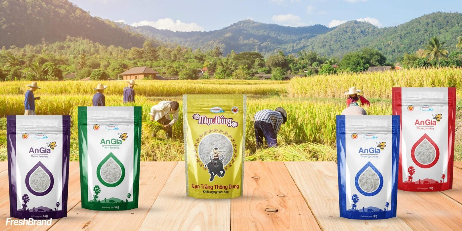
Among dozens of rice bags of the same size, shoppers may only glance along the shelf. So each AnGia and Muc Dong rice bag has a clear, water-drop-shaped window that shows the rice itself, while each variety keeps its own border color on the same layout; on the shelf the windows line up into a band that is easy to recognize, and the border colors help shoppers find the familiar variety.
When many products need to be one family
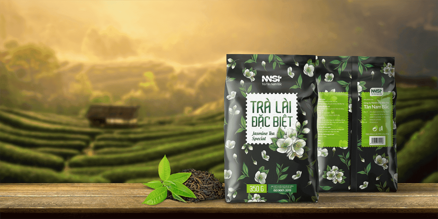
For NNST, the parent brand leads across everything from tins and wooden gift boxes to tea bags. Tra Lai Dac Biet carries hand-drawn jasmine flowers on a midnight blue ground, while Hong Tra switches to a deep red; the colors differ, yet it is clear they belong to one family.
When a product needs to be chosen as a gift
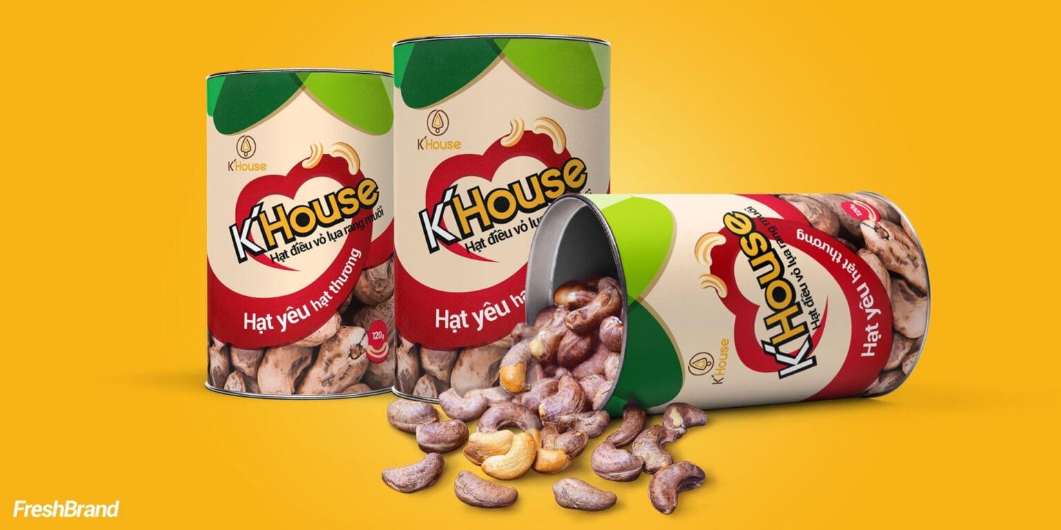
K’House packaging places the logo inside a red heart with the message “Hat yeu hat thuong” (roughly, “nuts to love and to cherish”), along with a clear window that shows cashews still in their silky skins. That way, Vietnamese cashews get chosen as a gift and not just as a snack.
When each flavor needs a face of its own
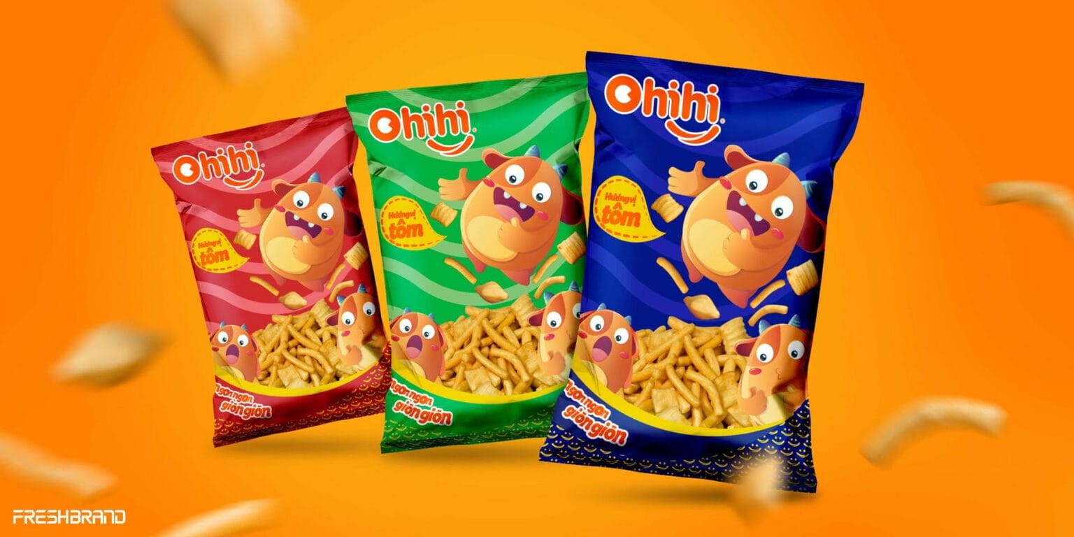
Ohihi has a little orange monster with plenty of moods. Each snack pack has its own background color and the monster in a different pose, so the whole line is unified and still easy to pick the right flavor from.
How FreshBrand works
FreshBrand decides packaging from the side of the shopper standing in front of the shelf, and only then turns to imagery and print specifications, through the five questions below.
Where is the brand now?
We start with the product, the shopper and where the product is sold, such as a supermarket shelf, a shop or the gift channel. Then we look at the products that sit next to it, the identity system and the existing packaging.
What does the packaging need to do?
From there, FreshBrand defines what the packaging has to do, in order of priority.
VisibilityHelps the product get noticed among others of its kind on the shelf
DifferentiationHelps shoppers pick the right flavor and variety across the whole line
InformationHelps shoppers read all the required information right at the counter
ProductionHelps the packaging fit its materials, pack format and printing method
What do we choose?
FreshBrand separates packaging into three distinct layers of decisions, so the product line can grow without starting over.
Fixed partThe logo, structure and placement of information stay the same on every pack
Variable partColor, imagery and name change with each flavor and each line
Focal pointWhat the shopper sees first, such as real grains of rice or real cashews
How is the design finished?
FreshBrand lays the design onto the exact die-cut and specifications of each type of packaging, checks color and detail against test prints, then hands over print-ready files with an application guide so later products still follow the system.
What will really change?
What is most worth checking is whether shoppers recognize the brand and choose the right product right at the shelf, while the business adds new products and the whole line still looks like one family.
What the business keeps
The product line will add new flavors after the project, so depending on the scope, the business receives both the packaging and the tools to extend it on its own:
- Packaging designs for each product and each pack format.
- A packaging system with fixed and variable parts for the whole product line.
- Labels with all the required content.
- Print-ready files built to the die-cut, with color and material specifications.
- An application guide for designing packaging for new products.
Label design
For many products the label is the only part that carries the brand, so it has to be recognizable from a distance and readable in the hand.
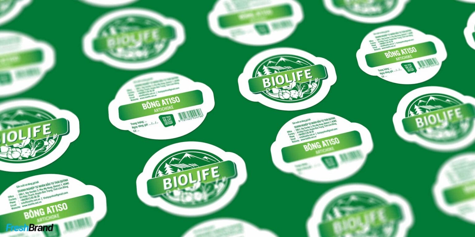
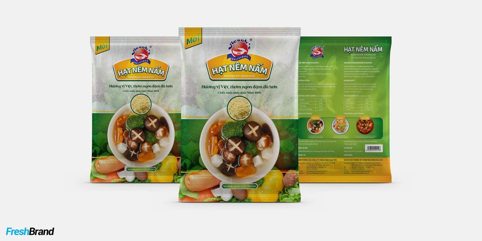
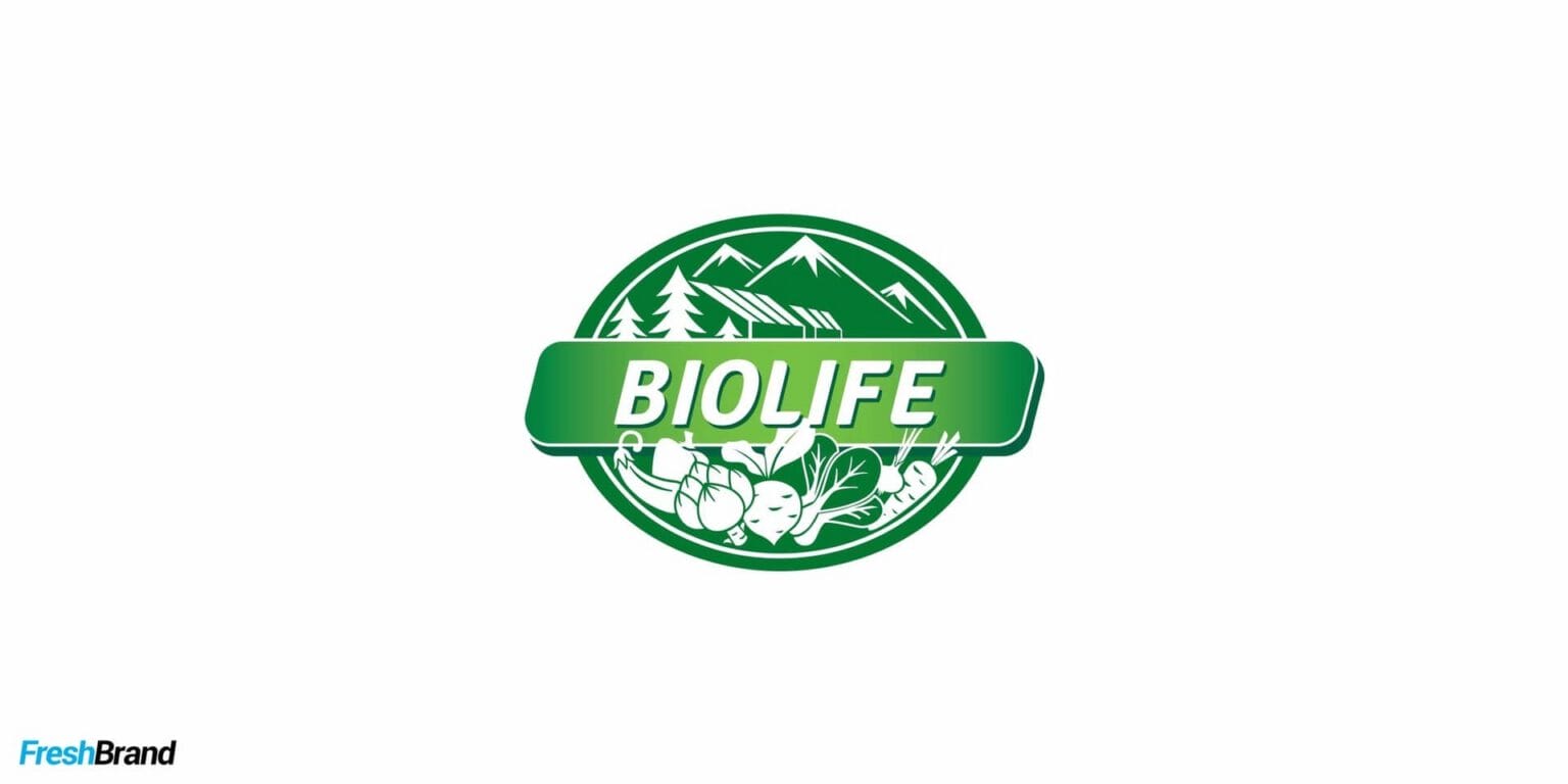
- Label system: One shared layout for the whole line, like the Biolife labels, which keep the seal, the green band and the product name area fixed.
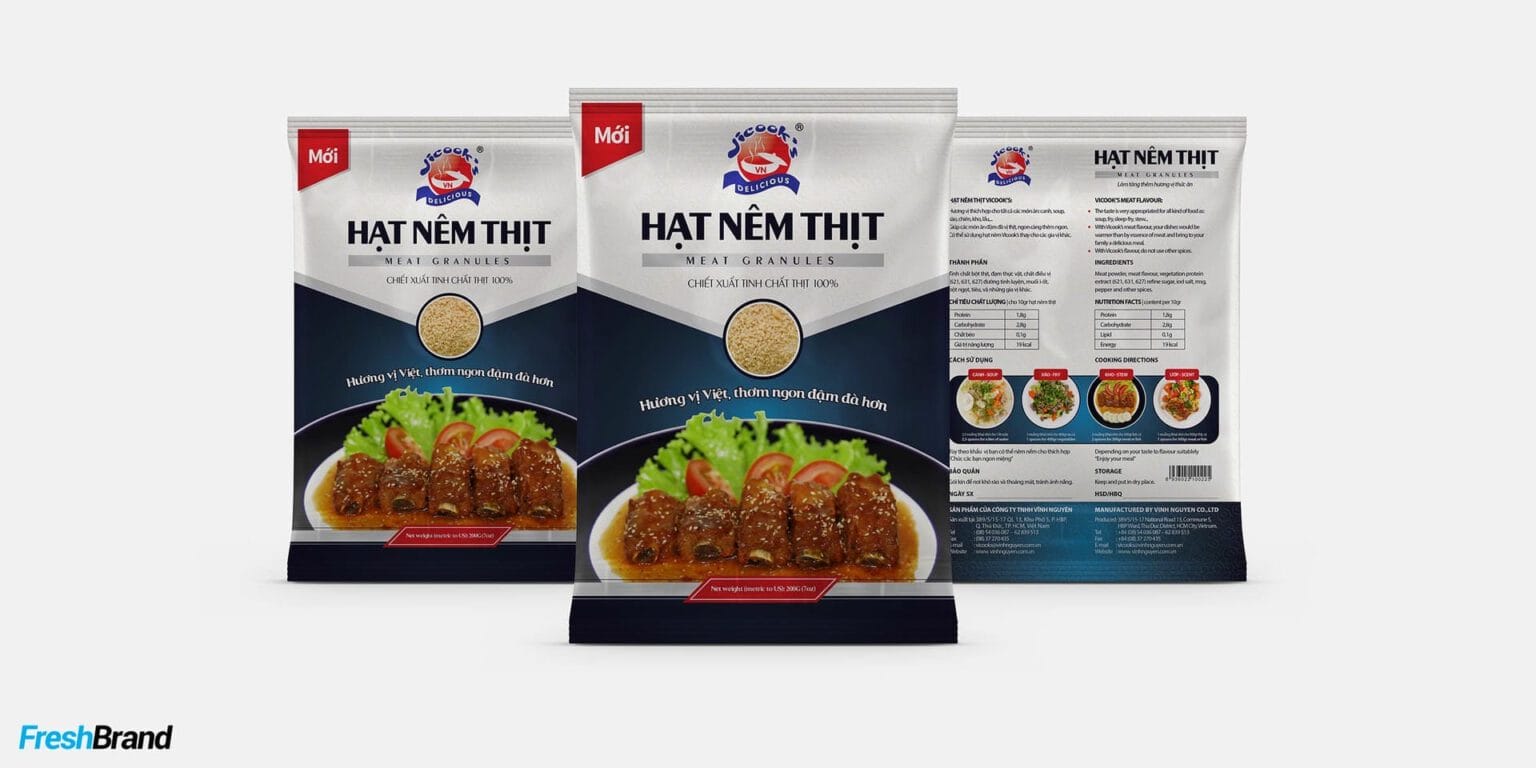
- Back of pack: Ingredients, directions for use and required information arranged to be easy to read, like the backs of the Vinh Nguyen seasoning packs.
- Labeling standards: Content and placement of information follow goods-labeling regulations, checked with the business before printing.
Print supervision
Packaging that looks good on screen can still come off the press with off colors or a misregistered die, so the last part of the design work is following it all the way to the finished product.
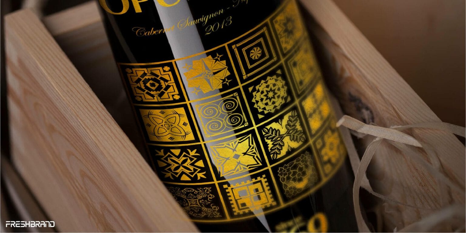
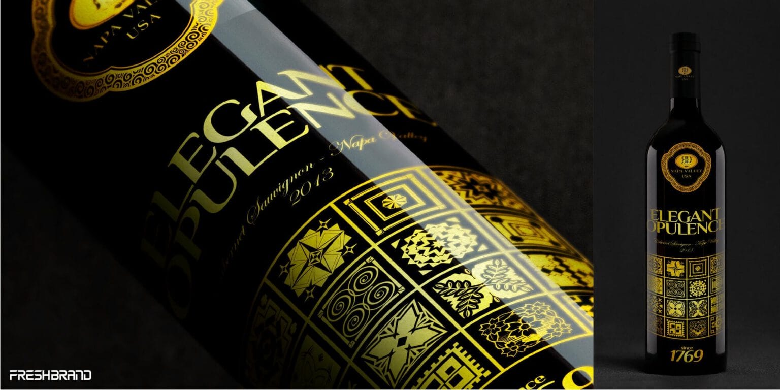
- Materials and effects: Advice on paper, film, glass, wood and finishing effects such as UV printing and foil stamping, for example on the RD – Napa Valley wine line.
- Test prints: Checking color, die-cut and small details on a real sample before the large run.
- Finished-product control: Comparing the finished product against the design files, so what reaches the shelf is what was approved.
Let's talk
Is your business facing a similar question? Send a request to talk with FreshBrand, or download the portfolio to see more of our work.
In practice
Kingness CoffeeNaming, identity and packaging
When packaging tells the story of coffee in engraved lines
Kingness Coffee is the coffee brand of Tra An Phat; FreshBrand named it and designed the logo, identity system, packaging and website for Kingness along a fresh, refined and luxurious direction, together with the message “Real coffee, real value.”
“Real coffee, real value. The brand only has to say exactly that, and say it beautifully.”
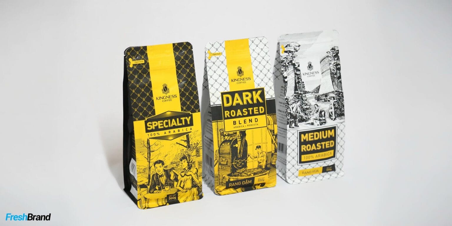
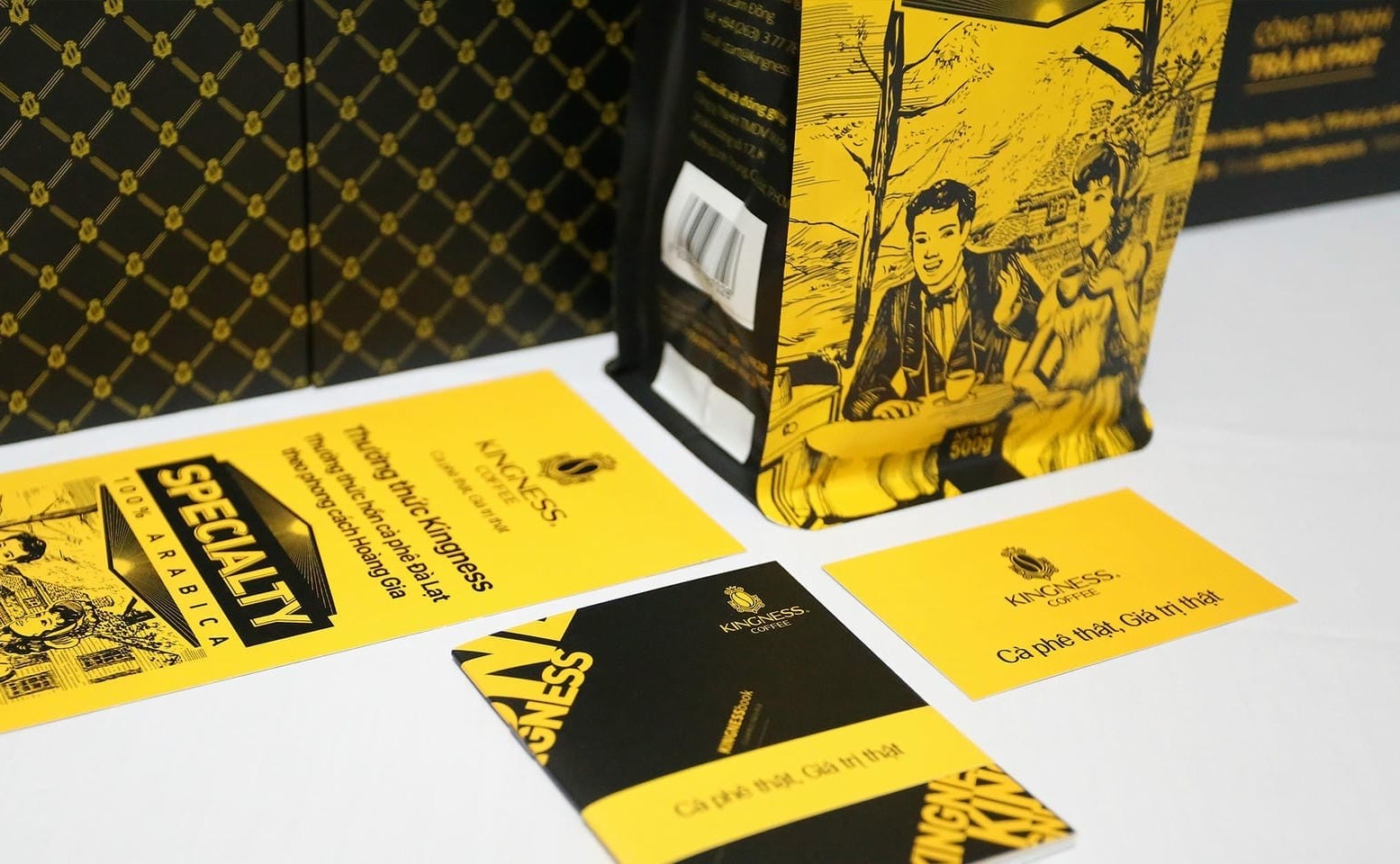
The packaging tells its story through engraved illustrations: the coffee picker, the roaster, scenes of life tied to the coffee bean. On the same black and gold ground, each line (Specialty, Dark Roasted, Medium Roasted and Drip Coffee) carries its own gold label, while the crest of a crown and a coffee bean is repeated into a mesh pattern that covers the packaging.
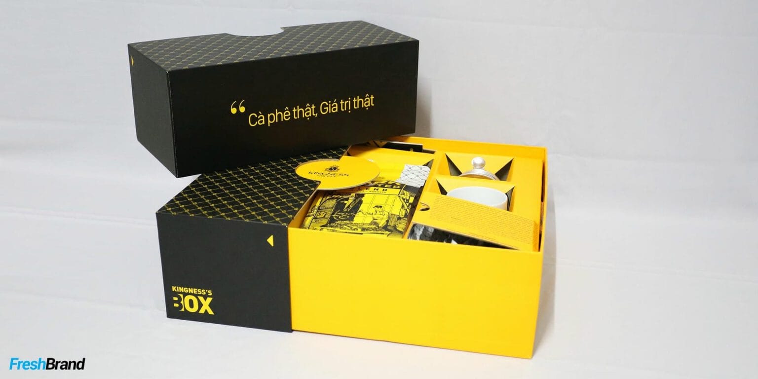
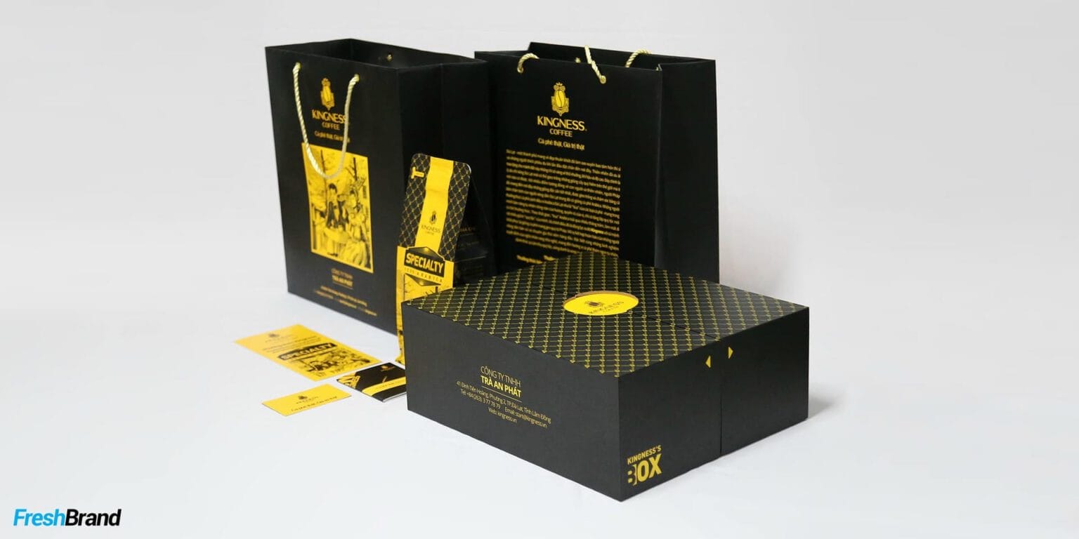
The gift box, kraft bag, paper cup and Kingness’s Box form a complete set, luxurious enough to give as a gift; the website keeps the language of the packaging with its black ground, gold areas and engraved illustrations, so shoppers meet the same brand whether on the shelf or on a screen.
The question behind it
A packaging line needs three things alongside it: an identity system as its footing, product imagery as its proof, and printed materials at the point of sale.
- Brand Identity Design
When packaging needs an identity system as the ground for color, type and image. - Corporate Photography & Film
When packaging needs real product photos for print and for selling online. - Communication Design
When a product needs POSM and point-of-sale printed materials to go with its packaging.
FreshBrand capabilities
Strategy
When a brand needs a direction
Identity
When a brand needs to be recognized
Expression
When meaning needs to take shape
- Packaging & Label Design
- Company Profile Design
- Brand Website Design
- Corporate Photography & Film
Experience
When a brand needs to be felt
Communication
When a brand needs to be understood
Start with FreshBrand
Send us the problem, get a point of view.
You can send a request today, or download the portfolio to share with your leadership before we talk.