
Kingness Coffee
A crown for the coffee bean.
- Client
- An Phat Tea

Overview
Kingness Coffee is the coffee brand of An Phat Tea.
FreshBrand named Kingness and designed its logo, identity system, packaging and website along a fresh, refined, luxurious direction, with the message “Real coffee, real value.”
Symbol
How did the idea take shape?
The emblem of a coffee bean
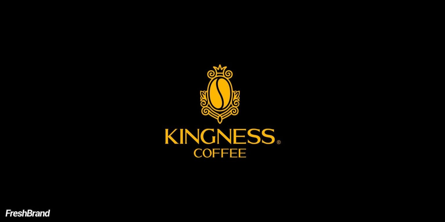
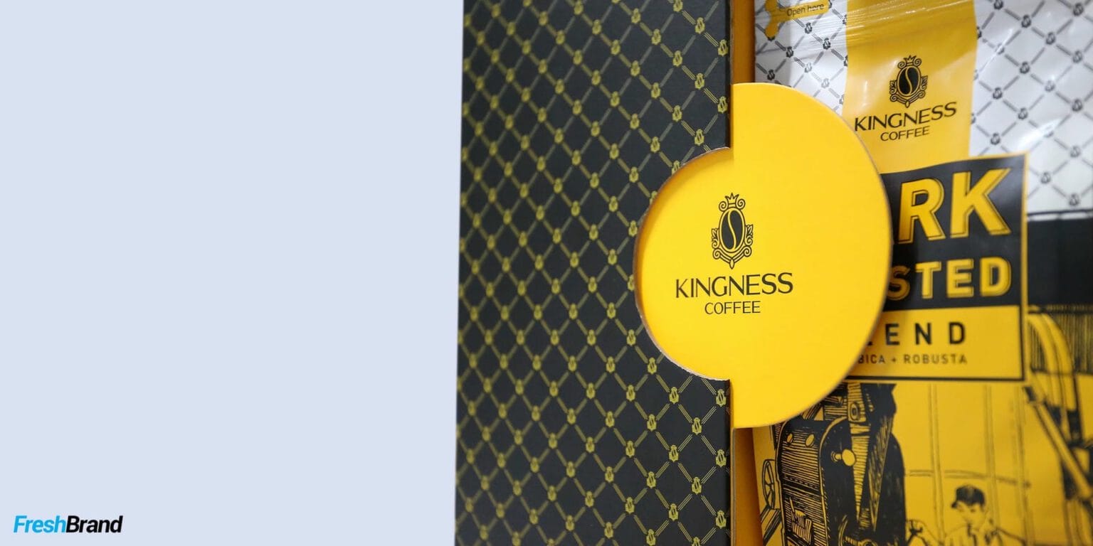
The symbol is a classic emblem: a crown above, a coffee bean in the middle, balanced ornament on either side. The word KINGNESS, set in a formal serif, sits beneath.
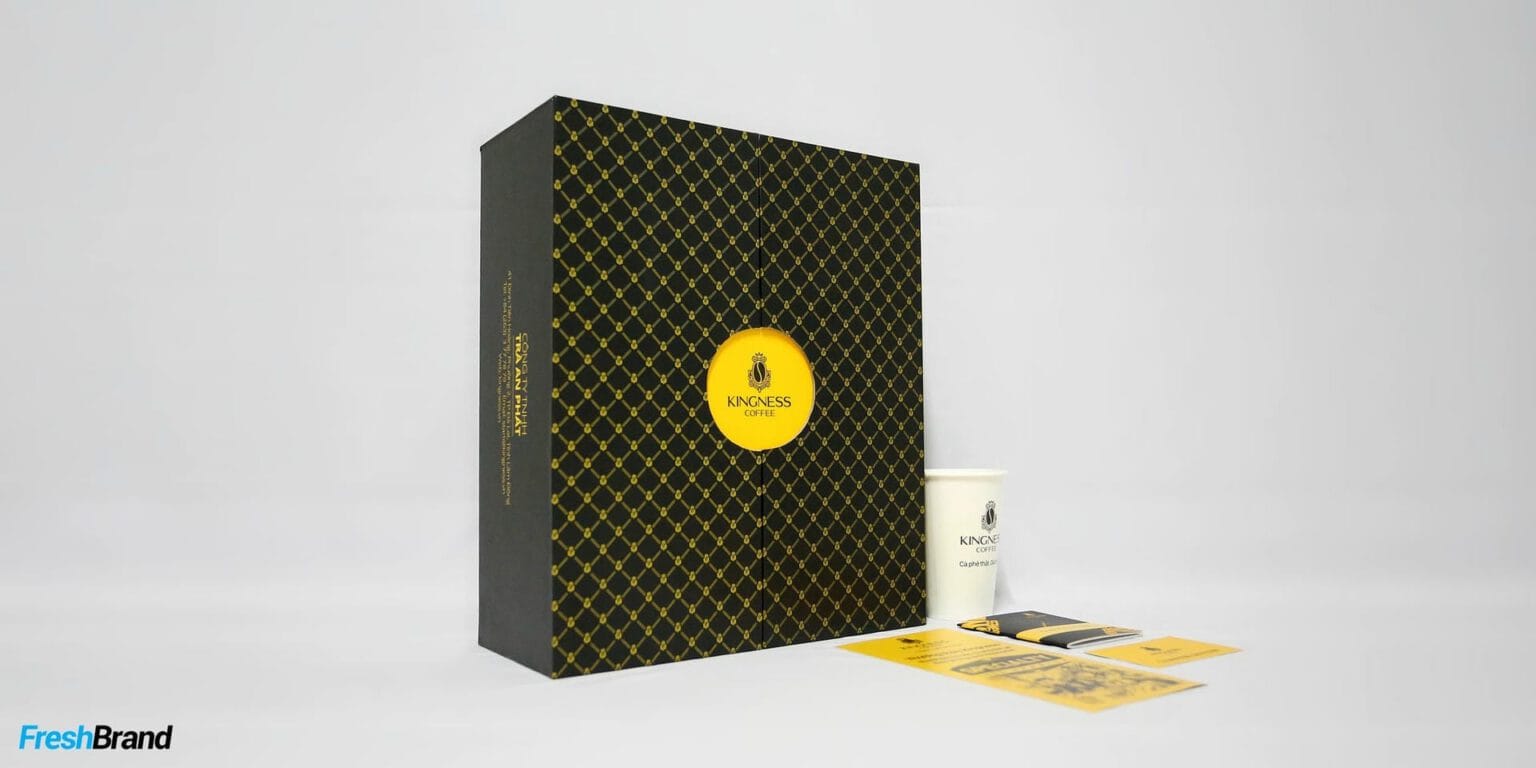
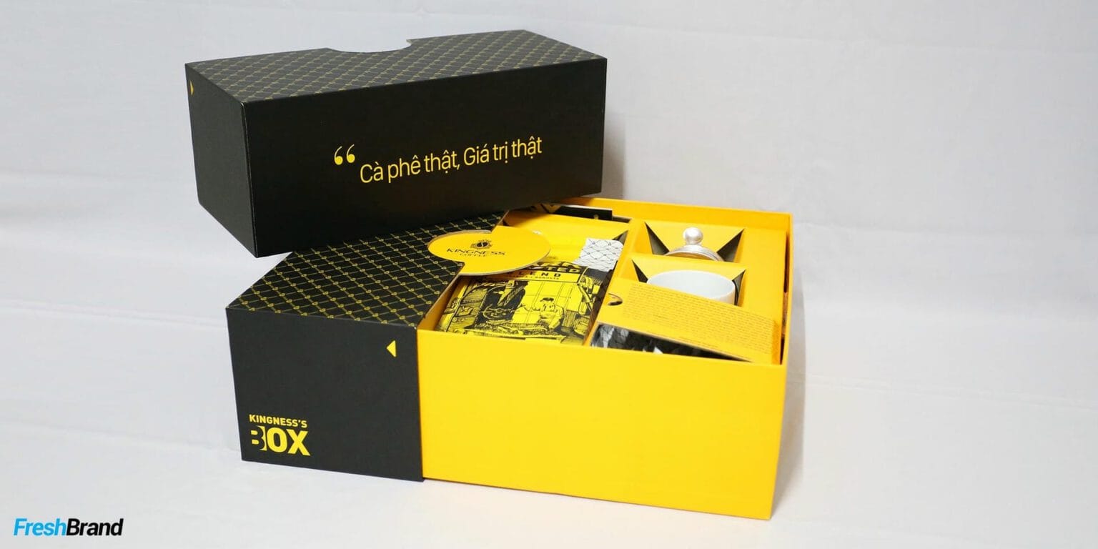
Black and gold are the only two colors. The emblem is multiplied into a mesh pattern that covers the packaging like woven silk.


Packaging
How does the product speak on the shelf?
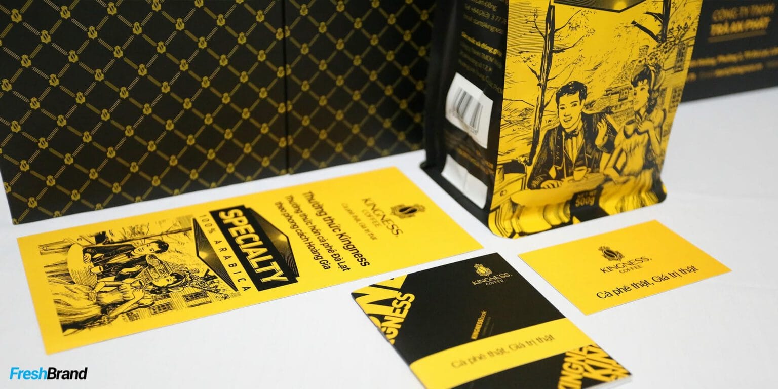
Telling the coffee story in engraving
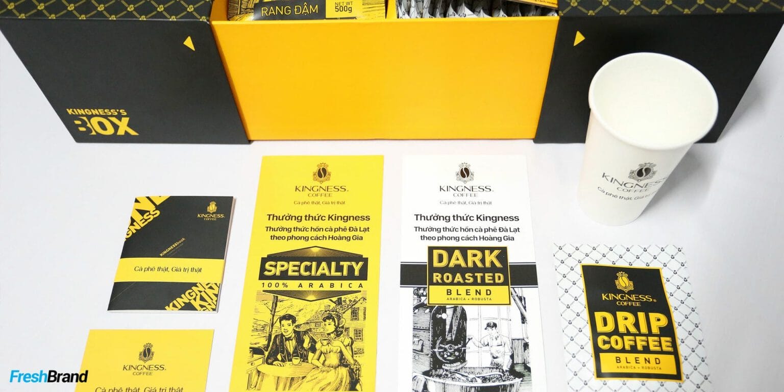
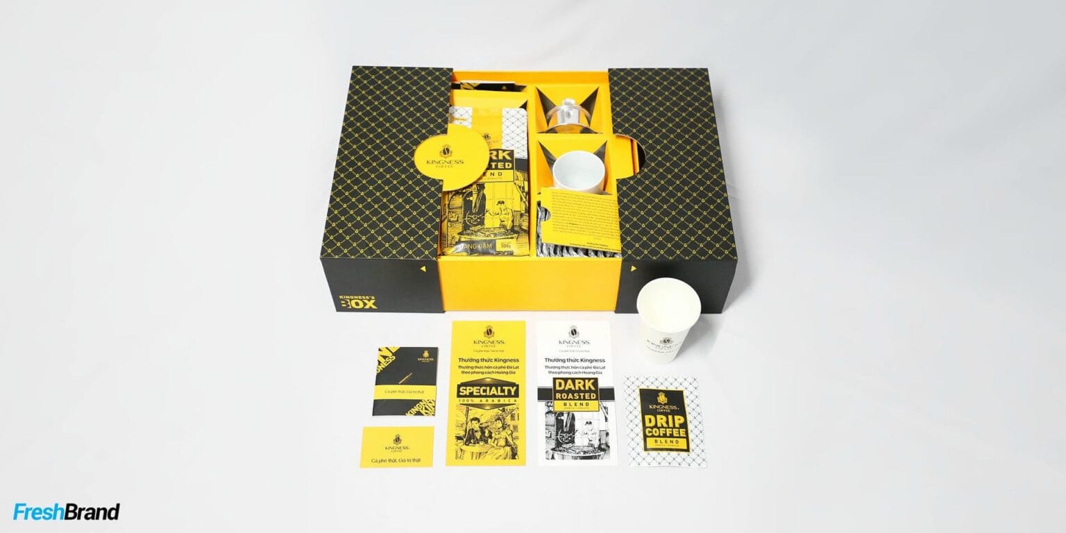
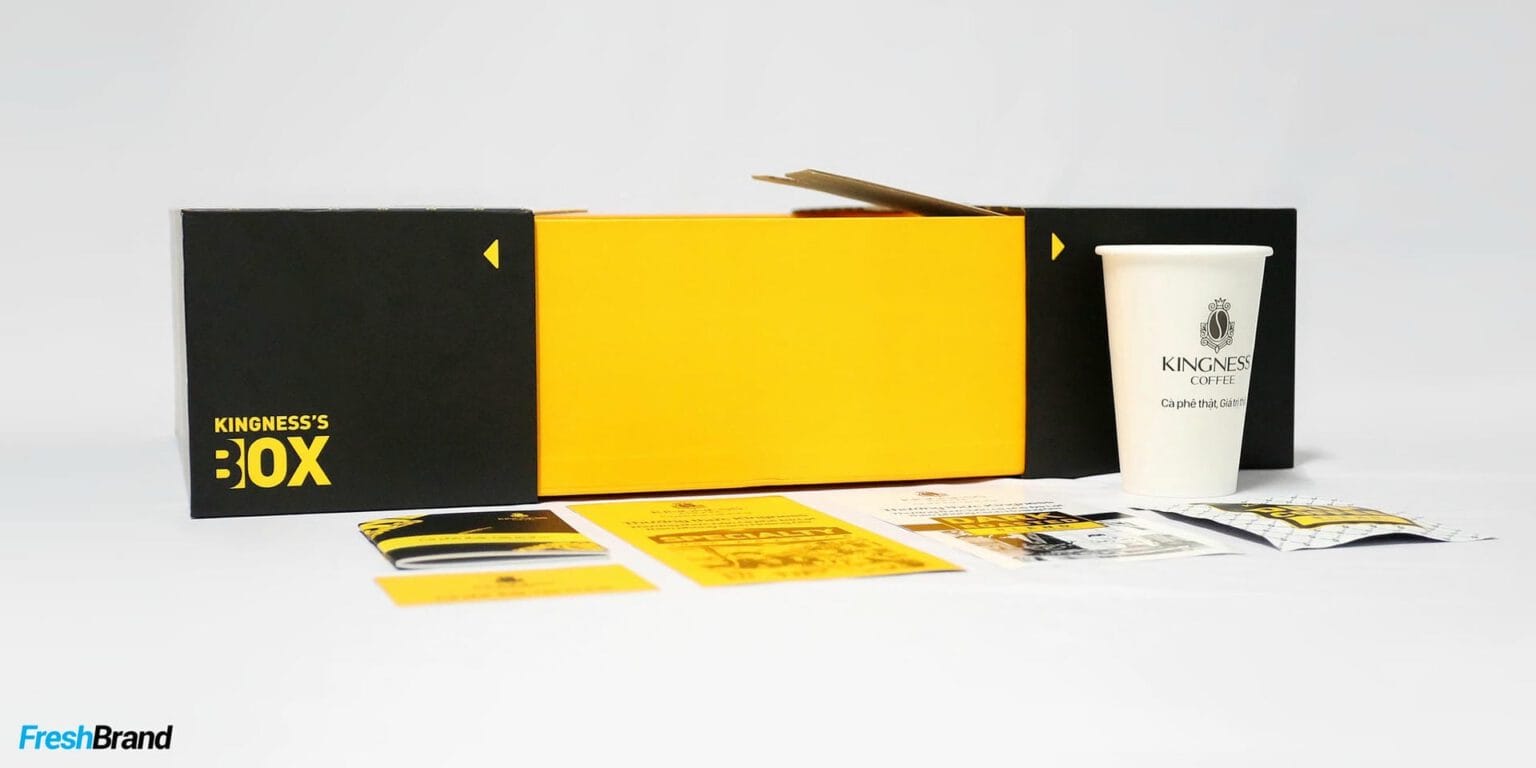
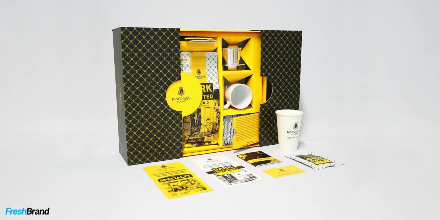
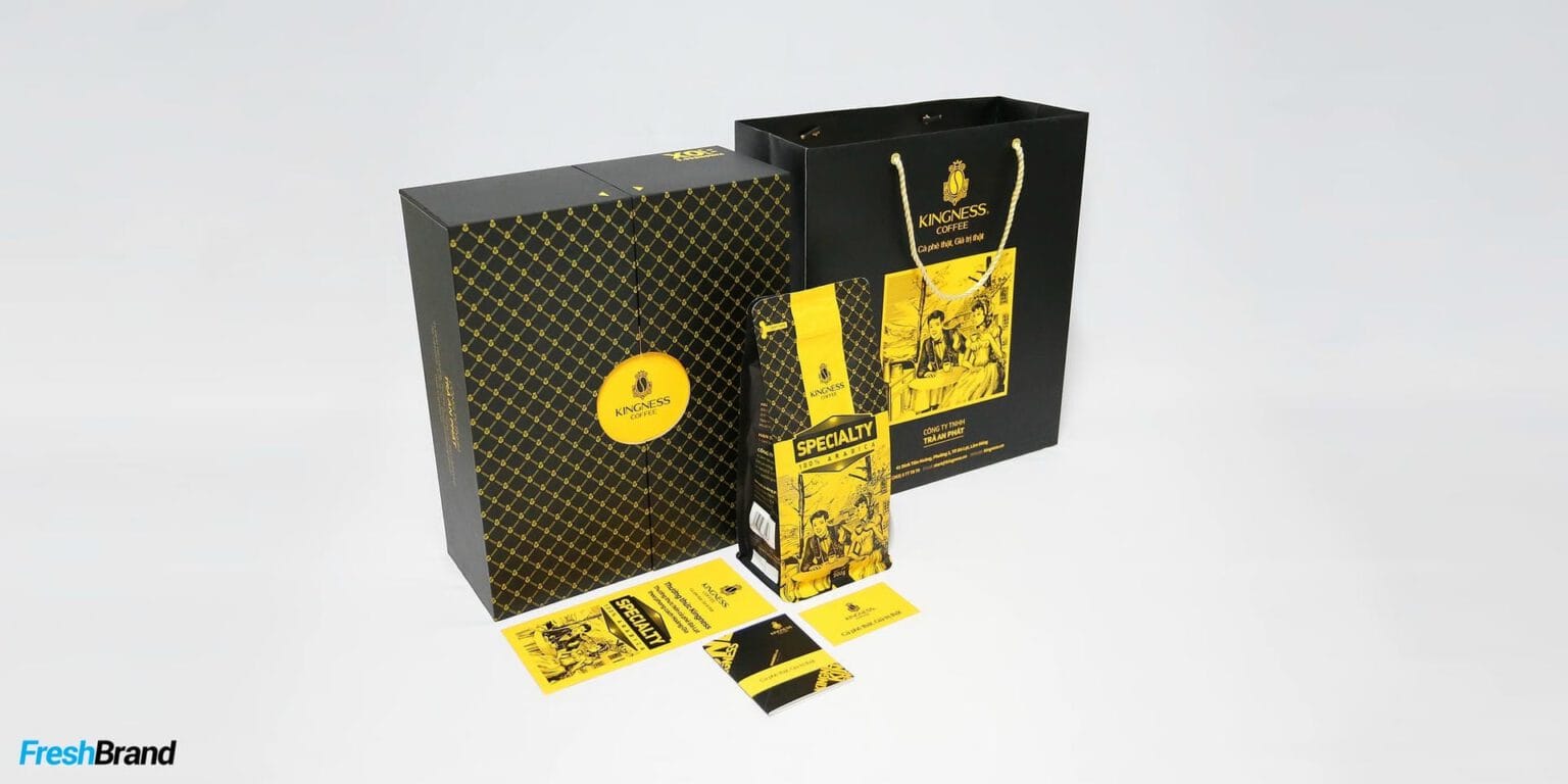
Kingness packaging tells its story through engraved illustrations: the coffee picker, the roaster, the scenes of life tied to the bean. Each product line (Specialty, Dark Roasted, Medium Roasted, Drip Coffee) carries its own gold label on the same ground.
The gift box, kraft bag, paper cup and Kingness’s Box form a complete set, luxurious enough to give as a gift.




Website
How does the brand live on screen?
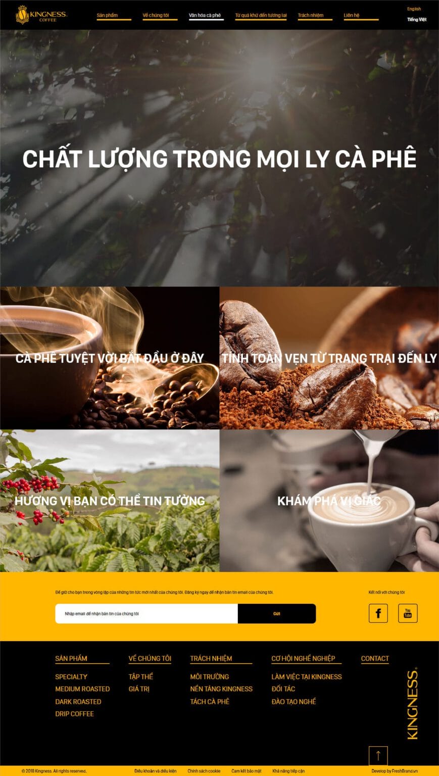
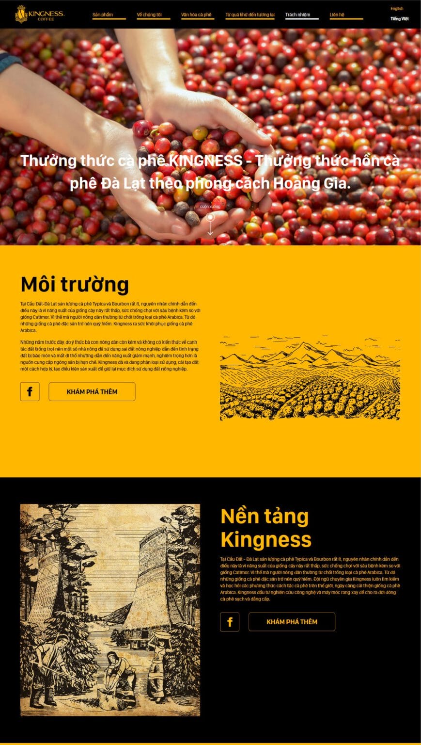
A website like a cup of black coffee
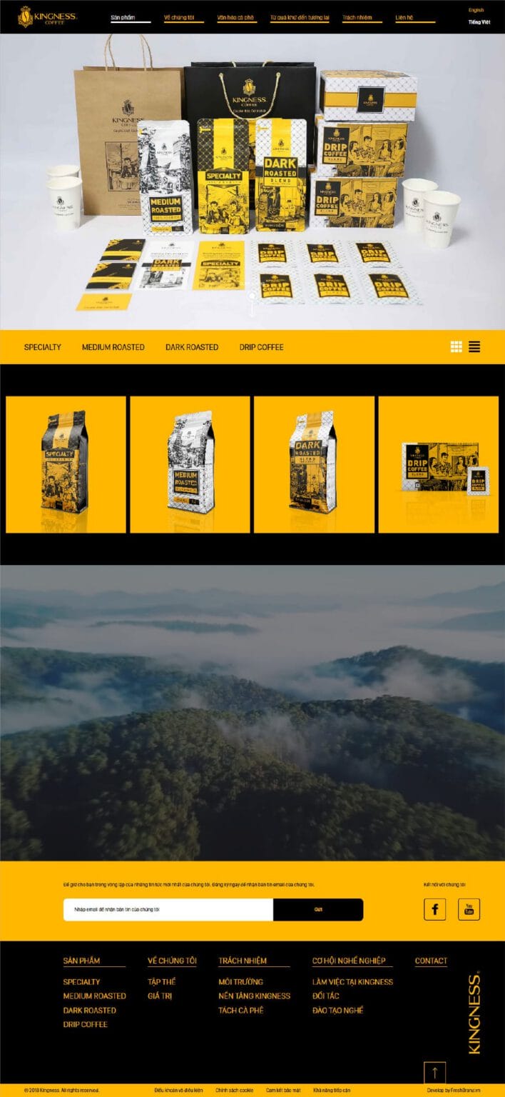
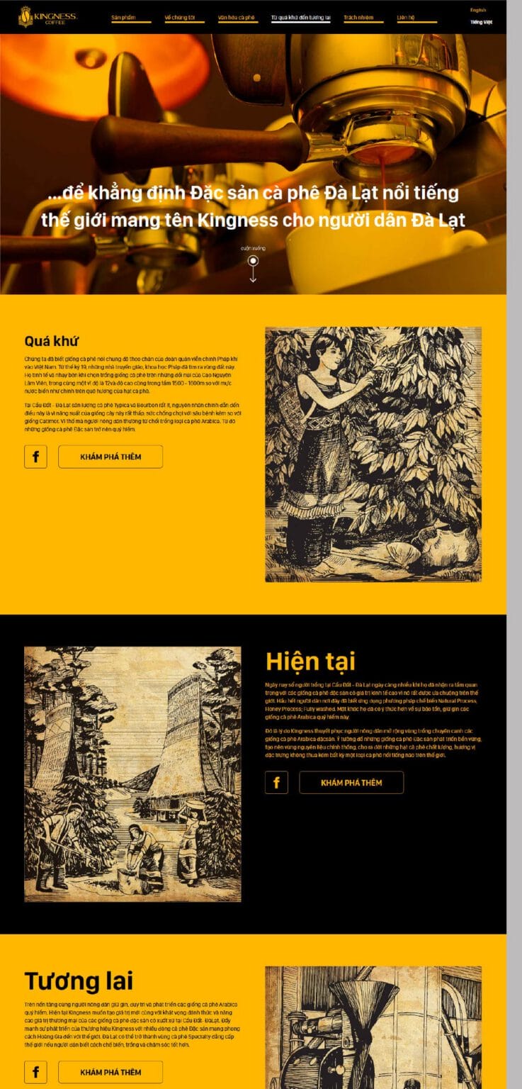
The website keeps the language of the packaging: black ground, gold areas, engraved illustrations. The story of Kingness’s quality, environment and foundations unfolds section by section, like a book turning its pages.

Real coffee, real value. The brand only had to say exactly that, and say it beautifully.
FreshBrand team
- Trần Anh Tú — Creative Director, Project Director, Design
- Hải Anh — Design
- Hồng Phong — Design
Project
- ClientAn Phat Tea
