
Qui Phuc
Identity renewal
2012
Every step leaves a footprint.
- Client
- Qui Phuc
- Year
- 2012
- Services
- Brand Identity Design, Logo Design
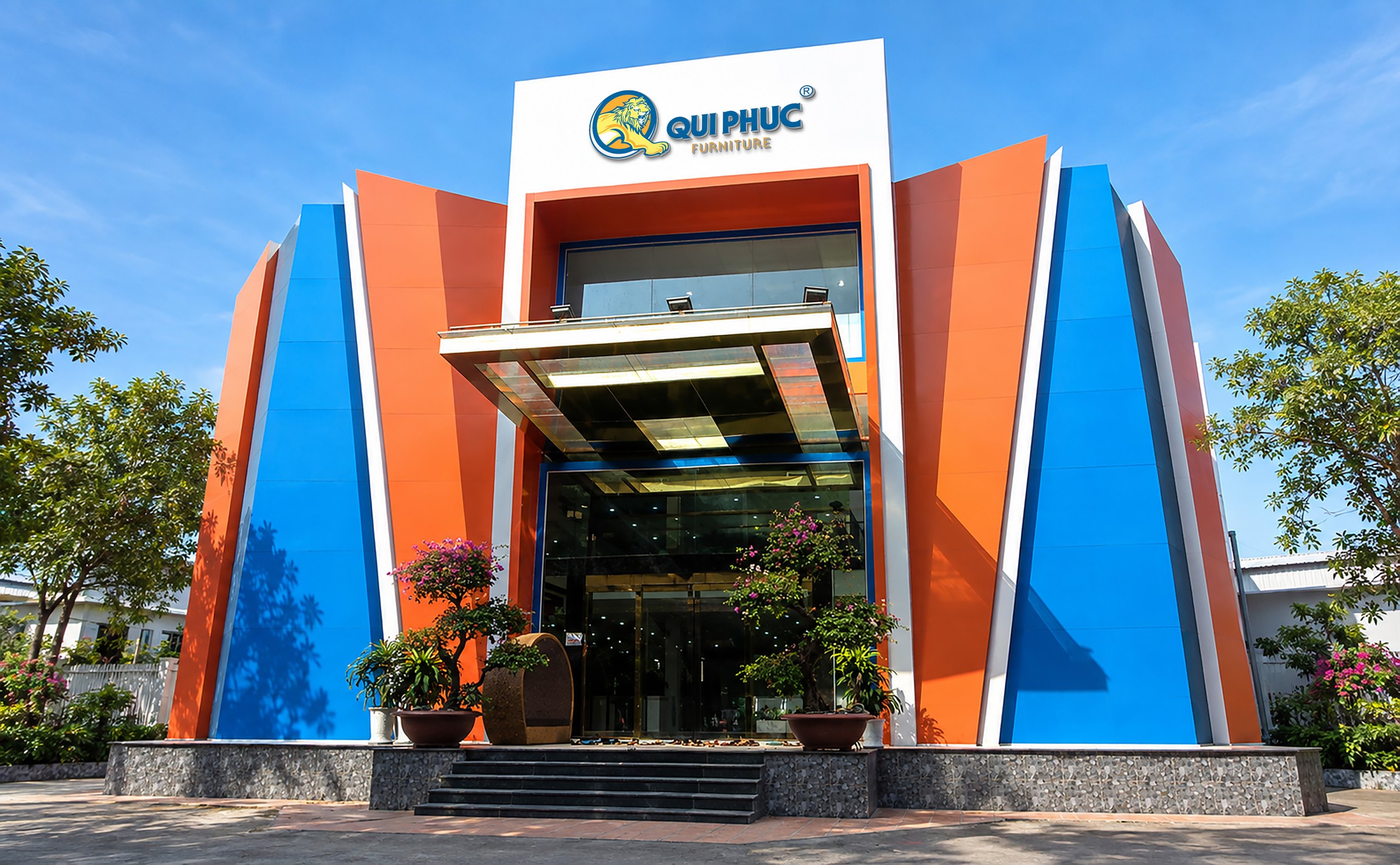
Overview
The greatest value of the project lies not in the Lion symbol or the tagline but in the way a business owner’s outlook was turned into a brand system with meaning and room to grow over the long term.
Context
Where did the brand stand?
When the business outgrew its brand image
Before 2012, Qui Phuc was entering a stage of growth quite unlike anything before it.
From a base in selling tables, chairs and household goods in the 1980s and 1990s, Qui Phuc formally founded its company in 2007, invested in a large-scale factory, modernized its machinery and professionalized its management. Its lines of stainless steel furniture, plastic cabinets and combined stainless steel and plastic products kept widening; its distribution network grew quickly nationwide and exports began to take shape.
The market was moving too. After the 2008 – 2009 crisis, demand rose for products that are durable, practical and reasonably priced. Meanwhile, imports, price competition, input materials and the modernization of domestic manufacturing put added pressure on Vietnamese businesses.
Qui Phuc had made clear progress in scale, production capability and market reach.
But a question was beginning to surface:
Now that the business had grown, how would the brand be seen?
Qui Phuc needed a new identity, not only to make its products recognizable but to show a business entering a new standing in stainless steel and household plastic furniture for the home and outdoors.
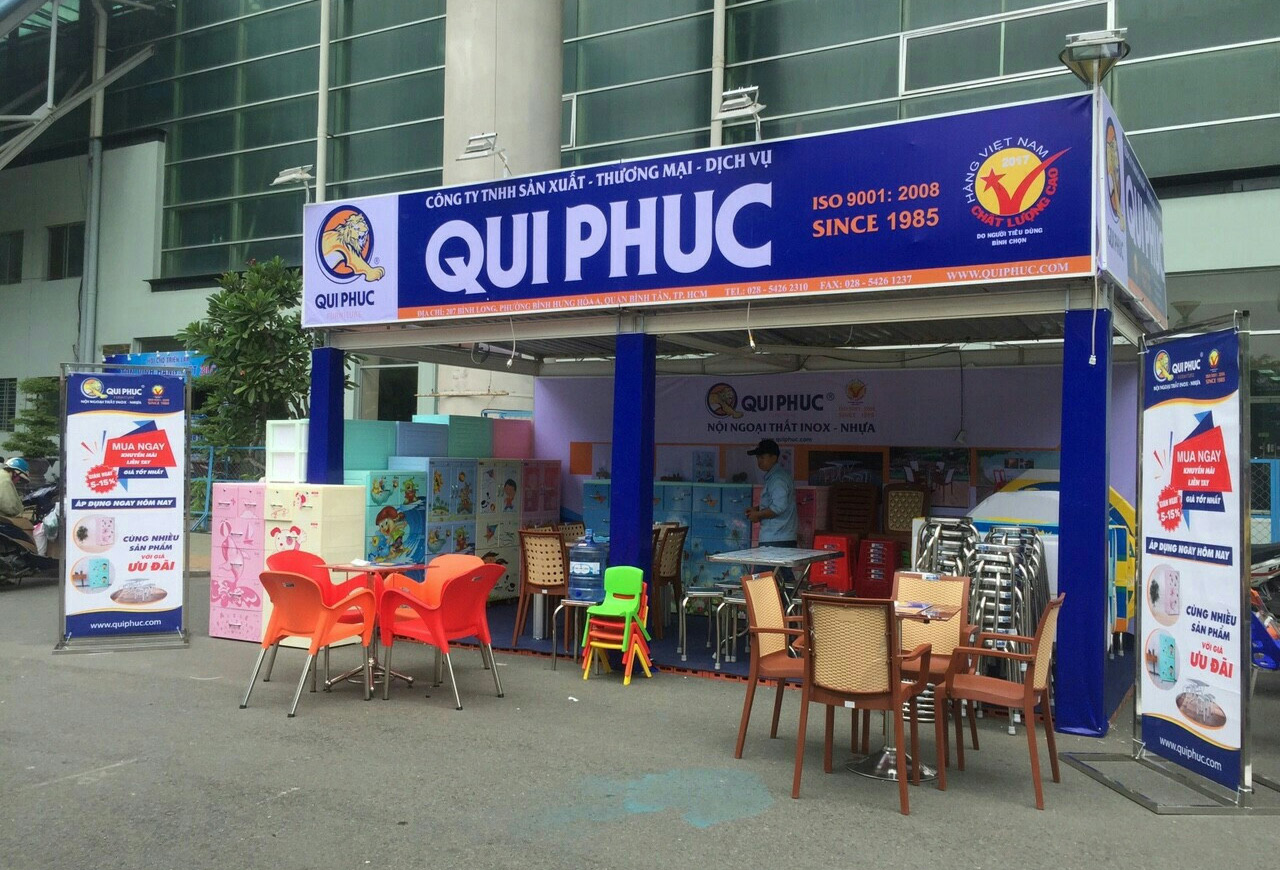
Problem
What really had to be renewed?
Wide presence is not the same as a clear position
Qui Phuc did not lack production capability.
It did not lack products.
And it did not lack reach.
Before 2012, the factory had been built at large scale with modern machinery; the distribution network was expanding quickly nationwide and exports were taking shape.
But those achievements had not yet come together into a clear enough brand perception.
Qui Phuc was still easily seen through what it made and where its products appeared: a stainless steel and plastic manufacturer with good, varied, widely available products.
What had not been established to the same degree was:
Who is Qui Phuc?
What does it stand for?
And what position does the brand want to hold?
So the task was not to make Qui Phuc appear more often.
It was to turn that presence into a brand with a clear identity and position.
That was the gap to close before any talk of identity, communication or design.
Discovery
What did FreshBrand see?
The business had moved ahead of its own image
FreshBrand looked at how Qui Phuc had grown and saw a gap that was becoming ever clearer. The factory had grown, the product range had widened, the distribution system had developed and export markets were opening up, but the way the brand was recognized had not kept pace with those moves.
Insight
Qui Phuc is growing faster than the way the market sees it.
Diagnosis
Qui Phuc did not need to build a new capability to prove it was growing. The evidence already existed inside the business. What was missing was an identity strong enough to connect those capabilities into one unified perception: a specialized, professional, approachable brand establishing a leading position.
Without it, the factory would keep growing and the products would keep traveling, yet the brand risked being seen as a manufacturer with plenty of goods rather than a brand with a position of its own.
So the point was not to make Qui Phuc “look bigger” but to bring the brand’s image up to the scale that already existed inside the business.
Point of view
How did FreshBrand read the problem?
Not only stepping forward, but leaving something that can be recognized.
In searching for the essence of the Qui Phuc brand, FreshBrand started from a sentence by the head of the business:
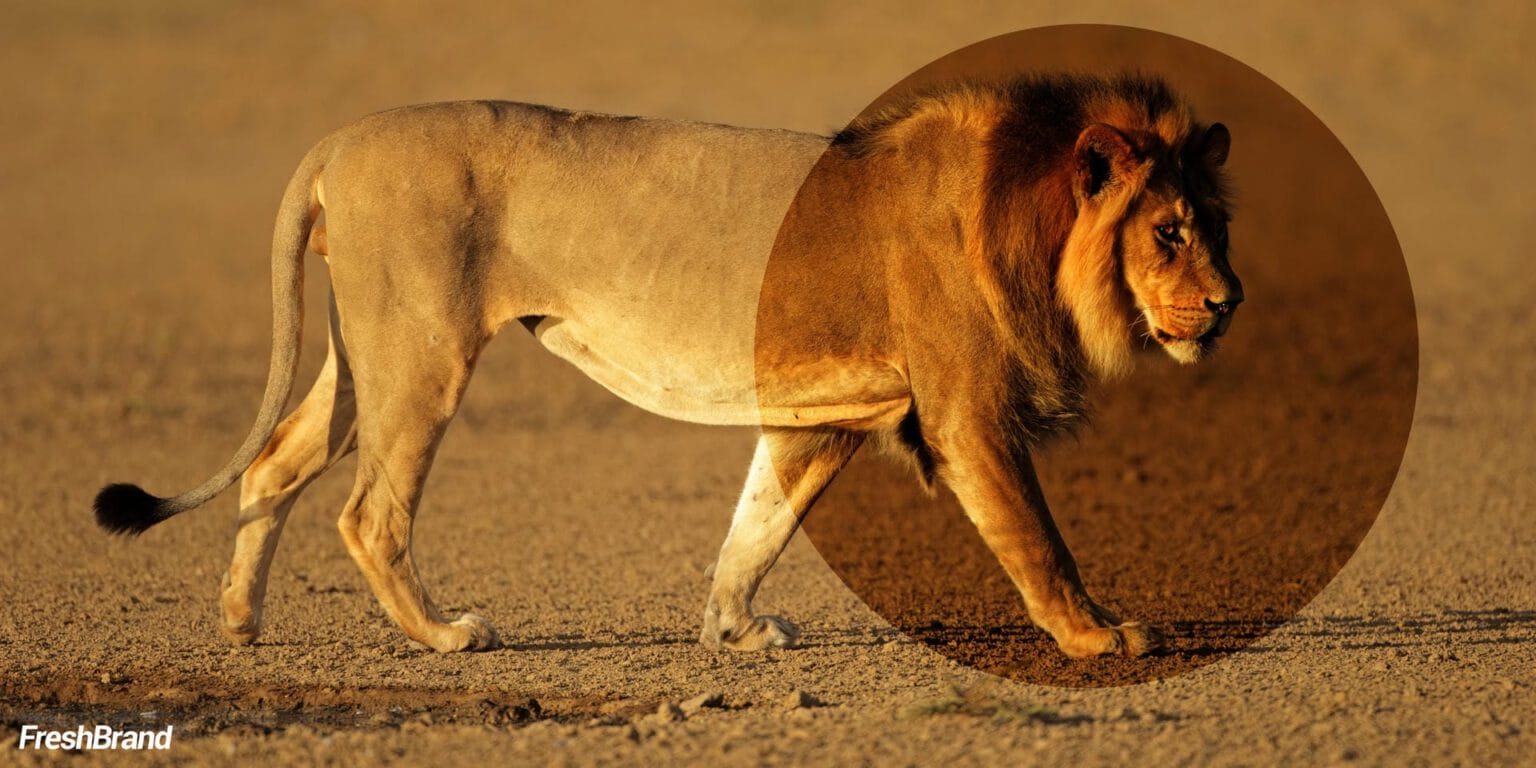
“I want each of our steps to be like the footprint of a Lion, leaving on the market an affirmation of reputation, quality and prosperity.”
Behind that sentence was more than an ambition to grow. It was a view of how a business should be present in the market: every step must have a purpose, every advance must create value and every appearance must help affirm who Qui Phuc is.
FreshBrand saw in it an idea that could become the foundation of the brand identity.
The Lion stands for strength and standing.
The footstep stands for action moving forward.
From there, the design question was no longer: How can Qui Phuc get an impressive logo?
It was how to turn the idea of a business that always moves forward into a symbol the market can recognize.
That point of view guided the whole identity renewal.

Strategy
What did we choose?
From reach to position
The strategy did not begin by changing what Qui Phuc had, but by redefining what it already had means.
- KeepProduction capability, quality, durability, variety, fair value and a far-reaching distribution system, the foundations that brought Qui Phuc into Vietnamese daily life.
- RenewHow the market sees it: from a manufacturer whose goods are everywhere → a specialized leading brand in stainless steel and household plastic furniture for the home and outdoors.
- FocusConnect scale, quality, professionalism and reach into one unified brand perception.
- GrowBuild an identity strong enough for Qui Phuc to keep expanding at home, step into international markets and still hold one consistent image.
The core choice
Qui Phuc does not need to appear more often to prove it is growing. It needs an identity clear enough for the market to see who Qui Phuc is.
That is the shift from product reach to brand position.
Renewal
How was the strategy brought to life?
When an idea is encoded into a brand
An idea from the business owner was turned into an idea, a symbol and an identity language.
- Every step, a markEvery advance Qui Phuc makes carries the wish to affirm reputation, quality and prosperity in the market.
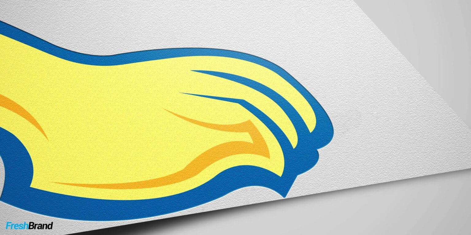
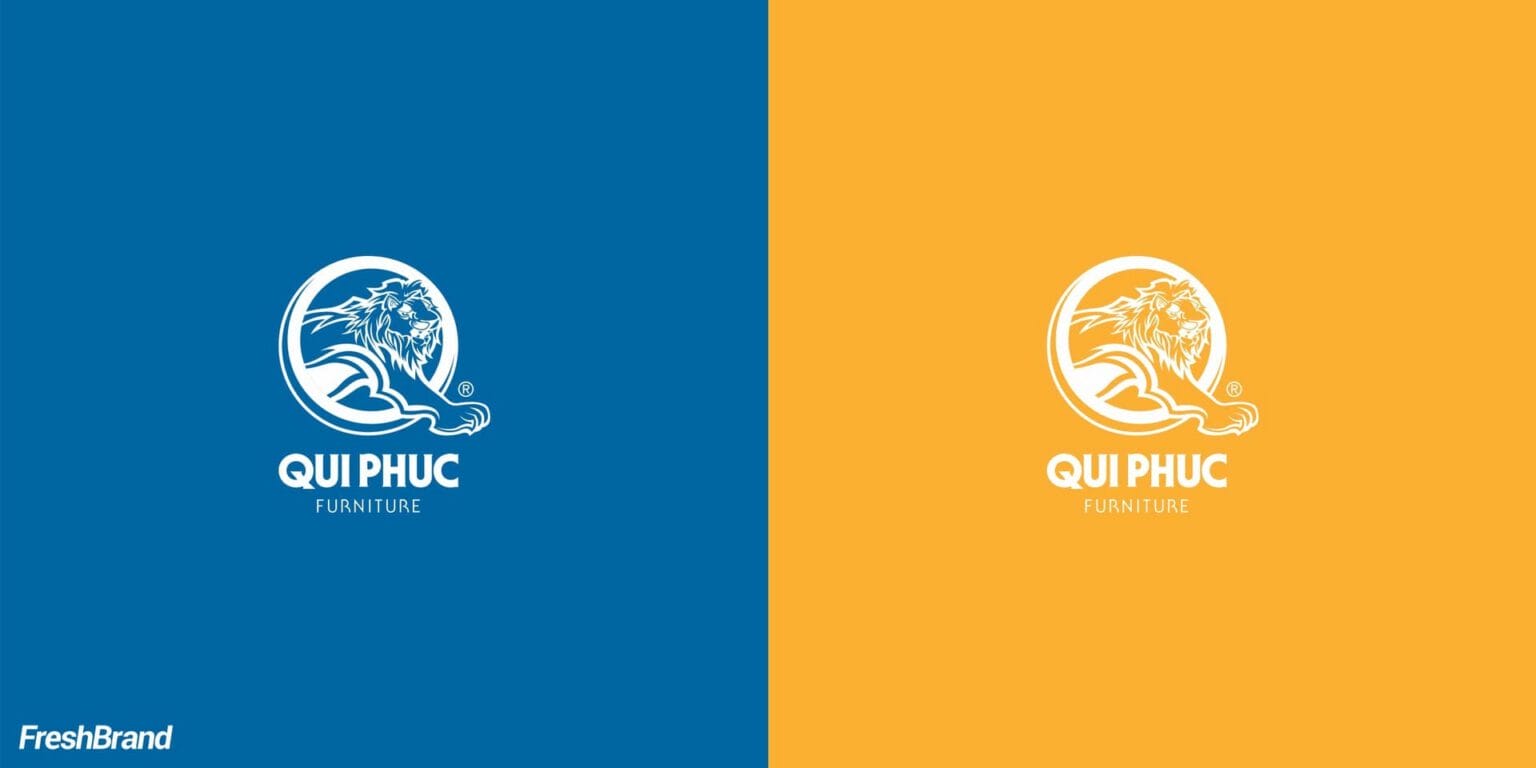
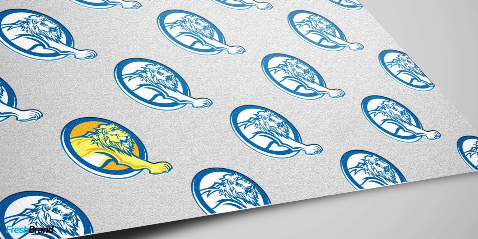
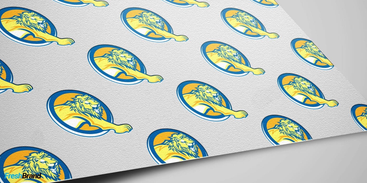
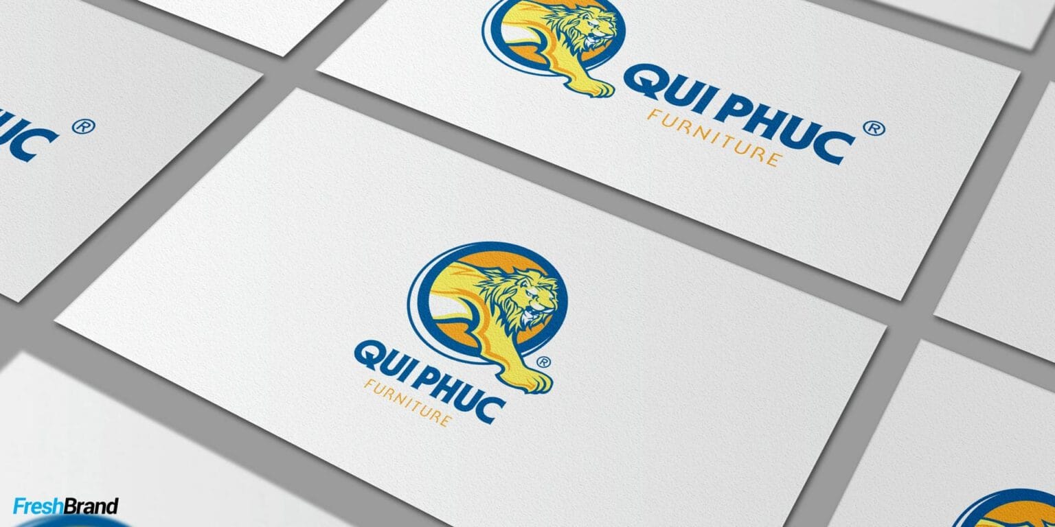
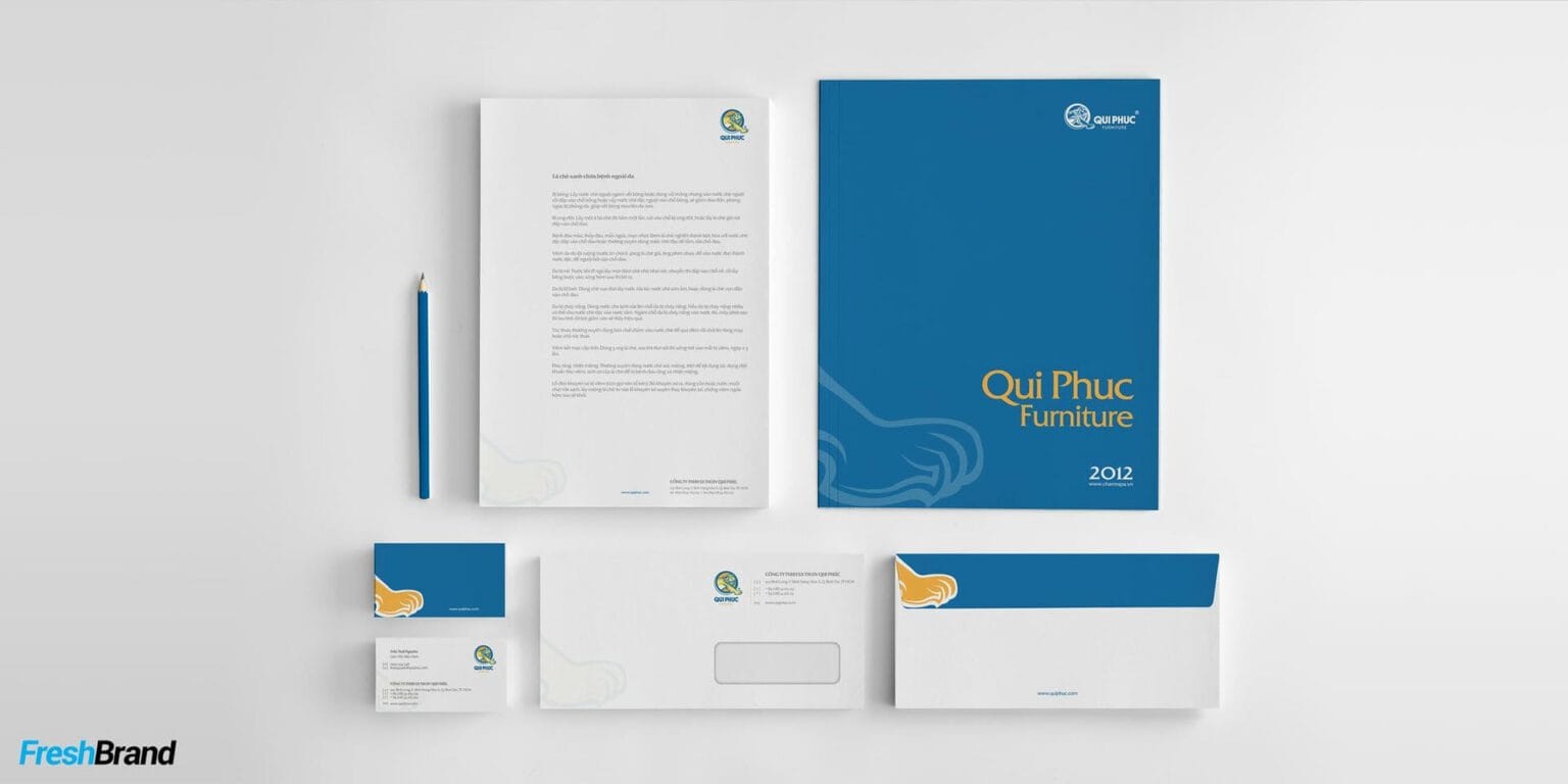
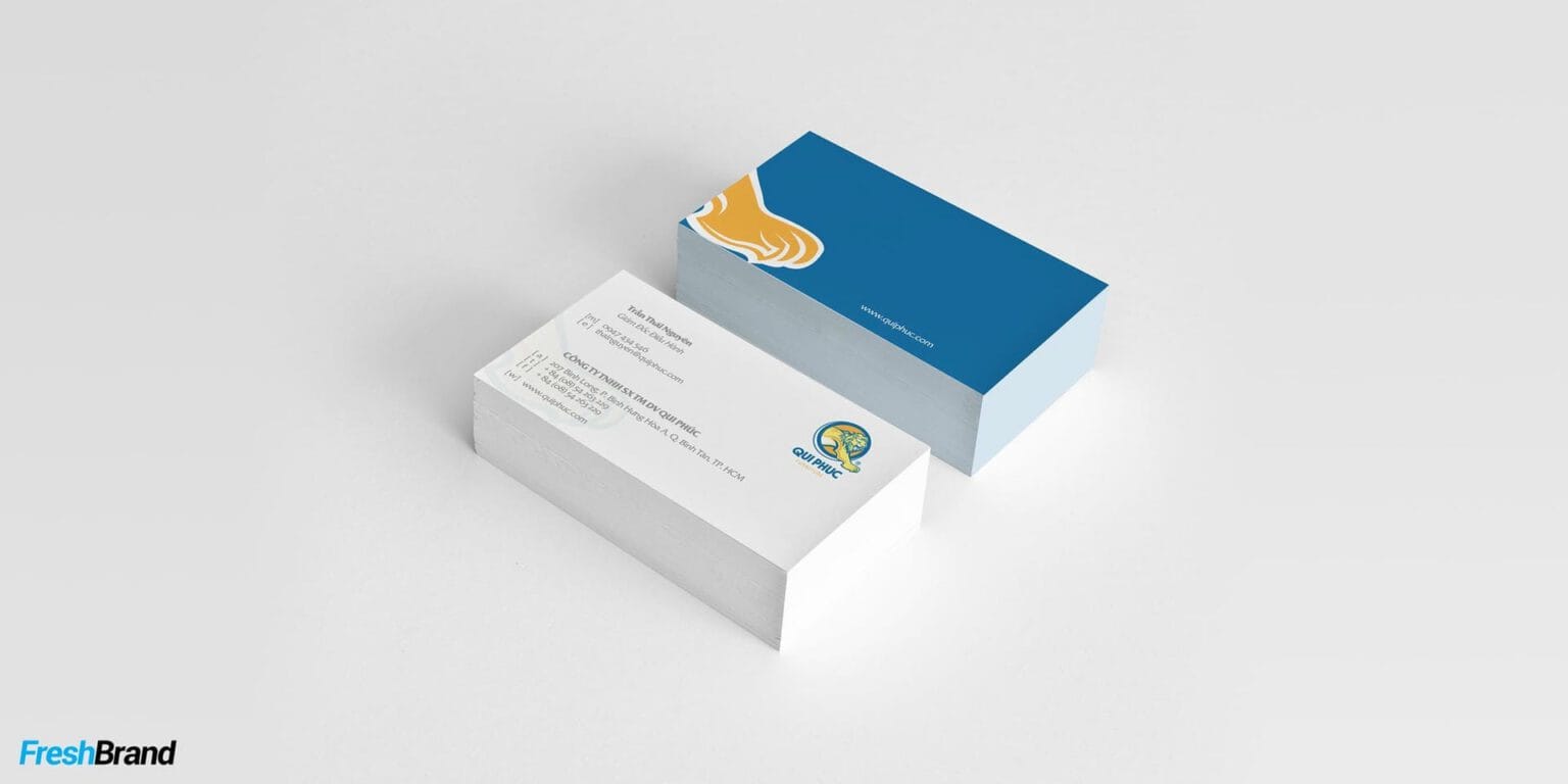
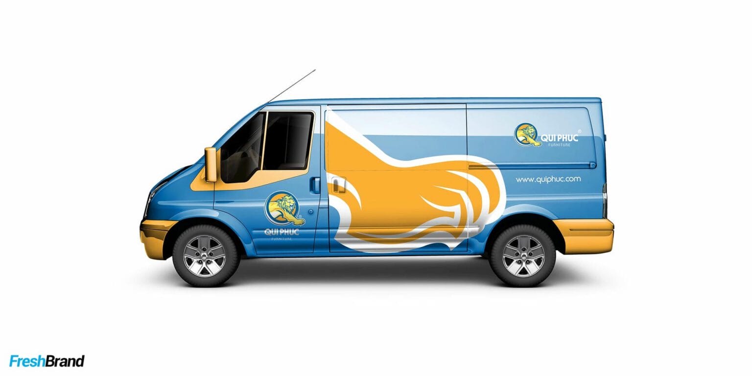
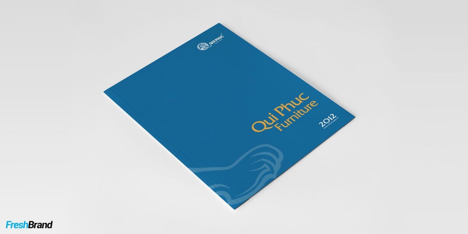
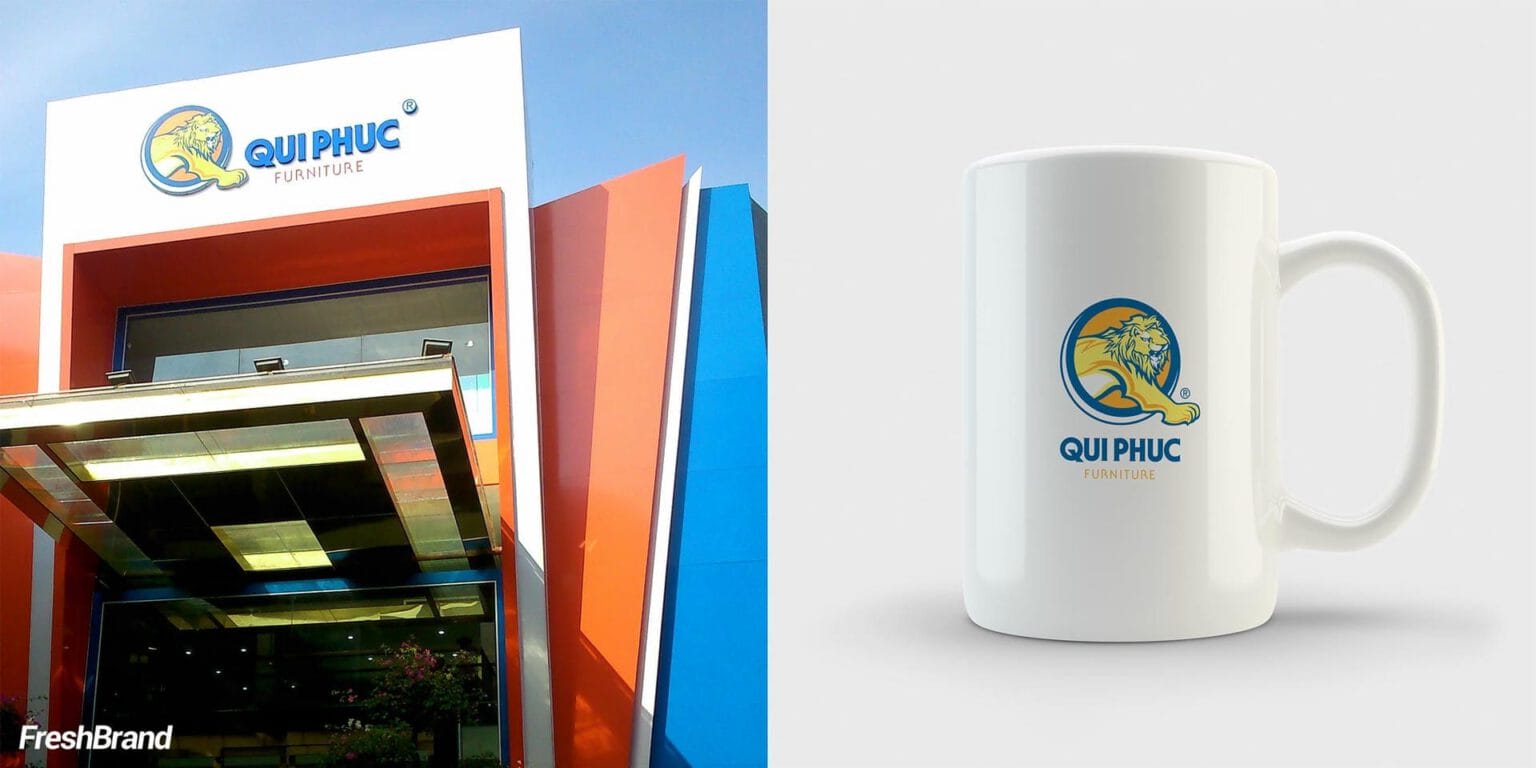
- SymbolThe Lion became the central mascot. Its right paw steps forward, suggesting initiative, exploration and moving ahead. That image was combined with a stylized diagonal slash in the letter Q, bringing the idea of the “footstep” into the very structure of the symbol.
- Brand systemQui Phuc stays the master brand, built on production capability, quality, variety and a wide distribution system. The identity system links the solid character of stainless steel with the flexibility of plastic, in a direction that is professional, approachable and easy to recognize.
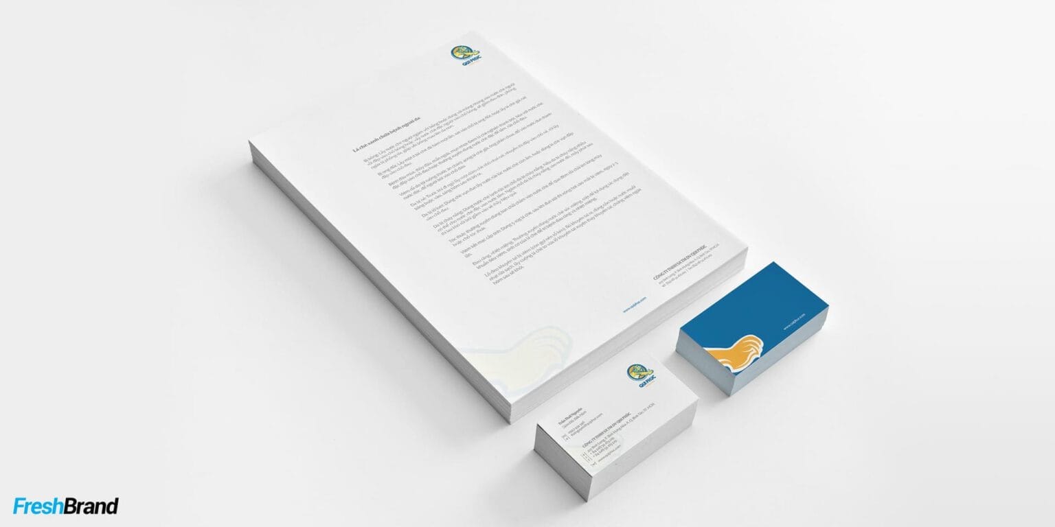
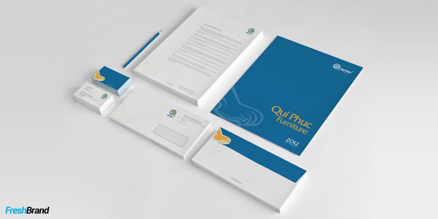
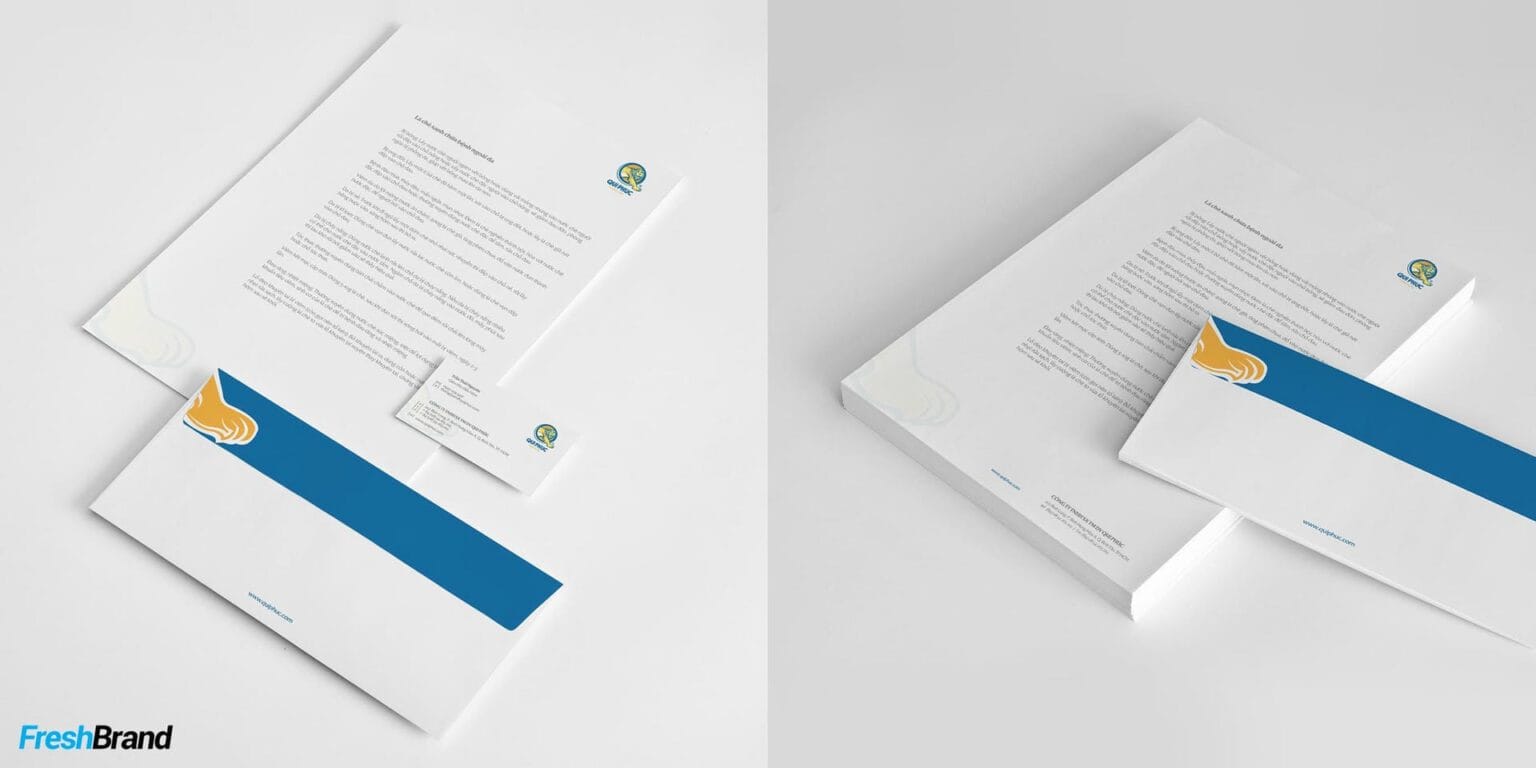
- “Moving forward, building life”ties the idea of the “footstep” to the brand’s role in daily life. From identity to points of sale, packaging, communications and brand materials, the system was standardized to keep one identity.

Impact
What really changed?
From many points of presence to one unified image
The new system brought together what had earlier been seen piece by piece: products, quality, reach and the distribution system.
- Identity & experienceQui Phuc has a clearer, more unified image across its distribution network. Points of sale, packaging, display spaces and the way products are presented follow one spirit, so the brand is recognized as a single entity and the experience is more coherent.
- Perception & meaningThe gap between the scale of the business and the image of the brand has narrowed, giving Qui Phuc a base to be recognized more clearly for its specialized leading position in stainless steel and plastic furniture for the home and outdoors. “Moving forward, building life” widens the brand’s role from products to the living spaces and practical needs of Vietnamese families.
- Team & distributionA shared brand language gives the team and the distribution system a base to understand, introduce and reinforce the image of Qui Phuc together.
The project did not create Qui Phuc’s growth. It gave that growth an identity to be recognized and carried on.
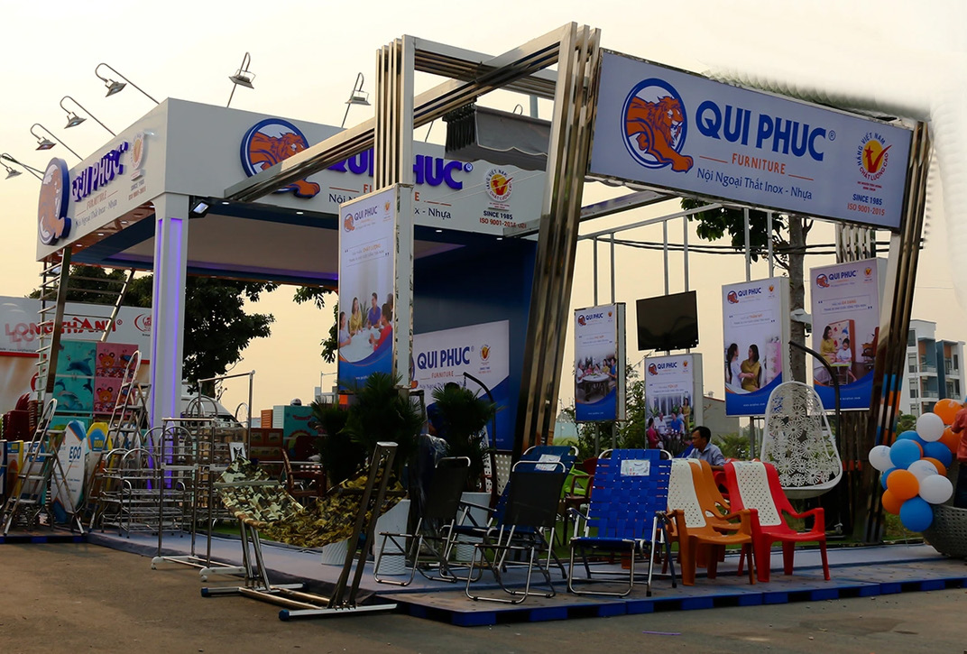
Value created
How did the brand come to mean more?
From an owner’s idea to a brand asset
From the wish “each step like the footprint of a Lion,” FreshBrand developed EVERY STEP, A MARK into the brand idea. The Lion’s right paw steps forward and, combined with the diagonal slash in the letter Q, brings the notion of the “footstep” into the very structure of the symbol.
From there, the Lion, the letter Q and the identity system make up a brand code of their own, while “Moving forward, building life” widens the meaning of Qui Phuc from products to values in daily life.
More important, the idea is not expressed in a logo alone but carried into a system that can keep going with Qui Phuc as the business grows.
A brand does not only need to be recognized.
It needs a meaning clear enough that every appearance reinforces what it stands for.
For Qui Phuc, each step of growth has created not only scale, but also a mark.
Thinking in Practice · FreshBrand Case Stories
Services
FreshBrand team
- Trần Anh Tú — Creative Director, Project Director, Design
- Hồng Phong — Design
Project
- ClientQui Phuc
- Year2012
