
Brand Space
When a brand needs to be felt
A customer may forget a business card, but they remember how it felt to walk into the company’s office, store or clinic.
FreshBrand designs offices, showrooms, stores and clinics along the brand’s identity, from the facade to materials, lighting and imagery on the walls, so that people who walk in understand right away which brand this is. FreshBrand handles the design of the identity within the space (color, materials, lighting, imagery), while function, structure and construction belong to the business’s architect or contractor, working together with FreshBrand.
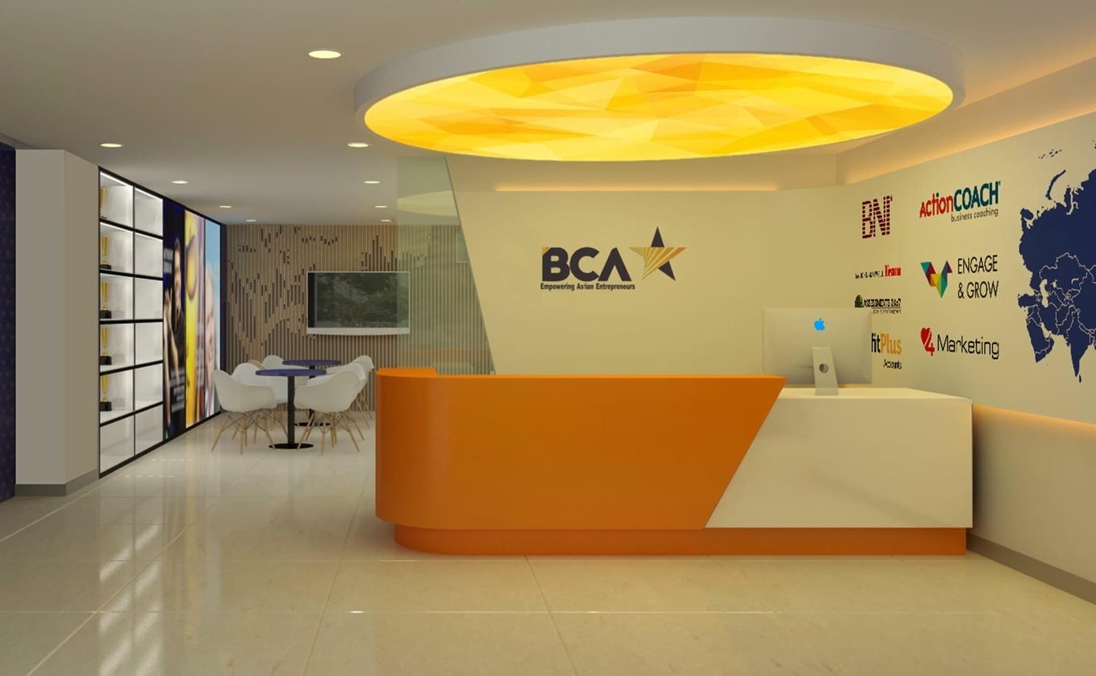
Perspective
Offices and stores are often made in reverse order: the interior contractor designs first and the logo is mounted on the wall last. That space may be beautiful, but put another company’s logo in its place and no one would find it strange.
A brand space starts with what the person walking in needs to feel: a partner who needs to trust the company’s capability, a customer who needs to feel at ease, an employee who needs to feel they belong here. From there, color, materials, lighting and imagery are chosen to follow the identity system, so the space speaks the same language as every other touchpoint of the brand.
For FreshBrand, a good brand space is a place where people stand inside the brand and can feel it from the entrance to the meeting room.
When to start here
A new headquarters, facility or store is a chance for a brand to have a space that is true to itself; an older space that no longer matches the current brand is also a reason to start over.
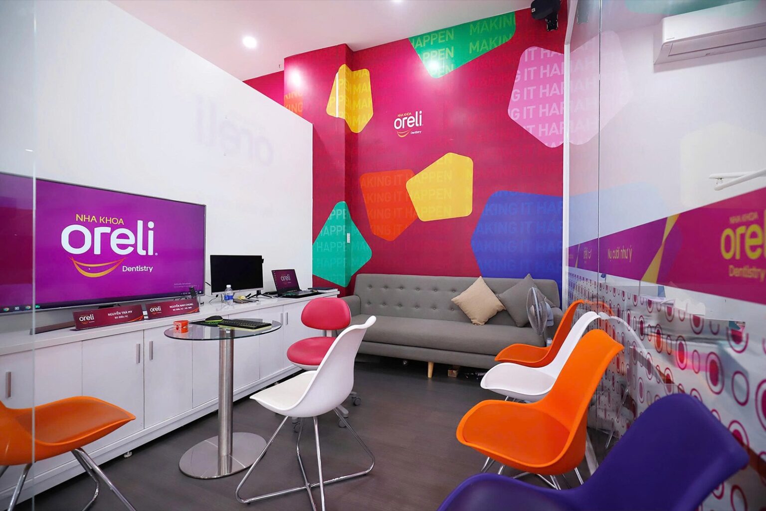
When identity has to follow each new location
At Oreli Dental Clinic, the white reception desk carries the logo and the promise “The smile you wish for”, while a pink-purple wall is covered with orange, yellow and green polygons taken from a motif in the brand standards. The same language was rebuilt in Buon Ma Thuot, Ea Kar and Buon Ho, so whichever clinic they walk into, visitors know they are at Oreli.
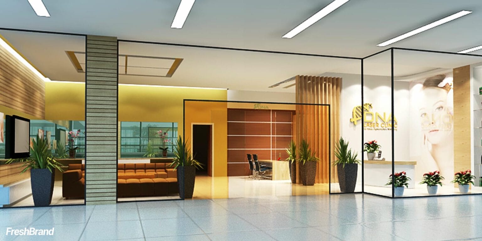
When customers need to feel at ease from the first step
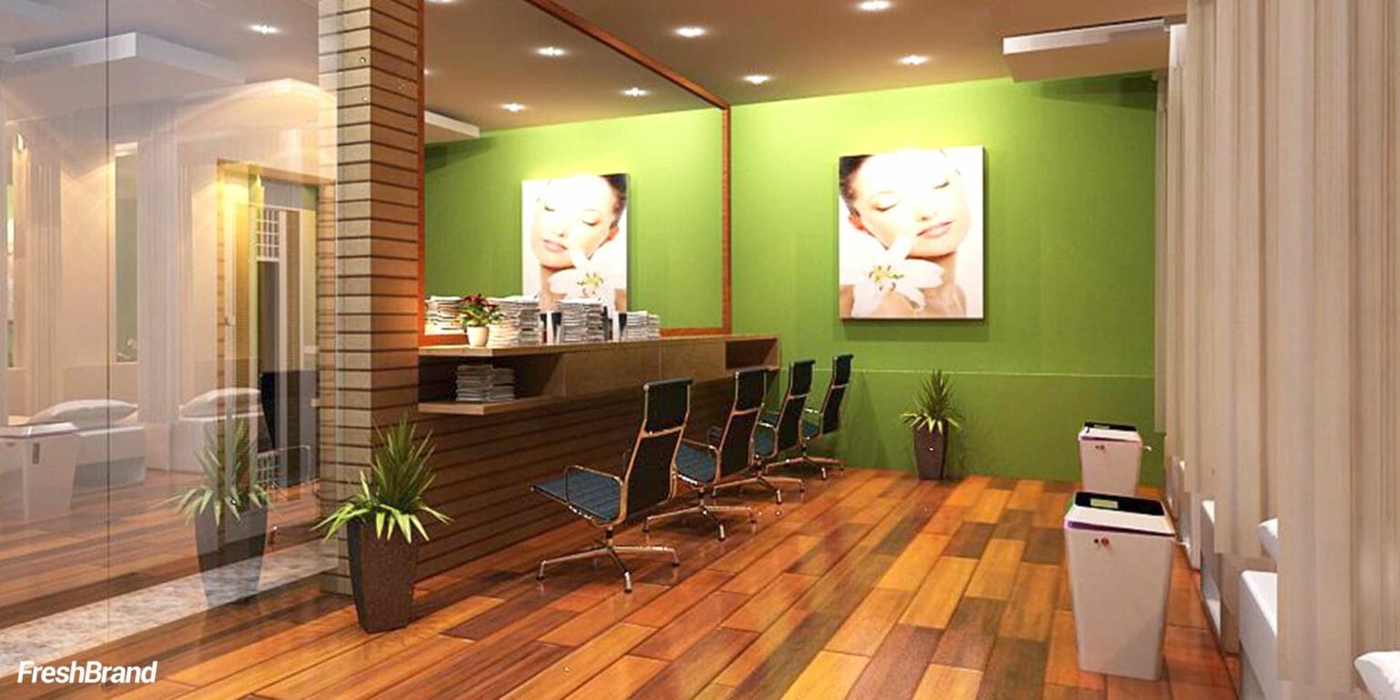
The reception area of DNA Laser Clinic is kept open and bright like a hotel lobby, with a white reception desk, slatted wood panels and a pale yellow wall. In the spaces that follow, green replaces the pale yellow, but the logo, the woman’s face and the wood panels stay the same.
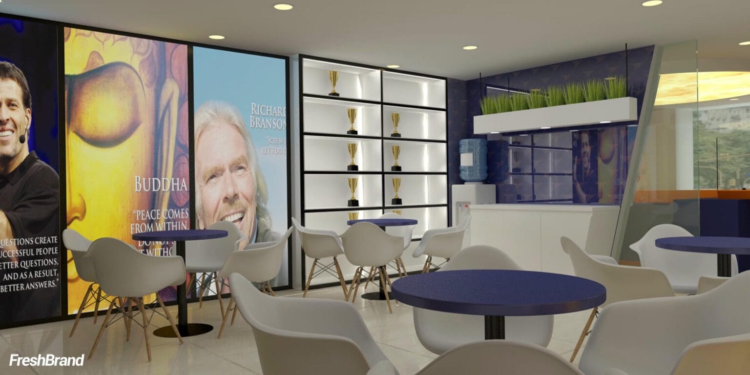
When a space needs to inspire the people who come to learn
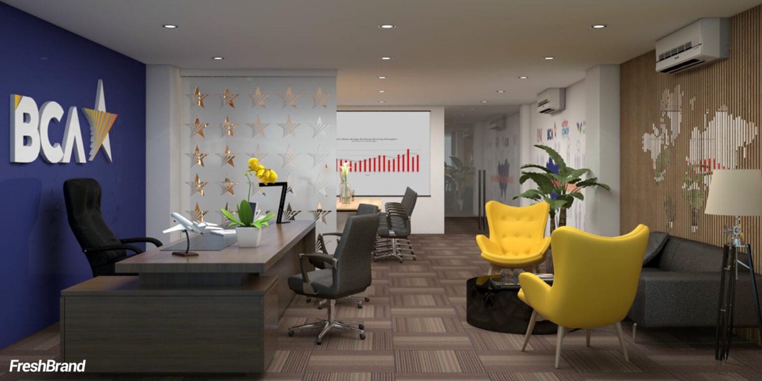
BCA is a business training company, so its coffee and study area hangs large portraits of world-famous entrepreneurs and inspirational speakers. Tables and chairs are arranged flexibly for small discussions, and the display shelves are set aside for achievements.
When the team needs to work inside the spirit of the brand
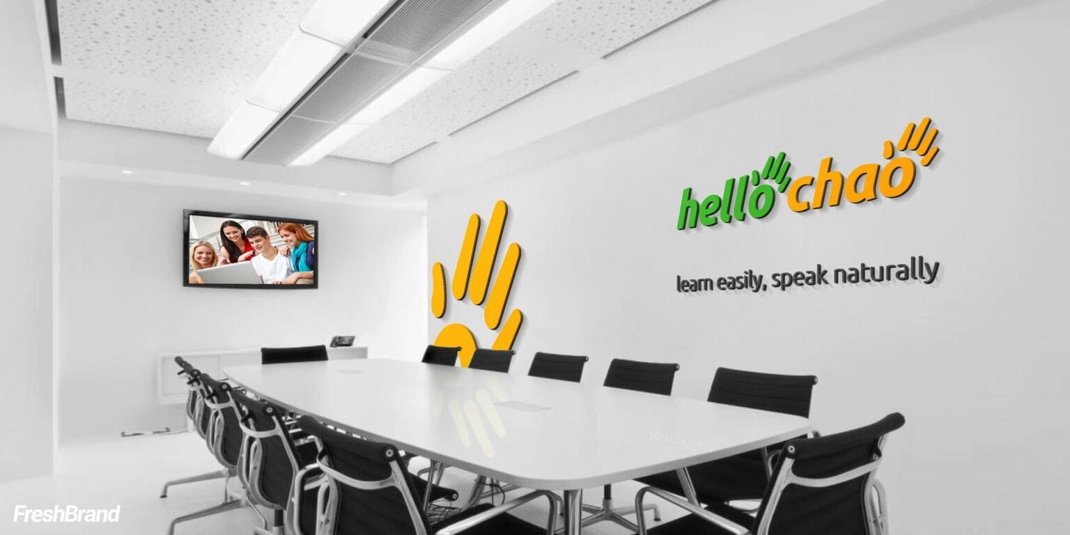
In the HelloChao office, the waving orange hand is blown up large on walls and glass, from the reception desk and meeting room to the library, along with the message “learn easily, speak naturally.” The team therefore works every day in the same spirit they bring to learners.
How FreshBrand works
The five questions below move from the people who will use the space to specific decisions about the entrance, materials and imagery, and then to the documentation that gets it built correctly.
Where is the brand now?
We start with the identity system and the brand story, with the floor plan and the current condition of the space, and with the people who will pass through it every day: customers, partners and staff.
What does this space need to do?
Each kind of space serves a different group of people and a different job, so FreshBrand identifies the type of space and the areas to be designed before work begins.
OfficeHeadquarters, reception desk, meeting rooms and work areas for partners and the team alike
StoreShowroom, facade, display areas and checkout counter for buyers
ClinicReception, waiting area and service rooms for customers
What do we choose?
Identity is turned into specific decisions about the space, so the brand is felt even in places with no logo.
EntranceThe facade, door and reception desk are the first points a person walking in touches
MaterialsThe identity’s color system is translated into wood, stone, fabric and glass, along with lighting for each area
ImageryLogos, patterns and images on walls, glass and partitions are set at the right scale and viewing distance
How does the space come to life?
FreshBrand builds 3D renderings of each area so the business can see the space before construction, then finalizes a design package covering materials, colors, signage and imagery. During construction, FreshBrand works together with the business’s architect or contractor, so the finished space keeps the spirit that was agreed.
What will actually change?
What changes first is the feeling of the person walking in: partners trust the company’s capability, customers feel reassured, and the team feels they belong here.
What the business keeps
When the business opens more locations, this set of assets lets the new space continue the language of the first one, even if the contractor is different.
- 3D renderings of the main areas.
- Direction for materials, colors and lighting based on the identity system.
- Designs for imagery on walls, glass and partitions, with specifications for construction.
- A guide for applying the design to later branches and stores.
Stores & showrooms
In a store, customers walk through the areas of the brand, so each area must both lead customers toward the decision to buy and keep the same identity.
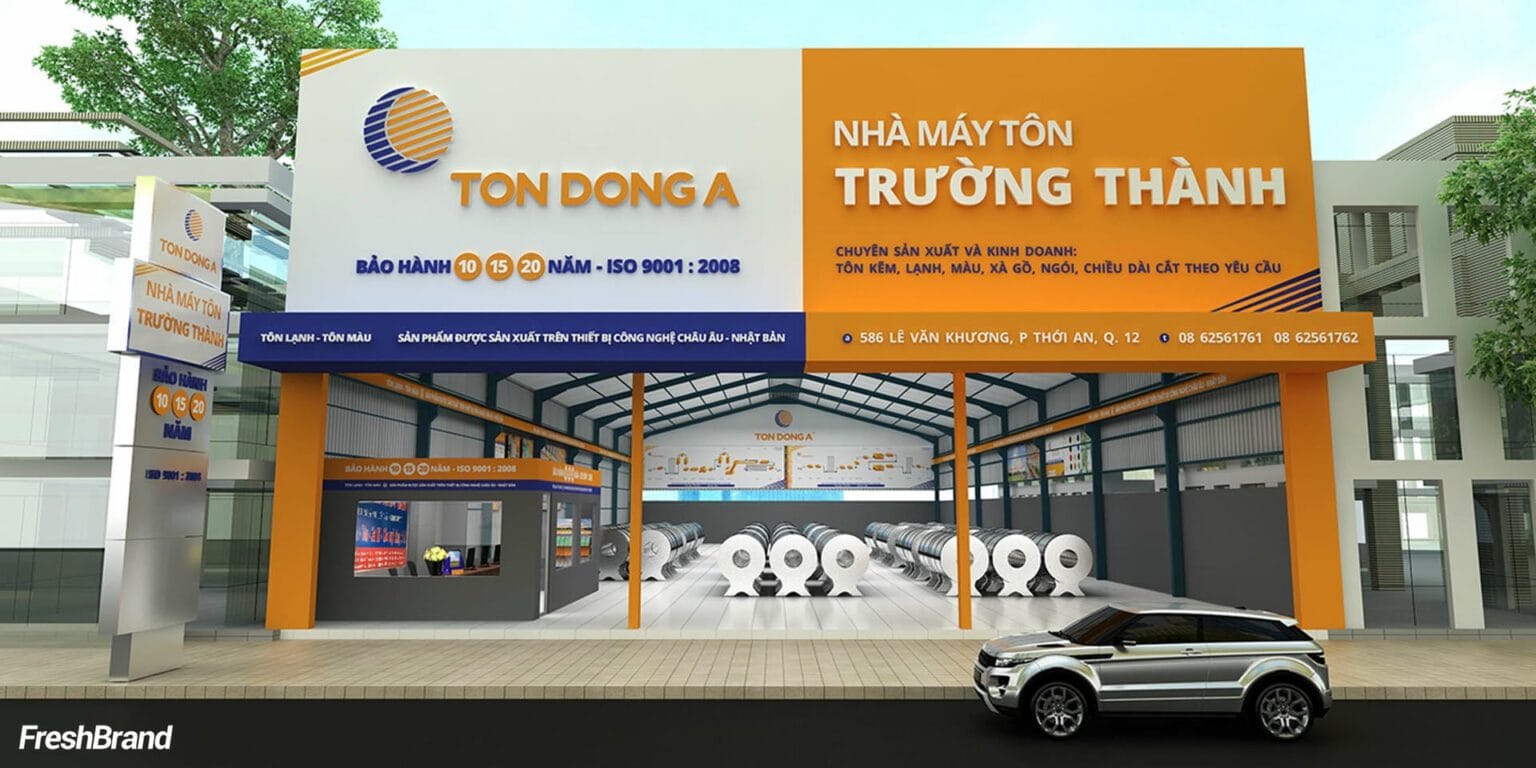
- Facade: Signage and glazing that stand out on a busy street or in a shopping mall.
- Display: Aisles, shelves and display areas that let products be seen the way the brand wants to tell their story.
- Dealer stores: Facades and signage are unified across the whole network, so buyers meet the same brand wherever they are.
Touchpoint system
A space is only one of many places where customers meet the brand, so FreshBrand looks at every touchpoint as a system.
- Touchpoint audit: List every place the brand appears, such as HADUCO’s vessels, uniforms, offices and port, or SCB’s branches, printed materials and digital channels.
- The role of each point: Decide which points to prioritize and what each one needs to express about the brand.
- Implementation standards: Bring the touchpoints into the brand guidelines, so every location is implemented consistently.

Let's talk
Is your business facing a similar question? Send a request to talk with FreshBrand, or download the portfolio to see more of our work.
In practice
TijoeLogo, identity and store space
When a symbol steps out of the logo and becomes a store
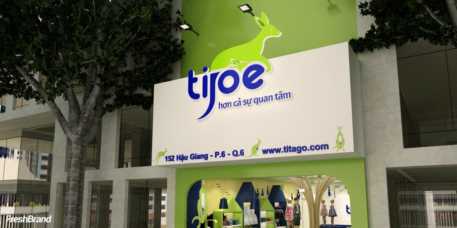
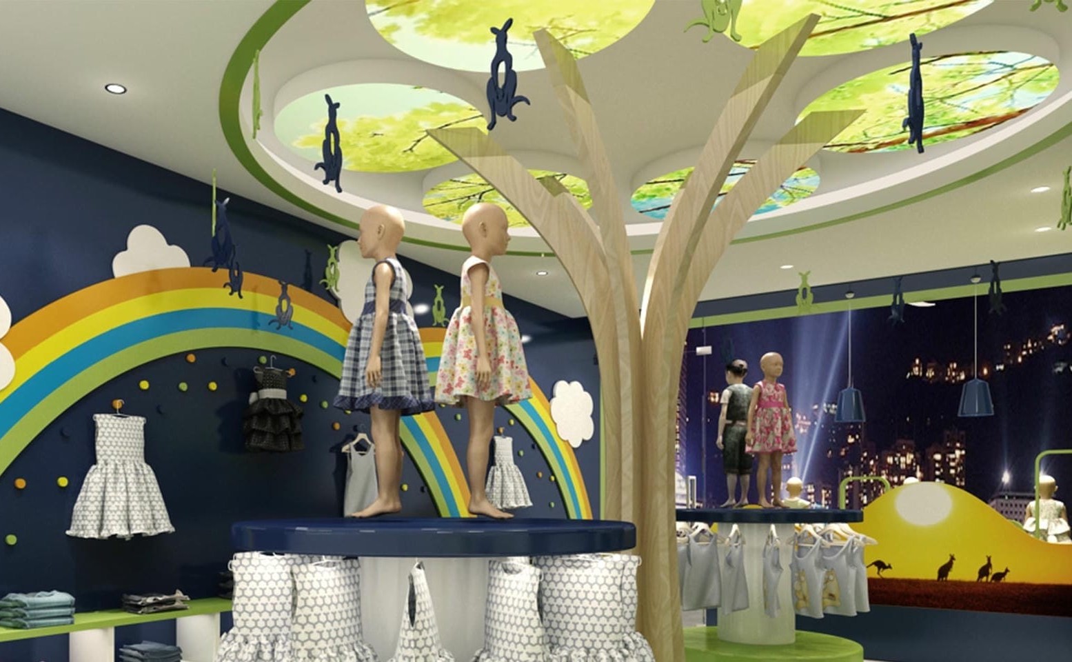
Tijoe is the mother-and-baby fashion brand of Tin Thanh Knitwear. FreshBrand designed the logo, identity system and store space for Tijoe around a direction of variety, quality, simplicity and refinement, starting from an image everyone understands: a mother kangaroo carrying her baby in her pouch.
“A store for children should make adults want to stay longer too.”
So the inside of the store was built as a fairy-tale forest, with a large tree trunk in the middle of the room, a rainbow, white clouds, a canopy of leaves on the ceiling and kangaroos hanging in mid-air. The children’s area, the mothers’ area and the checkout counter share one palette of green, yellow and midnight blue, while kangaroos stand welcoming customers right at the door.
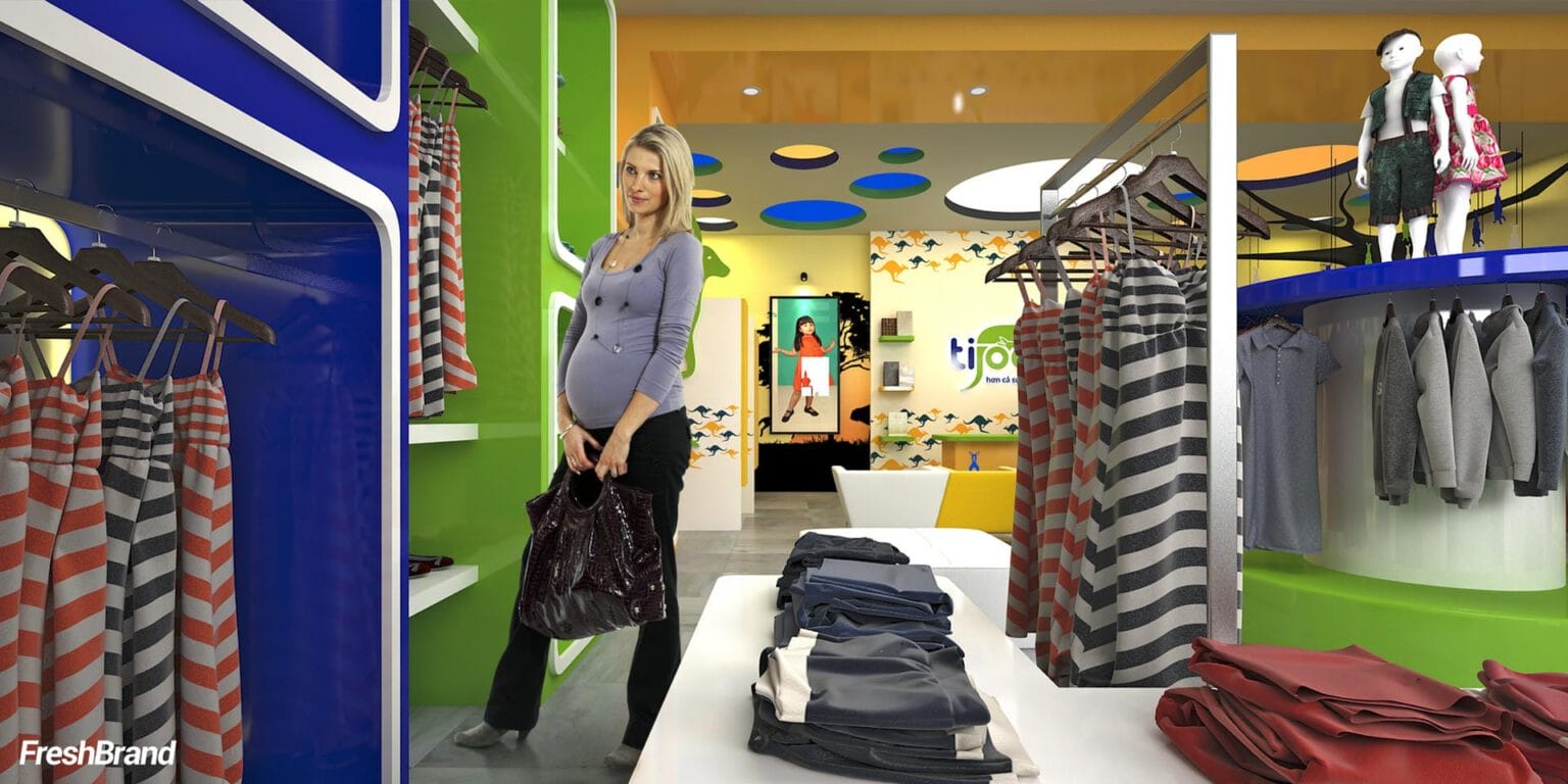
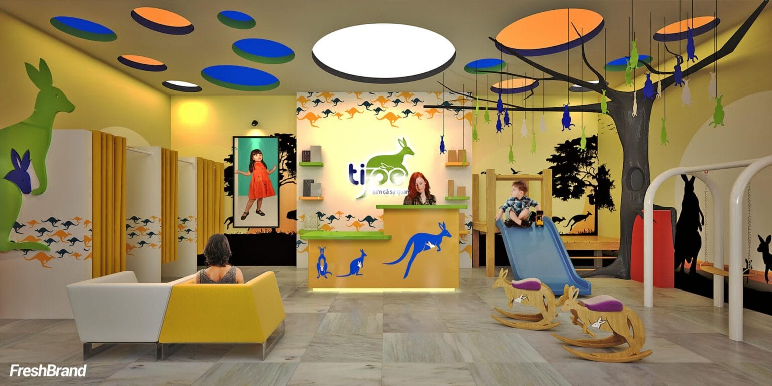
As a result, the kangaroo does not stop at the logo but becomes a space that children want to explore and parents feel at ease in. The same colors and mascot also appear on the website, so mothers can choose clothes for their baby from anywhere.
The question behind it
An interior space needs to go together with signage outside, temporary booths at trade fairs, and an identity system as its source.
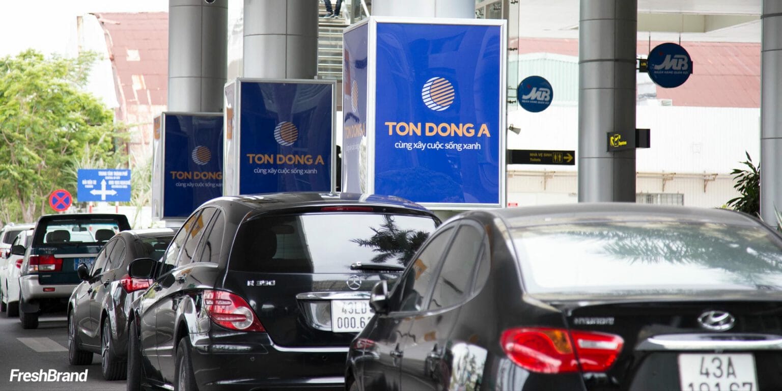
- Signage Design
When the facade, the building and the branch network need one signage standard. - Trade Show & Exhibition Booth Design
When a brand needs a temporary space at a trade fair or exhibition. - Brand Identity Design
When a space needs a clear identity system to translate into materials, colors and lighting.
FreshBrand capabilities
Strategy
When a brand needs a direction
Identity
When a brand needs to be recognized
Expression
When meaning needs to take shape
Experience
When a brand needs to be felt
- Brand Space Design
- Trade Show & Exhibition Booth Design
- Signage Design
Communication
When a brand needs to be understood
Start with FreshBrand
Send us the problem, get a point of view.
You can send a request today, or download the portfolio to share with your leadership before we talk.