
Tijoe – Store Space
More than care.
- Client
- Tin Thanh Knitwear
- Industry
- Fashion & Beauty, Retail & E-commerce

Overview
Tijoe is the mother-and-baby fashion brand of Tin Thanh Knitwear.
FreshBrand designed the logo, identity system and store space for Tijoe with a direction of variety, quality, simplicity and refinement, starting from an image everyone understands: a mother kangaroo carrying her baby in her pouch.
Symbol
How did the idea take shape?
The warmest pouch
No animal keeps its young as close as a kangaroo does. That image became the Tijoe symbol: a green kangaroo, paired with the promise of “more than care”.
The symbol also steps into real life, in kangaroo outfits for babies and in the kangaroos that greet customers at the store entrance.


Space
What do customers walk into?
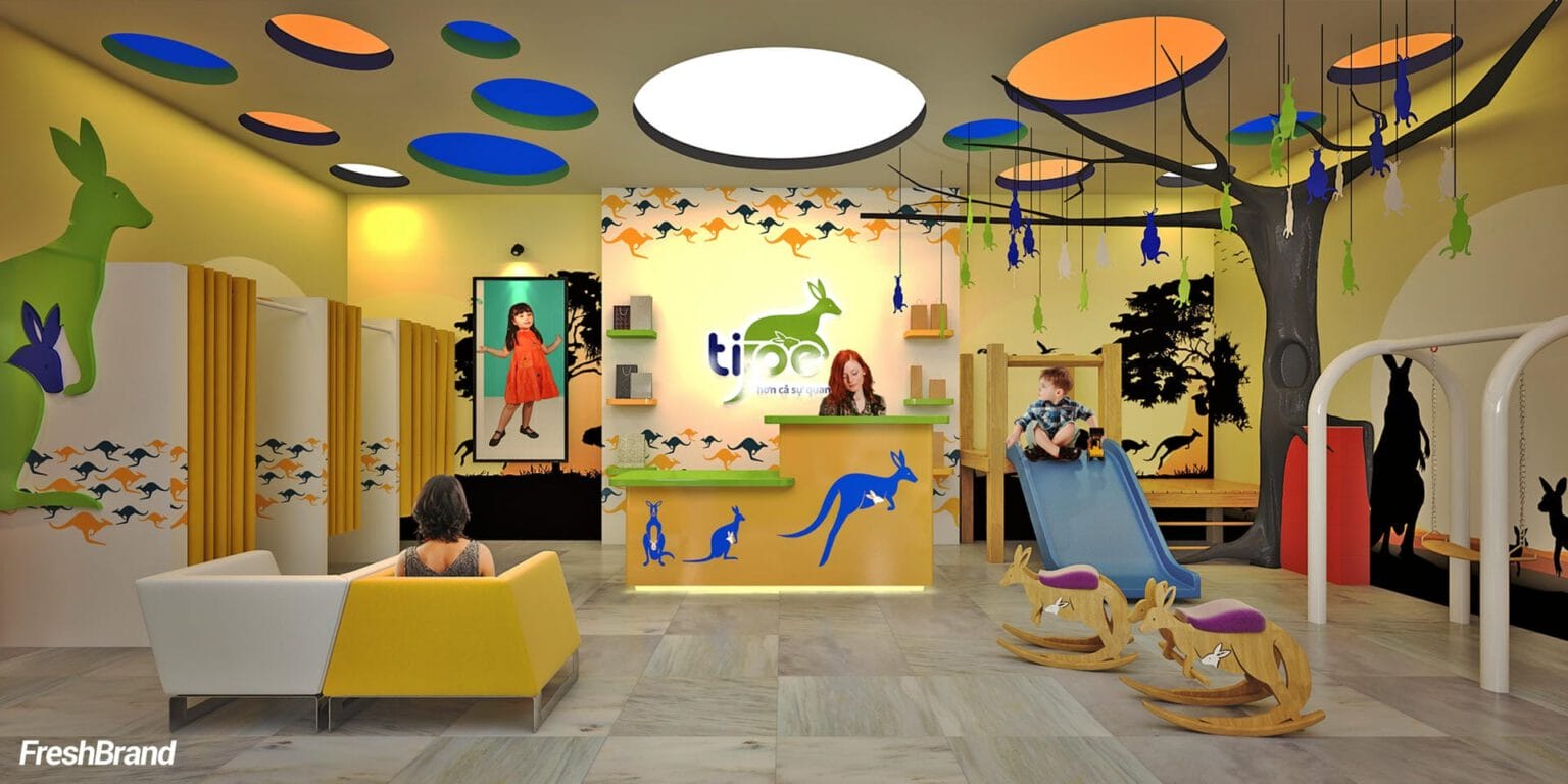
A small forest inside the store
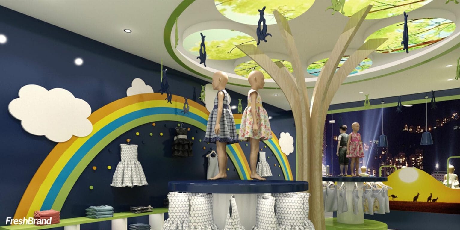
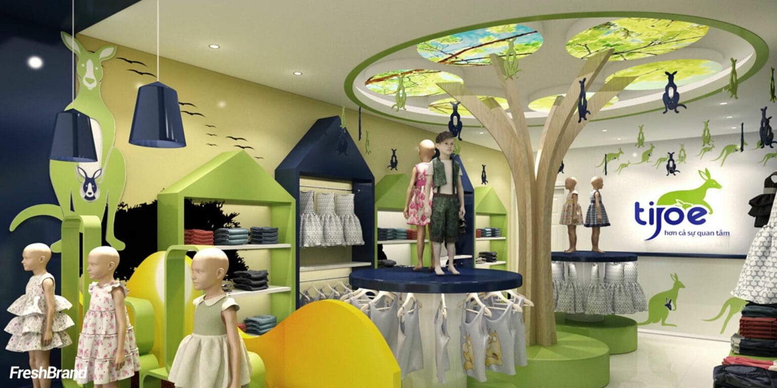
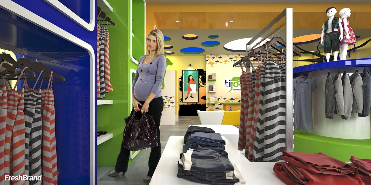
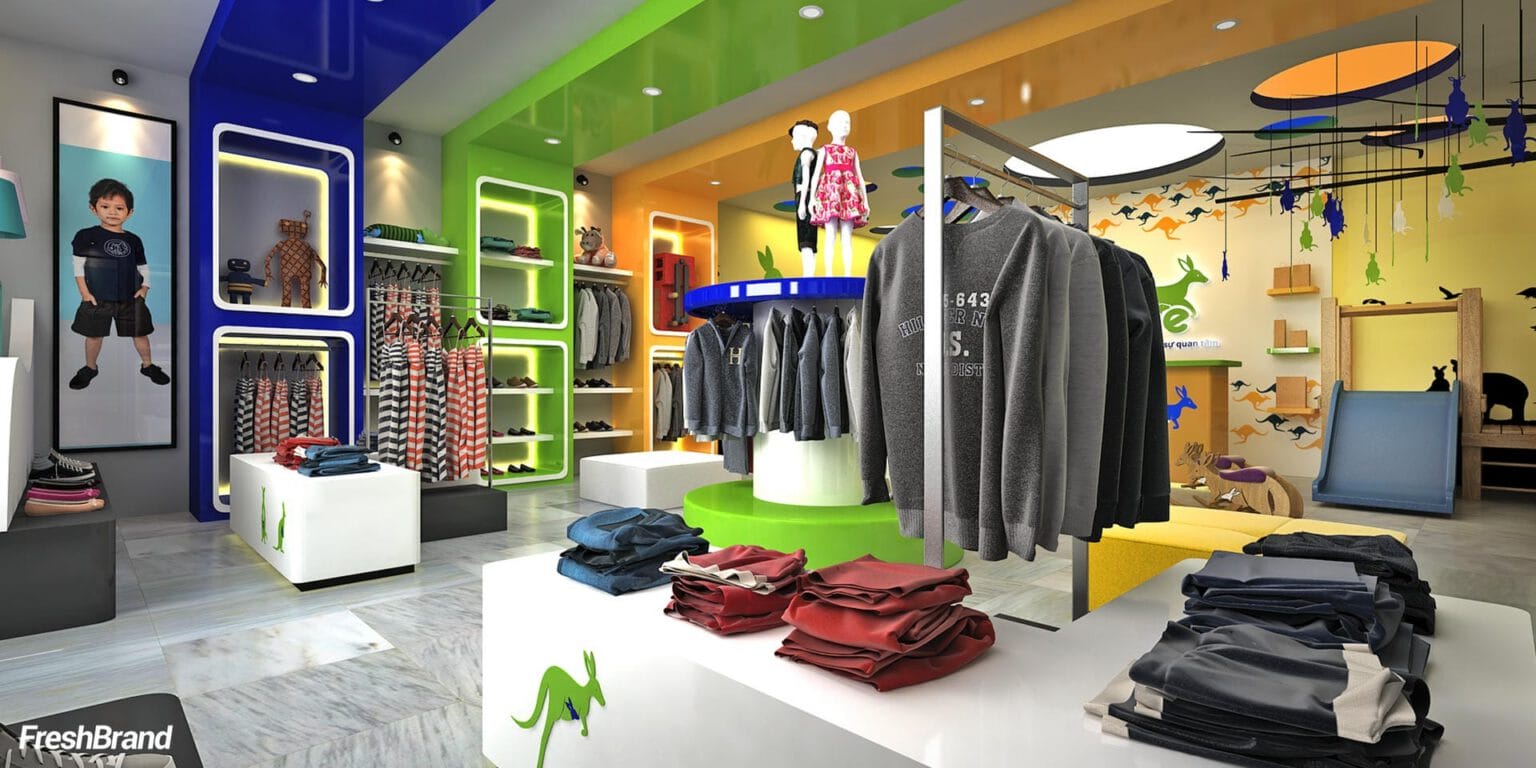
Inside, the store is built like a fairy-tale forest: a large tree trunk in the middle of the room, a rainbow, white clouds, a canopy of leaves on the ceiling and kangaroos hanging overhead. The children’s area, the mothers’ area and the checkout counter share one palette of green, yellow and midnight blue.
The space is made so children want to explore it and parents feel at ease.


Website
How does the brand live on screen?
A store that is open online too
The website carries the same colors and mascot as the store, so a mother can choose things for her baby wherever she is.

A store for children should make adults want to stay longer too.
FreshBrand team
- Trần Anh Tú — Creative Director, Project Director, Design
- Hải Anh — Design
- Thanh Thuận — Design
Project
- ClientTin Thanh Knitwear
