
Campaign Key Visual
When a brand needs to be understood
A campaign can appear on many channels, but viewers remember it only when every channel carries the same idea and the same image.
FreshBrand designs a campaign’s key visual from the campaign message and the brand’s identity. With that root, the image travels from billboards to points of sale to screens and viewers still recognize the brand at once. FreshBrand is responsible for the design; campaign planning and buying ad placements are handled by the business or its own media partner.
Perspective
An eye-catching image cut off from the identity system, with different colors, different type and a different style, can make a campaign noticed for a few weeks. Once the campaign ends, though, viewers rarely remember whom it belonged to, because the image was never tied to the brand.
A good key visual (the campaign’s lead image) restates what the brand already stands for, in a new image made for a specific moment. It is a system of imagery, type and color tight enough for viewers to recognize the brand, yet open enough to stretch from a sign beside a highway to an ad slot on a phone.
For FreshBrand, a key visual is worth having when it leaves the brand clearer after the campaign ends, not only more prominent while it runs.
When to start here
A business needs a key visual when it has something important to say to the market at a specific moment and wants it seen on every channel.
When a campaign needs a detail for viewers to find
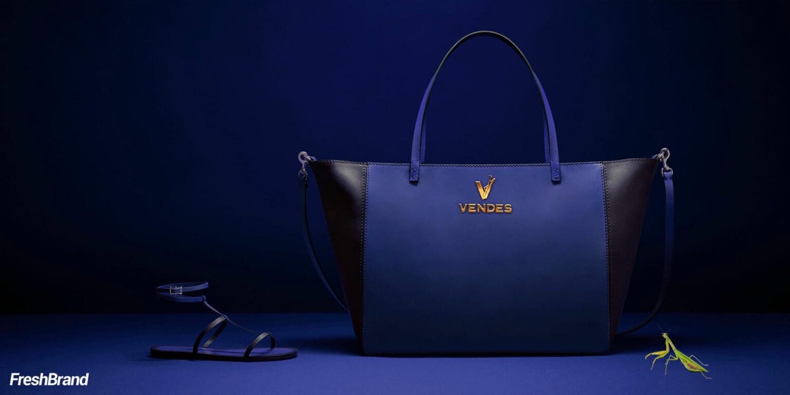
In the Vendes campaign images, the product and the model fill the frame, but in a corner there is often a small mantis perched on a bag strap or beside a shoe. A detail taken from the brand’s symbol lets viewers find it on their own, and remember longer.
When a new brand needs to be remembered by feel
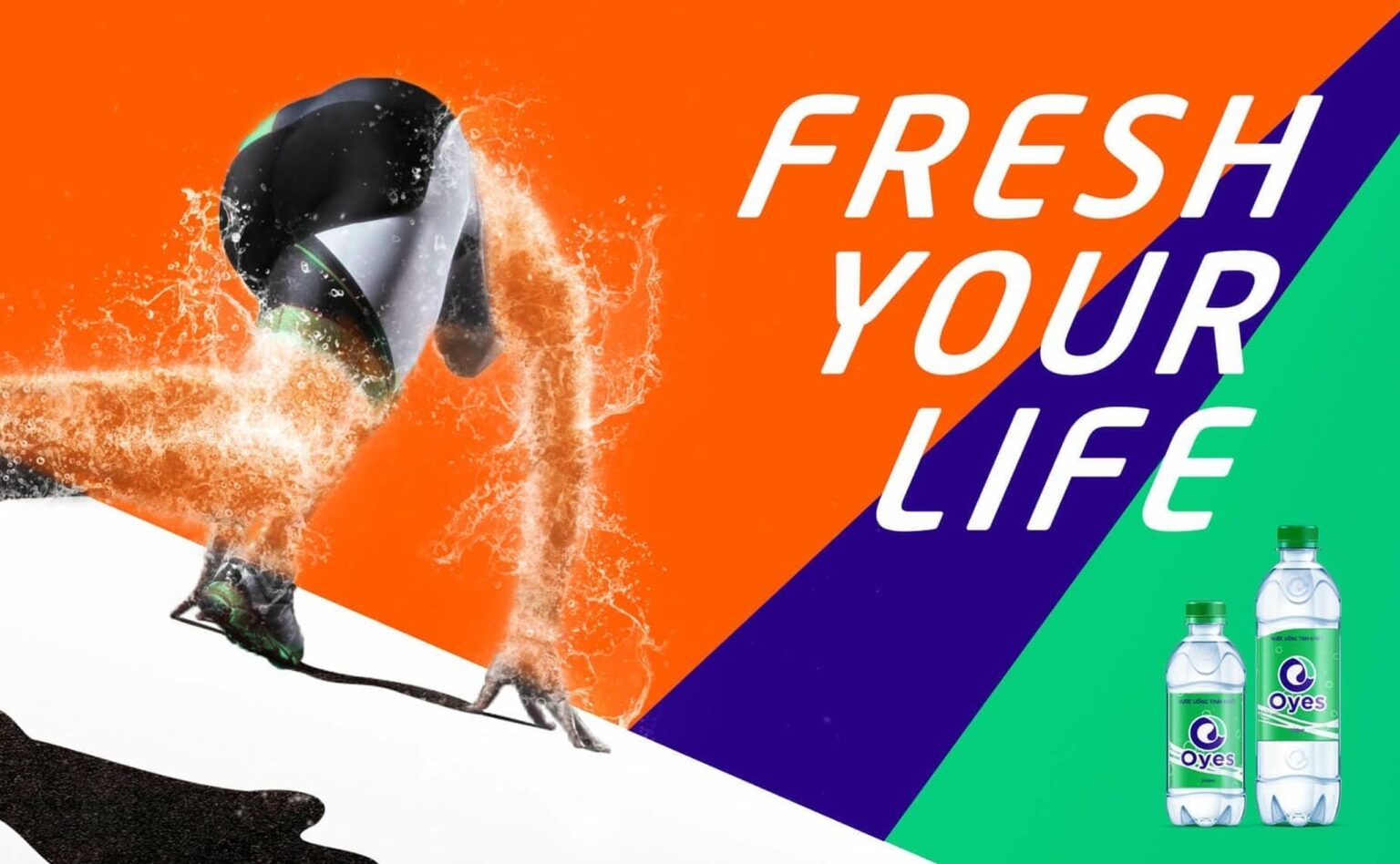
The Oyes campaign puts water in motion: an athlete rushes forward and water splashes into the shape of a person, beside an Oyes bottle with “Fresh your life” and “Fresh relief for thirst.” The same strong, youthful image runs from advertising to the bodies of vehicles.
When a new spirit needs an image to be remembered by
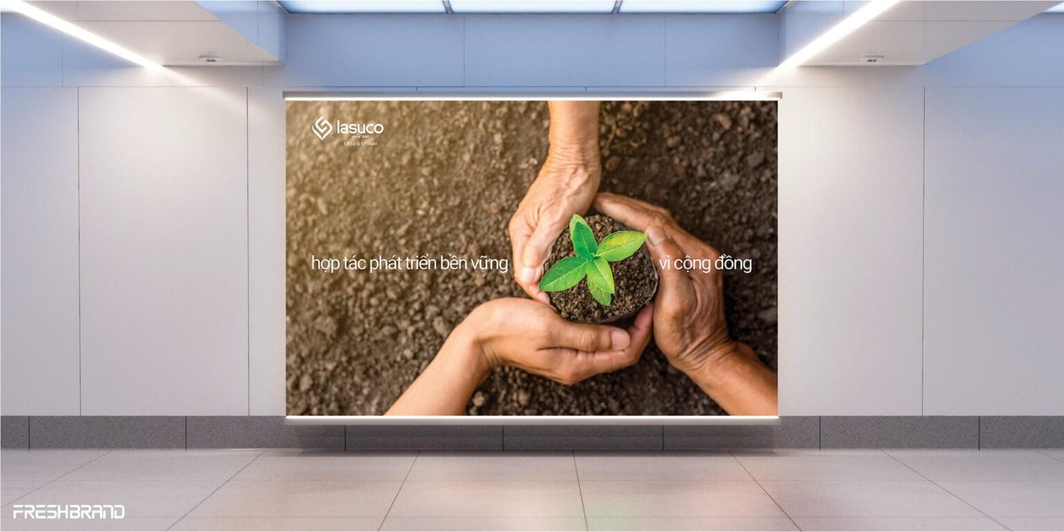
With the spirit of “It’s all natural,” a pair of hands lifting a seedling from the soil became the lead image on Lasuco’s billboards. The image speaks of the roots the company keeps with its farmers and raw-material regions as it steps into the position of a corporation.
How FreshBrand works
The key visual process runs from choosing the most important thing in the message, to testing the image across many formats, to building a set of applications for each channel.
Where is the brand now?
We start with the identity system, the campaign message and the places the campaign will appear, along with the imagery the brand has used before.
What really needs to be seen?
A campaign should carry only one lead image, so FreshBrand chooses the most important point of the message before designing.
Key visualThe lead image, combining layout, type and color for the whole campaign
Layout systemHow the key visual stretches to each format, from a billboard to a phone screen
ApplicationsBillboards, points of sale, printed materials and digital channels built on the same key visual
What do we choose?
Design directions are tested across many formats from the start, so we choose an image that still holds up once it moves away from the first sketch.
Tied to identityThe key visual uses the brand’s own colors, type and visual language
Easy to recognizeThe key visual still reads as the brand’s when cropped or seen from far away
ScalableThe layout system keeps its spirit when the format changes, wide or tall, large or small
How is the key visual finished?
The key visual is rolled out as a set of applications for each channel, with layout standards so the business’s team and its printing, fabrication and advertising partners get it right at every size.
What will actually change?
A key visual works when viewers recognize the brand from the image on whatever channel they meet it, and what the brand wants to say becomes clearer in their minds as well.
What the business keeps
A good key visual is still used after the first campaign closes, so the handover is prepared for the business to roll it out on its own in later waves.
- The finished key visual with usage guidance.
- A layout system for the formats used most often.
- Applications for billboards, points of sale, printed materials, events and digital channels.
- Master files and technical specifications for printing, fabrication and digital advertising.
- Standards for rolling out new applications throughout the campaign.
Layout system by channel
Each channel has its own format, so a key visual has to work in many different formats; that is why the layout system is designed together with the image, without waiting for adjustments afterward.
- Wide formats: Billboards, large banners and big screens, where viewers have only a moment to look.
- Tall formats: Standees, posters and phone screens, where the image and type have to be rearranged by height.
- Small formats: Digital banners, posts and merchandise, where only the recognizable part of the key visual remains.
Let's talk
Is your business facing a similar question? Send a request to talk with FreshBrand, or download the portfolio to see more of our work.
In practice
Ton Dong ARepositioning and communication, 2014
When a commitment becomes the lead image
In 2014, Ton Dong A had real manufacturing strength and modern technology, but end consumers still knew the brand mainly through dealer recommendations.
“Ton Dong A is not short on quality. It is short on a presence that matches it.”
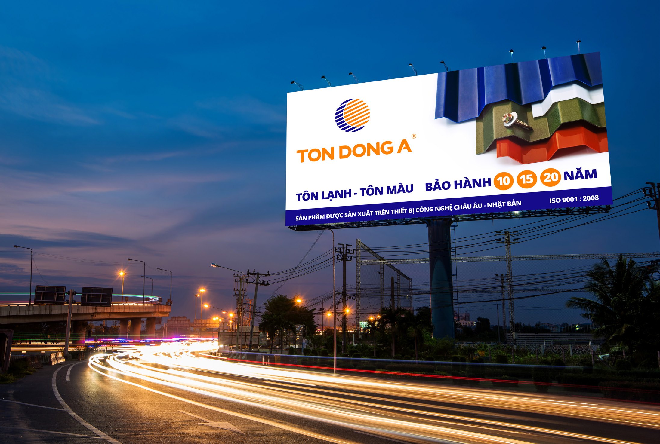
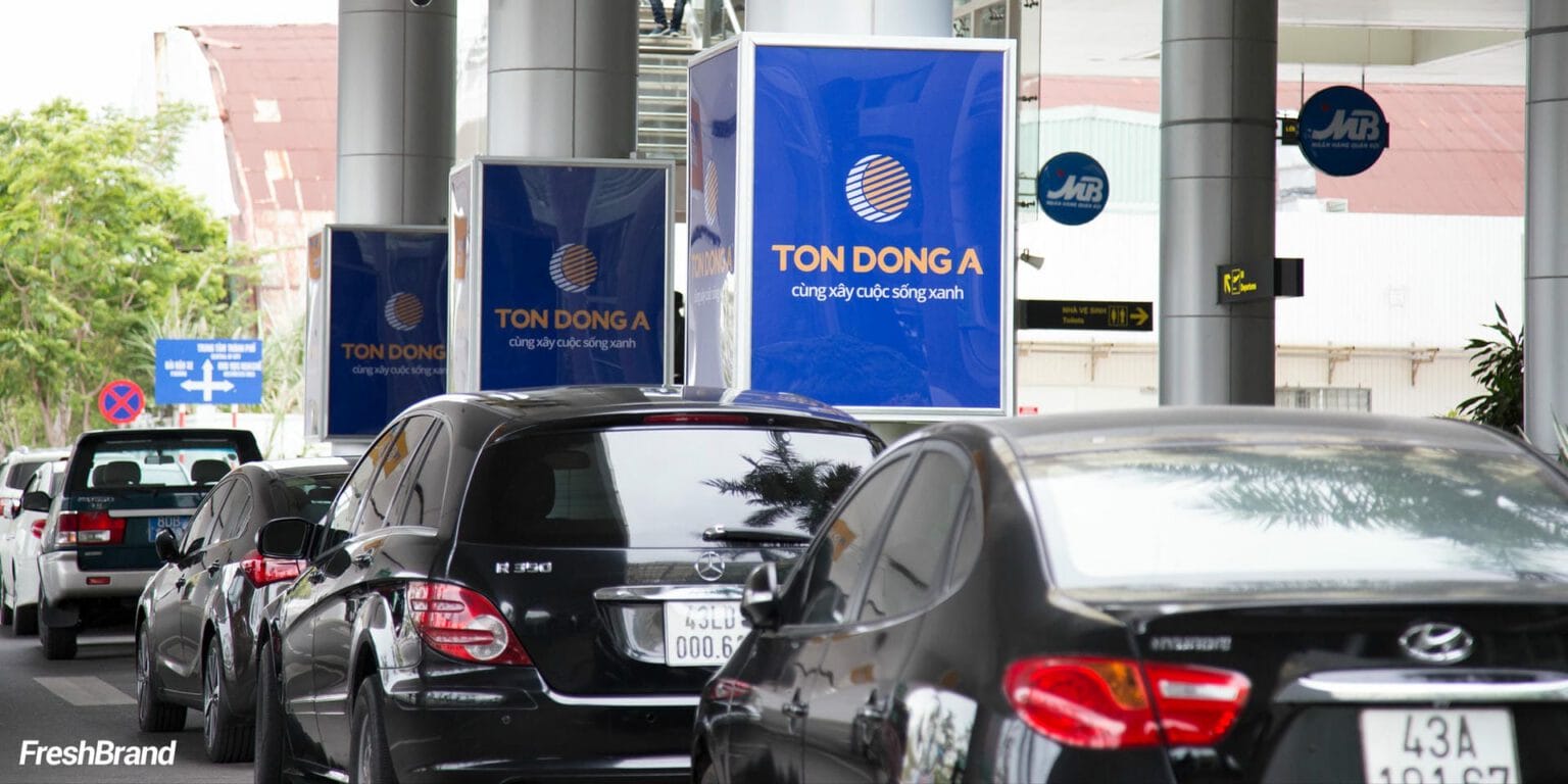
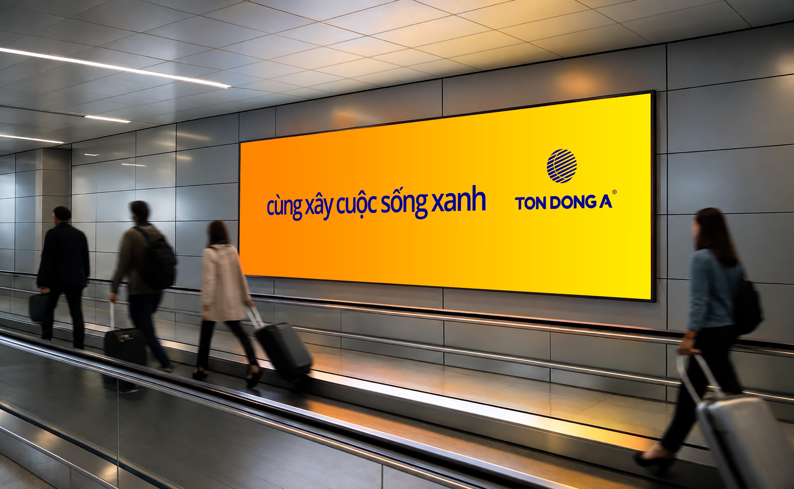
Instead of proclaiming quality, Ton Dong A used the commitment “Together we build green life” to widen the story from the product to a role alongside the community. That commitment became the lead image: a blaze of orange carrying those very words, appearing from station corridors to roadside billboards and illuminated signs at night.
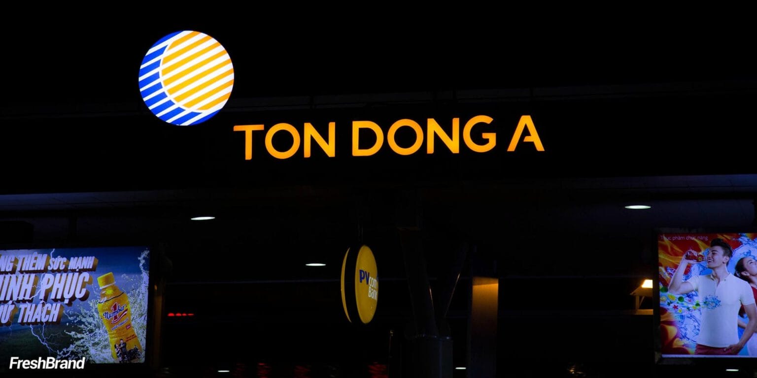
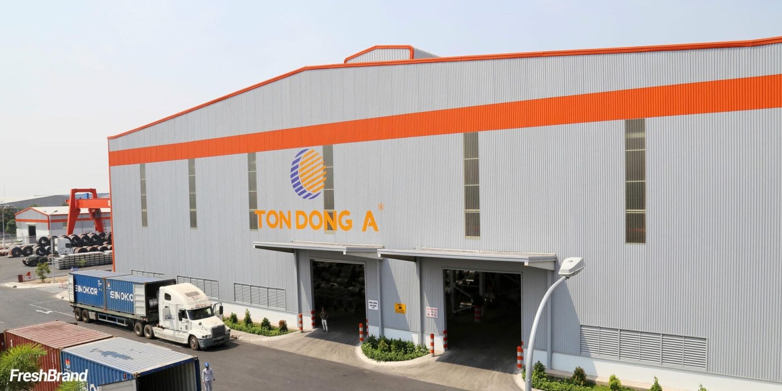
Each appearance therefore added to a single image of a brand with real strength and a role in the community. That image gave buyers a basis to know Ton Dong A directly, alongside the dealers’ introduction.
The question behind it
A key visual holds up only when the brand already has a clear message and an identity system to lean on.
- Communication Design
When a key visual needs to be rolled out as billboards, point-of-sale materials (POSM) and printed materials. - Tagline & Brand Messaging
When an image needs a line short enough to travel with it. - Brand Identity Design
When a campaign needs a solid identity system before it has an image of its own.
FreshBrand capabilities
Strategy
When a brand needs a direction
Identity
When a brand needs to be recognized
Expression
When meaning needs to take shape
Experience
When a brand needs to be felt
Communication
When a brand needs to be understood
- Communication Design
- Campaign Key Visual
Start with FreshBrand
Send us the problem, get a point of view.
You can send a request today, or download the portfolio to share with your leadership before we talk.