

Overview
Oyes is the bottled drinking water brand of Bao Minh.
FreshBrand named Oyes and designed its logo, identity system and packaging around a direction that is natural, distinctive, bold and new, with the tagline “fresh relief for thirst.”
Symbol
How did the idea take shape?
An O that swirls like flowing water
The symbol is an O that curls inward like a whirl of water and ends in a green leaf. The logo is built on a tight proportional grid and paired with a modern sans-serif typeface.
The palette uses indigo and green, two colors rarely seen among drinking waters, so that Oyes does not blend into a row of blue bottles on the shelf.


Applications
Where does the brand appear?
Waves on every surface
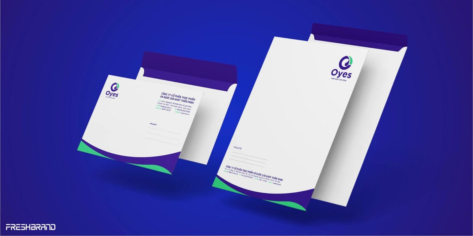
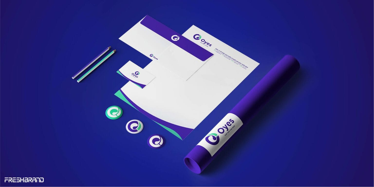
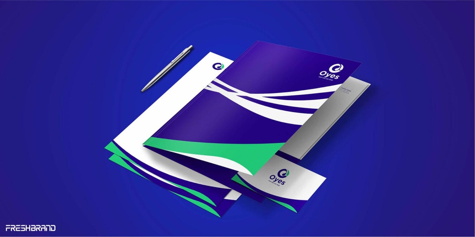
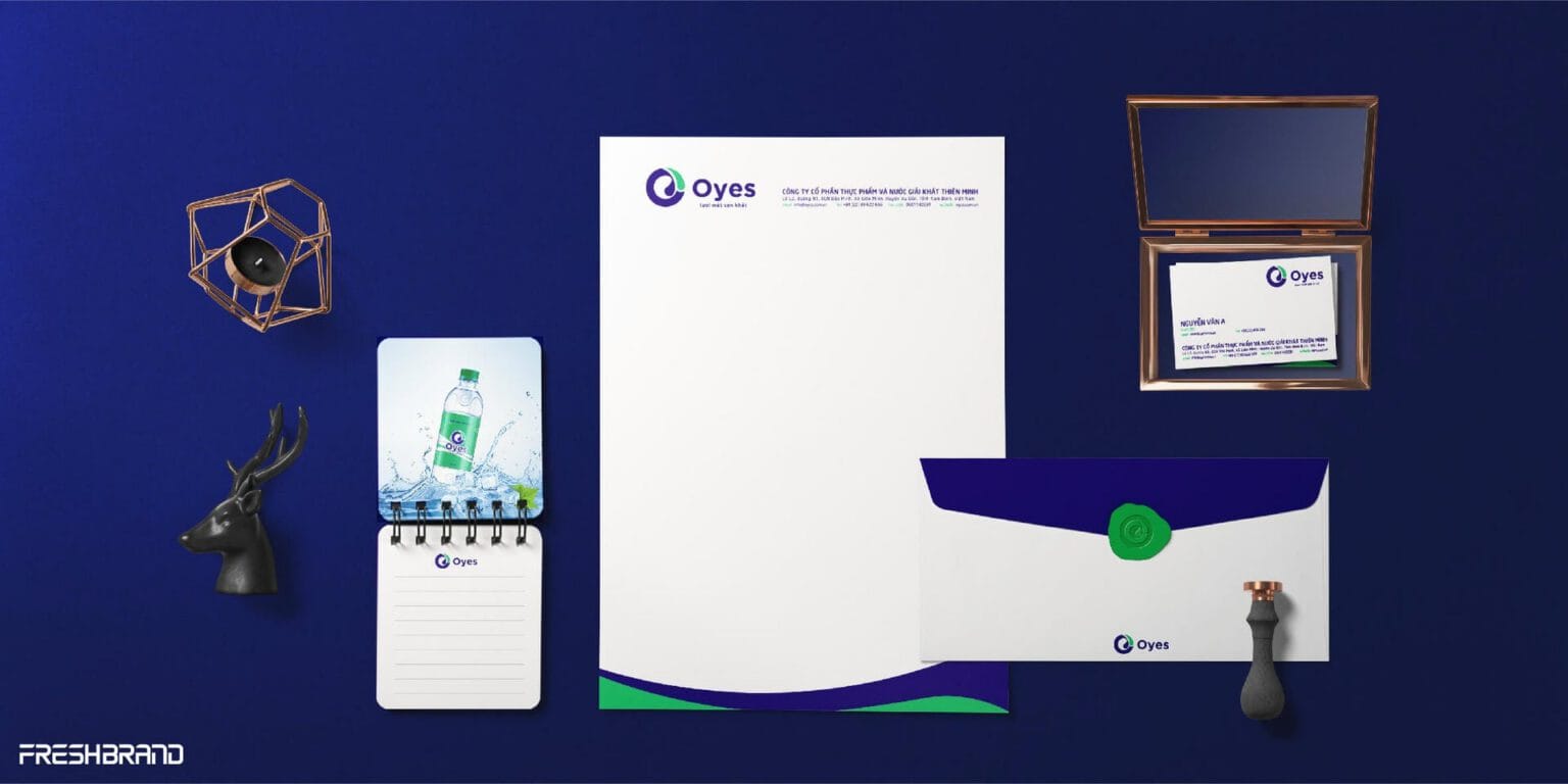
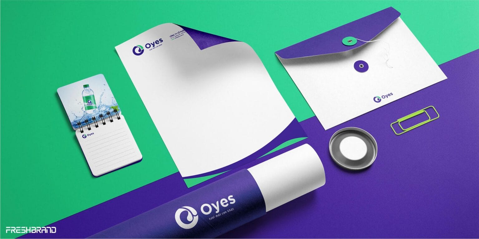
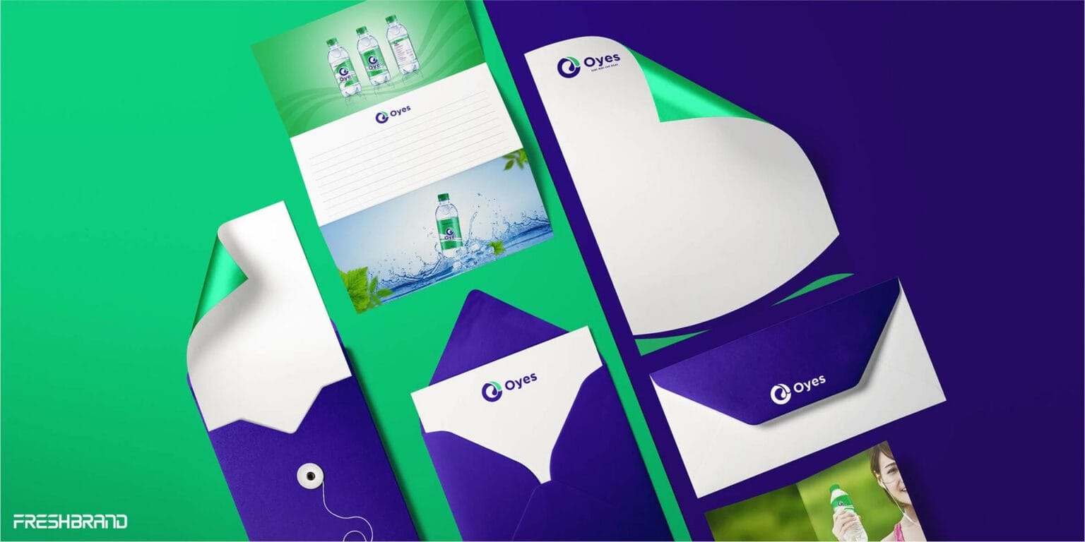
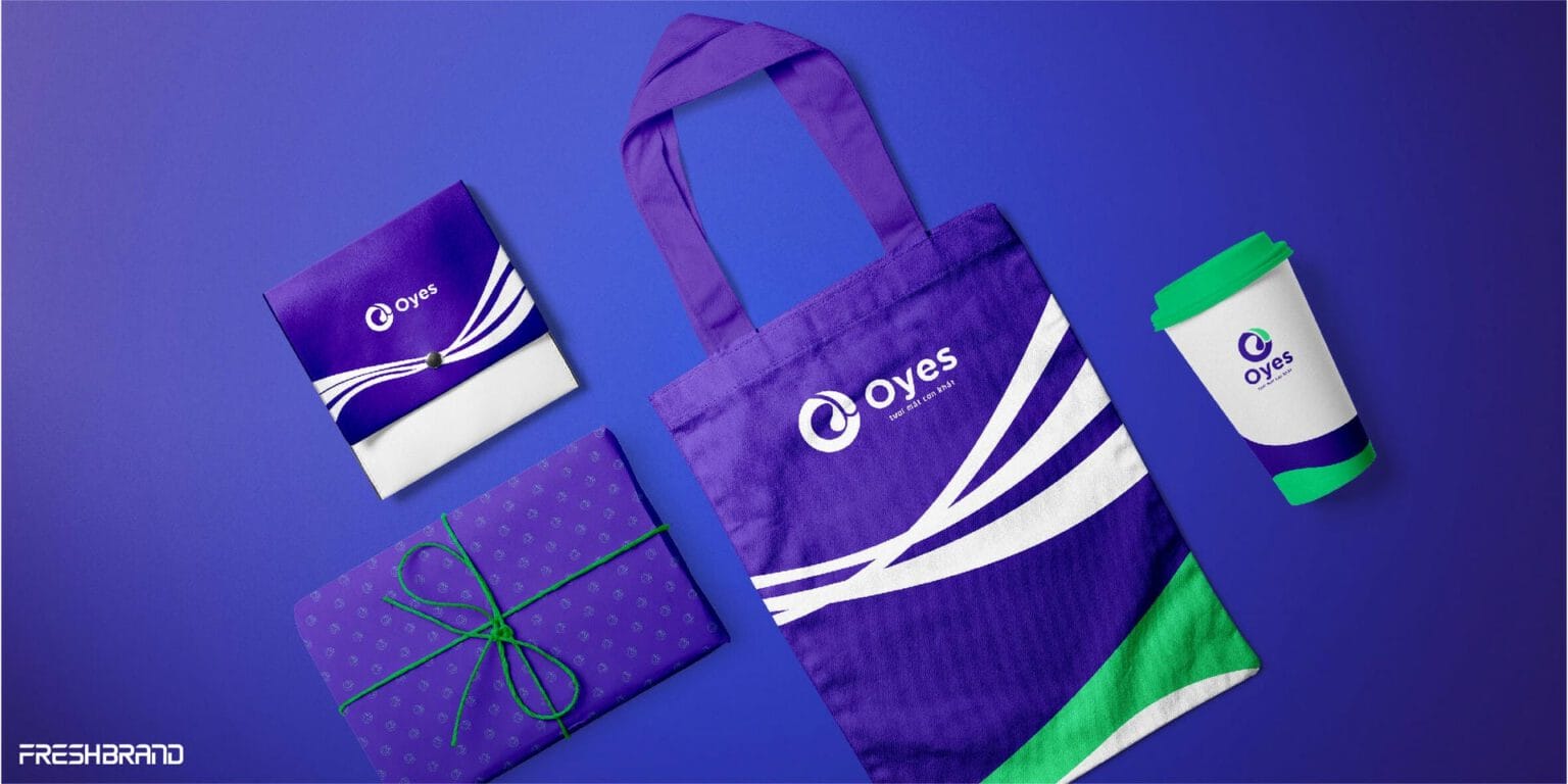
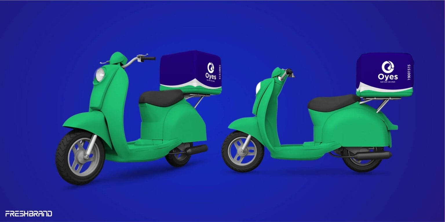
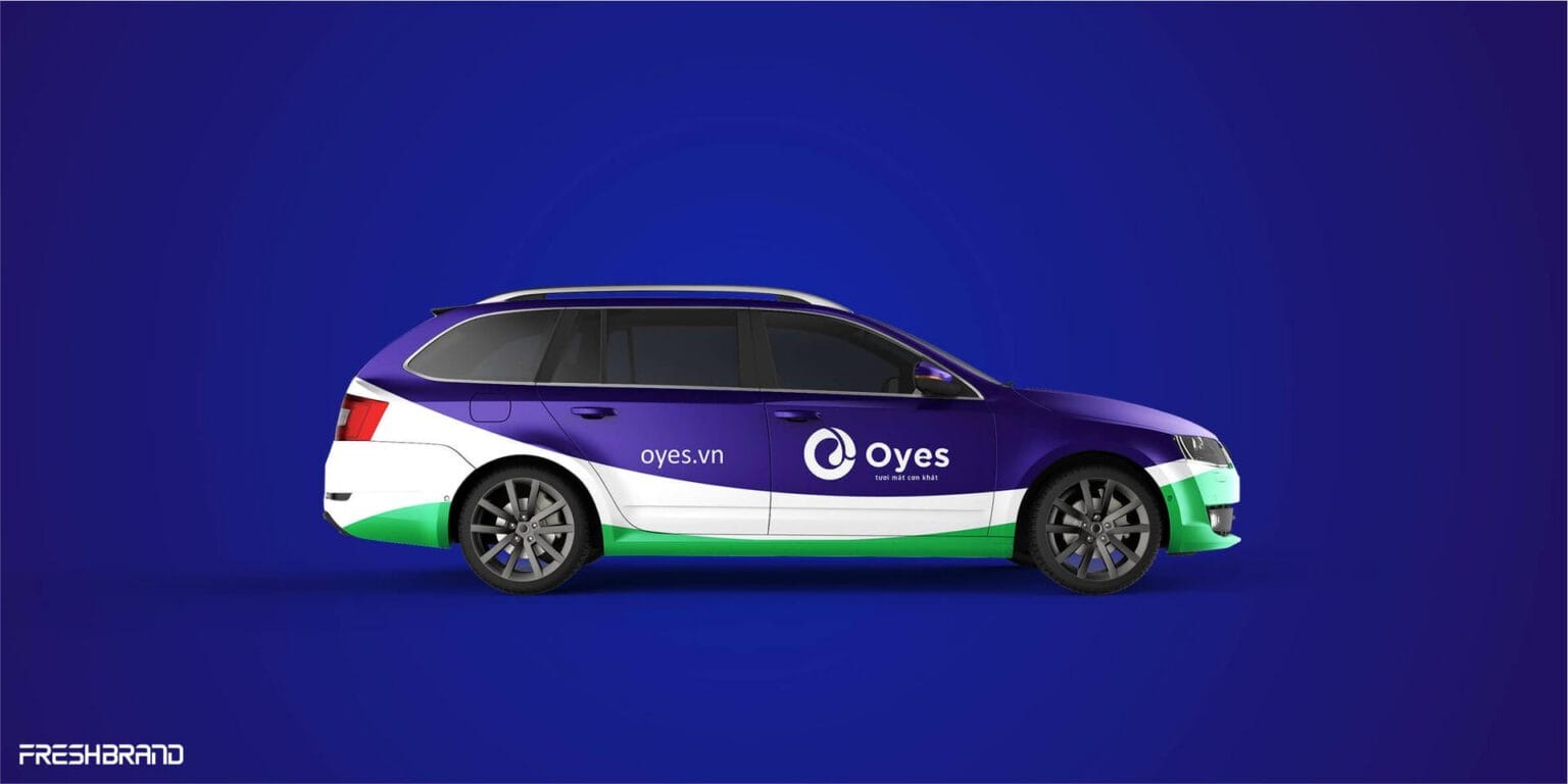
From business cards, letterheads and tote bags to motorbikes, cars and trucks, a band of green waves cuts across a purple ground. The same movement, at every size.



Campaign
How does the brand find its voice?
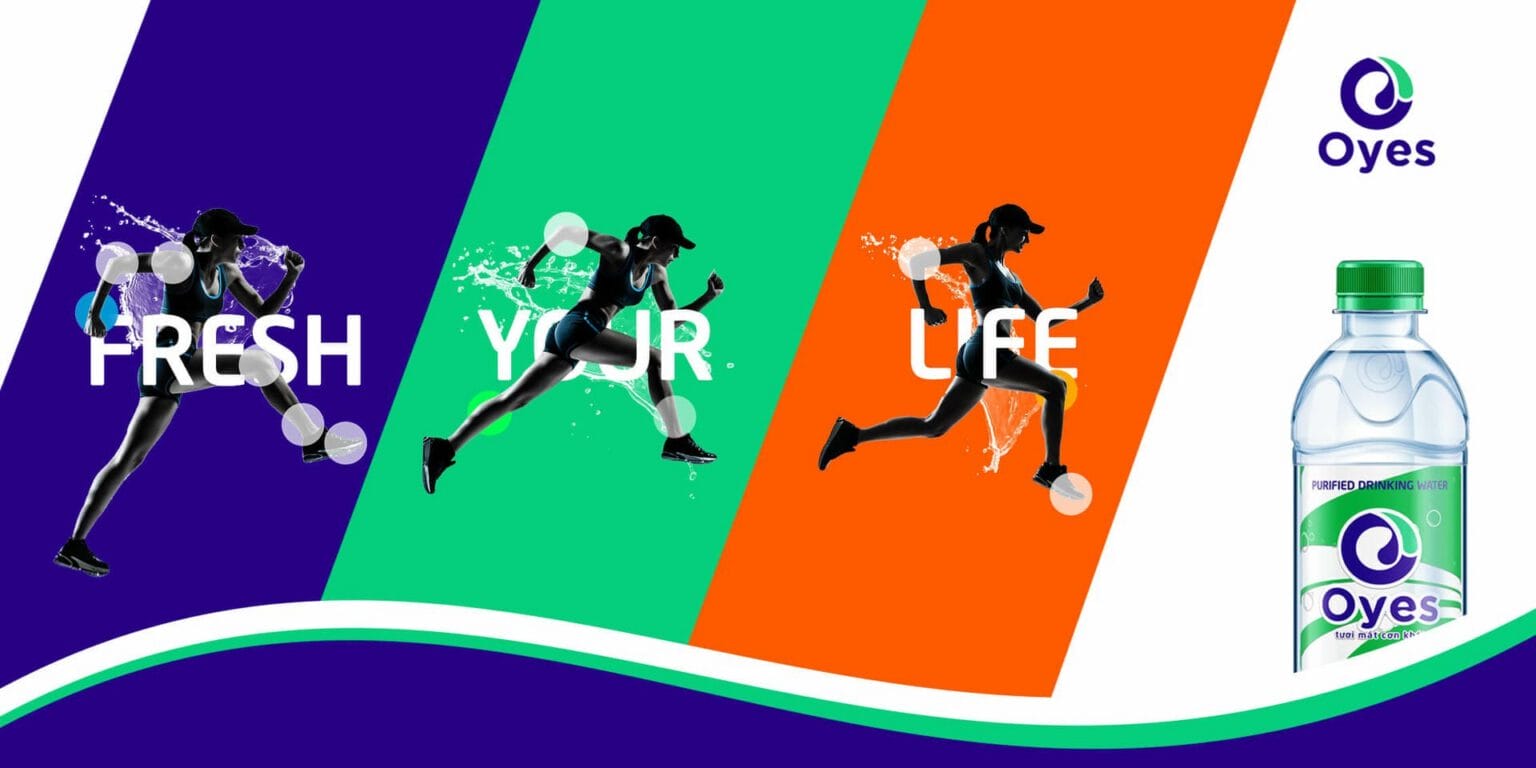
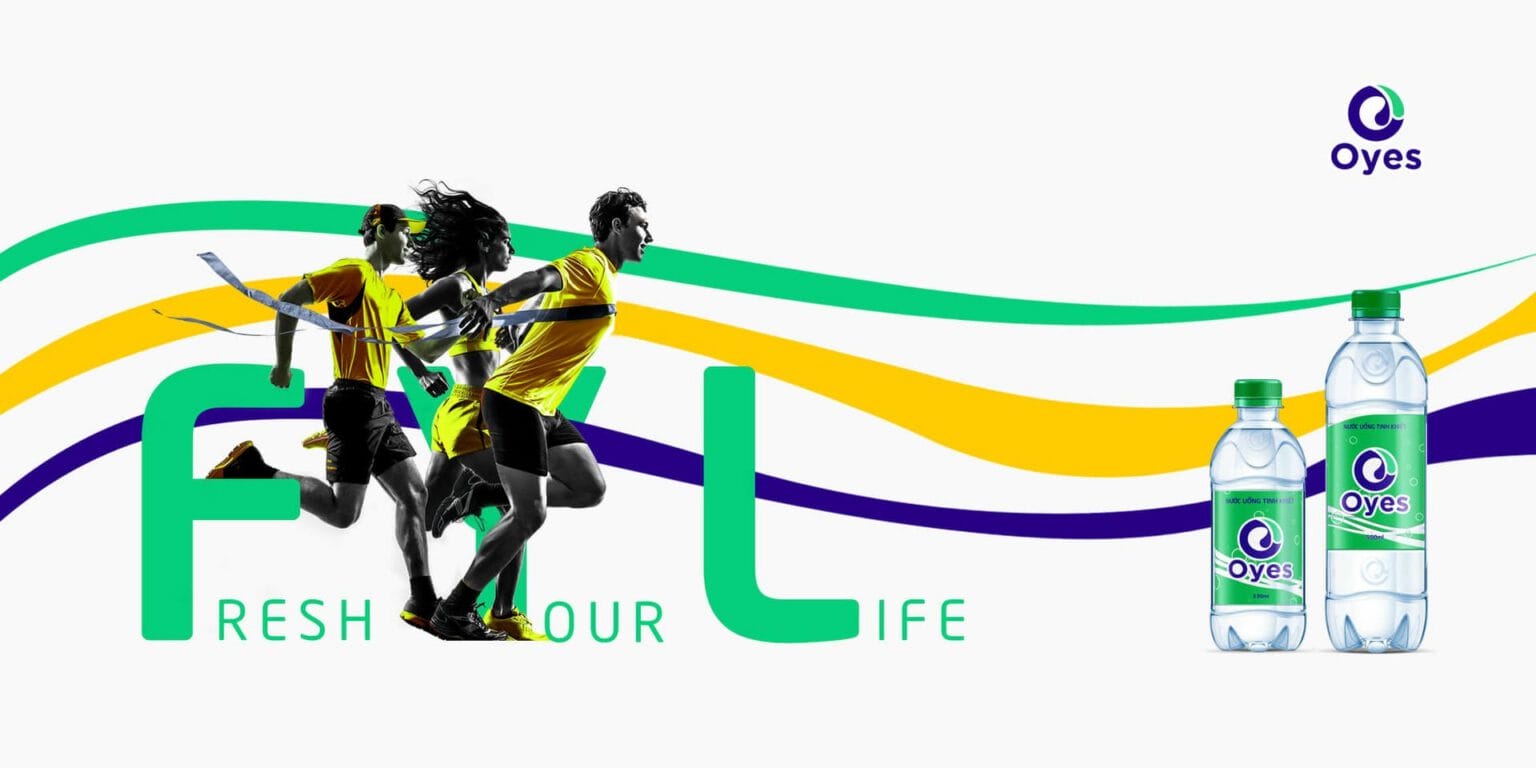
Fresh your life
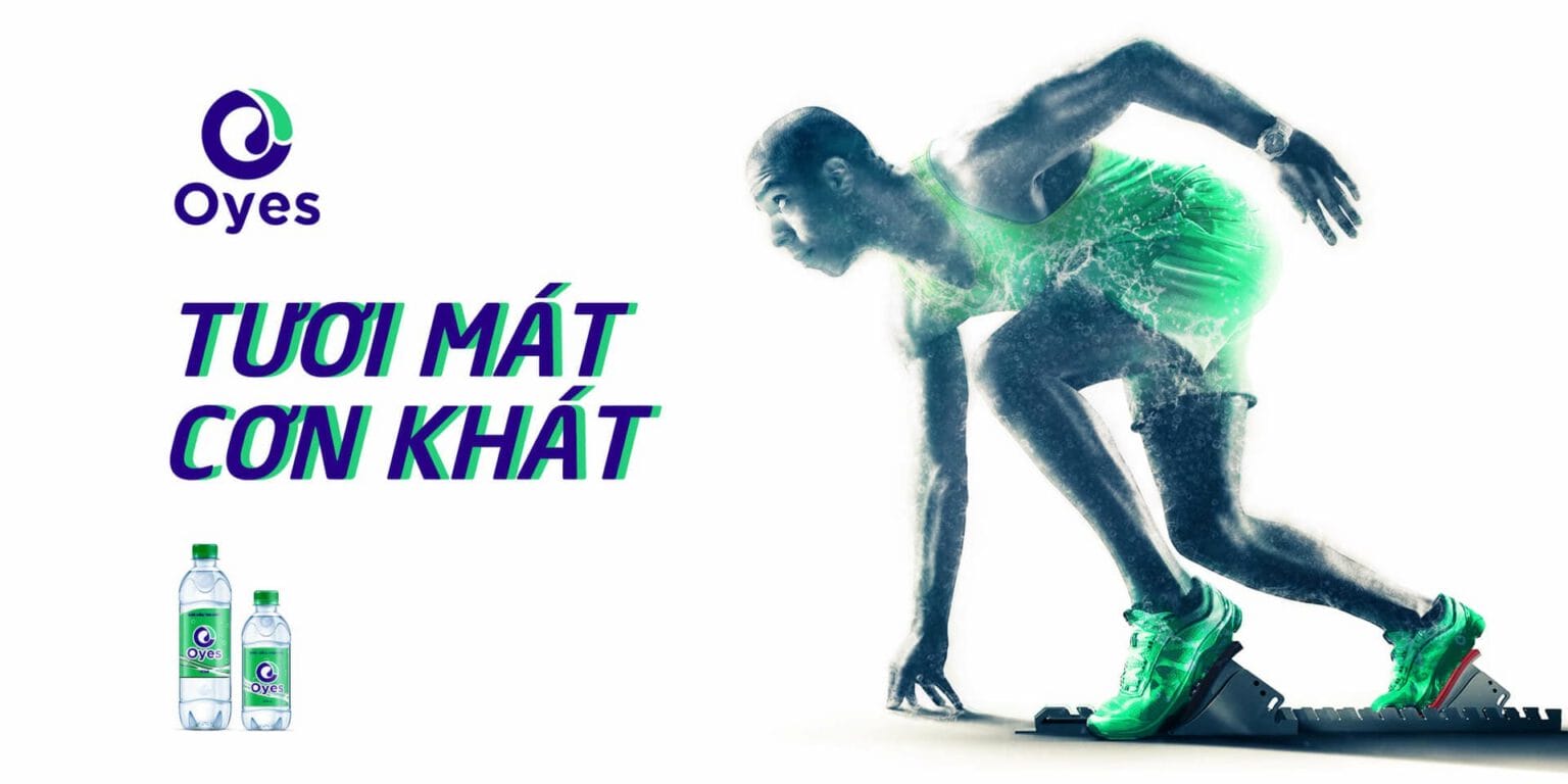
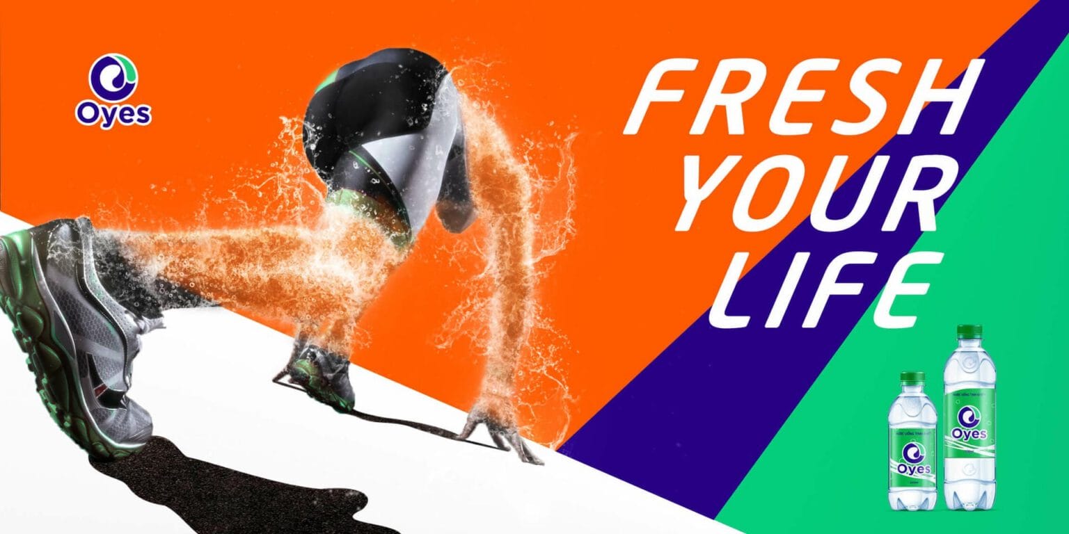
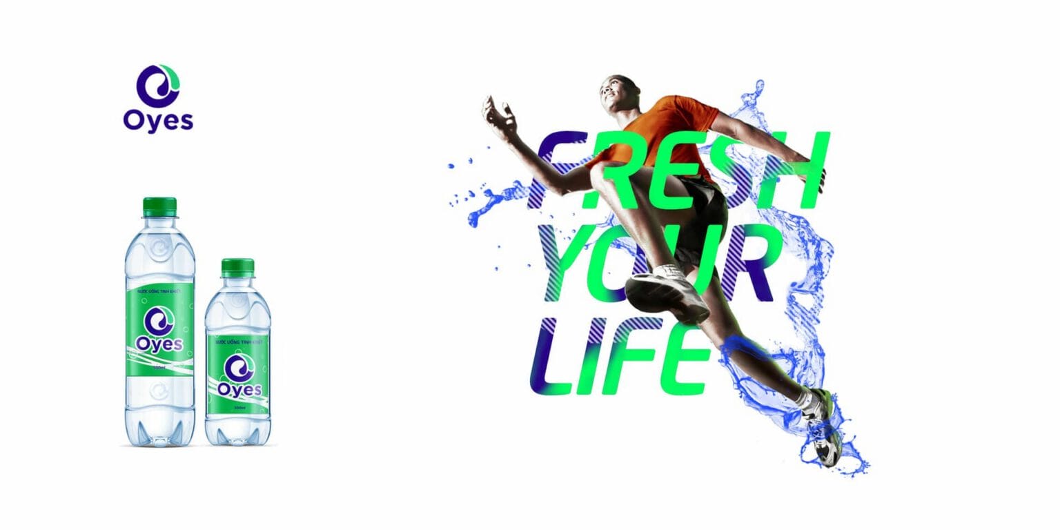
The campaign sets water in motion: an athlete surges forward as splashing water takes the shape of a figure. The messages “Fresh your life” and “Fresh relief for thirst” sit beside the Oyes bottle, strong and youthful, a good fit for a brand that wants to awaken thirst.



FreshBrand team
- Trần Anh Tú — Creative Director, Project Director, Design
- Hải Anh — Design
- Kiều Nga — Design
Project
- ClientBao Minh
