
Vendes
Luxury needs no announcement, only the right posture.
- Client
- Vendes
- Industry
- Fashion & Beauty
- Services
- Brand Identity Design, Logo Design

Overview
Vendes is a handbag and fashion accessories brand.
FreshBrand designed the logo and identity system for Vendes along a confident, luxurious, versatile direction, built on an image few would think of in fashion: the praying mantis.
Inspiration
Where did the idea start?
The stance of a praying mantis
A mantis always stands upright, forelegs raised, slim and exact. Its confidence lies in its posture, not in its color or size.
That is also what Vendes wants its customers to feel when they carry a bag.


Symbol
How did the idea take shape?
A V that stands like a mantis
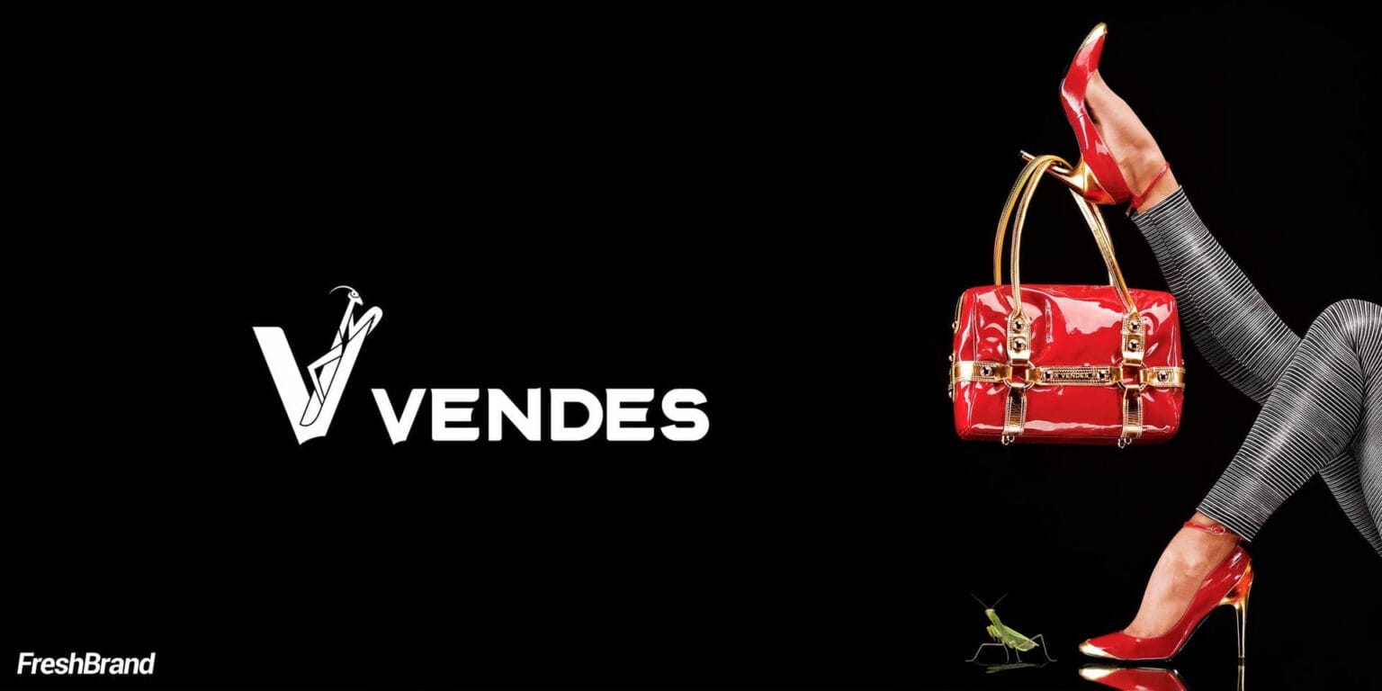
The logo works the mantis’s stance into the letter V: two slender strokes rising to a sharp, balanced point. The bold, angular VENDES wordmark sits on a midnight blue ground.
The symbol is compact enough to repeat as a pattern, and sharp enough to emboss on leather.


System
How is the identity kept consistent?
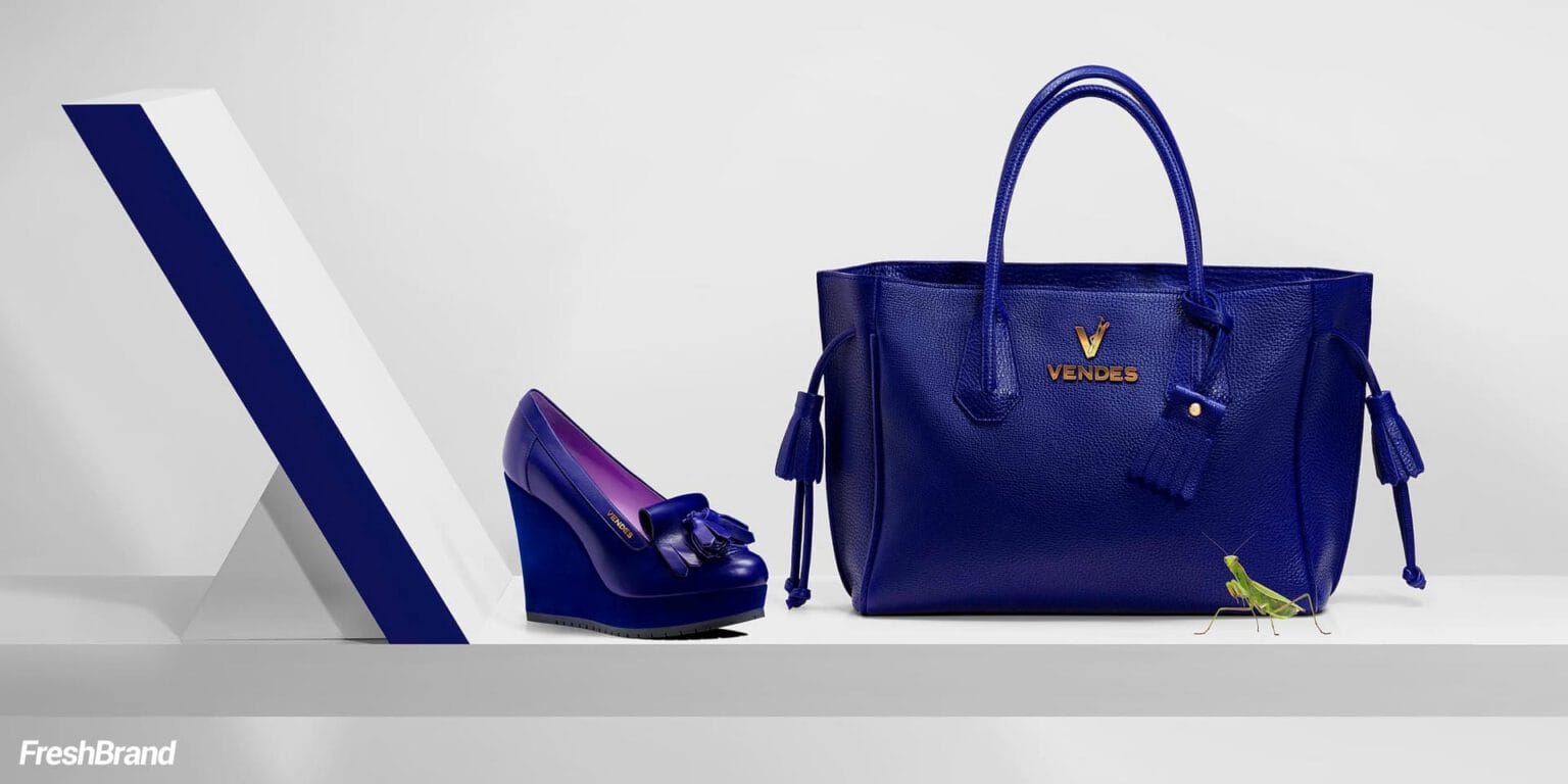
Midnight blue and white
Business cards, letterheads, envelopes and packaging use two colors: deep midnight blue and white. The V pattern covers the back of the printed materials like a woven fabric.


Campaign
How does the brand find its voice?
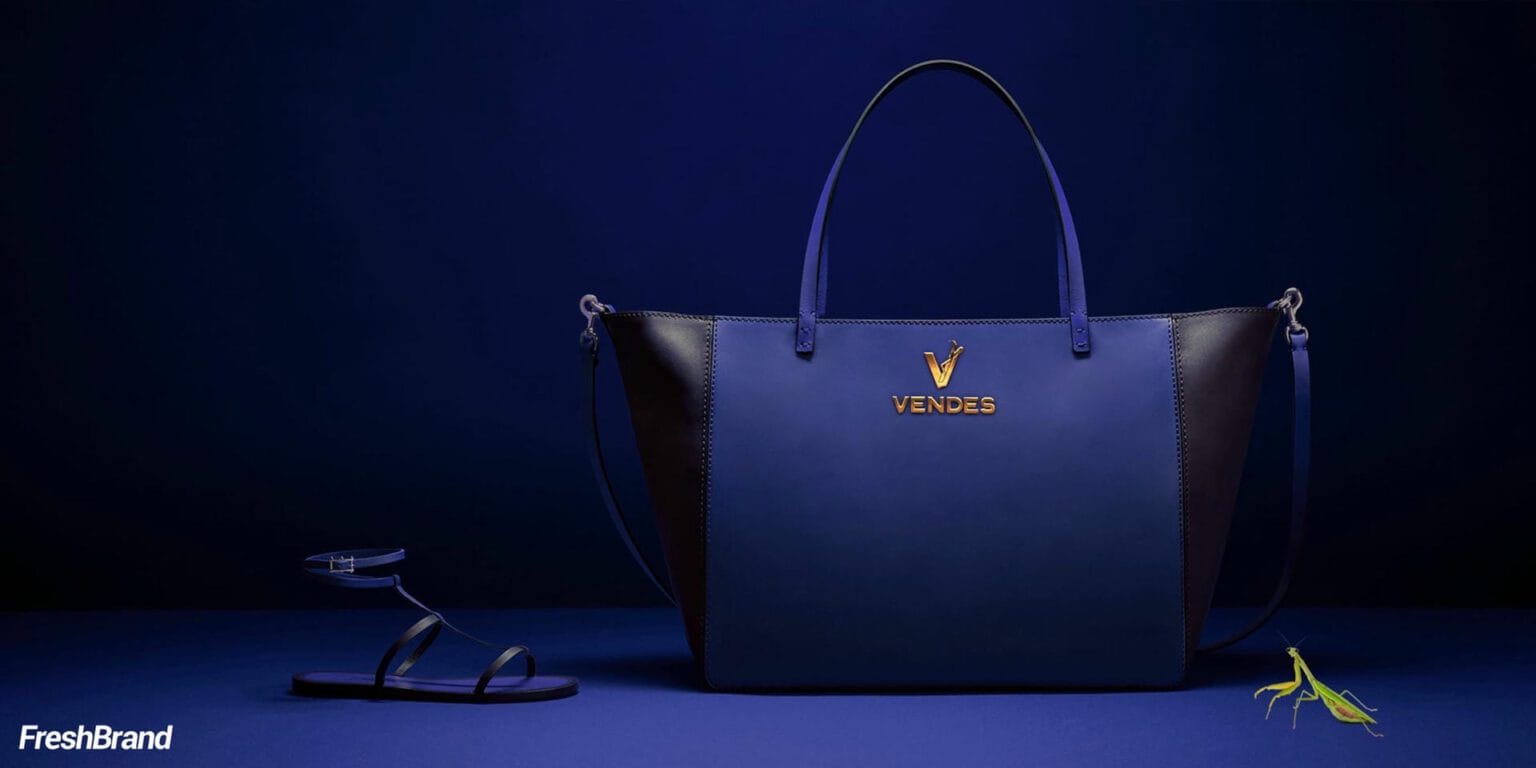
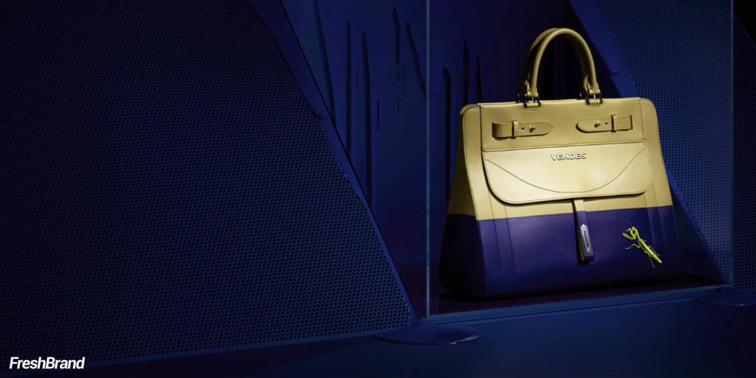
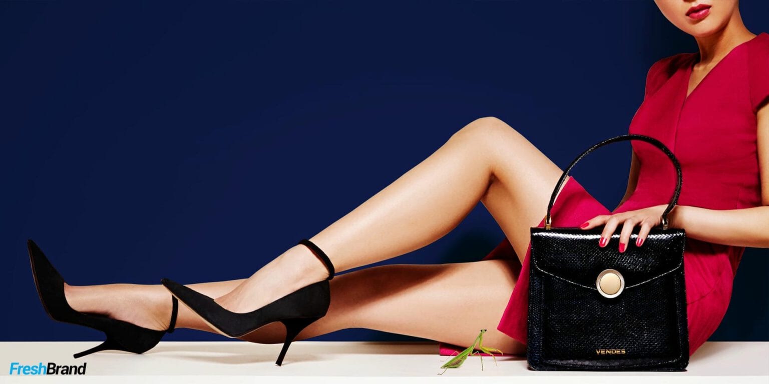
A small mantis in every frame
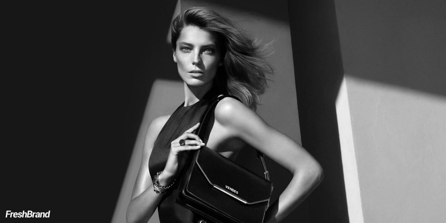
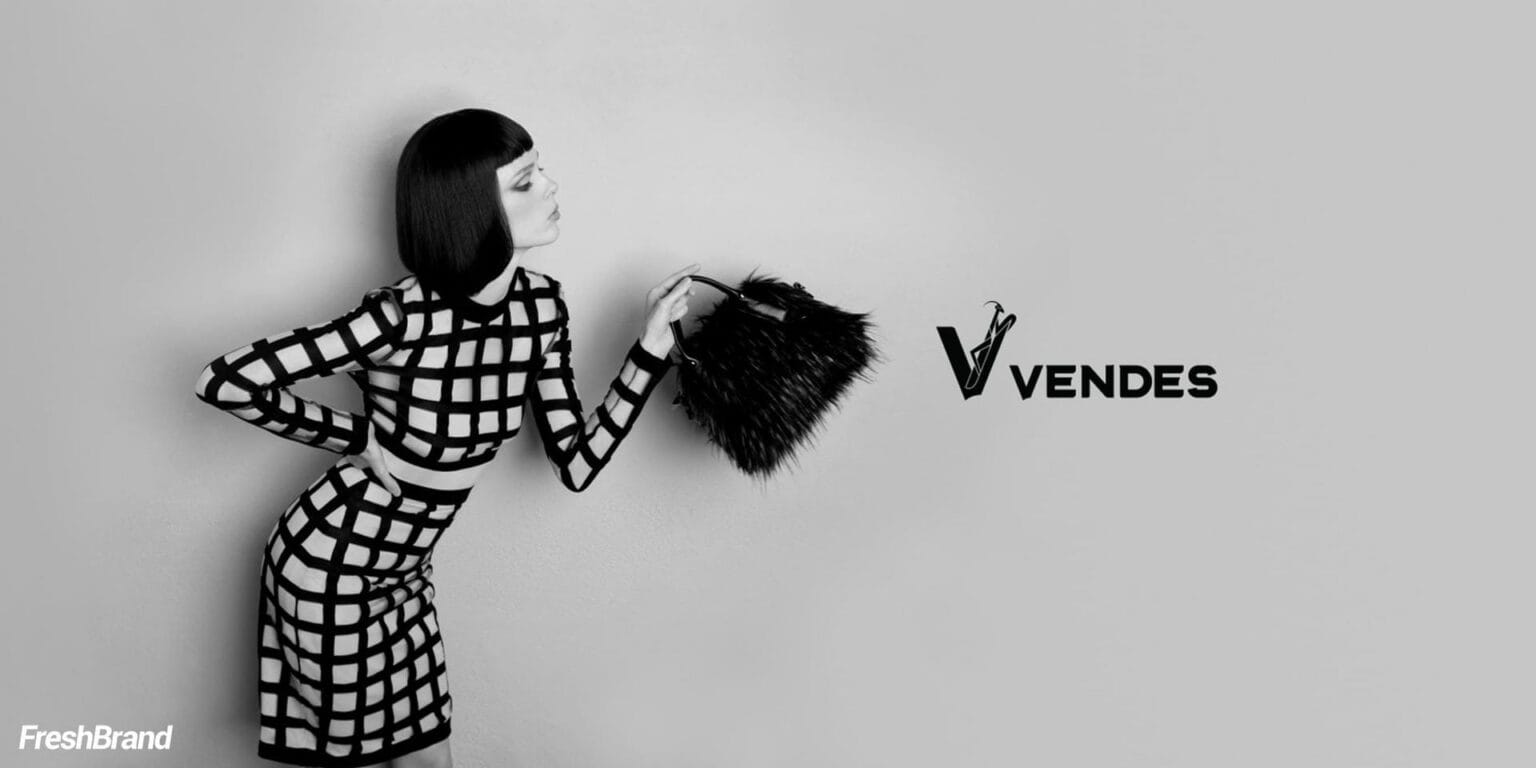
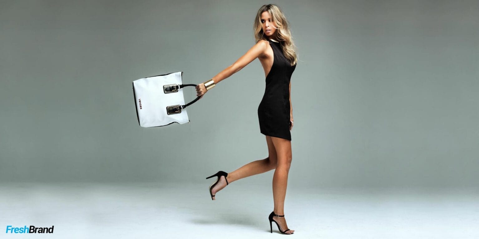
In the campaign images, the product and the model fill the frame. But somewhere in a corner there is often a small mantis, perched on a bag strap, beside a shoe, next to a business card. A detail for viewers to find on their own, and remember longer.


Services
FreshBrand team
- Trần Anh Tú — Creative Director, Project Director, Design
- Hồng Phong — Design
- Thanh Thuận — Design
Project
- ClientVendes
