
Van Phat Loi
Everything begins with a single grain of rice.
- Client
- Van Phat Loi
- Industry
- Agriculture & Agribusiness

Overview
For an agricultural brand, the most trustworthy thing is still the grain of rice itself.
FreshBrand designed the logo, identity system and brand space for Van Phat Loi around quality, friendliness and safety, placing the grain of rice at the center of the identity.
Symbol
How did the idea take shape?
An O that holds a grain of rice
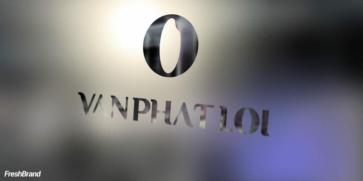
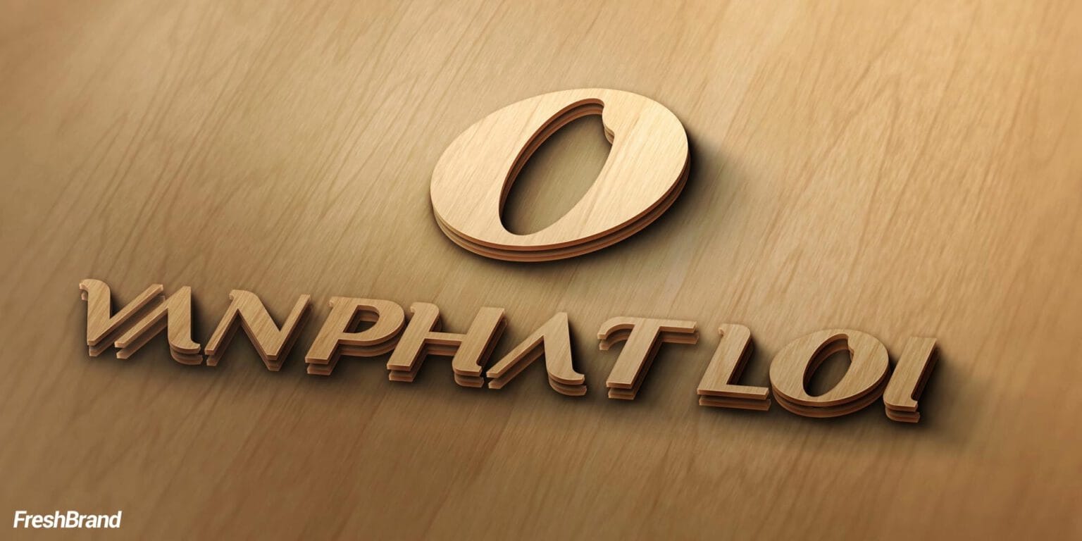
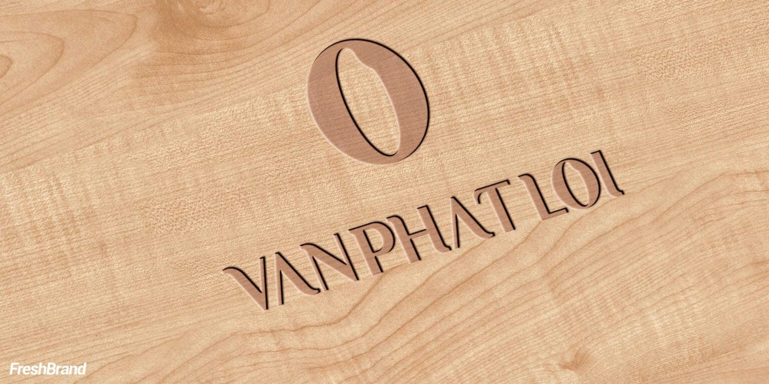
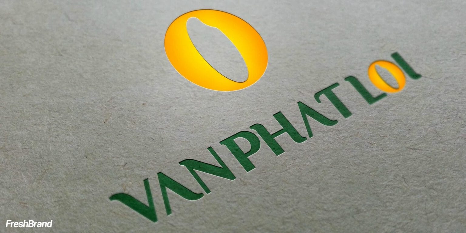
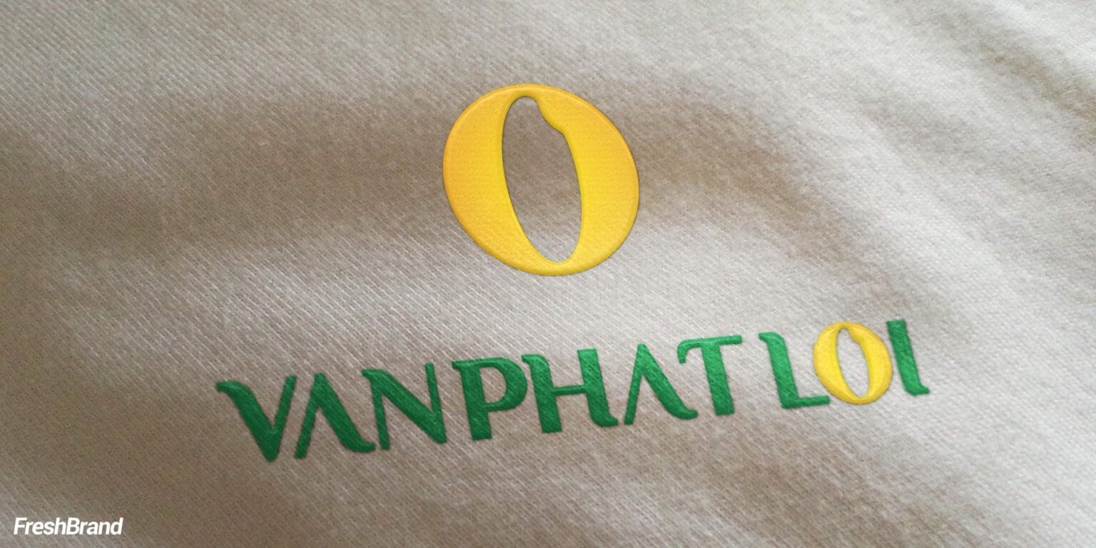
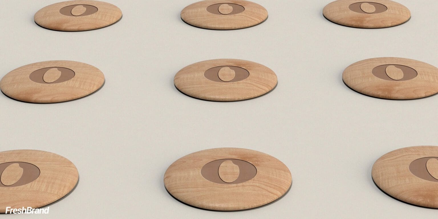
The symbol is a gold circle whose inner space takes the shape of a grain of rice. It is a simple form, yet it says three things at once: abundance, the color of ripe rice, and the company’s core product.
The VAN PHAT LOI wordmark in rice-leaf green stands beside the gold symbol: the two colors of a field.

System
How is the identity kept consistent?
Wood for material, rice for color
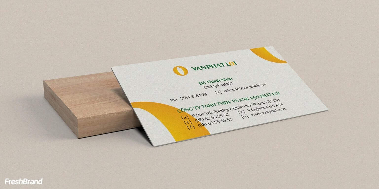
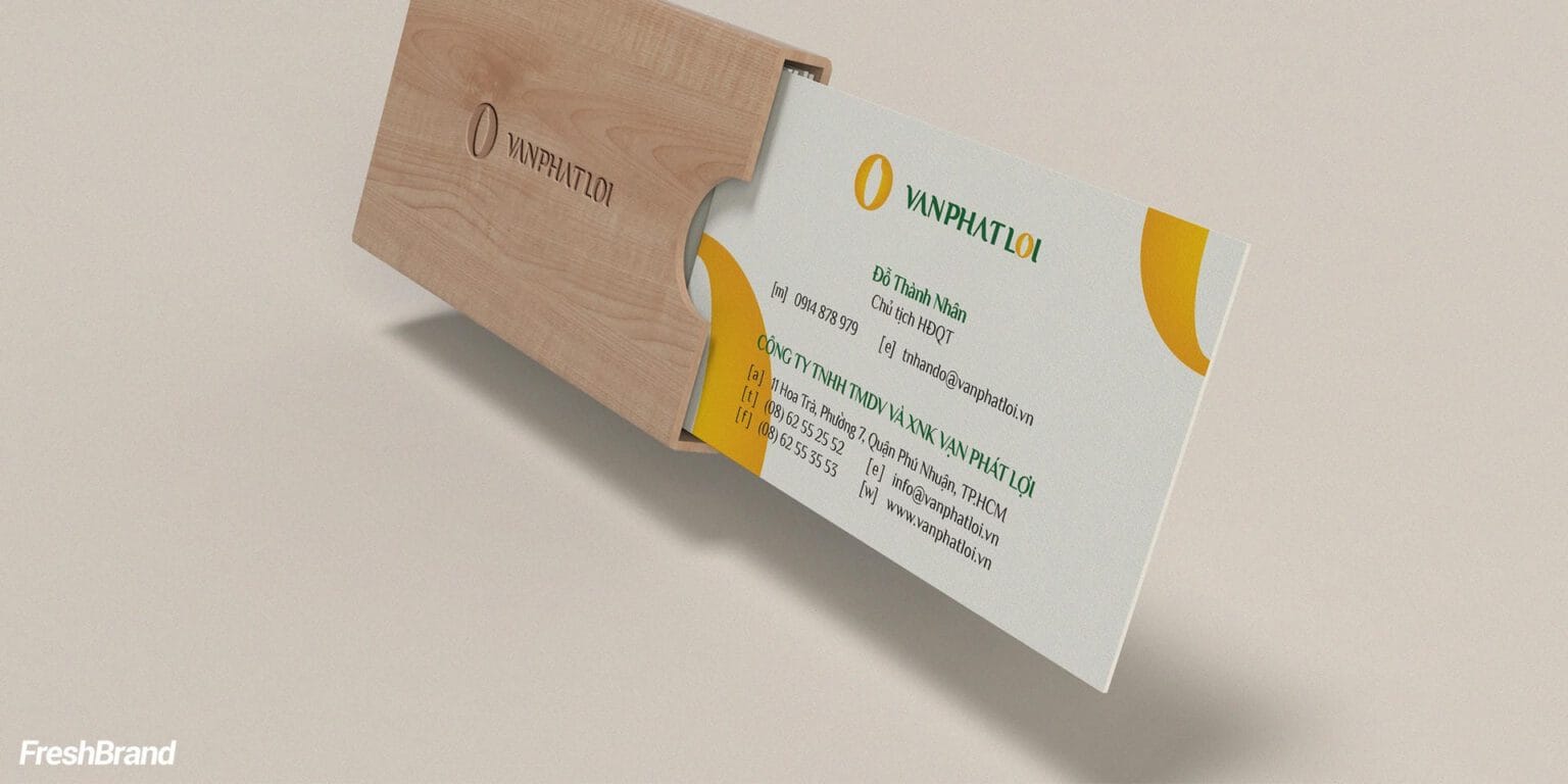
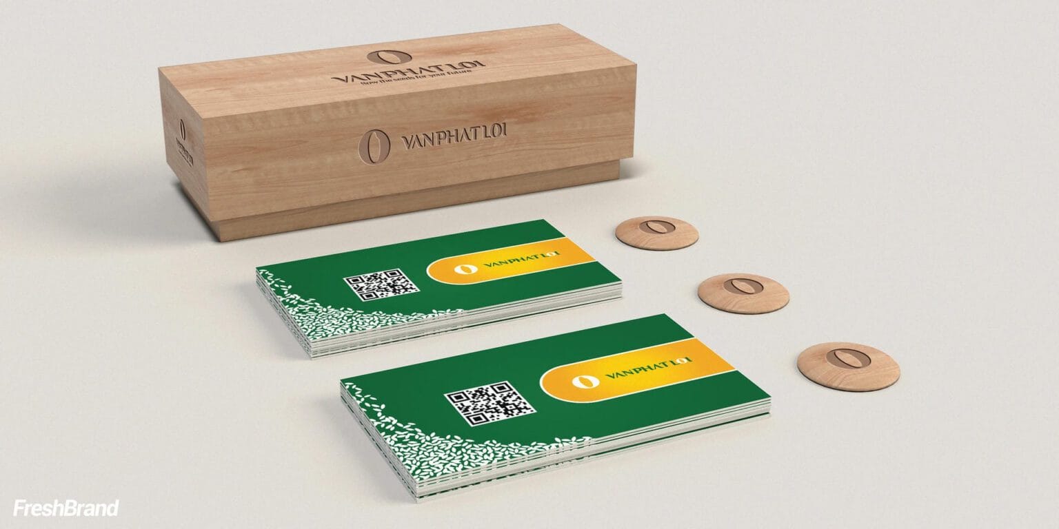
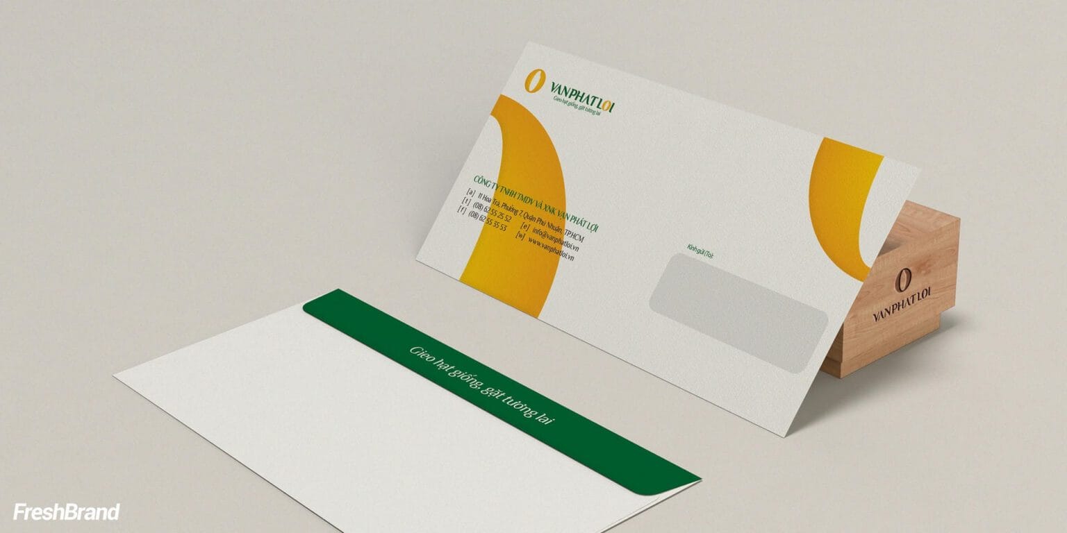
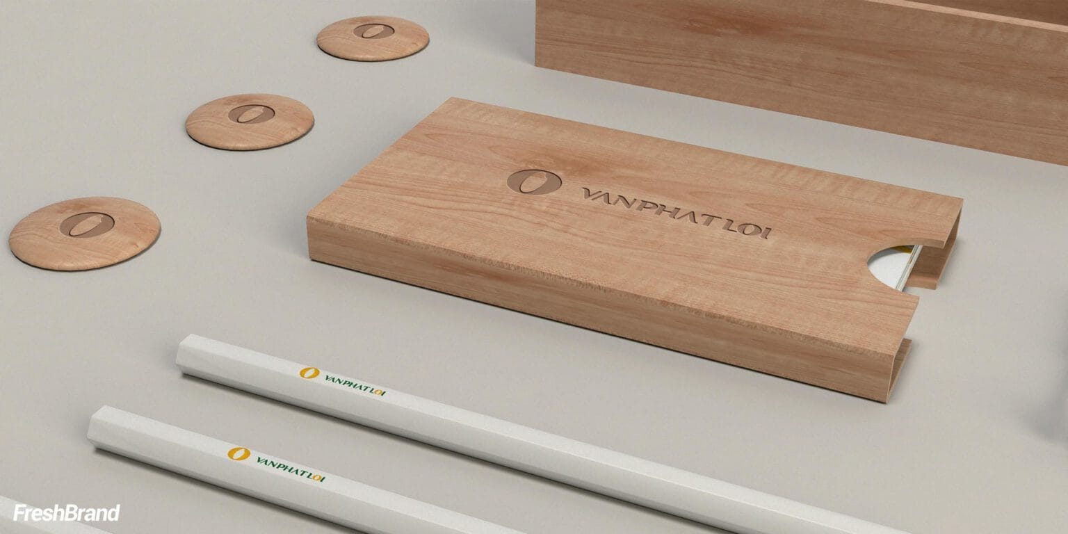
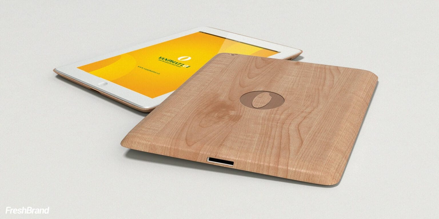
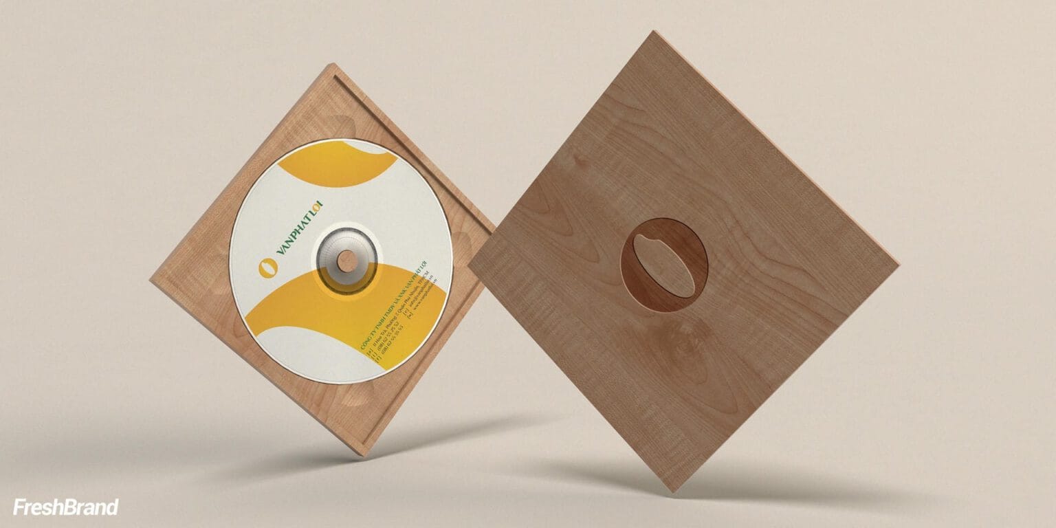
The printed materials do not stop at paper. Business cards, boxes, coasters and disc sleeves are made on raw wood, so that the feeling of nature and safety can be touched, not only seen.
Gold curves cut from the symbol run across every piece, joining small items into one set.





Presence
Where does the brand appear?
From the meeting room to the truck
At large scale, the symbol is repeated as a pattern on the meeting room wall and runs along the side of a container truck. The same grain of rice, at every size.


FreshBrand team
- Trần Anh Tú — Creative Director, Project Director, Design
- Hồng Phong — Design
- Thanh Thuận — Design
Project
- ClientVan Phat Loi
