
Lasuco
Repositioning
2017
Let the brand grow larger than the industry that raised it.
- Client
- Lasuco
- Year
- 2017

Overview
The greatest value does not lie in Lasuco gaining a new name or a tagline.
It lies in a business growing beyond the sugar industry and gaining a brand platform wide enough to grow with it.
Context
Where did the brand stand?
Before 2017, Lam Son Sugar Joint Stock Company had spent more than 37 years bound to sugarcane, its raw-material region and the farmers of western Thanh Hoa’s mountains. A business that once stood at the edge of collapse, it had recovered through its bond with farmers and a spirit of renewal.
In the market’s mind, however, the name “Lam Son Sugar” still mostly suggested a traditional sugar mill, even as the business had begun to expand into high-tech and organic agriculture and products beyond sugar.
At the same time, Vietnam’s sugar industry faced heavy pressure to integrate as ATIGA was about to take effect. Competition from countries with higher productivity and lower costs forced domestic companies to restructure and look for new directions.
Lam Son Sugar therefore faced a paradox:
The business had begun to grow beyond the sugar industry, but the brand was still held inside that very definition.
That was the situation in which the repositioning project began.
Problem
What really had to be renewed?
The problem was not production capacity or depth of history.
Lam Son Sugar had roots with farmers, a raw-material region and experience in the sugar industry, and had begun to develop high-tech and organic agriculture and a wider range of products. Yet the brand was anchored too tightly to the name “Lam Son Sugar.”
That name automatically framed the business as a sugar company, so its new directions in specialized agriculture, value-added products and value drawn from nature were not yet perceived at their true weight.
The market knew Lam Son mainly for sugar and had not yet seen a broader product ecosystem and a wider vision.
Polishing the logo or adding a tagline would therefore not have solved it.
The brand had to be freed from the narrow positioning of the sugar industry to match the strength and ambition taking shape.
Discovery
What did FreshBrand see?
Looking at Lam Son Sugar before 2017, FreshBrand saw a business with depth and roots: more than 37 years tied to sugarcane and the farmers of Thanh Hoa, a company that had come through hardship and had begun to move into high technology, organic farming and a wider product range.
But when we looked at how the market saw it, a wide gap appeared:
The company’s strength and ambition had begun to outgrow the frame of a “sugar company,” but the brand had not.
Insight
Lam Son Sugar was growing faster than the name and the perception the market gave it.
Diagnosis
The company lacked neither capability nor direction.
The brand was being held back by its own history of success in the sugar industry, just as the business wanted to step into a wider field: specialized agriculture and high-value products from nature.
That was the project’s key finding.
Point of view
How did FreshBrand read the problem?
FreshBrand did not believe Lam Son Sugar had to deny its past.
On the contrary, its roots with farmers, the land of Thanh Hoa and its depth in the sugar industry were the foundation for the brand to move forward.
But the brand could not carry the company further while it stayed anchored to an old definition of itself.
So the question was not how to make “Lam Son Sugar” more modern.
It was how to let the brand grow larger than the industry that had nurtured it.
From a long-established sugar company, the brand had to be freed to become a specialized agricultural group with value from nature at its core.
The principle FreshBrand set:
A brand must be wide enough to hold growth, rather than pull growth back to fit the old frame.
Strategy
What did we choose?
The strategy began with four choices: what to keep, what to renew, where to focus and how far to grow.
- KeepIts roots with farmers and the mountain raw-material region of Thanh Hoa; the spirit of commitment, shared benefit and long experience in the sugar industry.
- Renew & focusHow the market sees the business: from a sugar company to a specialized agricultural group.
Free the brand from a narrow industry positioning and focus on high-tech and organic agriculture and high-value products from nature. - GrowA name and brand system wide enough to connect new lines of business under one roof.
The core strategic choice
Do not deny the past, and do not let it keep defining the company’s future.
Keep the roots with farmers and sugarcane while freeing the brand to take its place as a specialized agricultural group with value from nature at its core.
That is why Lasuco and the spirit of “It’s all natural” became a strategic decision, not just a change of surface.
Renewal
How was the strategy brought to life?
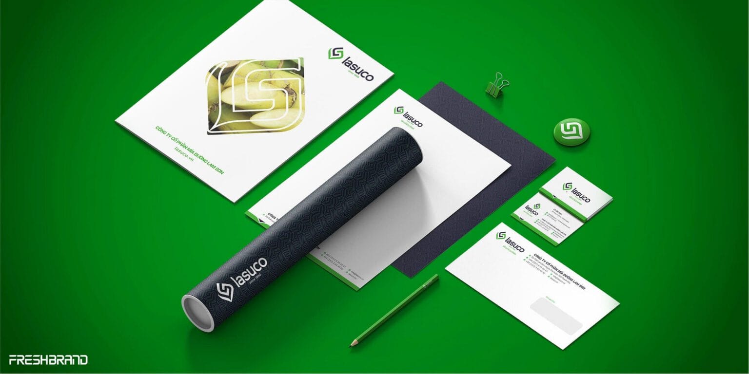
The strategy was turned into a new brand system that took the business out of the “sugar company” frame.
- PlatformA Brand Platform that connects roots with farmers and the land of Thanh Hoa to a direction of specialized agriculture with value from nature at its core.
- ArchitectureA move to a group structure, with Lasuco as the common roof for many lines of business and brands.
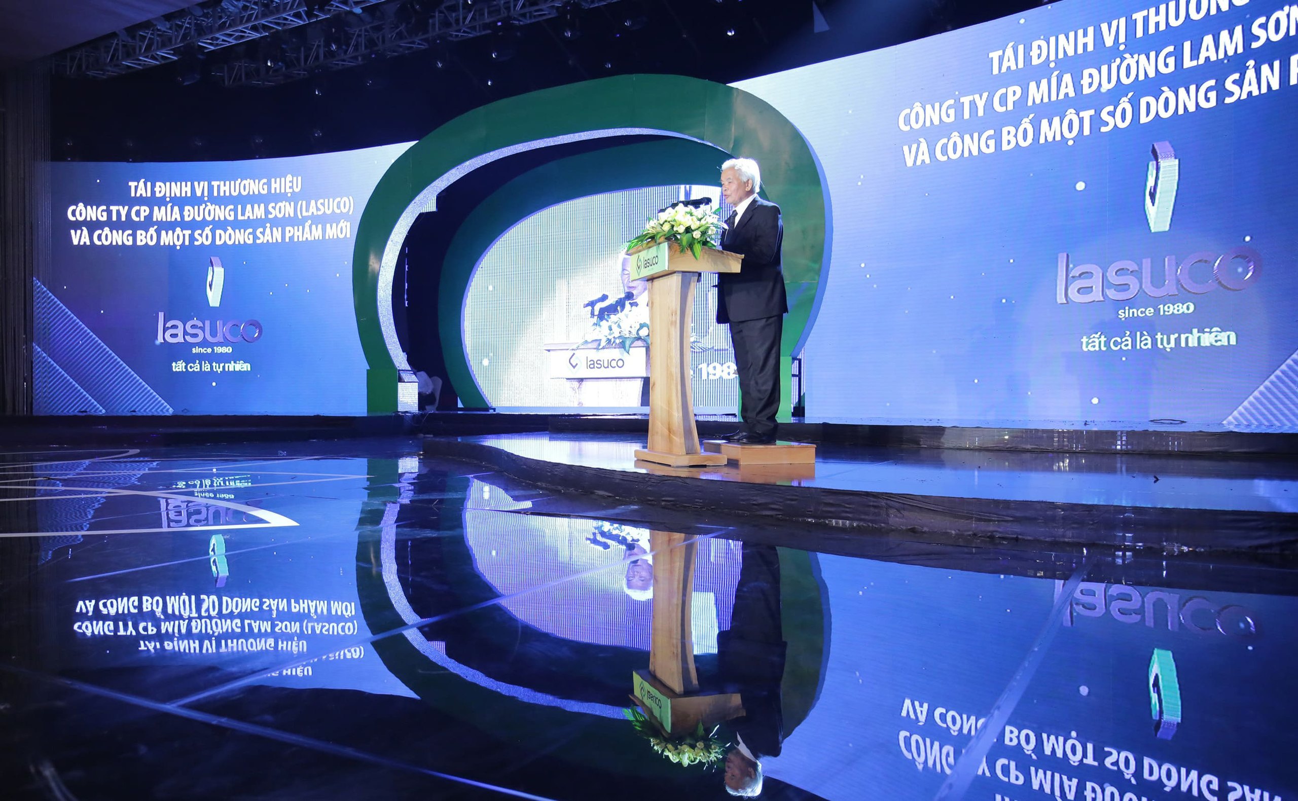
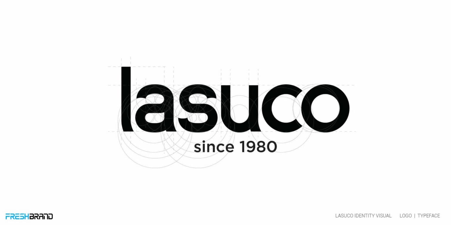
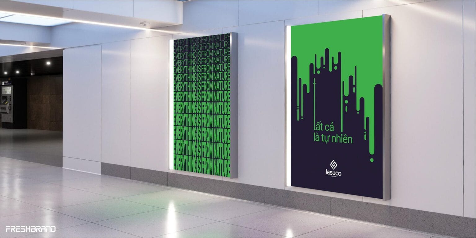
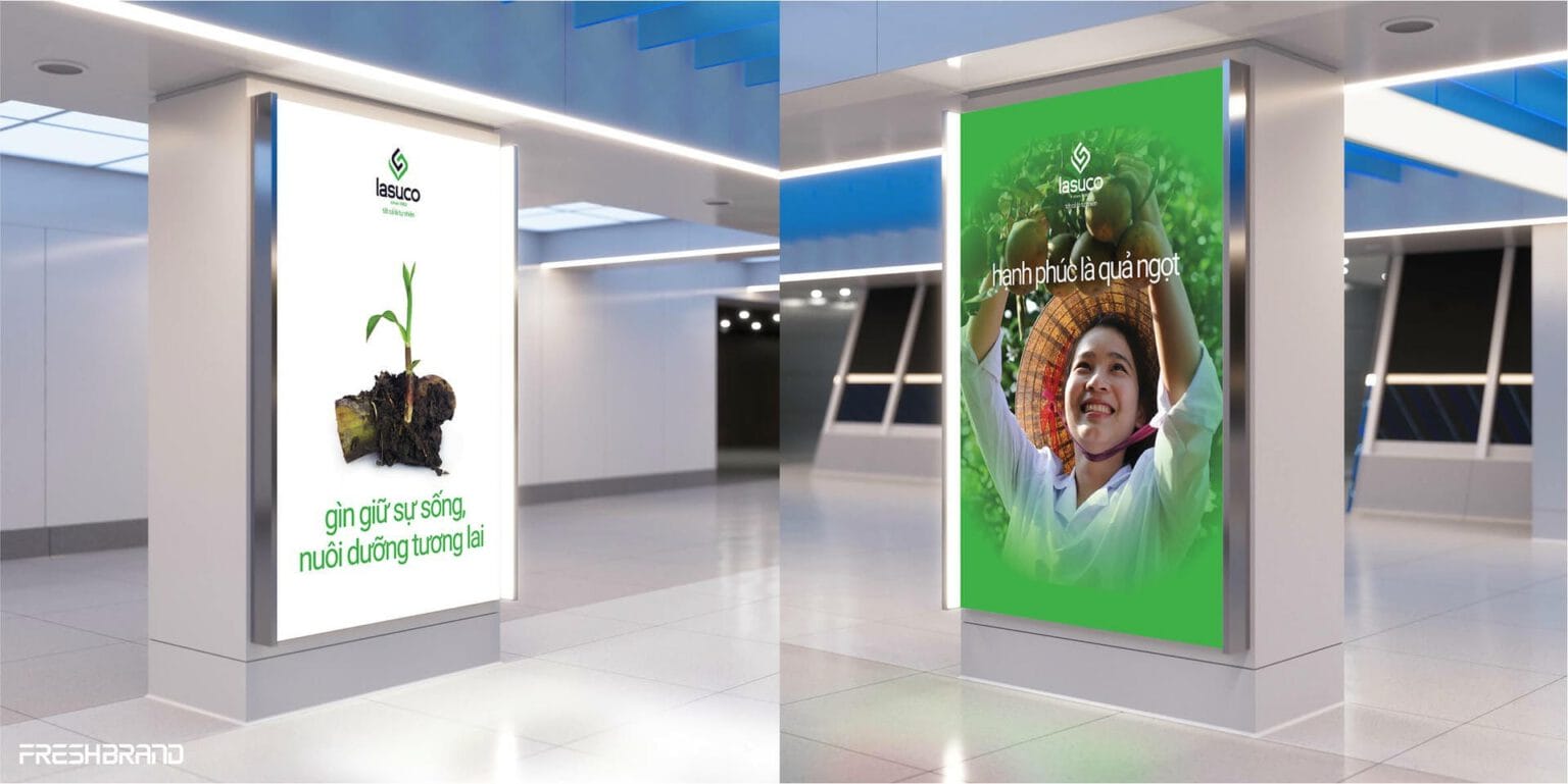
- Naming & brandThe name Lasuco replaced “Lam Son Sugar Joint Stock Company,” open enough for the new direction. The spirit of “It’s all natural” links products, operations and the brand story.
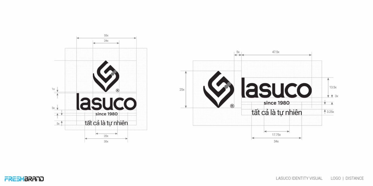
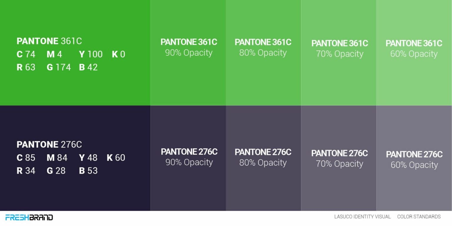
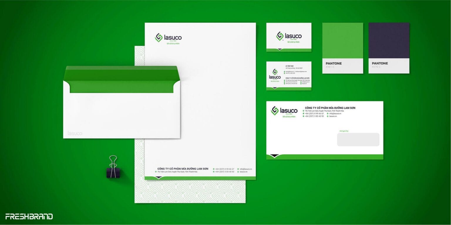
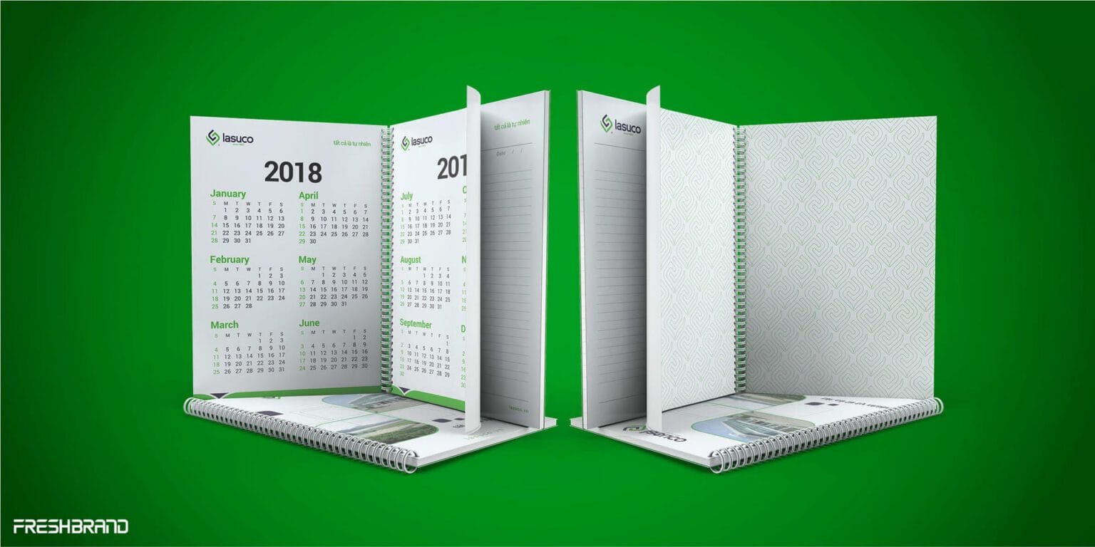
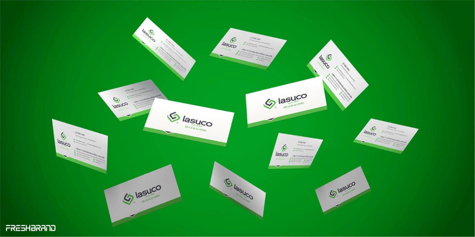
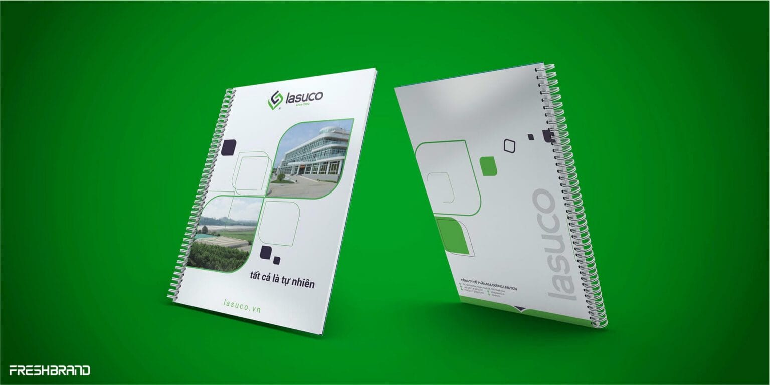
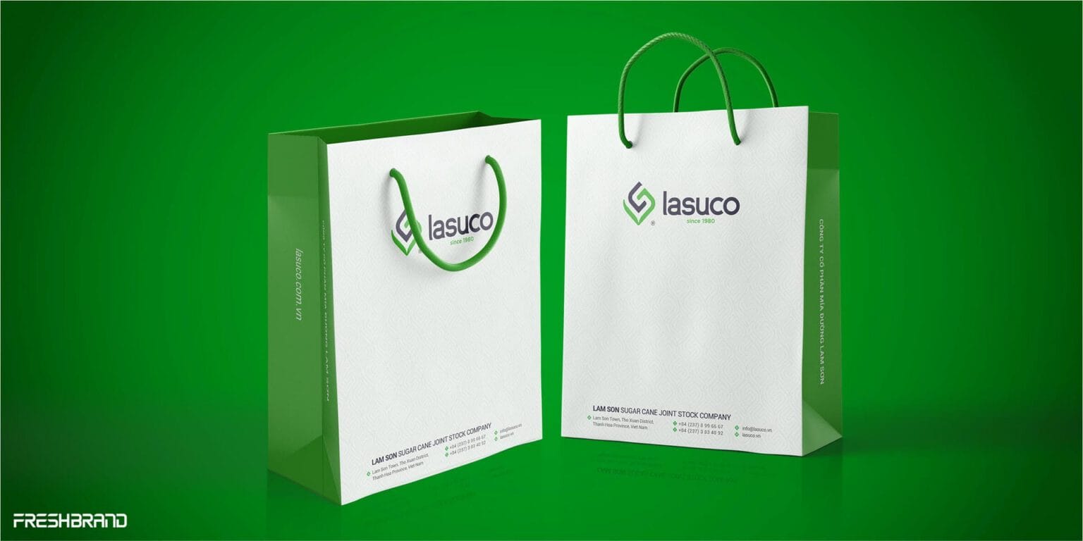
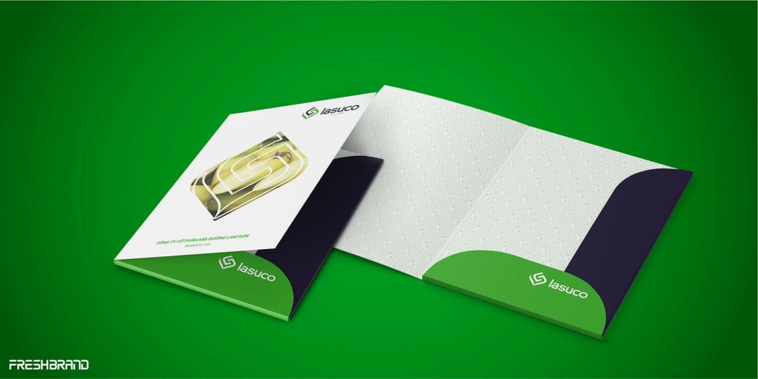
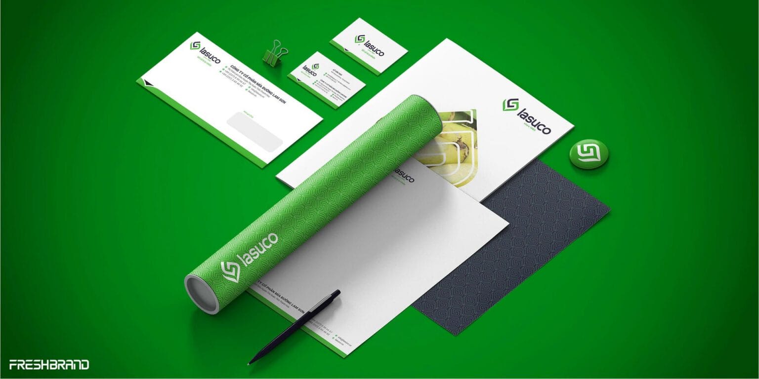
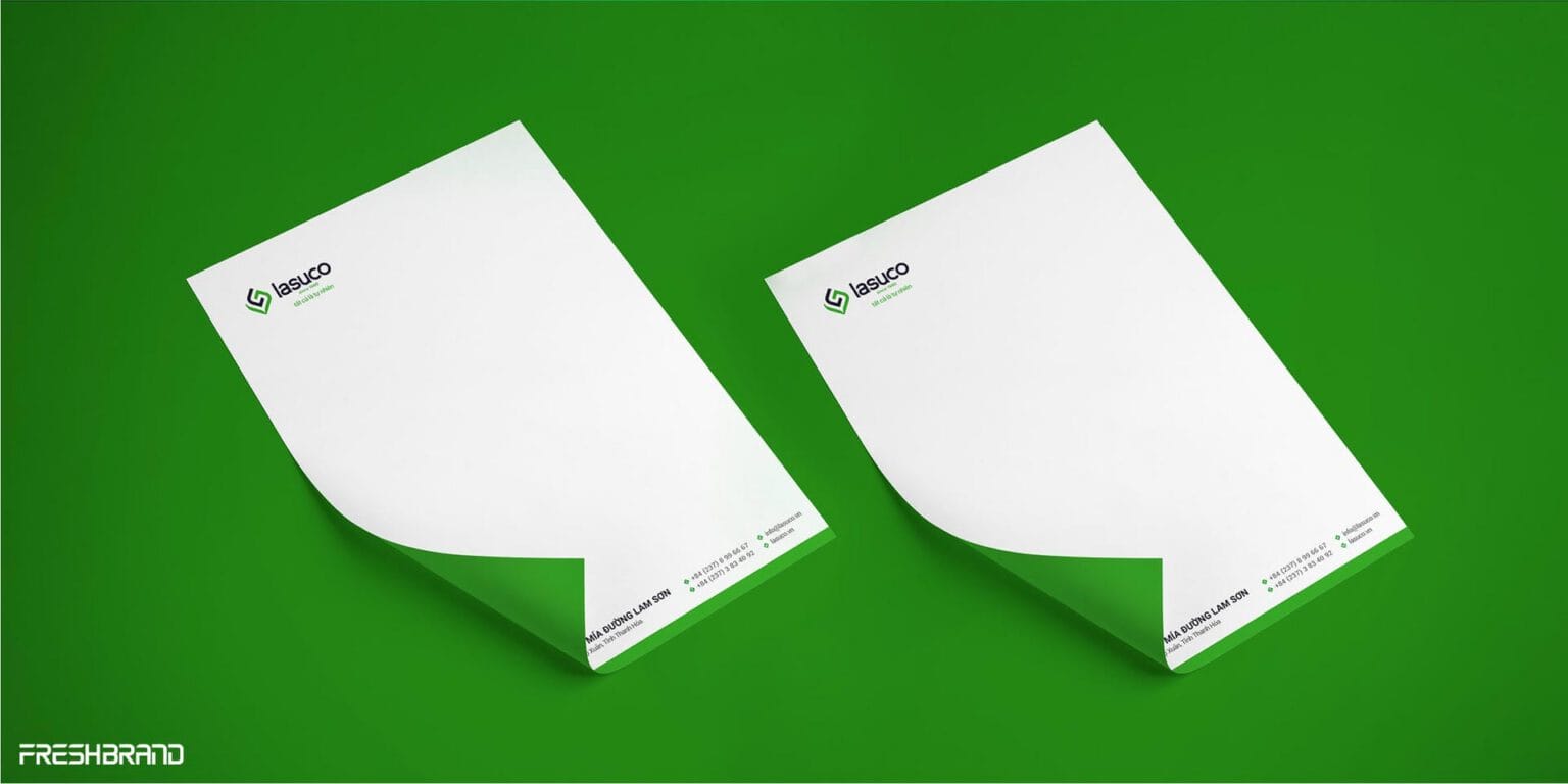
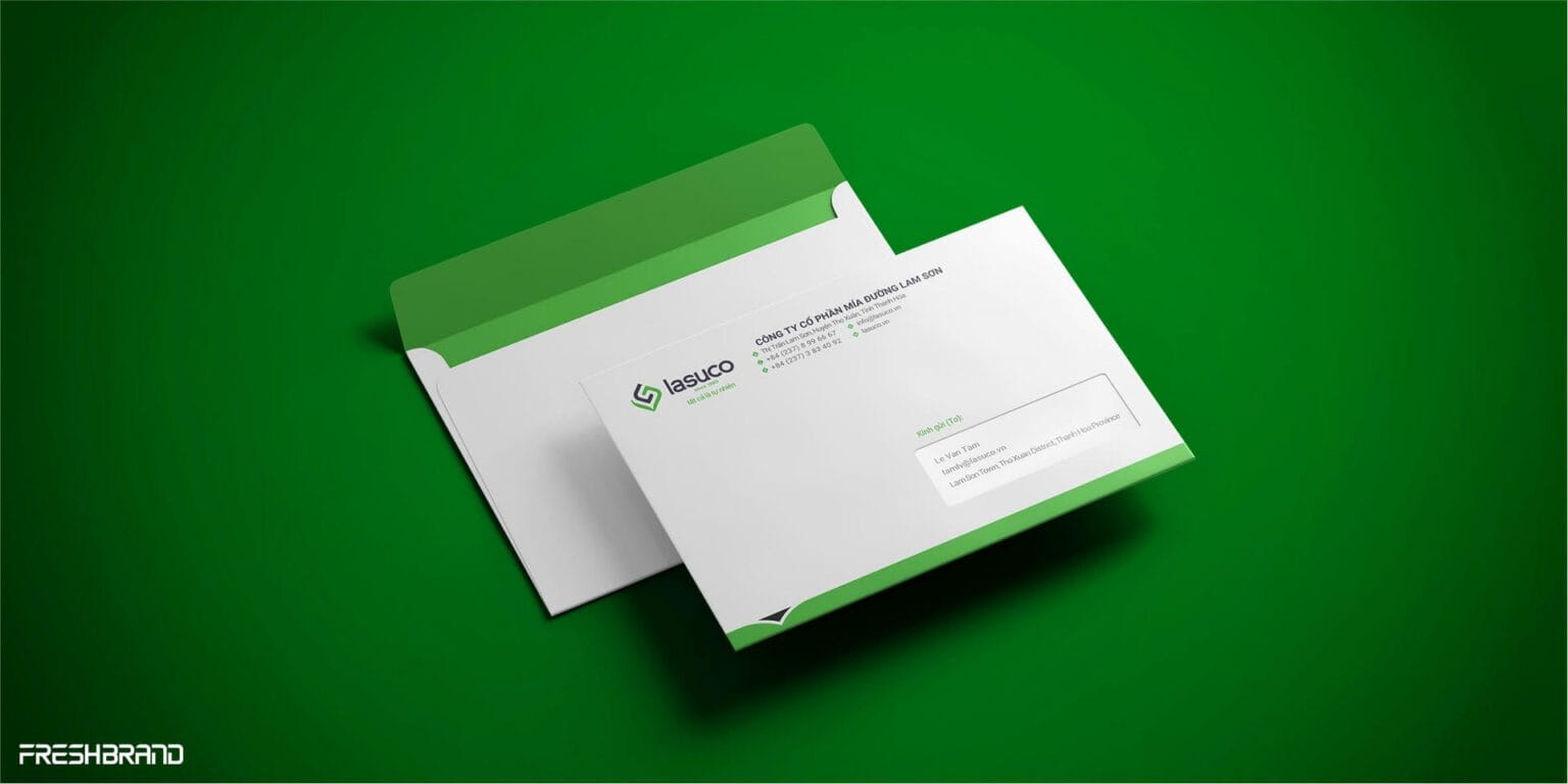
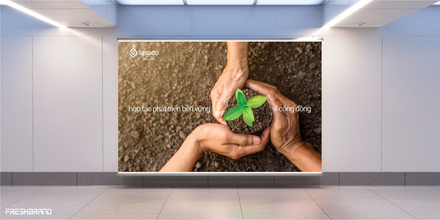
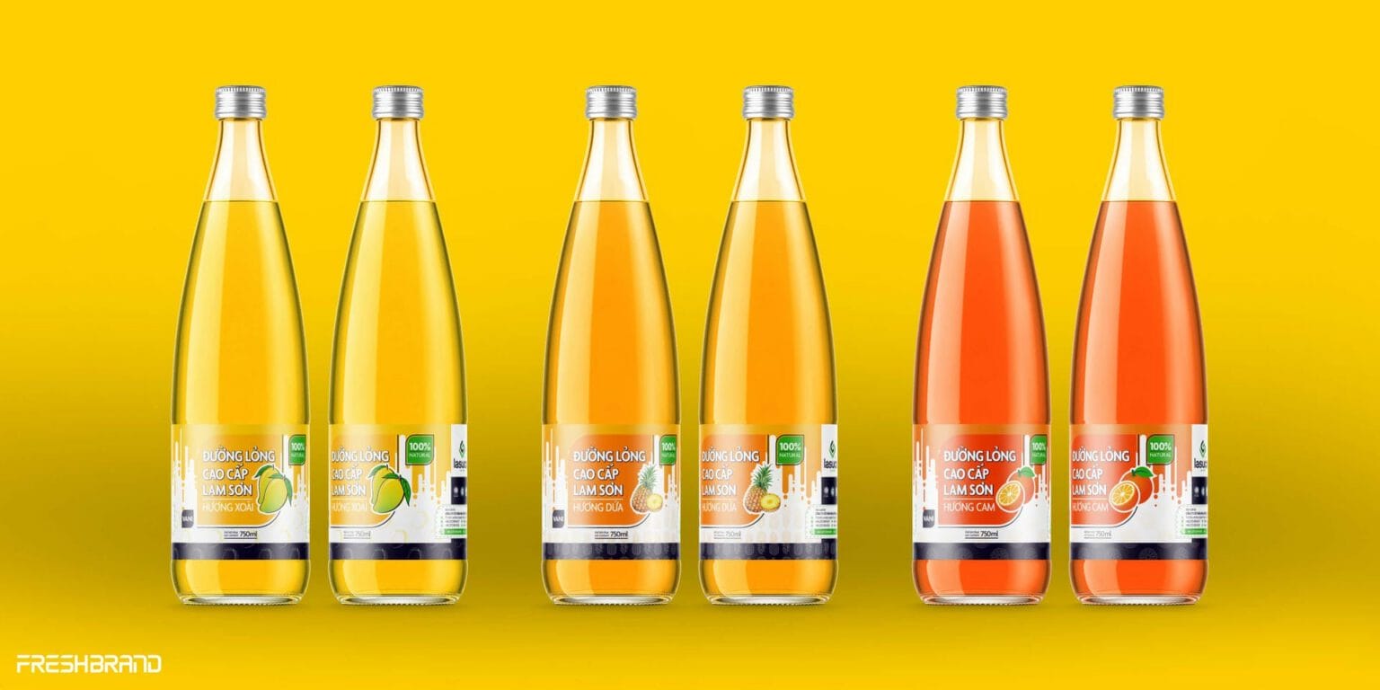
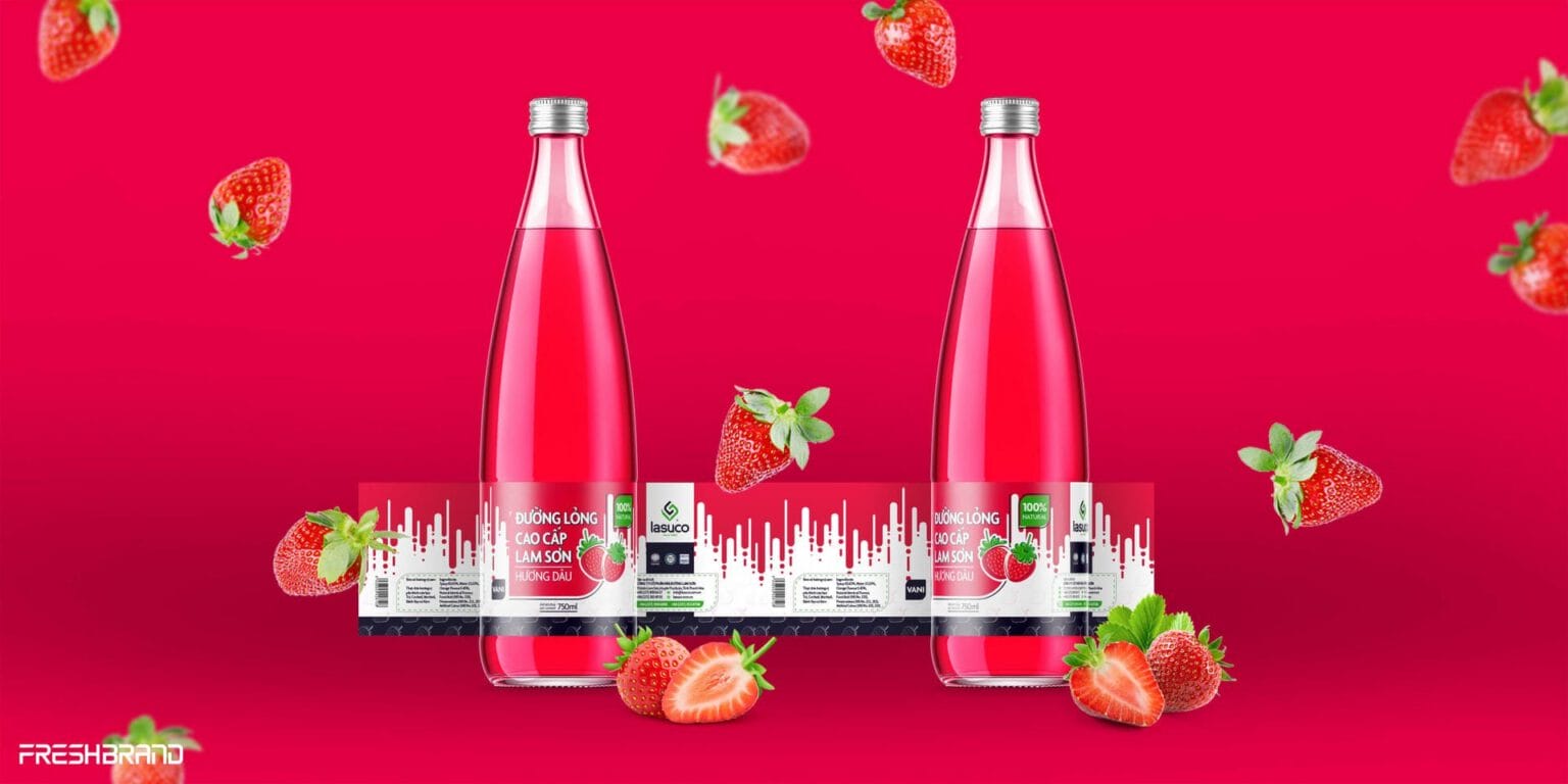
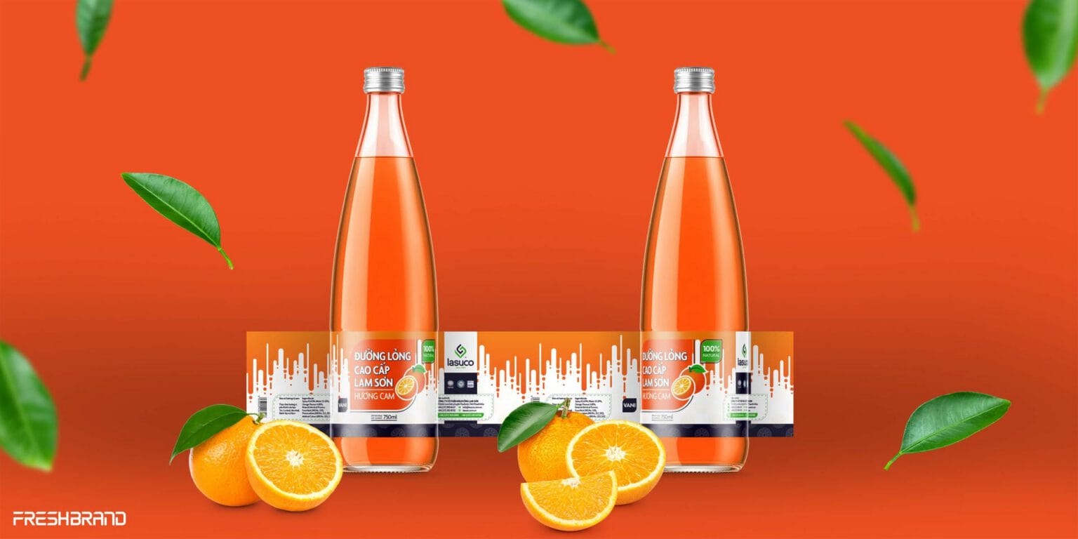
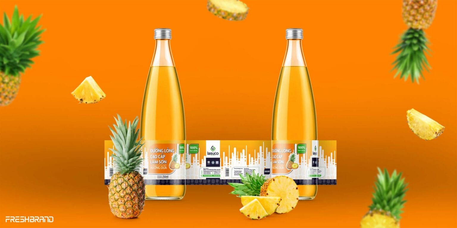
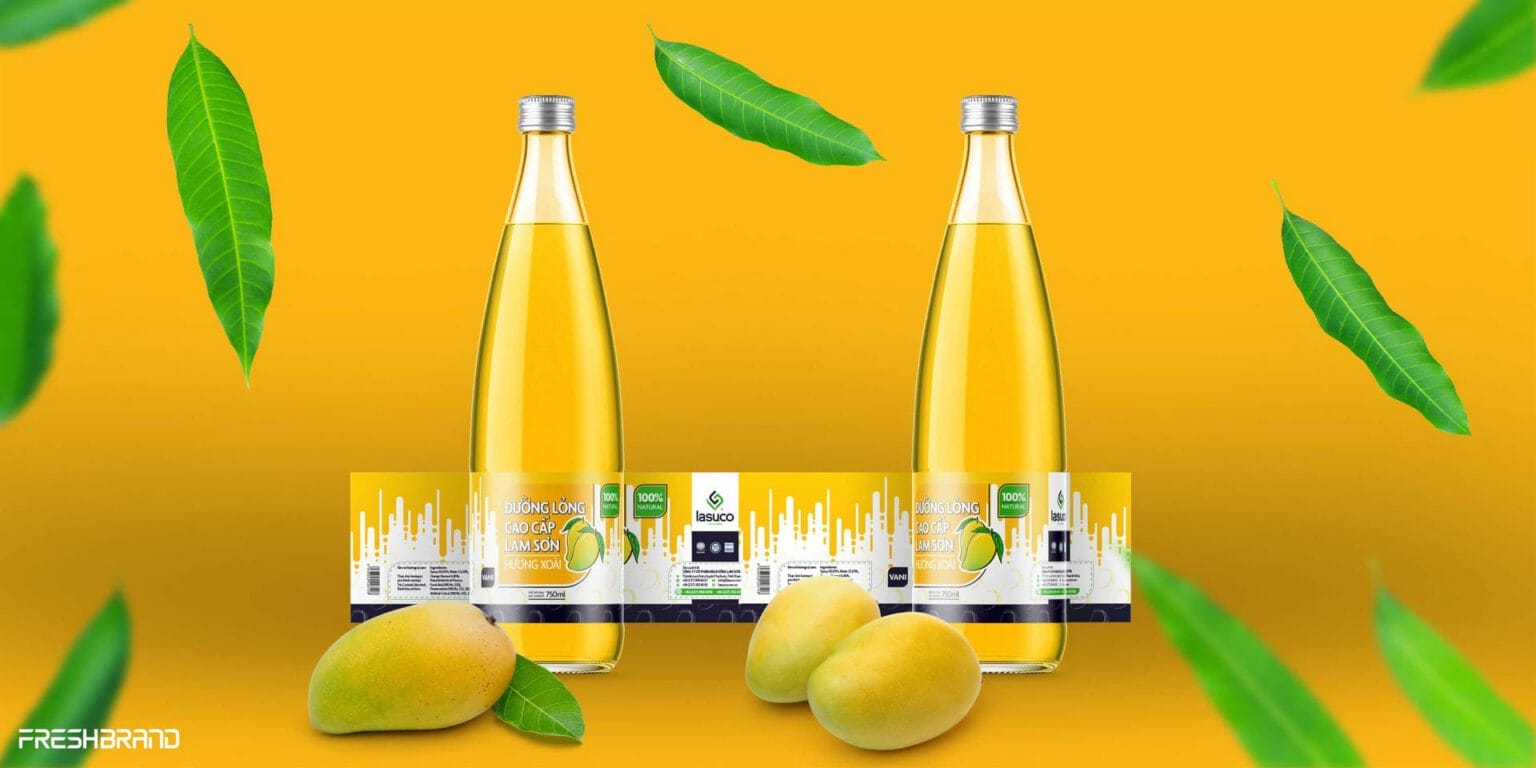
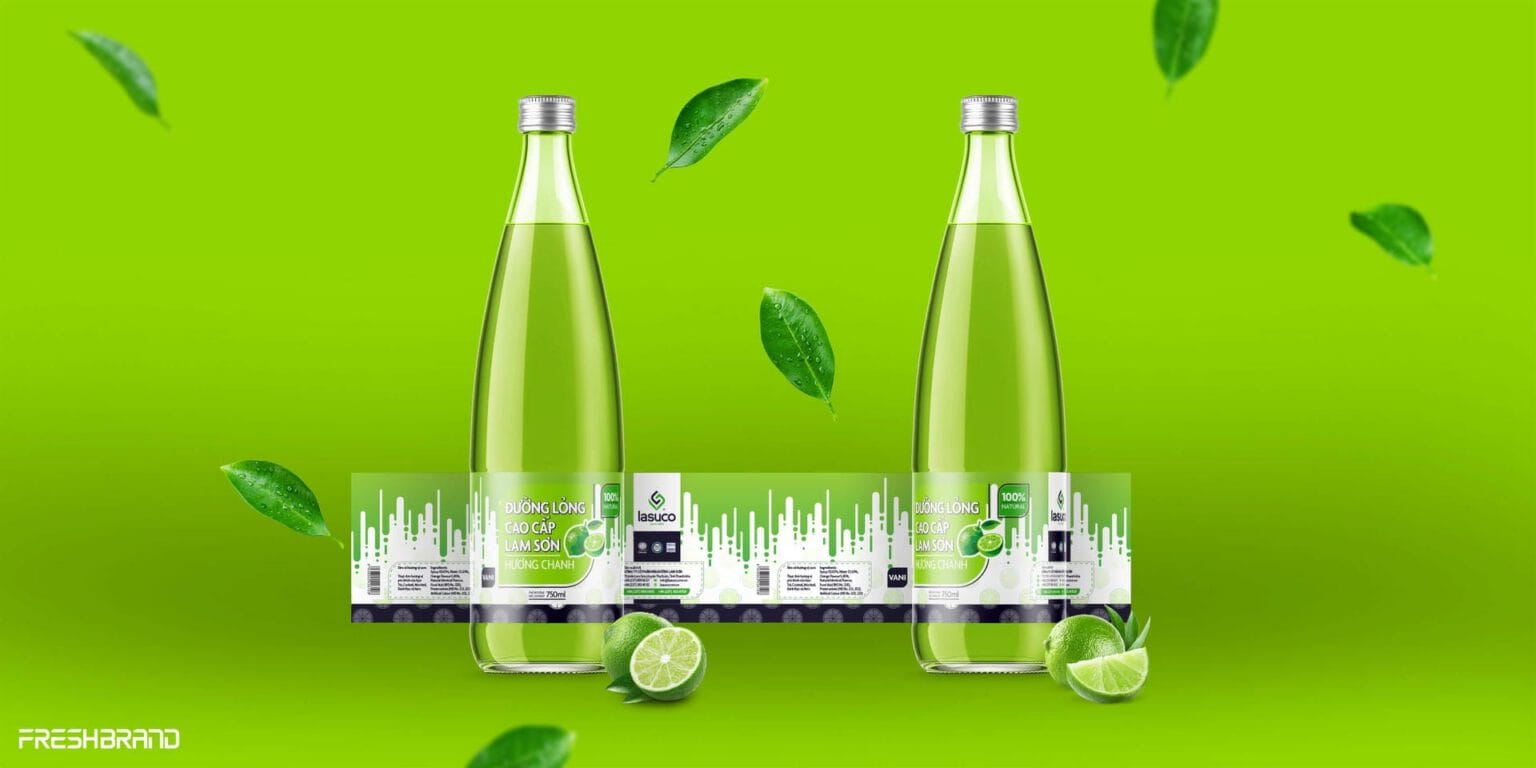
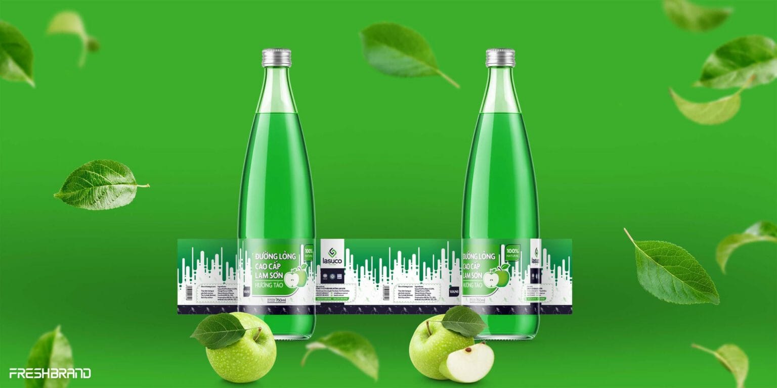
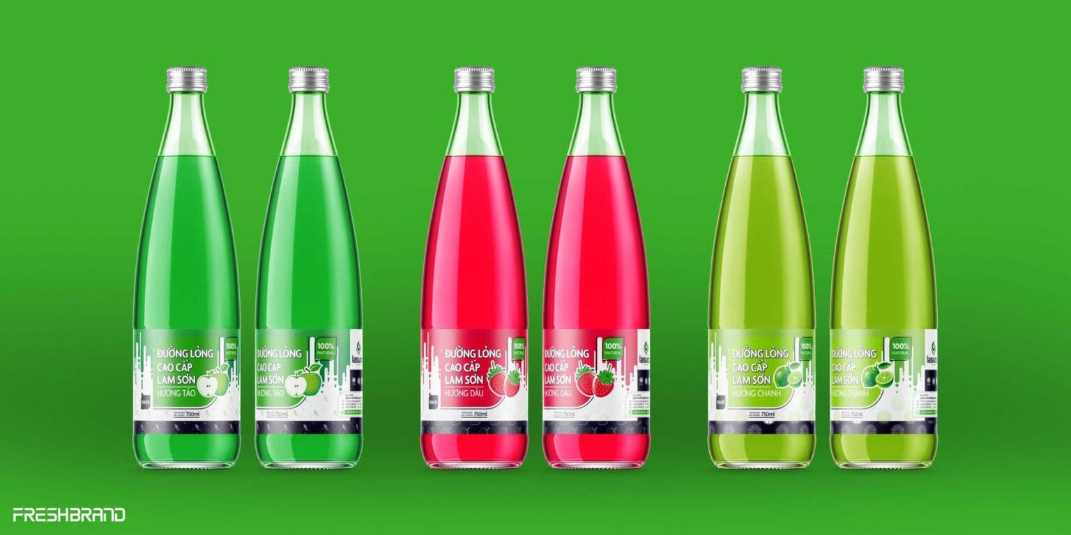
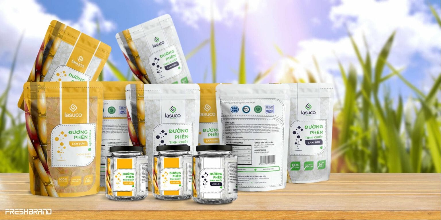
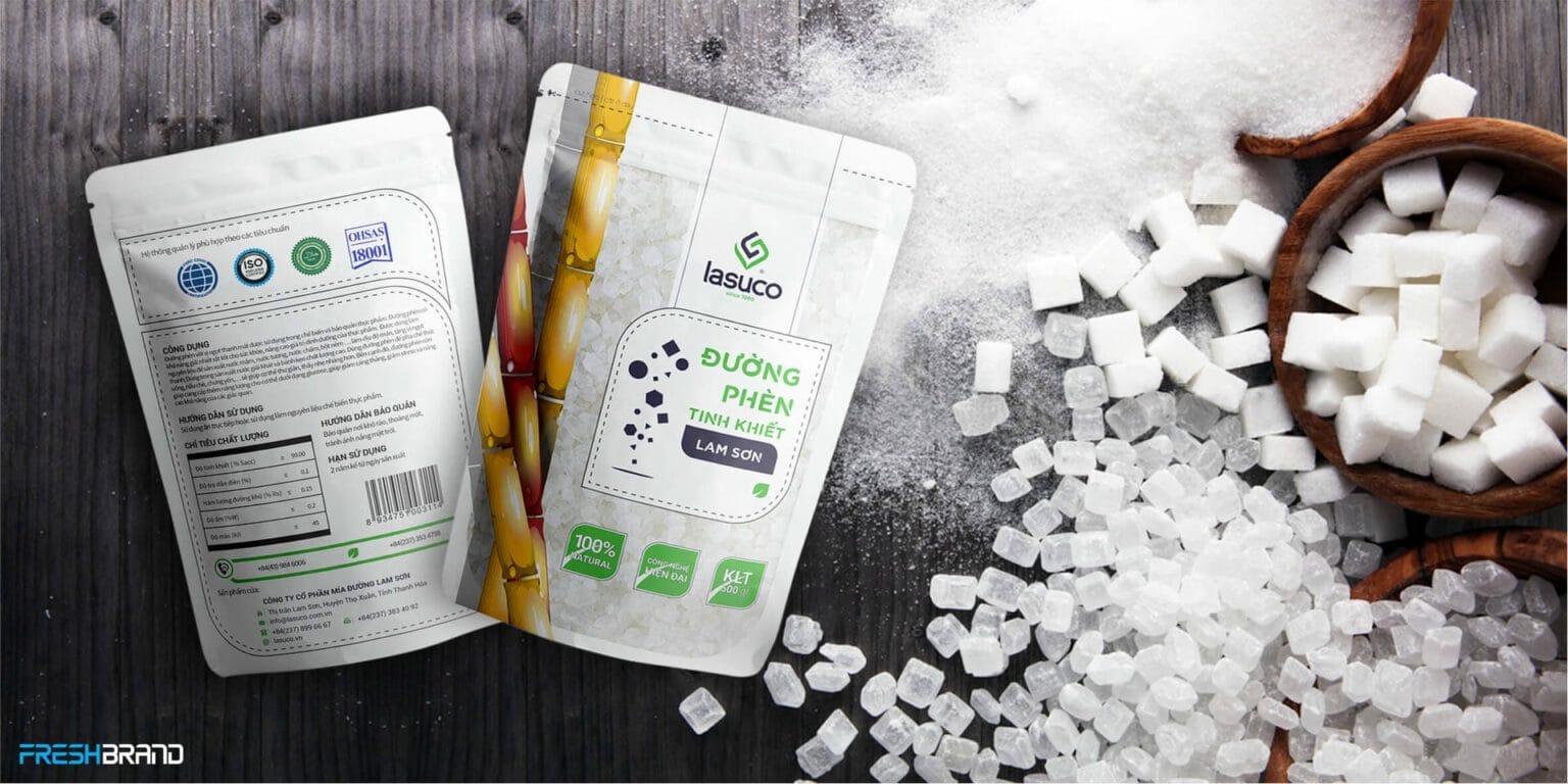
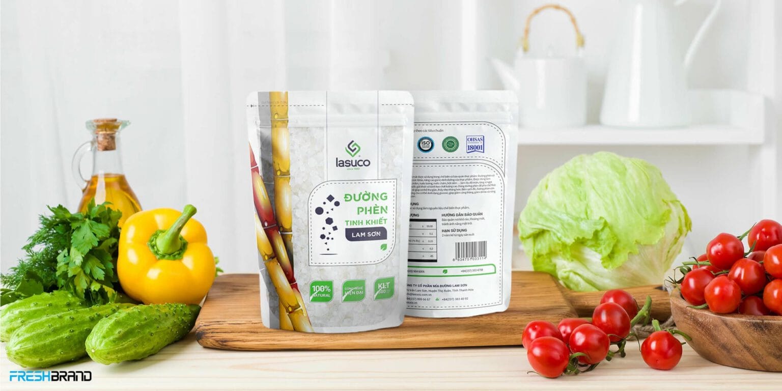
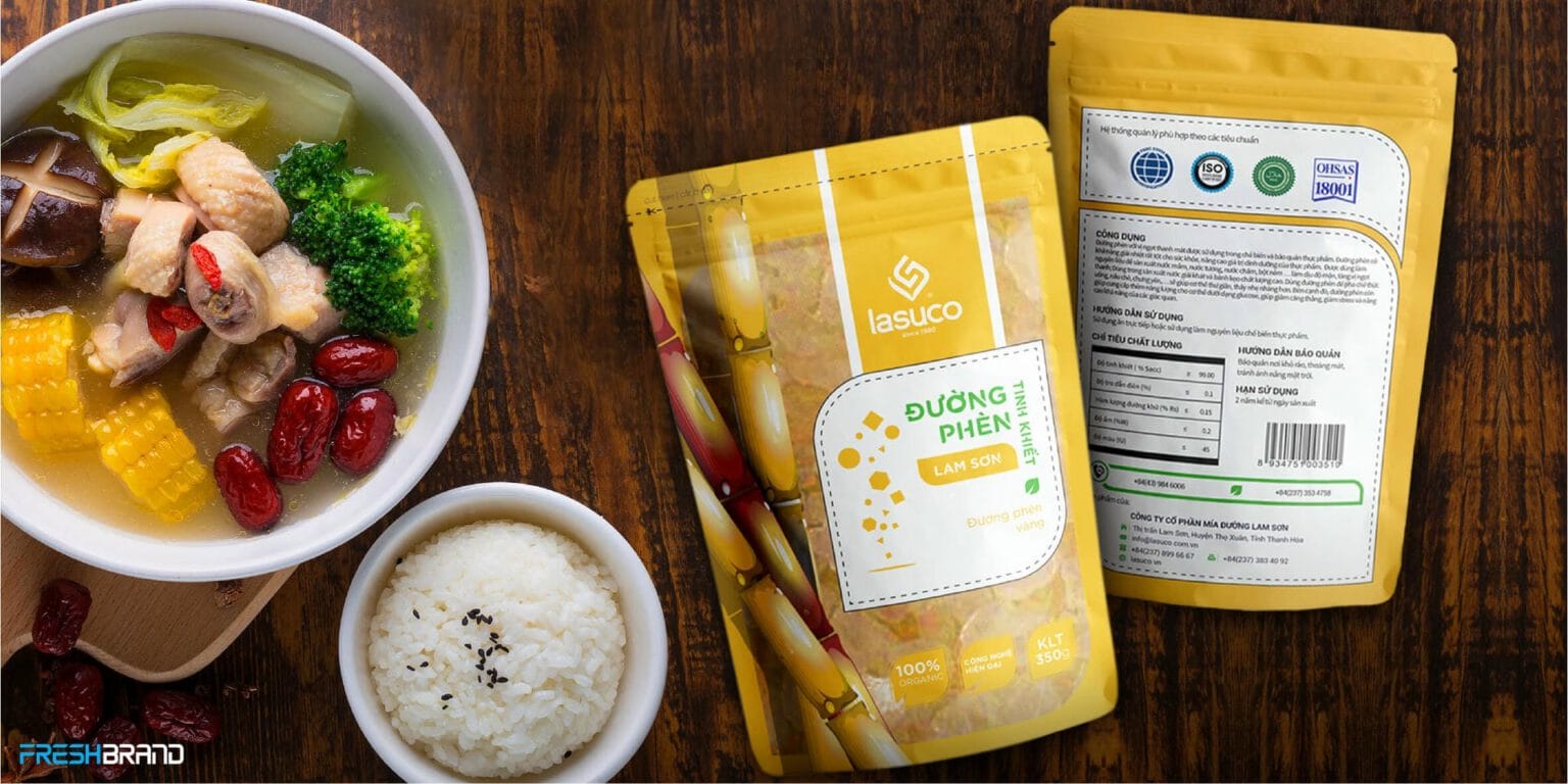
- Identity & experienceThe identity system, imagery, space, digital and communication were developed to feel natural, authentic and approachable, yet with the stature of a group.
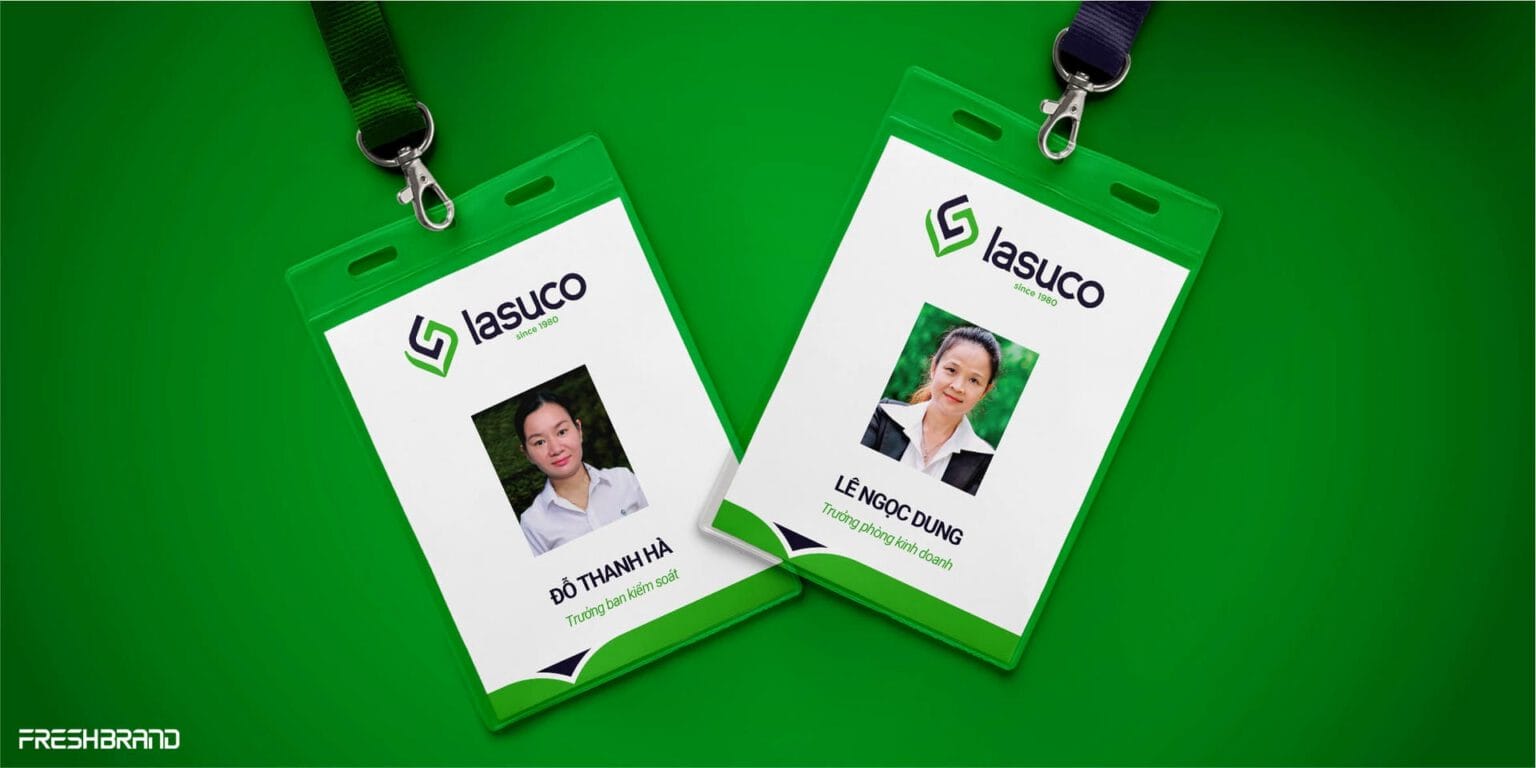
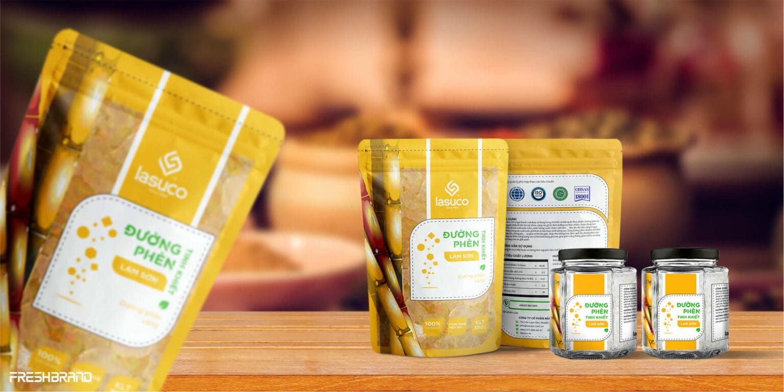
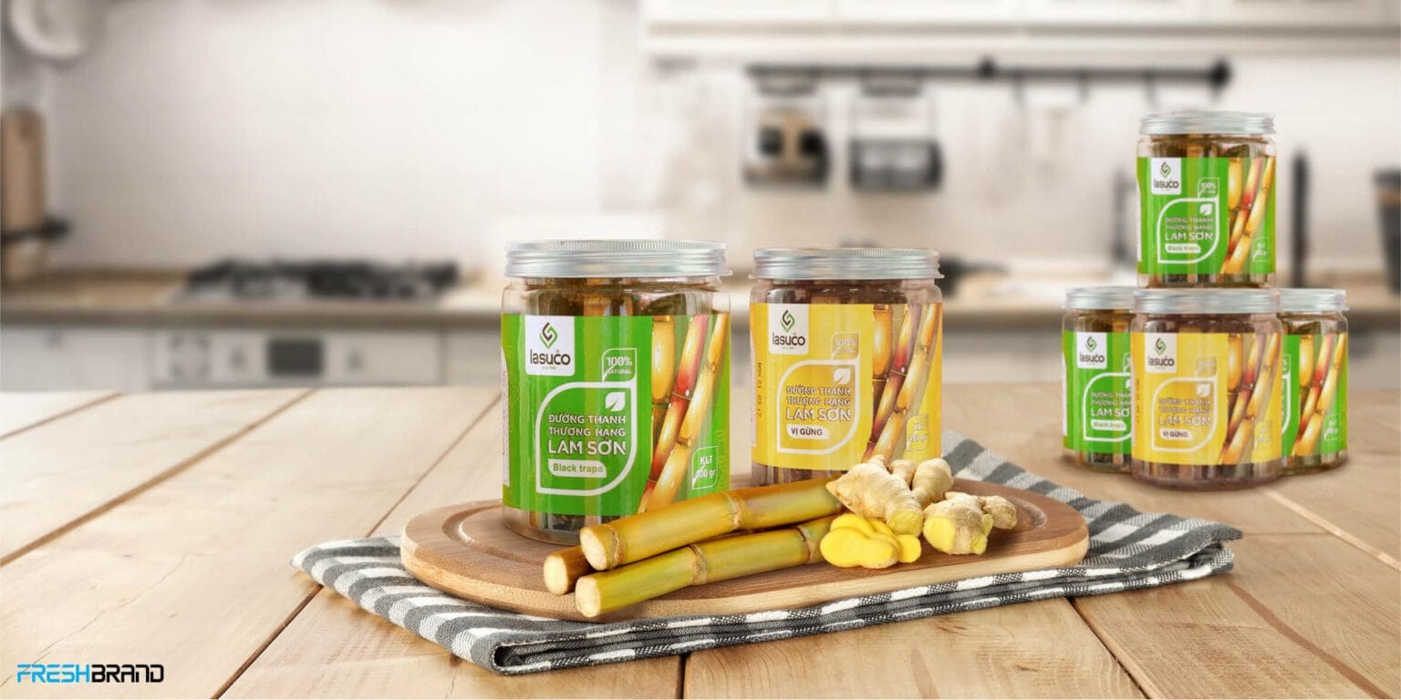
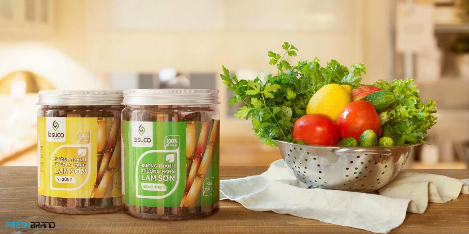
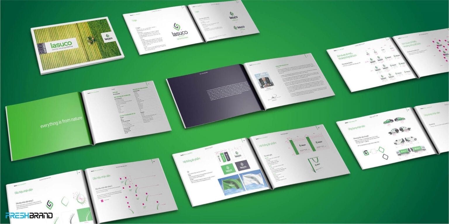
- TouchpointsBrand Guidelines standardize the system across packaging, stores, documents, events and sub-brands, keeping the whole ecosystem consistent.







Impact
What really changed?
The repositioning made a fundamental change: Lasuco has a broader definition of the brand to hold the growth of the business.
- BrandLasuco is no longer defined mainly by the image of a sugar mill. It is built as an agricultural group founded on “nature.”
- PerceptionThe name, positioning and brand system let the market see more clearly the new directions in agriculture, natural products, nutrition and diversification.
- System & internalNew lines of business and brands have a single brand roof. “It’s all natural” became the common language linking products, origins and responsibility to farmers and consumers.
- GrowthThe brand has more room to support multi-sector growth and to compete on value, difference and added value, instead of being locked into the competition of the traditional sugar industry.
Lasuco stepped out of the narrow positioning of a sugar company and opened a wider brand space for the future.
Value created
How did the brand come to mean more?
- Positioning valueLasuco is wide enough to hold both the sugar heritage and new lines of business from agriculture, food and other added-value products.
- Perception valueThe brand opens a different view of the business: from a sugar mill to an agricultural group in transformation.
- Meaning value“It’s all natural” links roots with farmers and the land of Thanh Hoa to a growing demand for natural, safe and nutritious products.
- Long-term valueA brand system able to keep holding the business’s diversification and new directions of growth.
What matters most was kept: the roots with farmers and the raw-material region. They are the irreplaceable foundation for every later expansion.
Brand Guidelines
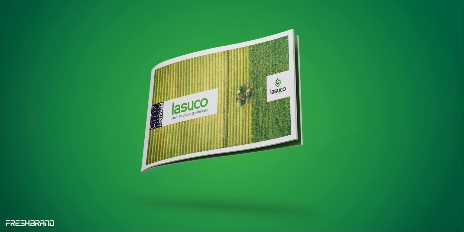
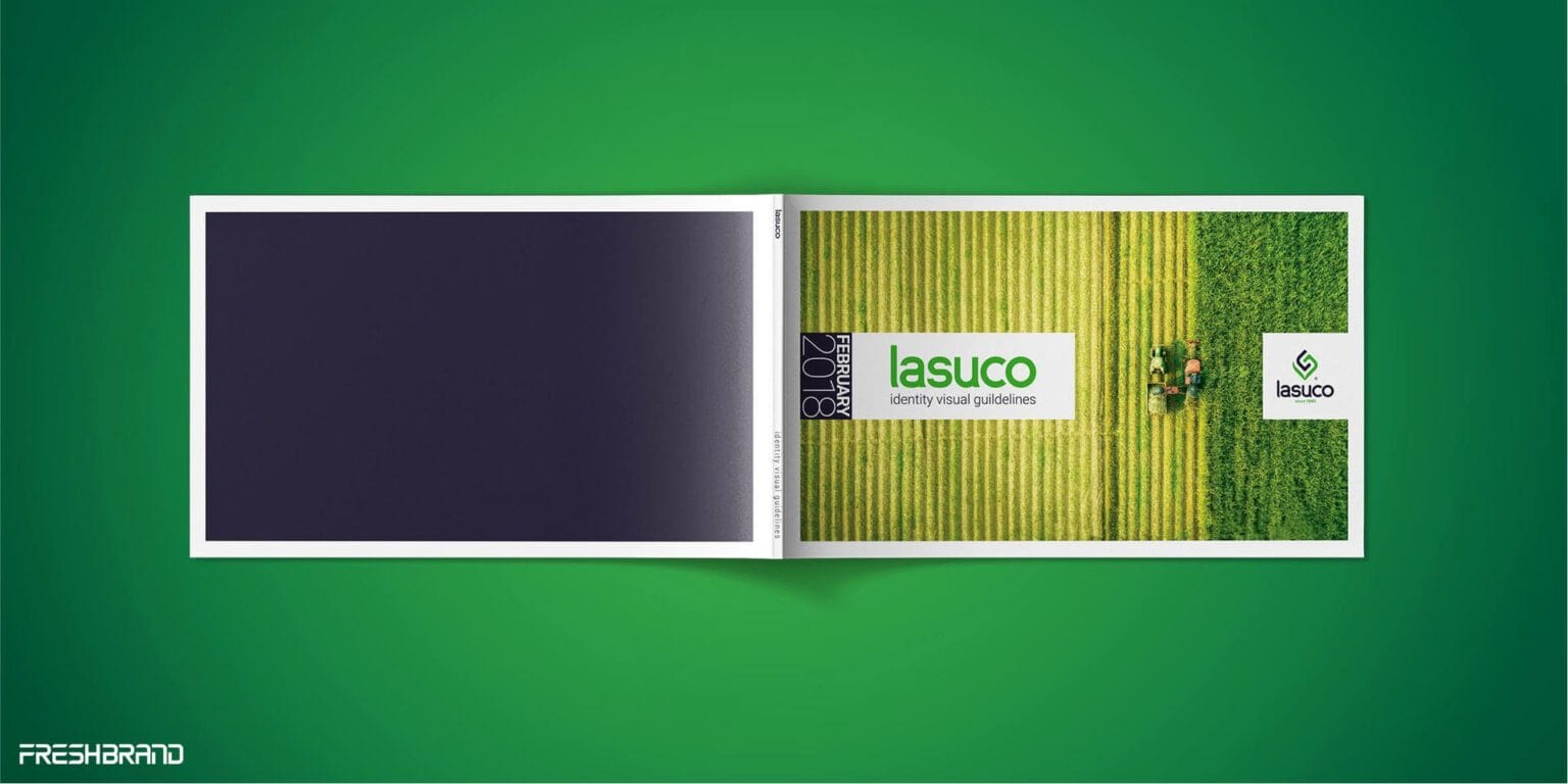
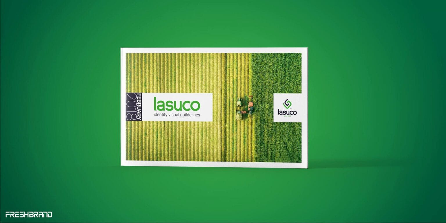
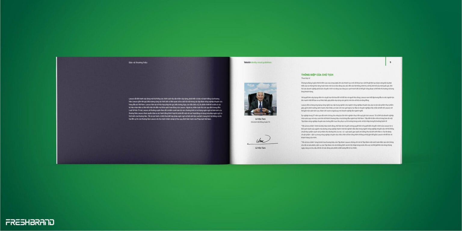
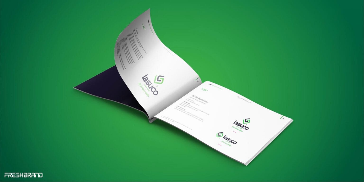
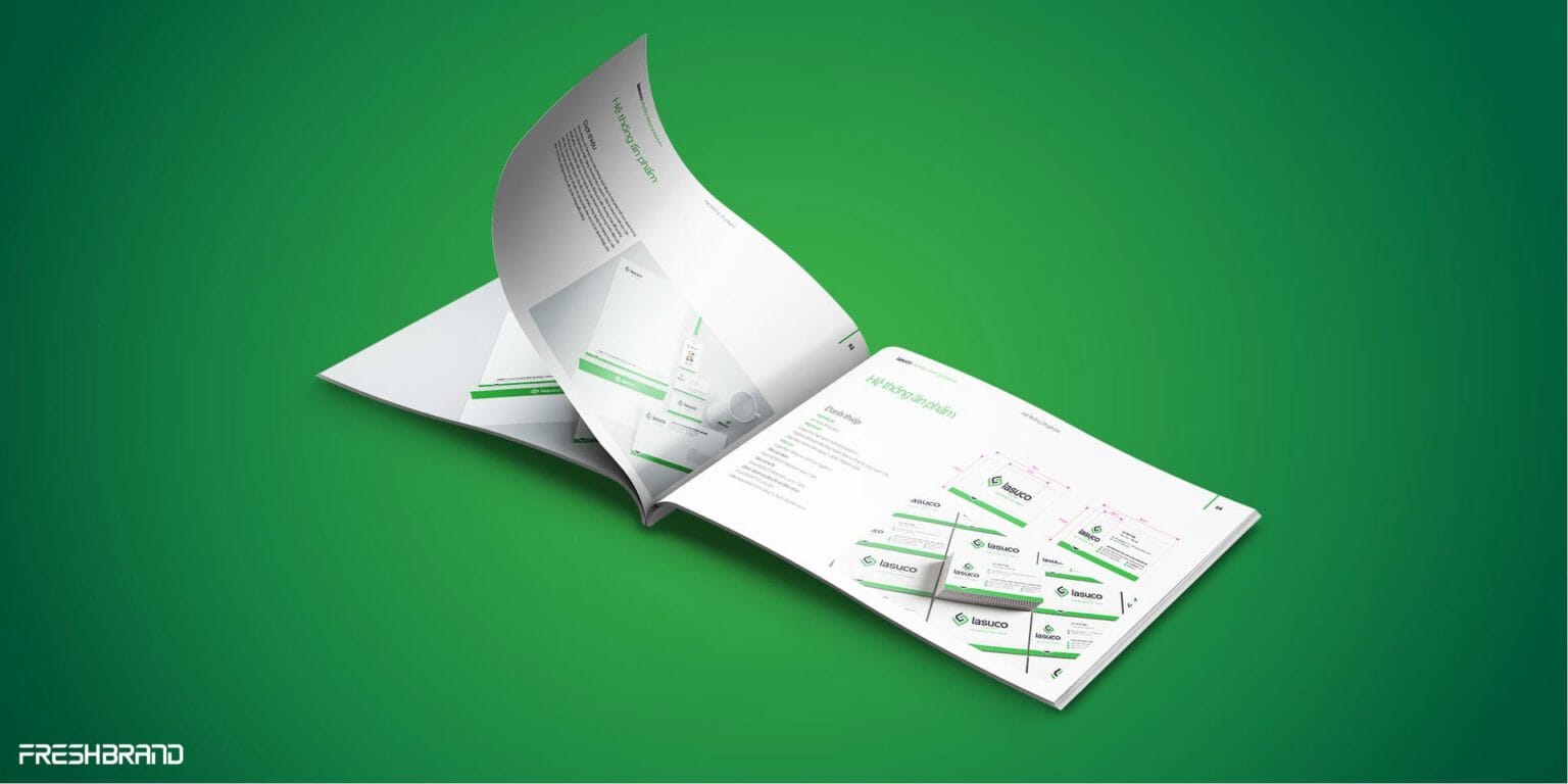
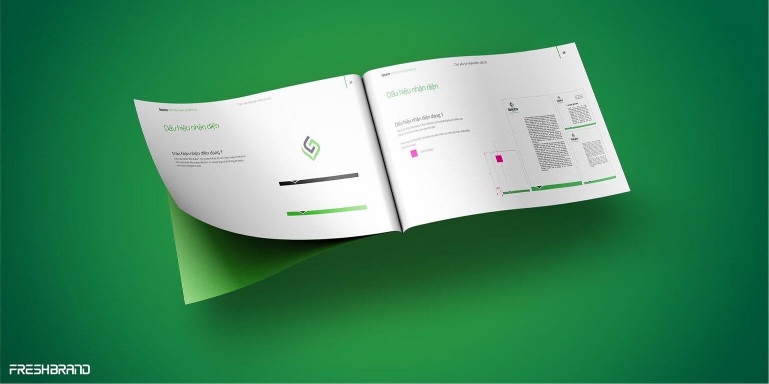
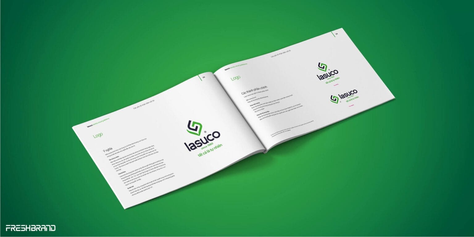
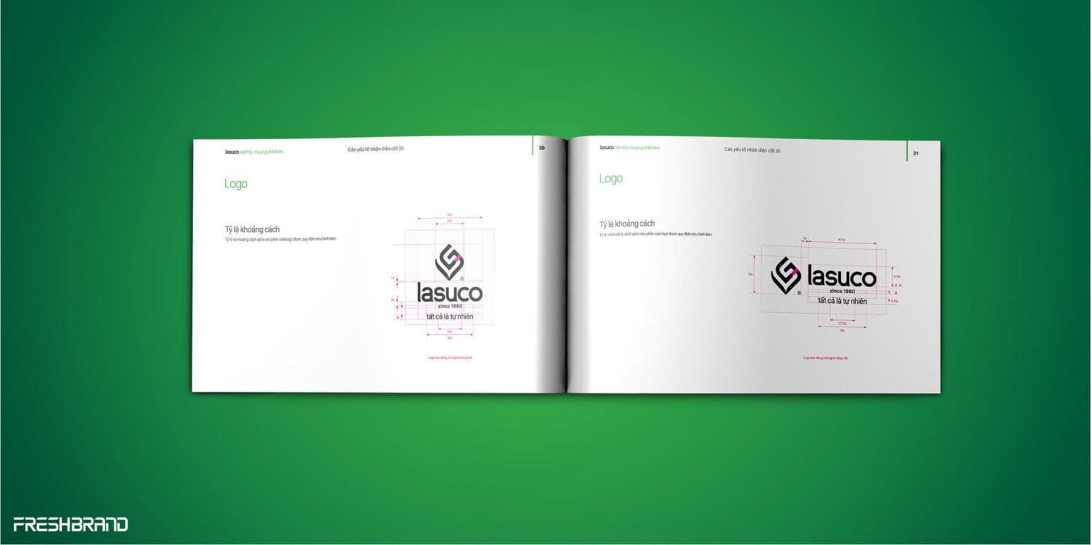
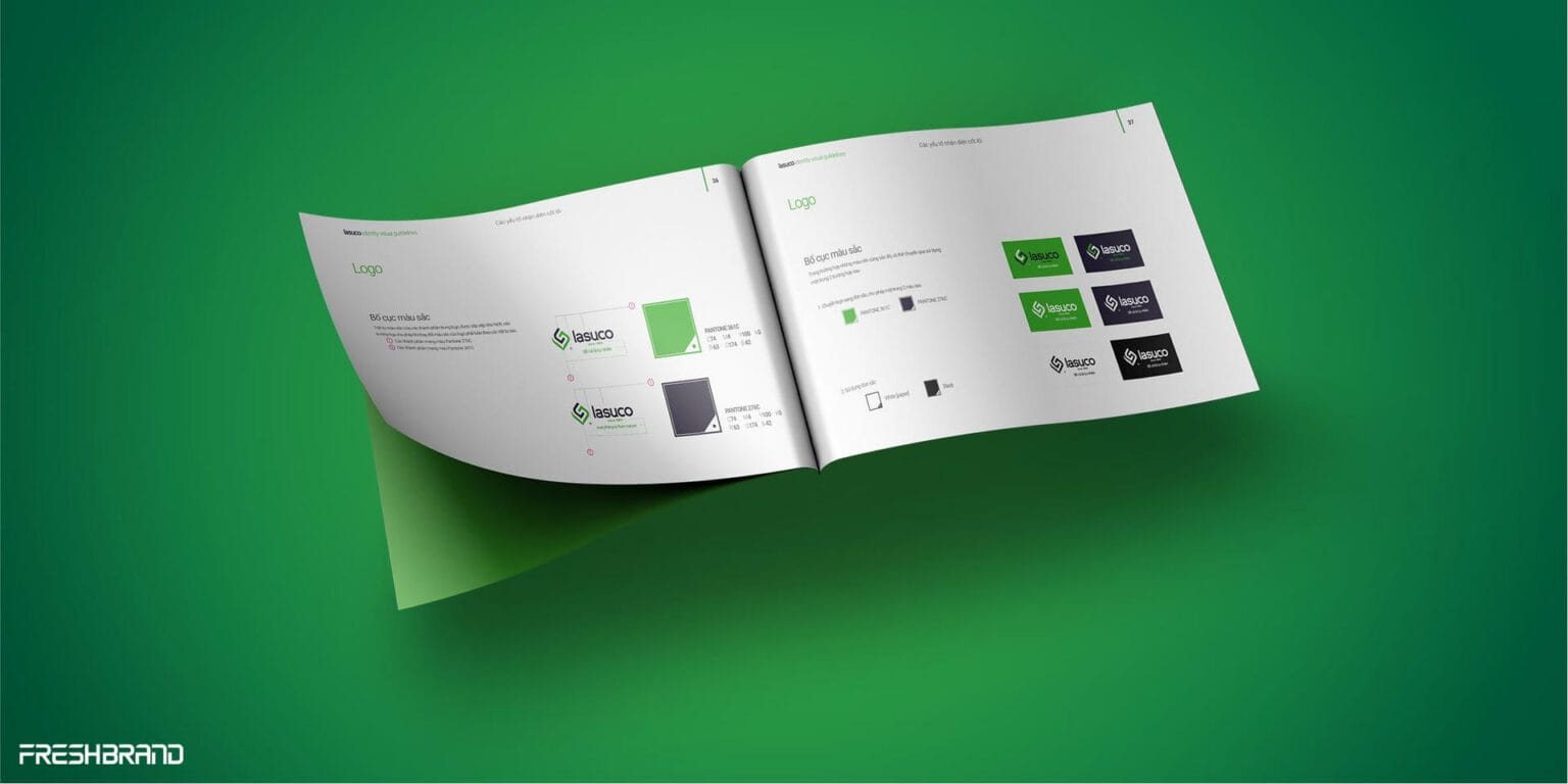
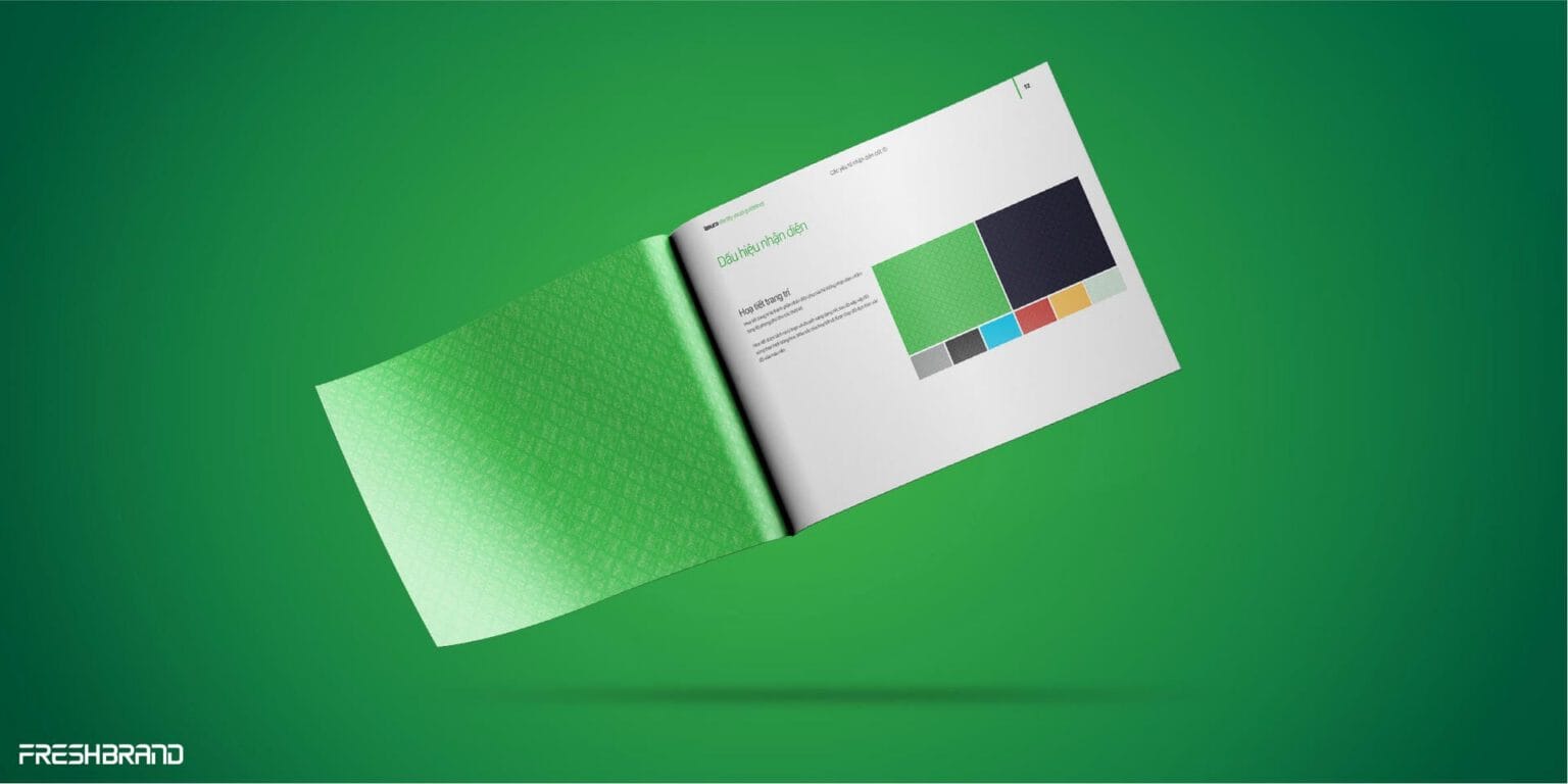
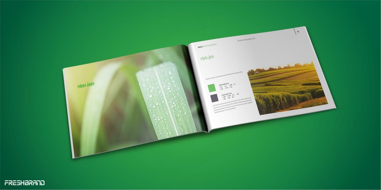
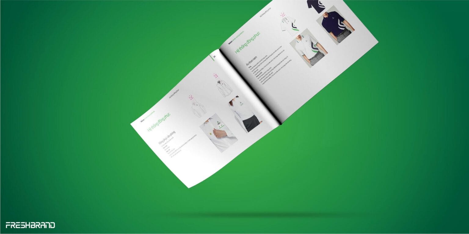
Lasuco did more than change what it was called. The brand was freed from an old definition to open room to grow in line with the business’s ambition.
Thinking in Practice · FreshBrand Case Stories
Services
FreshBrand team
- Trần Anh Tú — Creative Director, Project Director, Design
- Hải Anh — Design
- Kiều Nga — Design
- Phùng Thương — Design
Project
- ClientLasuco
- Year2017
