
Logo Design
When a brand needs to be recognized
A logo is seen for only a few seconds, yet it has to carry what a business spent years building.
FreshBrand designs a logo from a single idea, chosen from the business’s strategy and story and then drawn as a symbol, lettering and color. The accompanying versions keep the logo looking the same from a business card to the front of a building.

Perspective
Many logos try to tell the whole business in a single drawing, because the client wants customers to understand at once what the business does: a product, a letter, an industry color, all put together. The result is a complicated shape that is hard to remember and easy to confuse with other logos in the category.
A good logo starts with a single idea about the brand, simple enough to draw in a few strokes and deep enough that the business still wants it years later. The idea can come from the product itself, from the name, or from something the founder said, but it always comes after we understand what the brand wants to be remembered for.
For FreshBrand, a logo is the first link in the identity system, so each logo is designed to hold up when color, lettering, patterns and printed materials are added later.
When to start here
A business usually needs a logo at one of two moments: when a new brand is born, and when its current logo no longer says the right thing about it. In the first, the idea for the logo can come from the product, from the name or from what customers need to believe; in the second, the task is to keep what customers have grown used to.
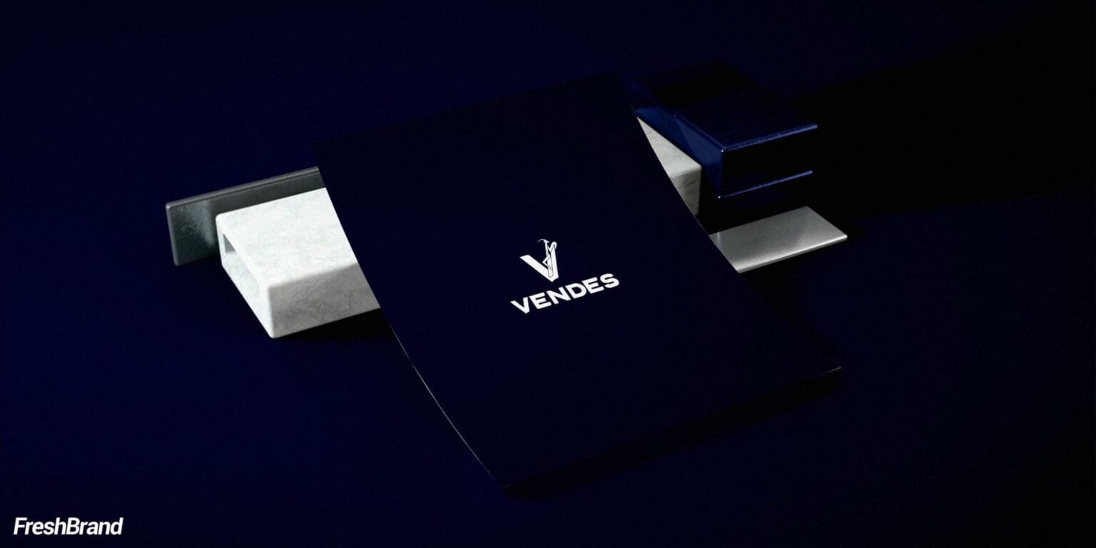
When the symbol comes from an image few would think of
For the handbag brand Vendes, the idea came from the stance of a praying mantis: upright, forelegs raised, slim and exact, with the confidence in the posture. The logo sets that stance inside the letter V, compact enough to repeat as a pattern and sharp enough to emboss on leather.
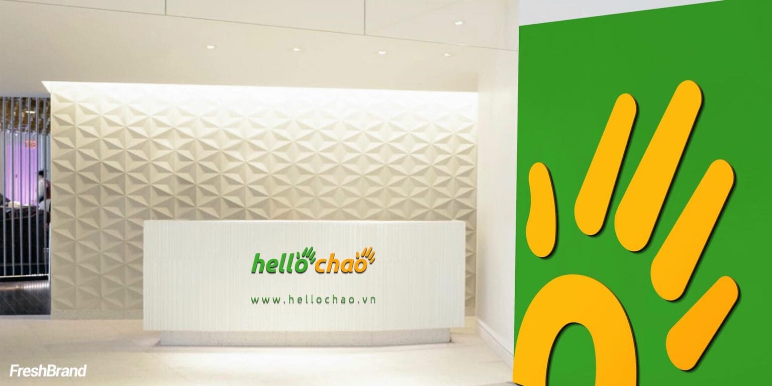
When the symbol comes from the name itself
The name HelloChao joins “hello” with the Vietnamese word for hello, so the symbol follows the same thought: a waving hand, its fingers fanning out like rays of sunlight. The warm orange and fresh green keep a learning brand for the many friendly from the first glance.

When the symbol has to speak of trust
For A Au, the symbol is a soft human figure drawn in gold lines and set inside an open circle. The delicate line speaks of beauty, while the circle speaks of protection and safety, which suits a place where customers entrust themselves.
When an existing logo needs refreshing
SCB was easily confused with other banks that also carry the name “Saigon.” In the repositioning, FreshBrand kept SCB as the central point of recognition while developing the logo and identity system in a modern, friendly, recognizable direction that keeps the trust of a long-established bank.
How FreshBrand works
FreshBrand chooses the idea first, sketches in black and white, and only then turns to color; the five questions below follow that order.
Where is the brand now?
We start with the business’s strategy, story and name, then look at how the logos in its category appear. With an existing logo, we also look at what customers have grown used to and what needs to be kept.
What does the logo need to say?
Before drawing, FreshBrand chooses a single idea for the logo, from one of these sources.
ProductA real image from inside the business, like the steel coil of Ton Dong A
NameThe meaning of the name, like the greeting in HelloChao
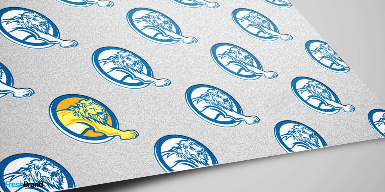
StoryA founder’s conviction, like the lion’s footstep of Qui Phuc
ValueWhat customers need to feel, like the protection of A Au
What do we choose?
The idea is sketched in black and white first, so the form can stand on its own before color is added.
SymbolA simple form that is recognizable even when very small
LetteringA custom typeface, or one refined for the name
ColorThe primary palette, chosen once the form holds up
How is the logo finished?
FreshBrand builds the logo on a grid and finishes it in horizontal, vertical, reversed, positive and single-color versions, with clear space and minimum sizes. Before handover, FreshBrand tests the logo on real applications.
What will actually change?
A logo meets the bar when customers recognize the brand both from far away and at a very small size, and when, years later, the business still finds it true to itself.
What the business keeps
A logo is only right when others use it correctly, so it comes with what printers, contractors and partners need, more or less depending on the scope of the project.
- The finished logo and the story of the idea behind it.
- Horizontal, vertical, reversed, positive and single-color versions.
- The construction grid, clear space and minimum sizes.
- The primary palette with specifications for print and screen.
- Master files in vector format for every size of use.
Logo design principles
Every logo FreshBrand designs has to pass five principles before it becomes the brand’s symbol.
- Simple: Every unnecessary detail is cut, so the logo reads clearly from a phone screen to a large sign.
- Memorable: It has one distinctive point of recognition, hard to confuse with other logos in the category.
- Lasting: It does not chase visual trends, so the logo still holds true years later.
- Flexible: It stays recognizable at small sizes, in reversed colors, and in a single color.
- Precise: Form, rhythm and color are chosen to suit the audience the brand wants to talk to, taking the product as a hint rather than redrawing it in full.

Logo redesign
A logo that has accompanied a business for many years may still need refreshing, when the business changes direction or the logo starts to be confused with someone else’s. The hardest part is choosing what to keep so existing customers still recognize it.
- Keep: What customers have grown used to, from the name and shape to the main color.
- Refine: Sharpen the shape, lettering and color for screens and small sizes.
- Transition: Plan the swap across touchpoints, so the old and new logos do not coexist for too long.
Let's talk
Is your business facing a similar question? Send a request to talk with FreshBrand, or download the portfolio to see more of our work.
In practice
DstoreNaming, logo and identity
When a letter D has to be as precise as what the store sells
Dstore sells genuine computers, watches and electronics. FreshBrand named the store and designed its logo, identity system and space, starting from a considered view of this kind of store.
“A digital device store is only convincing when it is as precise as what it sells.”
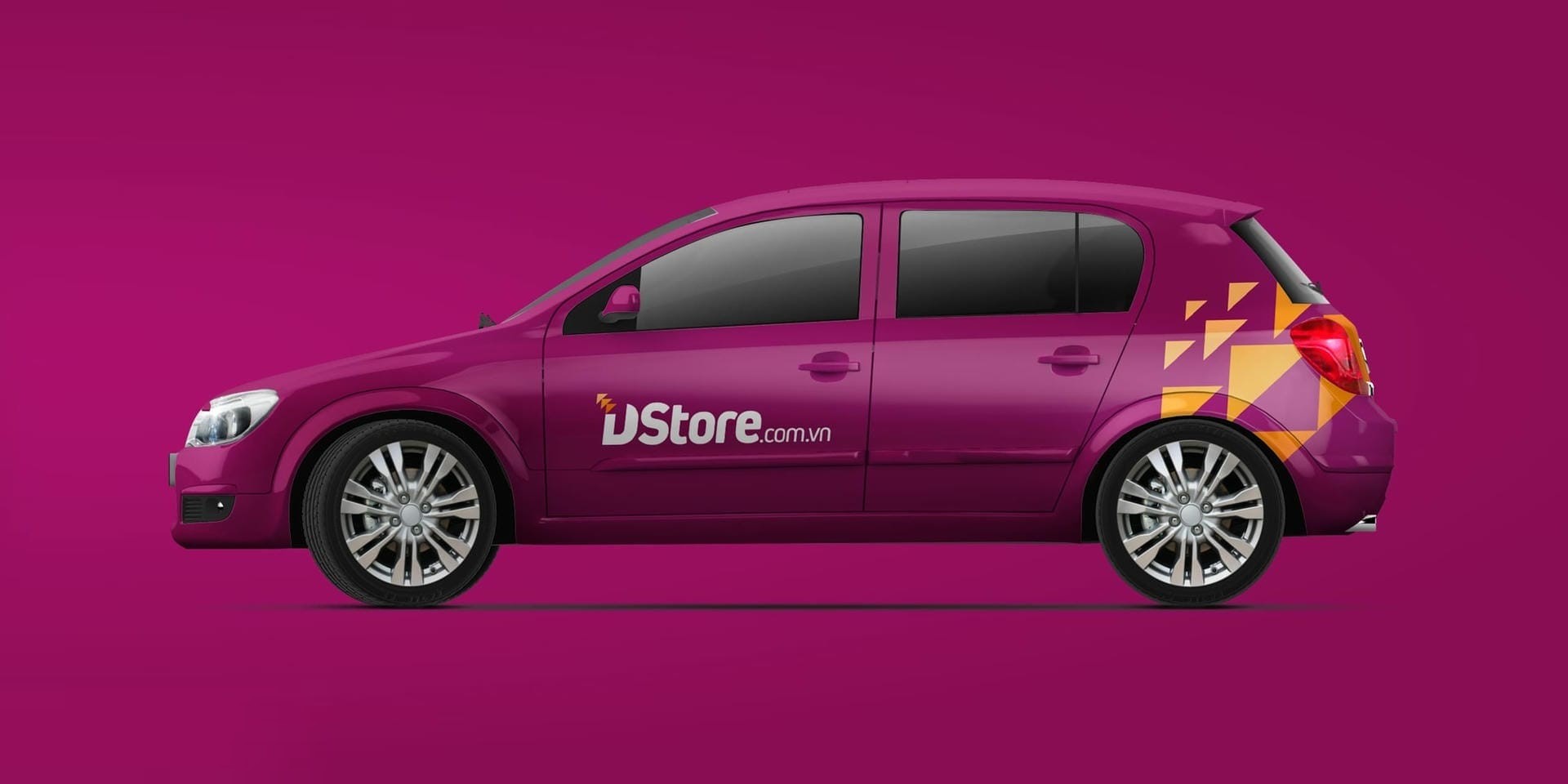
The logo starts from a bold letter D leaning forward. Above it, a few triangles break away like pixels, a small sign of the digital world Dstore brings. The palette is only a dominant pink-purple, orange as the accent, and white to breathe.
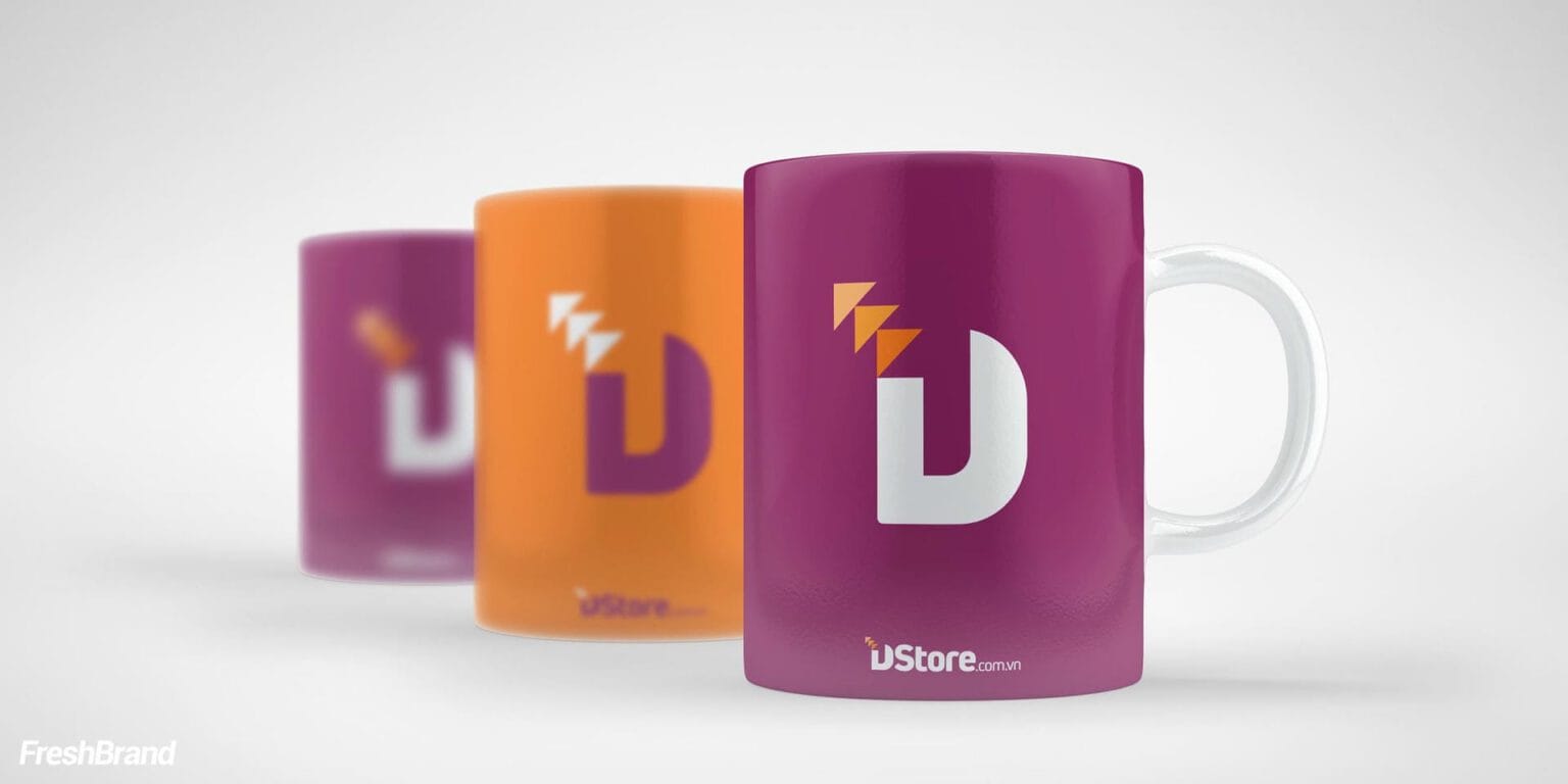
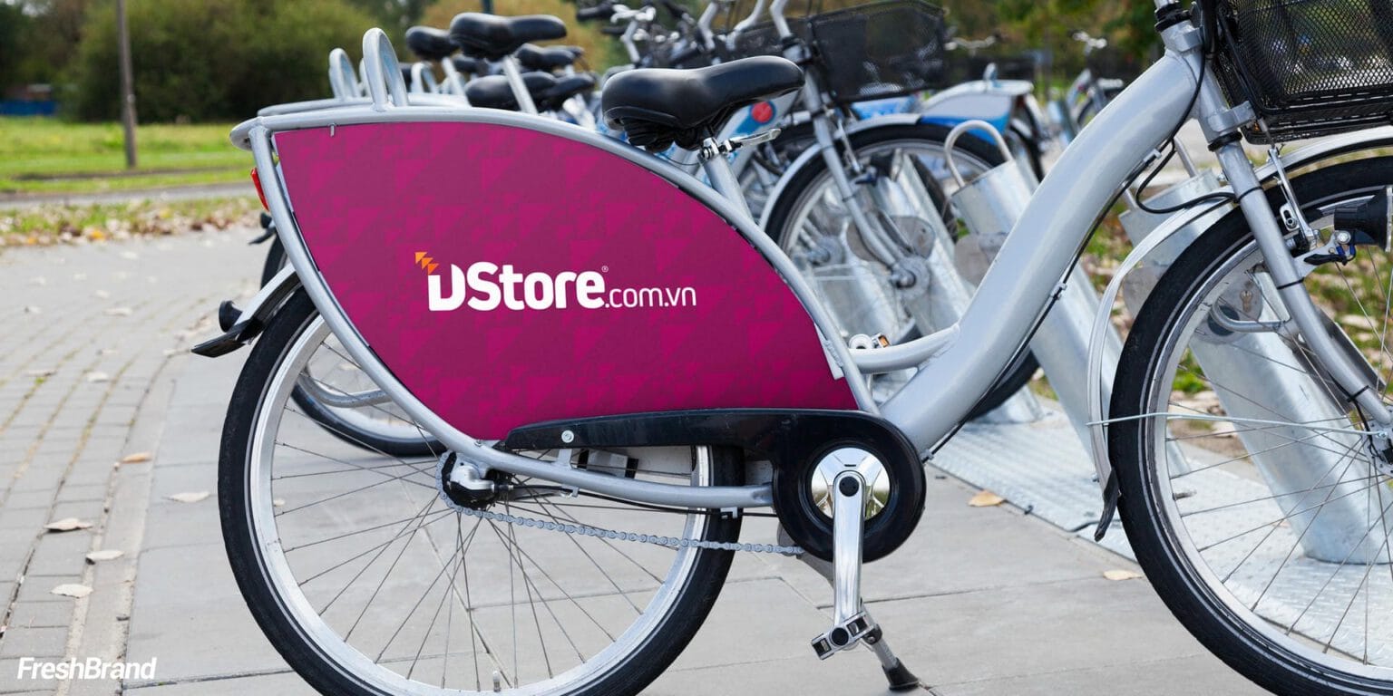
A digital device store has to look precise, so the system keeps only three elements (the pink-purple ground, the letter D and the orange triangles); from letterhead, cups and shopping bags to delivery bikes, Dstore keeps the same face everywhere.
The question behind it
A logo needs three things beside it so it does not stand alone: a right name, an identity system that grows from the logo itself, and a set of standards that keeps the logo consistent.
FreshBrand capabilities
Strategy
When a brand needs a direction
Identity
When a brand needs to be recognized
Expression
When meaning needs to take shape
Experience
When a brand needs to be felt
Communication
When a brand needs to be understood
Start with FreshBrand
Send us the problem, get a point of view.
You can send a request today, or download the portfolio to share with your leadership before we talk.