
GKG
Credibility, like wood grain, is made by time.
- Client
- Gia Khang
- Industry
- Manufacturing & Industry
- Services
- Brand Identity Design, Logo Design

Overview
GKG — Gia Khang — distributes wood materials and wood products.
FreshBrand designed the logo and identity system for GKG around the direction quality, credibility, stability, competitiveness — taking the very material the company makes as the language of the brand.
Symbol
How did the idea take shape?
Wood rings in a square
The symbol is a square block whose upper corner opens into concentric curves, like the grain on a cross-section of a tree trunk. Each ring is a year; the more rings, the sturdier the wood.
The wood yellow and deep brown come straight from the material and need no explanation.

Applications
Where does the brand appear?
Real wood on white
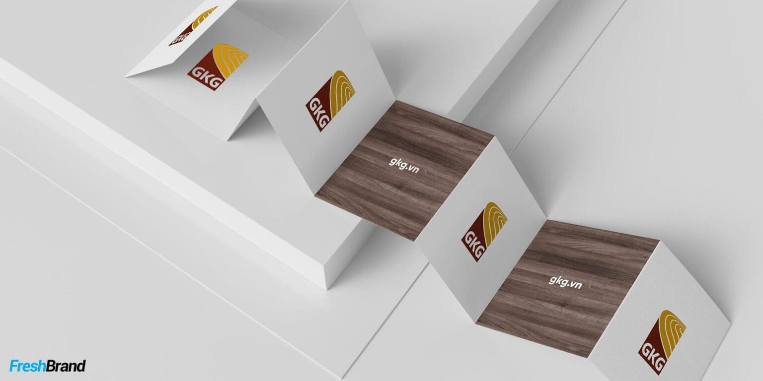
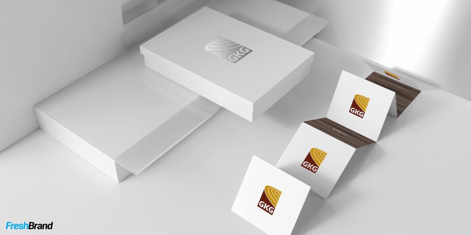
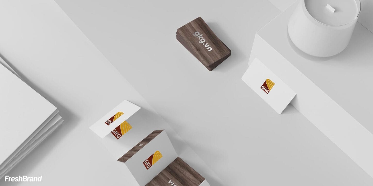
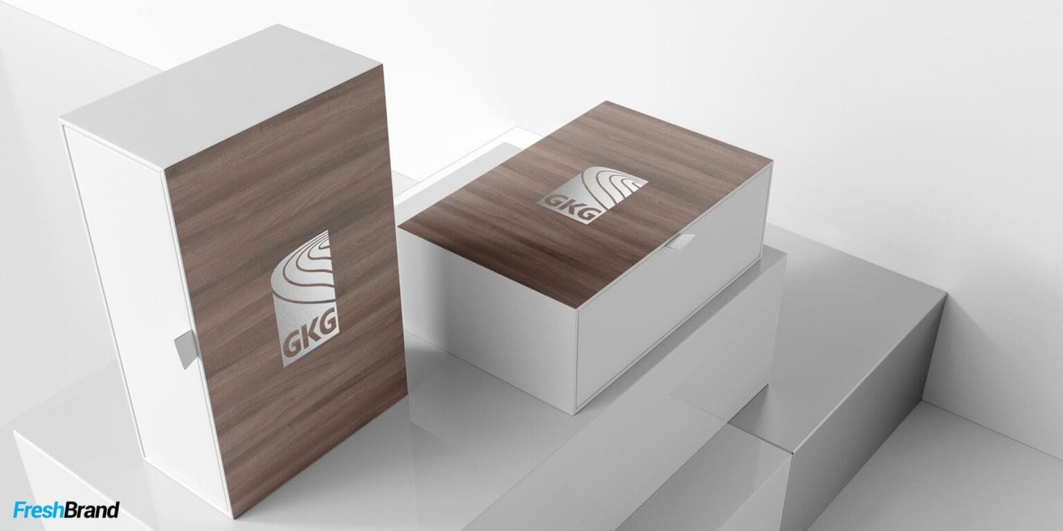
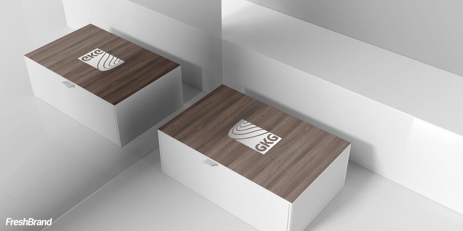
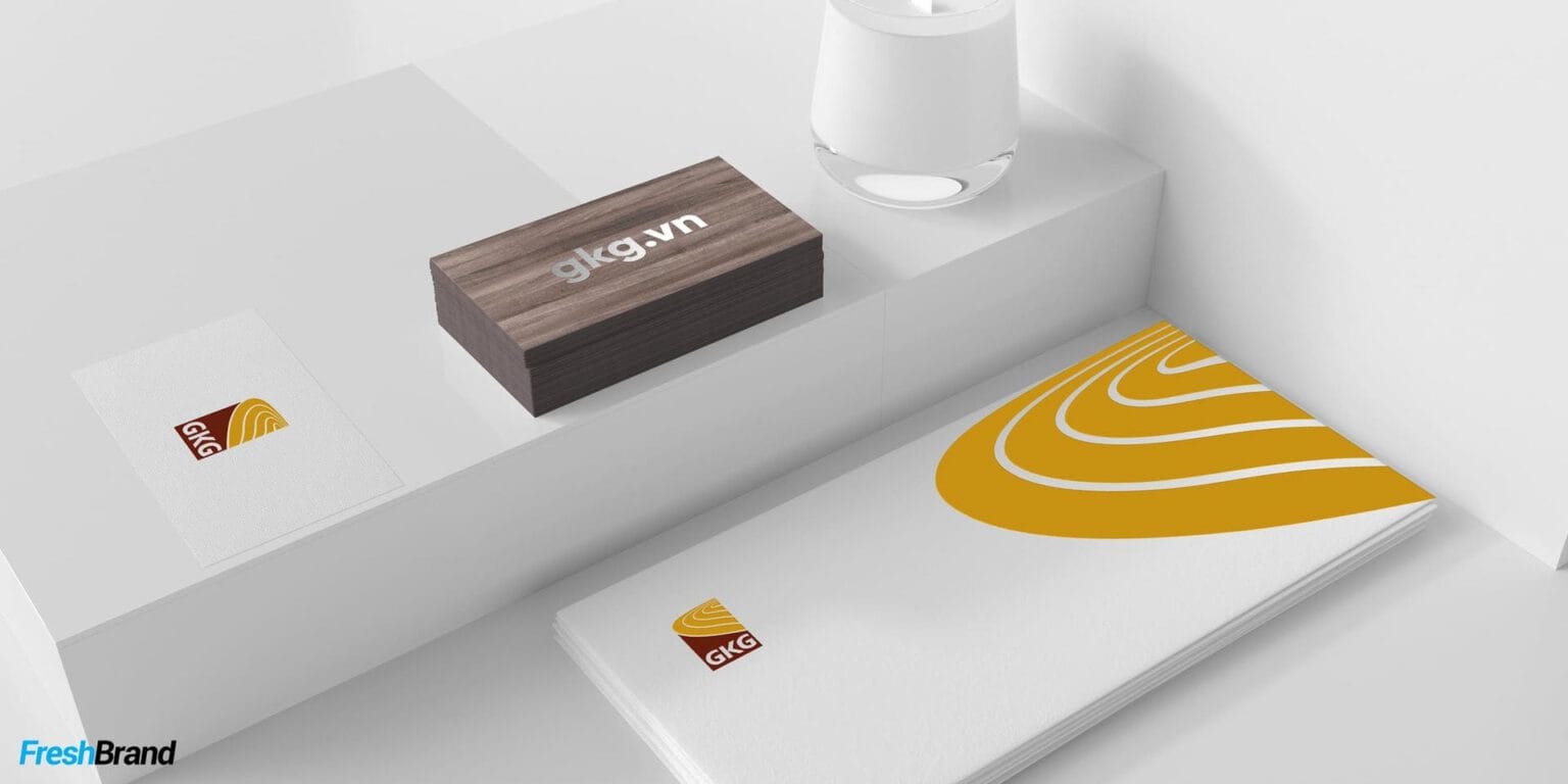
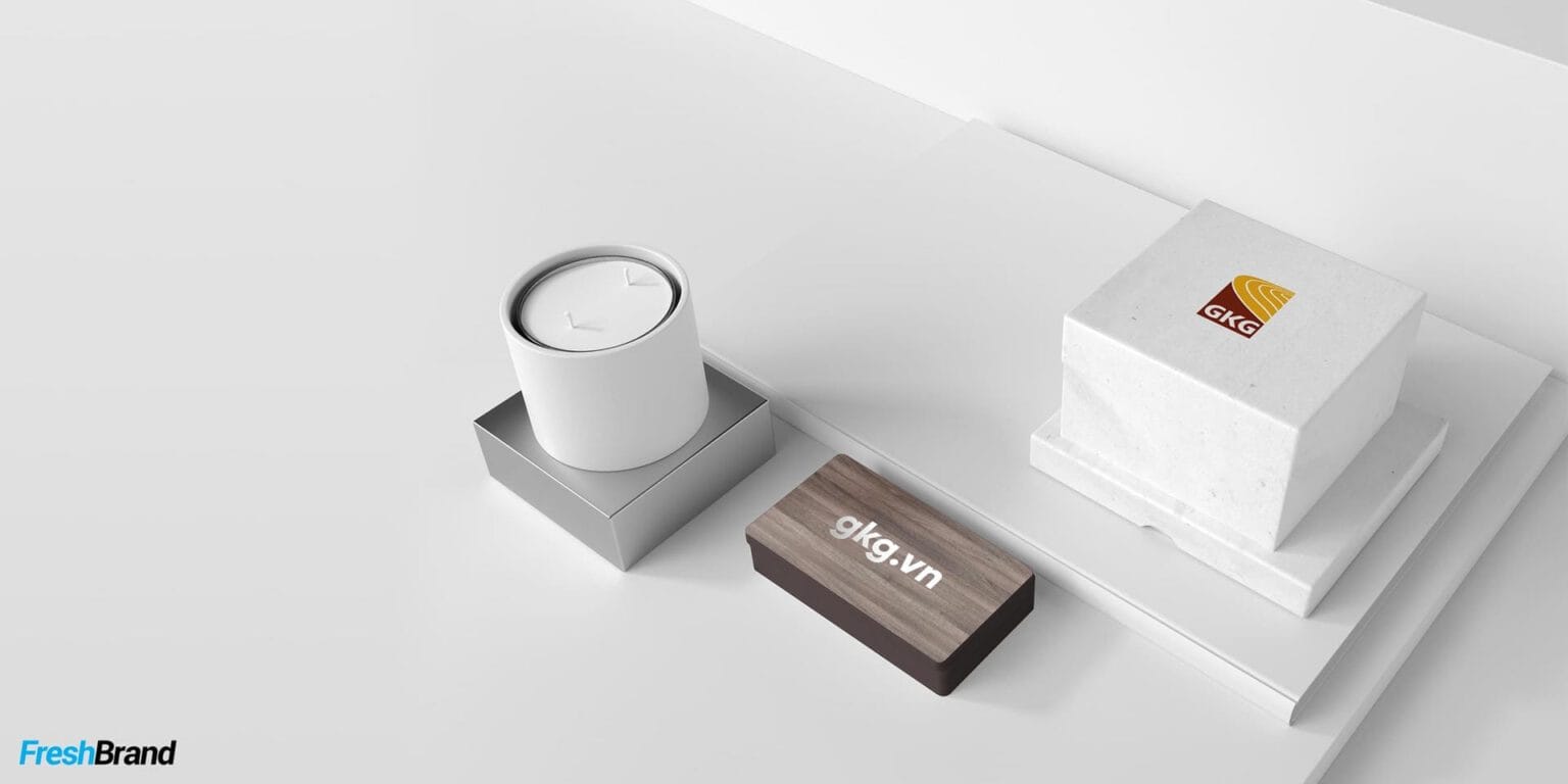
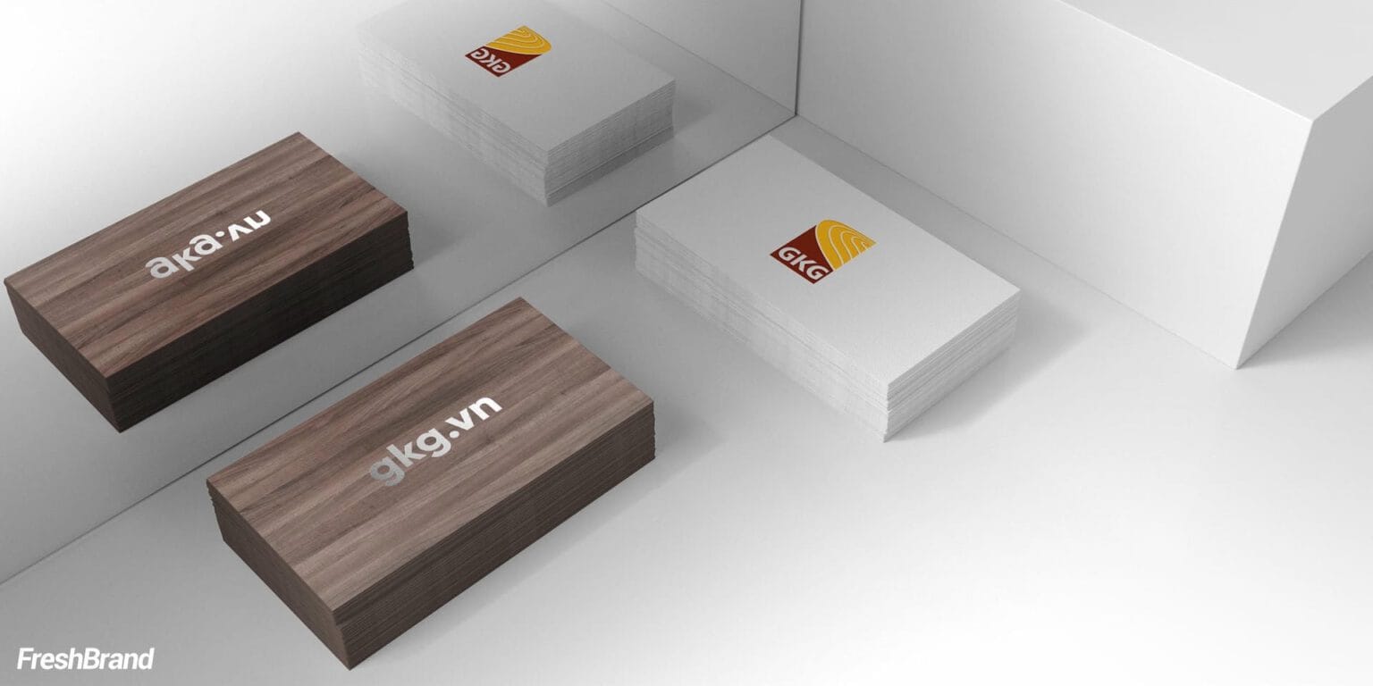
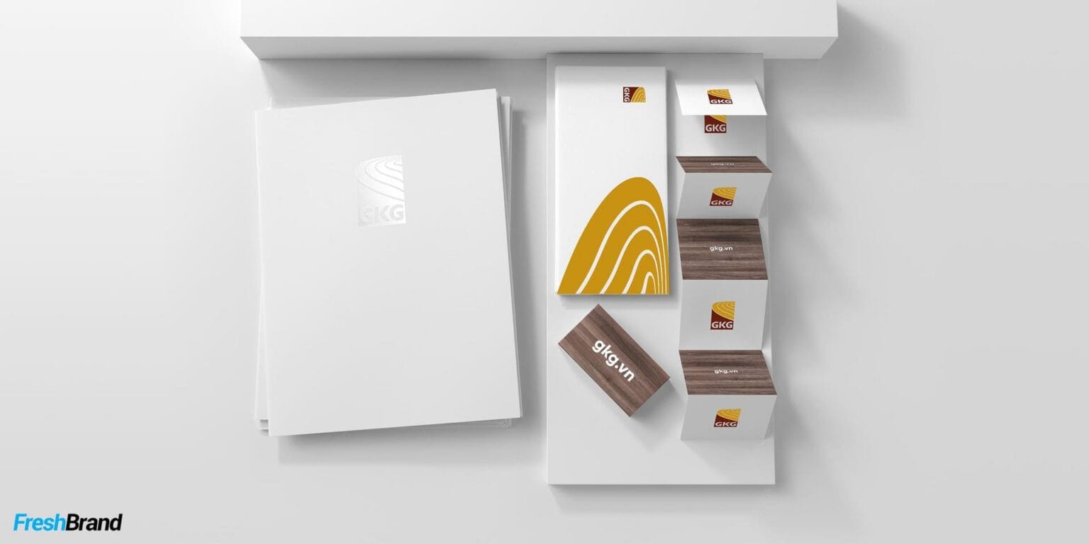
Business cards, document covers, boxes and packaging combine real wood faces with a clean white ground. The small symbol sits in a corner while golden grain lines run across the paper — a system with few details, letting the material speak for itself.

Services
FreshBrand team
- Trần Anh Tú — Creative Director, Project Director, Design
- Hồng Phong — Design
- Thanh Thúy — Design
Project
- ClientGia Khang
