
Basic Global
Every ascent needs a foundation.
- Client
- Basic Global
- Industry
- Manufacturing & Industry
- Services
- Brand Identity Design, Logo Design

Overview
Basic Global is a business in industrial manufacturing.
FreshBrand designed the logo and identity system for Basic Global, a brand that speaks about the basics yet faces forward.
Symbol
How did the idea take shape?
The A becomes an upward arrow
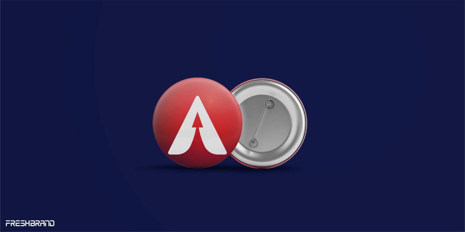
In the word BASIC, the A is replaced by a white arrow pointing up, set inside a red circle. It is one detail, but enough to give the whole name a sense of movement.
Deep blue for solidity and red for energy make the two main colors, joined by two supporting colors in the same tone.


Applications
Where does the brand appear?
Red and deep blue, compact and clear
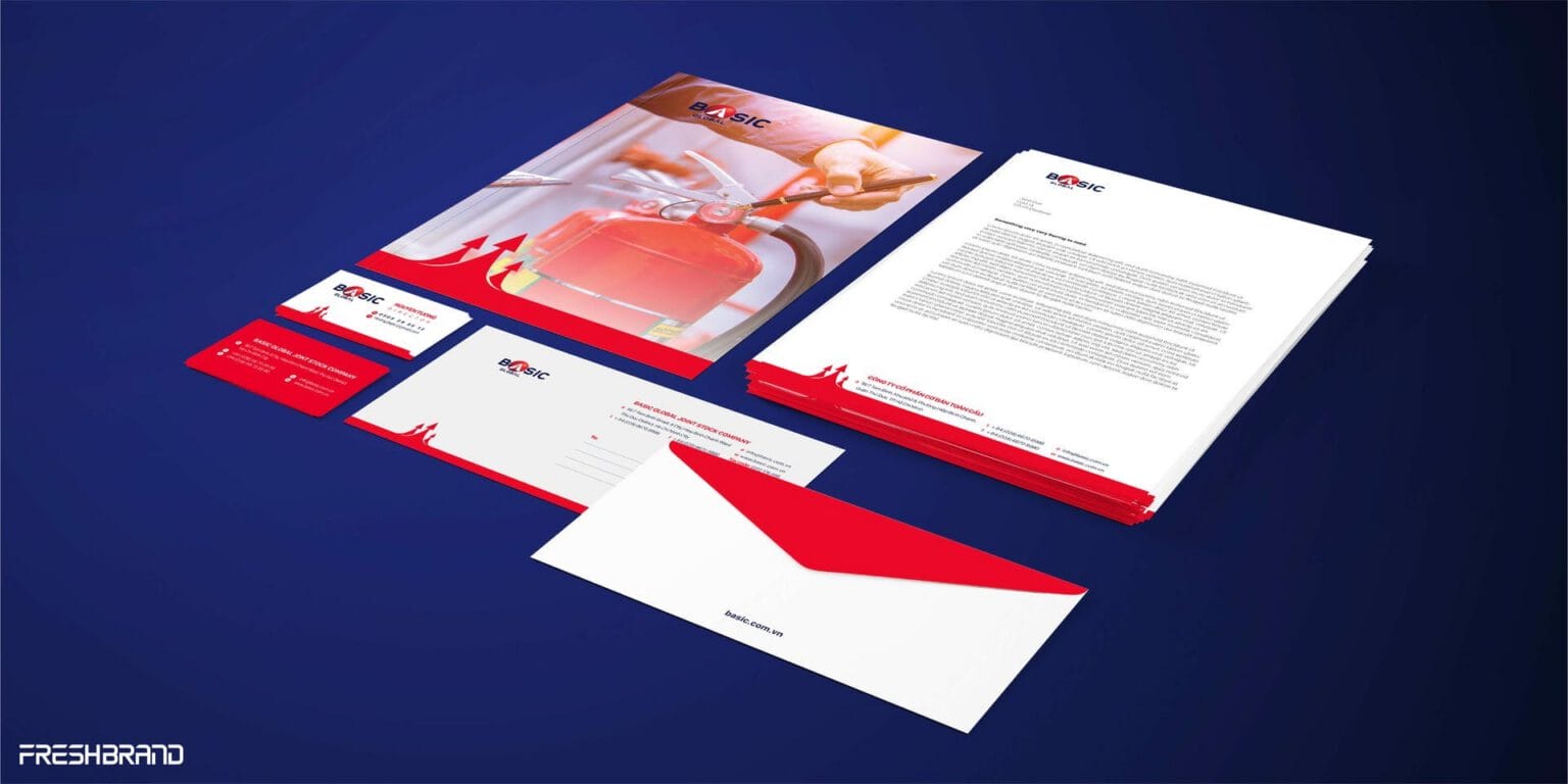
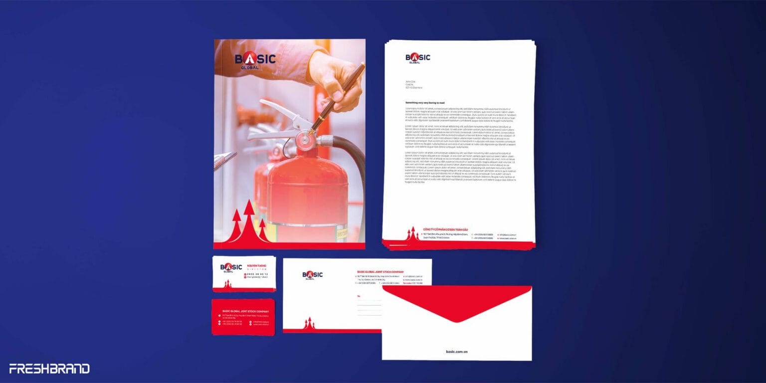
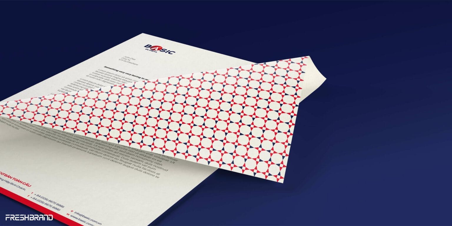
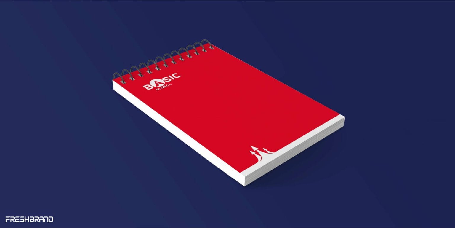
Business cards, letterhead, envelopes, notebooks and staff ID cards share one structure: a white ground, the logo in a corner, and a red band of upward arrows along the bottom edge. It is a system with few elements, easy to use and easy to keep consistent.



Services
FreshBrand team
- Trần Anh Tú — Creative Director, Project Director
- Trâm Anh — Design
Project
- ClientBasic Global
