

Overview
A digital-device store is only convincing when it is as precise as what it sells.
Dstore sells genuine computers, watches and electronics. FreshBrand named the store and designed its logo, identity system and space: a large letter D, a pink-purple no other brand could be mistaken for, and orange triangles like pixels in motion.
Symbol
How did the idea take shape?
The letter D and its pixels
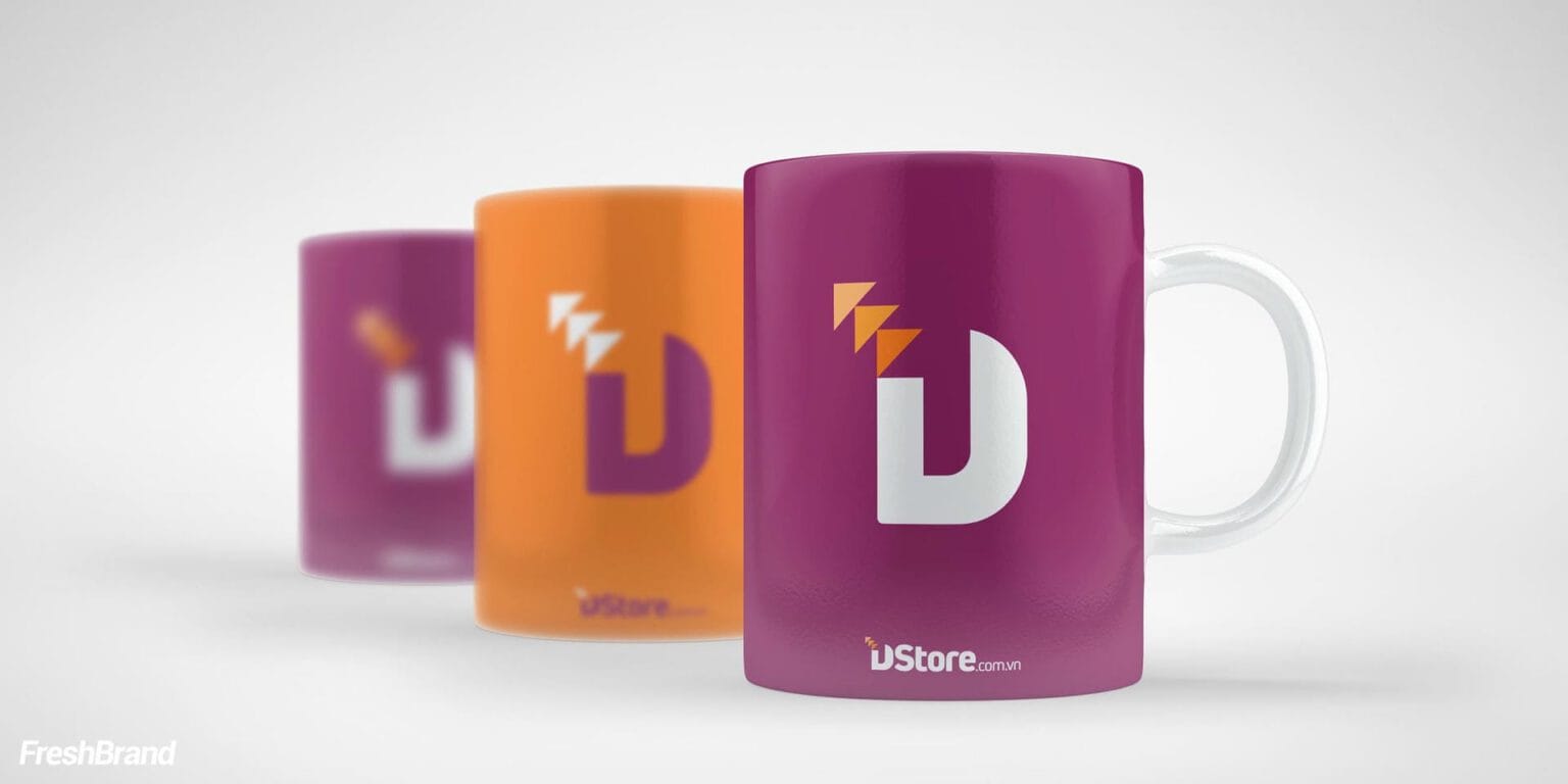
The logo starts from a bold letter D leaning forward. Above it, a few triangles break away like pixels, a small sign of the digital world Dstore brings.
The palette is minimal: pink-purple leads, orange accents, and white leaves room to breathe.


Applications
Where does the brand appear?
One color, recognizable from afar
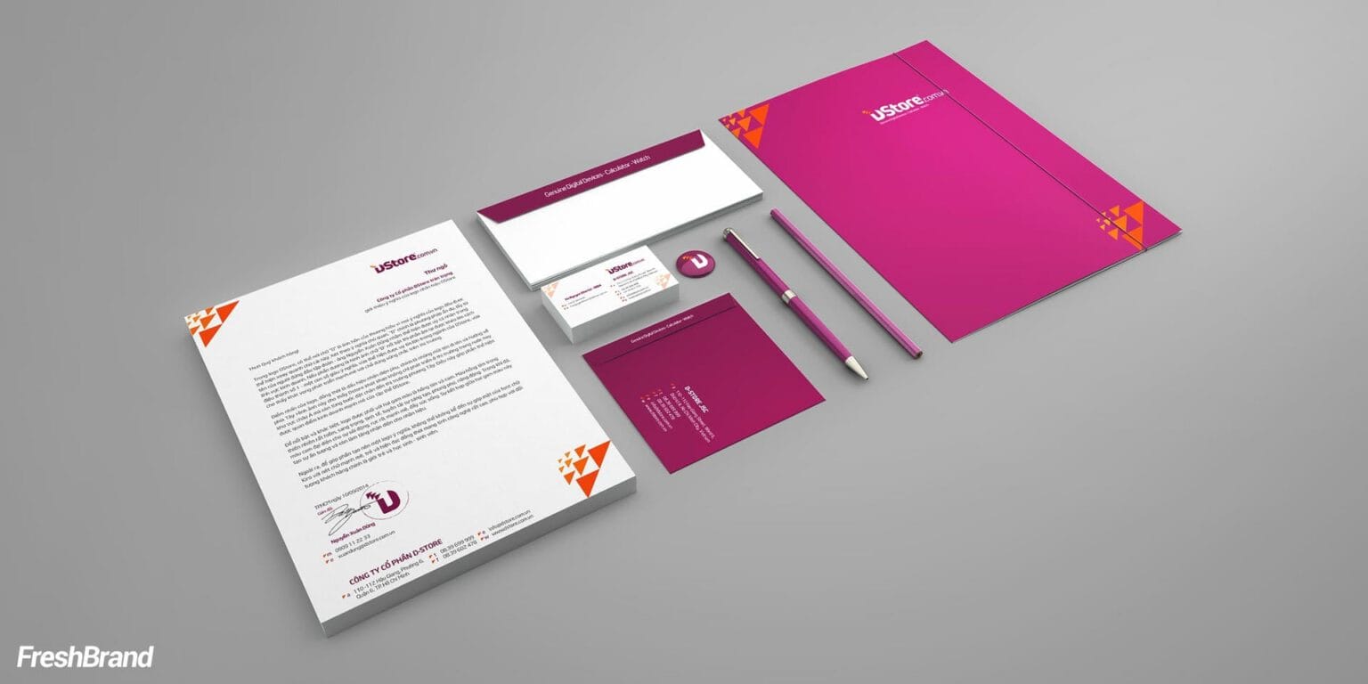
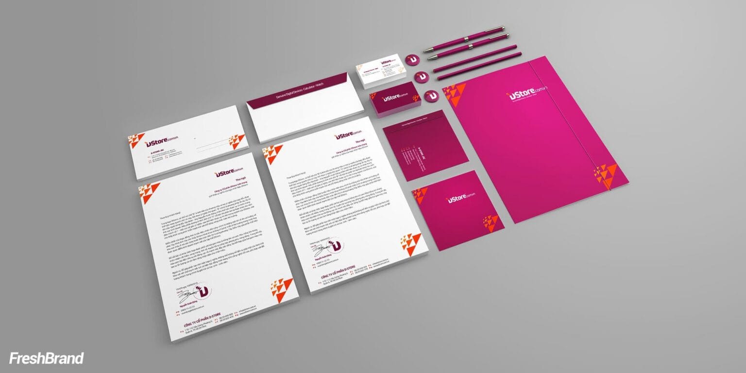
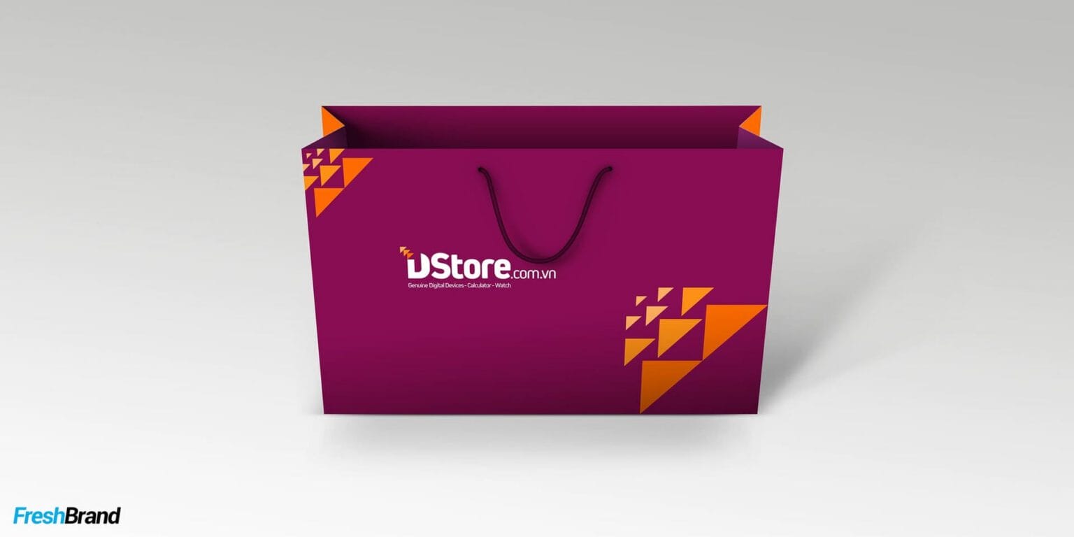
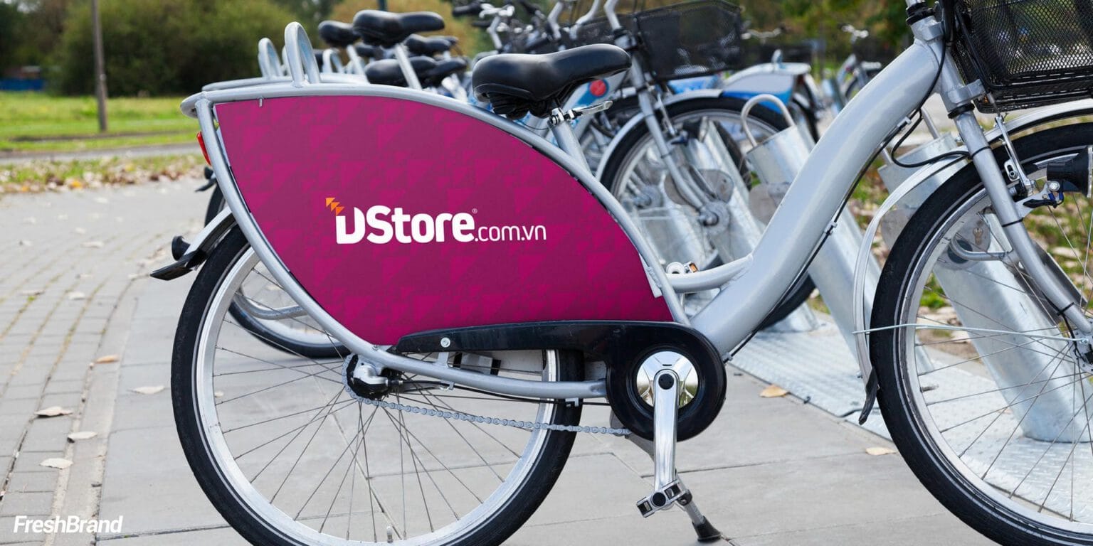
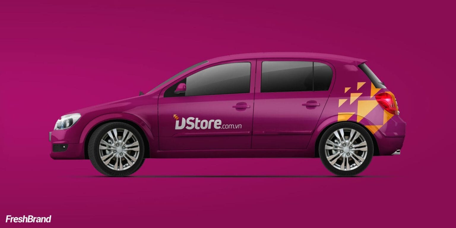
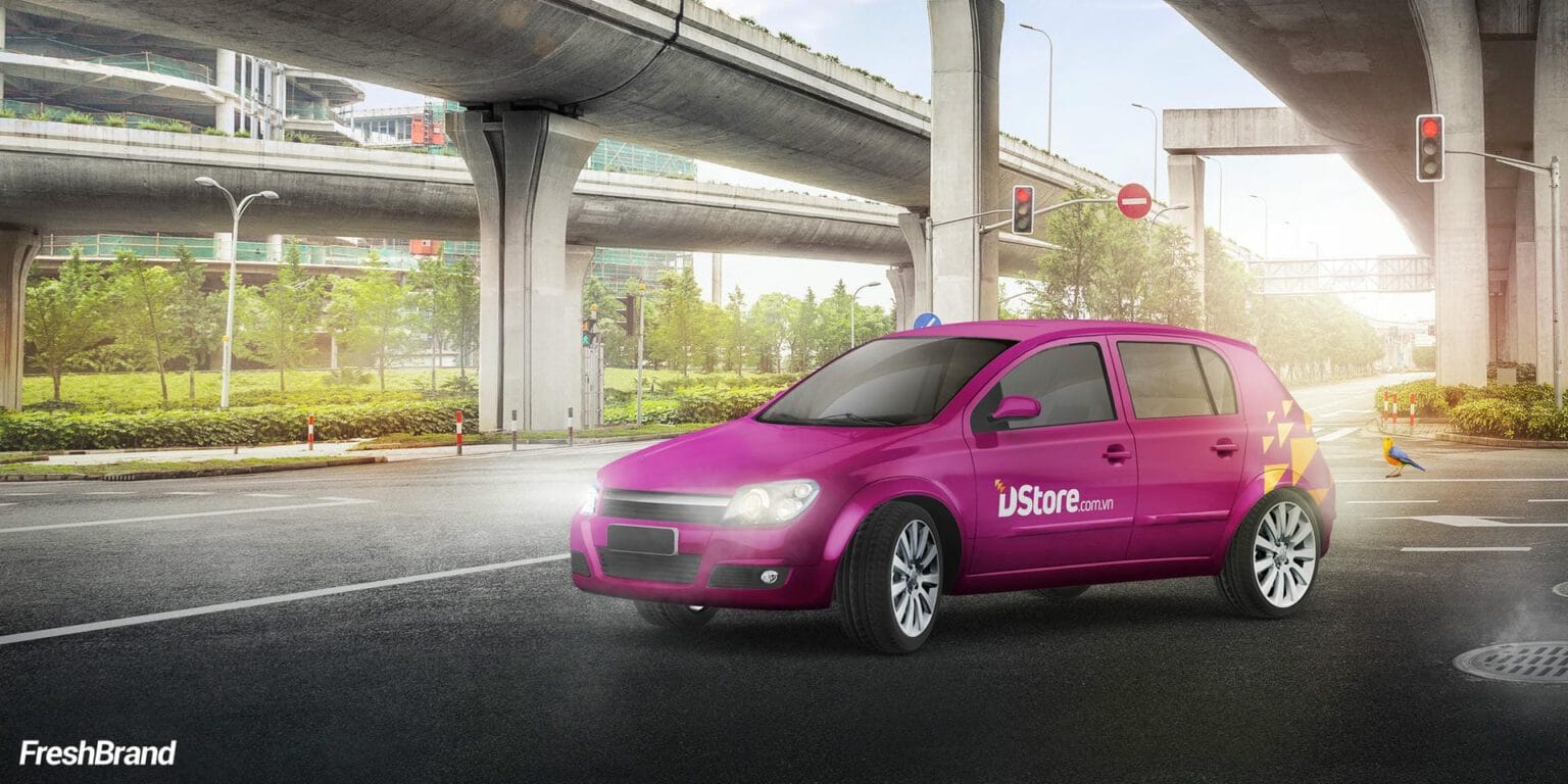
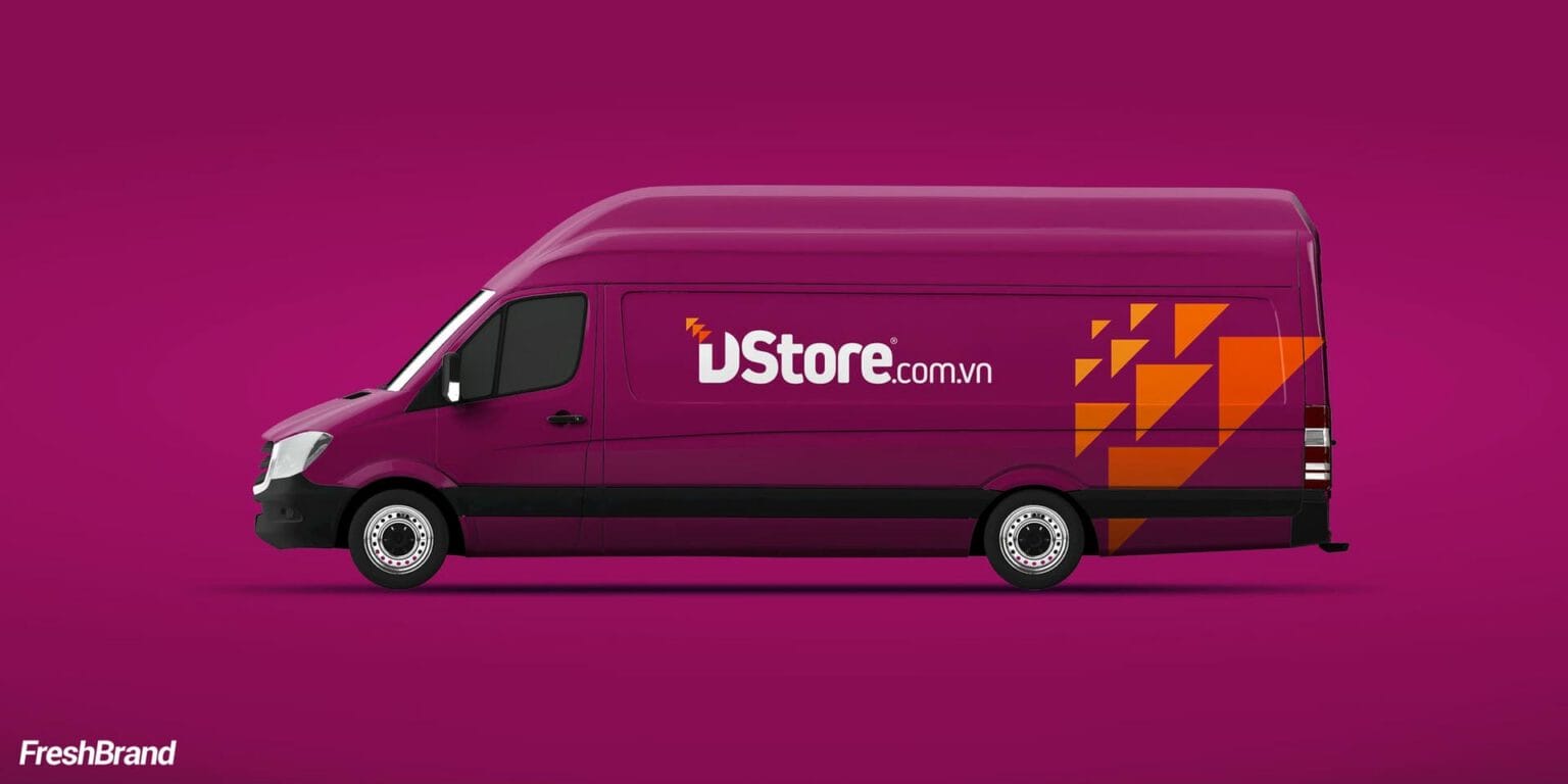
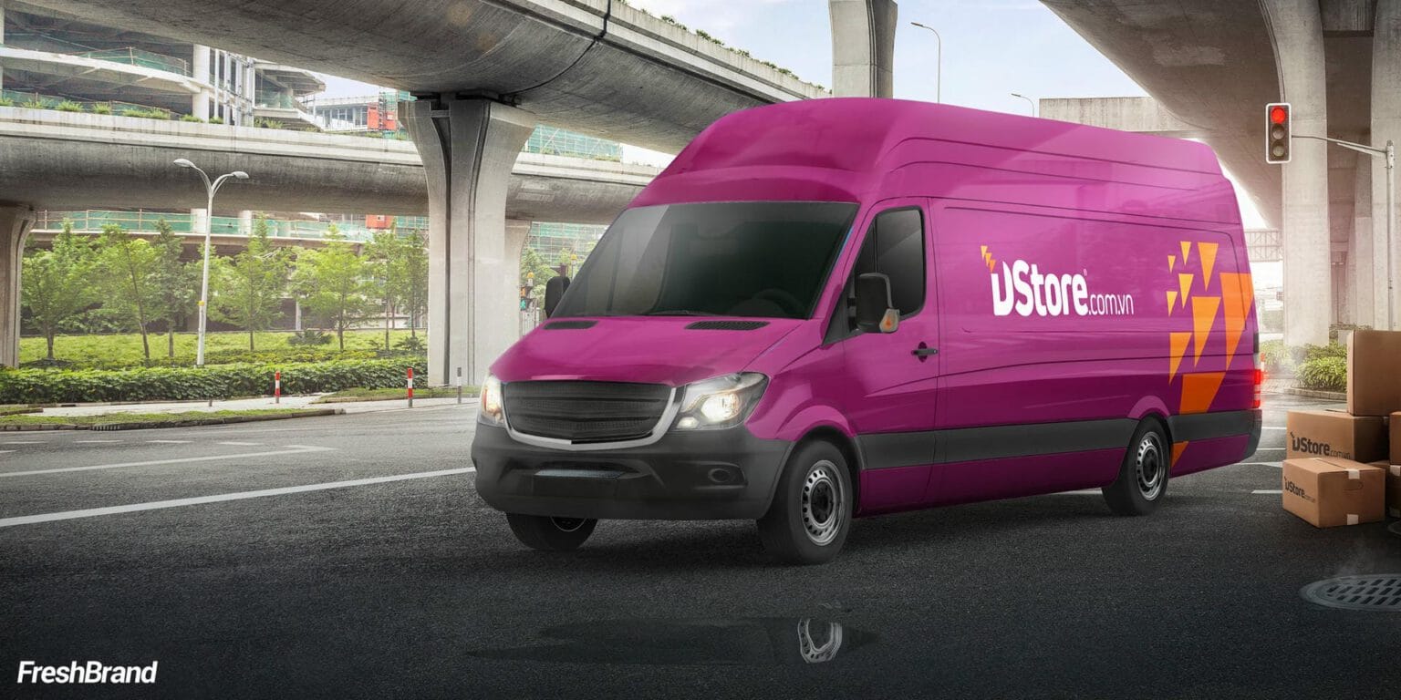
From letterhead, cups and shopping bags to delivery bikes, the system uses only a few things: a pink-purple ground, the letter D and a cluster of orange triangles. With so few elements, the brand keeps the same face everywhere.

Space
What do customers walk into?
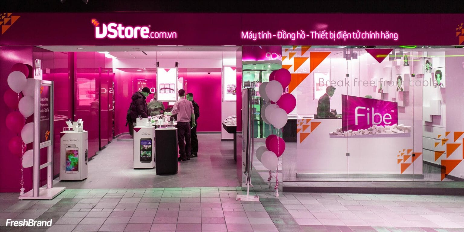
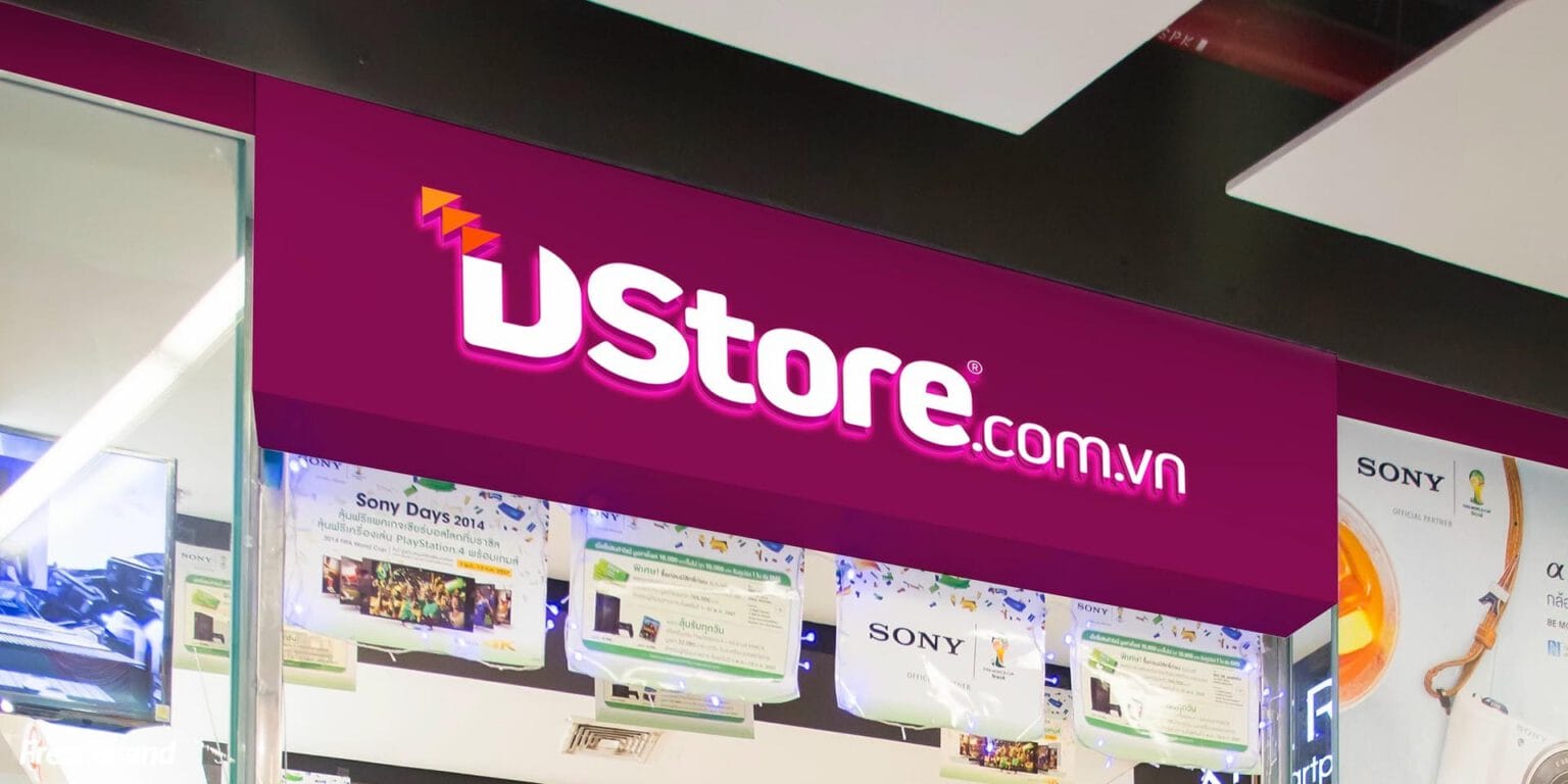
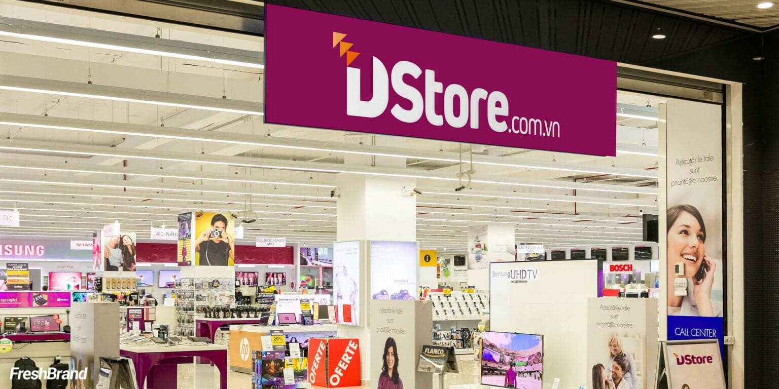
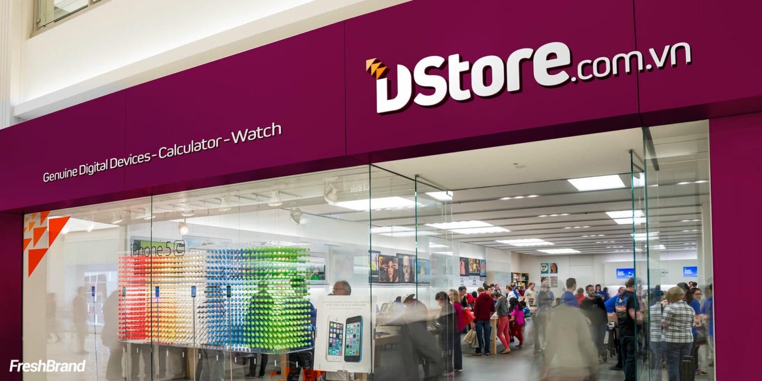
The store is the biggest logo
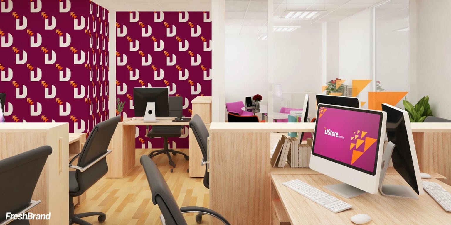
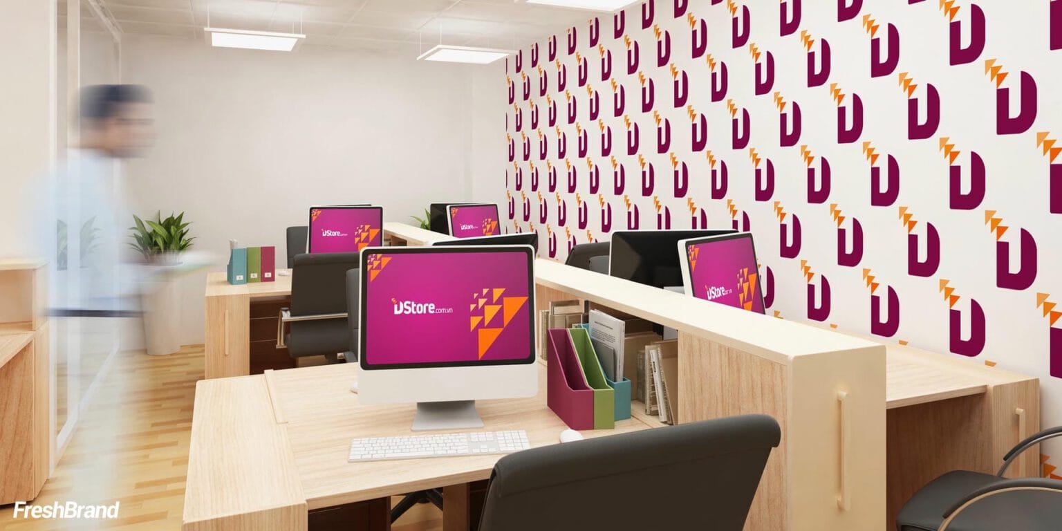
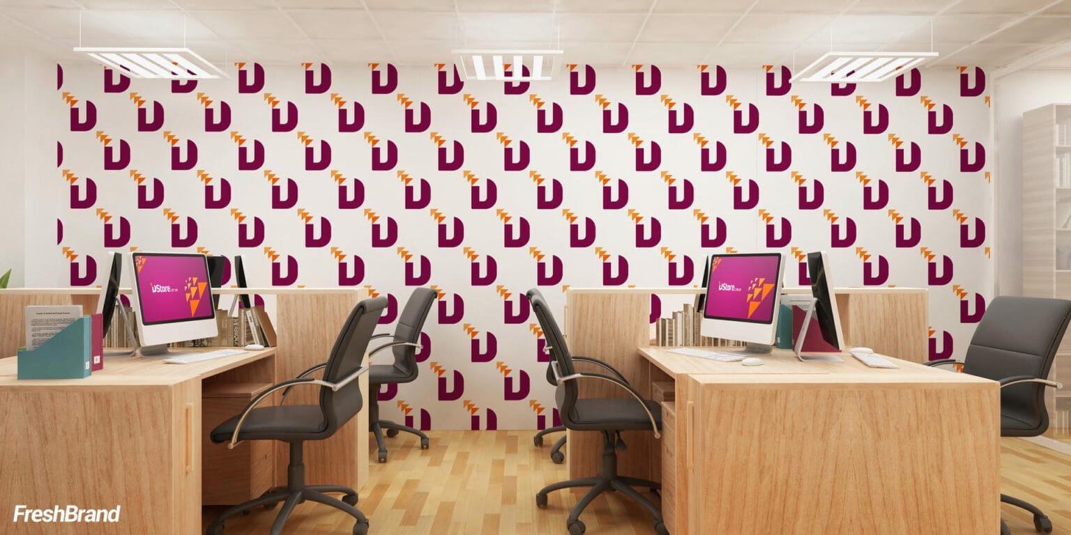
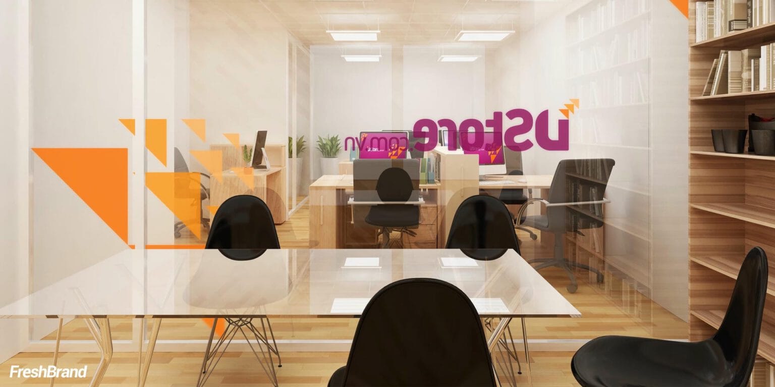
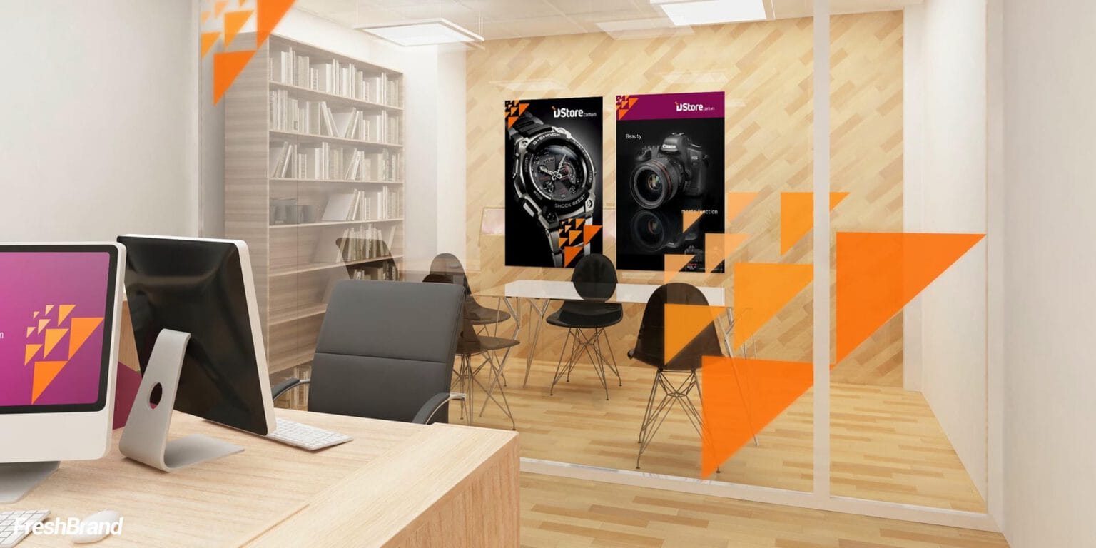
Inside the office, the letter D is multiplied into a wall pattern, and the triangles become decoration on glass and partitions. On the facade, a pink-purple sign runs the full width of the store, bold enough to stand out on a row of shops or in a shopping center.
The office and the store share one language, so staff and customers stand inside the same brand.



Advertising
How does the brand find its voice?
Product first, brand second
On posters and billboards, the product is always the lead. A pink-purple ground, the cluster of triangles and the Dstore signature in the corner are enough to tell viewers who is selling it.


FreshBrand team
- Trần Anh Tú — Creative Director, Project Director, Design
- Hồng Phong — Design
- Thanh Thuận — Design
Project
- ClientDstore Shop
