
Biolife
Clean has to be seen before it is tasted.
- Client
- Thai Quynh
- Industry
- Agriculture & Agribusiness
- Services
- Brand Identity Design, Logo Design, Packaging Design

Overview
With clean produce, trust begins at the first glance.
Biolife is the produce brand of Thai Quynh Enterprise. FreshBrand designed the logo, identity system and packaging with a direction of natural and friendly: a green seal clear enough to travel from the smallest sticker to an entire counter.
Symbol
How did the idea take shape?
A seal for what grows from the soil
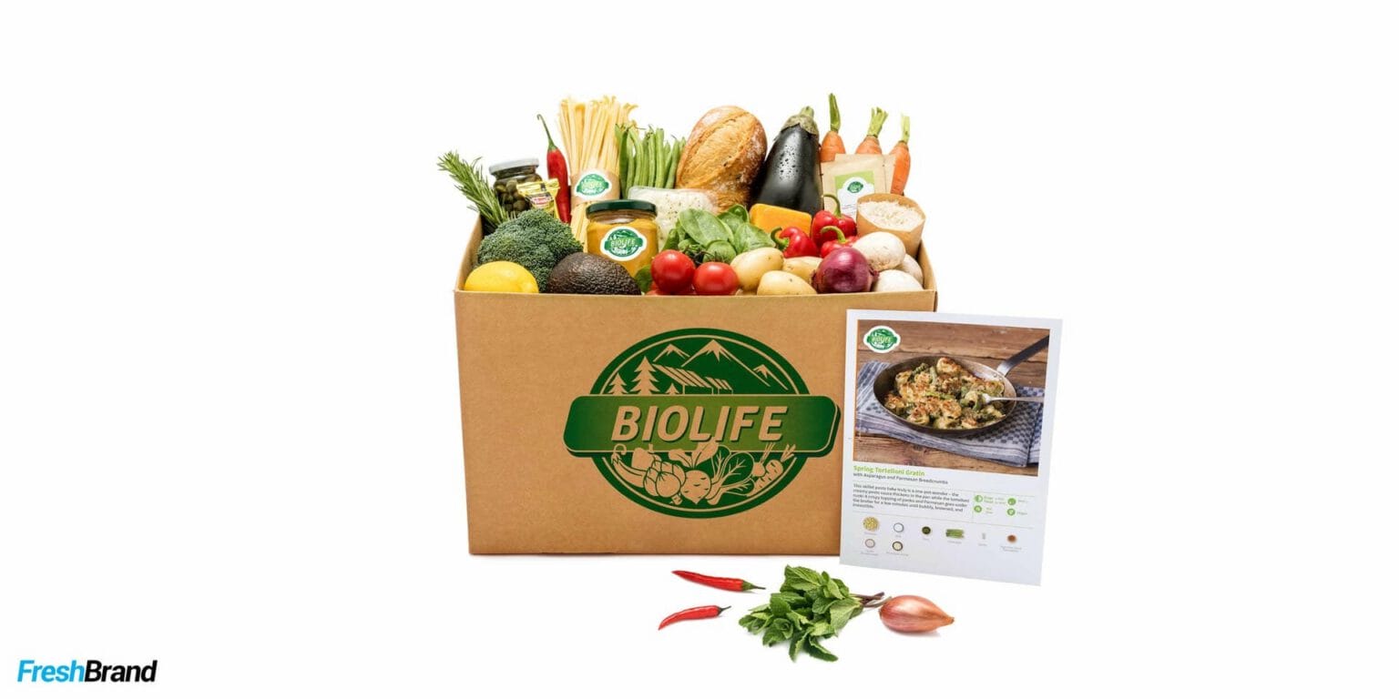
The Biolife symbol is built like a seal: hills behind, vegetables and fruit in front, and the brand name running across a ribbon. Everything that needs saying about origin is held in a single shape.
The green is split into several shades and paired with a tidy sans-serif typeface, fresh enough to suggest life and restrained enough to keep trust.


System
How is the identity kept consistent?
Green, but never loud
On business cards, letterhead and the rest of the office printed materials, the seal stands alone in white space or on a solid green ground. The leafy pattern appears only as a faint background layer, so the brand is always the first thing seen.


Packaging
How does the product speak on the shelf?
The label is the smallest promise
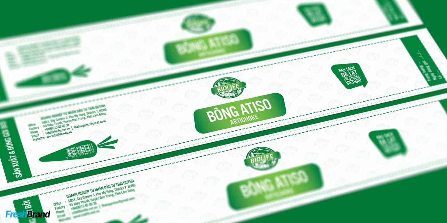
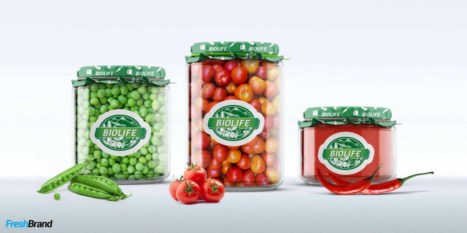
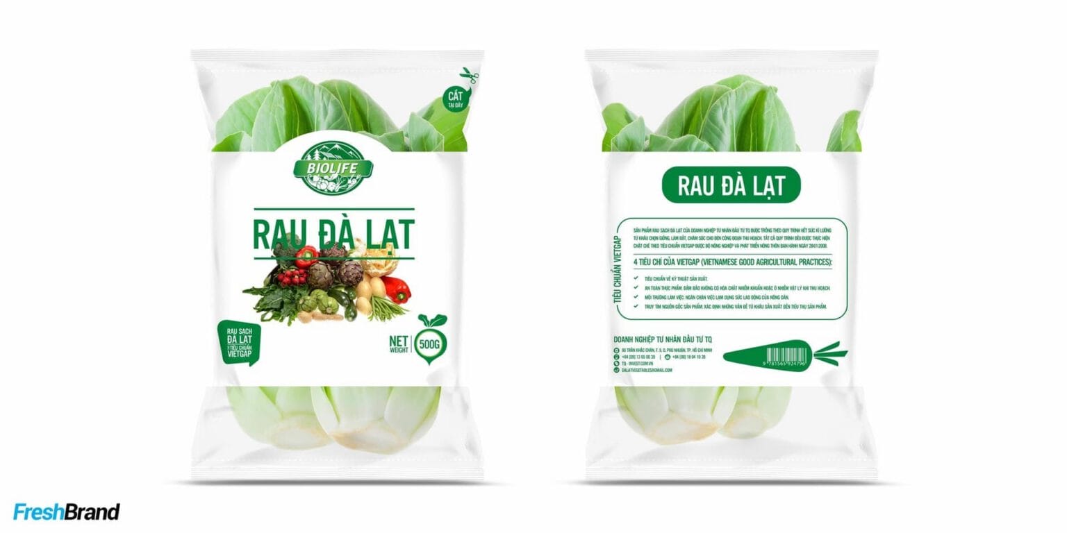
Clean produce usually comes in simple packaging, so the label has to do the work of the whole brand. The Biolife label system keeps the seal, the green band and the product name area fixed; only the content changes with each vegetable, root, jar or bottle.
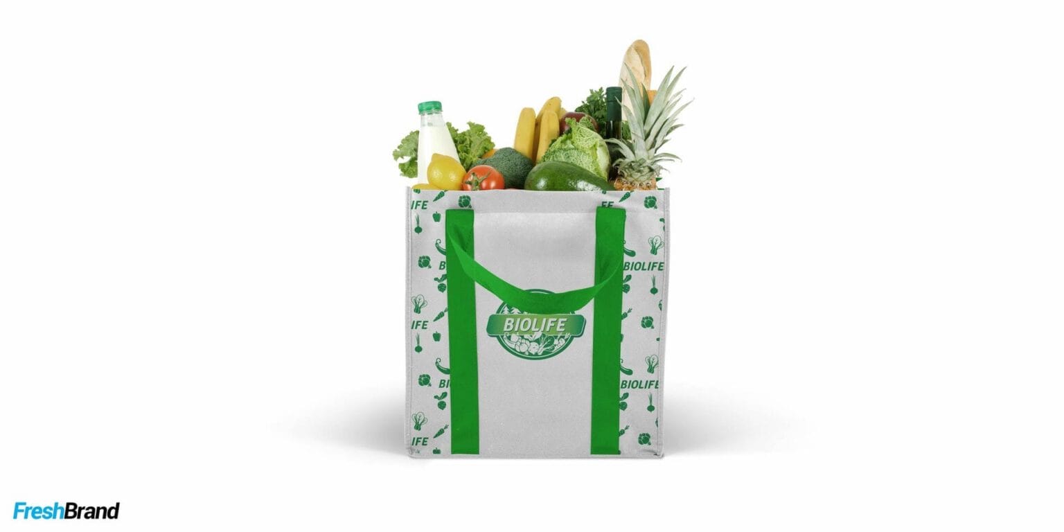
From vegetable bags and glass jars to juice bottles and cartons, every product is recognized as coming from the same house.



Retail
Where does the brand appear?
From the produce counter to the apron
At the point of sale, the identity leaves the packaging: the seal on display shelves, on staff aprons and on the cards placed among the fruit. Shoppers do not need to read much to know they are standing at a Biolife counter.


With clean produce, a brand does not need to speak louder, only to be recognized sooner.
FreshBrand team
- Trần Anh Tú — Creative Director, Project Director, Design
- Hải Anh — Design
- Kiều Nga — Design
- Phùng Thương — Design
Project
- ClientThai Quynh
