
A Au Hospital
With beauty, trust comes before every other choice.
- Client
- A Au Cosmetic Hospital

Overview
A Au is one of the long-established beauty providers in Vietnam.
Experience and reputation are A Au’s strengths, and it is now built as a cosmetic hospital and spa. FreshBrand designed the logo, identity system and space for A Au around a direction of reputation, quality and absolute safety, with the message “Where women place their trust.”
Symbol
How did the idea take shape?
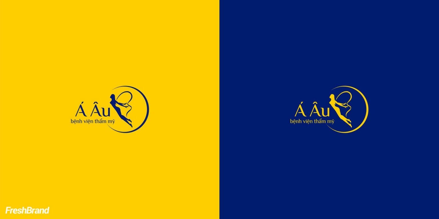
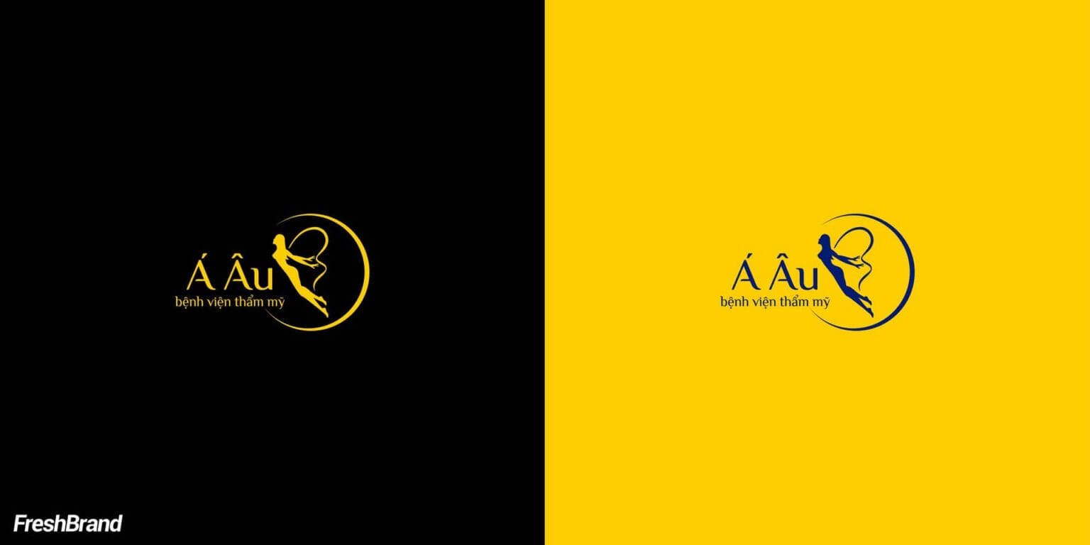
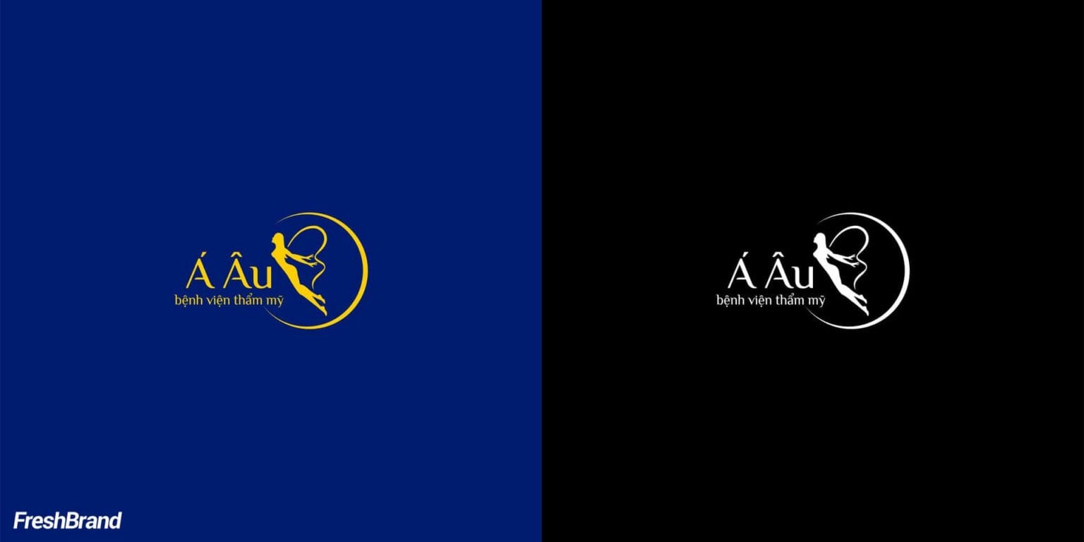
A figure inside a gold circle
The symbol is a soft human figure drawn in gold lines and set inside an open circle. The delicate line speaks of beauty, and the circle speaks of protection and safety.
The palette is only gold, deep green and black: elegant enough for a cosmetic hospital and serious enough for a place where customers entrust themselves.


System
How is the identity kept consistent?
A gold line through every printed piece
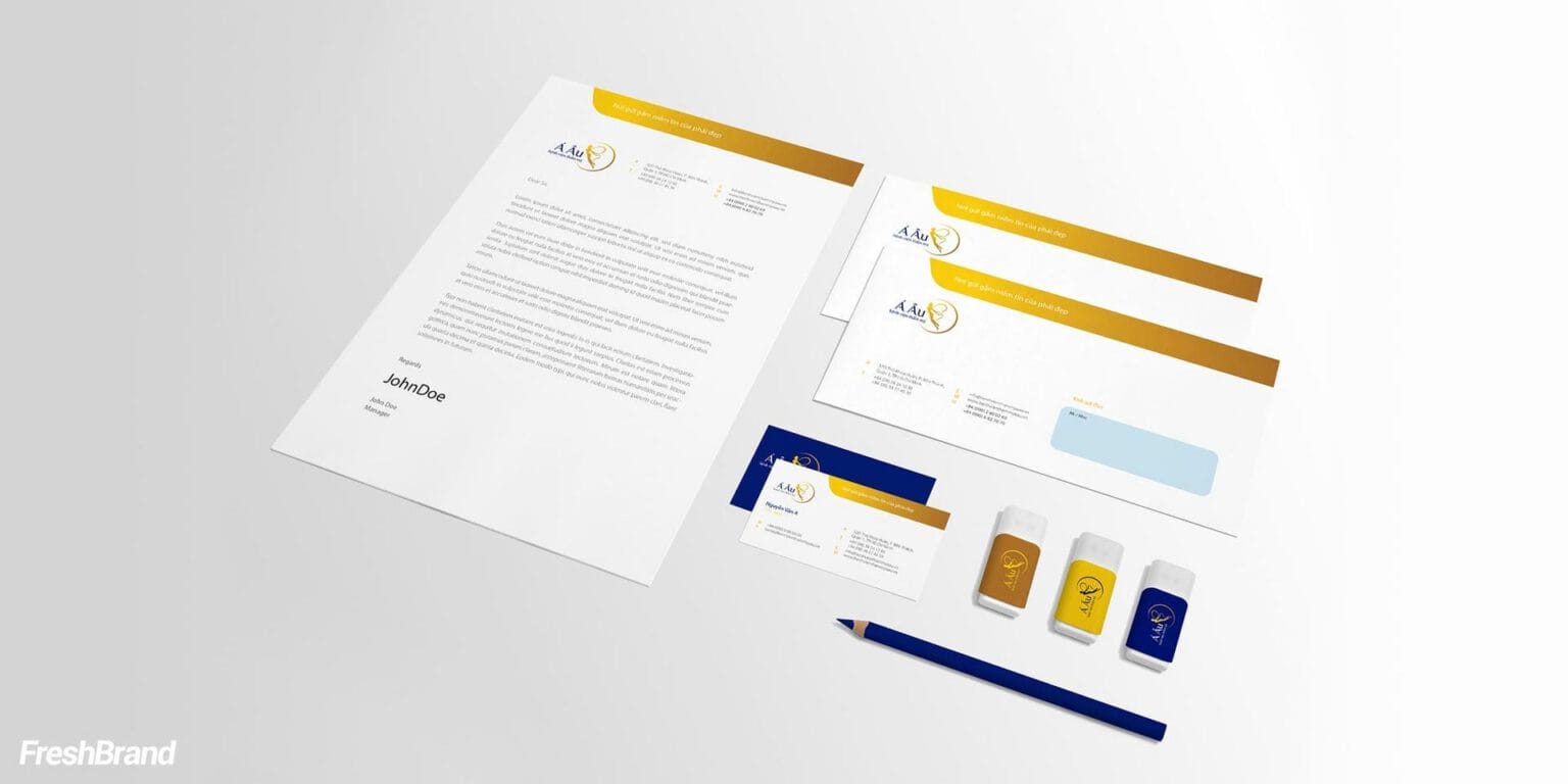
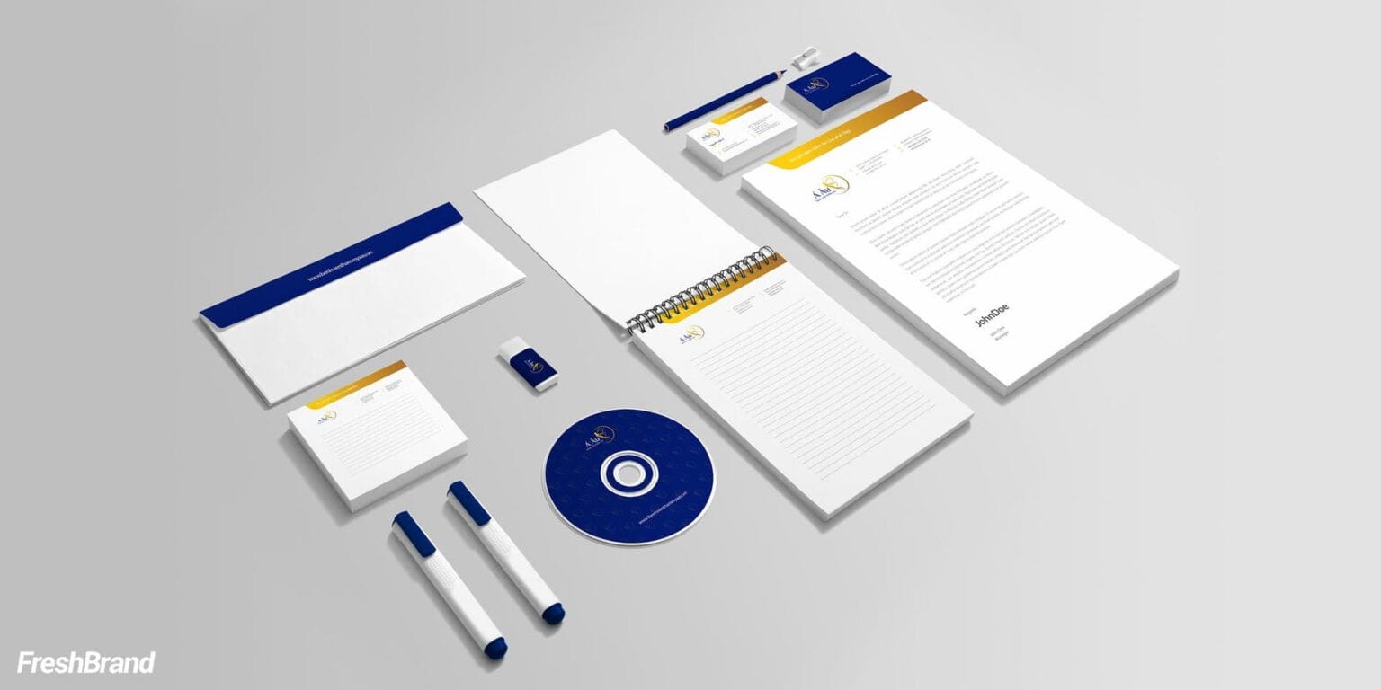
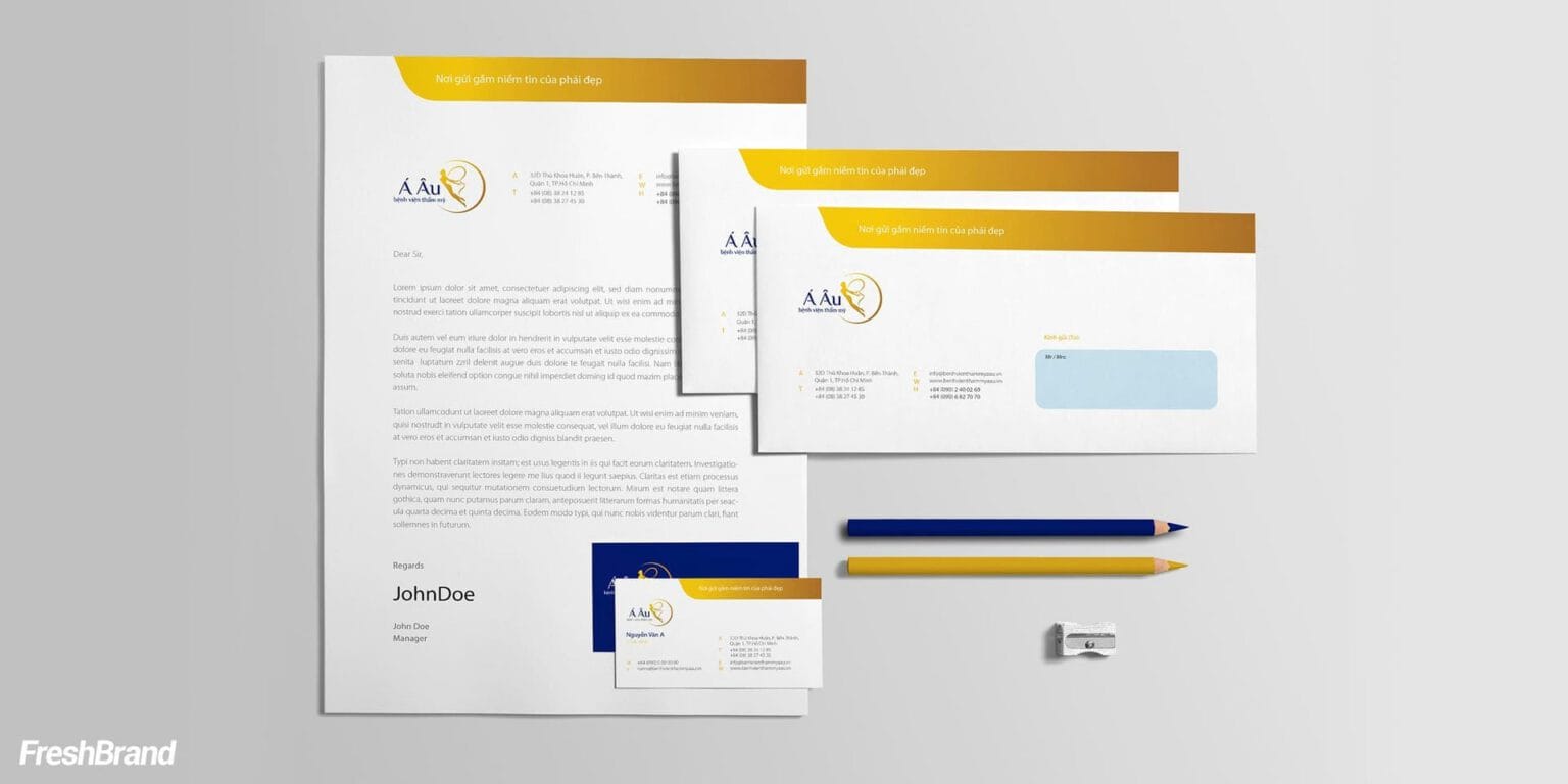
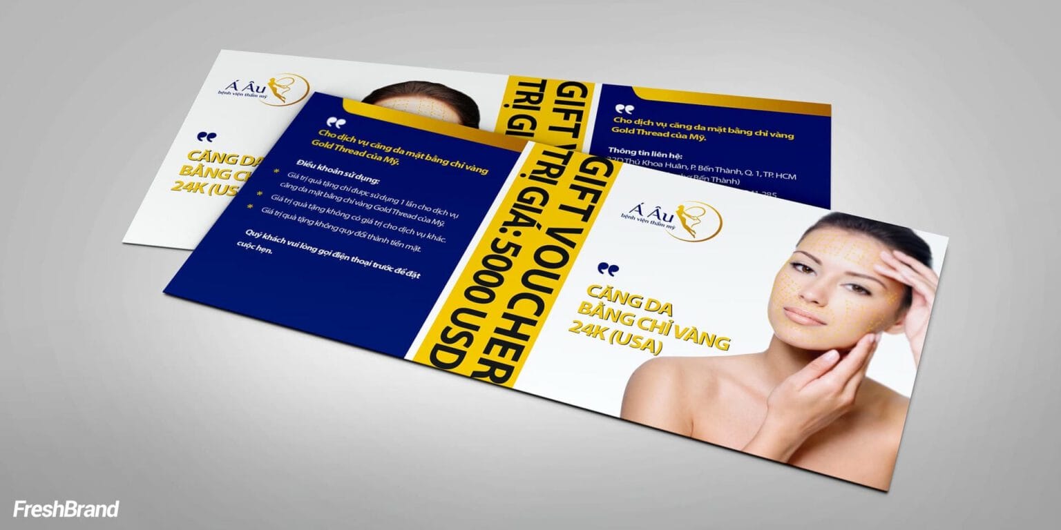
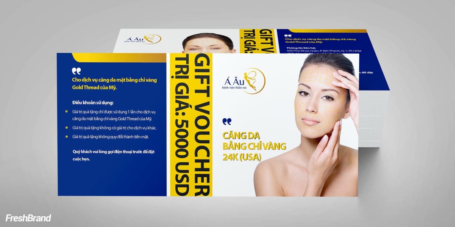
A band of gold runs along the top edge of the business cards, letterhead, envelopes and bags. That small detail gives every printed piece the same face, from the office stationery to the gift voucher.



Space
What do customers walk into?
Real faces, a bright space
In the corridor and at the trade show booth, healthy, radiant women’s faces fill most of the space. The gold symbol sits at the center, like a confirmation.


FreshBrand team
- Trần Anh Tú — Creative Director, Project Director, Design
- Hồng Phong — Design
Project
- ClientA Au Cosmetic Hospital
