

Overview
K’House is a brand of silk-skin cashews.
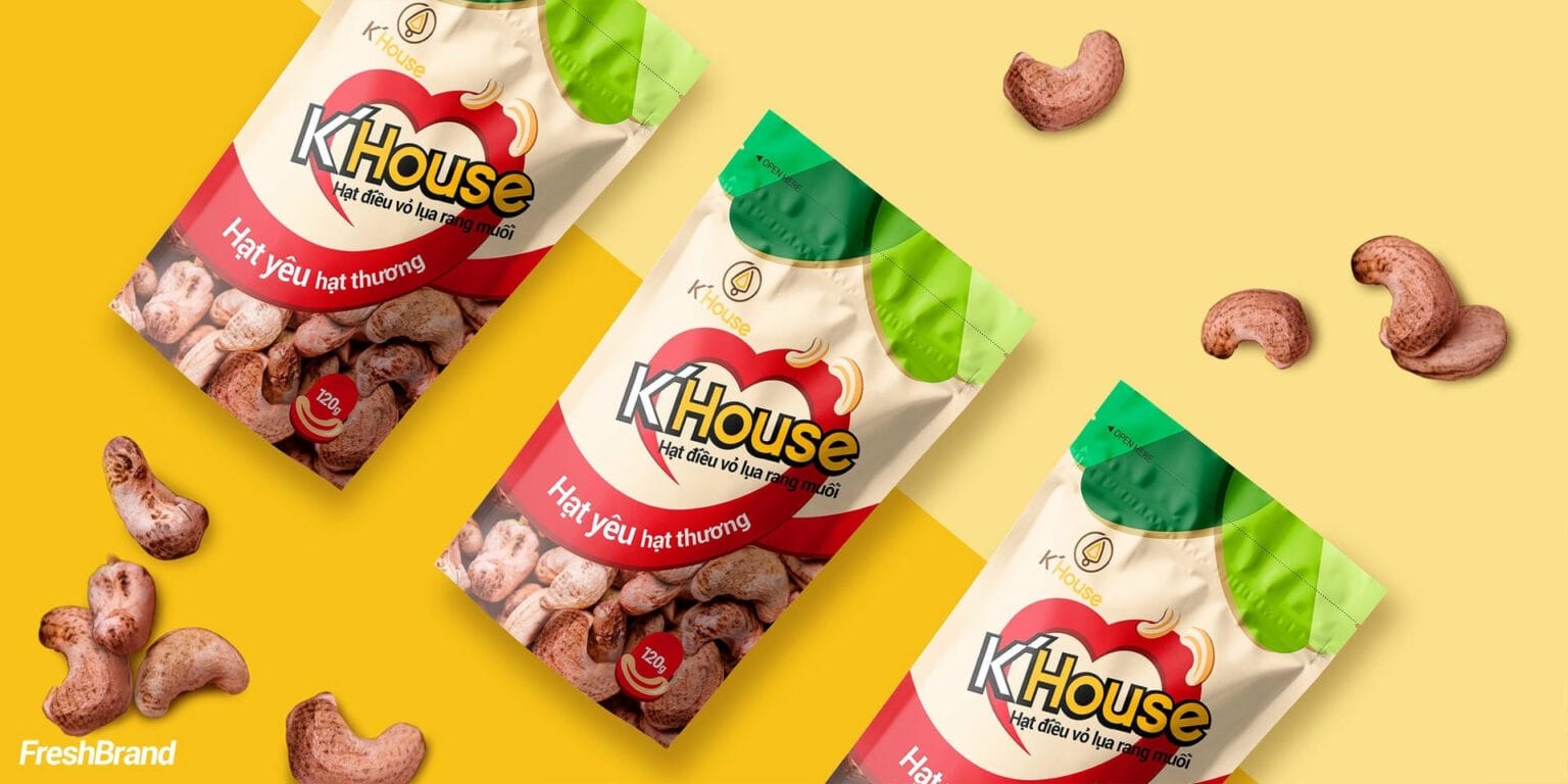
FreshBrand designed the K’House packaging with a direction of quality, flavor, nourishment, luxury and aesthetics, so that Vietnamese cashews are chosen as a gift and not only as a snack.
Packaging
How does the product speak on the shelf?
A red heart around the name
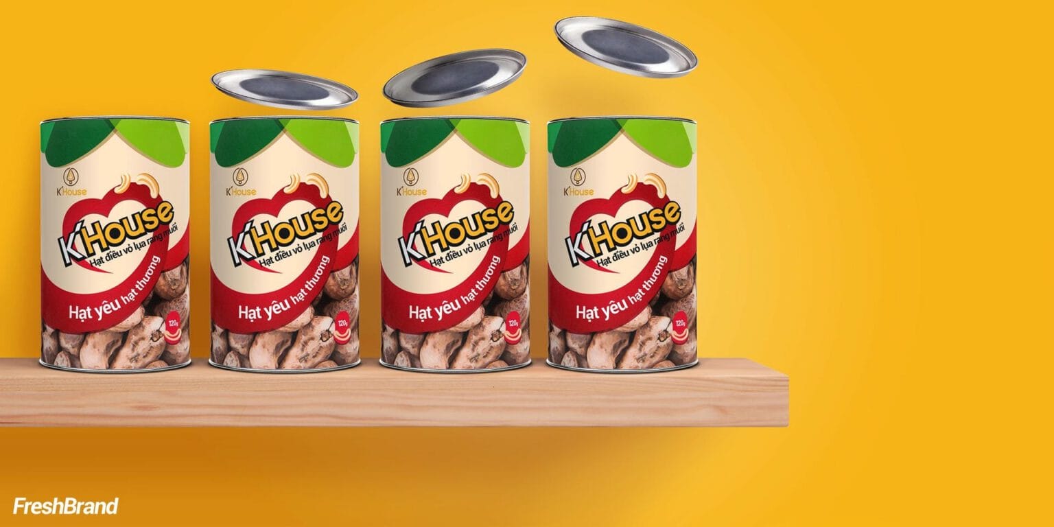
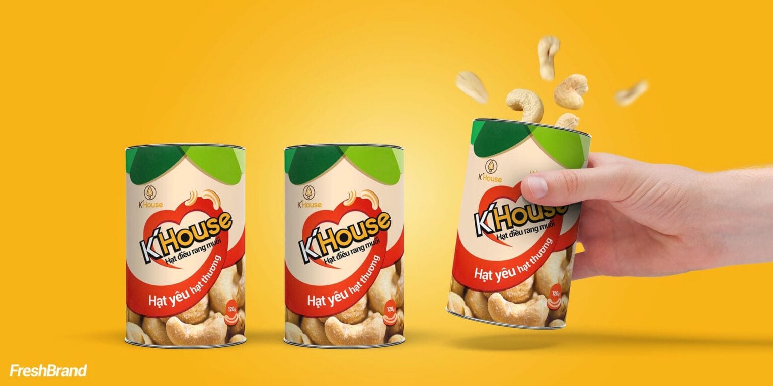
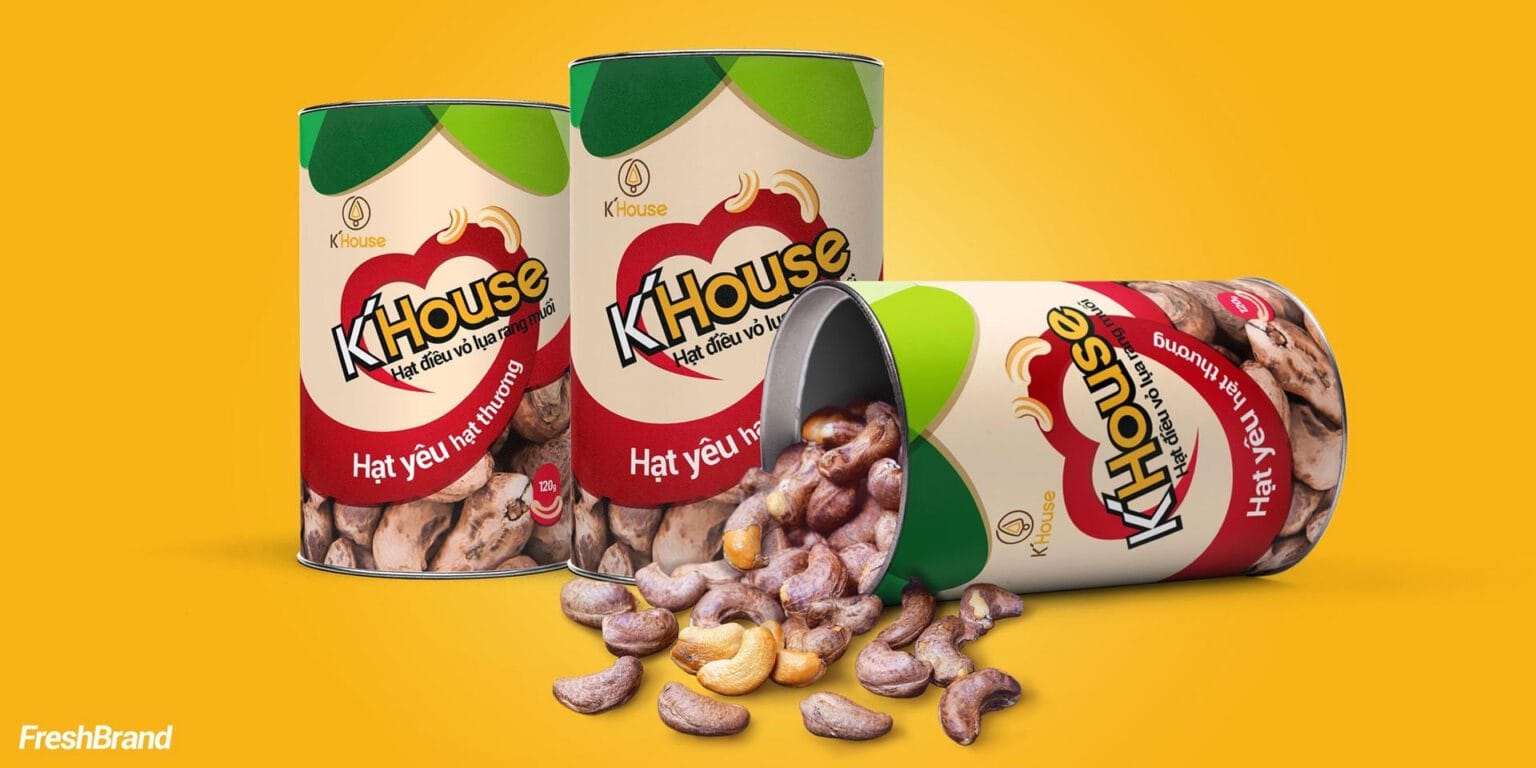
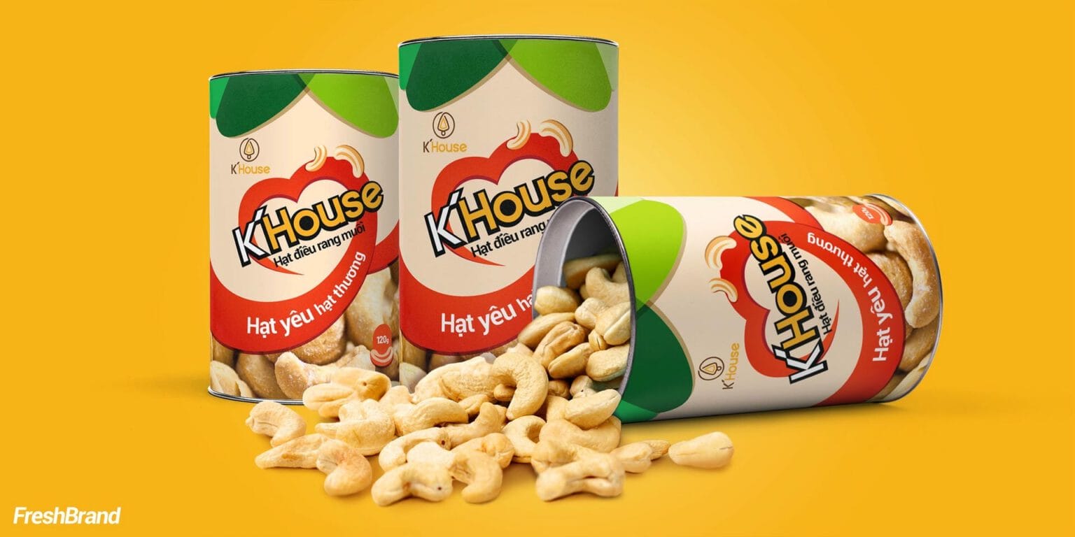
The K’House logo sits inside a red heart, together with the message “Hat yeu hat thuong” (roughly, “nuts to love and to cherish”). The stand-up pouch and the tin share a cream ground, a red band and a green leaf at the top, which recalls the cashew fruit and its leaf on the tree.
A clear window shows cashews still in their silky skins, because the tastiest product is the one you can see.




Services
FreshBrand team
- Trần Anh Tú — Creative Director, Project Director, Design
- Hải Anh — Design
- Hồng Phong — Design
- Thanh Thuận — Design
Project
- ClientK’house
