Ohihi – Packaging
Snacking is for fun, and so is the packaging.
- Client
- Gia Han
- Industry
- Food & Beverage
- Services
- Packaging Design
Overview
Ohihi is the snack brand of Gia Han.
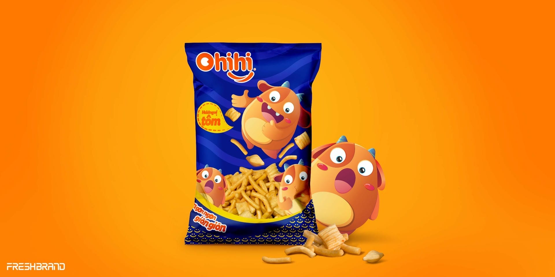
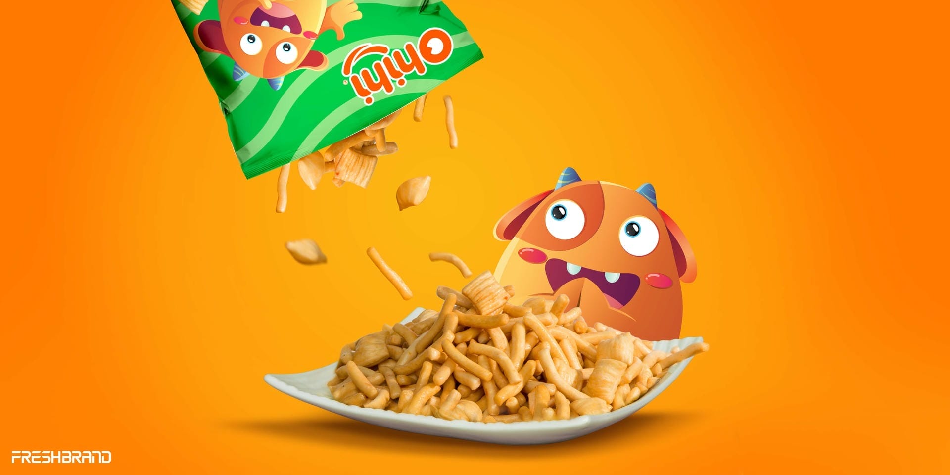
FreshBrand designed the packaging for Ohihi along a distinctive, playful, fresh direction, with a character cute enough to become the snacker’s friend.
Character
What did the brand want to say?
A little monster that smiles
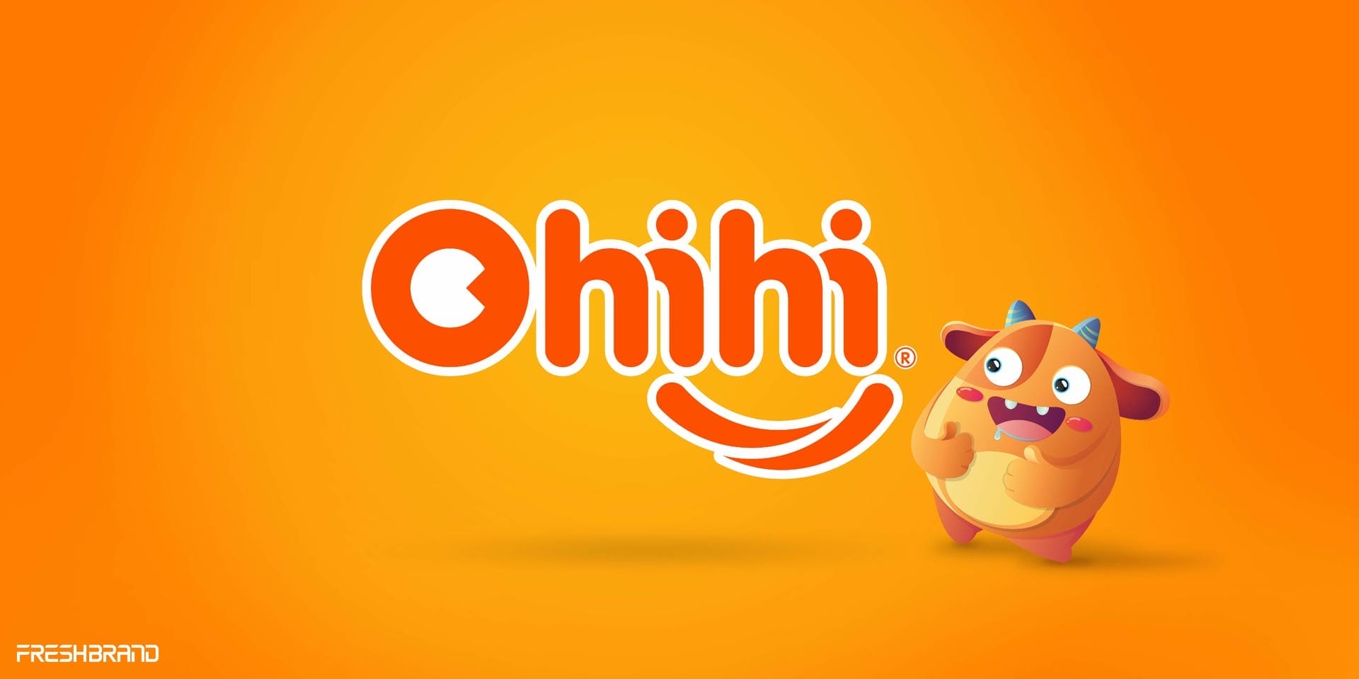
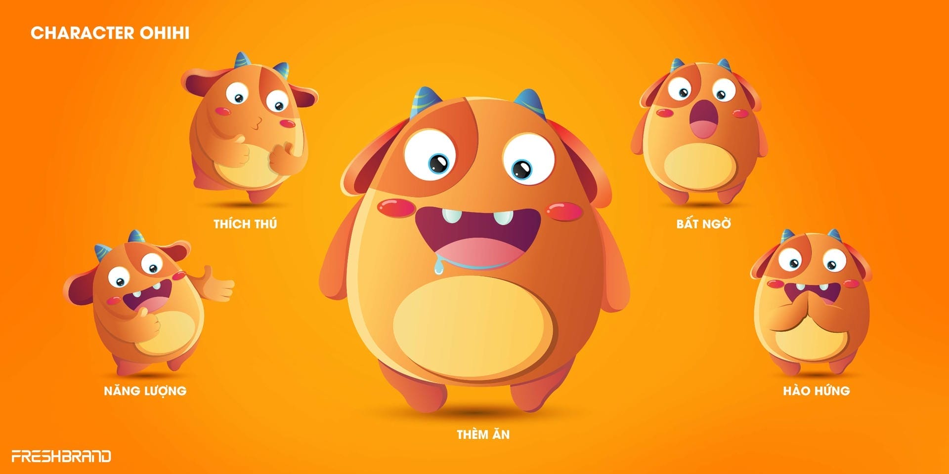
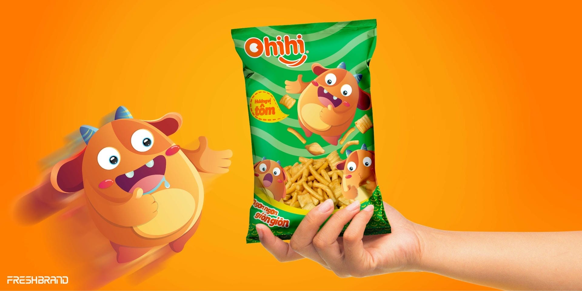
The Ohihi mascot is a little orange monster with short horns and round eyes, and plenty of moods: delighted, surprised, shy, excited. The Ohihi wordmark is rounded, with a smile beneath it.
Packaging
How does the product speak on the shelf?
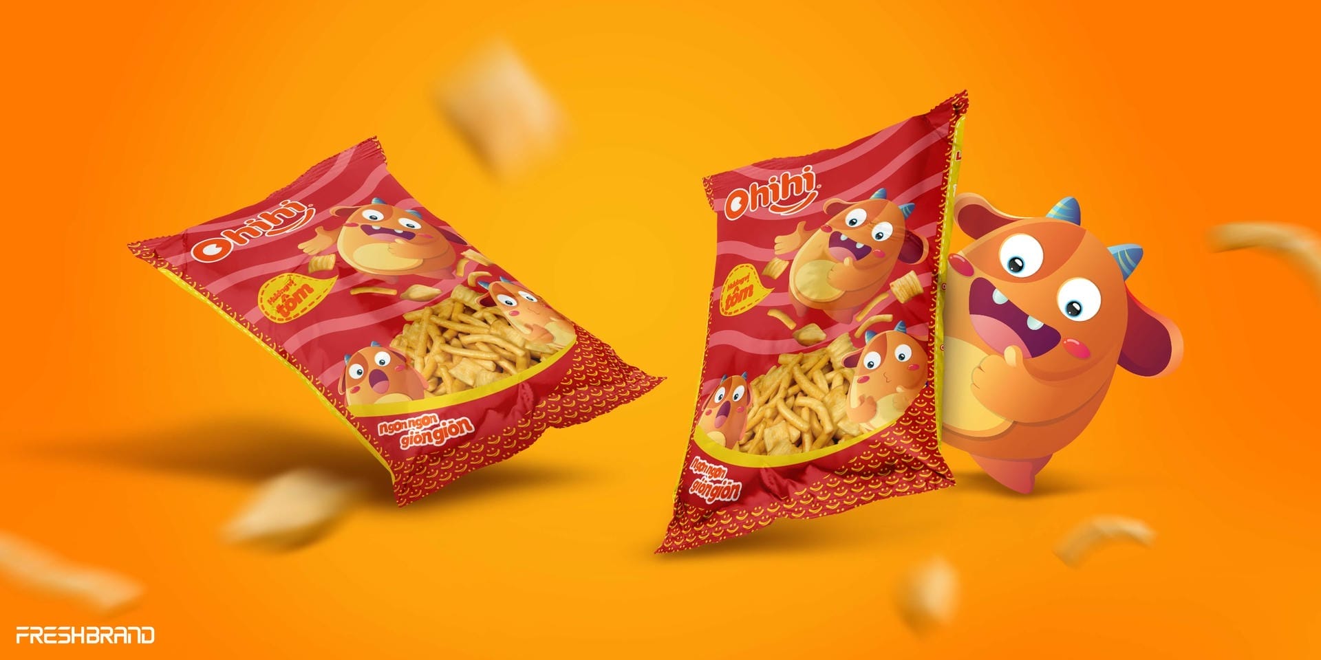
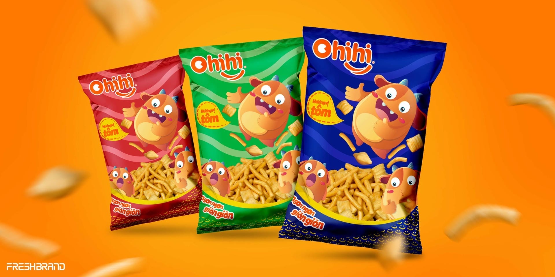
One color per flavor, one mood per pack
Each snack pack has its own background color (red, green, blue) and the monster appears in a different pose. Against a bright orange ground, the whole line looks like a party being set out.
Services
FreshBrand team
- Trần Anh Tú — Creative Director, Project Director
- Hồng Phong — Design
- Kim Anh — Design
- Phùng Thương — Design
- Trần Thuận — Design
Project
- ClientGia Han