
Morethan17
One letter carries a whole community.
- Client
- Morethan17 – Canada
- Services
- Brand Identity Design, Logo Design

Overview
Morethan17 is an online social group in Canada that supports life, art, beauty, culture, heritage and sustainable business.
Morethan17 sets out to educate the local business community about sustainability goals and to strengthen its members, especially women, contributing in its own way to the United Nations Global Goals. The brand’s message: “Empowering is Rewarding.”
Context
Where did the brand stand?
A community of many colors
Morethan17 brings together passionate members from many cultures and many fields, from charity and education to sustainable business. The brand had to represent them all without belonging to any one of them.


Sketches
How was the idea found?
Hundreds of strokes before one letter
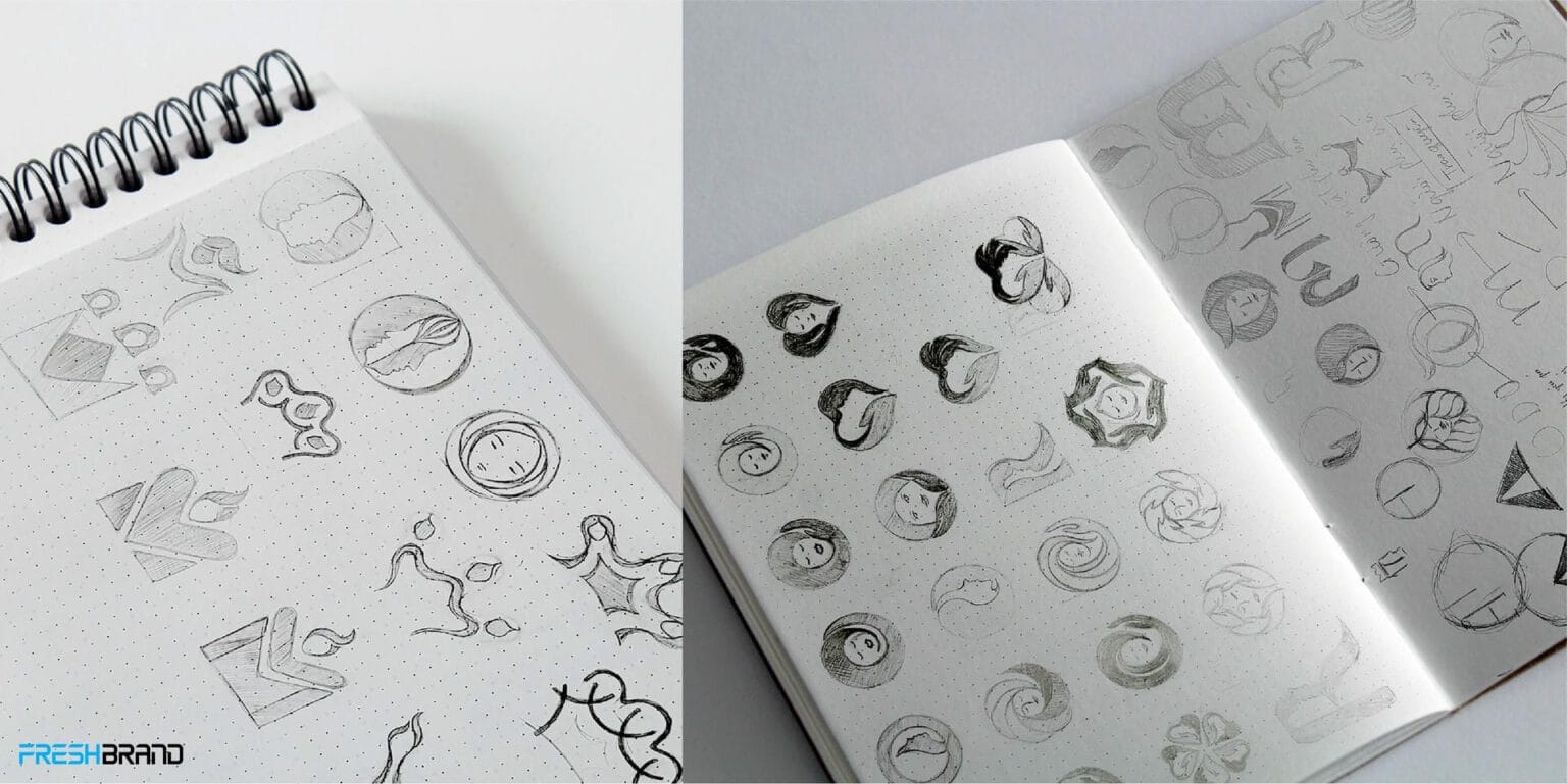
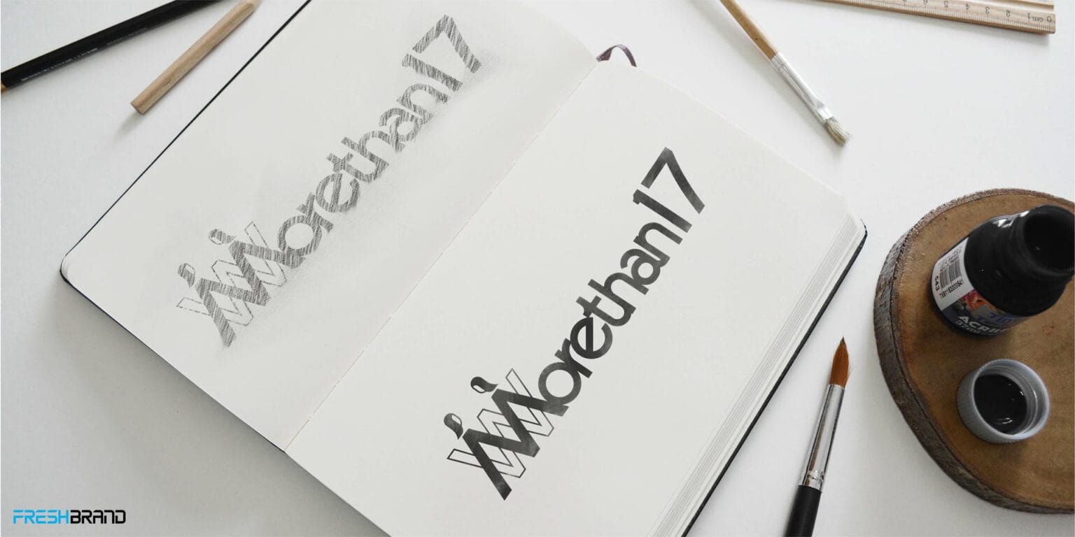
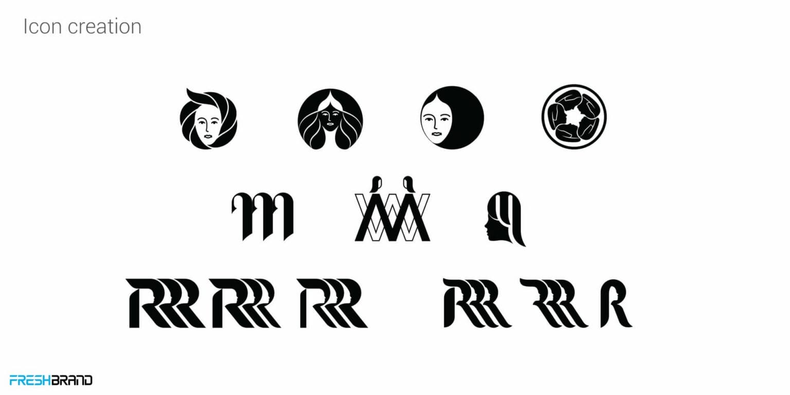
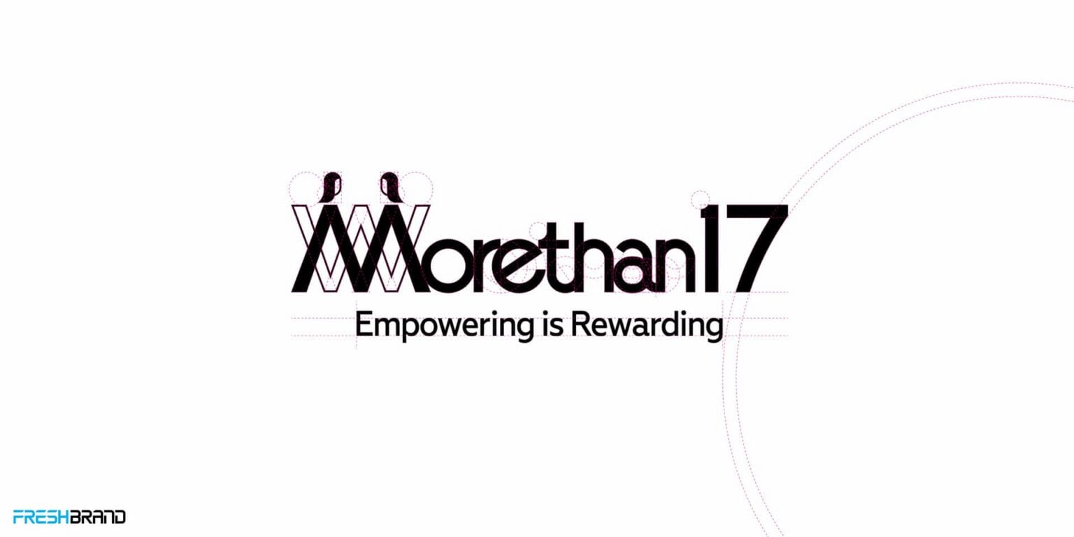
The brief was clear: a wordmark in which the name itself becomes the symbol, built on the golden ratio, and capturing the spirit of goodwill ambassador Helen Queen. FreshBrand began with hand sketches of crowns, faces and flowers, then narrowed them down to the letter M.


Symbol
How did the idea take shape?
The women inside the M
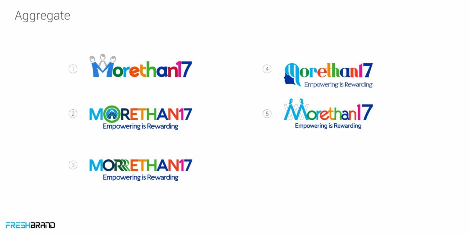
The M is built from figures standing side by side, hand in hand. Pulled apart, the strokes become multicolored petals turning around a center, one color for each field, all facing one shared goal.
A palette of eight colors keeps the brand open, while a deep blue ground keeps it serious.


Applications
Where does the brand appear?
Petals across every touchpoint
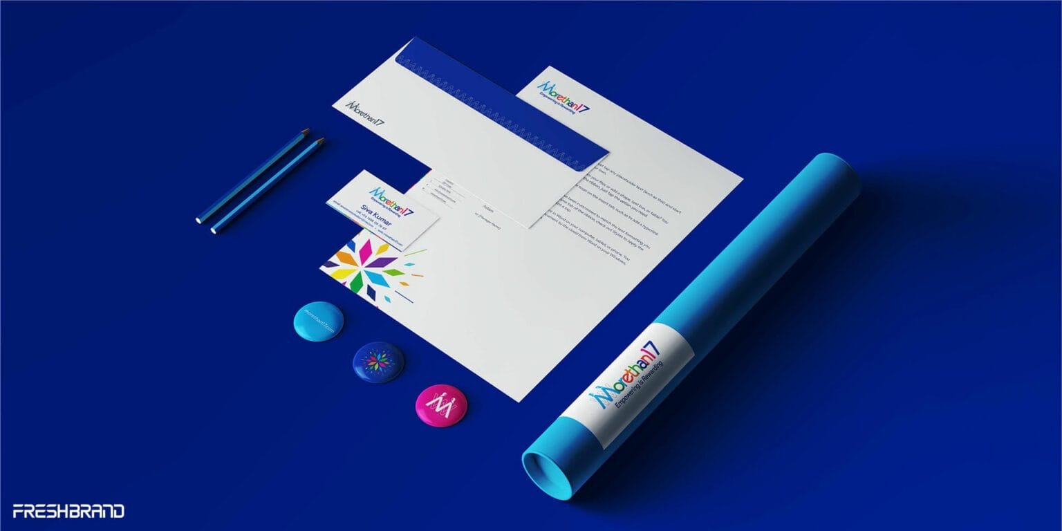
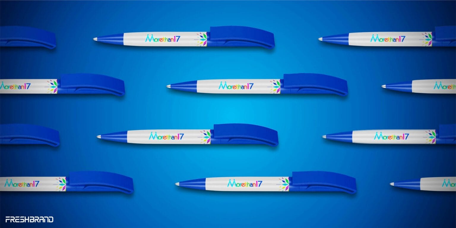
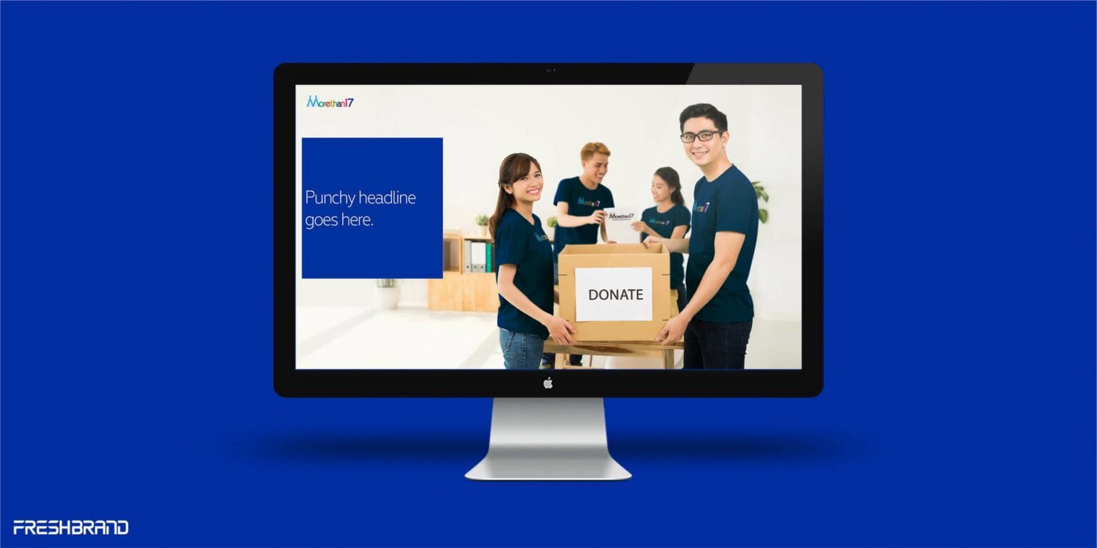
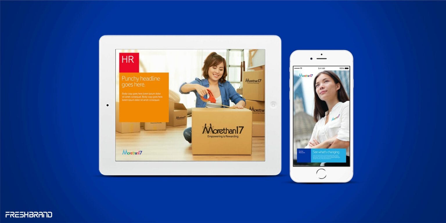
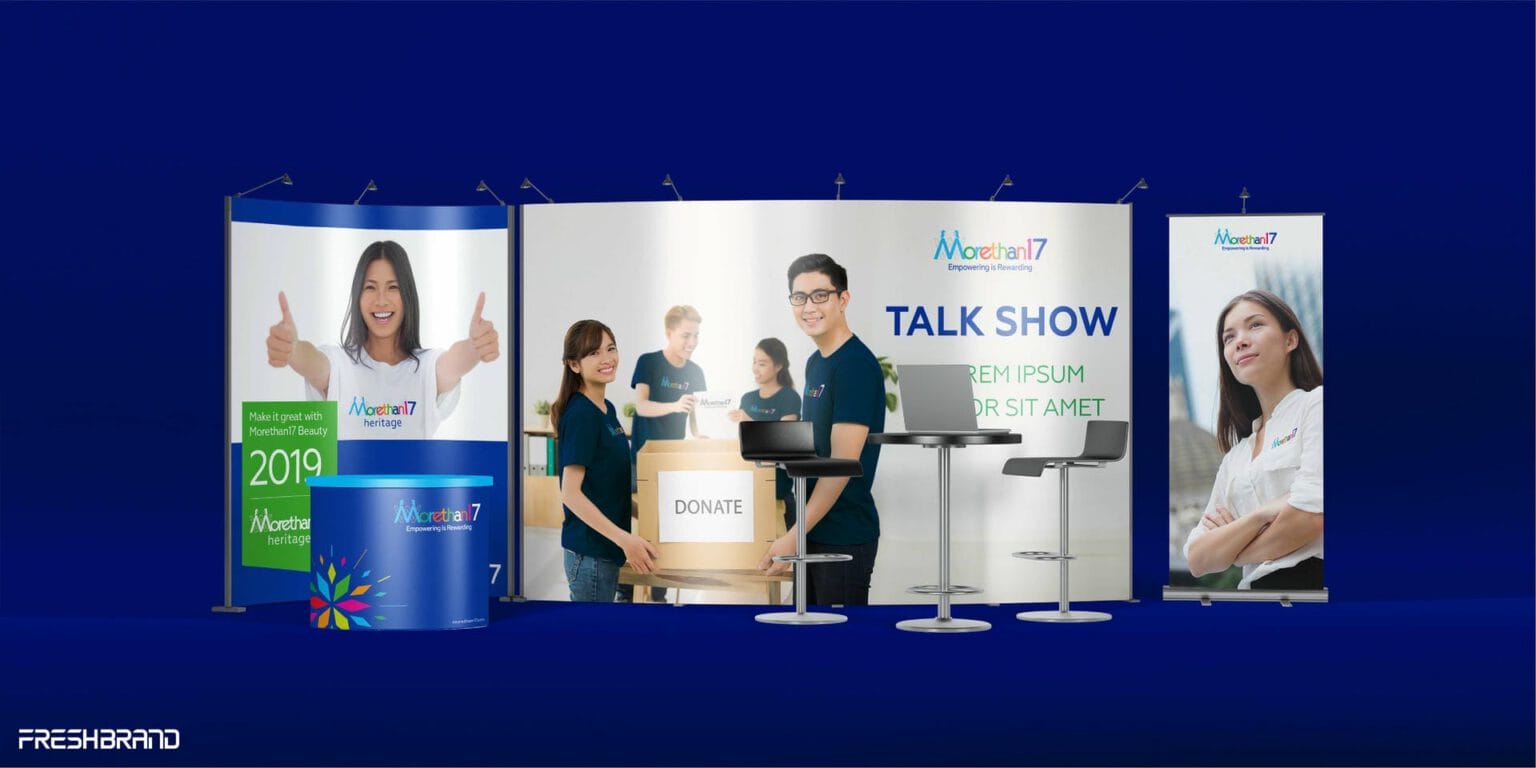
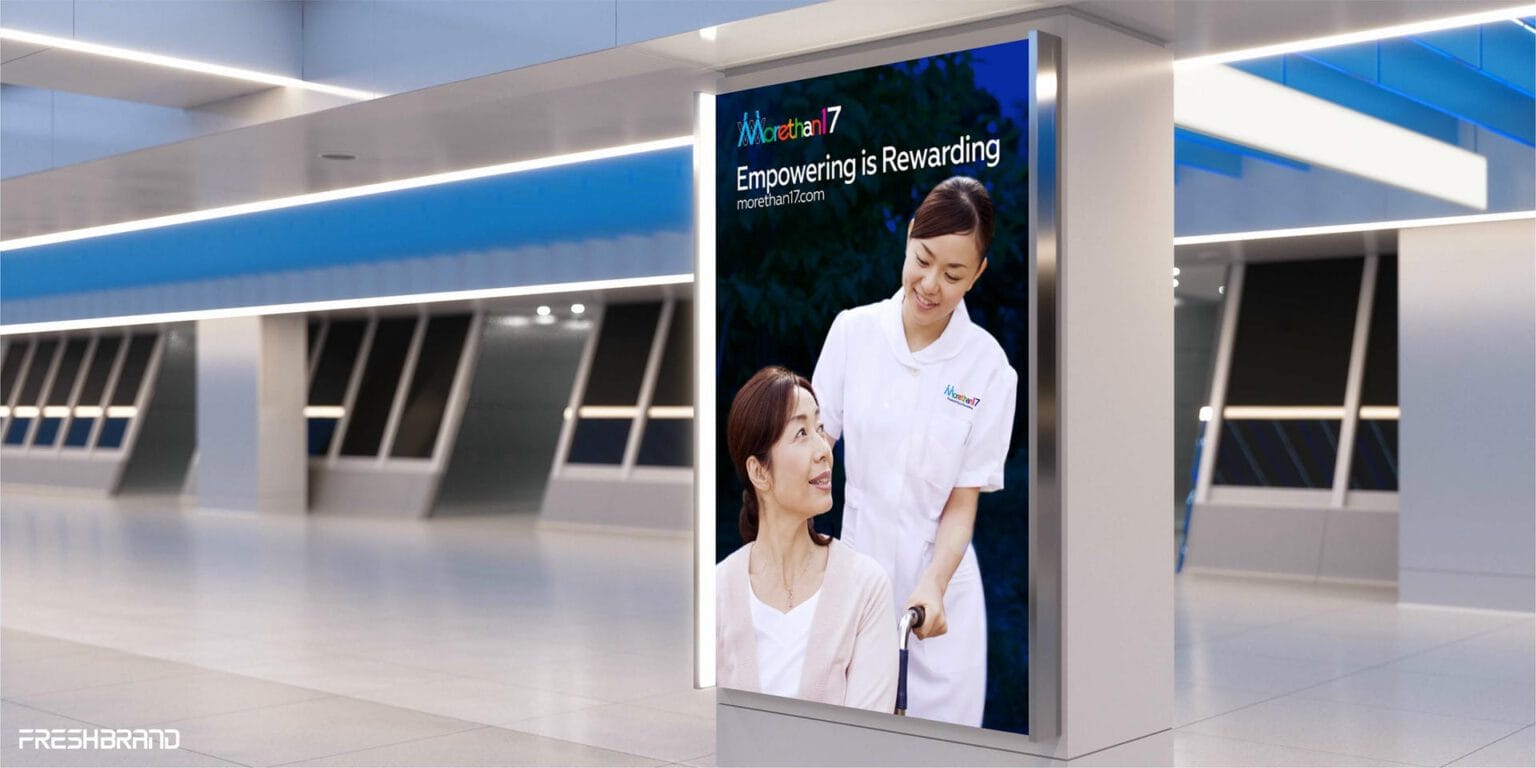
From the brand guidelines, business cards and office stationery to the website, event booth and advertising, the cluster of petals and the blue ground appear consistently. People, with real faces and real work, always stay at the center.

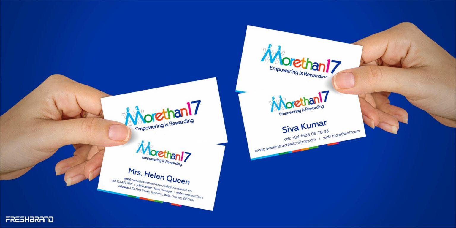
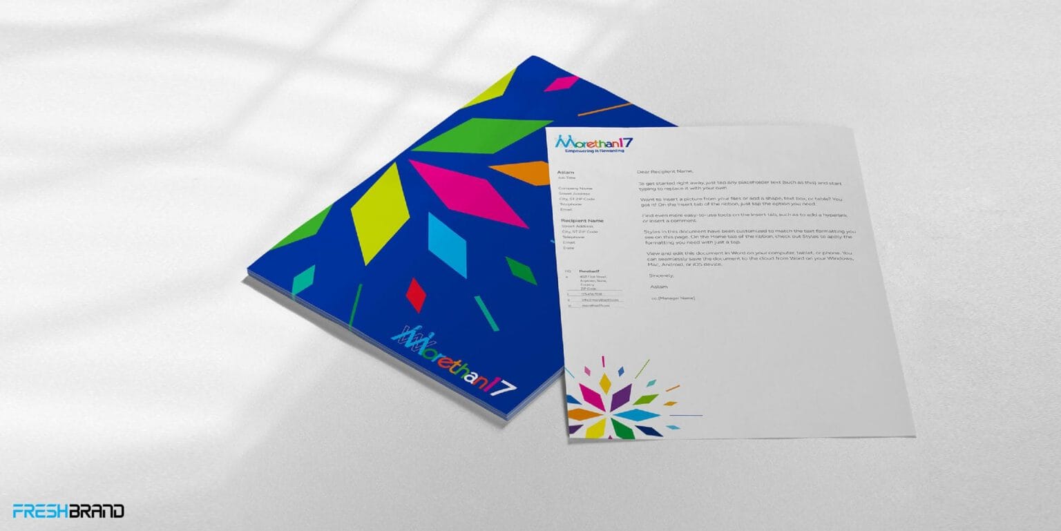
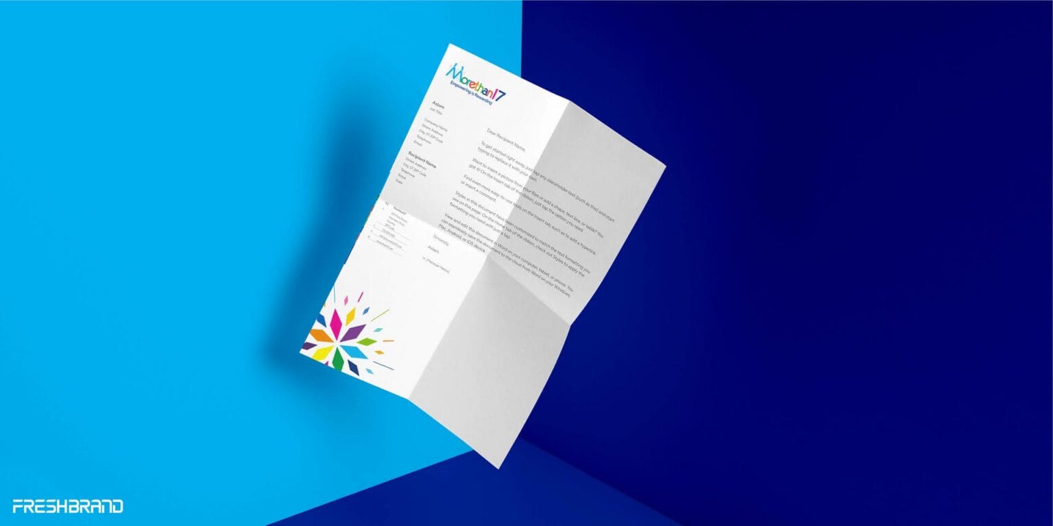
Empowering is Rewarding. A good brand helps many people see that together.
Services
FreshBrand team
- Trần Anh Tú — Creative Director, Project Director, Design
- Kiều Nga — Design
- Trâm Anh — Design
Project
- ClientMorethan17 – Canada
