
NNST
Vietnamese tea, in a form worthy of it.
- Client
- Tan Nam Bac Tea
- Services
- Brand Identity Design, Logo Design, Packaging Design

Overview
NNST — Tan Nam Bac Tea — is a tea brand in Ho Chi Minh City.
FreshBrand designed the logo, identity system and packaging for NNST around the direction natural, friendly, refined, from the parent brand to the Special Jasmine Tea and Black Tea lines.
Brand
What did the brand want to say?
Moss green, bronze gold and a cup of tea
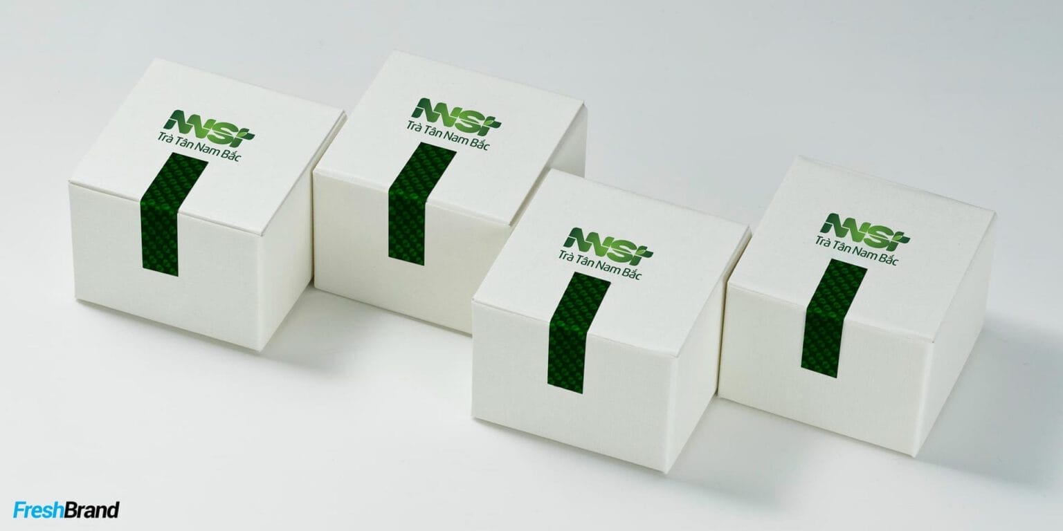
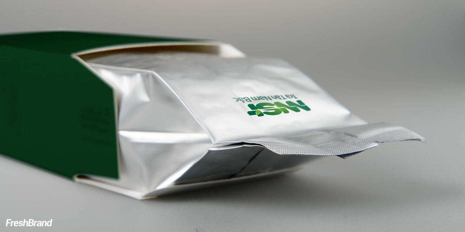
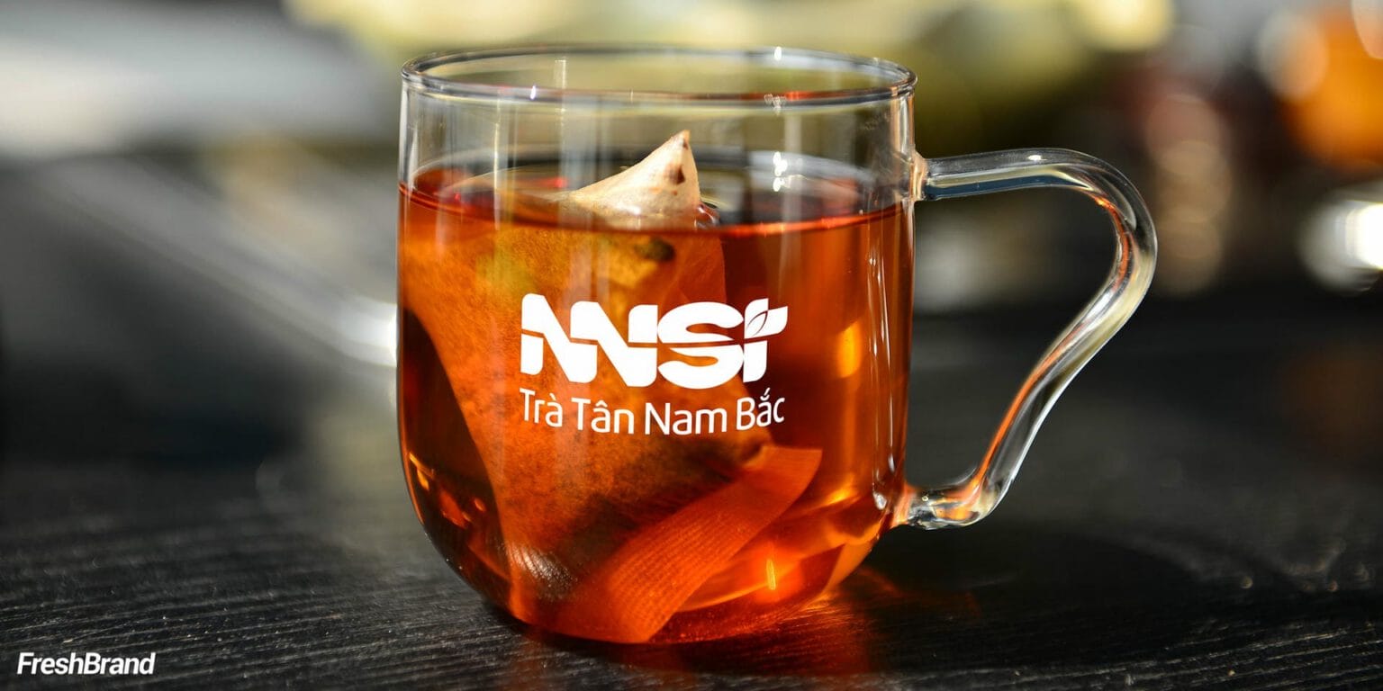
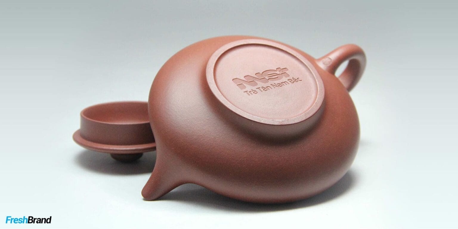
The NNST logo is compact enough to stand alone on a box lid, the base of a teapot or the bottom of a cup. The palette of deep moss green and bronze gold recalls tea leaves and the formality of a gift.
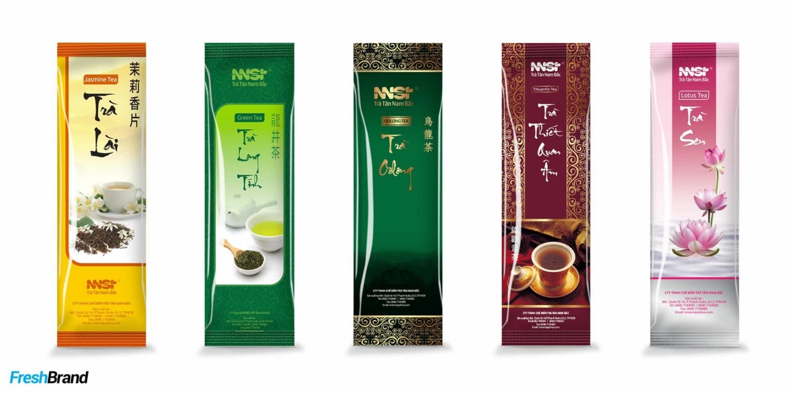
From tins and wooden gift boxes to multicolored tea bags, the parent brand leads; each tea has its own color but shares one structure.



Special Jasmine Tea
How does the product speak on the shelf?
Jasmine blooming against the night
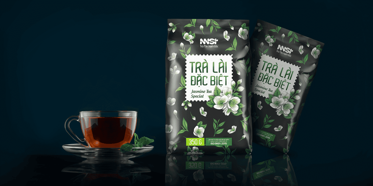
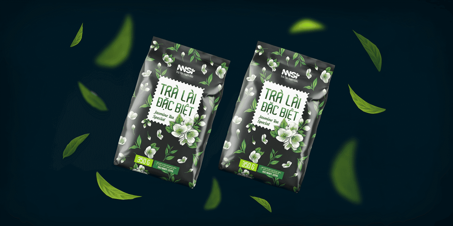
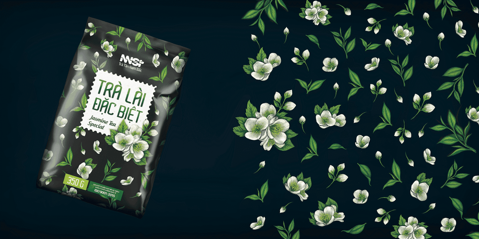
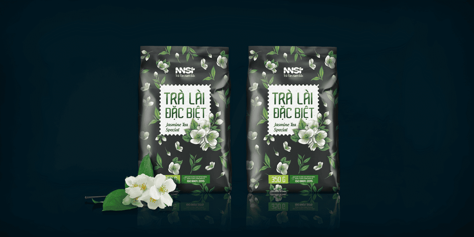
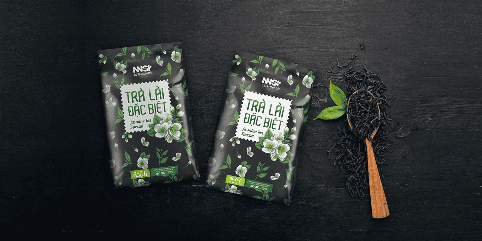
The Special Jasmine Tea packaging is hand-painted with a brush: white jasmine sprigs and green tea leaves on a midnight-blue ground. The product name sits in a stamp-like frame at the center, like a certification seal.

Black Tea
How is another tea introduced?
Deep red and sunlit gold
Black Tea switches to a deep red ground with a gold leaf pattern and a cream base. The same hand-drawn spirit and the same NNST logo at the top of the pack: the color differs, yet it is clearly one family.


A good cup of tea needs few words. The packaging only has to open onto that same feeling.
FreshBrand team
- Trần Anh Tú — Creative Director, Project Director, Design
- Hồng Phong — Design
- Thanh Thúy — Design
Project
- ClientTan Nam Bac Tea
