
Rose Villa Cafe
One rose is enough to recognize a whole place.
- Client
- Toppyco
- Industry
- Food & Beverage, Travel & Hospitality

Overview
Rose Villa Cafe is a coffee shop with Kid’s World, a play area for children.
FreshBrand named Rose Villa and designed its logo, identity system and packaging around a direction that is upscale, simple, welcoming and refined, with a symbol elegant enough for adults and warm enough for the whole family.
Symbol
How did the idea take shape?
A rose between two leaves
The symbol is a rose in full bloom between two leaves spread sideways, drawn in simple lines. The word ROSE, in an evenly spaced serif, sits beneath it.
Rose red and copper gold make up the palette, warm as an afternoon in the garden.

System
How is the identity kept consistent?
Rose red on a dark ground
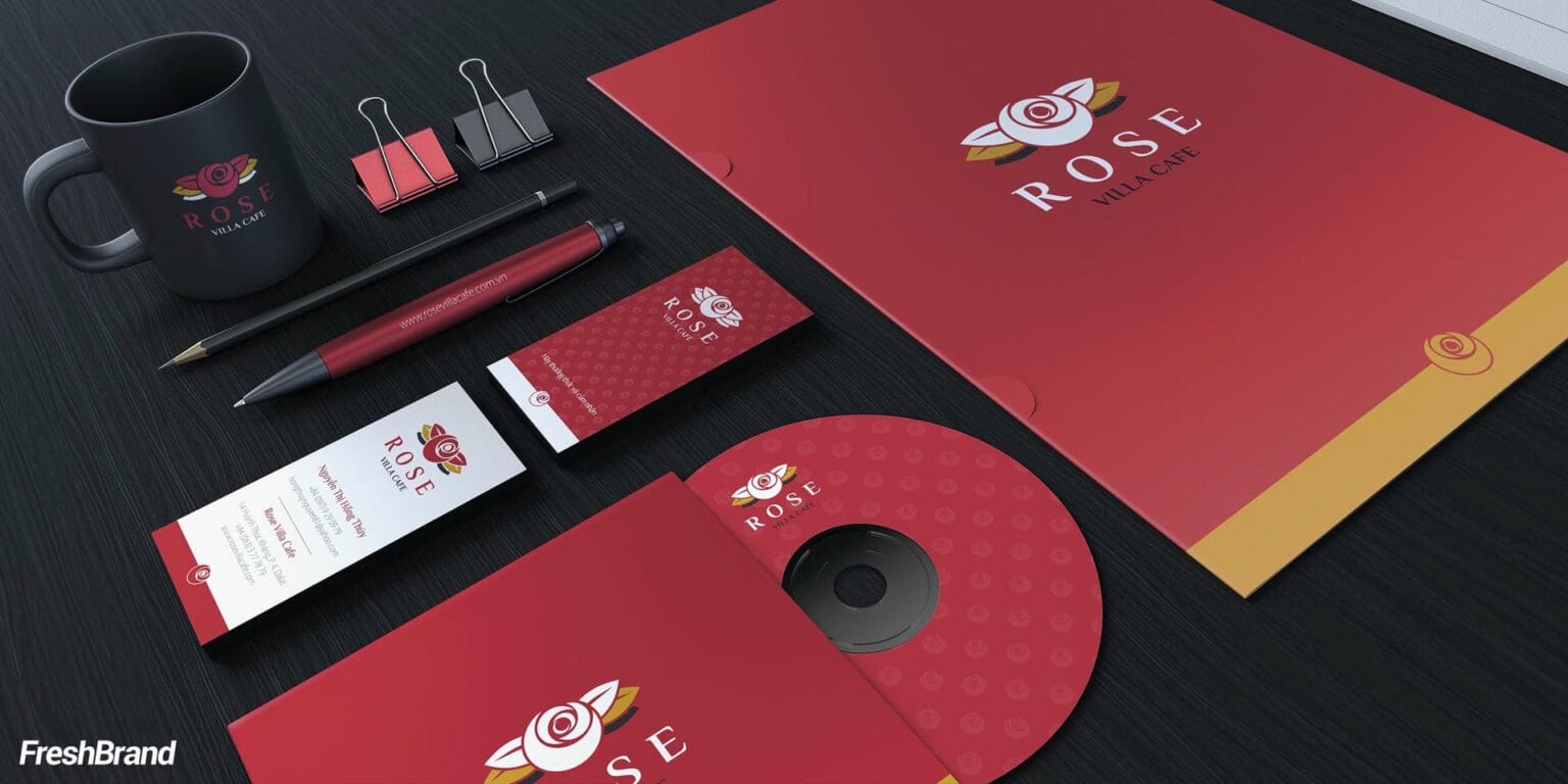
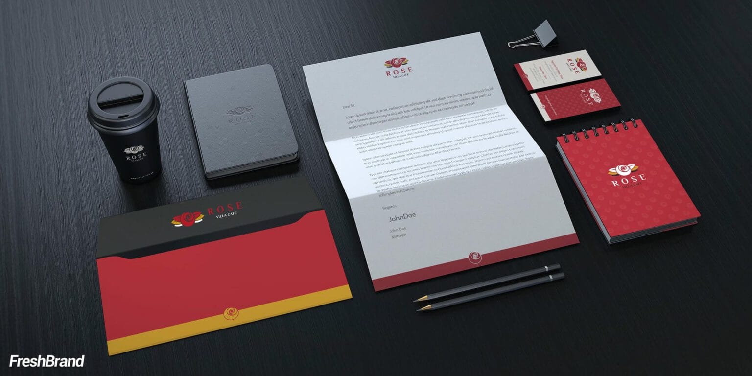
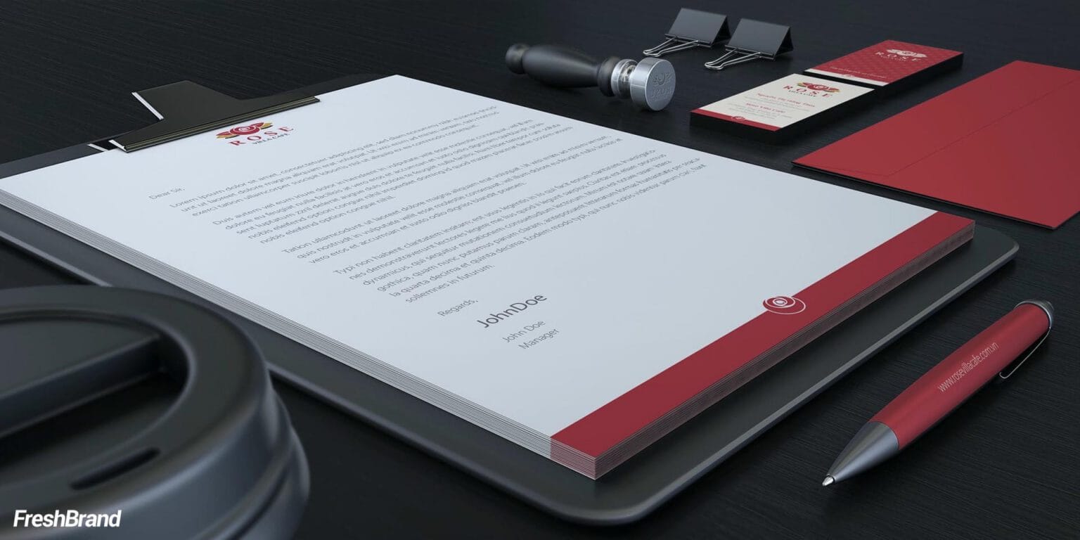
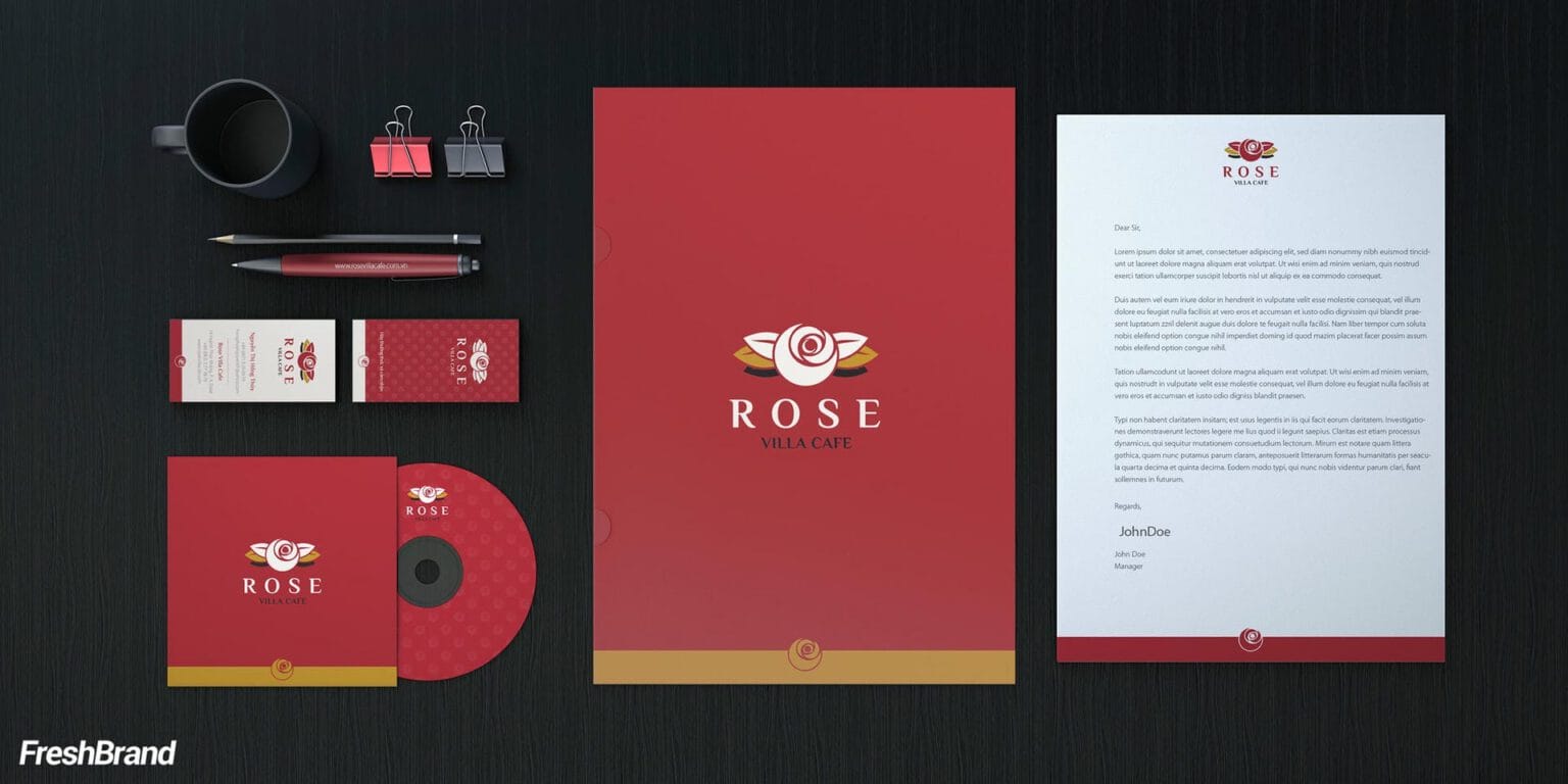
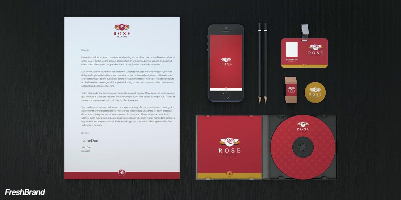
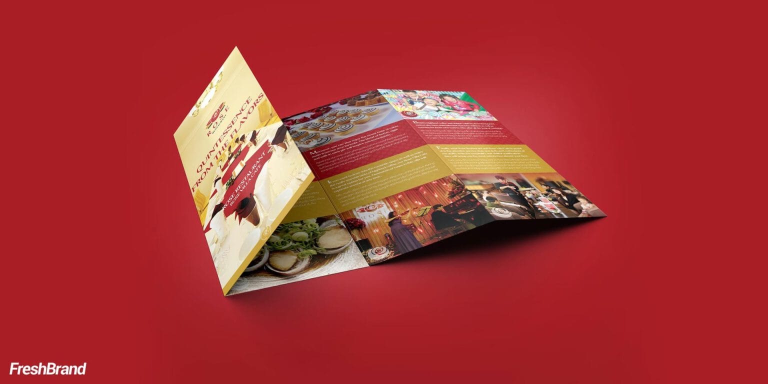
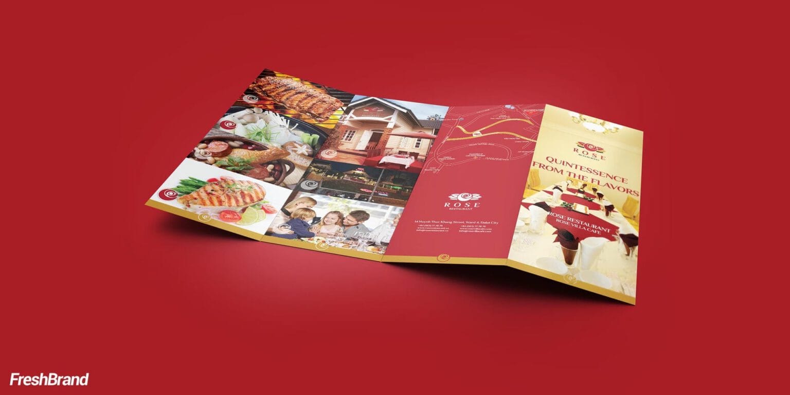
Business cards, letterhead, CD sleeves and paper bags use a red ground with a tone-on-tone rose pattern and a gold edge along the bottom. Set against a dark background, the printed materials look like a carefully wrapped gift.



Experience
Where do customers meet the brand?
From the coffee cup to the entry ticket
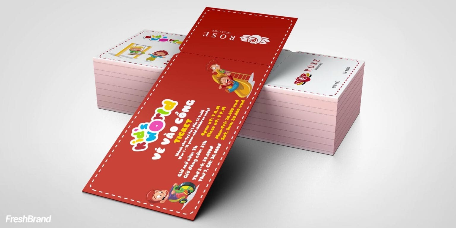
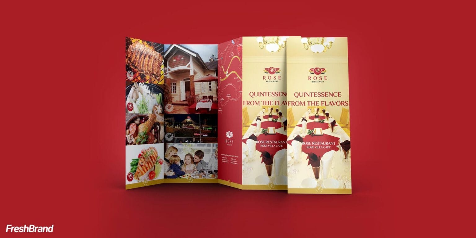
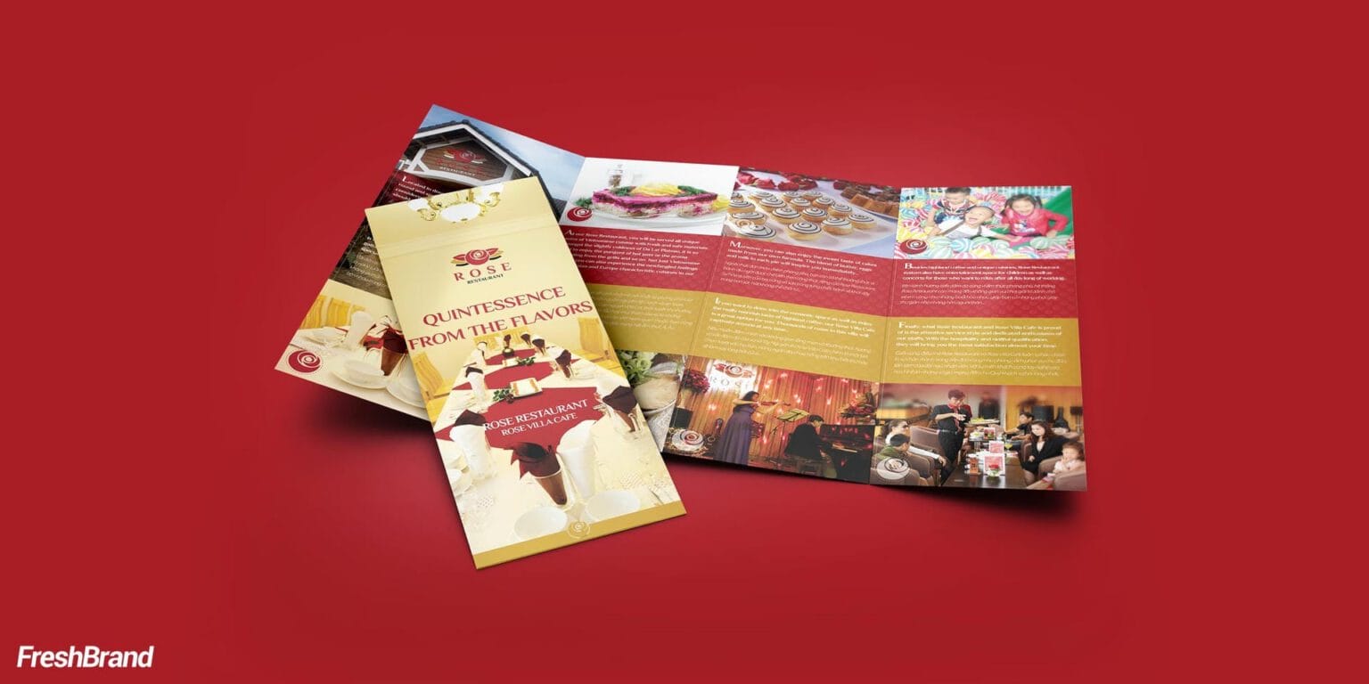
Paper cups, tickets to the Kid’s World play area, a folded introductory leaflet: everything a guest holds carries the rose and the red of Rose Villa. The children’s side is allowed to be brighter, yet it stays within the same system.


FreshBrand team
- Trần Anh Tú — Creative Director, Project Director, Design
- Hải Anh — Design
- Kiều Nga — Design
- Thanh Thuận — Design
Project
- ClientToppyco
