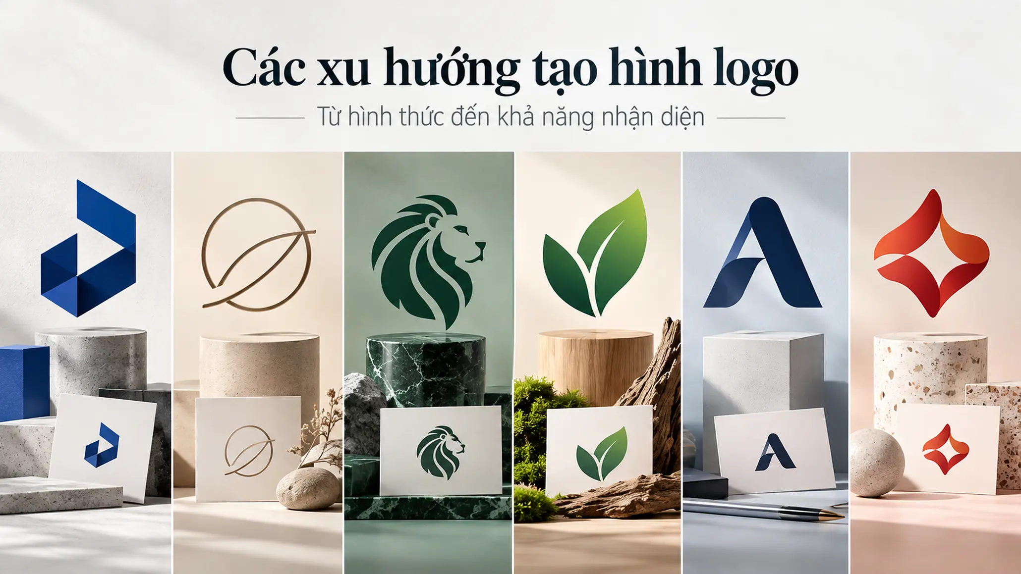
Logo design is often undervalued because a logo is a small image. A business sees a few lines, a symbol and a typeface, and the question comes easily: “Why would this cost so much?” But the value of a logo is not in the number of lines drawn. It lies in the thinking behind it, and in the ability to create a mark that can be recognized, remembered, distinguished and used reliably across the many situations a business meets.
KEY TAKEAWAY
A professional logo is not expensive because it has more strokes; it is valuable because behind those strokes lies a deliberate process of research, selection and validation.
1. What is a logo, really?
A logo is, first of all, a mark of recognition.
In brand activity, it helps a business, product or organization be recognized and told apart from others. Its shape, color, typeface and structure together shape how a brand appears to the public.
But a logo is not the whole brand.
This is an important distinction. A logo may be the first or most recognizable visual touchpoint, but it is only one component of a wider identity system. A good logo cannot by itself create a good product, service or experience. A carelessly designed logo, however, can make those qualities hard to recognize or hard to express consistently.
So the right question is not:
“Is this logo beautiful?”
It should be:
“Does this logo do a good job of identifying and expressing the role the brand needs?”
PRINCIPLE 01
A logo is a tool for recognition, not a decoration
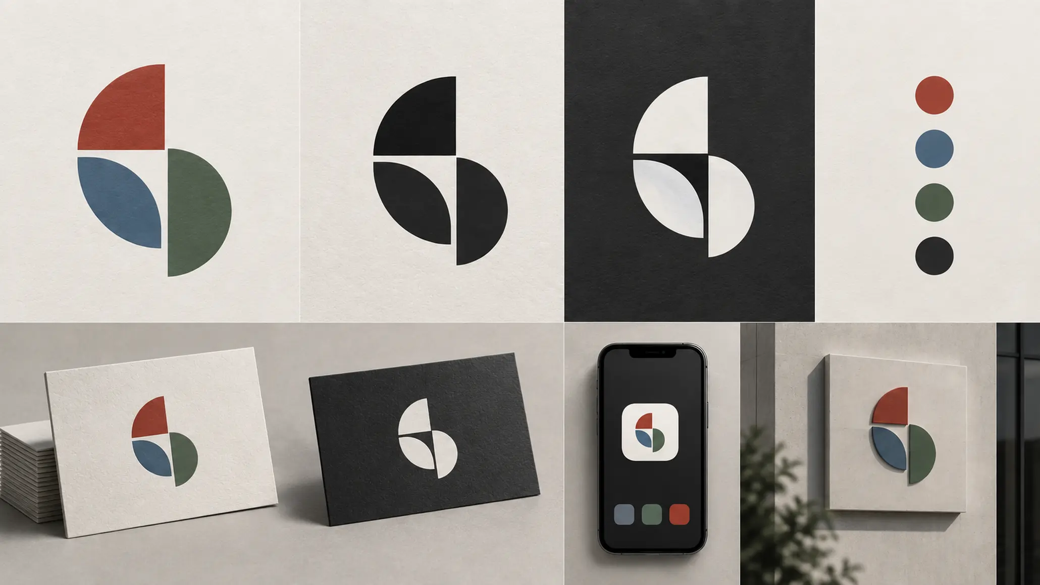
A logo should be judged in the context where it is actually used: is it easy to recognize, easy to remember, does it hold its character when scaled down, does it work in black and white, and does it fit the personality the brand wants to build?
A design can look striking on a large screen and fail completely on a business card, packaging, a website, signage or a small app icon.
2. Why does a low-priced logo ask the wrong question?
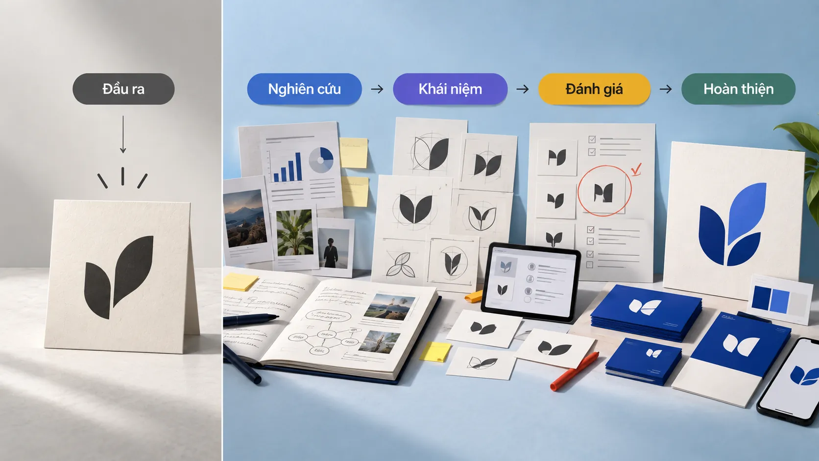
When a business looks for a logo at a very low price, it is usually looking at the final product instead of the process that creates it.
They see a symbol and assume it took only a few hours to make. But the hard part of professional logo design is not necessarily drawing an image. The harder part is deciding what to draw, why to draw it that way, and how to make it work in practice.
That is why two logos can both be simple images and still have completely different design value.
A professional logo usually has to answer a series of questions:
- How does the brand need to be recognized?
- Which feature should be kept to make it memorable?
- Is the design different enough from direct competitors?
- Do the typeface, shapes and colors suit the brand’s context?
- Does the logo work without using color?
- Does it keep its recognizability when scaled up or down?
- Can the logo be applied consistently across many touchpoints?
These questions do not arise naturally just because someone opens design software.
3. Logo contests and the problem of spec work

Before comparing cheap logos with professional ones, one common model needs to be addressed: spec work, meaning work done on speculation, where the designer works first and is paid only if their option is chosen or the client likes it.
At first glance, this model looks attractive to a business. It can receive many options from many people and pay only for the one it likes.
But that approach overlooks a fact: design is a professional activity that requires time, skill and resources.
EXAMPLE
Try applying the same logic to a different industry.
A dentist examines your teeth and finds you need a course of treatment. You ask them to do the work first, and only afterward, if you are happy with the result, decide whether to pay.
This is clearly not how an ordinary professional service works. The provider has to invest resources before producing any result, and the fee is set according to the scope of work.
Design is no different. A professional designer is not selling a logo file alone. They are providing research time, thinking, skill, and the process of developing, selecting and refining ideas.
COMMON MISTAKE
“Let several designers try, and pick whichever looks best.”
Why that is not enough
This approach turns design into a contest of tastes instead of a process of solving a problem. The chosen option may be the most eye-catching at that moment, but not necessarily the best fit for the brand’s direction, its customers, its competitive context or how it will be applied.
4. The cheap logo
A cheap logo does not necessarily fail just because it is cheap. The problem is that the budget and the way the work is done are usually not enough for a design process with real depth.
One example cited in the source is a $35 logo design contest on Digital Point, with a brief to create a logo for an online piano-learning website called Spela Piano.
Looking at the entries in a contest, a familiar problem appears: many designs rely on a quick combination of symbol and typeface, but show no clear system of principles behind them.
The point is not which option is “ugly” or “pretty.”
What matters is whether they can answer the basic questions of an identity system.
LESS EFFECTIVE
- Relies heavily on an instant impression of its form.
- Using a typeface or an image with no clear strategic reason.
- It is hard to judge memorability and recognition from a single context.
- It may depend on color or on the size of the first presentation.
STRONGER
- There is a clear reason for the shape, typeface and structure.
- Developed from the brand’s context and its industry.
- Recognizable when used at many sizes and in many environments.
- It can become the foundation for a consistent identity system.
5. What tests should a good logo pass?
A simple logo is not always good, and a logo with many details is not always poor.
What matters is how well it performs its function.
Put the logo in front of a series of questions:
- Could you describe that logo after seeing it only briefly?
- Can you recognize it with the color removed?
- Does it work at a very small size?
- Can it be used across different platforms and materials?
- Does it create a mark distinct enough within its industry?
- Can it reflect the personality or attitude the business wants to express?
- Does it feel right for the audience the brand wants to reach?
- Can it become the foundation for developing a consistent identity system?
No simple formula guarantees that every logo meets all of these criteria. But asking such questions is what makes logo design a professional problem rather than a decorative exercise.
6. Professional logo design starts with thinking
The biggest difference between professional design and quick design is often the process.
A professional designer does not begin by drawing as many options as possible. They begin by understanding the problem.
PROCESS
- Defining the brief: Learn about the business, its goals, its audience, the contexts of use and the requirements to be addressed.
- Research: Look at the industry, the company’s history, its competitors and the contexts in which the logo will appear.
- Reference: Study related identity systems, styles and ways of solving similar problems.
- Conceptualization: Develop idea directions with a basis, rather than producing random images.
- Sketching: Explore many possibilities before selecting and refining.
- Evaluation: Review the design from several angles, discard the options that are not strong enough and develop those with potential.
- Presentation and consultation: Explain the logic of the option, take in feedback and make the necessary adjustments.
- Refinement: Standardize the design so it can be used in real contexts.
This process can unfold in different ways depending on the designer or the project. What they share is this: a professional logo is not the result of a single moment of inspiration.
FIELD NOTE
In design practice, one of the most time-consuming jobs is sometimes discarding ideas that seem very good. An idea can look beautiful on its own and still not suit the brand, be hard to apply, or look too much like what the market already has. Good design is therefore not only the ability to produce options; it is also knowing which options not to keep.
7. The thinking behind a logo is the hard part to see
Looking at a finished logo, the viewer sees only the end result.
They do not see the sketches that were thrown out. They do not see the type options that were tested, or the changes in proportion, spacing, shape and structure. They do not see the research that helped the designer understand the problem before proposing a solution.
That is one of the reasons design work is so often undervalued.
The simpler a final product is, the easier it is to assume that making it was simple too.
But in logo design, simplicity in the output is sometimes the result of many carefully weighed decisions behind it.
WHAT WE LOOK FOR
A professional logo designer should not be judged only by their ability to produce an eye-catching image. What deserves attention first is how they approach the problem.
- Do they ask questions to understand the business before designing?
- Did they research the competitive context?
- Can they explain why one design direction suits better than another?
8. A logo has to live beyond the first presentation

One common mistake in evaluating a logo is to look at it only in the context the designer presents.
A logo can look impressive on a large screen, with beautiful color treatment and an eye-catching mockup. But a business does not use its logo only in that setting.
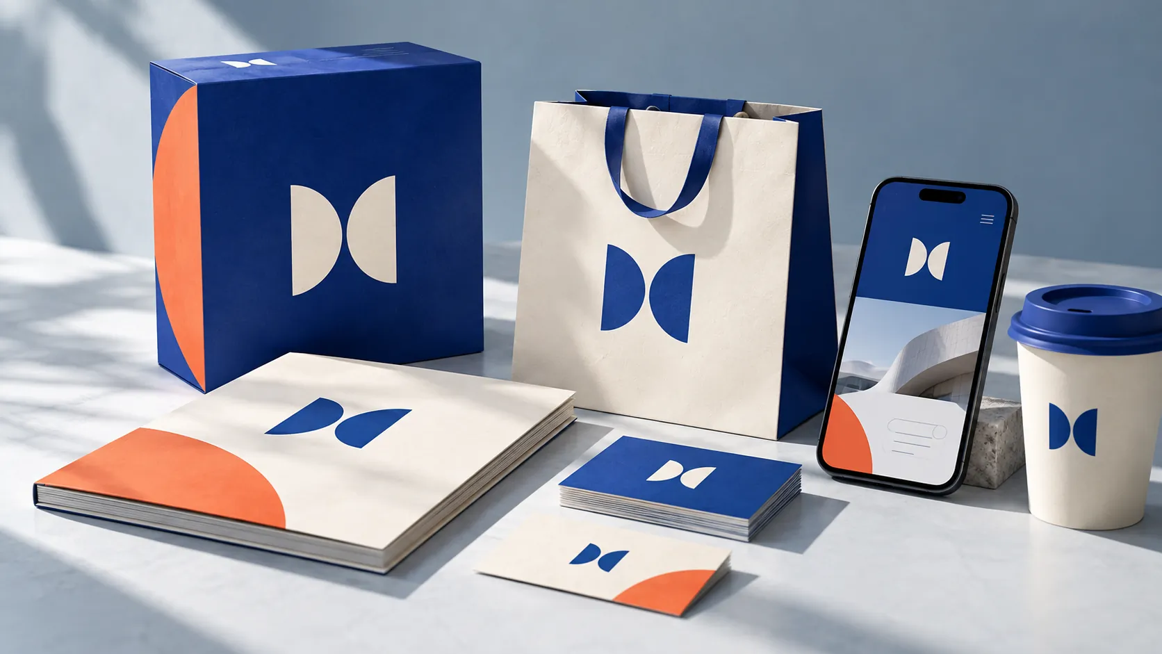
It may appear on a website, a company profile, business cards, packaging, signage, sales materials, social media or very small applications.
That is why scalability and applicability are important criteria.
A good logo needs enough structure to keep its recognizable character as its size changes, and enough flexibility to adapt to many environments.
FRAMEWORK
Four questions for evaluating a logo design
- Recognition: Can viewers recognize the logo and tell it apart from other marks?
- Memorability: Does the logo have features distinct enough for viewers to recall?
- Application: Does the logo work across many sizes, platforms and materials?
- Fit: Does the logo’s form suit the context, personality and role the brand needs to express?
These four questions are not a scoring formula. They are a simple way to move the discussion from “I like it” to “what is this design doing?”
9. How much does a professional logo cost?
It is a reasonable question, but there cannot be one price for every project.
The cost of design depends on the scope of work, the depth of research, the number of concept directions to develop, the number of revision rounds, and the scale and specific needs of the business.
So asking “how much does a logo cost?” without saying what problem it must solve usually gives too little information for a meaningful number.
A better approach is to define the project scope first and then request a matching quote.
It is also worth recognizing that a business is not paying only for design software or the hours spent at a computer. It is paying for professional expertise and the process of making decisions.
Software is only a tool. The computer is only a medium. The value lies in how the designer uses those tools to solve a specific problem.
10. The cost of a logo should not be separated from the cost of a brand decision
A business can save money by choosing a very cheap logo.
But the bigger question is: where is the business saving?
If the savings come from a sensibly streamlined process, that can be a perfectly normal choice. But if they come from skipping research, skipping concept development, skipping validation and turning design into a game of chance, the business is not simply buying a cheaper logo.
They are choosing a different approach to the brand problem.
CHECKLIST
Questions to ask:
- What brief and specific context was this logo designed from?
- What did the designer research before proposing an option?
- Is there a clear reason for the choice of shape, typeface and structure?
- Does the logo work when scaled down or stripped of color?
- Is it distinct enough in the competitive context?
- On what criteria, beyond personal taste, was the option chosen?
- Can the design grow into a consistent identity system?
11. Don’t buy a logo; evaluate how it was made
A good logo does not have to be expensive just because it is called “professional.” And a cheap logo is not automatically poor just because its price is low.
What needs to be evaluated is the relationship between the scope of work, the capability to deliver and the quality of the decision-making process.
If a business only needs a temporary image for a small project, its needs may be completely different from those of a brand preparing a long-term investment in the market.
But when a logo is expected to become the business’s long-term mark of recognition, the question of cost needs to be placed in a wider context.
Not: “How much does it cost to make a logo?”
But:
“Does this design have enough grounding to become a recognition asset for the brand?”
That is the question worth the time a business invests in answering.
FRESHBRAND
If a business is preparing to design or refresh a logo, it should start by defining what problem the logo needs to solve, rather than by asking what it costs.
A good design process clarifies the context, the criteria and how the logo will be used before deciding on the final form.