Color in logo design: how vision shapes brand perception
Color is often one of the first signals a customer notices on meeting a logo. But a “beautiful” color is not necessarily the right one. In logo design, color must at once support positioning, create a clear visual relationship, preserve recognizability and work across many platforms, materials and sizes. Choosing color is therefore a decision about perception and systems, not only an aesthetic one.
KEY TAKEAWAY
Effective color in logo design is not the most beautiful color but the palette that helps the brand be recognized, be perceived correctly and be used consistently in practice.
1. The color wheel helps systematize color combinations in logo design
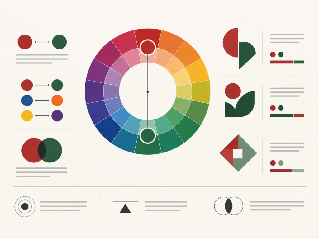
One of the basic tools for studying relationships between colors is the color wheel. It helps designers see the relative positions of colors and from there find combinations with the right level of contrast or harmony.
One familiar principle is complementary colors: two colors opposite each other on the color wheel. Red and green, for example, create strong contrast side by side. Other opposite pairs can produce a similar effect.
However, the color wheel is not a formula for a correct palette. With the same color relationship, changing the proportion, lightness or saturation can change the visual result considerably.
If two colors are both highly saturated and used in similar proportions, a logo can feel tense and hard to control. Conversely, when one color plays the main role and the other serves as an accent, contrast can become a tool for visual hierarchy.
So what needs studying is not only which color goes with which but also what role each color plays in the whole system.
FRAMEWORK
Three layers to consider when combining logo colors
A palette should be evaluated on three layers at once rather than looking at each color in isolation.
- Color relationships: Opposite, adjacent or other groups of colors create different levels of contrast and harmony.
- Shade: The same color with a change in lightness, darkness or saturation can create a very different impression.
- Context of use: A color may work well on screen but needs to be rechecked in print, signage, packaging or at small sizes.
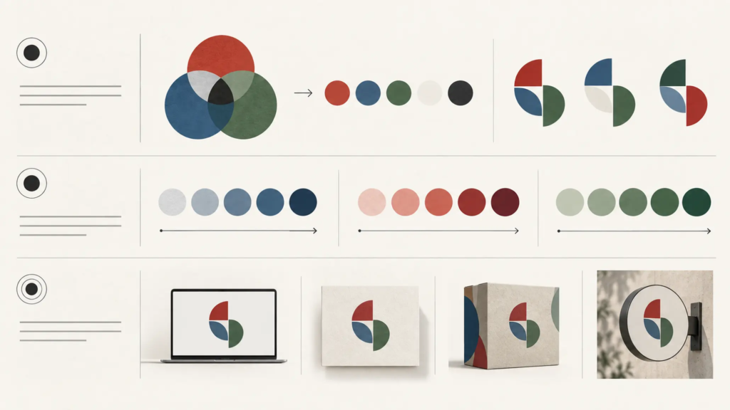
This is why a palette is considered suitable only after it has been placed in relation to the forms, typography, backgrounds and touchpoints the brand actually uses.
2. How does color in logo design affect perception?
Color is often explained through color psychology. This approach can be useful at the start, but turning it into a rigid conversion table easily oversimplifies the matter.
No single psychological meaning applies to everyone, every industry and every culture. How a color is perceived is also shaped by shade, context, personal experience and cultural convention.
Warm colors such as red, orange and magenta often feel stronger, more dynamic or more energetic in many contexts. Cool colors such as blue can suggest calm, reliability or freshness.
But even within one color family, shade can change the impression considerably.
A bright, highly saturated red can feel strong and direct. A deep red has a different tone. Likewise, bright blue and navy do not make the same impression even though they belong to the same color family.
Saying “red always means energy” or “blue always means trust” is therefore too simple an interpretation.
PRINCIPLE 01
The meaning of color lies in the system, not in a single color
A color becomes a brand signal only when it sits in a system of shades, typefaces, forms, layout, materials and context of use. So a more useful question than “What does this color mean?” is: “What impression does this color create when it appears with the brand’s other elements?”
3. Shade can completely change how a color is perceived
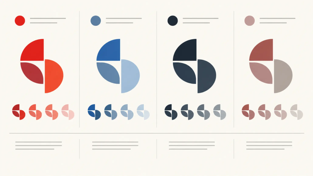
In logo design, choosing color does not stop at names such as red, blue, yellow or black. The designer must also decide whether that color is light or dark, strong or soft, highly or barely saturated.
Colors mixed with white usually feel lighter and softer. Conversely, when a color is darkened it can become deeper and heavier.
This explains why two logos that both use blue can still create very different brand images.
A brand that wants to feel dynamic may use bright, highly saturated colors. A brand that needs a sense of calm may use the same color family in deeper shades.
These interpretations are not absolute rules. They should be treated as a starting point for visual evaluation, then tested in the brand’s own context.
COMMON MISTAKE
“Just choose the right color by its psychological meaning and the logo will convey the right message.”
Why that is not enough
The meaning of color changes with culture, industry, shade and context. A color can create a different impression on a screen, on packaging, on signage or on another background color. Color therefore needs to be assessed within the whole identity system, not applied as a fixed conversion table.
4. Color must serve positioning, not just catch the eye
A logo can stand out and still not necessarily fit the brand.
This is an important point in assessing color. A high-contrast combination can attract attention, but if the feeling it creates does not fit the positioning, that prominence is not necessarily an advantage.
For brands that need stability and calm, deep or neutral colors such as black, gray, white and navy can provide a more restrained visual foundation.
In industries that call for energy, speed or standing out, warm colors such as red, orange and yellow can have a stronger effect. But even when choosing warm colors, lightness, saturation and proportion still need to be controlled.
Greens and teals are also often linked with nature, life, balance or growth in many contexts. These associations, however, are not fixed meanings. How a color is combined with imagery, typography and other identity elements is what shapes the overall impression.
5. Minimal color makes a logo easier to operate
A logo does not appear only on a computer screen.
It may be printed on business cards, packaging, documents, uniforms, signage or many other materials. So a good palette must not only look good on screen but also be reproducible and controllable in practice.
When too many colors or complex color effects are used, keeping consistency across touchpoints can be harder. Printing, embroidery and real-world fabrication also have requirements different from digital display.
From that angle, simplicity has value not only aesthetically but operationally.
FIELD NOTE
A useful check is to take the color out of the logo for a moment and look only at shape, lettering, proportion and spacing. If the symbol becomes recognizable only with color, the structure needs a second look. Color should strengthen a logo’s recognizability rather than having to “rescue” a form that was not clear enough.
6. A logo must work even without color
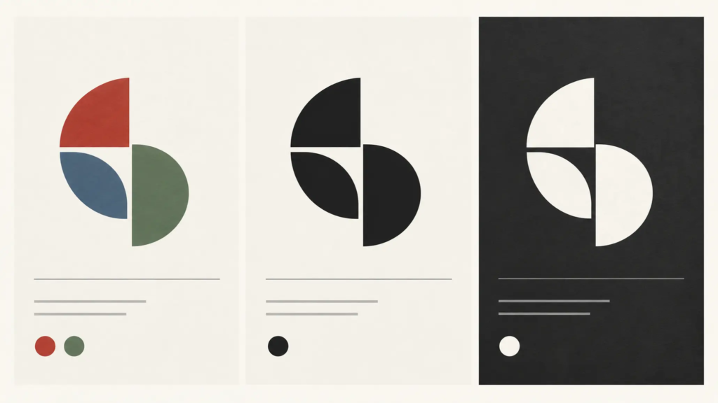
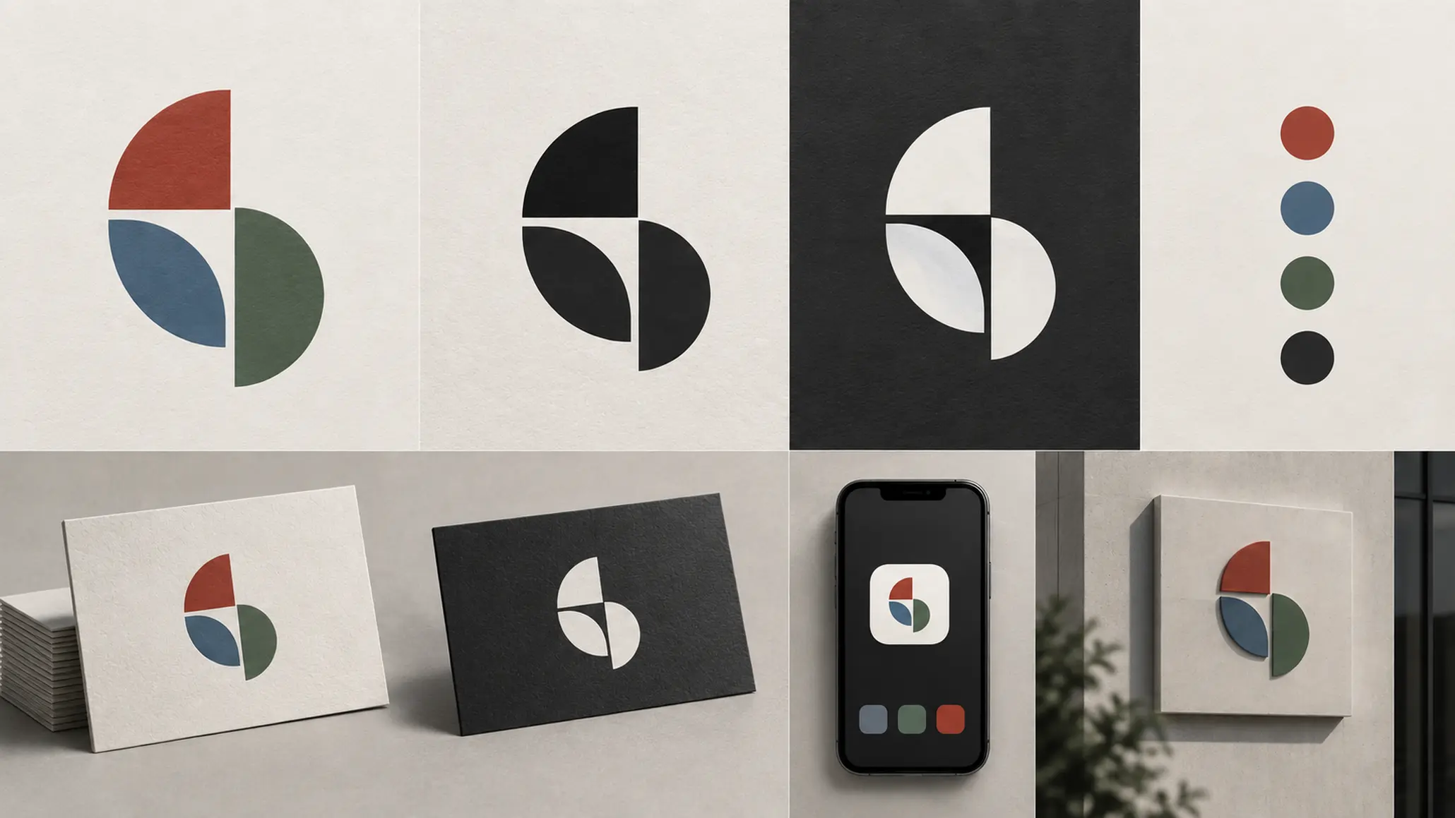
One important check is to reduce the logo to a single color (monochrome) or a negative.
The purpose is not that every logo must be used in a single color in practice. It is to check whether the logo’s structure is clear enough once the color element is removed.
If the logo remains recognizable in black and white, that shows the form, lettering, spacing and layout are doing their job well.
Conversely, if removing color makes the elements merge into each other, that may be a sign to revisit the structure before refining the palette further.
Color should therefore not be seen as a final decorative finish. It has to be placed in relation to the overall structure of the identity.
LESS EFFECTIVE
- Choosing a color because it is trendy or simply because it looks eye-catching.
- Using many colors to make a logo feel “rich”.
- Evaluating color on only one screen or one background.
STRONGER
- Choosing color based on positioning and the intended impression.
- Building a palette with clear roles and proportions.
- Test the logo on many backgrounds, sizes and reproduction methods.
7. Koloroo: color builds the relationship between symbol and tagline
In the example discussed in the article, the Koloroo logo uses a color combination that evokes Australia, nature, sunshine and the image of a kangaroo.
What deserves attention is not only the use of red and blue but also the relationship between the colors in the symbol and the tagline.
Red on some details of the symbol contrasts with the bright blue area, giving the parts a visual separation. Looking at how the colors are arranged, we can see that color does not exist on its own but helps steer how the viewer reads the symbol and the accompanying lettering.
This is a key point in logo design: color combination is not simply putting colors that “go together” next to each other. The colors must interact with the form, lettering and layout to create a visual structure with hierarchy.
8. Sports Link: harmony does not mean monotony
Another example mentioned is the Sports Link logo, which uses a split-complementary color combination.
Blue, green and red can evoke different associations in many contexts: blue suggests calm and trust; green is often linked to nature, vitality and growth; red can convey energy, passion and strength.
What deserves attention is how the colors are adjusted so they do not become too harsh. When shades are handled gently, many colors can coexist in one system without making the logo visually too heavy.
This shows that the number of colors is not the only factor deciding complexity. Shade, proportion and contrast matter just as much.
9. From Coca-Cola to McDonald’s: color is also shaped by industry convention
In the market, some color combinations gradually become familiar signals for consumers.
Red and yellow is a combination often associated with the fast-food industry, where McDonald’s is a prominent example of how color becomes part of a brand’s identity.
This poses a problem for brand builders: color can help customers quickly recognize an industry, but if it is used in too familiar a way, it can also make a brand blend in with others.
So consulting an industry’s color conventions is necessary, but it should not stop at copying.
The difference can come from shade, color proportion, how it is combined with typography and forms, or the whole identity system.
A palette therefore has to meet two requirements at once: familiar enough for viewers to understand the context, yet deliberate enough that the brand does not get lost among others.
10. Color in logo design must be seen in its cultural context
Color has no absolute common language across the world.
The same color can carry different associations across cultures. Meaning also changes with industry, circumstance of use and the viewer’s experience.
So when a brand operates in many markets, choosing color needs to be considered more broadly than aesthetics.
Instead of asking what a color “means”, it is better to ask more specific questions:
- How might the target customer perceive this color?
- Does this color fit the context of the industry?
- Does it make the brand stand apart or blend into an existing convention?
- Placed beside the brand name, symbol and typography, what feeling does the whole create?
- Does the palette work consistently across real touchpoints?
CHECKLIST
Questions to ask:
- Does the color fit the positioning the brand wants to build?
- Do the colors in the logo have a clear relationship of contrast and harmony?
- Do the shade and saturation fit the intended impression?
- Does the logo still read well in a single color or as a negative?
- Can the palette be reproduced reliably across many materials and sizes?
- Does the color help the brand stand apart without breaking the conventions the industry needs?
11. There is no single right color formula for every logo
The color wheel, color psychology and color combination principles are all useful tools. But they only truly have value when applied to the right brand problem.
A color can stand out and still not fit. A palette can be harmonious yet lack the ability to distinguish. A logo can look good on screen and run into problems when printed, embroidered or fabricated.
So the most important question is not “What color should the logo be?” but:
“Which palette helps the brand be recognized and perceived correctly in the contexts where it actually appears?”
Seen this way, logo design is no longer about picking a few nice colors to put next to each other. It is the process of building a deliberate visual signal that works in practice and has a clear role in the brand identity system.
FRESHBRAND
If you are choosing colors for a new logo or reassessing the current palette, start by checking the positioning, the relationships between colors, recognizability in a single color, and how the palette performs at real touchpoints. Color can then become part of the identity system rather than a decorative layer on the logo.