Using typography in logo design and brand identity
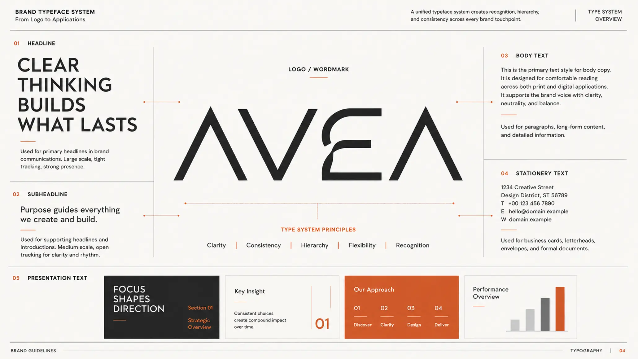
Typography in brand identity is often seen as an aesthetic decision: pick a font that suits the logo, then use it across printed materials. But typography plays a wider role. It shapes how a brand is perceived, how information is read and how consistent the whole identity system is. The choice of typeface should therefore start from positioning and brand personality, and only then move to specific design decisions.
KEY TAKEAWAY
A good typeface for a brand is not just beautiful on its own; it must help the brand be recognized, be perceived and be used consistently in many contexts.
1. The typeface in the logo is only a starting point
In brand design, typography is most visible in the logo, especially a lettering logo or wordmark. Still, choosing a typeface for the logo should not be treated as a decision separate from the identity system.
After the logo, typography continues to appear at many touchpoints: headlines, body text, office documents, presentations, advertising, packaging, websites and communication materials. So the important question is not only “Does this font suit the logo?” but also:
“Can this typographic language grow into a consistent identity system?”
A wordmark can be designed or refined specifically for a brand. A typography system, meanwhile, needs a set of fonts that can serve more levels of information and more environments of use. The two do not have to be identical, but they need a clear visual relationship.
PRINCIPLE 01
Typography needs to be designed as a system, not as a single font
The logo may be where a typographic language begins, but the identity system is where that language is tested. A typeface is truly right only if it keeps working well across different sizes, content, platforms and touchpoints.
2. Typography helps shape brand personality
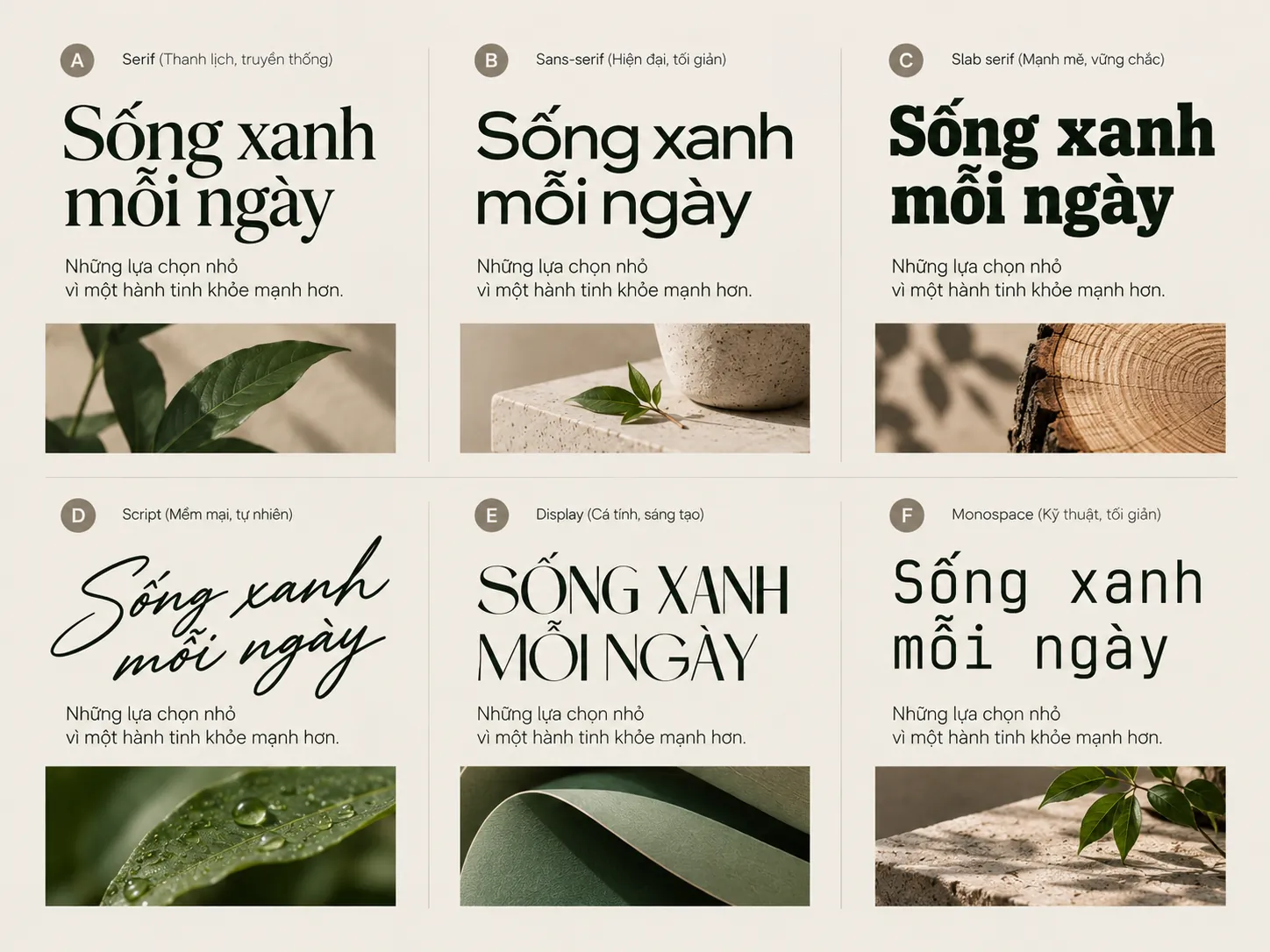
The same content set in different typefaces can create very different impressions. The difference comes not only from the shape of each character but also from proportion, weight, width, letter spacing, rhythm and how the elements are organized in the layout.
One typeface can feel strong, modern and decisive. Another can suggest refinement, tradition or warmth.
This makes typography part of the brand language. Used consistently, a typeface can become a recognition signal even where the logo does not appear.
EXAMPLE
Picture two brands presenting the same message with identical content. One uses a typeface with a clear structure, a compact form and a solid weight; the other uses a softer typeface with more detail and a lighter rhythm.
The basic information does not change, yet the impression of the two brands can differ considerably. This shows that typography conveys not only the content of the words but also part of how the brand wants to be perceived.
Choosing a font should therefore not begin with the designer’s personal taste. It should begin with the question of what personality the brand wants to express and which typeface can express that personality consistently.
3. The logo and the typography system need a clear relationship
The font used in the logo does not necessarily have to be used as is across the whole identity. In practice, the two roles have different requirements.
A logo needs to create a recognizable mark that works well within very limited bounds. A typography system has to handle a much larger volume of information, from headlines to long paragraphs, from digital screens to printed documents.
A wordmark can therefore be refined on its own while the brand’s font set is chosen for its broader applicability.
FIELD NOTE
A typography system that is easy to implement usually does not begin by hunting for lots of attractive fonts. It begins by defining the situations in which the brand needs type: logo, headlines, long-form text, secondary information, digital environments and other documents. From there, the designer has a basis for deciding which traits must stay constant across the system.
4. How many typefaces should a brand use?
More fonts do not mean a richer identity system. On the contrary, too many choices can weaken consistency and make it harder for the brand to keep a stable visual tone of voice.
A system can begin with one primary type family and then use variations in:
- Weight.
- Slant.
- Size.
- Spacing.
- Levels of information.
In some cases, two type families can be combined to create contrast, for example one typeface for headlines and another for body text. This pairing needs a clear reason, though, and both must serve the same brand personality.
LESS EFFECTIVE
- Choose many fonts only to give a sense of richness.
- Use a different typeface on each platform.
- Change fonts according to each implementer’s preference.
- Leave the role of each typeface undefined.
STRONGER
- Limit the number of fonts the system needs.
- Define the role of each typeface clearly.
- Use variations in weight and size to create hierarchy.
- Maintain one typographic language across touchpoints.
5. Principles for choosing brand typefaces
5.1. Prioritize legibility and applicability
A typeface can make a good impression at a large size yet become hard to read when scaled down. Brand typography therefore needs to be tested under many conditions of use rather than judged on a single design sample.
Consider how the typeface works in the logo, headlines, long-form text, website, office documents, presentations, advertising and printed materials.
A good type system must keep its distinctive character without sacrificing legibility.
5.2. Build a typographic hierarchy
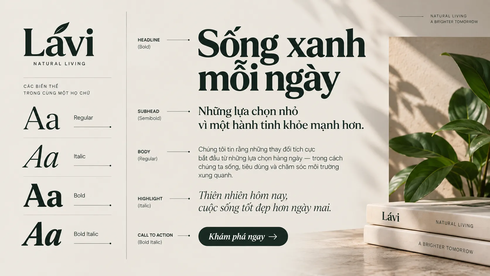
Typography is not just choosing a font. It is also a way of organizing information.
A basic system may need different levels for:
- Main headlines.
- Subheadings.
- Body text.
- Captions and secondary information.
- Elements that need emphasis.
- Content for digital environments and presentations.
Regular, Medium, Bold or Italic can be used to create hierarchy without constantly changing the type family.
When hierarchy is clearly set, readers can quickly tell what information is important, what is supporting content and how the elements of a layout relate to one another.
FRAMEWORK
A typography system needs to control three layers
- Typeface: Define the type family and the variations that may be used.
- Hierarchy: Define the roles of headlines, body text, captions and emphasis elements.
- Application: Define how typography works in different environments and at different touchpoints.
These three layers turn typography from a design choice into a system that can be implemented consistently.
5.3. Keep the whole system cohesive
Consistency does not mean all content must use the same size or the same weight.
What needs to be consistent is the logic of using typography: size, weight, letter spacing, line spacing and the relationships between levels of information.
When these elements are controlled, typography creates a stable visual rhythm for the brand even as content and layouts change.
5.4. When pairing two typefaces, they must be compatible
Two typefaces can be combined to create contrast, but the contrast needs to be deliberate.
The difference can come from structure, proportion, weight or the geometric character of the letters. The aim is to create enough difference to form a hierarchy, without giving the impression of two entirely separate visual languages.
More important, both typefaces must serve the brand’s overall personality.
COMMON MISTAKE
“The more fonts, the more flexible the system.”
Why that is not enough
Many options can increase variety in the short term but make the system harder to control. When every touchpoint uses a different typeface, the brand can lose continuity in the visual experience. Flexibility works better when it is built from a system with clear rules rather than from the number of fonts.
5.5. The typeface must suit the brand’s personality
There is no single best typeface for every brand. What matters is whether the traits of the typeface fit the way the brand wants to be perceived.
A brand may need to express:
- Modern: a clear, streamlined structure.
- Strong: a solid form and a suitable weight.
- Refined: proportion, spacing and detail handled with care.
- Friendly: soft, approachable letterforms.
- Traditional: typographic traits that suggest continuity and heritage.
These are not fixed rules for each personality. They are reference points for placing typography in the brand’s strategic context.
CHECKLIST
Questions to ask:
- Does the typeface suit the brand’s personality and positioning?
- Is it legible at both large and small sizes?
- Does it serve the brand’s main touchpoints?
- Does the system have enough hierarchy without needing too many fonts?
- Do the logo and the typography across the system share the same visual logic?
6. Typography needs to be specified in the brand guidelines
If typography is defined only by font names, the system is still incomplete. A brand guideline needs to clarify how typography is used, not just which fonts are used.
Depending on the brand’s needs, the system can specify type families, weights, sizes, levels of information, spacing and the application principles to be maintained.
This matters especially when the brand is implemented by several designers, departments or partners. When the rules are clearly defined, typography can stay consistent without depending entirely on whoever carries out the work.
WHAT WE LOOK FOR
When evaluating the typography of an identity system, the first thing to consider is not whether the font is “beautiful” but whether it solves the right usage problem.
- It reads well in real contexts.
- Are there enough variations to create an information hierarchy?
- Does it keep its identifying character when implemented across many touchpoints?
Typography is part of the identity system, not a decorative layer
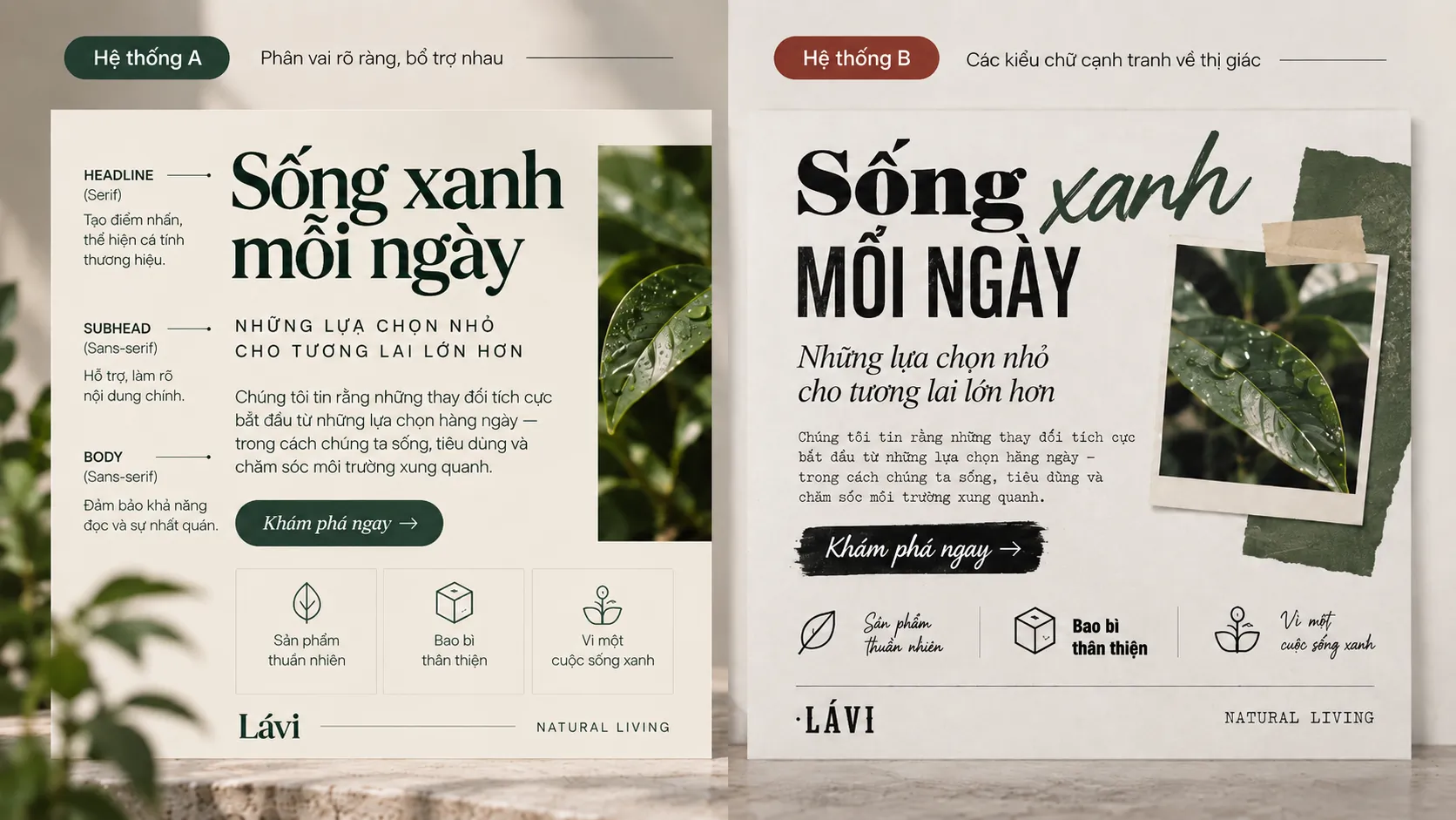
A common mistake is to treat typography as an isolated decision: choose a font for the logo, then a different one for the website and another for advertising materials.
A more rigorous approach is to develop typography together with the other components of the identity. Logo, color, imagery, layout, graphics and type need to point toward one unified visual language.
The brand then does not need to depend on the logo at every touchpoint to stay recognizable. The way type is organized, its proportions, its hierarchy and its rhythm can also become part of the brand experience.
KEY TAKEAWAY
Effective typography is not about finding one beautiful font but about building a type system that suits the brand and is consistent enough to work in the long term.
FRESHBRAND
When evaluating an identity system, try to look at typography as a system rather than at each font in isolation.
From logo to website, documents, packaging and communications, the key question is whether the decisions about type together create a clear and consistent identity.