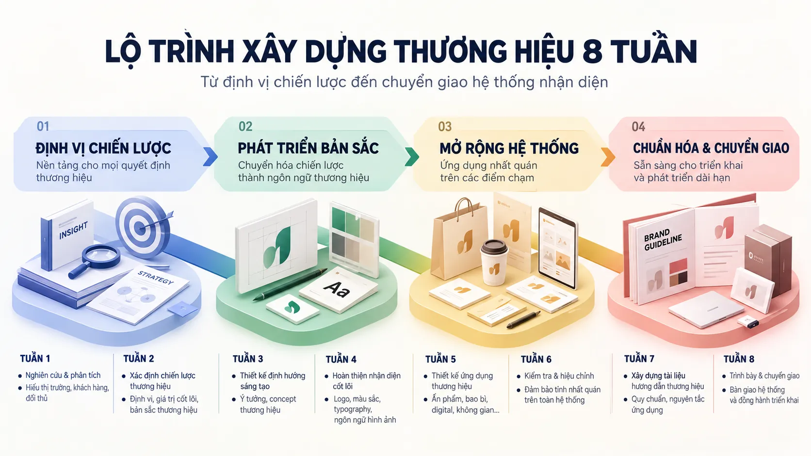
Brand identity system: The visual language and strategic compact of a business
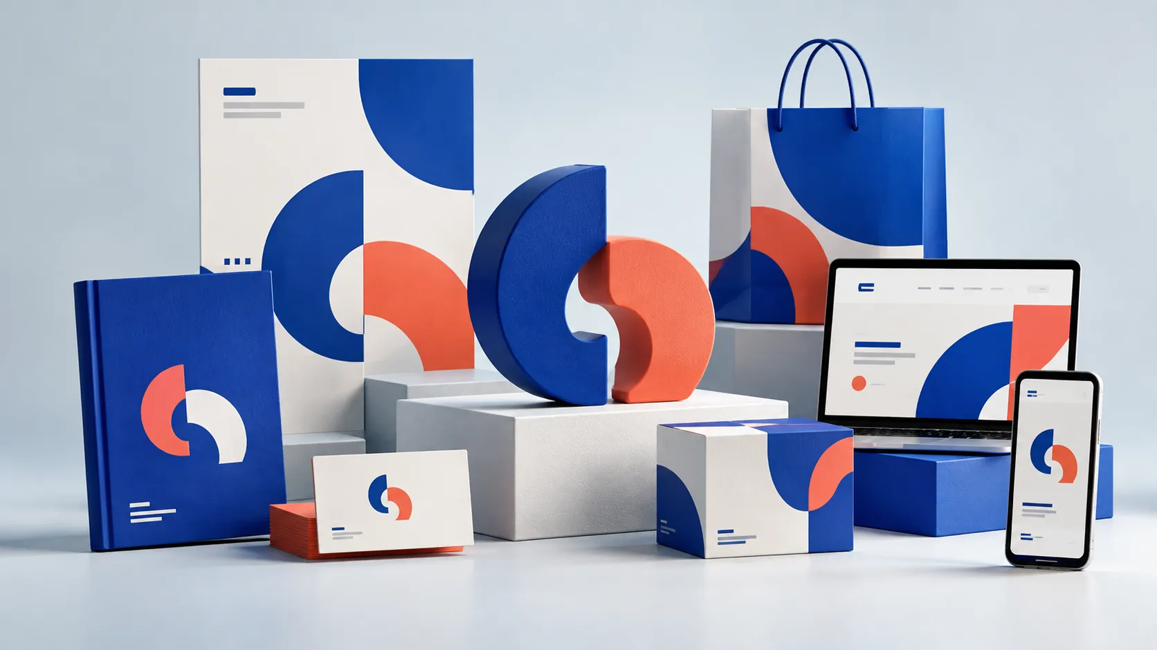
In business management, a brand can have the right strategy and still deliver a fragmented experience if its values are never turned into a consistent system of expression. Customers do not see “positioning,” “core values” or “vision”; they see a name, colors, typefaces, packaging, spaces, uniforms, sales materials and a long list of other touchpoints. A brand identity system therefore does more than answer what a business “looks like”: it decides how the business is recognized, distinguished and experienced.
KEY TAKEAWAY
A brand identity system is valuable not for producing a beautiful image, but for turning strategy into a consistent language that can operate across hundreds or thousands of the business’s touchpoints.
A brand identity system is really an operating system
If brand strategy is the submerged part of the iceberg, where a business defines who it is, whom it serves, where it differs and how it wants to be remembered, then brand identity is the mechanism that brings those decisions into everyday life.
This distinction matters: brand identity is not the same as a logo.
The logo is only one component of identity. A complete system can also include a color structure, typography, imagery, graphics, iconography, layout, photographic style, rules for using shapes, ways of presenting information and specific applications across the business’s touchpoints.
More important, the system does not exist only in design files. It has to be able to answer very practical questions:
- When expanding into a new product line, how will the brand express itself?
- When another employee produces the sales materials, is the imagery still consistent?
- When the brand appears on a phone screen instead of a sign, is the recognition mark still strong enough?
- When a new branch, point of sale or office opens, does the experience still belong to the same brand?
- As the business grows in scale, is the identity system flexible enough to expand without losing its identity?
That is why a good identity should be seen as a system with principles rather than a collection of graphic assets.
PRINCIPLE 01
Identity must translate strategy, not merely illustrate it
A design can be beautiful and still fail if it does not help viewers recognize the brand, understand its position or form an impression that fits the strategy. The value of identity lies in the gap between what the business intends and what the market actually experiences: the more a system brings the two closer together, the more it is worth as a management tool.
Difference starts not with doing things differently, but with expressing exactly what only your brand has
In industries where products are very similar, businesses often look for difference by adding more visual elements: bolder colors, more complex logos, more eye-catching imagery.
But visual difference is not the same as brand difference.
If every element is chosen only because it “looks good” or is “different from competitors,” the system may stand out in the short term but lack the foundation to last. When the visual language instead comes from the positioning and the values the business truly wants to own in the customer’s mind, every design component has a reason to exist.
This is the difference between decoration and identity.
A color is more than a feeling. It can become a recurring recognition signal.
A typeface is more than something to read. It helps shape the brand’s tone of voice.
A visual system is not there just to beautify communication. It determines how the brand appears in a visual world that grows more uniform by the day.
A layout rule does more than keep a design “tidy.” It lets many different touchpoints still be recognized as the same brand.
Context: HADUCO operates in transport and oil and gas maritime services, and needed to reposition its corporate image.

Decision: FreshBrand worked with HADUCO’s leadership to restructure the identity system comprehensively in a dynamic, modern direction with an international stature.
Challenge: The business’s values and capabilities had to be turned into a visual language clear enough to express its position across brand touchpoints.
Lesson: When identity is built from the positioning problem, design is no longer just an outer layer of imagery but a means of expressing the business’s position.
FIELD NOTE
In repositioning projects, the hard part is not always finding a new symbol. The larger challenge is deciding what to keep, what to change and which traits must become recurring recognition signals across the whole system. A mature identity rarely tries to say everything at once; it chooses a few important traits and expresses them consistently.
Consistent does not mean every touchpoint must look identical
One of the most common misunderstandings about brand guidelines is to treat them as a set of rules that force every design to look the same.
In fact, consistency and absolute uniformity are two different things.
A system that is too rigid can make the brand monotonous. But a system that is too open lets every department, supplier or campaign interpret the brand in its own way.
The task of identity is to decide what is constant and what is variable.
Constants are the elements that must be protected to keep recognition: the logo structure, the main colors, core typography, layout principles, the way imagery is used or distinctive visual signals.
Variables are the elements that must stay flexible to fit each context: size, proportion, content, campaign imagery, the way components are combined or the way the system is deployed on each platform.
FRAMEWORK
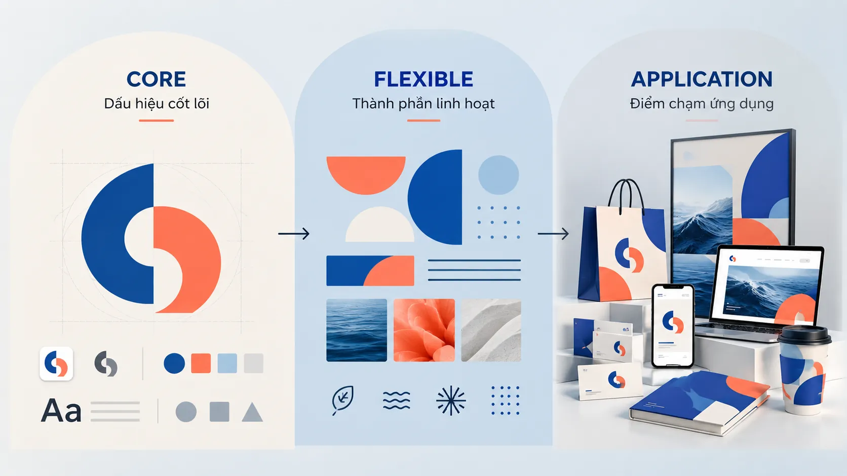
An identity system should be designed on the logic of “Core – Flexible – Application”
- Core: The elements that create the recognition mark and must be tightly controlled.
- Flexible: The components that can change so the brand adapts to many contexts without losing its identity.
- Application: How the system is deployed on packaging, space, documents, digital media, uniforms and specific touchpoints.
This approach helps a brand avoid two extremes: a different look everywhere or the same look everywhere, mechanically.
The more touchpoints, the more the system matters
A small business can control its image through a few people on the team. But as the business grows, the number of touchpoints multiplies: packaging, stores, showrooms, websites, social media, sales materials, company profiles, uniforms, delivery vehicles, signage, internal documents and digital platforms.
The problem is then no longer “designing a beautiful image.”
The question is how hundreds of different outputs can still form one experience that belongs to the same brand.
This is why brand guidelines should not be only a document that says where the logo goes, how large it is or what code a color has. A guideline that works in practice must help its users understand the logic behind the system, so they can make the right decision even in situations the guideline never illustrated directly.
Context: Qui Phuc is a brand in household goods and furniture. Qui Phuc needed to standardize and align its brand identity system across all touchpoints, from product labels and packaging to digital media channels.

Decision: FreshBrand deployed a unified identity system from labels and packaging to digital media touchpoints.
Challenge: When a brand is present at many points of sale and media channels at once, inconsistency can weaken recognition and the brand experience.
Lesson: An identity system proves its value only when it works across touchpoints, rather than looking good in a few sample applications.
COMMON MISTAKE
“A good logo is all a business needs for a brand identity.”
Why it is not enough
A logo creates a mark of recognition, but it cannot control the whole visual experience by itself. If color, typography, imagery, layout, packaging, space and other applications do not share one logic, customers may meet a business “with a logo” without necessarily meeting a brand with a system.
Brand identity creates value through accumulation
Brand value does not form after a single launch of an identity.
It builds up over time, as consistent signals appear often enough in the customer’s experience. A color seen again and again. A way of presenting information that becomes familiar. A packaging structure recognized on the shelf. A style of imagery associated with the same business.
From this view, brand identity has an important characteristic: its value is cumulative.
One appearance may not make much difference. But thousands of consistent appearances can build a recognition asset that competitors cannot easily copy with a single design change.
This is also why identity decisions should not be judged only by an instant reaction such as “pretty” or “not pretty.”
The more important question is:
Can this system create a recognition mark clear enough, consistent enough and durable enough to accumulate over time?
Context: Lasuco operates with many product lines, from refined sugar to products related to nutrition from sugarcane. Lasuco needed FreshBrand to build a unified brand identity system that links the group brand and its product lines consistently, forming an identity architecture able to grow with the business portfolio.

Decision: FreshBrand designed a unified identity system in the spirit of “Everything is natural.”
Challenge: A brand with several product groups had to keep a link of recognition between them without losing the individual character of each product.
Lesson: An identity system can act as a linking structure, so that different products and touchpoints belong to one consistent brand architecture.
WHAT WE LOOK FOR
When building an identity, a question we often ask is not “is this design beautiful?” but “if we take the logo away, how many elements still let people recognize the brand?”
- Is there a visual signal distinctive enough to be remembered?
- Do those elements appear consistently at the important touchpoints?
- Is the system flexible enough for the business to grow without redesigning from scratch?
An identity that is strong outside but fragmented inside is still an incomplete system
A brand is not experienced by customers alone.
Employees also create and carry the brand continuously through the way they communicate, work and serve. An identity system can therefore have an internal effect when it helps the team understand more clearly what the organization wants to stand for.
Workspaces, uniforms, internal documents, wayfinding and communication tools are more than visual applications. They can become recurring signals that let staff feel the consistency between what the business says and the environment they work in.
Still, it is worth avoiding the simple assumption that “investing in identity will automatically attract talent.” The real value lies in how far an identity system supports a more consistent organizational experience, while culture, policy, environment and quality of management remain other deciding factors.
EXAMPLE
Picture a customer walking into an aesthetic hospital.
They do not meet only the logo. They see the signage, the space, the uniforms, the instruction materials, the wayfinding, the information screens and the way these components are organized in a service environment.
If every touchpoint uses a different language, the impression of the organization can become fragmented. When the components are designed within one system, the experience becomes easier to understand and more continuous.
This shows that brand identity is not only how a business is seen but also part of how it is experienced.
Context: A Au Cosmetic Hospital operates in a medical and aesthetic service environment, where the sense of professionalism is formed through many touchpoints.

Decision: FreshBrand deployed the identity system from the experience space and professional attire to internal printed materials.
Challenge: The brand image had to appear consistently across the service environment and the activities inside the organization.
Lesson: An identity system with depth must be designed to work both outside and inside the organization, where staff are also part of the brand experience.
When identity helps a business escape a price-only fight
In many categories, customers cannot judge the full quality of a product before buying. They rely on substitute signals to form expectations: packaging, presentation, retail space, product information and how professional the brand appears.
Such signals cannot replace real quality. But they can shape expectations of quality and trust before customers have enough information to judge a product fully.
This is one reason identity can contribute to a competitive gap beyond price.
This should not be read to mean that a beautiful identity lets a business charge higher prices automatically. If the real experience does not meet the expectation the image creates, the identity itself can become a source of disappointment.
Effective identity must therefore create a match between promise and experience, rather than simply trying to make the brand look more expensive.
LESS EFFECTIVE
- Using imagery to create a premium feel when the product and service do not match.
- Each campaign uses a different imagery style.
- Treating identity as a layer of decoration outside the business.
STRONGER
- Designing identity based on positioning and real experience.
- Building principles clear enough that many campaigns still belong to the same brand.
- Treating the identity system as the basis for organizing and operating touchpoints.
A good system is also a mechanism for controlling long-term cost
Without a system, every time the business needs new packaging, a brochure, sales materials, a banner, a post or a promotional item, the team has to make decisions from scratch.
And design decisions that are not standardized usually carry other costs: time spent discussing, time spent revising, dependence on individual suppliers and the risk of producing different versions of the brand.
By contrast, a well-designed system can turn many repeated decisions into ready-made principles.
Not redesigning the colors every time a document is made.
Not having to debate again how the logo is placed in each application.
Not having to explain the imagery style again to every partner.
Not starting from a blank page whenever a new touchpoint opens.
This value is often overlooked but very important: systematizing design reduces the number of decisions that have to be made again from the beginning.
Context: Biolife operates in clean vegetables and organic food, where trust is an important factor in consumer choice.

Decision: FreshBrand built the identity system around inspiration from nature, while keeping a careful, systematic way of presenting it.
Challenge: Agricultural products had to be distinguished from products with no clear brand system, while the sales touchpoints needed to create a unified experience.
Lesson: Identity can help a business reorganize how its products appear on the market, from packaging to point of sale, rather than competing on product features or price alone.
A sound brand identity system should be judged by how well it works in practice
Having a logo, colors and guidelines does not mean a business already has a good system.
A system that is truly useful has to pass at least three tests.
First is recognition: when the logo is absent or appears at a small size, what other signs still let the brand be recognized?
Second is consistency: when many teams, suppliers and platforms deploy the brand together, is the system clear enough to reduce arbitrary interpretation?
Third is scalability: when the business launches a new product, enters a new market or appears at a new touchpoint, can the system adapt without losing its identity?
If the answers to all three questions are unclear, the problem may lie not in the quality of individual designs but in the architecture of the system itself.
FRAMEWORK
Three layers of value in an identity system
- Recognition: Helps the market recognize and distinguish the brand through recurring visual signals.
- Consistency: Lets many touchpoints and many people apply the same brand logic.
- Scalability: Lets the brand add products, channels and experiences without tearing down the whole existing system.
An identity that looks good in only a few applications can make an impression. An identity that works across many new contexts becomes a strategic asset.
From an “identity kit” to the business’s “visual operating system”
Seen for what it really is, a brand identity system is not the end point of the design process.
It is the starting point of an operating process.
Once built, the system has to keep being used, controlled, updated and extended. The principles created today will shape how the brand appears for years to come.
The question for a business should therefore not be only:
“How should we design the identity?”
Instead, turn it into:
“How do we want the brand to be recognized, distinguished and experienced everywhere the business appears?”
The second question makes the business look at identity at the level of management rather than only at the level of aesthetics.
CHECKLIST
Questions to ask:
- Does the current identity system reflect the positioning the business wants to own?
- Can customers recognize the brand when the logo is not the most prominent element?
- Are the important touchpoints using the same visual logic?
- Is the system flexible enough to extend across products, channels and markets?
- Do staff and partners have enough guidance to apply the brand consistently?
- Which specific brand problem is each identity component solving?
The value of identity lies not in the number of assets designed, but in the ability to turn those assets into one consistent language that works over time.
FRESHBRAND
If your business is facing a repositioning, an expansion or the need to standardize its image across many touchpoints, the important question is not which logo to start with, but which system to build so that the strategy can be seen and experienced consistently.
FreshBrand approaches brand identity from a strategic angle: it starts from the position and the values the business needs to express, then turns them into a system that can be applied and operated in practice.