The 8 most important elements of brand identity design
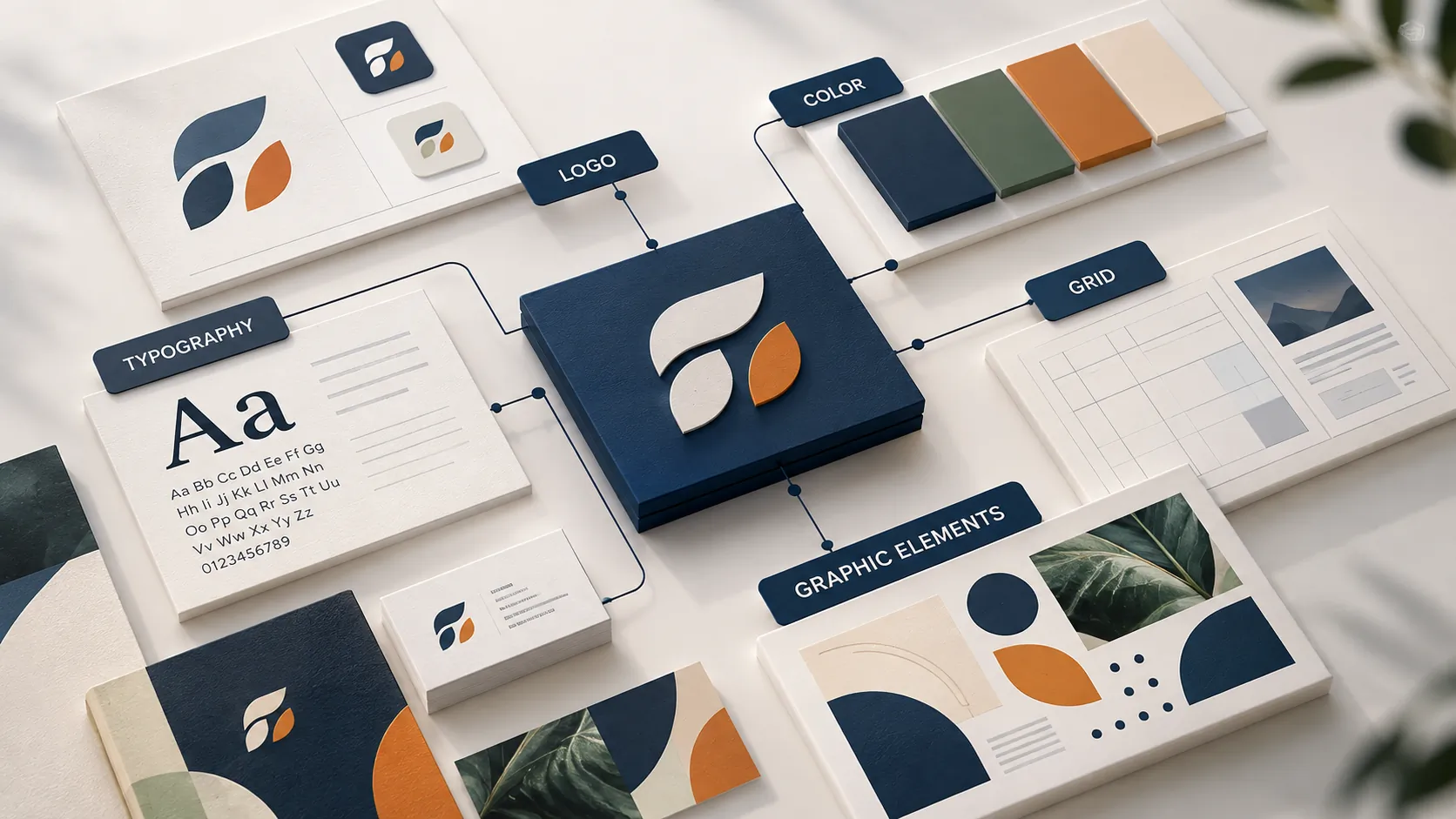
A brand identity system can look complete and still not help a business stand out. The problem is usually not a logo that is not attractive enough or a palette that is not striking enough, but visual components that have not been organized into a system that can be recognized, extended and run consistently. Brand identity design should therefore be seen as a question of strategy, structure and applicability, not only of aesthetics.
KEY TAKEAWAY
An effective brand identity is not made of individually attractive designs, but of a visual system clear, flexible and consistent enough for the brand to be recognized at every touchpoint.
1. The symbol system: The logo should be the point of recognition, not the whole identity
The logo is usually the first component seen when people talk about brand identity. But in a complete system, the logo should not be treated as the whole brand; it is an anchor that helps people recognize the business.
A logo system can include a logomark, a logotype, horizontal and vertical versions, monochrome versions, or configurations suited to different sizes and platforms. What matters is that the structure is clear enough for quick recognition and flexible enough to work in practice.
PRINCIPLE 01
A logo needs to be designed for the system
A logo can look striking when placed large on a presentation slide and run into trouble when reduced to a favicon, an office document, packaging or a digital interface. So a logo’s value lies not only in its form but in its ability to be a stable component of the whole identity system.
2. Operational flexibility: An identity has to live at many sizes
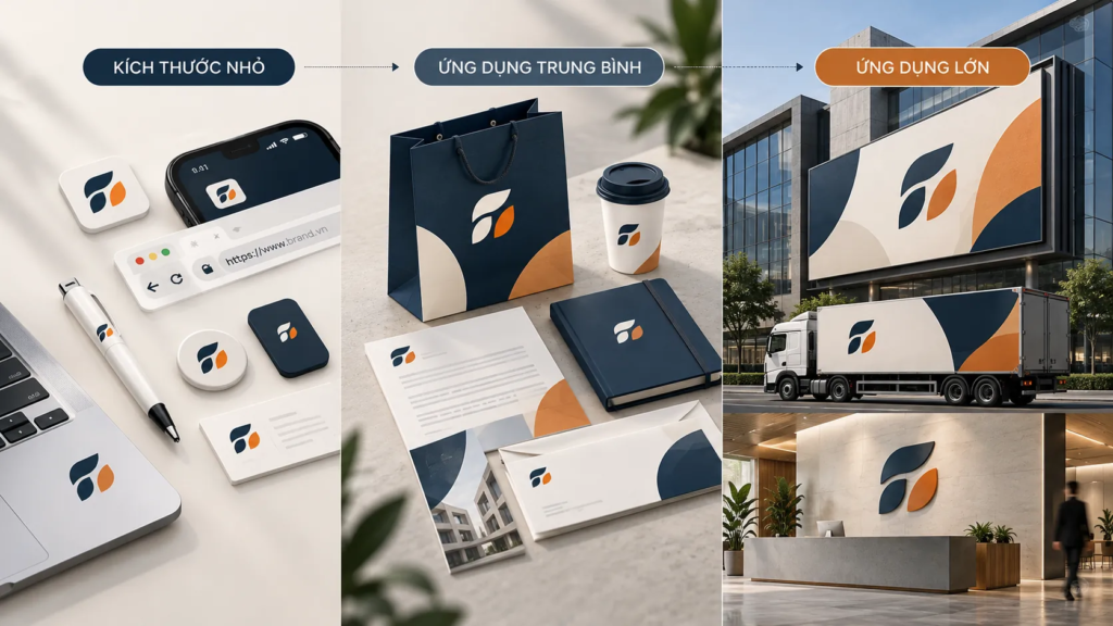
A brand does not appear only on a few marketing materials. It can show up on business cards, websites, social media, sales materials, packaging, signage or communication formats of very different sizes.
That is why scalability needs to be considered from the moment the identity is built. A good system has to keep its core distinguishing features when the size, material, display environment or production method changes.
COMMON MISTAKE
“Designing a beautiful identity kit on a mockup is enough.”
Why it is not enough
A mockup shows only one state of an identity. In real operation, a business has to use the system across a great many touchpoints. If a design works well only at one size or in one context, the team soon has to handle the exceptions on their own, and consistency begins to erode.
3. The strategic color palette: Color must serve the positioning
Color directly affects how a brand is perceived. But choosing a color should not begin with “Which color looks nice?” It should begin with which color fits the role and position the brand wants to build?
A color palette can include primary colors, secondary colors, background colors and functional colors. Assigning clear roles means the business not only has an attractive palette but also knows how to use color in specific situations.
FIELD NOTE
In implementation, the problem is usually not that a business lacks color but that it has too many colors and no rules for using them. When each design picks a different combination, color gradually loses its ability to be a stable signal of recognition.
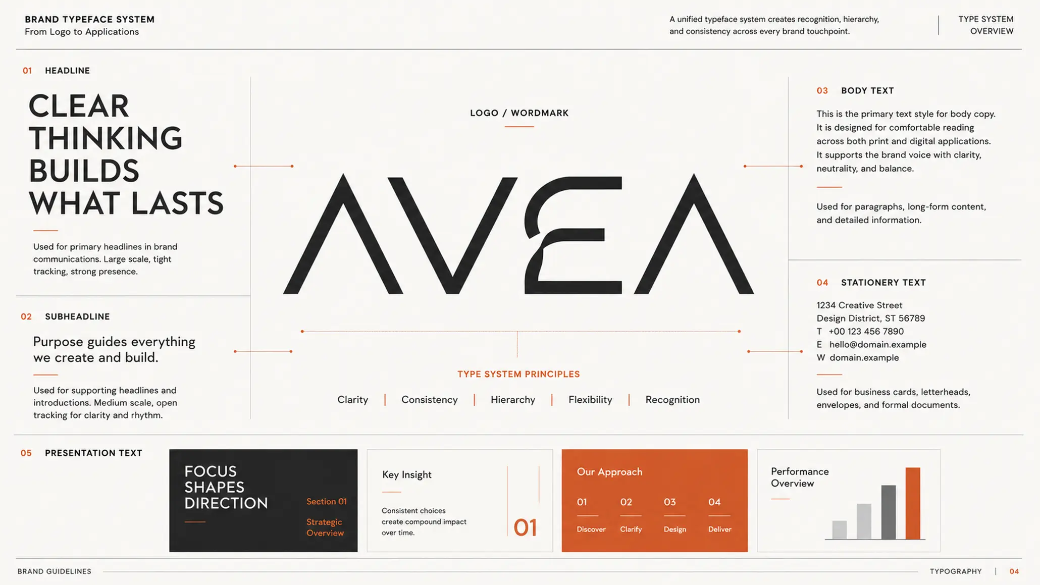
4. Typography: The typeface is part of the brand’s voice
If color creates a layer of feeling, typography helps shape how the brand “speaks” to the reader.
Typeface, size, weight, letter spacing, line height and the hierarchy of headings all affect how information is taken in. A standardized typography system gives the website, brochures, presentations, sales materials and other communications one visual language.
Typography also needs to be assessed from an operational standpoint. A typeface may suit headlines but not long passages of text. A font set that looks good on a designer’s machine but is hard to use in an office system can also cause problems at scale.
FRAMEWORK
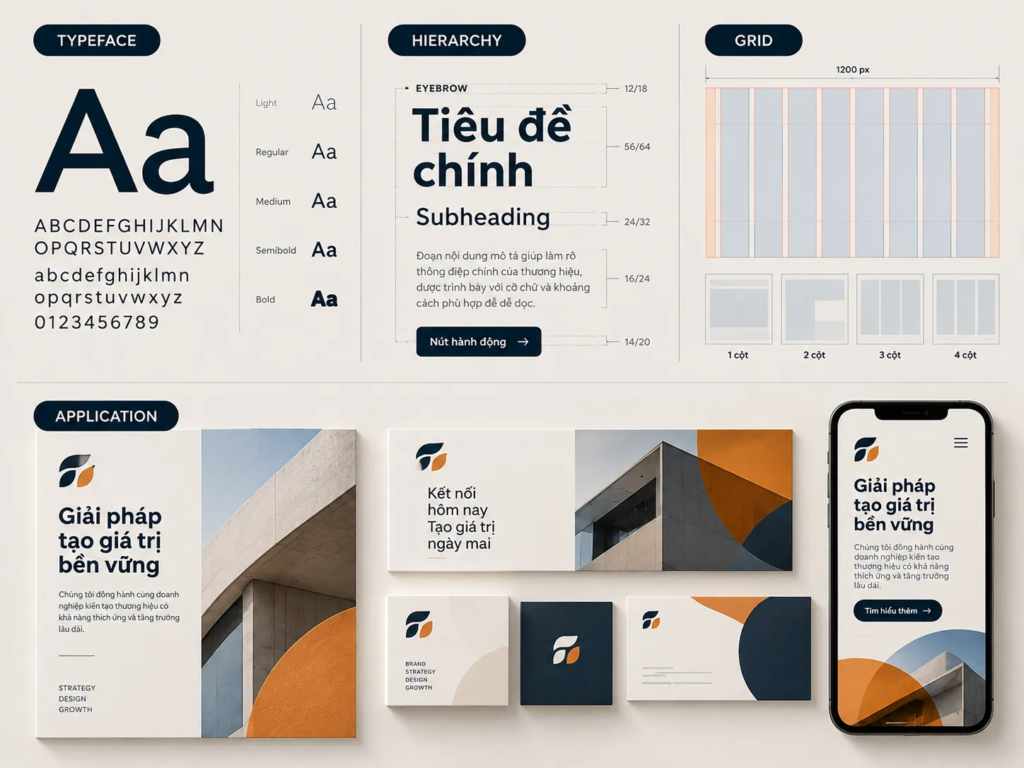
Typography needs to be built as a hierarchy
- Typeface: Defines the family of typefaces that gives the identity its main visual character.
- Hierarchy: Defines the difference between headings, subheadings, body content and supporting information.
- Application: Defines how typography works across different platforms and document types.
5. The layout grid system: Turning consistency into visual discipline
A brand identity cannot be consistent with only a logo and colors. When the brand appears across many documents, the way content is organized also needs principles.
A grid system defines position, spacing, proportion and the relationships among components in a layout. It gives imagery, typography, logo and information a structure in which they can coexist without becoming cluttered.
For brands that produce a lot of content in particular, a grid reduces dependence on each designer’s personal judgment. Instead of every design starting from a blank page, the team has a common frame of reference for making decisions.
PRINCIPLE 02
Consistency does not mean every design must look the same
A good identity system lets different designs still share the same visual “family.” The grid creates discipline; its purpose is not to turn every piece into a copy of the others.
6. The graphic element system: Creating a language beyond the logo
Once the logo is in the right place, the brand still needs other elements to build recognition.
These can be shapes, lines, textures, patterns, ways of cropping images or graphic elements built specifically for the system. They add a further layer of identity, especially useful where the logo cannot or should not be made too prominent.
EXAMPLE
Picture a brand document with many pages of content. If every page uses only the logo, color and typography, the potential for visual rhythm is rather limited. When the system also has clearly specified graphic elements, pages can change layout and still keep their identity connection.
This shows that a strong identity does not necessarily put the logo everywhere. Sometimes it is the secondary elements, used consistently, that let viewers recognize “which brand this is.”
7. Consistency in visual language: Consistency has to be designed in from the start
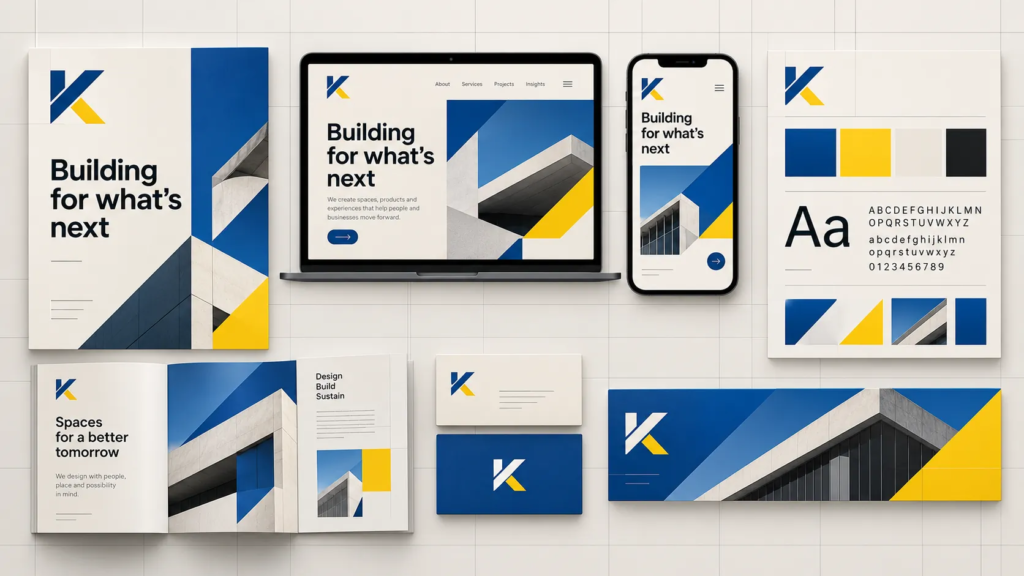
Brand identities usually fail not because components are missing, but because the components are not used with the same logic.
Photography, illustration, charts, icons, color, typography and layout need to point toward one visual language. If each component follows its own style, the brand sends many different signals instead of one unified experience.
LESS EFFECTIVE
- The logo is standardized but imagery is used arbitrarily.
- Brand colors are specified but the proportions of use are unclear.
- Typography changes from document to document.
- Designs that are attractive individually but have no connection.
STRONGER
- The visual components are built into a system.
- Each component has a clear role and rules for use.
- The differences between pieces still sit within the same language.
- The team can roll out the identity without having to decide everything again from scratch.
8. The implementation partner: A good system has to be turned into the ability to operate
Brand identity design does not end when the design files are handed over. What follows is a longer process: the business has to use, extend and maintain the system in many real situations.
That is why an implementation partner should be judged not only by the images they can produce but also by how they build the logic of the whole system. An identity with operational value must help the team understand why a component was designed the way it was, when to use it and how to keep building without breaking the overall structure.
WHAT WE LOOK FOR
When assessing an identity system, what deserves attention is not just a few of its best applications but how the system handles both ordinary and unexpected cases.
- Does the identity work well when scaled down or changed to another format?
- Can people other than the designer understand and use the system?
- Do the components form a shared language, or are they just a collection of design assets?
- Is the system flexible enough for the business to keep developing new content?
9. The eight elements need to be seen as one system
The eight elements above do not work independently. A logo needs a color and typography system to be placed in the right context. Typography and the grid give content its structure. Graphic elements widen recognition. Flexibility lets the whole system adapt to many touchpoints. And consistency turns these individual components into a brand experience people can recognize.
CHECKLIST
Questions to ask:
- Does the logo keep its recognizability at many sizes and in many contexts?
- Does the color palette have clear roles, or is it simply a set of colors chosen by preference?
- Are typography and the grid standardized enough for many people to work with?
- Do the graphic elements add recognition beyond the logo?
- Can the system extend to new touchpoints without losing its core character?
- Does the business have enough principles to keep things consistent after the project ends?
FRESHBRAND
A brand identity should be judged on how well it can operate over the long term, not on the impression of the first few designs.
If your business is considering a new identity system or wants to reassess the current one, the first step is to look at all touchpoints as one system: what must stay consistent, what needs to be flexible and which components truly create recognition. FreshBrand can work with you to revisit those questions before moving into design decisions.