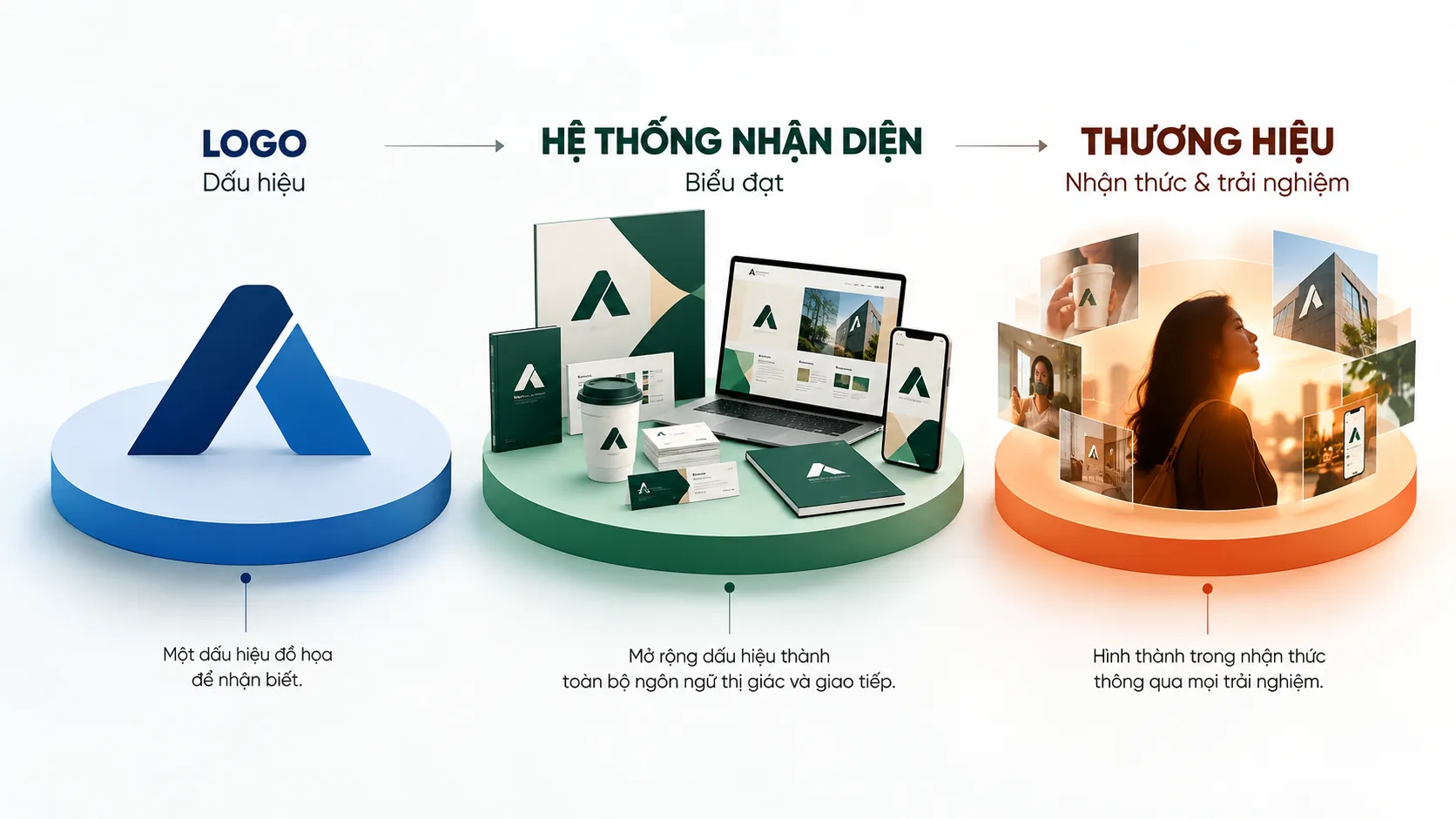
Brand identity design: from visual symbol to strategic asset
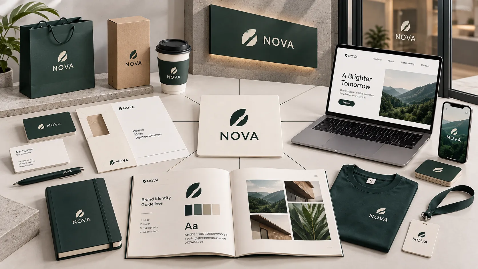
Many businesses begin the brand identity conversation with the logo: a symbol that should look good, be easy to recognize and be usable in legal filings. But if a logo is seen only as an image for trademark registration, the business draws on a very small part of its value. A properly built identity system must at once differentiate, convey core values, work consistently and help the business protect its brand assets over the long term.
KEY TAKEAWAY
A logo has strategic value not because it is beautiful, but because it helps the business be recognized, remembered and consistently vouched for across the whole brand system.
1. Brand identity starts from ownership and distinctiveness
Brand identity design is often viewed from the visual side: which colors suit, which typeface is attractive, which symbol is memorable. But before any of those questions comes a more basic one: does the business own a mark distinctive enough to protect and use over the long term?
Registering a trademark is not just an administrative procedure. In essence, it is the step of establishing rights over an intangible asset that can stay with the business for many years.
An identity system built on strategic thinking has to take differentiation into account from the start. Using common symbols, recycled ones or designs too close to those already on the market can make it hard for a brand to leave its own mark, and also raises risks around ownership and protectability that need to be weighed.
PRINCIPLE 01
Visual difference must come with the ability to own it
A brand identity needs not only to be seen and recognized; the business also needs a basis for using, protecting and developing it as its own asset. So originality should not be treated as a finishing touch at the end of the design process but as a criterion set from the beginning.
This matters especially when a brand expands into several markets or product groups. A distinctive, deliberately built mark provides a better foundation for managing brand assets later on.
2. A logo is how a business encodes its core values
A logo does not exist independently of the business. Behind an effective symbol are decisions about how the business wants to be seen, whom it serves and what difference it wants to make.
So logo design should not start from the simple question: “What shape will look good?”
The more important question is: “Which values need to be turned into visual language?”
Vision, mission, core values, industry and growth direction can all become inputs to building an identity. The job of design is to turn what is strategic and abstract into elements that can be seen, used and remembered.
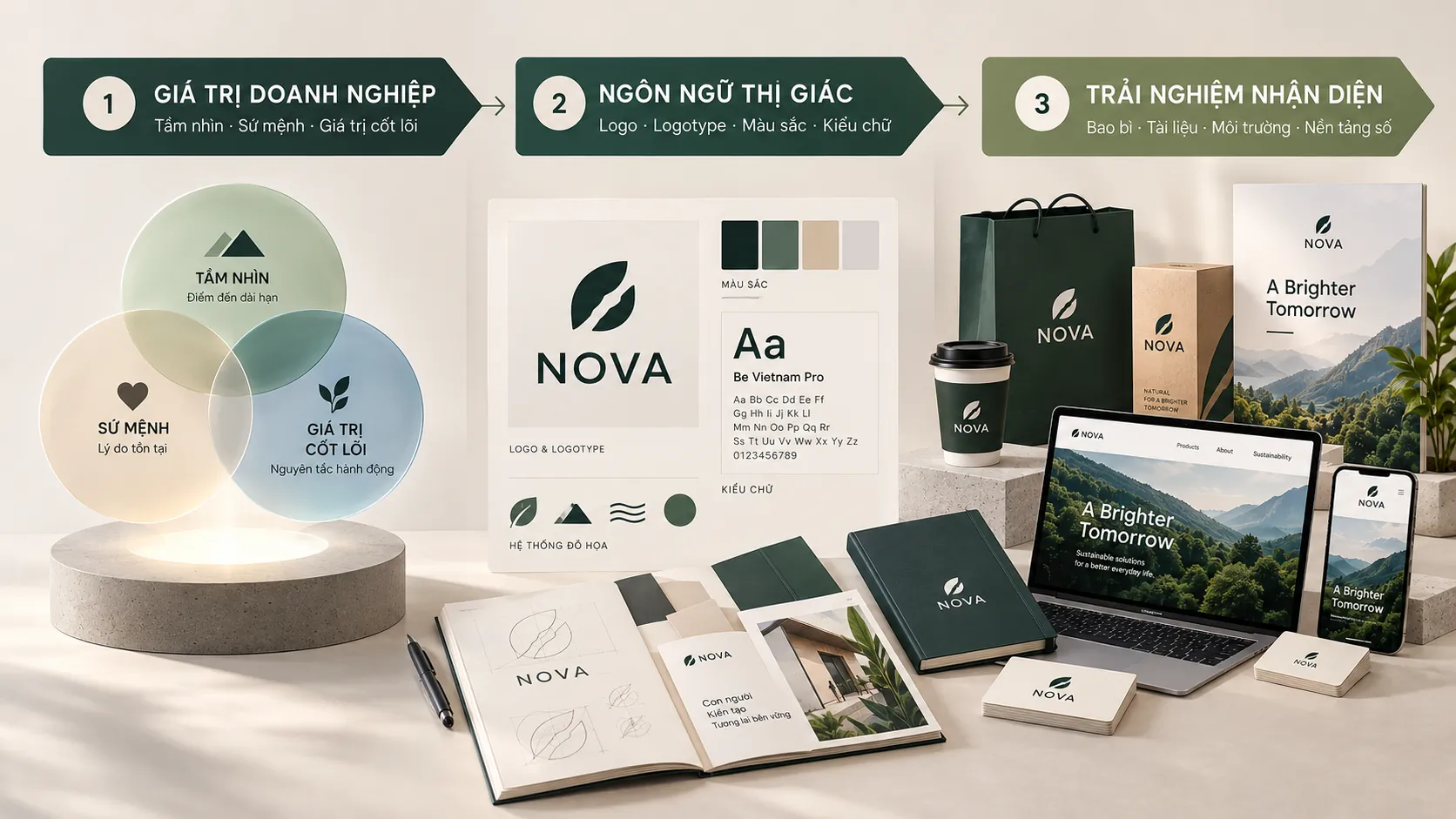 alt=”Diagram of three layers that turn business values into visual language and experience.” class=”wp-image-35436″/>
FRAMEWORK
From strategy to symbol
An identity system can be viewed through three connected layers:
- Business values: The vision, mission, core values and direction the business pursues.
- Visual language: Symbol, logotype, colors, typefaces and design principles turn those values into visual expression.
- Identity experience: How the system is deployed across packaging, documents, environments, digital platforms and other touchpoints.
When these three layers connect, the logo is no longer a standalone image on a business card. It becomes a component of an identity system that can work in many contexts.
A logo can combine a logotype — the part that renders the brand name in lettering — and a logomark — the symbol. This combination can support recognition when the brand appears at different sizes, on different platforms and at different touchpoints.
FIELD NOTE
In practice, a logo can look highly convincing when presented at large size on a mockup, yet run into trouble when scaled down, printed in one color, placed on packaging or shown in digital environments. That is why a logo should not be judged only by its best-looking presentation; how it performs in the real system needs to be examined.
3. Brand identity must work at every touchpoint
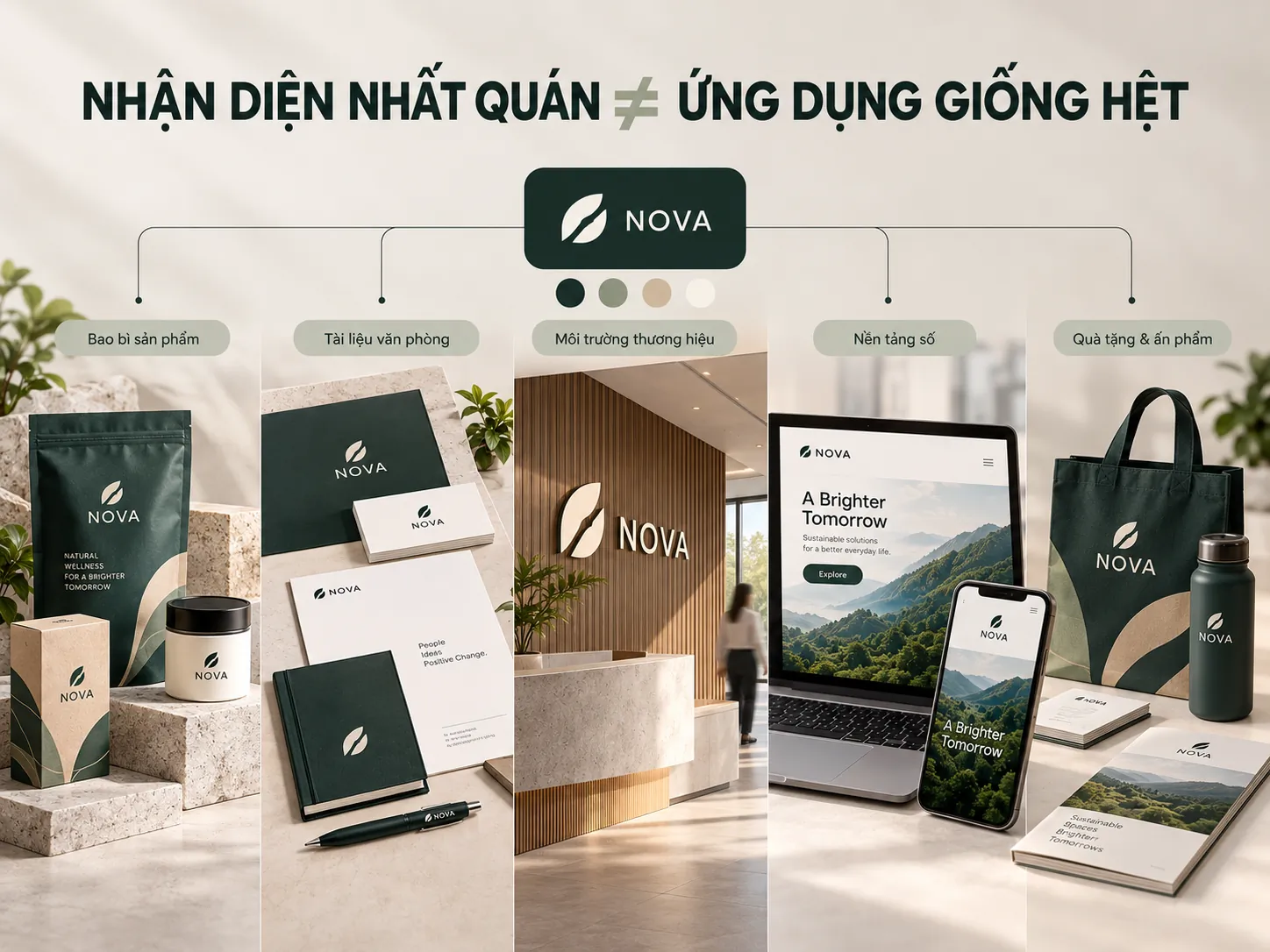 alt=”Brand identity applications deployed consistently across packaging, documents and digital platforms.” class=”wp-image-35437″/>
A brand does not appear only when customers look at the logo.
A logo may appear on the company profile, business cards, packaging, catalogs, uniforms, the website, social media or documents used with partners. Each touchpoint is another occasion on which the brand is recognized and interpreted.
This changes how a logo is viewed. Rather than treating the logo as the sole center of an identity, it can be seen as a visual signature within a larger system.
COMMON MISTAKE
“Designing one really good logo means most of the brand identity work is done.”
Why that is not enough
The logo is only one component of the system. If typefaces, colors, layouts, imagery, packaging and other applications share no common principles, the brand can end up expressed differently at every touchpoint. The problem is then not the logo itself but how well the whole identity system works.
A good system does not necessarily mean every application is identical. Consistency is not the same as uniformity. Each touchpoint can be expressed in a way that suits its own function, as long as shared identity principles still link them.
WHAT WE LOOK FOR
When evaluating an identity system, what to look at first is not whether each application looks “good” on its own, but whether they all speak about the same brand.
- Does the logo keep its character when size and context change?
- Do the identity elements form one unified visual language?
- Is the system flexible enough to work in both physical and digital environments?
If the answer is unclear, continuing to add design items may only make the system bigger without making it stronger.
4. The strength of an identity lies in consistency
When an identity appears repeatedly across many touchpoints, every appearance helps reinforce how customers recognize the brand.
That is why a brand does not need to keep announcing in words who it is. The care taken over the system can itself convey something about how the business organizes and presents itself to customers and partners.
This deserves particular attention for businesses operating in B2B environments. When customers judge not only the product but also operational capability, reliability and professionalism in communication, the brand identity becomes part of the overall experience of the company.
LESS EFFECTIVE
- Treating the logo as a standalone design item.
- Focusing on a beautiful presentation while barely testing how it applies.
- Designing each touchpoint in its own style.
- Building the identity after the strategy is almost finished.
STRONGER
- Treat the logo as one component of the brand system.
- Test the identity under real conditions of use.
- Build principles so that different touchpoints can still be recognized as one brand.
- Bring strategic direction into the formation of the visual language.
5. Choosing a design partner is choosing the ability to solve the problem
Brand identity design is an investment with a long period of use. So the criteria for choosing a partner should not stop at the ability to produce an attractive logo in a short time.
A business should consider whether a partner can place the design in a broader context: from the business problem, positioning and target customers to how the identity is deployed in practice.
CHECKLIST
Questions to ask:
- Does the partner start from the brand problem, or directly from the form?
- Has the logo been tested in real conditions of use?
- Does the identity system have enough principles for the business to keep operating it after handover?
- Does the design create a difference that suits the brand’s position, or only a difference in form?
A strategic partner does more than give a business another identity set. The greater value lies in how they connect brand strategy → visual language → application system → experience at touchpoints.
6. FreshBrand: repositioning the brand for CAMIMEX Group
One example given in the article is FreshBrand’s project for CAMIMEX Group, an export seafood group.
6.1. The situation: certified products, but an image that did not provide enough assurance
According to the case information provided, CAMIMEX Group has products that meet international standards such as ASC/BAP, but faced a problem with positioning and with how the brand was perceived in the EU market.
The old identity system was judged to carry a “mass-market domestic” visual language and to lack coordination between touchpoints. The task was therefore not simply to change the logo.
Context: CAMIMEX Group came to FreshBrand with a brand repositioning challenge in the context of its seafood export business.
Decision: FreshBrand carried out a Brand Audit and built a roadmap for intervening in both the visual positioning and the identity system.
Problem: The old identity system did not fully convey the image of capability and standards the business wanted to show.
Lesson: When a gap exists between real capability and brand image, redesigning a single symbol may not address the cause of the problem.

6.2. The strategy: more than redesigning the logo
FreshBrand carried out a Brand Audit to identify gaps in positioning. From there, the project was approached structurally rather than focusing on a single identity item.
Visual positioning
The design language moved from a purely naturalistic approach to a style the article calls “Precision Seafood”, focused on simplicity, transparency and sustainability in how the brand is expressed.
What stands out here is that visual positioning is not treated as a decorative trend. It needs to reflect how the brand wants to be seen within its industry and target market.
Identity system
The scope of deployment was extended from the logo to many touchpoints such as packaging, catalogs, the company profile and uniforms.
This moves the story from “designing a new logo” to “building a system that can operate.”
Credibility assurance
According to the case material provided, indicators of the production process and operating standards were built into the identity design to show the ability to meet international standards.
Here, brand identity acts as the link between what the business really has and what customers can recognize through touchpoints.
7. From logo to system: a more mature view of brand identity
A logo can be a starting point, but it should not be the end point of the brand identity problem.
The value of design shows more clearly when a symbol is placed in a system: one with strategy as its base, a visual language to express it, principles to operate by and the ability to adapt to many touchpoints.
KEY TAKEAWAY
A business does not invest in a logo to have one more image; it invests in an identity to create a system that lets its value be seen and recognized consistently.
So before starting a brand identity design project, the important question is not only “What should the logo look like?” but also:
What should this brand be recognized for, where does it differ, and which visual system can convey that consistently?
FRESHBRAND
If a business faces a new design or a repositioning of its identity system, the starting point should be the brand problem, not just the form.
FreshBrand can work at the level of strategy and positioning, and at turning strategy into an identity system that works across many touchpoints.