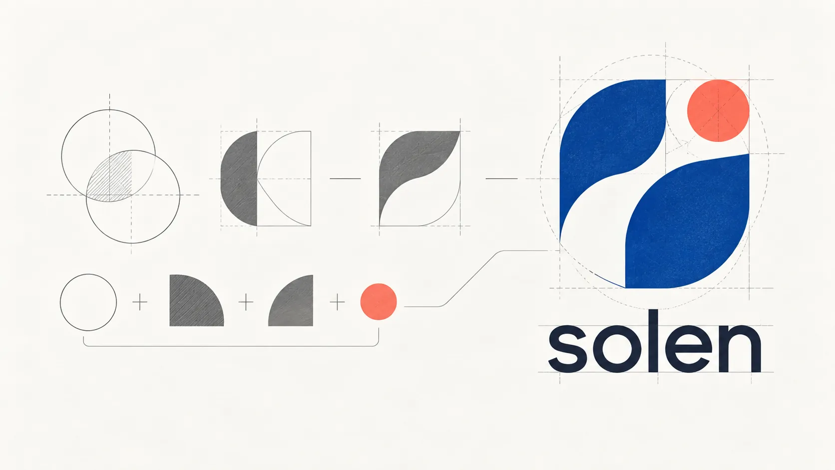
The core mistakes that should change how you think about corporate logo design
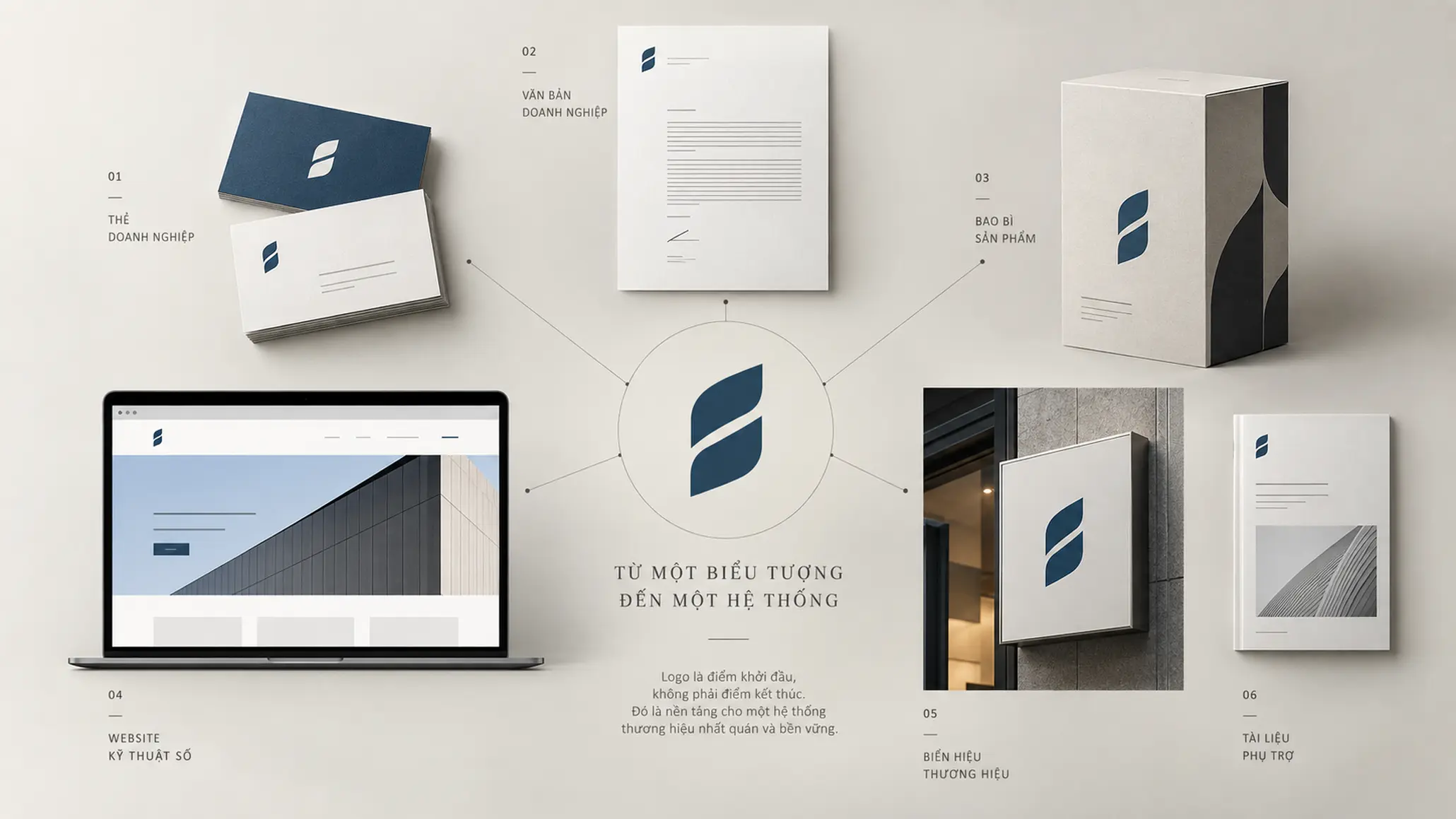
When a brand is being built or repositioned, the logo is often one of the first touchpoints people see. For exactly that reason it is also easy to judge wrongly: a business may spend a great deal of time on form and overlook the strategy behind the symbol. A logo that is visually attractive is not enough to become a valuable brand asset if it does not reflect the true nature of the business, does not make the brand recognizable and does not work well in practice.
KEY TAKEAWAY
A logo with commercial value does not begin with drawing something beautiful; it begins with understanding the business correctly and turning strategy into an identity system that can run for the long term.
Logo design should therefore not be seen as a standalone artistic problem. It is a decision about identity, differentiation, applicability and the brand’s consistency in operation.
No planning process or strategic research
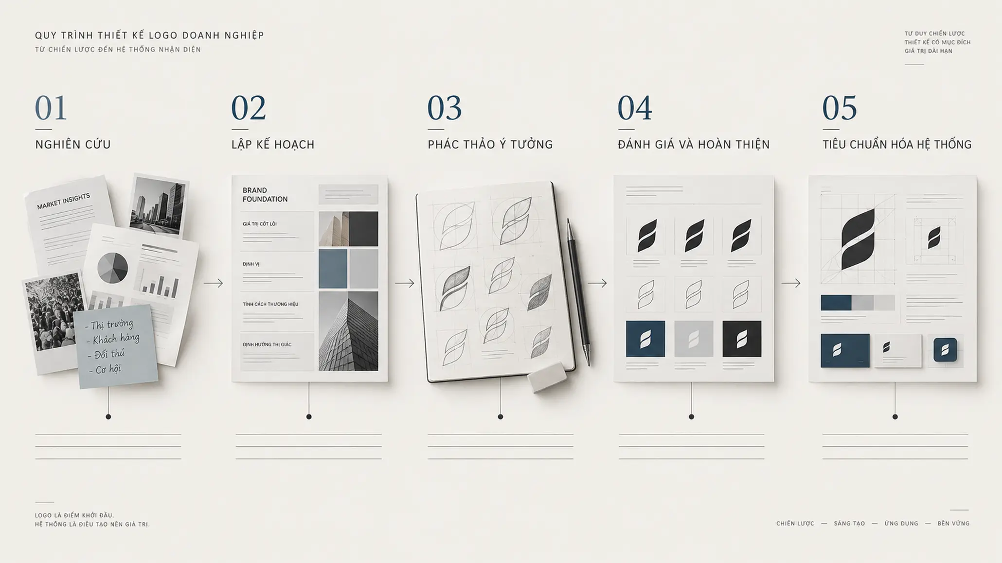
One of the most common mistakes is starting to design too early.
When a design team opens the software before understanding the business model, customers, market, growth direction and the position the business wants to occupy, every visual decision risks becoming a subjective choice.
A logo can be attractive, balanced and on-trend and still fail to solve the most important question: how and for what should this business be recognized?
PROCESS
- Research — Understand the business model, scope of operations, stakeholders and competitive context.
- Planning — Define the traits that must be translated into identity language before design begins.
- Sketching — Explore many directions of expression rather than locking early into the first visual idea.
- Evaluation — Test the idea on strategy, identity and applicability.
- Standardization — Turn the chosen option into a system of assets that can be used consistently.
Designing directly in software without a planning phase makes the tool the place where ideas form, instead of the means of realizing a thought already established.
Drifting from the core nature of the business
A logo does not need to tell the whole story of the business. But it does need a reason to exist.
A symbol can be minimal enough to consist of a single shape or a very simple mark. What matters is not the number of details but the link between that form and the nature of the brand.
Questions need to be asked before the first stroke is drawn:
- What value does the business actually create?
- Which trait does the brand want to be remembered for?
- What must be preserved as the business grows?
- What helps the brand avoid blending in with competitors in the same industry?
- Is the symbol conveying a strategic intent, or just producing an attractive image?
PRINCIPLE 01
The logo must come from strategy, not the other way around
When a symbol is developed from the nature of the business, the design has a basis for its decisions. Without that basis, every choice of shape, color or typeface easily becomes a matter of personal taste.
This is also why the brand’s intent must be distinguished from the viewer’s perception. A business may want its logo to express trustworthiness, innovation or professionalism, but viewers do not automatically understand that just because the internal team has attached those meanings to the symbol.
Losing enduring quality over time
Design trends are always changing. A style that is popular today can quickly become familiar or dated after a while.
The mistake is not in looking at trends. The problem appears when a trend becomes the main reason a logo is designed a certain way.
A brand needs a symbol that can keep working as the market, products, technology and communication channels change.
EXAMPLE
A logo may appear on a website today and on packaging, a company profile, sales materials or signage tomorrow. If its power to identify depends too much on one effect or one fashionable visual style, the adaptability of the whole system is limited.
This shows an important principle: an enduring design does not mean one that never changes, but one with a core structure strong enough to adapt without losing its identity.
Brands with long identity histories, such as Coca-Cola or Nike, are often cited in this context. What is notable is not simply the age of the symbol but the ability to keep its core identifying traits through many stages of development.
Getting lost in complexity and overusing color
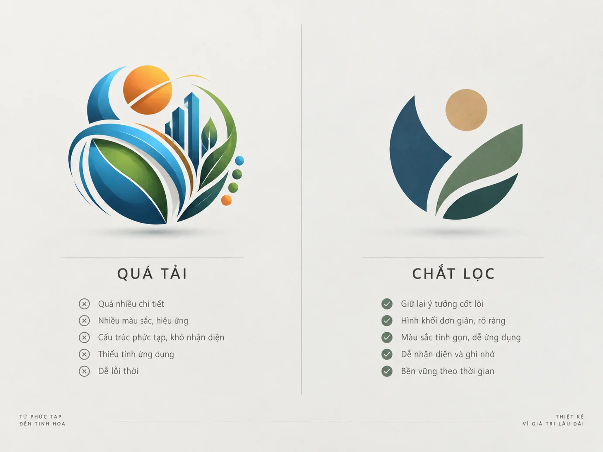
A logo with more components does not mean it better expresses the scale or capability of the business.
Conversely, too many shapes, colors, lines and effects can raise the cognitive load when viewers need to recognize the symbol quickly or at a small size.
COMMON MISTAKE
“The more details a logo has, the more investment it shows.”
Why it is not enough
Details only have value when they serve a clear function of identification or communication. When elements have no necessary role, they weaken memorability and make the logo hard to apply at different sizes or in different environments. Minimalism is therefore not arbitrary cutting; it means keeping the elements that are truly necessary.
Nike and McDonald’s are familiar examples of building recognition with relatively simple visual structures. Their power does not come from the complexity of the symbol.
Copying and losing originality
Looking at what the market is doing is part of the research process. But referencing and copying are two entirely different things.
A logo has identifying value only when it helps the brand stand apart from others. If the design sits too close to the visual language common in its industry, a business can end up with a system that looks “right for the industry” but is hard to remember as a specific brand.
LESS EFFECTIVE
- Picking imagery familiar to the industry simply because it is easy to associate.
- Relying on a design template that is popular in the market.
- Favoring the feeling of “looking like a professional brand” over the ability to differentiate.
STRONGER
- Study the identifying codes that already exist in the industry.
- Identify the elements to avoid in order to reduce the risk of blending in.
- Finding a direction of expression that fits the business’s own nature.
Originality does not mean forcing a strange form at any cost. It lies in building a mark that has a reason to exist and can be told apart in a real competitive context.
Overusing surface graphic effects
Gradients, drop shadows, 3D effects or complex layers of color can make a logo eye-catching in a presentation.
But an identity system does not exist only on a presentation screen.
A logo has to work across many platforms, sizes and materials. So before judging color effects, check the basic structure of the symbol.
FIELD NOTE
A useful test is to reduce the logo to a single color. If the structure still holds up as recognizable once color and effects are removed, the design rests on a fairly clear formal foundation. If the symbol is only convincing when it leans on surface effects, look again at its structure rather than adding more effects.
This is also why people often repeat a line from the design expert Jacob Cass: if a logo needs complex color effects to become a strong symbol, the problem may lie in the symbol itself.
Using an incompatible typeface
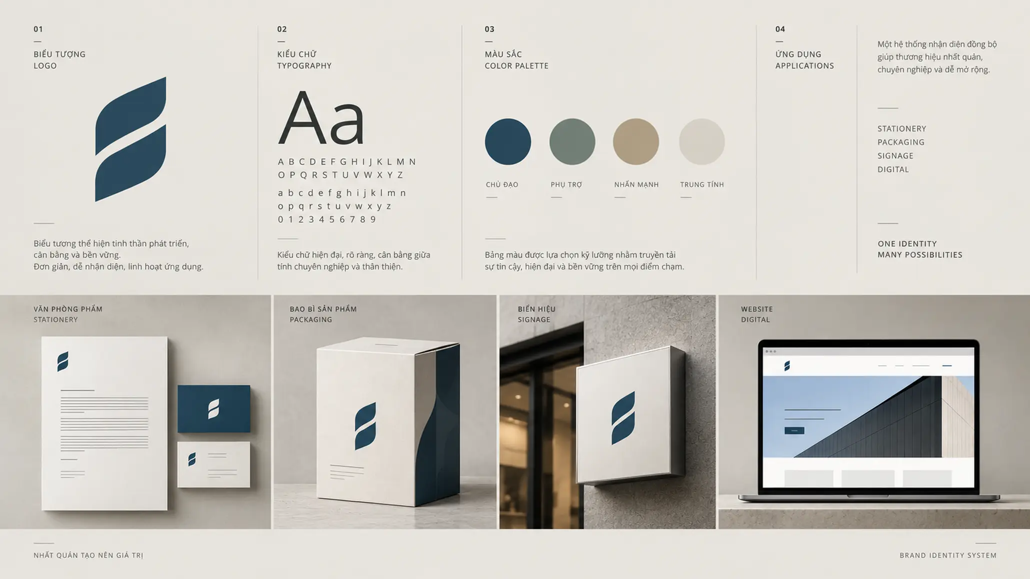
Typography is not an extra added after the symbol is finished.
In many cases the brand name and typeface take up most of the identity. An unsuitable typeface can create a mismatch between the image the business wants to build and the impression viewers actually receive.
A financial institution, a technology company, a household brand and a law firm may each need a different visual tone. No single typeface suits every industry.
What needs to be evaluated is the relationship between:
- the character of the typeface;
- the structure of the symbol;
- legibility;
- the context of application;
- and consistency with the brand positioning.
CHECKLIST
Questions to ask:
- Is the typeface suited to the nature and operating context of the business?
- Is the brand name legible at a small size?
- Do the wordmark and the symbol form a unified whole?
- Does the typeface still fit as the brand system extends to more touchpoints?
Rushing the schedule
One common misunderstanding is to treat design time as a direct measure of effectiveness.
A logo finished quickly is not necessarily a poor one. Conversely, a drawn-out project does not automatically produce a better result.
What matters is the time spent on the right kind of work: research, planning, exploring options, critique, testing and standardization.
Speed only means something when the process behind it is clear.
If time is cut by skipping research or application testing, a business may save time in the design phase but pay it back in revisions, rollout or redesign.
Breakdown in communication with partners
A logo is not created in a vacuum. It is the result of interaction between brand strategy, the design team and the people who know the business from the inside.
When communication breaks down, a gap easily opens between what the business wants to solve and what the design team is trying to express.
WHAT WE LOOK FOR
In evaluating a design direction, it is important not only to ask “is it beautiful?” but also to check:
- Which strategic problem does this idea come from?
- Does it help the brand be recognized or told apart better?
- In real rollout, where are its strengths and limits?
Effective feedback should therefore not stop at “I like it” or “I don’t like it”. Feedback needs to become criteria that can be explained and tested.
Wrong delivery formats and no system standards
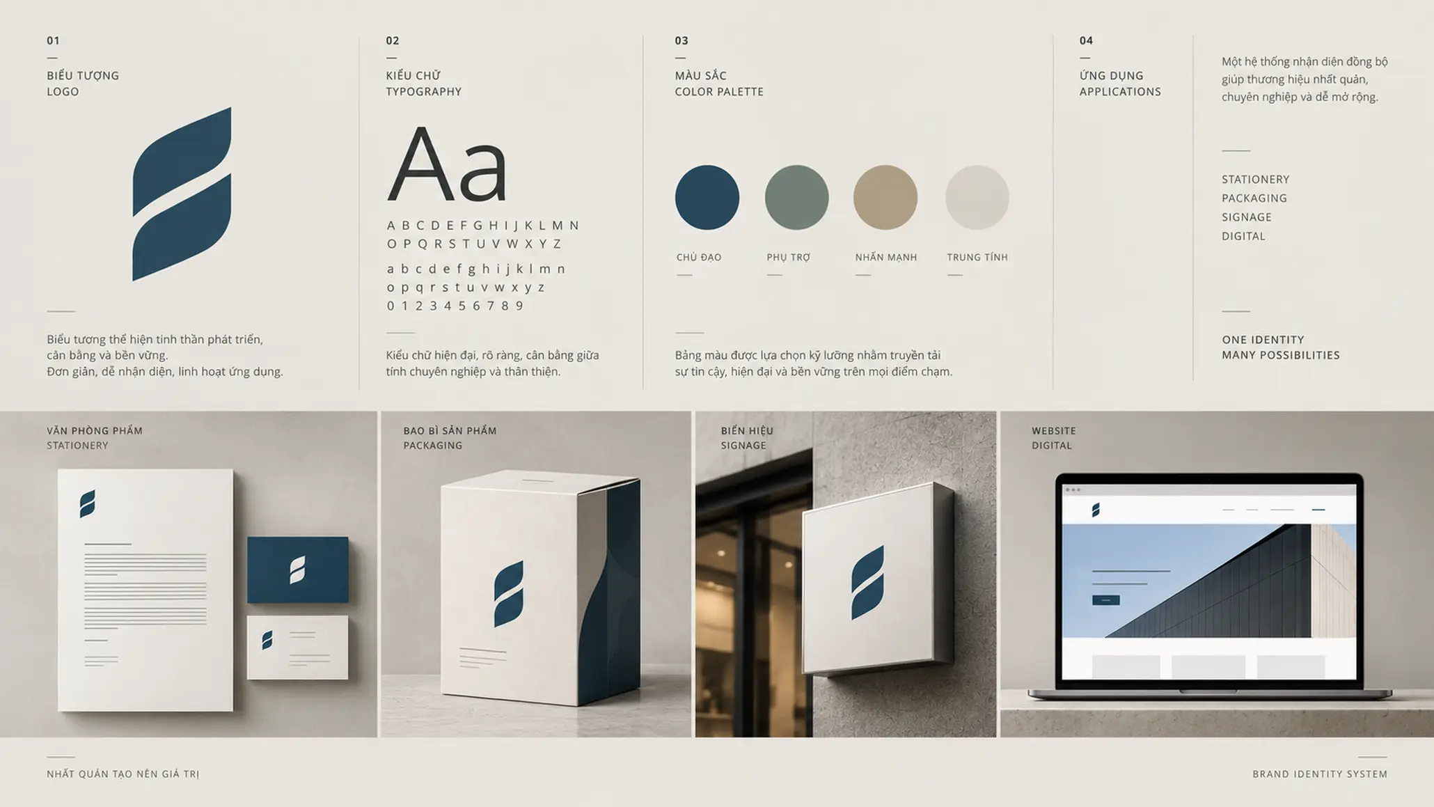
A logo finished on screen is not yet a complete identity system.
The business needs to be able to use this asset in many contexts: from business cards and office documents to packaging, signage, websites and large-format media.
That requires the design files to be standardized, with versions suited to each application need.
More important, the logo needs to sit within a clear system of standards. Brand guidelines define how the logo is used: clear space, proportions, colors, backgrounds, typefaces and the cases where it must not be used.
Without standards, an identity asset, however well designed, can still be distorted over the course of operations.
From an attractive symbol to a brand asset that can operate
Looking back over these mistakes, a logo’s problem rarely lies in form alone.
It usually starts with an earlier decision: the business has not defined how it needs to be recognized, does not understand which differences to protect, or has not seen the logo as one component of the whole brand system.
FRAMEWORK
5 questions before approving a logo
- Strategic Fit — Does the logo come from the nature and direction of the business?
- Recognition — Is the symbol clear enough to be recognized and remembered?
- Differentiation — Does it help the brand avoid blending into the market?
- Adaptability — Does the logo work well across many sizes, platforms and materials?
- System — Can the business build and maintain a consistent identity system from this logo?
These five questions do not replace research and design. They move the discussion from “is the logo beautiful?” to questions of more value for a brand decision.
PRINCIPLE 02
The logo is the starting point of identity, not the end point of design
A symbol only truly has value when it can leave the drawing board, enter the business and keep creating consistency over time.
FRESHBRAND
Before changing a logo, a business should start with a simpler question: what identity problem does the new logo actually need to solve?
From that answer, the research, direction and design can be set on a clear foundation, so the logo is not only attractive in a presentation but has a strategic reason to exist within the whole brand system.