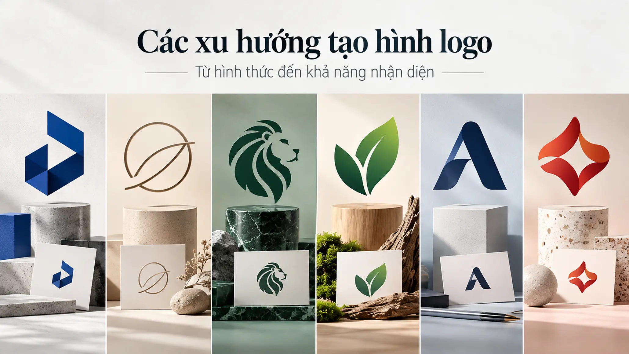
A logo is more than an image placed next to a company name. It is the point of recognition that lets customers connect an organization, product or service in a very short time. That is why logo design should not begin with the question “what looks good?” but with “how does the brand need to be recognized and remembered?” Without principles, a logo can look attractive and still signal the wrong field, be hard to remember, or fail to set the brand apart.
KEY TAKEAWAY
An effective logo is judged not only by whether it looks good, but by whether it represents the brand accurately, is easy to recognize and remember, and can be used reliably in many contexts.
1. What is a logo, and why does a business need a clear identity system?
A logo is a visual mark that represents a business, product or service. The mark can be made of lettering, a symbol, shapes, color or a combination of several elements.
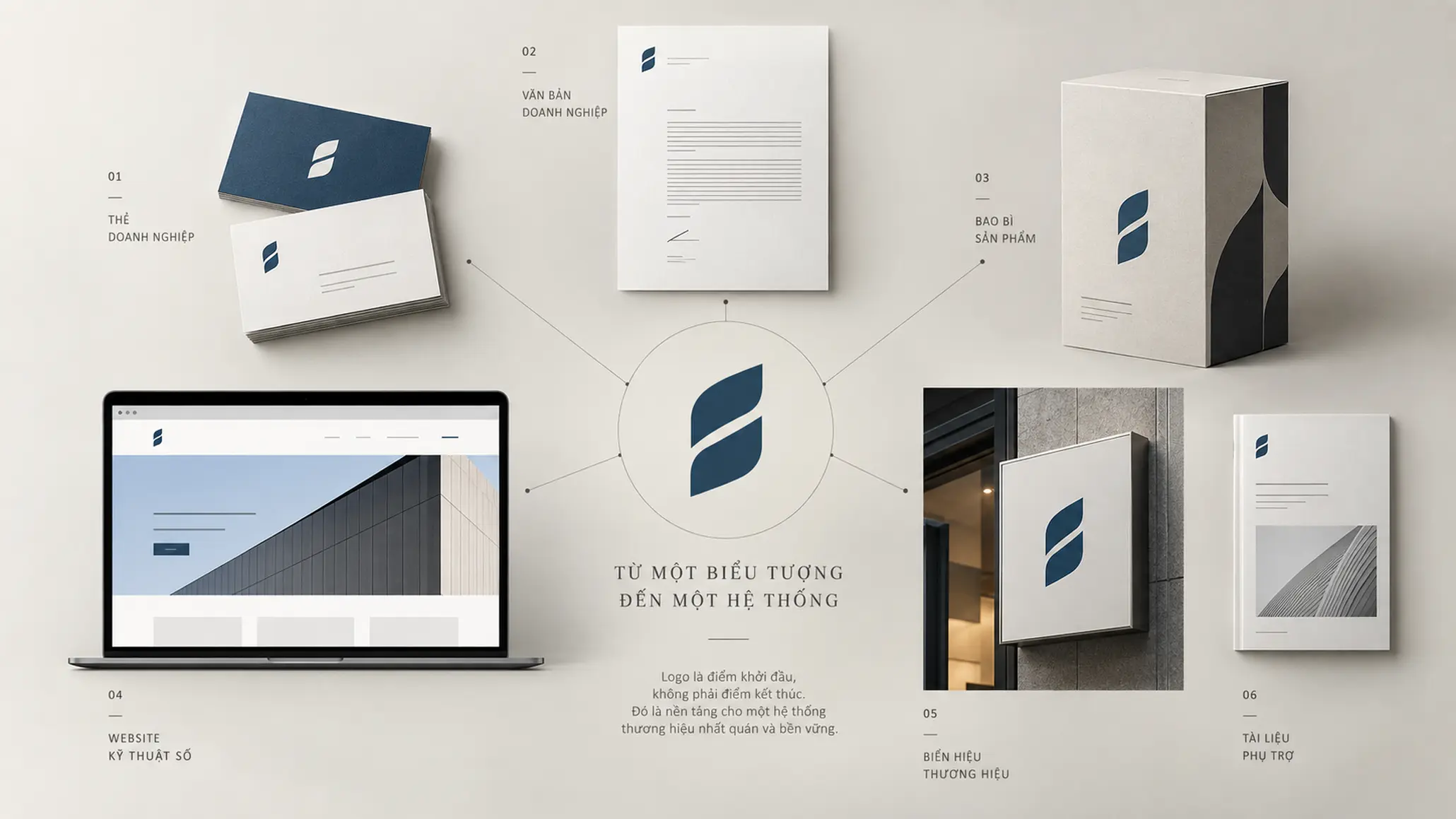
In building a brand, the logo acts as a visual point of contact. Whether it appears on a website, packaging, documents, signage, media or other touchpoints, the logo lets people recognize the source of the information they are receiving.
That said, a logo should not be equated with the whole brand. A brand also includes positioning, experience, products, ways of communicating and the associations formed in the customer’s mind. The logo is one part of the system that expresses the brand; it does not create all of the brand’s value on its own.
A logo must serve identity before it serves decoration
A good logo design should help people recognize and remember the business while creating associations that fit its field and brand direction. Aesthetic value matters, but it only means something when it supports the goals of identity and communication.
2. Core principles of logo design
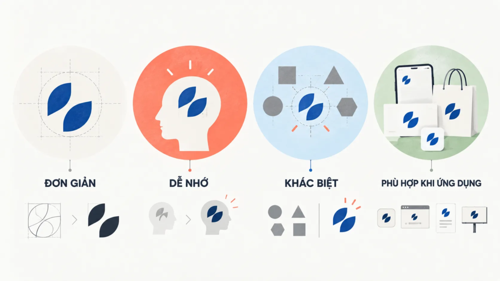
Logo design is a deliberate process. Rather than relying entirely on intuition, the designer needs to control a few foundational principles so that the final mark is both recognizable and useful over the long term.
2.1. Simple enough to recognize
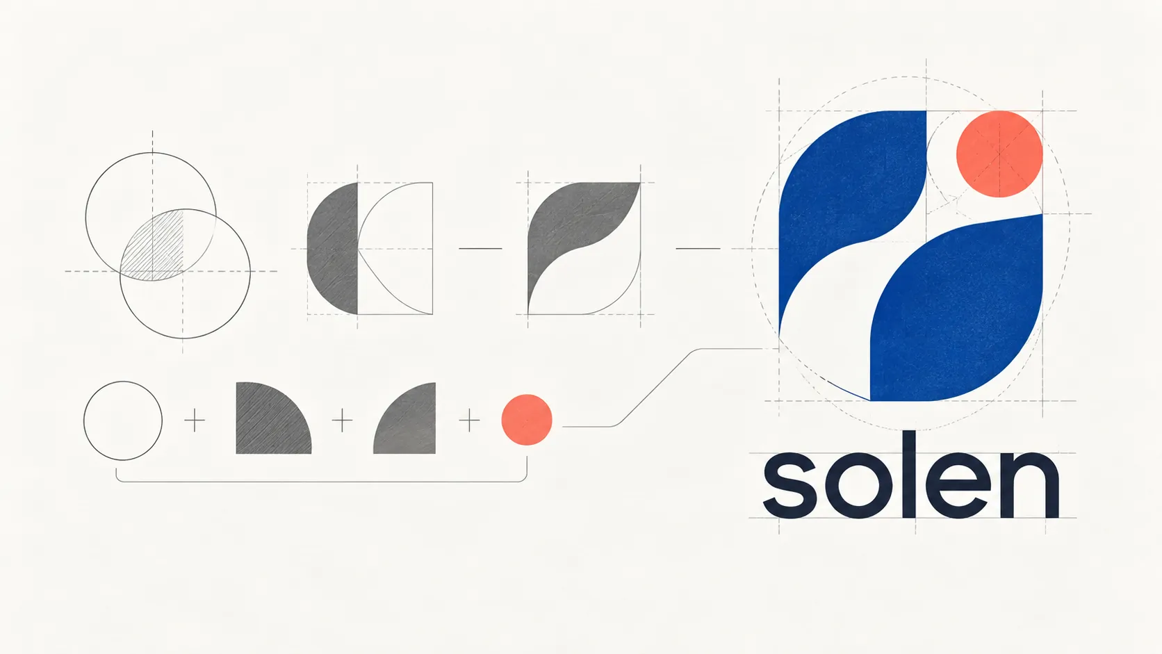
Simplicity is one of the most important principles of logo design. A logo with too many details, lines or ideas at once can make it hard for the viewer to tell which trait is the main one to remember.
Simplicity does not mean stripping a logo bare. Real simplicity means removing what is unnecessary to keep the structure with the highest recognition value.
When a logo is scaled down, printed in one color or seen for only a moment, its core traits still need to hold. This is why a design with few details but a clear structure usually has an advantage over one that tries to tell too many stories through imagery.
EXAMPLE
Imagine a business whose logo contains a name, a symbol, a slogan, many colors and many images all at once. The viewer may sense that the design is trying to convey a lot, but not know which element to remember.
This shows that the issue is not whether a logo has few or many components, but how well it organizes and prioritizes visual information.
A good logo needs to identify which element is the main source of identity and which details can be left out.
2.2. Memorable, not merely striking
A logo can grab attention immediately and still be hard to remember afterward. This is an important difference between instant impact and lasting recognition.
Memorability is usually supported by a clear visual structure, a distinctive identifying trait and consistent use. Adding many effects or unusual details therefore does not automatically make a logo more memorable.
COMMON MISTAKE
“The more details a logo has, the more of the brand’s value it can express.”
Why this is not enough
A logo has to work when the viewer has little time to look. When too much information is placed in one mark, recognition can be diluted. It is better to settle on one or a few visual traits clear enough to become the memorable cue.
2.3. Distinctive, with a reason
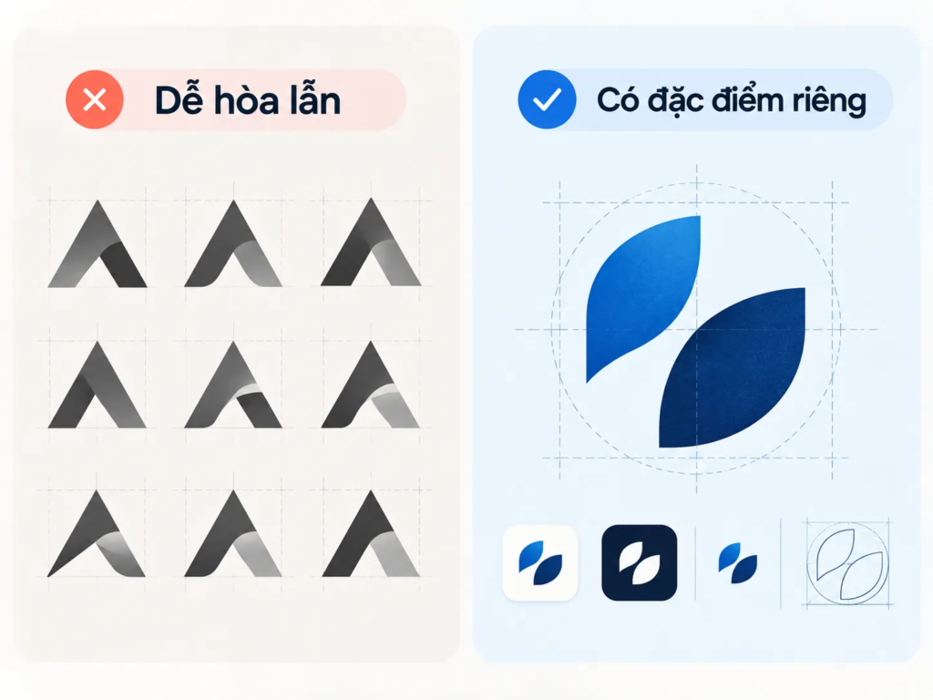
In a market with many businesses in the same field, a logo needs to be able to set the brand apart from the other choices.
Being different, however, does not mean deliberately creating a strange image. A distinctive form is valuable when it also fits the nature, direction and competitive context of the brand.
If a business uses symbols that are too common in its industry without treating them in its own way, the logo can become hard to tell apart. Conversely, if it forces a difference with a form unrelated to the brand, the design can become confusing.
[COMPARISON]
LESS EFFECTIVE
- Choosing a familiar symbol only because it is commonly used in the industry.
- Adding more details to create a feeling of difference.
- Favoring novelty without testing how well it fits the brand.
STRONGER
- Identify which trait should help the brand be recognized.
- Find a distinctive way to express that idea.
- Check clarity, memorability and distinctiveness together.
2.4. Appropriate to the brand and the context of use
A logo does not exist on its own on a design presentation board. It will be used in many environments and at many sizes.
A logo may appear on screens, documents, packaging, signage or other touchpoints. The design should therefore be considered from the start with application in mind.
2.5 Three questions to test a logo design
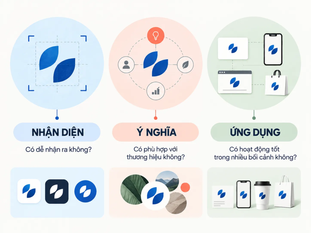
This checklist helps evaluate a logo beyond the feeling of “good-looking or not.”
- Recognition: Can viewers tell this is a mark that belongs to the brand?
- Meaning: Does the form create associations that fit the brand and its field?
- Application: Does the logo keep its structure and recognizability when the size, color or context of use changes?
If a design is strong in only one of the three respects, the design process still needs further review.
3. How does a logo represent a brand?
A logo represents a brand by creating a consistent visual mark. When that mark is repeated across many touchpoints, viewers have the chance to form a link between the image and the business.
This explains why a simple symbol can become very powerful when it is used consistently over a long period.
Take Nike’s Swoosh or the “M” of McDonald’s: both are widely recognized visual marks. What is worth noting is not only the shape of the symbol, but the process by which these marks became tied to the brand and to the experience it provides.
For this reason, you should not expect a new logo to be recognized instantly the way brands built over a long time are. A logo is the starting point of the process of identification, not the whole process.
FIELD NOTE
In design practice, a useful question is this: if you remove the brand name from the logo, does the symbol still have enough character to be recognized? The answer will not always be “yes,” but the question tests how much the design depends on the lettering and how well it creates a mark of its own.
4. What do these principles mean for a logo designer?
To create a logo with a sound basis, the designer needs to combine observation, visual thinking and design technique.
Observation helps the designer understand the characteristics of the field, the competitive context and the elements that can become raw material for the form. An aesthetic sense helps organize shape, proportion, color and typography. Knowledge of tools and technique then turns the idea into a design system that can be put to work.
But software skill is not the only deciding factor. A designer can be fluent with the tools and still produce a logo with no direction if they do not understand the problem the design has to solve.
WHAT WE LOOK FOR
One point to examine early in logo design is whether the idea is leading the form or the form is leading the idea.
- Check whether the logo starts from a clear identifying trait.
- Observe which details are truly necessary for the idea.
- Try placing the design in different contexts of use before judging it finished.
5. Creativity does not mean copying what looks different
One of the key requirements of logo design is creating a mark with its own character. This means the designer must avoid depending on symbols, shapes or treatments that are too familiar.
Creativity, however, does not mean constantly searching for a form that has never appeared before. In brand design, what matters more is how the designer organizes and interprets the problem into a mark that suits the brand.
PROCESS
- Discovery: Identify the business, products, services and the problem the logo needs to represent.
- Selection: Identify the traits that carry recognition value and remove unnecessary information.
- Design: Develop the form, lettering, proportion and color from the chosen idea.
- Testing: Evaluate recognizability, memorability, distinctiveness and application across contexts.
- Refinement: Adjust the system so the logo can be used consistently, rather than looking good only in a presentation.
6. A beautiful logo is not yet an effective logo
A successful logo balances creativity and professionalism. If it focuses only on aesthetics, the design may be attractive but fail to solve the identity problem. If it focuses only on function, it may be clear but lack the character that helps a brand leave an impression.
This is why logo evaluation should start from the question of role rather than personal taste.
CHECKLIST
Questions to ask:
- Does the logo help the brand be recognized clearly?
- Does the form fit the brand and its field of activity?
- Is the design simple enough to remember and use?
- Does the logo create a difference instead of blending in with competitors?
- When the size or context of use changes, does the identifying trait still hold?
7. Conclusion
The core principles of logo design are not a set of rules that limit creativity. On the contrary, they give creativity a basis for going in the right direction.
A logo needs to be simple without being dull, distinctive without being arbitrary, memorable without relying on effects, and appropriate to the brand while staying flexible enough for real use. Above all, logo design should be seen as one component of a brand system, not an image made only to look good.
FRESHBRAND
If you are evaluating a logo design, start by identifying where it needs to help the brand be recognized, through which trait, and in what context of use.
When these questions are answered first, the design process has a clearer basis, and judging options no longer depends only on whether something feels “good-looking” or not.