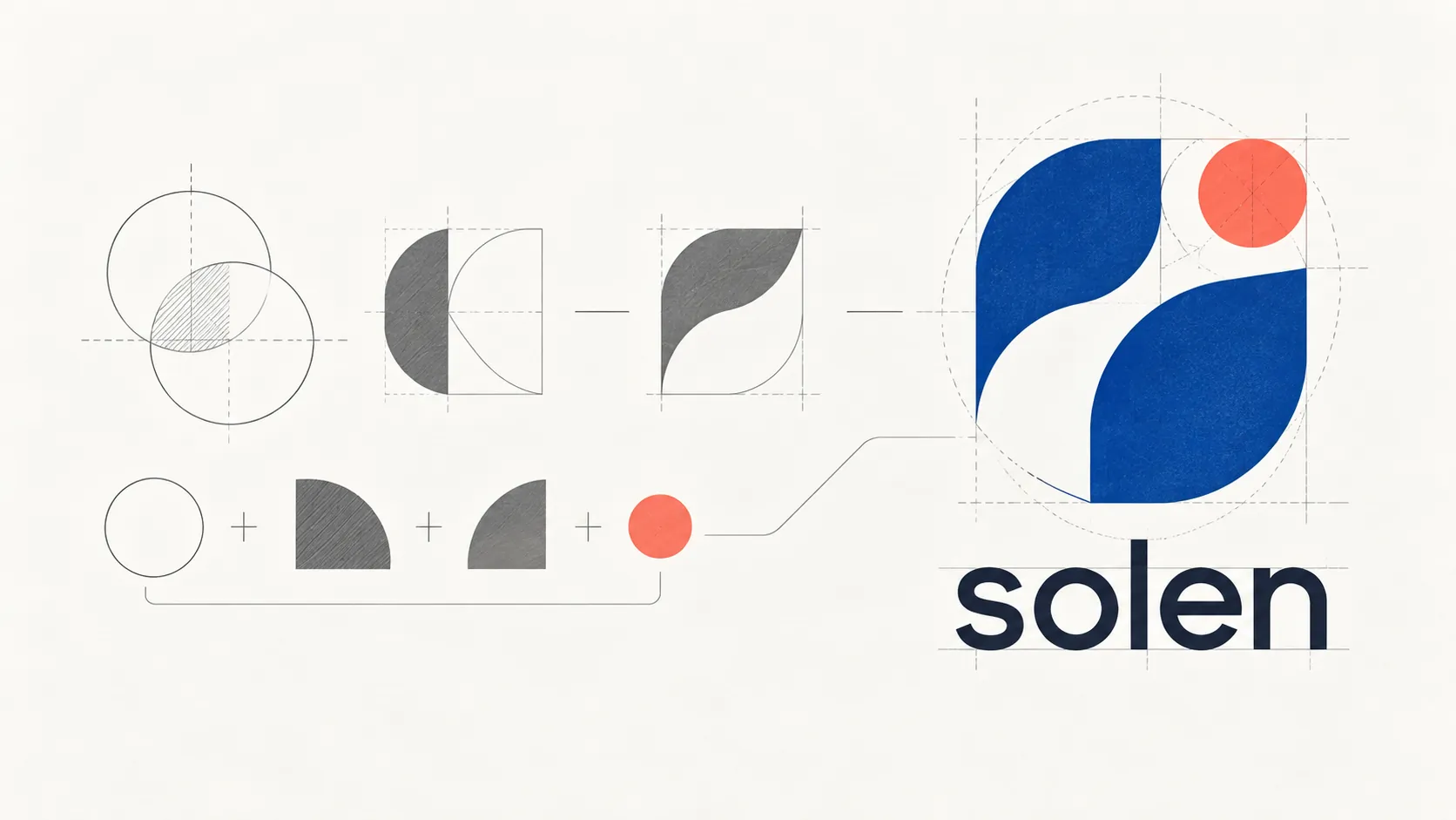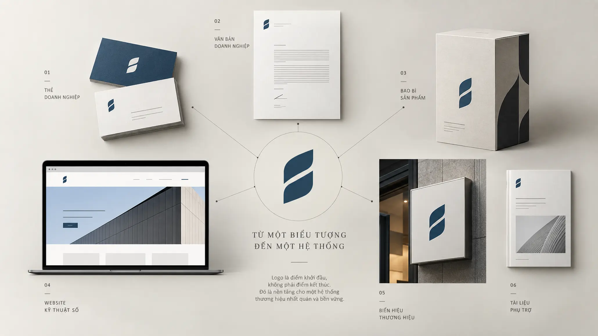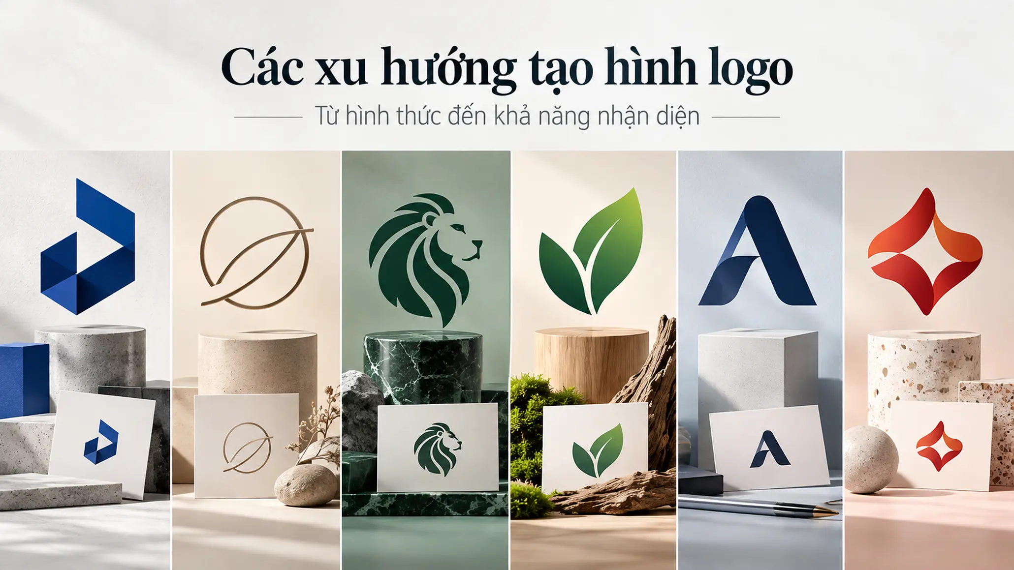
In logo design, form is not simply a matter of picking an attractive symbol. Shape, line, proportion, negative space and the way visual elements are combined all affect how people recognize and remember a brand. A logo can be built from a water-drop shape, minimalist lines, an animal symbol, a stylized letter or familiar characters. Whichever form is chosen, though, it has to start from the brand’s characteristics and the purpose of the identity, not from chasing a visual trend.
KEY TAKEAWAY
Effective logo form is the process of distilling an image into a recognizable structure that has its own character and fits the brand strategy.
What is form in logo design?
Form in logo design is the process of organizing visual elements such as lines, geometry, letters, signs and stylized images into an identifying symbol.
The same subject shaped in different ways can create different impressions. A symbol built with minimalist lines usually comes across differently from one that uses many color layers, gradients or natural imagery. The difference lies not only in appearance but also in complexity, recognizability and how the symbol is used in practice.
The choice of form should therefore not rest on the designer’s taste alone. The form needs to fit the line of business, the brand personality, the target customers and the traits the business wants the public to remember.
Form must serve recognition
A form trend can attract attention without necessarily producing an effective logo. If the symbol is too complex, lacks a structure of its own, or depends entirely on color effects, recognition can drop when the logo is reduced in size, printed in one color or used on different materials.
Conversely, a simple form can still leave its own mark if it is built from deliberate proportions, lines and geometric relationships. The point is not to reduce detail at all costs but to keep the elements truly needed for the symbol to be recognized.
1. Designing a logo around a water-drop shape
A water-drop shape has a fairly recognizable structure, usually a tapered tip and a widening body. By combining several drops, a designer can develop symbols that suggest convergence, flow or the relationship between different components.
This form can be considered in fields where the image of a water drop fits the product, the activity or the brand message. But a water-drop shape should not be assumed to always represent a particular industry. The meaning of a symbol also depends on how it is formed and the context in which it is used.
One advantage of the water-drop shape is that it can develop into a standalone symbol. A designer can adjust proportions, tilt, curves or the way shapes are combined to create a structure of its own.
Drop shadows or gradients can be used to add depth to an image. Even so, the main shape must remain clear enough once these effects are removed. If a symbol is recognizable only because of its effects, the logo’s identity structure is not yet sound.
2. Shaping a logo with minimalist lines
PRINCIPLE 01
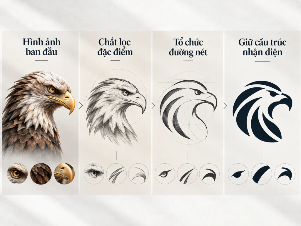
Reduce detail without losing the identifying features
Form built from minimalist lines focuses on using curves, straight lines and negative space to create a symbol with a clear structure. Instead of describing an object in full, the designer picks the features most essential for viewers to recognize the image.
This approach calls for control over proportion, stroke weight and the relationship between components. As the number of details falls, each remaining line plays a bigger part in shaping the whole form.
A minimalist symbol can be applied across business cards, documents, packaging or digital interfaces. But usability does not come automatically from using fewer strokes. The symbol still needs to be tested at different sizes and display conditions to make sure the important details are not lost.
FIELD NOTE
In distilling an image, a single curve can decide whether the symbol is recognized as a specific object or just a generic shape. Removing detail is part of the work; deciding which details must stay is the part that takes more thought.
3. Using animal symbols in logo design
The animal symbol is a common form, in which the image of an animal is used directly or stylized into an identifying mark. Depending on the treatment, the symbol can emphasize the overall silhouette, a distinctive part or a recognizable pose.
Animal imagery tends to evoke associations with the character, behavior or traits of the animal. A powerful-looking animal, for example, can suggest strength, while a bird in flight can suggest movement. These are possible associations, not fixed meanings that every viewer interprets the same way.
Choosing an animal as a symbol should therefore rest on its connection to the brand’s traits. If an animal is chosen only because the image is eye-catching or popular, the logo may lack a link to the brand positioning and struggle to create a distinguishing mark.
How the image is treated also matters a great deal. A detailed illustration may suit a painting or an advertising image but not necessarily work as a logo. Simplifying the shape, controlling proportion and identifying the key identifying feature make the symbol more concise.
4. Distilling an image into a symbol of its own
FRAMEWORK
Three factors to control when distilling an image
The process of simplifying an image into a logo can be examined through three factors:
- Core feature Identify the part of the shape or the detail that lets viewers recognize the subject.
- Visual structure Organize curves, proportions, negative space and components into one unified shape.
- A distinguishing mark Adjust the form so the symbol is not only easy to recognize but also has its own character suited to the brand.
A rustic, simple form does not mean using rough shapes at random. In removing secondary details, the designer must understand the structure of the subject and identify which element decides how recognizable it is.
When turning a detailed image into a symbol, for example, a designer might keep the distinctive outline, a tilt, or the relationship between two shapes. The remaining elements should be removed if they do not contribute significantly to recognition.
The fewer the details, the greater the demand for precision in proportion and line. A small change in a curve or a gap can noticeably alter how the symbol is perceived. Minimalist form therefore calls for observation, sketching and revision, not just a reduction in the number of components.
5. Using imagery from nature
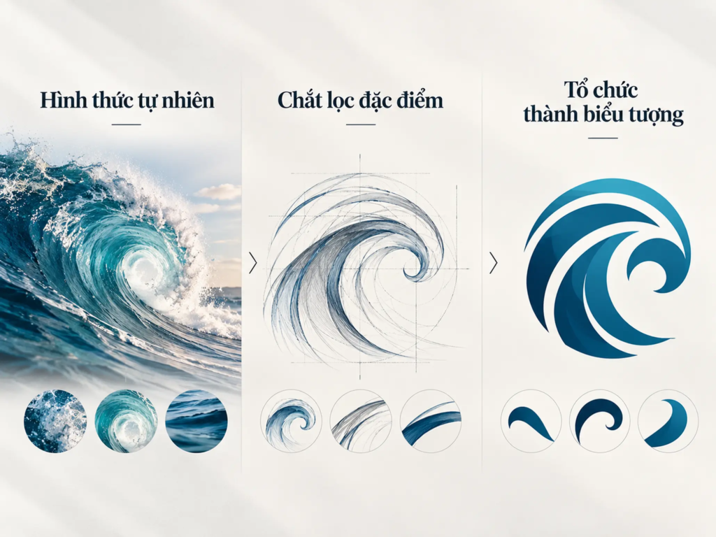
Nature offers many forms that can be a starting point for logo design, from paint drops, spirals and whirlpools to circles of light. These images can keep some of their natural character or be reorganized into orderly geometric structures.
What deserves attention is how an observed image is turned into an identity form. A natural spiral can be reduced to curves with a clear rhythm. A drop of paint can become the basic shape from which a symbol is developed. The process does not have to reproduce the original object exactly, but it needs to keep the features that matter to the final form.
LESS EFFECTIVE
- Copying a natural image as it is without defining which features to keep.
- Putting so many details into the symbol that the main shape is hard to recognize.
- Relying on color effects to stand out instead of building a clear structure.
STRONGER
- Choose visual features that suit the meaning to be expressed.
- Reorganize the image with deliberate lines and shapes.
- Keep enough features for the symbol to have its own character and stay recognizable when simplified.
A natural image is only a starting point. The value of a logo lies in how the designer converts that image into a structure that suits the brand, rather than just reproducing the beauty of the original subject.
6. Stylizing letters into images
Letters can play two roles in logo design: they spell the brand name and they can become part of the symbol. When a designer adjusts the shape of a letter, combines strokes or makes use of the space around them, the character can suggest other images while keeping its link to the original letter.
A letter can be treated to suggest an eye, a nose, an ear or a mouth. In other cases, two characters can be combined into a single form. The lettering and the image then support each other instead of existing as two separate components.
This form opens up many creative possibilities, but it also makes one important demand: viewers need to recognize the structure of the letter or understand the link between letter and image. If the stylization goes too far, the original character may be lost, leaving the symbol unable to convey its intended meaning.
EXAMPLE
Hypothetical example: A business whose name begins with the letter A wants to develop its logo from that character. The designer can work with the apex, the two diagonal strokes and the space in the middle to form a symbol with its own structure.
If the new form still keeps the character of the letter A, viewers can see the link between the symbol and the brand name. If, on the other hand, the strokes are altered too much, the image can become confusing or lose its clear tie to the name.
This example shows that stylizing a letter is not just a matter of distorting a typeface. It is the process of controlling the relationship between legibility, visual form and identity.
7. Using gradient and transparency effects
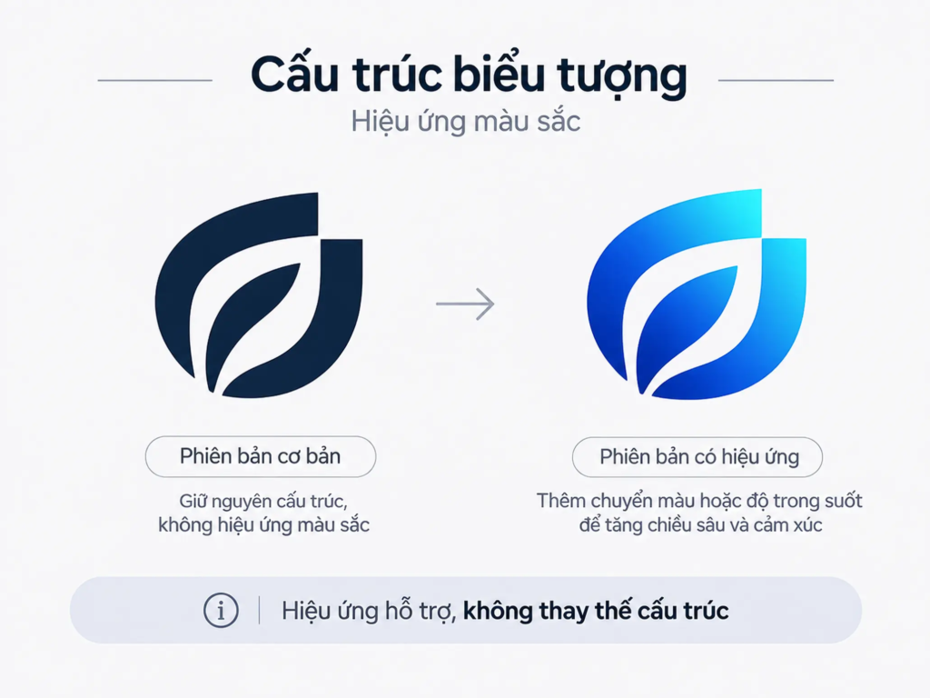
COMMON MISTAKE
“The more color layers and effects a logo has, the more it stands out.”
Why it is not enough
Gradients, transparency and overlapping shapes can create a sense of depth or make an image livelier. Visual effects, however, cannot replace the structure of the symbol. If the main shape is unclear, adding more color will not necessarily make the logo easier to recognize.
One design direction mentioned in this field is the use of transparent color layers to create overlapping areas. The MSN logo is an example often linked with this use of color in identity. However, this example alone is not enough to conclude that gradient or transparency effects suit every brand.
When considering effects, the designer should look at both the primary form and the real conditions of use. A logo may appear on screens, be printed on documents, or be used where only one color is allowed. If the symbol cannot keep its structure once the effects are removed, its usability is limited.
So build the core shape first, and then assess whether color effects really contribute to how the brand is expressed.
8. Using special characters
Familiar characters from written language and digital communication, such as the @ sign or punctuation marks, can also become components of a logo. Used with intent, they can suggest a field, a way of expressing something, or a trait in the brand name.
Unlike using an ordinary pictorial symbol, this form draws on shapes viewers already know. A designer can adjust the proportions, alter part of the structure or combine the character with other elements to create a new identity form.
Still, a familiar character does not automatically create difference. If it is used as it is, without a treatment of its own, the symbol may lack the traits to set it apart from other common uses.
The value of this form lies in the relationship between the shape of the character, its associations and the brand’s traits. The treatment needs to be clear enough for viewers to recognize the character, and deliberate enough for it to become an identity component rather than mere decoration.
9. Using simple shapes with a clear typeface
Another form focuses on simple shapes combined with a legible typeface. Instead of creating a complex symbol, the designer uses concise visual components and controls the relationship between the image and the brand name.
Simple shapes cut unnecessary detail, while the typeface gives direct information about the name. The two can complement each other if proportion, spacing and prominence are organized sensibly.
Simple, however, does not mean using any basic shape. A circle, a square or a line becomes a useful component only when the way it is organized suits the logo’s structure and contributes to its identity.
FIELD NOTE
When evaluating a logo that combines a symbol and lettering, look at both components separately and at the whole. The symbol may be easy to recognize but not suit the typeface; conversely, the brand name may be easy to read while the graphic part lacks a connection to it. A good structure lets the components support each other without reducing how recognizable each part is.
How to choose the right form for your brand
No single form trend suits every business. Water-drop shapes, animal symbols, minimalist lines and stylized letters are all options worth considering, but each should be assessed against the identity goal and the conditions of use.
Before choosing a design direction, a business needs to define what the logo must help the public recognize, which brand traits it should express, and in what contexts it will be used. These requirements narrow the creative range and give a basis for evaluating the options.
CHECKLIST
Questions worth asking:
- Does the form suit the line of business and the traits of the brand?
- Is the symbol clear enough for viewers to recognize when it is reduced in size?
- Do the details contribute to recognition, or are they only decorative?
- Are the letters, characters and symbol combined in a sensible way?
- With the color effects removed, does the logo still keep its main structure?
- Can the logo be used on different materials and platforms without losing its important features?
A form should be judged by how well it meets these criteria, rather than only by whether it is novel or on trend.
Logo form is a design decision tied to brand strategy
Form is an important part of the logo design process, but it should not be separated from brand strategy. The visual form needs to reflect the traits the business wants to build and support how the public recognizes the brand. A beautiful symbol with no clear link to the brand is not necessarily the right choice.
Form trends such as minimalist lines, animal symbols, natural imagery, stylized letters and color effects each offer a different approach. What decides the quality of a logo is not which trend is in use but how the designer selects, organizes and controls the visual elements.
FRESHBRAND
When evaluating or building a new logo, start with the question of what identity the brand needs to create, and only then choose a fitting form of expression.
Linking brand strategy to identity design gives a business a clearer basis for choosing a form, assessing usability and keeping consistency as the brand develops.