Is it time to redesign your logo? Why, and how to do it right
A logo may have suited a business perfectly when it was created, but that does not mean it will always suit it. As the business grows, customers change, new competitors enter the market or the brand is expressed differently than before, the logo can fall out of step with the rest of the system. So the important question is not “Is the new logo better looking?” but “Is the current logo still doing its job?”
KEY TAKEAWAY
A logo redesign should not start from the wish for a new image, but from working out whether the current logo still suits the business, its customers and the way the brand needs to be recognized.
- If the problem lies in a few details, a refresh may be enough.
- If the brand direction has changed profoundly, a full redesign may be the better fit.
When should a business seriously consider redesigning its logo?
A strong logo can last a very long time. Some brands succeed with their first logo and adjust it very little as they grow. But in many cases a logo does need updating to keep pace with changes in the business, the market and the design environment.
This is especially visible in businesses with a long history. A design made many years ago may have fit the communication system of its time, yet struggle to appear on today’s websites, mobile devices, social media or other digital touchpoints.
More importantly, an old logo is not necessarily a “bad” logo. The question is how well the logo fits the brand the business is becoming.
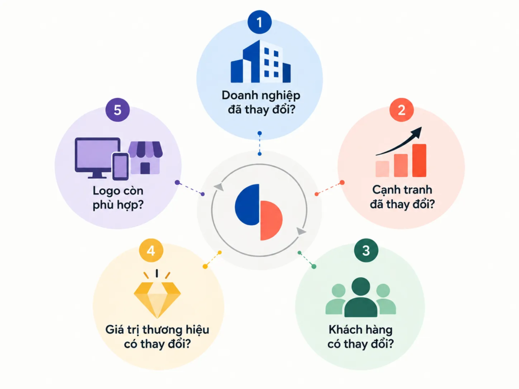
5 questions to ask before redesigning your logo
FRAMEWORK
5 questions to check how well your logo fits
Before starting a redesign project, look at the current logo from the point of view of the business and the brand, rather than judging it only by aesthetic impression.
- Has the business expanded or changed? Changes in products, services, size or scope can leave the old logo no longer reflecting the business accurately.
- Has the competition changed? The arrival of new competitors may mean the brand needs to revisit how it is recognized in its industry.
- Have your customers changed? When a business starts reaching a new group of customers, the identity system needs to be reassessed for how well it connects.
- Have the values or mission changed? If the company’s character and direction differ from when it was founded, the logo should be reviewed in that light.
- Does the logo still suit the environments where it is used today? A design that once suited traditional media may struggle when it has to work across many sizes and digital platforms.
1. Has your business expanded or changed?
A business can change in many ways. You may have added a new product line, expanded operations, moved headquarters or grown your team.
These changes do not automatically mean the logo must be redesigned. But they are a signal to ask whether the current image still describes the scope and character of the business accurately.
FIELD NOTE
A logo created for a business in its early stage often has to solve a different problem from the logo of the same business after many years of growth. When the scope of operations changes, what needs to be examined is the relationship between the logo and the current brand system, not just the symbol itself.
2. Do you have new competitors?
More competitors does not mean a business has to change its logo. But a shift in the competitive context can expose limitations that were not clear before.
If the brand needs to show a different position, or wants to be recognized more clearly in its industry, the logo may be one of the things to consider.
In this case, a redesign should not aim merely to produce an image that is “newer” than the competition’s. The goal is to make sure the identity fits the position the brand wants to build.
3. Are you talking to a new customer?
A business may have a long-standing, loyal group of customers and, at the same time, want to reach new groups of consumers.
In that case, a logo redesign can become part of adjusting how the brand communicates. But it is a balancing act: the new image should open a connection with new customers without necessarily denying the relationship existing customers have already built with the brand.
COMMON MISTAKE
“To reach younger customers, you need a younger logo.”
Why that is not enough
A customer’s age does not by itself decide what a logo should look like. What matters more is understanding which values new customers use to recognize a brand, in what context and across which touchpoints. If a business only shifts its visual style to follow a trend, it may end up with a new logo that still has not solved the brand problem.
4. Have the brand’s values or mission changed?
As a business grows, its character, direction and view of itself often change too.
A company may start as a small operation and later grow into an organization with substantially different products, services or scope. If the brand direction has changed, the logo needs to be placed in that new context as well.
A logo does not exist on its own. It is a visual expression of the brand. When what the brand wants to represent has changed, how well the old logo fits needs to be reassessed.
5. Is your logo getting old?
This is a simple question, but it should not be read only as “Is the logo aesthetically outdated?”
A logo created many years ago can run into problems in environments that were not considered when it was designed. Phones, tablets, websites and other digital platforms require an identity that works flexibly across many sizes and contexts.
So a logo’s age is a signal to check, not an automatic reason to replace it.
Logo redesign or just a logo refresh?
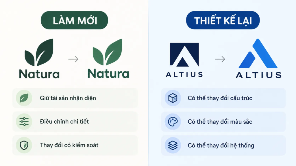
If one or more of the questions above show that the logo needs review, the next step is to determine how much change is needed.
Not every problem calls for a full redesign. In some cases a business only needs to refresh the elements it already has. In others, a new identity system has to be built from the foundation up.
LESS EFFECTIVE
- Treating every old logo as one that needs replacing.
- Judging the new design mainly on how fresh it feels.
- Changing the whole system when the problem lies in just a few elements.
STRONGER
- Pinpoint the exact problem the current logo is having.
- Distinguish between problems of aesthetics, usability and brand direction.
- Choose a degree of change that matches the problem to be solved.
What is a logo refresh?
Refreshing a logo is the less dramatic approach. Instead of discarding the whole system, the designer keeps the elements that have value and adjusts them so the logo fits the present better.
The changes may be in color, typeface, layout or how simple the form is.
One example mentioned in the source material is MasterCard’s logo update in 2016. The brand kept its two circles and distinctive colors, and brought the brand name into a more modern typographic treatment.
What is notable about this approach is that change does not have to erase what customers already know. The value of the identity can be kept while its form is adjusted.
When does a logo need to be redesigned?
A logo redesign has a wider scope. It can include a new message, a new color palette or a completely different way of presenting the brand. In some cases, changing a brand can even involve changing the company name, as in the example of Federal Express becoming FedEx, mentioned in the source material.
This is a decision with greater impact, because a new logo does not change just one visual element; it can change the relationship of recognition between the brand and its customers.
Before choosing this route, three more questions need to be asked.
3 questions before making a major logo change
1. Where exactly is the current logo not working?
This is a question that should be answered with a specific problem.
Does the logo no longer reflect the business? Does it not suit new customers? Is it hard to use on digital platforms? Or has the internal team simply grown bored with it?
If the problem is not identified, a redesign easily becomes a decision based on taste.
PRINCIPLE 01
A redesign only makes sense when it solves a real problem
A new logo does not automatically create a better brand. The value of a redesign lies in making the identity fit the business, its customers and the touchpoint system the brand needs to operate in.
2. Which elements of the current logo should be kept?
Even once a redesign has been decided on, you should not assume that every old element has lost its value.
Perhaps the current colors have become an important identifying signal. Perhaps the typeface, the way the name is capitalized or a certain structure has already been remembered by customers.
Before taking the logo apart, you need to identify which elements are doing a good job of identifying and representing the organization.
3. Is the current logo closely tied to your customers?
This is one of the most important risks in changing an identity.
Customers do not simply see a logo. Over time they build a visual association between the logo and the business, its products, their experience and everything else they know about the brand.
A strong change can weaken that familiar association. So a business should consider how existing customers will recognize the change, and how much change is appropriate for the brand’s goals.
CHECKLIST
Questions to ask:
- What specific problem is the current logo having?
- Which elements of the old logo carry recognition value?
- How strong is the existing customers’ connection to the old logo?
- What degree of change is needed to solve the problem without creating unnecessary risk?
Where should a logo redesign process begin?
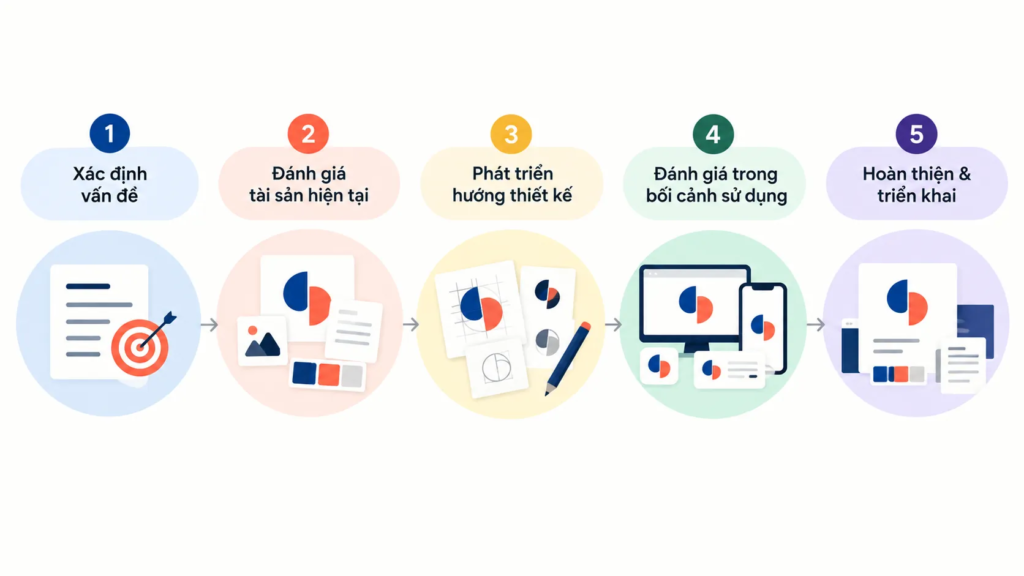
Only after the reason for the change is identified, the context researched and the degree of change decided should the business move into the design process.
The process can start from the current logo, but the evaluation should not simply be to set new options beside the old one and ask which looks better.
PROCESS
- Define the problem — Clarify why the current logo needs to be reviewed and which problem the new design must solve.
- Assess the current identity assets — Identify which elements create recognition and which no longer fit.
- Develop the design direction — Build options based on the brand direction and how the logo will be used, rather than simply looking for a different form.
- Assess in the context of use — See how the logo performs at the touchpoints the brand actually needs to use.
- Finalize and roll out — Settle the new identity system and prepare the transition from the old logo to the new one.
WHAT WE LOOK FOR
When evaluating a redesign option, what matters is not how different the new logo looks from the old one, but how it represents the brand and whether it works well within the system.
- Check the relationship between the logo and the brand direction.
- Check how recognizable the elements that are kept or changed will be.
- Check which touchpoints will be affected when the new identity is rolled out.
Don’t use the old logo as the only yardstick
A new option can look very different from the old logo and still suit the brand better. Conversely, an option that changes a great deal has not necessarily solved the problem.
The question should shift from “Is the new logo better looking than the old one?” to “Does the new logo represent the brand more accurately and work better?”
This keeps the evaluation from being driven entirely by feelings about a familiar image.
Don’t decide too fast just because it feels fresh
Changing an identity often stirs strong feelings. A new design can feel exciting because it is different. But that same difference can leave the team worried that the brand has changed too much.
So the decision should not be settled on first reactions alone. Taking time to look at the design again once the initial emotion has settled can help a business see more clearly why it wants to change.
Take the whole brand system into account
A logo does not sit alone on a sheet of paper.
A change in color or design style can bring changes to brand assets and marketing materials with it. If the new logo is significantly different, the business may have to update more touchpoints than expected.
The degree of change to the logo therefore needs to be considered together with how well the whole system can implement it.
EXAMPLE
Imagine a business that decides to change its logo and, at the same time, adopt a completely new color palette. The task is then no longer just replacing the symbol on the website. The new colors and identity may need to be updated in email signatures, documents, social media platforms and other brand assets.
This shows that a logo redesign always carries an implementation problem. A design may be right in concept and still cause difficulty if the business has not prepared for the scope of change that comes with it.
How do you avoid ending up with a bad logo after a redesign?
One of the risks of a redesign is focusing too much on creating a sense of newness.
When a business has put a lot of time and resources into a project, it is easy to feel the new logo must prove itself by being clearly different from the old one. But difference is not the only criterion.
A new logo should be judged in relation to the brand, its customers and the environments where it is used. The change needs a reason, rather than being made only to show that the business has done a new project.
COMMON MISTAKE
“The more different the new logo is from the old one, the more successful the redesign.”
Why that is not enough
How different a design looks does not tell you whether it is the right one. A logo can change a great deal and still fail to solve a problem of recognition, direction or usability. Conversely, a controlled change can be enough to move the identity system into a more suitable stage.
What to do once you have a new logo

Having a new logo is only the start of the transition.
The business needs to decide how the new logo will go into use. It can be rolled out over a period of time, or a target date can be chosen for the switch and the official announcement.
Whichever route is chosen, the rollout should be managed as a transition of the identity system, not just the swapping of a logo file.
FRAMEWORK
Map of the transition from the old logo to the new
- Decide the timing — Determine how and when to introduce the new identity.
- Take stock of touchpoints — Identify where the current logo appears across communication and operations.
- Update everything in step — Change the logo across the platforms and documents that need it.
- Check the identity experience — Make sure the new logo is used consistently after the transition.
Touchpoints can include email signatures, the website, social platforms such as Twitter, Facebook and LinkedIn, and the business’s other documents or brand assets.
A clear transition plan helps reduce the situation where the old and new logos coexist in the system without any intent.
A logo redesign is not a race to get a new image
A logo can be an important identity asset, but it should not be changed just because the business feels it needs something fresh.
A well-founded redesign decision usually starts from real changes: the business has grown, the competitive market is different, customers have changed, the brand’s values have shifted, or the logo no longer works well in the environments where it is used today.
From there, the business can decide whether it needs a partial refresh or a full redesign.
The most important thing is to understand what you are changing, why it needs to change and what should not be lost along the way.
FRESHBRAND
If your current logo has been around for many years, start by evaluating it in the context of today’s brand rather than rushing to ask for a new design.
An effective redesign looks at the brand direction, recognizability, the relationship with customers and the whole touchpoint system the logo has to work in, all at the same time.