Brand repositioning: 5 strategic lessons from controversial identity changes

Brand repositioning usually begins with a reasonable question: is the current brand still right for the business and the market? But the answer does not necessarily lie in swapping an old logo for a new one. For brands that have built recognition over many years, every color, typeface, symbol or visual structure may already be part of their perceptual assets. Changing an identity is therefore not simply a design decision; it is a decision about how a business preserves, adjusts or restructures what the market has already remembered.
KEY TAKEAWAY
A successful repositioning is not about creating an entirely new image. It is about identifying exactly what needs to change and what must be kept, so that the brand is still recognized, understood and better suited to its new direction.
Why repositioning should not begin with the question “Does the new logo look better?”
One of the most common mix-ups in brand renewal is equating rebranding with redesign.
A redesign mainly addresses how a brand is expressed visually. Repositioning at the strategic level asks a broader question: how the business wants to be seen, whom it serves, on what basis it competes and which perceptions it needs to change in the market’s mind.
The two processes can happen together, but they do not always have to.
A brand can change its strategy and adjust its identity only slightly. Conversely, a logo can be replaced while the brand’s standing barely changes.
The key point lies in the relationship between strategy and expression.
If the strategy changes but the identity cannot express the new direction, the brand can start to look dated. But if the identity changes while the strategy, the experience and the core values stay the same, the business risks opening a gap between what the brand wants to say and what customers actually recognize.
PRINCIPLE 01
Repositioning is managing a change in perception
A good identity system does not just make a brand look different. It has to help the market understand the brand more accurately while keeping enough of the signals needed to recognize it.
This is why controversial identity changes are worth studying: not because a logo is “ugly” or “beautiful,” but because they show the cost of changing perceptual assets without being clear about what each asset does.
1. Pepsi: Renewal has to start from understanding the value of heritage
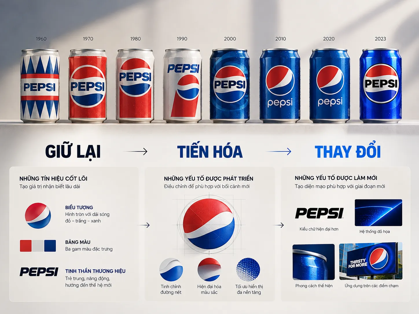
Pepsi is a special case because the brand has evolved its identity many times rather than holding on to a single unchanging symbol. In 2008, Pepsi rolled out a new look as part of a multi-year program of brand reinvestment.
It is worth noting that Pepsi itself later continued with an approach of evolution grounded in the brand’s history. For its global redesign in 2023, PepsiCo described a process that began with studying the brand’s history and then connected that heritage to its direction for the future.
This leads to a principle more important than the 2008 logo story:
A long-established brand never starts from a blank page.
The customer’s mind already holds a large store of memories about the brand: colors, shapes, typefaces, packaging, sounds, the experience at the point of sale and countless earlier encounters.
When a new design removes too many familiar signals at once, the business is not just “refreshing its image.” It is asking customers to learn the brand all over again.
FIELD NOTE
In identity refresh projects, a more useful question than “Should we keep the old logo?” is usually this: “Which parts of the current system create recognition that we cannot afford to lose?” Only then can we decide what to preserve, what can evolve and what really needs to be replaced.
Strategic lesson: Inheriting does not mean being conservative
An identity system can be modernized and still keep the brand’s important signals.
That is the difference between evolution and replacement.
Evolution looks to increase relevance without breaking the whole stock of recognition built up so far. Replacement starts over almost from scratch and therefore demands a much stronger strategic reason.
The question is not whether a brand is allowed to change.
The question is: what is the business changing, for what reason, and which values are being put on the scale?
2. Kraft: When the visual system no longer delivers speed of recognition
The Kraft story is often cited in discussions of controversial logo changes. When analyzing this case strategically, however, we need to avoid turning an aesthetic reaction into an absolute conclusion about business performance.
A more worthwhile question lies at a deeper level: how many elements of an identity system are truly necessary for consumers to recognize the brand?
In a highly competitive environment, consumers do not take in each design element the way a designer would analyze it. They take in an overall image and use familiar signals to recognize a brand quickly.
PRINCIPLE 02
Recognition is a function, not a feeling
A design can look good standing alone and still be weak in a real competitive setting.

A logo on a large presentation slide is one thing. A logo on packaging, on a shelf, in a mobile app, on signage, in a small ad or in an interface with dozens of other brands is another.
That is why an identity should be evaluated in real conditions of use, not by looking at the logo alone.
LESS EFFECTIVE
- Judging the logo mainly on its own.
- Focusing on the number of details or how “impressive” the design looks.
- Treating aesthetics as a proxy for how well the identity works.
STRONGER
- Test recognition in a competitive environment.
- Identify the visual signals that carry value before simplifying or replacing them.
- Evaluate the system across many sizes and touchpoints.
Strategic lesson: Simplify to improve recognition, not to follow a trend
Simplification is valuable when it makes the brand easier to recognize, easier to use and easier to keep consistent.
But “simple” is not in itself a strategic goal.
A logo stripped down so far that it loses its important distinguishing features can still be a weak system. Conversely, a system with many components that are clearly organized can still produce a strong identity.
So the question should not be:
“How many details can we remove?”
It is:
“Which details are actually doing the work of identification?”
3. Animal Planet: When the form no longer speaks for the brand’s purpose
Animal Planet is a useful example for looking at the relationship between Purpose and Visual Identity.
The old identity, with its globe and elephant, created a direct association with the animal world. When the system changed, the debate around the new identity pointed to an important issue: once descriptive visual cues are removed, a brand needs other mechanisms to carry its meaning.
This does not mean a brand about animals must use an animal in its logo.
A brand can express its purpose through typography, color, imagery, motion, experience or a system of language.
But if none of these components is clearly tied to the brand’s direction, the identity system becomes a layer of aesthetics standing outside the strategy.
EXAMPLE
Imagine two brands that both declare they want to create an entirely new position in the market.
Brand A changes its logo, colors and typography, but its experience, its communication and its product structure stay almost the same.
Brand B also changes its identity, but at the same time adjusts how it tells its story, its digital touchpoints, its brand spaces and related expressions so that they all point toward a new positioning.
Both may end up with a logo that is better than the old one. But a logo alone cannot produce the shift in perception that the strategy requires.
Strategic lesson: Purpose must be translated into a system of expression
Purpose should not live only in a brand statement.
If purpose really matters, it has to be translated into decisions that can be observed: how the brand speaks, how it appears, what it designs, which experiences it prioritizes and how consistent it is.
An identity is therefore not an illustration of purpose.
It is one of the means by which purpose becomes recognizable.

AOL is a notable case because its new identity system was designed to be flexible, with a lowercase wordmark and a dot, combined with a range of different backgrounds. The debate around this system raises a broader question: how flexible can a brand be before consistency starts to erode?
This matters more and more in the digital environment.
A modern brand has to appear on websites, apps, social media, ads, video, products, physical spaces and interfaces of many different sizes. That is why an identity system needs to be flexible.
But flexible does not mean endlessly customizable.
FRAMEWORK
Three layers to balance in a flexible identity system
- Recognition — Users must still recognize the brand even when the context changes.
- Consistency — Touchpoints must share a few common rules so that they feel like they belong to the same brand.
- Flexibility — The system must be able to adapt to different environments and content.

If you optimize only for recognition, the brand can become rigid.
If you optimize only for flexibility, the brand risks becoming unstable.
If you optimize only for consistency, the system can become monotonous and hard to adapt.
The value lies in the architecture of the system, not in a single logo.
FIELD NOTE
One telling sign when evaluating an identity system is whether it can produce many different expressions and still make people feel they belong to the same brand. If every application looks good but they have no clear relationship when placed side by side, the problem may lie in the system rather than in any single design.
Strategic lesson: Consistency does not mean repetition
A consistent brand does not necessarily use the same layout everywhere.
Consistency can come from typography, color, proportion, imagery, motion, the way the logo is used, tone of voice or other visual rules.
What a business needs to build is a shared frame of reference, not a design template copied again and again.
5. GAP: A lesson in the risk of changing perceptual assets too fast
The 2010 GAP case is often mentioned when discussing the risk of a sudden identity change. The brand introduced a new logo in place of its familiar mark, then quickly went back to the old one after strong public reaction.
What stands out here is not only that the new logo drew a reaction.
It lies in the speed of the decision and how many brand assets are changed at once.
When a symbol has been in use for a long time, its value does not live only in the logo file. It lives in stores, packaging, advertising, clothing, websites, customers’ memories and countless other touchpoints.
Changing it therefore always has a cost.

COMMON MISTAKE
“The new logo has to look very different for the market to notice that the brand is changing.”
Why it is not enough
How different a design looks is not a measure of how well a repositioning has worked. A big change makes sense only when it solves a strategic problem big enough to justify it. If the business has not made clear which assets to keep, which to change and which perceptions it wants to shift, then the larger the change, the more the risk of a break deserves attention.
Strategic lesson: A brand audit must come before a brand redesign
Before deciding to change its identity, a business needs to understand what the current system actually does.
Not just asking:
- Is the current logo old?
- Are the colors outdated?
- Is the typography modern?
But asking:
- By which signals do customers recognize the brand?
- Which signals carry high recognition value?
- Which factors are holding back the new positioning?
- Which touchpoints are inconsistent?
- Where is the gap between the desired positioning and the current perception?
- Which components can evolve rather than be replaced outright?
This is the difference between redesigning an identity and managing brand assets.
Each brand has its own context, so the cases are best looked at one by one. We cannot simply conclude that a new logo failed because the public reacted to it, nor can we attribute a company’s entire business results to a single identity change.
But the debates around these cases are still valuable because they raise the same question:
Has the business identified the right problem before changing how the brand is expressed?
CHECKLIST
Questions to ask:
- Is the brand changing because the business strategy has changed, or only because the identity looks old?
- Which identity assets are creating recognition?
- Which perception does the new positioning ask customers to change?
- Does the new system help the brand get recognized in a competitive environment?
- Can the new identity work consistently across all touchpoints?
- Has the business tested the system before rolling it out widely?
Repositioning is not a contest to find a new logo
PRINCIPLE 03
The value of repositioning lies in the gap between strategy and perception
If a business wants to change how the market sees it, it first has to understand how the market sees it now.
Only then can we define the gap to be crossed and the degree of change the brand system really needs.
WHAT WE LOOK FOR
In brand strategy practice, the first thing to look at is not whether the new logo is more attractive than the old one. What matters more is whether the new system solves the problem the business actually faces.
- If the problem lies in positioning, design cannot solve it on its own.
- If the problem lies in the identity, we need to pin down exactly which assets are weak.
- If the problem lies in consistency, replacing the logo alone is usually not enough.
- If the problem lies in the experience, a new identity cannot replace improving the touchpoints.
That is why repositioning should be seen as a brand management decision before it is carried out as a design project.
How much should the business change?
There is no fixed ratio for how much a brand should change.
Some cases call for an almost complete transformation. Others need only an adjustment to typography, color, visual structure or the way the system is deployed in digital environments.
What decides it is not whether the change is big or small.
It is about whether the degree of change matches the strategic gap to be closed.
A brand that is losing its competitive edge because its positioning is out of date needs a different approach from a brand whose only problem is how well its identity works on digital platforms.
That is why, before writing the brief for a redesign project, a business should settle three points:
Where the brand stands today → how it wants to be perceived → which systems need to change to close that gap.
FRESHBRAND
Brand repositioning is a decision about the future, but it must always begin with a proper understanding of the assets that exist today.
FreshBrand approaches identity from the standpoint of brand strategy: define the problem, clarify the positioning and assess the role of the identity system before moving on to visual expression. If your business is considering an identity change, the first step is to ask the right questions before designing the answers.