Product packaging design: a visual touchpoint and a launchpad for brand strategy
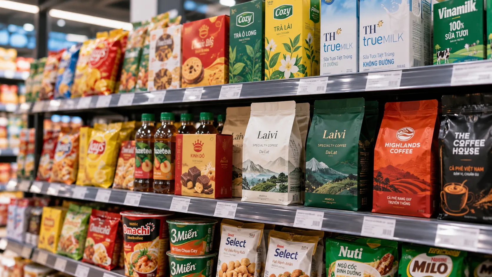
In a retail setting, consumers do not meet brand strategy as a positioning statement or a set of guidelines. They meet the brand first through what is in front of them: color, structure, typography, imagery, information and the way the product sits on the shelf. Packaging therefore does not only solve the problem of protecting the product. It is a touchpoint where brand positioning has to be turned into visual signals, a usage experience and a purchase decision.
KEY TAKEAWAY
Effective packaging is not the packaging that grabs the most attention, but the packaging that conveys the right value to the right audience in the right context of use, quickly, consistently and with purpose.
Packaging starts not from design but from a brand problem
One of the common mistakes in packaging design is to start from the question: “What should the packaging look like?”
The more important question should be: “What should the packaging make consumers understand, feel and do?”
This difference seems small but determines the whole approach.
If a business sees packaging only as a graphic asset, the design process tends to focus on color, imagery, typefaces or visual trends. The result may look good on the surface without necessarily solving the problem of identification, differentiation or positioning.
Conversely, when packaging is treated as a component of the brand system, the design has to answer several questions at once: who the product is for, what context it competes in, which value takes priority, what must be recognized first, and which elements must be kept so the brand can grow later.
PRINCIPLE 01
Packaging is where brand positioning meets buying behavior
Positioning exists at the strategic level, but consumers experience it through specific signals. Packaging is one of the clearest places where strategy turns into something that can be seen, touched and used.
Good packaging design is therefore not simply an aesthetic problem; it is the problem of turning strategy into experience.
Three lenses for evaluating a packaging design
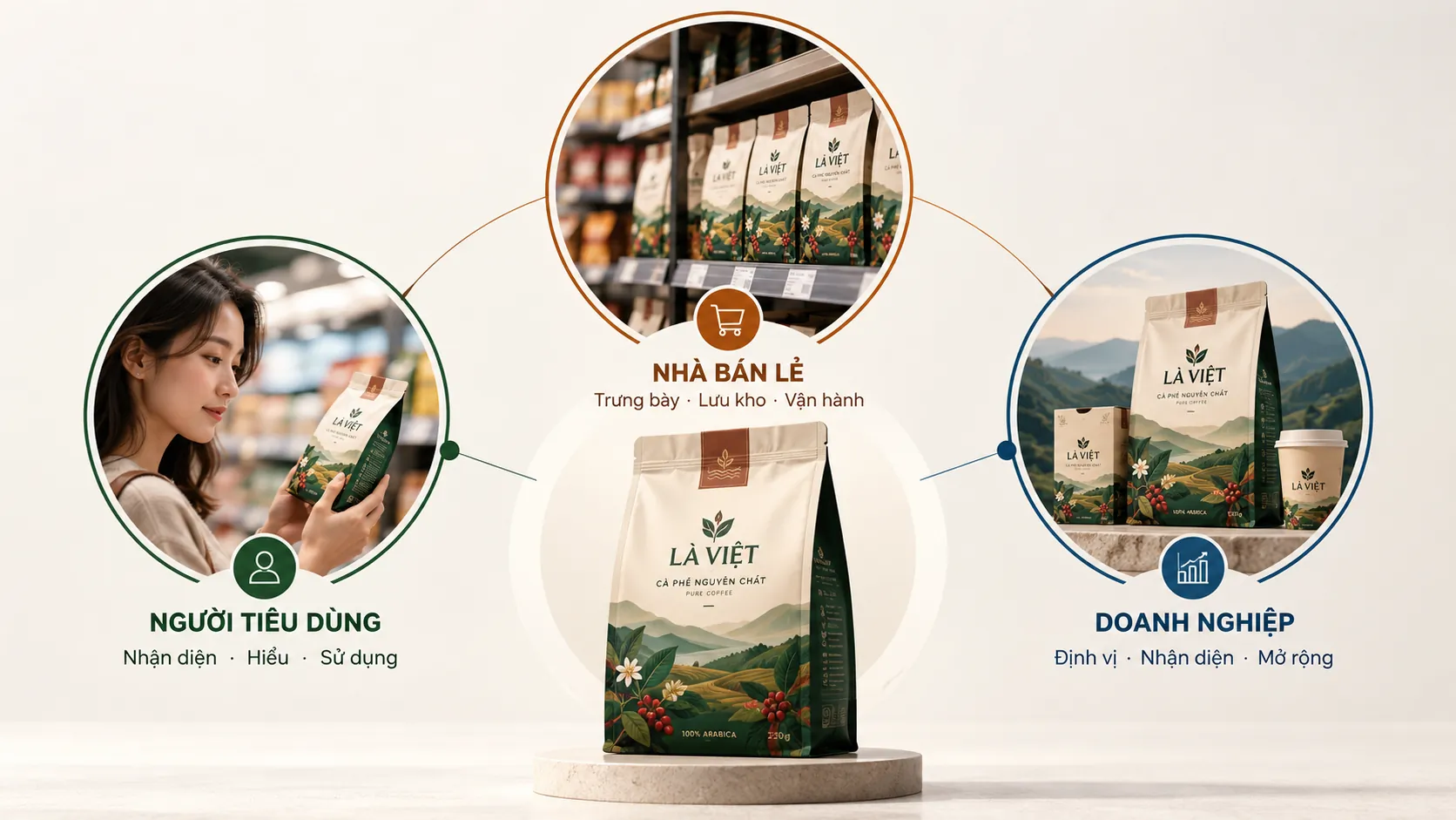
A packaging design can be viewed from several sides. But if it is seen only from the business’s side or the designer’s, it is easy to miss problems that arise at the point of sale and in use.
Packaging can be seen through three lenses: the consumer, the retailer and the business.
FRAMEWORK
The three lenses of strategic packaging
This framework keeps a business from judging packaging only by whether it feels “good-looking” or not, and has it consider the effect on experience, operations and the brand as well.
- The consumer: Is the packaging easy to recognize, understand and use, and does it fit what the buyer expects?
- The retailer: Is the packaging convenient for display, stacking, storage, stocktaking and reading the information?
- The business: Does the packaging reinforce the positioning, identity and perceived value the brand wants to build?
1. The consumer lens: from the first glance to the usage experience
On the consumer’s side, packaging has to handle a continuous chain of experiences.
Before the product is picked up, packaging must help it be seen and recognized. Once it is in hand, it must help the buyer understand what the product is, who it is for and which features matter. After the purchase, packaging continues as part of the usage experience.
Aesthetics must keep pace with recognition speed
On a shelf with many products in the same category, consumers have no reason to study each design in turn. Packaging therefore needs a visual hierarchy clear enough for the buyer to know where to look first.
The logo, product name, key benefit, imagery, color and supporting information cannot all compete for attention at once.
This is the role of visual hierarchy.
A good hierarchy does not necessarily produce a complicated design. On the contrary, it often removes unnecessary elements so the most important information stands out.
The point is not to “put as much information as possible on the packaging,” but to decide which information must be seen first, which can be read later, and which does not need to appear on the main face.
Transparent information is part of the brand experience
A beautiful package that is hard to read still creates friction.
The product name, function, ingredients, specifications and other necessary information should be organized so buyers can quickly find what they are looking for.
Here, typography is no longer simply a matter of style. Type size, contrast, spacing, line length and the placement of information all directly affect how readily the information is taken in.
FIELD NOTE
A common mistake is to turn the front of the pack into a container for the entire brand story. When every piece of information is treated as important, none really has priority. The packaging becomes dense but ineffective at guiding the eye.
Usability extends the experience beyond the point of sale
Packaging does not finish its job once the product is bought.
How easily a pack opens, closes again, is held, releases the product and is stored can all affect how users perceive it. A small detail in the packaging structure sometimes makes more difference than a major graphic change.
This is why packaging design has to look at ergonomics as well: the relationship between product structure and real usage behavior.
2. The retailer lens: packaging must work within the operating system
Packaging is not only in the consumer’s hands. Before that, it passes through a system of distribution, storage and display.
A design can look appealing on its own yet run into trouble beside dozens of other SKUs. Size, shape, stackability, durability and the way information appears all bear on operational efficiency.
Structure must account for stacking and storage
Packaging has to meet the physical conditions of the supply chain: easy to handle, stable enough in storage and suited to display space.
This part is seldom seen in discussions of design, because it creates no immediate visual effect. But if the structure is wrong, problems appear in transport, in storage or at the point of sale.
Packaging is also an operational information system
Information on packaging does not serve buyers alone. Product and pack specifications also support stocktaking, sorting and goods management.
Packaging design should therefore be examined across the whole system, not judged only on the front of the product.
The “silent salesperson” needs to be understood correctly
Packaging can support the sale by letting the product explain itself: what the product is, what group it belongs to, how it differs, and which need it suits.
But that does not mean packaging should say a great deal.
The “self-selling” ability of packaging comes from a clear information structure and clear visual signals, not from the amount of messaging put on it.
3. The business lens: packaging is an asset of the brand system
At the business level, the question is no longer just “does the product stand out?” but “how is this product contributing to building the brand?”
The packaging of a single SKU can be a short-term asset. But when many SKUs share one identity system, they begin to build a brand asset that accumulates over time.
PRINCIPLE 02
A good package can be different; a good packaging system has to be both different and recognizable
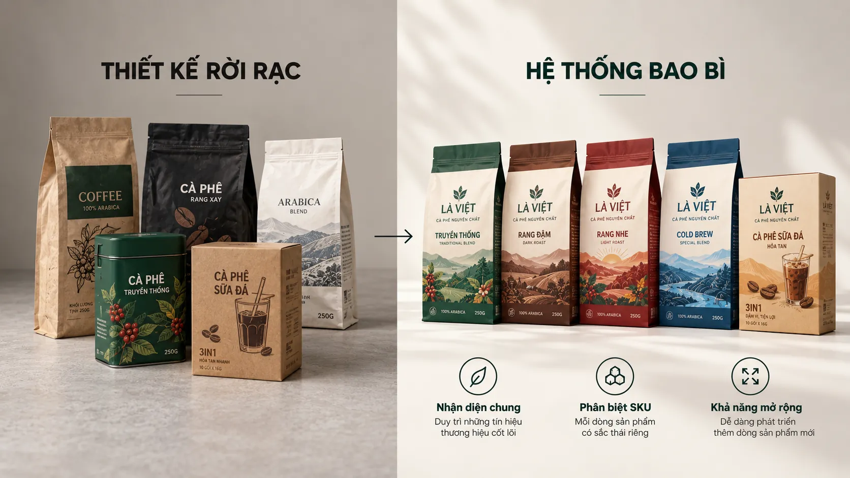
A business should not design each product as a separate “brand” if the goal is a unified identity. There need to be elements stable enough for consumers to recognize one brand, along with enough variation to tell the product lines apart.
This is a balancing problem between consistency and differentiation.
Packaging and the question of value positioning
Packaging does not decide a brand’s price or standing on its own. But it helps shape how the product is perceived.
A design with too many details, no order, or a poor fit with the target audience can weaken the value signal the business wants to send. By contrast, a deliberate design system can help the product express more clearly the level of care, expertise or style the brand has chosen.
What matters is not to equate “beautiful” with “premium”.
A minimalist design is not automatically a high-value design. A design with many details is not automatically a poor one.
Perceived value comes from how well many elements fit together: audience, category, positioning, materials, structure, typography, color, imagery and the whole usage experience.
COMMON MISTAKE
“The more a package stands out, the easier it sells.”
Why it is not enough
Standing out solves only part of the problem. If a design catches the eye but does not help buyers recognize the brand, understand the product or tell it apart from other options in a meaningful way, that attention does not necessarily become brand value. Packaging needs to create directed attention, not just attention.
The designer’s role: more than making a brief look good
When packaging is treated as a component of brand strategy, the role of the design partner changes too.
A designer does not simply take a brief and turn it into images. They need to understand the business problem behind the brief: what the brand wants to change, which customer group it serves, what obstacles it meets at the point of sale, and which identity assets must be preserved.
WHAT WE LOOK FOR
In a packaging project, the first thing to consider is not “which design style is popular,” but what the brand needs buyers to recognize first.
- Defining the identity signals to keep.
- Defining the information to prioritize on the packaging.
- Define the difference to create in a competitive context.
- Check whether the new design can grow into a system or only solves a single SKU.
Turning core values into visual signals
A brand value such as “simple,” “professional,” “friendly” or “reliable” is not in itself a design language.
The designer must turn those concepts into specific decisions: structure, color, typography, imagery, materials, white space and how information is organized.
This is the process of encoding values into observable signals.
Ask the right question before proposing options
A good brief is not always a complete brief.
A business may ask for a “packaging refresh” when the real problem is that consumers do not recognize the brand. Or it may want to “make the image younger” when the actual barrier is an SKU system without hierarchy.
If the question is not reset, the design may solve very well a problem the business does not actually have.
The design must be able to scale
A single package can be very beautiful. But a business rarely has just one product.
As the range expands, the packaging system must allow new SKUs, variants, sizes or product lines to be added while keeping the shared identity structure.
That is why packaging design should be built as a system with rules, not a collection of disconnected graphic decisions.
Restructuring packaging: when is change needed?
Not every problem calls for a full redesign.
Sometimes a brand only needs to adjust typography or the information hierarchy. Sometimes the packaging structure has to change. And sometimes the whole system needs restructuring because the positioning, audience or product range has changed.
LESS EFFECTIVE
- Changing packaging only because the current design looks “old.”
- Choosing options mainly on internal impressions.
- Designing each SKU in its own style.
- Chasing visual trends without checking the fit with positioning.
STRONGER
- Define the brand problem and the behavior to address before designing.
- Evaluating packaging in both the shelf context and the usage experience.
- Building a rule-based identity system for many SKUs.
- Keep the valuable identity assets while updating what no longer fits.
A brand audit for the packaging system
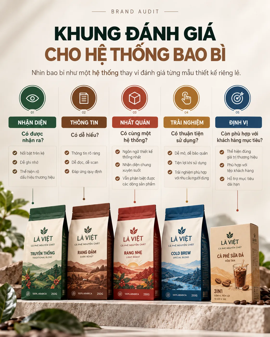
Markets, product categories and consumer behavior do not stand still. Packaging should therefore be reviewed on a regular schedule, not only when sales run into trouble.
A brand audit in this context is not simply a check on whether the packaging looks good. It has to place the packaging within the brand system and the market it operates in.
CHECKLIST
Questions worth asking:
- Do consumers recognize the brand quickly enough in a competitive setting?
- Does the order of information on the packaging reflect the buyer’s order of priority?
- Do the color, typography and imagery systems create a consistent identity across SKUs?
- Does the packaging suit real usage behavior and display conditions?
- Does the current design still fit the positioning and the customer group the business is aiming for?
- Which identity assets should be kept when restructuring?
Restructuring does not mean erasing
An effective packaging change does not necessarily have to feel “completely new.”
If a brand has already built up valuable identity assets, removing them all may cost the business the familiar cues that help consumers recognize the product.
Restructuring should therefore be seen as a process of filtering and reorganizing: identifying what creates value, what gets in the way of the experience, and what needs updating so the system keeps fitting the market.
EXAMPLE
A hypothetical example: a brand has several product lines, but its current packaging uses too many different graphic styles. Consumers may recognize each product individually yet struggle to see the link between them.
In this case, the task is not necessarily to create an entirely new look for each product. Another approach is to identify the shared identity assets, reset the information hierarchy and build rules so that SKUs can differ while still being recognized as members of one system.
What this situation shows is that sometimes the problem with packaging lies not in any single design but in the inconsistency of the whole system.
From a beautiful package to a strategic packaging system
Excellent packaging does not need to “shout” to be seen.
It needs to know when to stand out, when to be clear, when to hold back and when to give way to information.
At the strategic level, packaging design should be seen as the meeting point of four factors: brand positioning, consumer behavior, operational requirements and the scalability of the identity system.
When these four elements are addressed together, packaging is no longer a shell designed last for a finished product. It becomes part of how the brand shows up, communicates and competes in the market.
Packaging does not only say what the product is. It shows consumers how the brand wants to be seen.
FRESHBRAND
If a business is considering changing its packaging, the first question is not necessarily “what should the new design look like?” but “what is the current system doing well, and where is it creating friction?”
FreshBrand can work with you from positioning and the identity system through to turning strategy into a packaging language that suits each touchpoint.