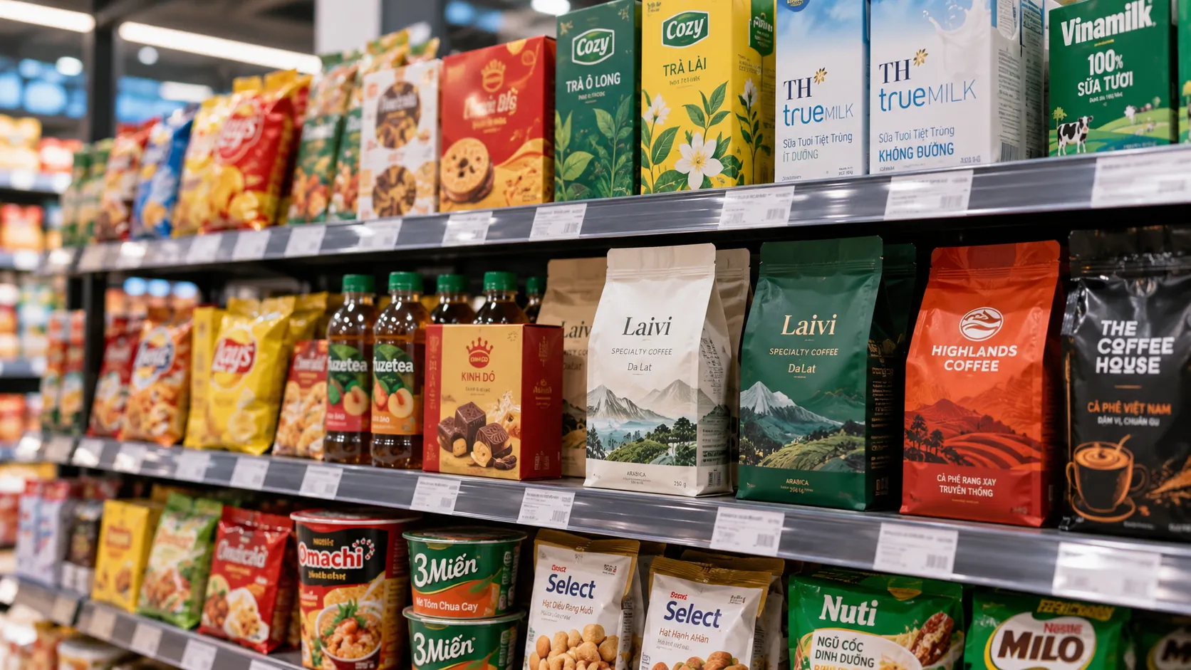
Packaging as a strategic touchpoint in the consumer’s decision path

Packaging is usually seen from two sides: a shell that protects the product and a surface that presents the brand. At the point of sale, though, the two functions meet in a larger question: will the product be noticed, understood correctly and chosen? When consumers have little time to learn about the business behind a product, packaging becomes one of the most direct touchpoints for showing who the brand is, who it is for and why it deserves consideration.
KEY TAKEAWAY
Effective packaging does not only make a product easy to recognize; it must help consumers understand, trust and choose it within a very short time.
Packaging is not the final decoration of a product
In many businesses, packaging still enters quite late in product development. The product already has a name, a formula, a price, a distribution channel and a communication plan, and only at the end is packaging design asked to “make the product look better.”
This approach casts packaging as a decorative layer, when in fact it takes part directly in how the product is perceived.
At the point of sale, consumers do not meet a product through the whole brand story. They usually see a shape, a color, a name, a typographic system, an image and a limited amount of information. From those signals they form a first judgment of the product.
So the important question is not:
“Is this packaging beautiful?”
But:
“What is this packaging making consumers understand about the product in the first few seconds?”
PRINCIPLE 01
Packaging is the interface between brand strategy and choice behavior
A brand strategy has value only when it can be turned into signals the market recognizes. Packaging is one of the clearest places for that translation to happen: positioning, target audience and distinctive value become color, information structure, imagery, materials and the experience of use.
The value of packaging lies in both what consumers see and how they use it
A pack design can make a strong impression and still fail if users struggle to read the information, open the product, take it out or understand how to use it.
Likewise, well-structured packaging can create a good experience even when consumers are not aware that the design is doing that work.
This is what sets packaging design apart from a purely decorative task. It has to solve identity, information, function, production and experience at the same time.
FRAMEWORK
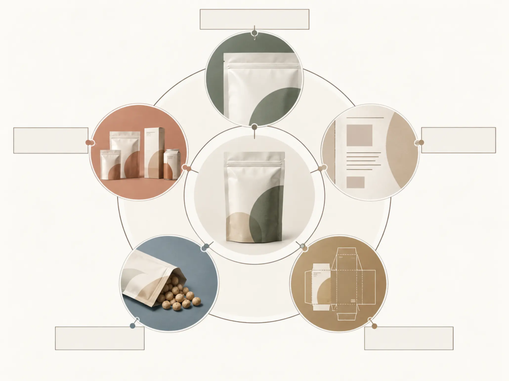
Five layers to resolve in a packaging design
- Identity: Do consumers recognize the brand and tell the product apart from the options beside it?
- Information: Are the product name, product line and key information organized in the right order of priority?
- Positioning: Does the visual language fit the segment, the competitive context and the value the brand wants to build?
- Function: Is the packaging easy to hold, open, close, store, transport and use in practice?
- Feasibility: Can the design be produced reliably across different materials, sizes and specifications?
These five layers do not work independently. A design can be easy to recognize yet convey the wrong positioning; it can look good on screen yet run into problems in print; or it can carry complete information yet lack the hierarchy that tells people what to read first.
That is why packaging design should be treated as a system of decisions, not a flat surface for arranging images and text.
Functionalism: when form must serve function
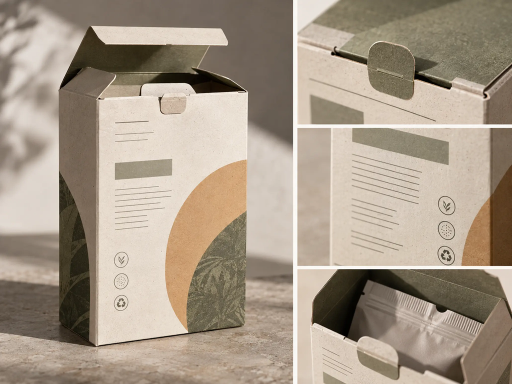
One useful principle for evaluating packaging is Functionalism: form follows function.
This does not mean every pack must be minimal, nor that aesthetics do not matter. It means each design decision needs a clear role in the overall experience.
A color can help a brand be recognized faster. A typographic structure can create hierarchy between the brand and the product name. A clean information area can help people read faster. A well-chosen pack structure can make the product easier to take out or to store.
Conversely, a visual detail that exists only to make the design “busier,” without contributing to identity, information, function or positioning, easily becomes noise.
COMMON MISTAKE
“The more detail on the packaging, the more value it shows.”
Why it is not enough
Packaging cannot carry unlimited information in a single glance. When every element wants attention, none has real hierarchy. The design has to decide what must be recognized first, what is supporting information and what can be left out.
EXAMPLE
Picture a product on a shelf among many others in the same category. The buyer needs to recognize the brand, understand which group the product belongs to and quickly decide whether it suits their need.
If the brand name is too small, the product struggles to build recognition. If the product name is lost among decorative imagery, buyers cannot tell what they are looking at. If all the information is presented at the same size and contrast, consumers must decode the entire front of the pack themselves.
This situation shows that “adding information” does not automatically add value. The value lies in how information is organized to reduce the user’s cognitive effort.
Heinz and the lesson of treating packaging as a brand asset
Heinz is an example often cited when discussing the relationship between brand and packaging. What stands out is not only its familiar look but also the way packaging can become part of the brand experience and an identity asset over time.
From this view, packaging should not be seen simply as a cost of bringing a product to market. It can become an asset that accumulates value if its identifying features and experience stay consistent over a long period.
FIELD NOTE
In design practice, a common problem is that a business evaluates packaging on a single mockup instead of in its real competitive setting. A design can look very convincing alone on a screen and still lose its distinctiveness beside dozens of other products. The “on the shelf” context, or the real selling environment, should therefore enter the evaluation as early as possible.
From “beautiful” to “competitive”
The difference between beautiful packaging and effective packaging often lies in how a business asks its questions.
If the only question is “is the design beautiful?”, the discussion is easily pulled toward personal taste.
Ask “what will consumers see first?”, “is the brand recognized?”, “is the product understood correctly?”, “is the point of difference clear enough?” and “can the design be produced reliably?”, and the discussion moves from aesthetics to effectiveness.
That is also when the role of design changes: from decorating the product to solving a business problem through visual language and experience.
LESS EFFECTIVE
- Starting by choosing the colors, imagery or style that are currently popular.
- Judging the design mainly on a single stand-alone pack sample.
- Trying to put as much information as possible on the front.
- Treating manufacturability as a problem to solve after the design is finished.
STRONGER
- Start from positioning, users and the competitive context.
- Evaluate the design in the environment where the product actually appears.
- Build the information hierarchy around how people recognize and choose.
- Take materials, specifications, printing and use into account from the start of the design process.
Packaging must create identity, not just momentary difference
One of the hard problems in packaging is balancing difference with consistency.
If a design is too close to its competitors in the same category, the product can blend into a familiar category code and struggle to own a position of its own. Conversely, if a brand tries to be different at all costs, it may lose the signals consumers need to understand which category the product belongs to.
Effective difference, then, does not have to mean a design that is entirely unfamiliar. It can lie in how the brand arranges familiar elements in a structure of its own that is consistent and memorable.
WHAT WE LOOK FOR
When looking at a packaging system, the first thing to examine is not “is this style attractive?” but which identifying elements the brand owns and which of them truly set the product apart in a competitive environment.
- Are the identifying elements maintained across the whole product range?
- Are the product variants different enough for users to tell apart, yet consistent enough to be recognized as the same brand?
- When scaled down, printed on another material or placed in a digital environment, does the identity system still work?
A good packaging system has to live beyond the design file
Packaging does not, in the end, exist in the design file.
It is printed, folded, glued, laminated, shipped, stacked, placed on a shelf, held in the hand and used again and again. Materials, size, production specifications and conditions of use can therefore directly affect how the design is perceived.
A design that looks good only on screen but is hard to produce, hard to control in color or inconsistent across specifications cannot yet be considered a complete packaging system.
This matters most when a business has many SKUs. As the number of variants grows, the design is no longer a single pack face but a visual architecture that needs rules.
FRAMEWORK
Three questions for evaluating a packaging system
- Is it recognized? At a quick glance or from a distance, can consumers identify the brand and the product group?
- Is it understood? Do consumers know what product they are looking at, and is the important information prioritized correctly?
- Is it consistent? As the range grows, do new products keep reinforcing the shared identity rather than creating separate “little brands”?
If a system answers only one of the three questions well, the business still has a gap to close.
How FreshBrand approaches packaging
At FreshBrand, packaging is seen in relation to brand strategy rather than handled as a stand-alone graphic task.
That begins with defining how the product should be seen, where it differs, what competitive setting it sits in and what consumers need to understand before they decide.
Only then is the visual language turned into a packaging system: from information structure, color, typography and imagery to the way product variants are organized into a unified range.
PROCESS
- Read the competitive context: Identify the visual codes common in the category and the gap the brand can own.
- Set the identity hierarchy: Decide in what order the brand, product name, product line and supporting information should be seen.
- Build the visual system: Turn positioning into principles for color, layout, typography, imagery and pack structure.
- Test in real context: Evaluate the design on the shelf, across product specifications and at the touchpoints where the packaging actually appears.
- Finalize for production: Check consistency as the design moves into materials, printing and manufacturing.
This is how packaging can move from being a “shell around the product” to a component of the brand system.
From a product to an asset that accumulates value
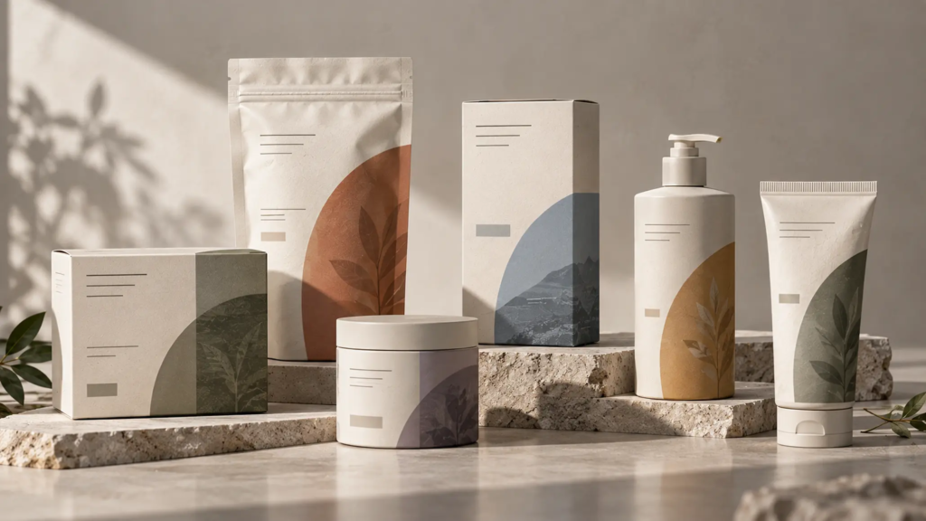
Packaging that works only at the moment of purchase is not enough. Long-term value appears when consumers gradually link the visual features of the pack with the brand itself.
Then color, structure, shape and the way information is organized are no longer separate design elements. They become signals that help consumers recognize the brand on later encounters.
That is why a business should not change its packaging just because a new visual trend has appeared. Each change should be set against a larger question: are we improving the experience and our competitiveness, or are we unintentionally discarding identity assets we have built up?
CHECKLIST
The questions to ask:
- Does the current packaging express the position the brand wants to hold?
- Do consumers recognize the brand before reading all the information?
- Does the information hierarchy reflect how people recognize and choose the product?
- Does the design create difference without breaking recognition of the category?
- Does the system stay consistent as it extends across SKUs, sizes and materials?
- Is the packaging practical to produce, ship, use and store?
Effective packaging does not only make a product stand out on the shelf; it helps the brand be recognized, understood correctly and remembered.
When packaging becomes part of brand strategy
In a market with ever more choices, a business cannot expect its product to explain its own value. Consumers experience a brand through concrete touchpoints, and packaging is one they can see, hold and use directly.
So the conversation about packaging should not begin with “what style should we design in?” It should begin with harder questions: how does the brand want to be recognized, why should the product be chosen, and what visual system can turn those strategies into a concrete experience?
Once these questions are answered, the design has a basis for becoming a brand asset rather than just a coat of paint on the product.
FRESHBRAND
If a business is preparing to launch a product, expand its range or reassess its packaging system, the first question is not necessarily “how should we redesign it?” but is the current packaging helping or hindering the way the brand is recognized and chosen?
FreshBrand can start from that strategic question to define the role of packaging within the whole brand system, before turning it into a design language and specific touchpoints.