
Nhat Dai Thanh
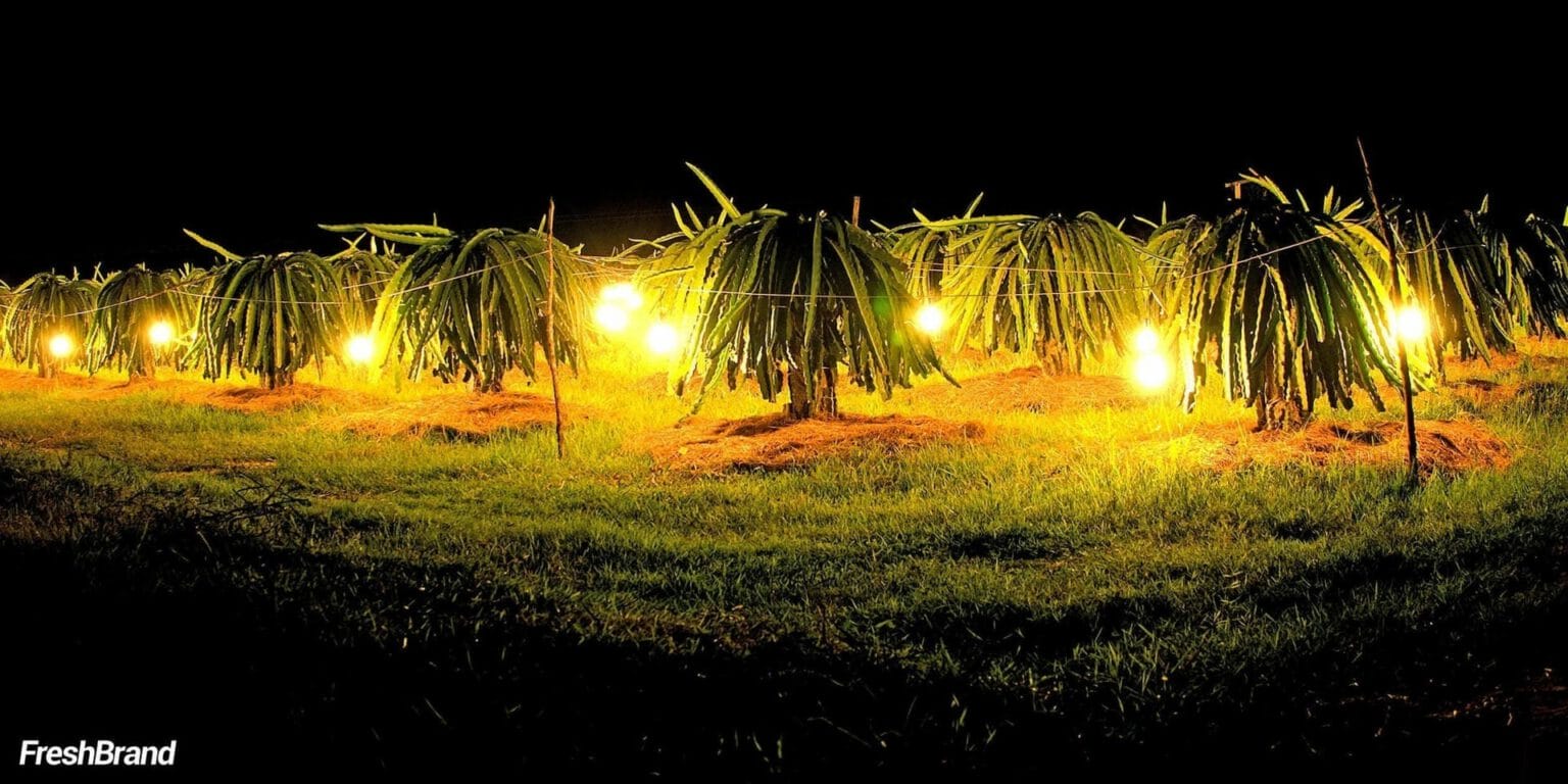
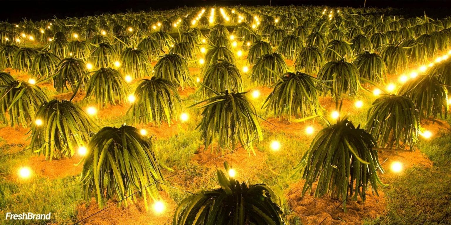
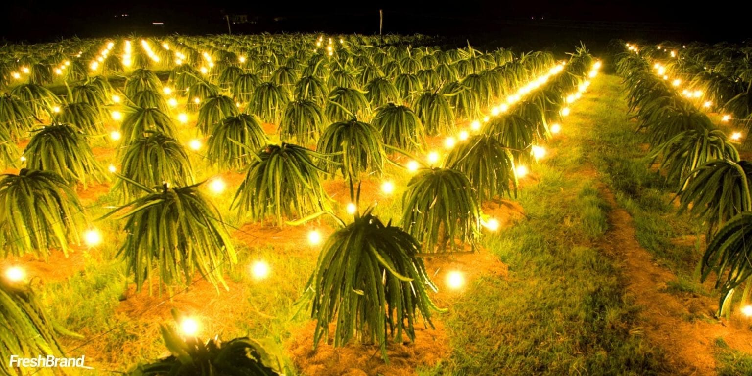
Fields lit up through the night.
- Client
- Nhat Dai Thanh
- Industry
- Agriculture & Agribusiness
- Services
- Packaging Design

Overview
Nhat Dai Thanh is a dragon fruit business.
FreshBrand designed the shipping-carton packaging for Nhat Dai Thanh around a direction that is natural, fragrant, tasty, nourishing and affordable, so that the dragon fruit can travel far and still carry the color of the orchard.
Inspiration
Where did the idea start?
From bud to harvest
The dragon fruit bud, the white blossom opening in the dark, orchards lit up bright as a field of stars. Then the farmer’s hand, cutting each ripe red fruit.
A fruit tended from day to night deserves packaging that tells that story.






Packaging
How does the product speak on the shelf?
A red carton you can recognize from far away
The cartons use the red of the dragon fruit skin and the green of its stems, with the logo set inside a yellow circle. Stacked in blocks in a warehouse or on a truck, they form a patch of color that cannot be mistaken for anything else.


Services
FreshBrand team
- Trần Anh Tú — Creative Director, Project Director, Design
- Hồng Phong — Design
- Thanh Thúy — Design
Project
- ClientNhat Dai Thanh
