FreshBrand — Tư vấn chuyển đổi Thương hiệu, thiết kế nhận dạng Thương hiệu, thiết kế logo, thiết kế bao bì.


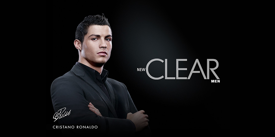
From stained-glass church windows to Cristiano Ronaldo billboards, images add immediacy, power, and when carefully considered clarity to communications. Visual metaphors have surprising staying power; both the image and the style in which it is represented say something about the brand it represents. Consider the depth of meaning that images might add to a brand identity, and choose wisely.
Illustrative Logos
All illustrative logos are pictures, but they cover a range of meaning. Some literally illustrate a product or service. Others symbolically represent an idea more loosely related to an organization’s mission. A third group suggests meaning or captures a spirit rather than illustrating something specific.
The more literal an illustrative logo is, the less work a potential customer needs to do to interpret it. If your client is a dentist, and you create a logo for her practice that resembles a toothbrush, her logo says, “This is the dentist, not the cobbler.”
![]()
Some logos literally illustrate the name of an organization, while others represent the product or service being provided. Still others stand for a more abstract idea.
Sometimes, an illustration can be concrete while its meaning remains abstract. Name your moving company Mayflower Transit, and using a picture of the famous Pilgrim vessel for your graphic identity becomes the obvious choice provided you can make a connection in the minds of your potential customers between the thing being illustrated and a meaningful aspect of your business.
Apple provides the classic example of an illustrative logo with its meaning left open for interpretation. Apple doesn’t sell apples, but you wouldn’t know that from its logo a stylized image of an apple with a bite taken out of it.
Visual Style
Creating a coherent identity program involves more than slapping a bug on baseball hats and polo shirts. The style of additive visual elements photography, illustration, etc. truly helps define an identity program.
Color or black-and-white photography, editorial or nonrepresentational illustrations: A strong and clear image style helps define a program aesthetic.
Sometimes, designers overlook the obvious. Granted, there’s a fine line between obvious and banal, and you do not want to cross it. Keep in mind, however, that art and design serve different purposes. Art is a one-to-one communication. Design needs to communicate directly with a specific group of people. When developing the photography or illustration style for a program, you don’t need to trade clarity for sophistication. A lot of programs flounder by using sophisticated, but unclear imagery. Fall into this trap, and you fail to communicate anything.
Insightful use of communicative images reinforces and in some cases, establishes a program’s visual tone.
An Aesthetic Niche
The evolution of online stock photography and photo-sharing sites has given designers access to a plethora of easy-to-come-by images. Search iStockphoto for “guys in ties running through airports,” and you’ll find ample imagery to represent just about any business customer. But using these clichéd images won’t carve out a visual niche for the brand. It will merely add to the noise.

Heath Ceramics relies heavily on graphic color photography to tell the story of its brand. Photographs of flatware taken from dramatic angles adds interest and variety to the Gourmet Settings brand website.
With everybody using the same pool of photos, it’s hard to use images as a unique differentiator or identifier. In response to this, brand designers need to work harder to create new visual artifacts. Additional creative minds can serve as wonderful collaborators in this effort, lending a new sense of depth and experience. Often, a good photographer or illustrator can work side by side with a design director to carve out a new niche with a level of visual sophistication appropriate for the client.