FreshBrand — Tư vấn chuyển đổi Thương hiệu, thiết kế nhận dạng Thương hiệu, thiết kế logo, thiết kế bao bì.


Typefaces may vary, but whenever typography plays an important role in a brand identity, we can assume that the brand is appealing to a reader someone who appreciates prose, or at least a good headline. They might be a comic book reader as much as a Shakespearean scholar, but, nonetheless, we expect them to read.
MONOGRAMS AND WORD MARKS
Monograms and word marks rely on words (typically the initials or name of the organization) rather than pictures to represent an organization graphically, although lots of typographic games blur this line. Context and circumstances should guide decisions about whether or not to use a typographic logo.
When the goal is a mark that’s clear and straight-forward, type may be best. Of course, that goes out the window if the competitors have all done the same thing. See? Context.
For most organizations, word marks or monograms don’t ask the viewer to interpret much. That’s not true for organizations with unusual names. The Google word mark challenges customers on a different level than the word mark for Heath Ceramics.
A typographic logo opens up more possibilities than an illustrative symbol. And it’s closing fewer doors around the globe for U.S. companies as English has established itself as the language of international business. In a world that’s rapidly filling up with symbols (Don’t believe it? Check out your computer desktop), a word mark can look very clean, professional, and classic.
Monograms can be inspired by a traditional monogram, varsity letter, or family crest. Word marks that employ straight type express the character of a brand in subtle ways.
TYPE CHOICES
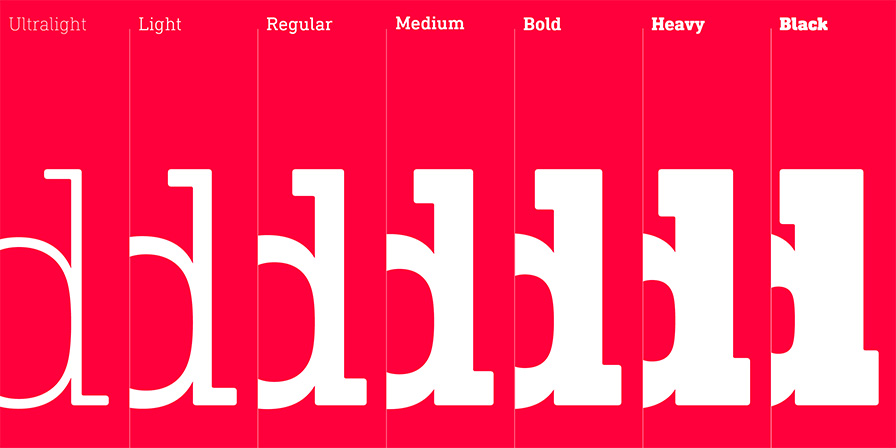
Type has personality. Show us someone who disagrees, and we’ll show you someone who’s the walking embodiment of Times New Roman. Picking the right typeface means picking one that imbues your program with the right feeling. The choice begins with serif vs. sans serif.
The thicks and thins of serif typefaces evolved from the pressure points created by a calligrapher’s hand. Given that lineage, serif typefaces often get equated with tradition. By contrast, the relatively younger sans serif typefaces get equated with modernity. However, evidence hints that these personalities are in flux. Sans serif typefaces have been adopted for signage systems all over the world. As a result, what was once seen as quintessentially modern now can be seen as institutional.
![]()
All programs require choices about type. Some programs lead with type when establishing a brand image.
Personality is an important consideration when selecting a typeface, but it should not be the only consideration. Legibility, flexibility, and consistency are also important factors to consider for an identity program.
TYPE AND MEANING
As with imagery, typography usually suggests an alternate meaning or cultural context for a brand identity. A typestyle that references classic print ads from the 1950s pushes a brand identity in a very different direction than one inspired by graffiti tags on New York City subway trains from the 1980s.
Typestyles always carry their own history, which often shades the meaning of what is being written. Brand identities built with typographic elements in concert with images may ask a bit more of the viewer than those built with images alone, but they often create deeper and more lasting memories. Some of the most effective campaigns and promotions rely on a headline and an image working together as a single unit. That’s why advertising firms continue to partner writers with designers.
![]()
Type can be manipulated to underscore or enhance meaning. For example, the idea of lost siblings is represented by deleting the second i in the Siblings word mark.