FreshBrand — Tư vấn chuyển đổi Thương hiệu, thiết kế nhận dạng Thương hiệu, thiết kế logo, thiết kế bao bì.


Without contrast, it’s impossible to stand out. Contrast is a powerful tool for designing well-composed, meaningful graphic identities. That’s true for brands, too. So besides giving designers another arrow for their quiver, contrast also provides them with a target.
CONTRAST IN COMPOSITION
Contrast makes marks distinguishable. As a rule, the less contrast a mark has both internally and with its surroundings the harder it is to make it stand out.
The phrase “graphic identity” implies high contrast. A “graphic” identity has graphic form it lives as an abstracted, simplified, high-contrast symbol of something. Good graphic identities often use contrast to draw a comparison between two things. Usually that comparison begs a conversation, leading the viewer to wonder: Why is the weight of this letter different than that one? Why is this shape different than all the rest? And what does this all mean? Is it a joke? Does it suggest some deeper meaning? Does it imply variety, evolution, individuality?
![]()
The intentional juxtaposition of two elements weight, color, typeface, orientation, etc. can enhance meaning or simply add interest.
CONTRASTING ELEMENTS
Contrast is relative to the things around it. If you’re looking at a mark on a high-resolution backdrop (a piece of white paper), then it doesn’t need to be high contrast to be legible. In fact, if contrast is too high, even a sophisticated mark can look crude.
When applied as part of an identity program, the mark must contrast from its surroundings. This may seem obvious, but it can be a challenge in practice.
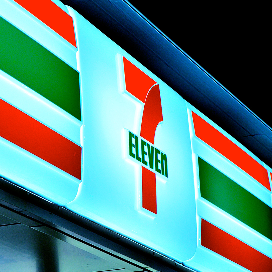
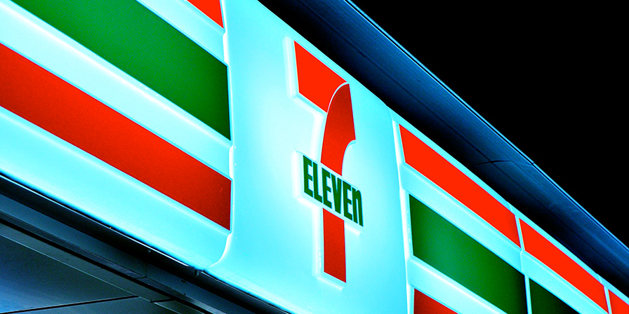
These graphics are designed to stand out by using colors and shapes that contrast with their surroundings.
BEING DIFFERENT
Strong brand identities not only stand in contrast with their top competitor(s), but also with the overall market landscape. Contrast in brand identity begins with positioning, which should focus on points of differentiation, and can be reflected through graphic style, program application, and meaning.
Brand identities that use contrast well stand out based on how they look, feel, and behave differently than the rest of the market. For example, a brand identity built on Apollo-era NASA engineers and classic TV cop shows helps Geek Squad stand out among computer tech support companies.
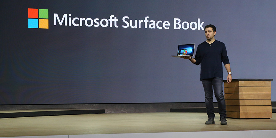
The unique design combine tablet with laptop has helped Surface Book outstanding in its market. Becoming an “ultimate laptop” was most cared by experts.
Of course, as competition makes standing out harder, designers must dig deeper. Increasingly, differentiating a brand means looking for blue oceans new, uncontested markets ripe for growth. When others zig, try zagging.