FreshBrand — Tư vấn chuyển đổi Thương hiệu, thiết kế nhận dạng Thương hiệu, thiết kế logo, thiết kế bao bì.


So much brand design work begins in two-dimensional form, but technology has enabled the expression of a graphic identity designed in two dimensions to be experienced in three. When considering the appropriateness of these 3-D expressions, interesting questions and risks emerge.
3-D LOGOS
Should a logo stylized to look spherical actually become a sphere in signage? How should a logo be viewed from the side? Should a logo composed of three horizontal bars be interpreted as three rectangular blocks or three cylinders? Is this open for artistic interpretation, or is there a correct 3-D manifestation of the symbol?
When dealing with these questions, a larger issue emerges quickly: whether a logo exists inherently as a symbol of a thing, or if given the opportunity as the thing itself. In our view, this answer is clear. A logo is a symbol. Making a logo into a piece of sculpture risks confusing its readability as a symbol.
![]()
Environmental graphics sometimes raise the question of whether or not to create a 3-D logo.
Of course, on the other hand, other treatments may add interest and actually enhance understanding. Creating readable outdoor signage often involves making raised, cut out, or extruded shapes and letterforms. This can be a reliable technique, provided the substrate thickness enhances, rather than interferes with, the readability of the mark.
PHYSICAL ELEMENTS
As identity programs make their way into physical spaces, they present golden opportunities for amplifying brand attributes. Concepts suggested in the two-dimensional mark translucency, shape, color, contrast, etc. can be realized in sophisticated, surprising, and enlightened ways when they move into three-dimensional space.
Well-executed programs demonstrate the personality or character of the brand through details of interior and exterior architecture as well as signage. Logos should be treated with care, but pulling other program elements into a physical space is a fantastic way to build a brand beyond the logo. Many other factors, constraints, and opportunities come into play here including readability, materials, scale, distance, proximity, atmosphere, wayfinding, and experience design.

Expanding the logo concept into physical elements (custom embroidery for The Apartment and posts and banners for la Gare het Station) move these brands beyond two dimensions.
A SENSE OF PLACE
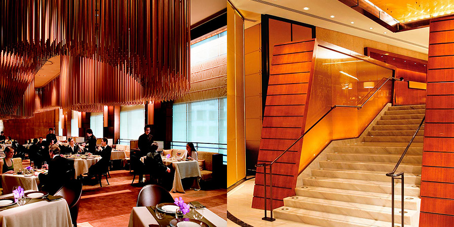
Physical spaces present an opportunity to envelop the customer in a brand experience. Consider the experience you are trying to create and whether the physical environment helps deliver it.
Like colors on an artist’s palette, program elements in a physical space mix together to paint a cohesive picture. This introduces an important opportunity for creating a compelling brand experience.
The most successful retail chains and product showrooms excel at creating meaningful, ownable brand identities within their commercial environments. Think about how materials, color, and space come together to deliver different customer experiences at a Starbucks store as opposed to Victoria’s Secret or Costco. How big is the front door? What color are the walls?
How low is the ceiling? How wide are the aisles? How are the products arranged? Where is the cashier?
When working to translate a brand into a physical environment, look for inspiration in any impactful space that leaves an impression: a five-star hotel, New York City’s Central Park, an art museum, a corporate lobby. Good brand identities express a sense of place.